


-

"Very nice Posters. The quality is amazing and we received it very quickly !"
-

"A shop to visit absolutely. Huge selection of posters. We spent more than an hour there !"
-

"Perfect to find gift. Price are very good. An they can frame and pack it on site"


About the Artist
Patrick Blackwell emerged as a designer during the transformative 1960s, a period when Op Art and kinetic visual experiments reshaped graphic culture. His work from 1965 reflects the era’s fascination with perception and the boundaries between art and science. Rather than simply decorating, Blackwell’s posters invite viewers to engage with the act of seeing itself, echoing the intellectual curiosity and optimism of mid-century modernism.
Influenced by the rise of optical and kinetic art, Blackwell’s approach aligns with a generation of artists who sought to challenge and expand the viewer’s experience through visual puzzles and dynamic forms. His contributions remain emblematic of a time when posters became vehicles for both artistic innovation and public engagement.
The Artwork
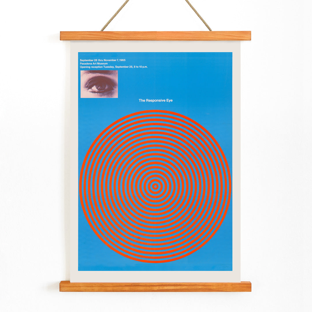
The Responsive Eye, created in 1965, stands as a visual exploration of perception. Instead of presenting a narrative or landscape, the artwork centers on the viewer’s own act of looking. The motif of a stylized eye, surrounded by vibrating concentric rings, transforms the poster into an optical experiment—inviting the observer to notice how the image seems to pulse and shift with each glance.
This piece emerged during a moment when Op Art captured popular imagination, appearing in major exhibitions and influencing everything from fashion to advertising. As a vintage poster, it embodies the era’s belief in progress, sensation, and the transformative power of modern design. For those interested in the history of abstract and Bauhaus art, it offers a window into a period of creative exploration.
Style & Characteristics
The composition is defined by its bold geometry: vivid red concentric circles radiate from a central, simplified eye, all set against a deep blue background. The use of hard edges and saturated color fields creates a classic Op Art effect, with the rings appearing to vibrate and move in response to the viewer’s gaze.
With its high-contrast palette and precise forms, this poster exemplifies the clarity and energy of 1960s optical design. The mood is both playful and intense, offering a striking visual statement that complements collections of blue or red wall art.
In Interior Design
This 1960s Op Art poster enlivens modern interiors, serving as a dynamic focal point in living rooms, offices, or creative spaces. Its crisp lines and vivid colors pair well with minimalist furniture and mid-century accents, adding a touch of visual intrigue without overwhelming the decor.
Ideal for those who appreciate vintage-modern aesthetics, it can tie together blue and red accents or provide a bold contrast in neutral settings. The artwork’s optical qualities ensure it remains engaging, subtly shifting with changes in light and perspective.