


You may also like
-
Farbstudien, 10 Blätter III Poster
Karl Wiener · 1923 · Energetic abstract poster exploring contrasting color fields with modernist rhythm
Poster from 69 kr · Framed from 122,67 kr
Regular price From 46,00 krRegular price -
Farbstudien, 10 Blätter IV Poster
Karl Wiener · 1923 · Luminous abstract watercolor art print with layered color fields in blue, purple, and yellow
Poster from 69 kr · Framed from 122,67 kr
Regular price From 46,00 krRegular price -
Farbstudien, 10 Blätter VIII Poster
Karl Wiener · 1923 · Fluid abstract art print with warm yellow washes and deep purple currents
Poster from 69 kr · Framed from 122,67 kr
Regular price From 46,00 krRegular price -
Farbstudien, 10 Blätter I Poster
Karl Wiener · 1923 · Energetic abstract poster balancing orange and green forms on warm beige
Poster from 69 kr · Framed from 122,67 kr
Regular price From 46,00 krRegular price


-

"Very nice Posters. The quality is amazing and we received it very quickly !"
-

"A shop to visit absolutely. Huge selection of posters. We spent more than an hour there !"
-

"Perfect to find gift. Price are very good. An they can frame and pack it on site"


About the Artist
Karl Wiener was an Austrian modernist artist active in Vienna during the interwar years, known for his innovative approach to drawing, watercolor, and print design. His work reflects a pivotal era when European artists sought new visual languages, moving away from traditional representation toward abstraction and formal experimentation.
Wiener's practice is closely aligned with the spirit of early 20th-century design reform, resonating with the clarity and structure found in Bauhaus posters and the broader modernist movement. His legacy endures among those who appreciate the evolution of abstract art and its role in shaping visual culture.
The Artwork
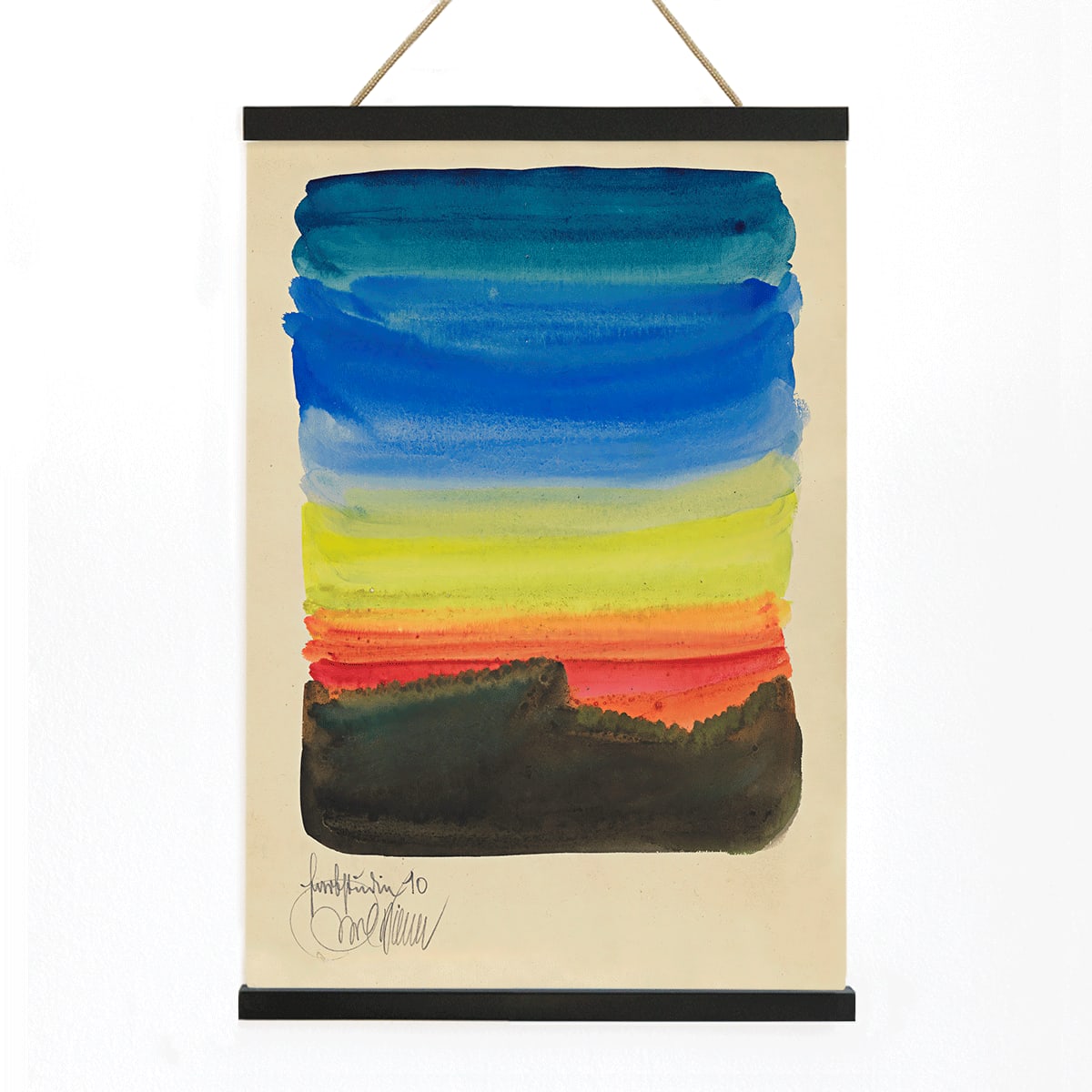
Farbstudien, 10 Blätter X was created in 1923 as part of a series of color studies that explored the dynamic relationships between hue, form, and balance. In the aftermath of World War I, such studies became a way for artists to search for universal visual principles and a renewed sense of order. This particular sheet, the tenth in the set, reflects a period of intense artistic inquiry into how color and geometry could express new ideas about harmony and structure.
Intended as both a personal investigation and a contribution to the wider discourse on abstraction, this piece embodies the intellectual curiosity of its time. It stands as a testament to the belief that art could offer stability and clarity in a rapidly changing world, making it a thoughtful addition to any collection of abstract art prints or vintage modernist works.
Style & Characteristics
This abstract composition features a rhythmic arrangement of geometric forms, primarily rectangles and squares, rendered in muted tones of blue, ochre, black, and white. The interplay of these shapes creates a sense of balance and movement, with each color field carefully calibrated to interact with its neighbors.
The overall effect is one of calm precision, where the absence of figurative elements allows the viewer to focus on the relationships between color and form. The artwork's measured geometry and subtle contrasts evoke a contemplative, almost meditative atmosphere, characteristic of early modernist abstraction.
In Interior Design
This fine art print brings a refined sense of order and sophistication to contemporary interiors, whether displayed in a living room, office, or creative studio. Its understated palette and geometric clarity make it especially well-suited to minimalist, Scandinavian, or mid-century spaces.
For a harmonious look, pair it with neutral walls and simple furnishings, allowing the artwork's structure to take center stage. To enhance the presentation, consider frames that emphasize clean lines, or combine it with other pieces from the abstract collection for a cohesive gallery wall.