


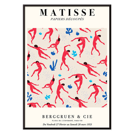
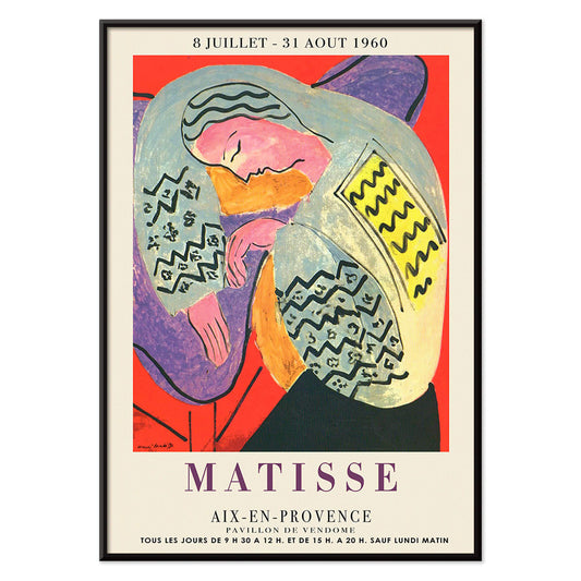
- Matisse Dancing Figures Poster
- The Dream Poster
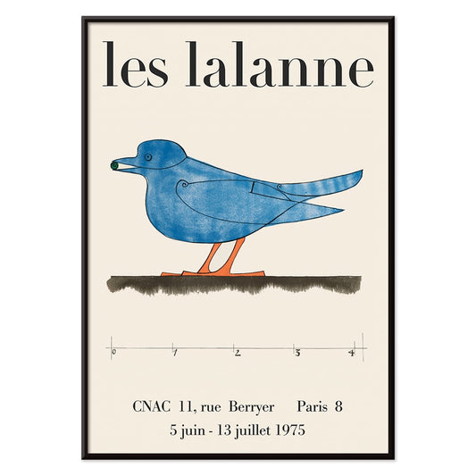
- Les Lalanne Poster
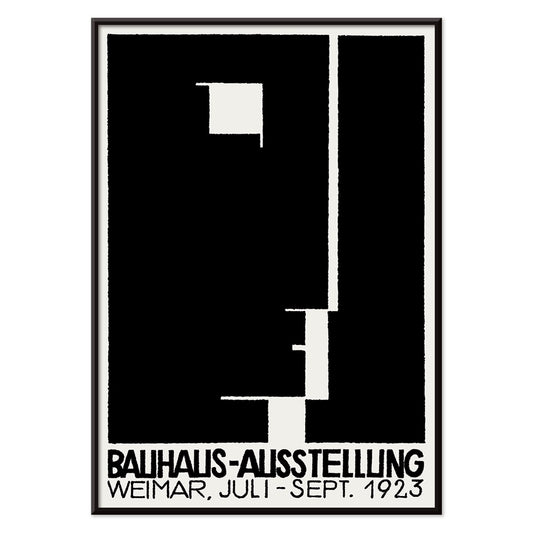
- Bauhaus Ausstellung Poster
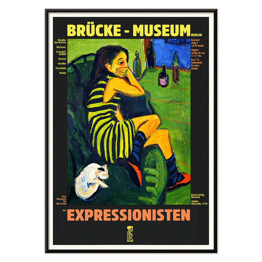
- Female Artist Poster
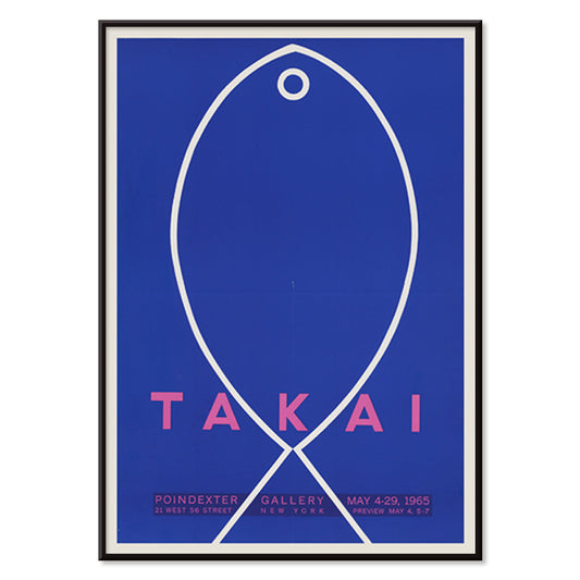
- Takai Poster
- Schiele-Ausstellung in der Galerie Arnot Poster
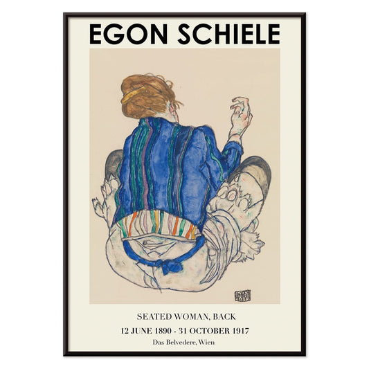
- Woman Seated Back Poster
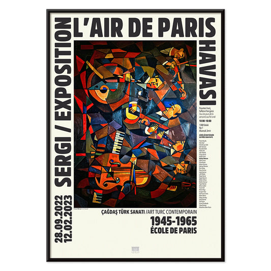
- Le Concert Poster
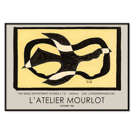
- Bird passing through a Cloud Poster
- Riley Blaze Poster
- School of Visual Arts Poster
- Tom Krojer Exhibition Poster Poster
- The Current Standpoint of the Mahatmas Poster
- Woman and Bird at Night Poster
- Berlin Street Scene Poster
- Ernst Kirchner Exhibition Poster
- Dancing couple in the snow Poster
- Block prints Poster
- Rose Fried Gallery Poster
- Punch Boutique Poster
-
Matisse Dancing Figures Poster
Henri Matisse · 1909 · Energetic dancing figures poster with bold red silhouettes set against deep blue
Poster from 69 kr · Framed from 122,67 kr
Regular price From 46,00 krRegular price -
The Dream Poster
Henri Matisse · 1960 · Vibrant sleeping figure poster with flowing contours and bold, flat color shapes
Poster from 69 kr · Framed from 122,67 kr
Regular price From 46,00 krRegular price -
Secret Poster
Le Corbusier · 1987 · Enigmatic abstract poster with bold black lines and pink, orange, and blue blocks
Poster from 69 kr · Framed from 122,67 kr
Regular price From 46,00 krRegular price -
Les Lalanne Poster
François-Xavier Lalanne · 1975 · Minimal exhibition poster featuring a stylized blue bird on warm beige ground
Poster from 69 kr · Framed from 122,67 kr
Regular price From 46,00 krRegular price -
Bauhaus Ausstellung Poster
Unknown artist · 1923 · Bauhaus exhibition poster featuring bold black and white geometry and clean sans serif type
Poster from 69 kr · Framed from 122,67 kr
Regular price From 46,00 krRegular price -
Female Artist Poster
Ernst Ludwig Kirchner · 1910 · Angular figure art print with bold black contours and high-contrast color fields
Poster from 69 kr · Framed from 122,67 kr
Regular price From 46,00 krRegular price -
Takai Poster
Teiji Takai · 1965 · Minimalist fish poster floating on ultramarine blue with crisp hand-drawn lines
Poster from 69 kr · Framed from 122,67 kr
Regular price From 46,00 krRegular price -
Schiele-Ausstellung in der Galerie Arnot Poster
Egon Schiele · 1915 · Expressionist exhibition poster with angular figure and bold orange accent
Poster from 69 kr · Framed from 122,67 kr
Regular price From 46,00 krRegular price -
Woman Seated Back Poster
Egon Schiele · 1917 · Expressive figure art print of a seated woman from behind in earthy tones
Poster from 69 kr · Framed from 122,67 kr
Regular price From 46,00 krRegular price -
Le Concert Poster
Hulusi Mercan · 1960 · Energetic abstract poster of musical instruments with bold red blue and yellow shapes
Poster from 69 kr · Framed from 122,67 kr
Regular price From 46,00 krRegular price -
Bird passing through a Cloud Poster
George Braque · 1957 · Abstract bird poster drifting through a cloud with crisp black lines on warm yellow
Poster from 69 kr · Framed from 122,67 kr
Regular price From 46,00 krRegular price -
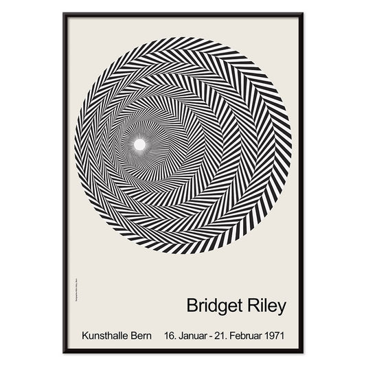
Riley Blaze Poster
Bridget Riley · 1964 · Hypnotic black and white Op Art poster with curving bands that seem to pulse
Poster from 69 kr · Framed from 122,67 kr
Regular price From 46,00 krRegular price -
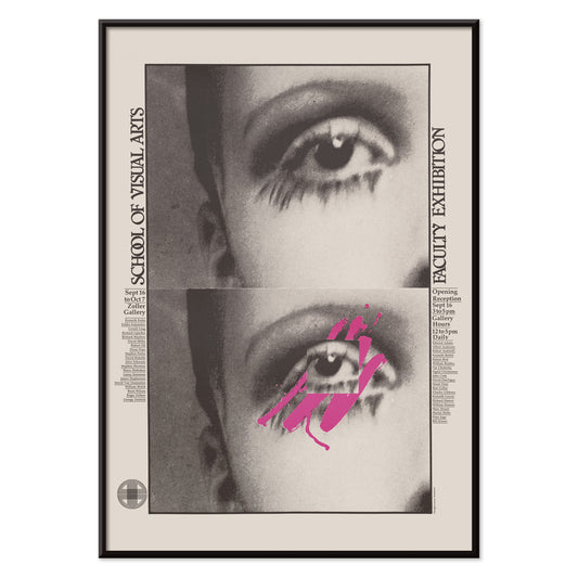
School of Visual Arts Poster
Lanny Sommese · 1979 · Graphic eye poster with black background and vivid pink accents for SVA
Poster from 69 kr · Framed from 122,67 kr
Regular price From 46,00 krRegular price -
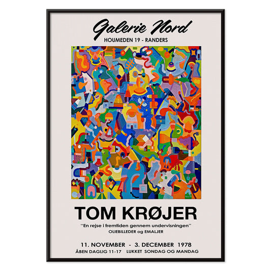
Tom Krojer Exhibition Poster Poster
Tom Krojer · 1989 · Dynamic geometric exhibition poster balancing vivid color blocks with crisp modern typography
Poster from 69 kr · Framed from 122,67 kr
Regular price From 46,00 krRegular price -
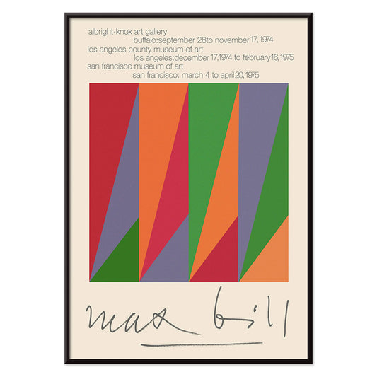
Max Bill Poster
Max Bill · 1974 · Geometric abstract poster with interlocking forms in vivid red, orange, green, and purple
Poster from 69 kr · Framed from 122,67 kr
Regular price From 46,00 krRegular price -
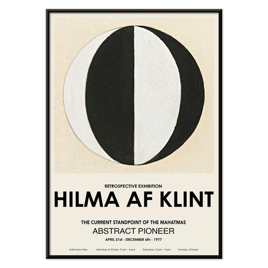
The Current Standpoint of the Mahatmas Poster
Hilma Af Klint · 1920 · Geometric art print featuring circles and triangles in bold black and white symmetry
Poster from 69 kr · Framed from 122,67 kr
Regular price From 46,00 krRegular price -
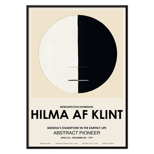
Buddha's Standpoint in the Earthly Life Poster
Hilma af Klint · 1917 · Meditative abstract art print centering Buddhist symbolism in a calm circular diagram
Poster from 69 kr · Framed from 122,67 kr
Regular price From 46,00 krRegular price -
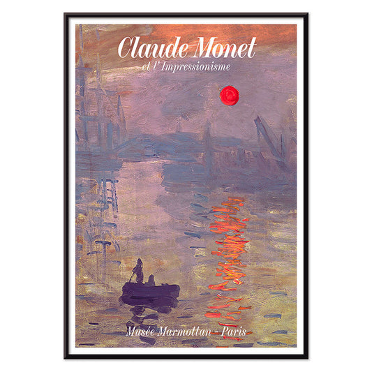
Soleil Levant Poster
Claude Monet · 1872 · Misty harbor sunrise poster with orange sun and blue-grey water reflections
Poster from 69 kr · Framed from 122,67 kr
Regular price From 46,00 krRegular price -
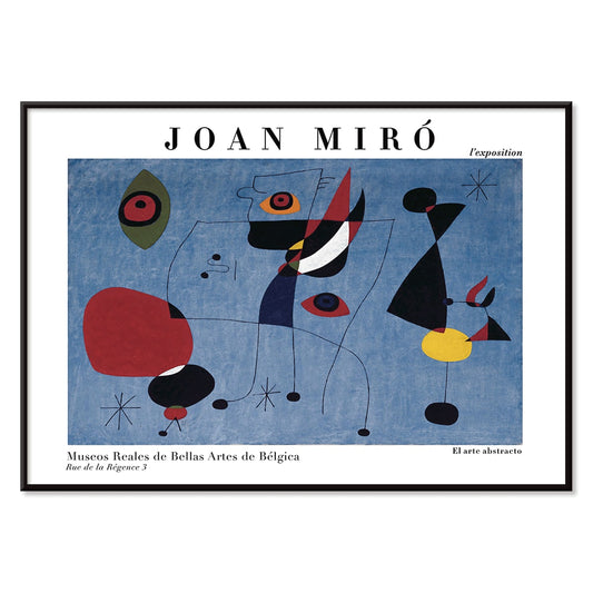
Woman and Bird at Night Poster
Joan Miro · 1947 · Playful surrealist poster with midnight blue field and bright red and yellow signs
Poster from 69 kr · Framed from 122,67 kr
Regular price From 46,00 krRegular price -
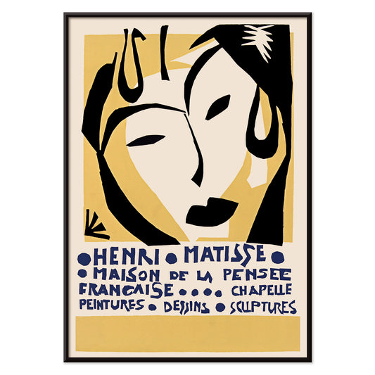
Maison de la Pensée française poster Poster
Henri Matisse · 1950 · Exhibition poster with a masklike face and blue lettering
Poster from 69 kr · Framed from 122,67 kr
Regular price From 46,00 krRegular price -
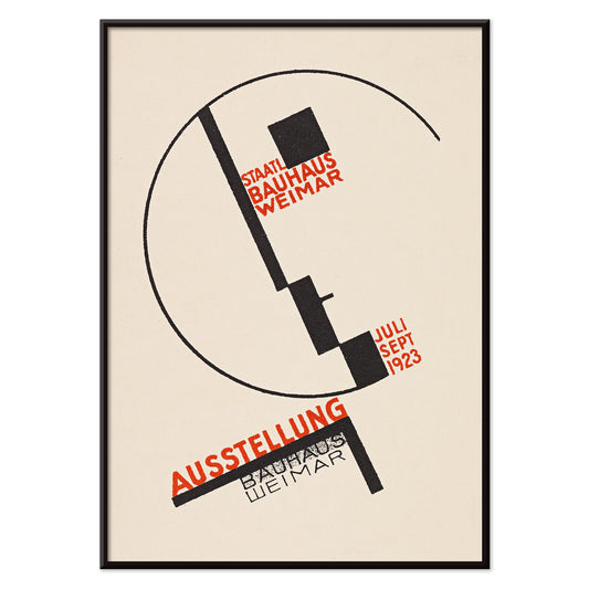
Bauhaus Weimar exhibition Poster
Dörte Helm · 1923 · Bauhaus exhibition poster with bold geometry and red typography on beige paper
Poster from 69 kr · Framed from 122,67 kr
Regular price From 46,00 krRegular price -
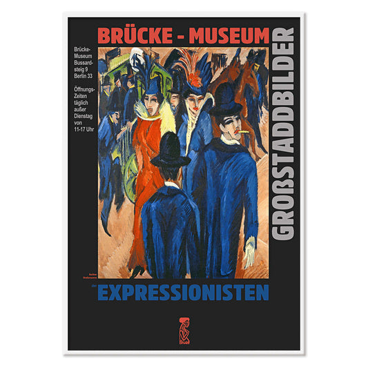
Berlin Street Scene Poster
Ernst Kirchner · 1913 · Dynamic Berlin street poster with angular figures, bright color blocks, and nightlife energy
Poster from 69 kr · Framed from 122,67 kr
Regular price From 46,00 krRegular price -
El Maestro 3 Poster
Unknown artist · 1921 · Graphic educational poster with a monumental scribe figure in black, beige, and red
Poster from 69 kr · Framed from 122,67 kr
Regular price From 46,00 krRegular price -
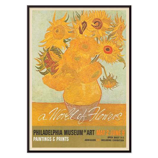
A world of flowers Poster
Unknown artist · 1964 · Cheerful floral poster combining bold petals and leafy shapes in sunny mid-century style
Poster from 69 kr · Framed from 122,67 kr
Regular price From 46,00 krRegular price -
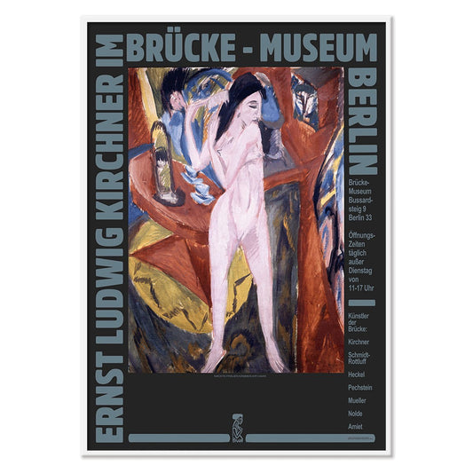
Ernst Kirchner Exhibition Poster
Ernst Kirchner · 1910 · Expressionist nude exhibition poster with bold black outlines and vivid blue and red
Poster from 69 kr · Framed from 122,67 kr
Regular price From 46,00 krRegular price -
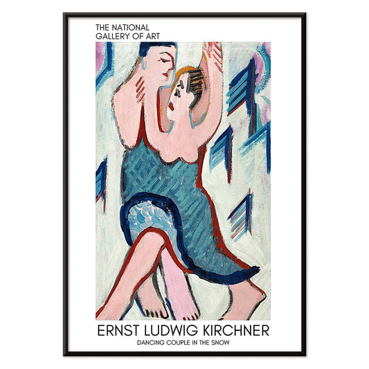
Dancing couple in the snow Poster
Ernst Ludwig Kirchner · 1928 · Expressionist art print of a dancing couple in a vivid snowy landscape
Poster from 69 kr · Framed from 122,67 kr
Regular price From 46,00 krRegular price -
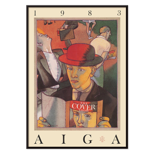
The cover show Poster
Jeff Smith · 1983 · Playful poster of a man in a red hat absorbed in a magazine
Poster from 69 kr · Framed from 122,67 kr
Regular price From 46,00 krRegular price -
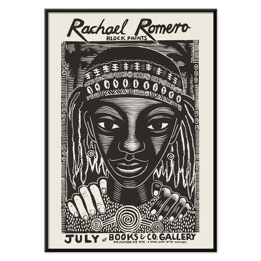
Block prints Poster
Rachael Romero · 1953 · Graphic black-and-white poster of a braided figure framed by rhythmic abstract motifs
Poster from 69 kr · Framed from 122,67 kr
Regular price From 46,00 krRegular price -
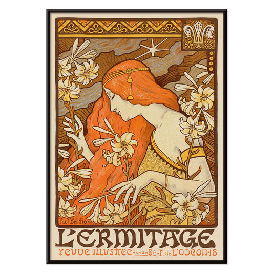
L'Ermitage Poster
Paul Berthon · 1900 · Art Nouveau poster with a red-haired muse among lilies
Poster from 69 kr · Framed from 122,67 kr
Regular price From 46,00 krRegular price -
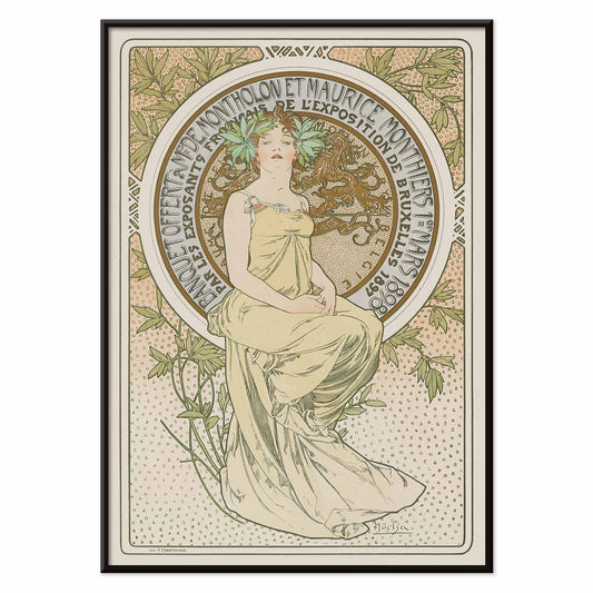
Exposition de Bruxelles Poster
Alphonse Mucha · 1897 · Art Nouveau poster for Exposition de Bruxelles with a seated figure
Poster from 69 kr · Framed from 122,67 kr
Regular price From 46,00 krRegular price -
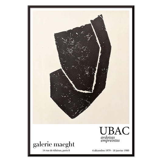
Ardoises Empreintes Poster
Raoul Ubac · 1979 · Abstract poster with engraved slate textures and shadowy organic forms
Poster from 69 kr · Framed from 122,67 kr
Regular price From 46,00 krRegular price -
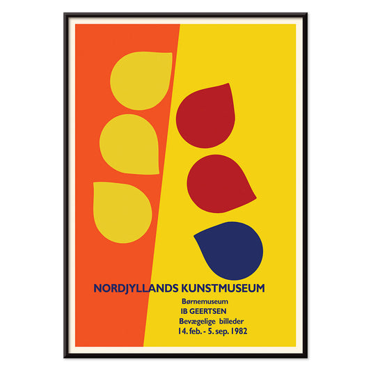
Ib Geertsen Poster
Ib Geertsen · 1982 · Vibrant geometric poster balancing bold primary blocks with crisp Scandinavian modernism
Poster from 69 kr · Framed from 122,67 kr
Regular price From 46,00 krRegular price -
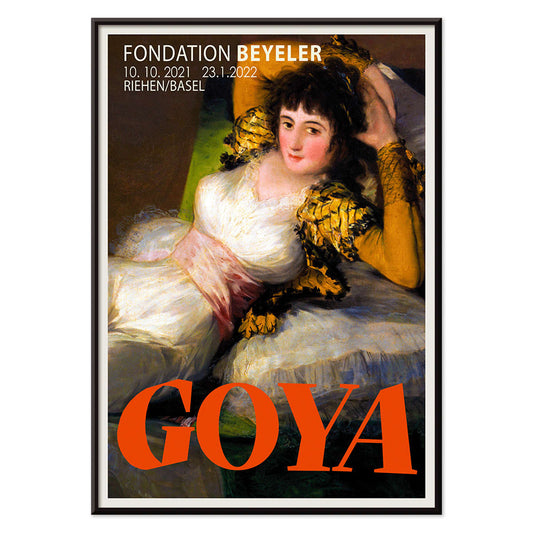
The Clothed Maja Poster
Francisco Goya · 1802 · Iconic reclining figure art print with crisp whites, green sash, and golden cushions
Poster from 69 kr · Framed from 122,67 kr
Regular price From 46,00 krRegular price -
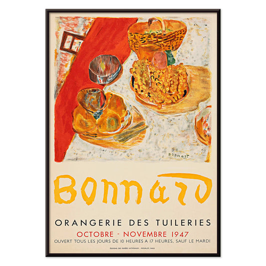
Exposition Bonnard Poster
Unknown artist · 1947 · Sunlit still life poster balancing bold color blocks and elegant exhibition typography
Poster from 69 kr · Framed from 122,67 kr
Regular price From 46,00 krRegular price -
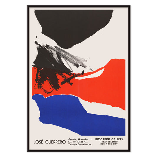
Rose Fried Gallery Poster
José Guerrero · 1963 · Energetic abstract poster balancing black, red, and blue gestures on white space
Poster from 69 kr · Framed from 122,67 kr
Regular price From 46,00 krRegular price -
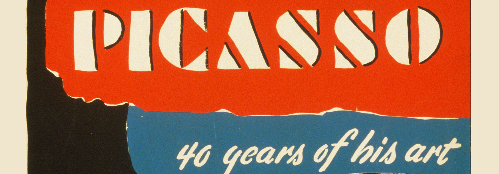
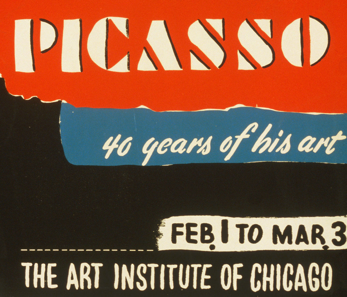
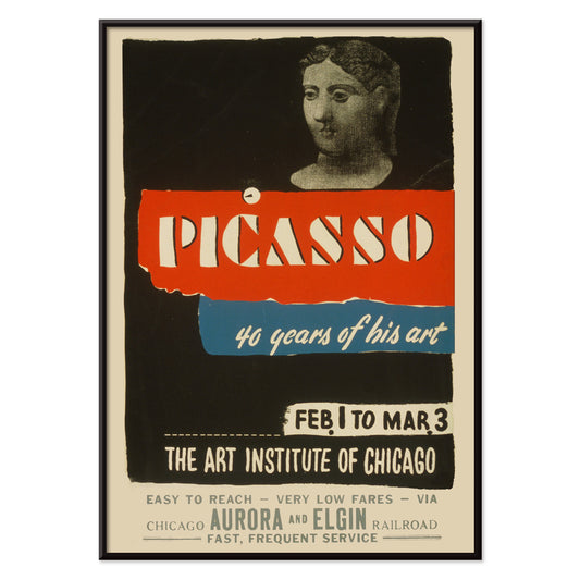
Picasso - 40 years of his art Poster
Art Institute of Chicago · 1970 · Striking exhibition poster with bold typography and modern abstract figure in red and blue
Poster from 69 kr · Framed from 122,67 kr
Regular price From 46,00 krRegular price


36/44 items
- Matisse Dancing Figures Poster
- The Dream Poster
- Les Lalanne Poster
- Bauhaus Ausstellung Poster
- Female Artist Poster
- Takai Poster
- Schiele-Ausstellung in der Galerie Arnot Poster
- Woman Seated Back Poster
- Le Concert Poster
- Bird passing through a Cloud Poster
- Riley Blaze Poster
- School of Visual Arts Poster
- Tom Krojer Exhibition Poster Poster
- The Current Standpoint of the Mahatmas Poster
- Woman and Bird at Night Poster
- Berlin Street Scene Poster
- Ernst Kirchner Exhibition Poster
- Dancing couple in the snow Poster
- Block prints Poster
- Rose Fried Gallery Poster
Art Made for the Public Eye
Exhibition posters sit at a lively crossroads: they are invitations, historical documents, and pieces of graphic art in their own right. This Exhibitions collection is shaped around the museum wall, the gallery opening, and the printed announcement that once pulled passers-by toward a room full of paintings or photographs. As vintage poster culture, it carries the rhythm of city streets and the quiet authority of the catalogue page, turning public events into wall art with memory, typography, and atmosphere.
The Language of Shows and Salons
What makes an exhibition print compelling is often restraint. A curator’s name, a date, a block of color, or a cropped detail can suggest an entire aesthetic universe. Some will echo the refined hierarchy of classic art catalogues; others may borrow the punch of vintage advertising, where lettering has to work quickly from a distance. The collection favors pieces with that double life: clear enough to announce a show, rich enough to reward long looking at home. Designs related to exhibition posters often reveal how museums balanced clarity, persuasion, and atmosphere, while famous artists exhibitions can turn a single image detail into a recognizable public signal.
Rooms That Suit Exhibition Prints
In interiors, exhibition posters are especially good at giving a room a sense of cultural lived-in-ness without feeling theatrical. A single large poster above a desk can read like a studio noticeboard; a pair in a hallway can feel like a small archive. For calm rooms, place pale museum graphics beside white or beige decoration. In livelier spaces, saturated type and bold margins can speak to Bauhaus furniture, lacquered shelves, or a growing gallery wall of prints collected over time. A muted grey frame can also steady sharper compositions, while black & white pieces add a quieter rhythm to dense interiors.
Pairing Type, Image, and Silence
The best pairings respect the poster’s original job: to communicate across space. Thin black frames sharpen typographic pieces, while warm oak softens photographic or painterly announcements. Try mixing an exhibition art print with quieter works from photo collections, then adding one chromatic accent from Bauhaus or abstract collections. The contrast keeps the arrangement from becoming a museum imitation. Leave margins visible when possible; those expanses of paper, once used for dates and venues, are part of the design intelligence and help the eye rest. A measured minimalist frame can preserve that clarity without making the composition feel sparse.
A Collection Beginning With Anticipation
Because this collection is just beginning, its identity will develop carefully rather than loudly. We will look for posters that preserve the atmosphere of a particular cultural moment: the modernist retrospective, the small photographic survey, the seaside museum season, the avant-garde evening announced in spare type. Some will suit disciplined home decor, others will bring a looser, bohemian note to shelves of books and ceramics. Together, they will form a record of how art travels before and after the exhibition itself, from studio to printer, street to apartment, public notice to private decoration. That migration is what gives exhibition wall art its quiet charge: it lets a room feel connected to openings, conversations, catalogues, and the larger pleasure of looking. Over time, the edit will balance celebrated institutions with humbler local shows, because both can reveal how taste was framed, promoted, and remembered through ink, paper, scale, and the everyday poetry of a public date.