


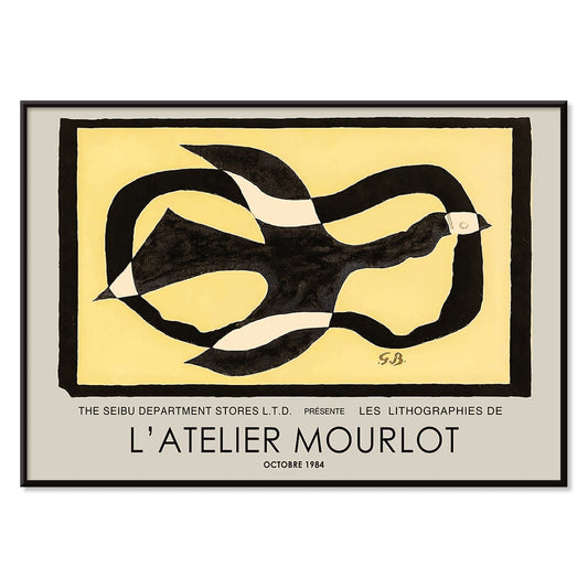
- Les Lalanne Plakat
- Punch Boutique Plakat
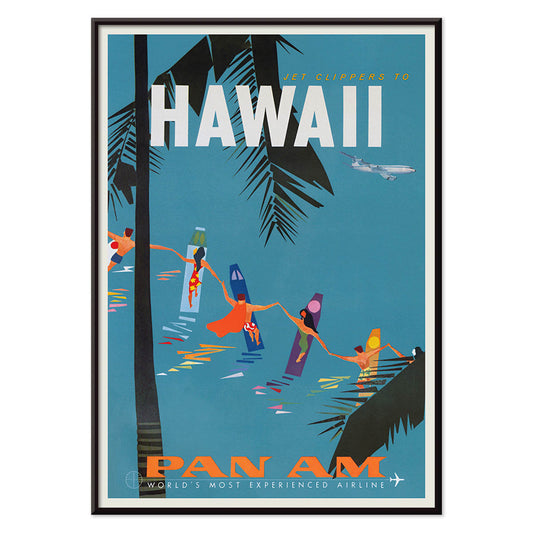
- Jet Clipper til Hawaii Plakat
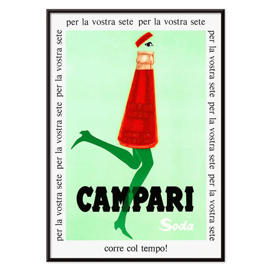
- Campari Soda Plakat
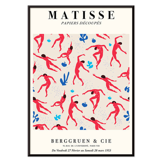
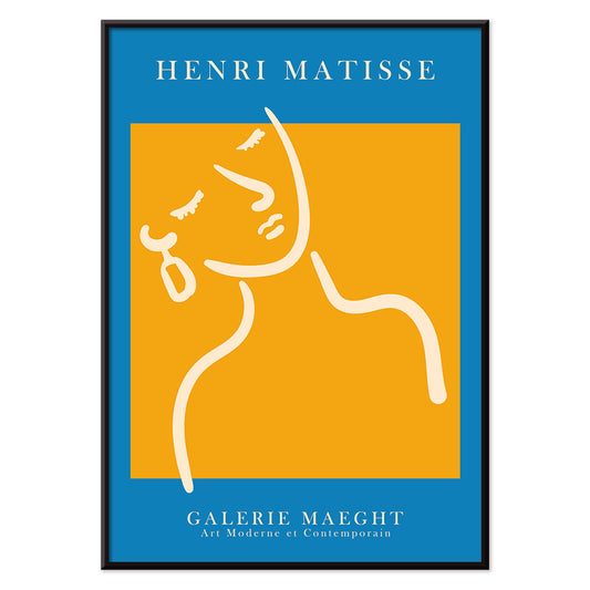
- Dansende figurer Matisse Plakat
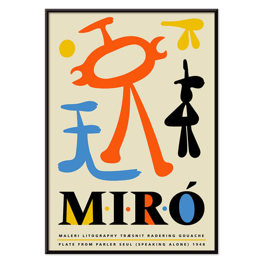
- Parler Seul 2 Plakat
- Mahatmaernes nuværende standpunkt Plakat
- Tusmørkets Ring Plakat
- Parler Seul Plakat
- Fugl passerer gennem en sky Plakat
- Riley Blaze Plakat
- Almanaque Plakat
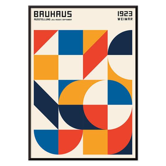
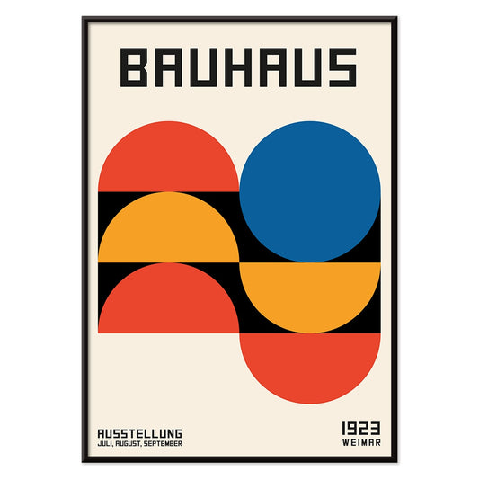
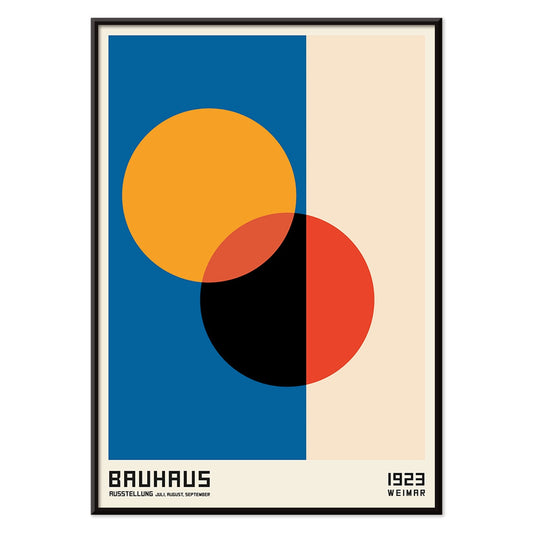
- Bauhaus 20 Plakat
- Bauhaus 21 Plakat
- Spis flere frugter Plakat
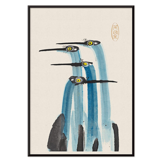
- Blå japansk trane Plakat
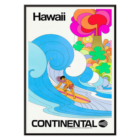
- Continental Hawaii Airline Plakat
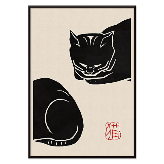
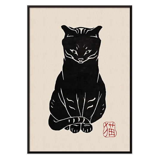
- Sort kat 4 Plakat
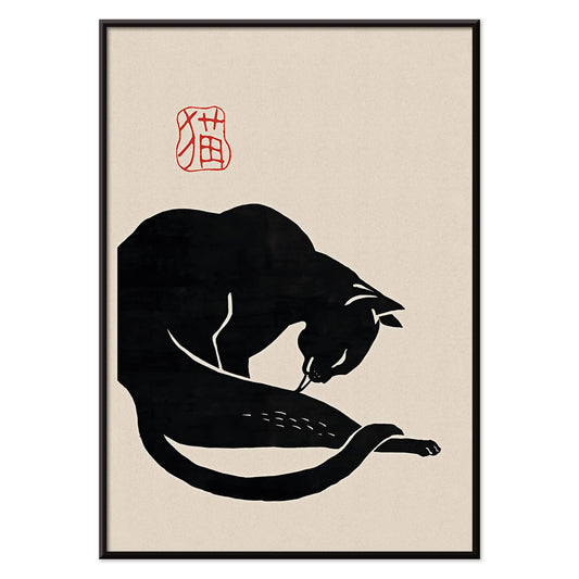
- Sort kat 3 Plakat
- Mexicos vestkyst Plakat
- El Maestro 1 Plakat
- Sort kat 2 Plakat
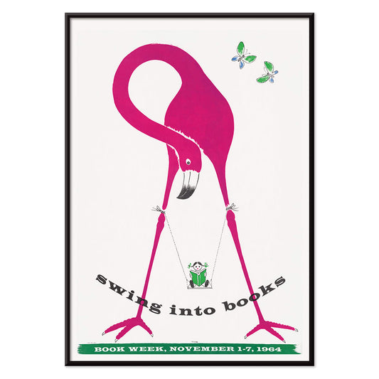
- Gynge ind i bøger plakat
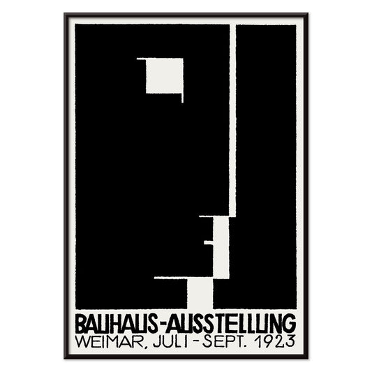
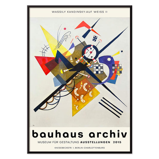
- Bauhausudstillingsplakat
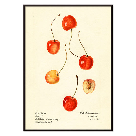
- Prunus avium Plakat
- Flere farvede stjerner Plakat
- Colorations variées de la Lune Plakat
- Le Ciel Plakat
- Blomstermarkedet i Valencia Plakat
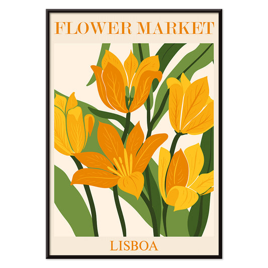
- Blomstermarked i Lissabon Plakat
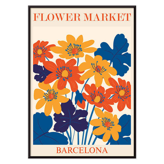
- Blomstermarked Barcelona Plakat
- Pige med ørering Plakat
- Orange udklip Plakat
- Japansk kunst Plakat
- Udsigt over Eiffeltårnet Plakat
- Pegasus foran en sky Plakat
- Maskers Plakat
- Zoologischer Garten Plakat
- L'Art Hollandais contemporain Plakat
-
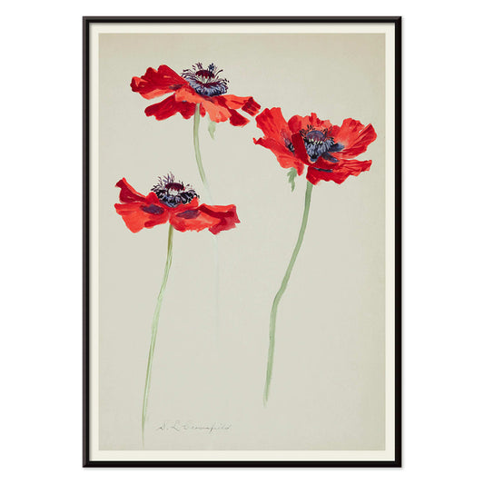
Tre studier af valmuer Plakat
Sophia Crownfield · 1900 · Fint botanisk tryk med tre valmuer i klare kronblade og slanke stilke
Plakat fra 69 kr · Indrammet fra 122,67 kr
Normalpris Fra 46,00 krNormalpris -
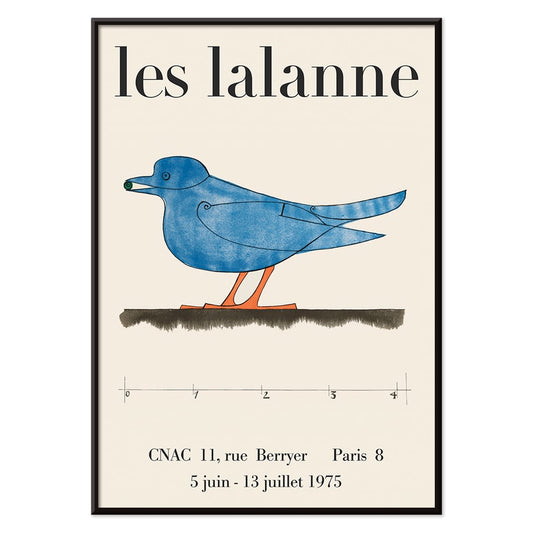
Les Lalanne Plakat
François-Xavier Lalanne · 1975 · minimal udstillingsplakat med en stiliseret blå fugl på varm beige baggrund
Plakat fra 69 kr · Indrammet fra 122,67 kr
Normalpris Fra 46,00 krNormalpris -
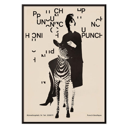
Punch Boutique Plakat
Paul Mitzkat · 1950 · vittig sort og beige plakat med elegant kvinde ved en zebra
Plakat fra 69 kr · Indrammet fra 122,67 kr
Normalpris Fra 46,00 krNormalpris -
Jet Clipper til Hawaii Plakat
Ukendt kunstner · 1950 · Rejseplakat fra Hawaii med luftfartsglamour og solvarm østemning
Plakat fra 69 kr · Indrammet fra 122,67 kr
Normalpris Fra 46,00 krNormalpris -
Campari Soda Plakat
Ukendt kunstner · 1932 · Legesyg Campari Soda reklameplakat med en spadserende flaske mod dyb sort baggrund
Plakat fra 69 kr · Indrammet fra 122,67 kr
Normalpris Fra 46,00 krNormalpris -
Dansende figurer Matisse Plakat
Henri Matisse · 1909 · Energisk plakat med dansende figurer og kraftige røde silhuetter mod dyb blå
Plakat fra 69 kr · Indrammet fra 122,67 kr
Normalpris Fra 46,00 krNormalpris -
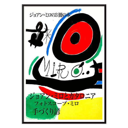
Parler Seul 2 Plakat
Joan Miró · 1948 · Legende biomorft plakat med svævende sorte linjer og orange, blå og gule accenter på beige
Plakat fra 69 kr · Indrammet fra 122,67 kr
Normalpris Fra 46,00 krNormalpris -
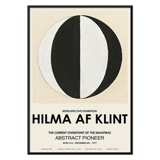
Mahatmaernes nuværende standpunkt Plakat
Hilma af Klint · 1920 · Geometrisk kunsttryk med cirkler og trekanter i markant sort og hvid symmetri
Plakat fra 69 kr · Indrammet fra 122,67 kr
Normalpris Fra 46,00 krNormalpris -
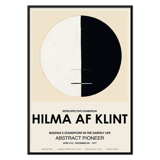
Buddhas ståsted i det jordiske liv Plakat
Hilma af Klint · 1917 · Meditativt abstrakt kunsttryk med buddhistiske symboler i en rolig cirkulær komposition
Plakat fra 69 kr · Indrammet fra 122,67 kr
Normalpris Fra 46,00 krNormalpris -
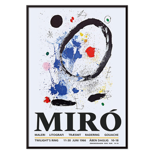
Tusmørkets Ring Plakat
Joan Miró · 2018 · Legende abstrakt plakat med orbitale former og stjernemærker på dyb blå
Plakat fra 69 kr · Indrammet fra 122,67 kr
Normalpris Fra 46,00 krNormalpris -
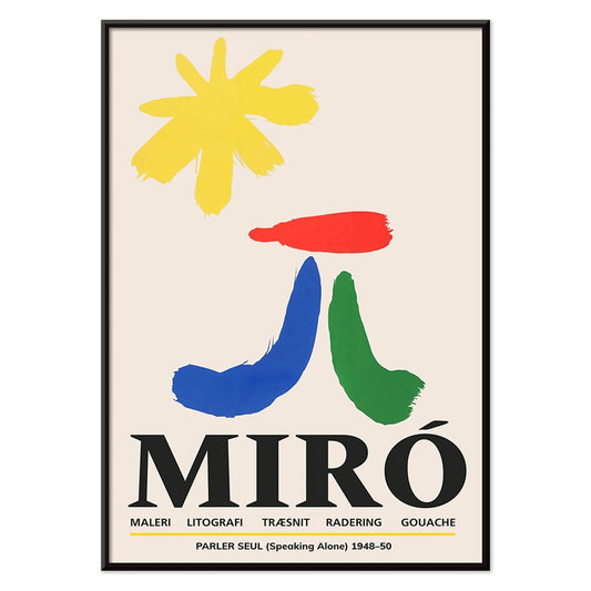
Parler Seul Plakat
Joan Miró · 1948 · Legende abstrakt plakat med flydende symboler, markante linjer og primære farvetoner i livligt udtryk
Plakat fra 69 kr · Indrammet fra 122,67 kr
Normalpris Fra 46,00 krNormalpris -
Fugl passerer gennem en sky Plakat
George Braque · 1957 · Abstrakt fugleplakat der skærer gennem en sky med klare sorte linjer i varm gul
Plakat fra 69 kr · Indrammet fra 122,67 kr
Normalpris Fra 46,00 krNormalpris -
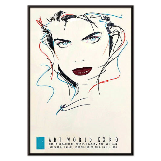
Metropol Julie Plakat
Dennis Mukai · 1988 · Vovet kvindeportræt i sort, rød og blå med pulserende bynatenergi
Plakat fra 69 kr · Indrammet fra 122,67 kr
Normalpris Fra 46,00 krNormalpris -
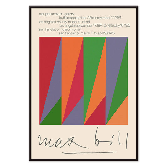
Max Bill Plakat
Max Bill · 1974 · Geometrisk abstrakt plakat med sammenflettede former i klare røde, orange, grønne og lilla toner
Plakat fra 69 kr · Indrammet fra 122,67 kr
Normalpris Fra 46,00 krNormalpris -
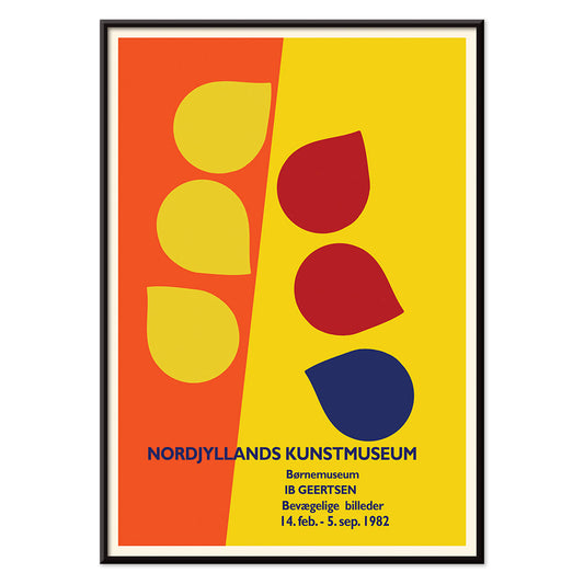
Ib Geertsen Plakat
Ib Geertsen · 1982 · Frodig geometrisk plakat med markante primærfarveblokke og stringent skandinavisk modernisme
Plakat fra 69 kr · Indrammet fra 122,67 kr
Normalpris Fra 46,00 krNormalpris -
Joan Miró Osaka Plakat
Joan Miró · 1970 · Legende abstrakt plakat med kalligrafiske sorte former og klare primærfarver
Plakat fra 69 kr · Indrammet fra 122,67 kr
Normalpris Fra 46,00 krNormalpris -
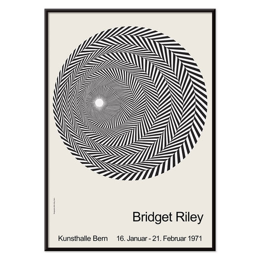
Riley Blaze Plakat
Bridget Riley · 1964 · Hypnotisk sort-hvid Op Art plakat med buede bånd der synes at pulsere
Plakat fra 69 kr · Indrammet fra 122,67 kr
Normalpris Fra 46,00 krNormalpris -
Almanaque Plakat
Sebastião Rodrigues · 1960 · abstrakt løveplakat med kraftige orange og sorte geometriske former i midtårhundredets stil
Plakat fra 69 kr · Indrammet fra 122,67 kr
Normalpris Fra 46,00 krNormalpris -
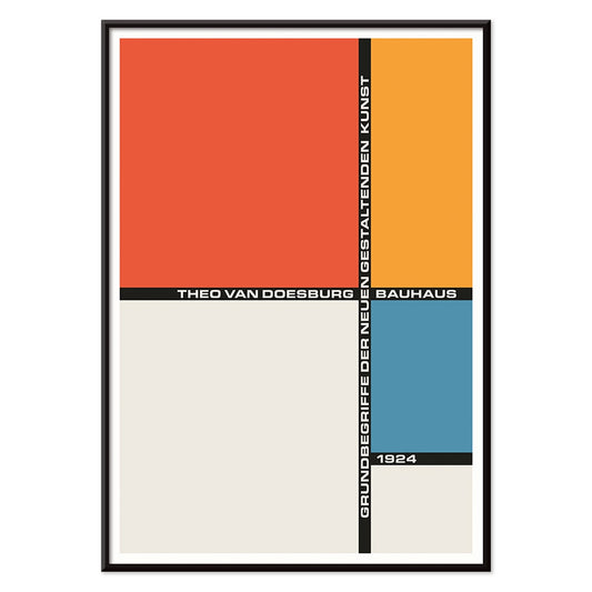
Bauhaus 20 Plakat
Ukendt kunstner · 1923 · Dynamisk Bauhausplakat med primære farvefelter, skarpe geometriske former og grafisk klarhed
Plakat fra 69 kr · Indrammet fra 122,67 kr
Normalpris Fra 46,00 krNormalpris -
Bauhaus 21 Plakat
Ukendt kunstner · 1924 · geometrisk Bauhausplakat med orange cirkel, blå blok og skarpe sorte linjer
Plakat fra 69 kr · Indrammet fra 122,67 kr
Normalpris Fra 46,00 krNormalpris -
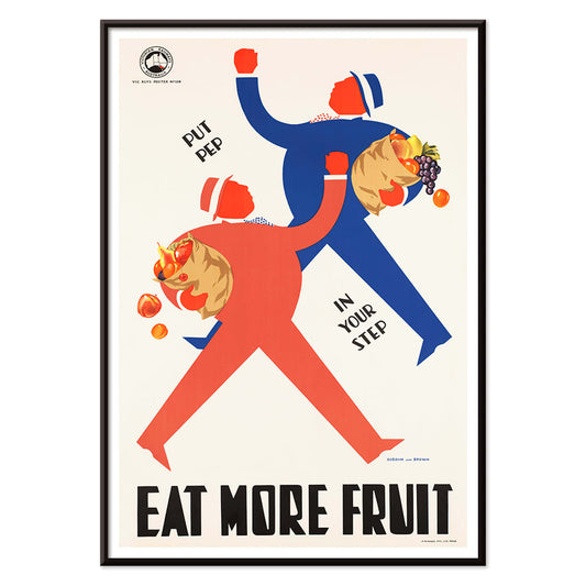
Spis flere frugter Plakat
Ukendt kunstner · 1950 · Glædesfyldt folkesundhedsplakat med stiliserede handlende og fyldte frugtkurve i klare farver
Plakat fra 69 kr · Indrammet fra 122,67 kr
Normalpris Fra 46,00 krNormalpris -
Blå japansk trane Plakat
Ukendt kunstner · 1889 · stille japansk tranetryk i blå nuancer med luftig negativ plads
Plakat fra 69 kr · Indrammet fra 122,67 kr
Normalpris Fra 46,00 krNormalpris -
Exposition Matisse Plakat
Ukendt kunstner · 1980 · Minimalistisk udstillingsplakat med dansende figur i sort streg og rød tekst
Plakat fra 69 kr · Indrammet fra 122,67 kr
Normalpris Fra 46,00 krNormalpris -
Continental Hawaii Airline Plakat
Ukendt kunstner · 1960 · Glædesfyldt Hawaii surfplakat med surfer iført lei i klare tropiske farver
Plakat fra 69 kr · Indrammet fra 122,67 kr
Normalpris Fra 46,00 krNormalpris -
Sort kat 4 Plakat
Ukendt kunstner · 1750 · Fængslende vintage tryk af sort kat med markant silhuet på varm beige baggrund
Plakat fra 69 kr · Indrammet fra 122,67 kr
Normalpris Fra 46,00 krNormalpris -
Sort kat 3 Plakat
Ukendt kunstner · 1750 · Minimalistisk sort katteplakat med kraftig silhuet og rød kalligrafi på varm beige
Plakat fra 69 kr · Indrammet fra 122,67 kr
Normalpris Fra 46,00 krNormalpris -
Pepito Vasquez Plakat
Tito Livio De Madrazo · 1954 · Dynamisk danseplakat med en langstrakt båndformet figur på dyb sort
Plakat fra 69 kr · Indrammet fra 122,67 kr
Normalpris Fra 46,00 krNormalpris -
Mexicos vestkyst Plakat
Ray Bethers · 1935 · Solbeskinnet kystlandsbyplakat med palmer, blåt hav og markant rejsetypografi i levende farver
Plakat fra 69 kr · Indrammet fra 122,67 kr
Normalpris Fra 46,00 krNormalpris -
El Maestro 1 Plakat
ukendt kunstner · 1921 · mexicansk blomsterplakat med kraftige røde blomster og stiliseret grøn kaktus på beige
Plakat fra 69 kr · Indrammet fra 122,67 kr
Normalpris Fra 46,00 krNormalpris -
Sort kat 2 Plakat
Ukendt kunstner · 1750 · Minimalistisk sortkat vintage tryk med rødt segl på varm beige bund
Plakat fra 69 kr · Indrammet fra 122,67 kr
Normalpris Fra 46,00 krNormalpris -
Gynge ind i bøger plakat
Ukendt kunstner · 1964 · Legesyg bogugeplakat med et læsende barn på en flamingo
Plakat fra 69 kr · Indrammet fra 122,67 kr
Normalpris Fra 46,00 krNormalpris -
Bauhausudstillingsplakat
Ukendt kunstner · 1923 · Bauhausudstillingsplakat med dristig sort-hvid geometri og ren sans serif typografi
Plakat fra 69 kr · Indrammet fra 122,67 kr
Normalpris Fra 46,00 krNormalpris -
Prunus avium Plakat
Charles Steadman · 1917 · Delikat botanisk kirsebærtryk med modne klynger og friske grønne blade
Plakat fra 69 kr · Indrammet fra 122,67 kr
Normalpris Fra 46,00 krNormalpris -
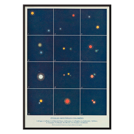
Flere farvede stjerner Plakat
Alphonse Berget · 1925 · Pædagogisk astronomiplakat der kortlægger flere stjernesystemer i klart blå med lyse stjernepunkter
Plakat fra 69 kr · Indrammet fra 122,67 kr
Normalpris Fra 46,00 krNormalpris -
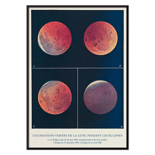
Colorations variées de la Lune Plakat
Alphonse Berget · 1925 · Diagrammatisk videnskabeligt tryk af måneformørkelser, måner skifter fra hvid til kobberrød
Plakat fra 69 kr · Indrammet fra 122,67 kr
Normalpris Fra 46,00 krNormalpris -
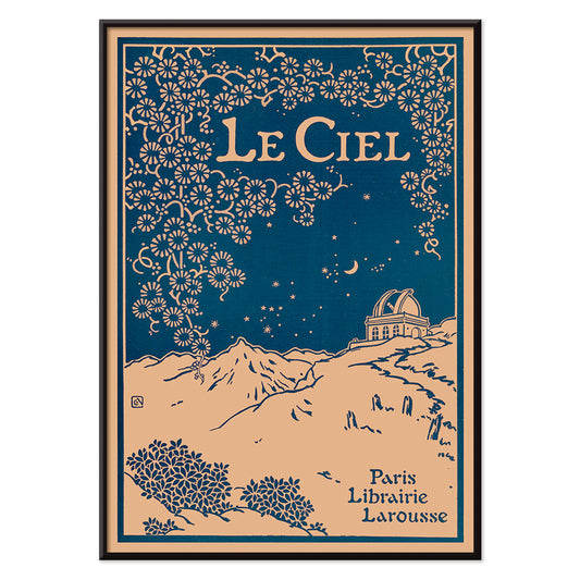
Le Ciel Plakat
Alphonse Berget · 1925 · Art Nouveau astronomiplakat med dyb blå himmel, detaljerede stjernekort og florale ornamenter
Plakat fra 69 kr · Indrammet fra 122,67 kr
Normalpris Fra 46,00 krNormalpris -
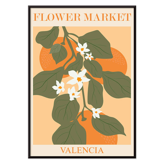
Blomstermarkedet i Valencia Plakat
MORYARTY · 2022 · Lys botanisk plakat med Valenciablade og hvide blomster på varm orange
Plakat fra 69 kr · Indrammet fra 122,67 kr
Normalpris Fra 46,00 krNormalpris -
Blomstermarked i Lissabon Plakat
MORYARTY · 2019 · Solfyldt Lissabon blomsterplakat med markante blomster og frodige grønne blade
Plakat fra 69 kr · Indrammet fra 122,67 kr
Normalpris Fra 46,00 krNormalpris -
Blomstermarked Barcelona Plakat
MORYARTY · 2022 · livlig plakat med blomsterflisemotiv i stærke mediterranske farver og ren geometri
Plakat fra 69 kr · Indrammet fra 122,67 kr
Normalpris Fra 46,00 krNormalpris -
Pige med ørering Plakat
MORYARTY · 2022 · Matisse inspireret portrætplakat med blå baggrund, hvidt ansigt og gul ørering
Plakat fra 69 kr · Indrammet fra 122,67 kr
Normalpris Fra 46,00 krNormalpris -
Orange udklip Plakat
MORYARTY · 2022 · Abstrakt udklipsplakat med orange former og grønne accenter på varm beige
Plakat fra 69 kr · Indrammet fra 122,67 kr
Normalpris Fra 46,00 krNormalpris -
Japansk kunst Plakat
Julius Klinger · 1927 · Fin fisk- og tangplakat i japanskinspireret streg og roligt negativrum
Plakat fra 69 kr · Indrammet fra 122,67 kr
Normalpris Fra 46,00 krNormalpris -
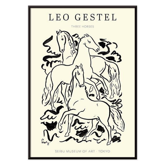
Tre Heste Plakat
Leo Gestel · 1925 · Udtryksfuldt sort-hvidt hestetryk der fanger bevægelse med sparsomme, energiske linjer
Plakat fra 69 kr · Indrammet fra 122,67 kr
Normalpris Fra 46,00 krNormalpris -
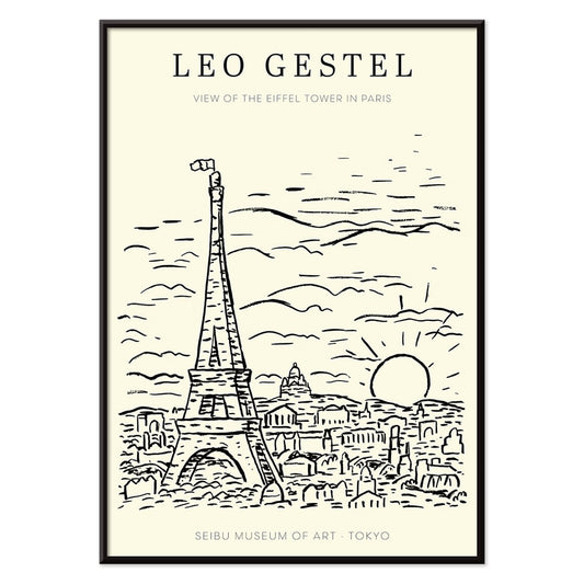
Udsigt over Eiffeltårnet Plakat
Leo Gestel · 1921 · Udtryksfuld sort-hvid Eiffeltårnplakat i skitseagtig stil med energiske, grafiske og rytmiske modernistiske linjer
Plakat fra 69 kr · Indrammet fra 122,67 kr
Normalpris Fra 46,00 krNormalpris -
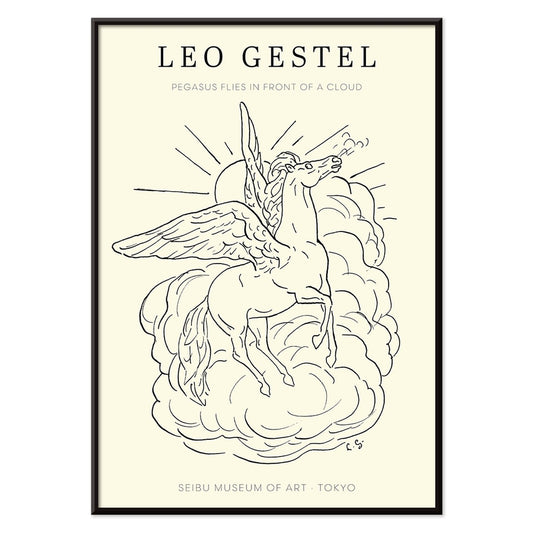
Pegasus foran en sky Plakat
Leo Gestel · 1922 · Luftig sort-hvid plakat med Pegasus flyvende over en rund sky
Plakat fra 69 kr · Indrammet fra 122,67 kr
Normalpris Fra 46,00 krNormalpris -
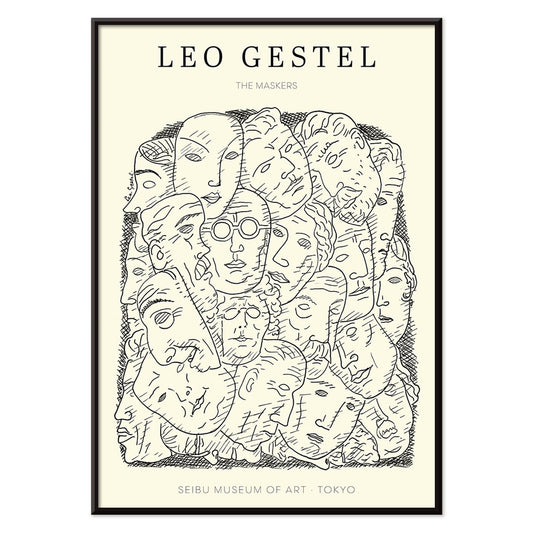
Maskers Plakat
Leo Gestel · 1923 · markant maskefladet plakat i kraftig sort og hvid kontrast med kantede modernistiske former
Plakat fra 69 kr · Indrammet fra 122,67 kr
Normalpris Fra 46,00 krNormalpris -
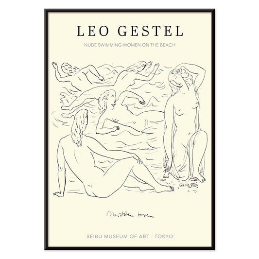
Nøgne kvinder der svømmer Plakat
Leo Gestel · 1925 · ekspressiv sort-hvid plakat med nøgne svømmere i kraftige, flydende linjer
Plakat fra 69 kr · Indrammet fra 122,67 kr
Normalpris Fra 46,00 krNormalpris -
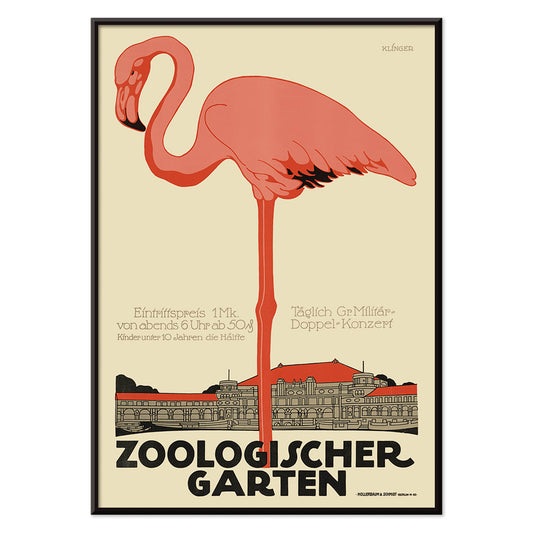
Zoologischer Garten Plakat
Julius Klinger · 1910 · Elegant flamingo plakat med jugendstiltypografi og luftig arkitektonisk ramme
Plakat fra 69 kr · Indrammet fra 122,67 kr
Normalpris Fra 46,00 krNormalpris -
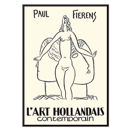
L'Art Hollandais contemporain Plakat
Paul Fierens · 1933 · Elegant sort-hvid nøgenplakat med raffineret streg og moderne fransk typografi
Plakat fra 69 kr · Indrammet fra 122,67 kr
Normalpris Fra 46,00 krNormalpris -
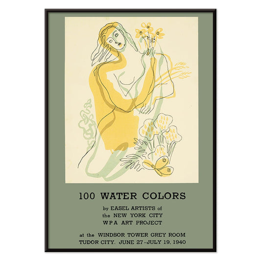
100 akvareller Plakat
WPA Art Project · 1940 · Modernistisk plakat med stiliseret kvinde med blomster i stærke gule og grønne toner
Plakat fra 69 kr · Indrammet fra 122,67 kr
Normalpris Fra 46,00 krNormalpris -
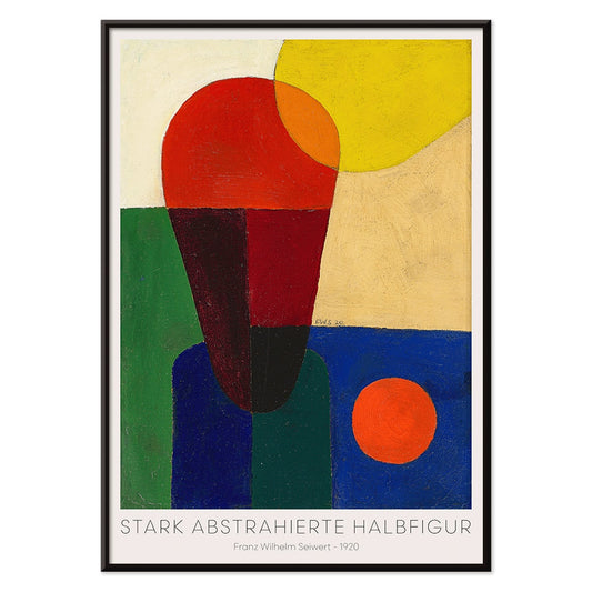
Stærkt abstraheret halvfigur Plakat
Franz Wilhelm Seiwert · 1920 · Geometrisk halvfigur kunsttryk med markante primærfarveblokke og klart modernistisk rytme
Plakat fra 69 kr · Indrammet fra 122,67 kr
Normalpris Fra 46,00 krNormalpris -
Bauhaus 19 Plakat
MORYARTY · 1923 · Geometrisk Bauhaus plakat med balancerede cirkler og kvadrater i klare primærfarver
Plakat fra 69 kr · Indrammet fra 122,67 kr
Normalpris Fra 46,00 krNormalpris -
Bauhaus Plakat 18
MORYARTY · 1926 · Plakat med geometriske cirkler og bjælker i primærfarver til skarpe modernistiske vægge
Plakat fra 69 kr · Indrammet fra 122,67 kr
Normalpris Fra 46,00 krNormalpris -
Bauhaus 17 Plakat
MORYARTY · Geometrisk Bauhaus plakat med krydsende cirkler og primærfarver på varm beige
Plakat fra 69 kr · Indrammet fra 122,67 kr
Normalpris Fra 46,00 krNormalpris -
Samtidsmusikfestival i Salzburg Plakat
Edmund Dulac · 1924 · Mytisk kentaur med lyre i markant grafisk sort-hvid komposition og stærk kontrast
Plakat fra 69 kr · Indrammet fra 122,67 kr
Normalpris Fra 46,00 krNormalpris -
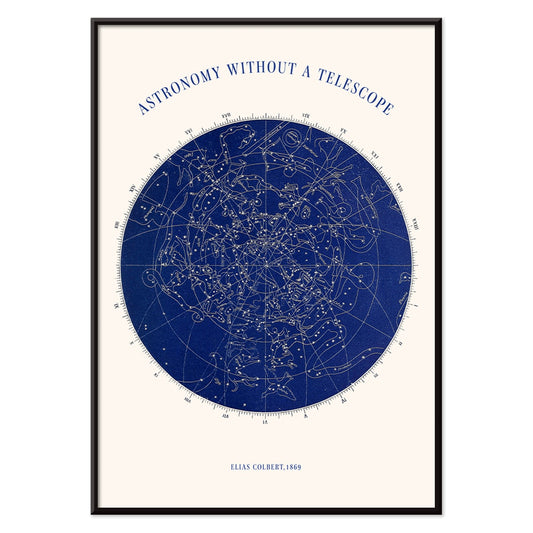
Astronomi uden teleskop Plakat
Elias Colbert · 1869 · Detaljeret stjernekortplakat med konstellationer til observation med det blotte øje
Plakat fra 69 kr · Indrammet fra 122,67 kr
Normalpris Fra 46,00 krNormalpris -
Blomstermønster Plakat
Owen Jones · 1912 · Fint blomstermønster plakat i rød og blå på hvid baggrund
Plakat fra 69 kr · Indrammet fra 122,67 kr
Normalpris Fra 46,00 krNormalpris -
Rødt blomstermønster plakat
Owen Jones · 1912 · Ornamenteret blomsterplakat med hvide blomster og slyngende vinranker på dybrød
Plakat fra 69 kr · Indrammet fra 122,67 kr
Normalpris Fra 46,00 krNormalpris -
Herbier Français Pl.59 Plakat
Antoine Cusin · 1867 · Fint botanisk tryk af skovgeranium med bløde lyserøde blomster og præcis stregføring
Plakat fra 69 kr · Indrammet fra 122,67 kr
Normalpris Fra 46,00 krNormalpris -
Herbier Français Pl.117 Plakat
Antoine Cusin · 1867 · Forfinet Hypericum androsaemum botanisk tryk med klare streger og bløde gule og grønne toner
Plakat fra 69 kr · Indrammet fra 122,67 kr
Normalpris Fra 46,00 krNormalpris -
Stilleben med blomster og skål Plakat
Oskar Moll · 1902 · farverigt stillebentryk med fyldig buket og en rolig skål i fokus
Plakat fra 69 kr · Indrammet fra 122,67 kr
Normalpris Fra 46,00 krNormalpris -
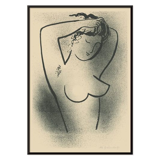
Toaleta Plakat
Mikuláš Galanda · 1937 · Minimalistisk sort-hvid nøgenplakat fremstillet i flydende, moderne konturlinjer og elegant sans for form
Plakat fra 69 kr · Indrammet fra 122,67 kr
Normalpris Fra 46,00 krNormalpris -
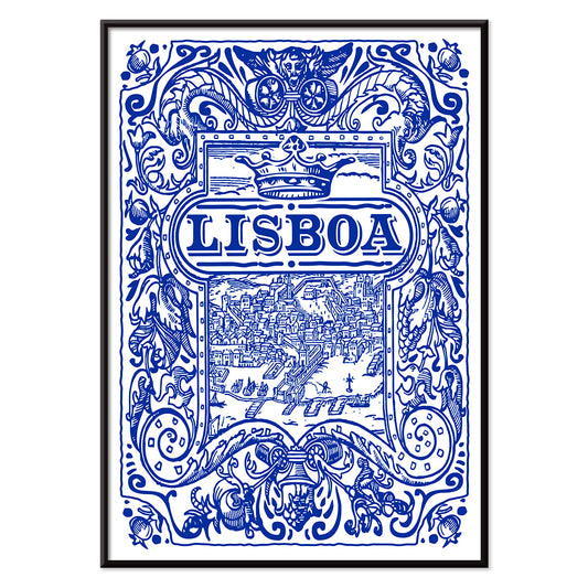
Lissabon Azulejo 1 Plakat
MORYARTY · blå azulejoplakat med ornamenteret fliseramme og klare nautiske linjer i koboltblå og hvid
Plakat fra 69 kr · Indrammet fra 122,67 kr
Normalpris Fra 46,00 krNormalpris -
Lissabon Azulejo 2 Plakat
MORYARTY · 1755 · blåhvid azulejoplakat med udsmykkede flisemotiver og klar symmetri
Plakat fra 69 kr · Indrammet fra 122,67 kr
Normalpris Fra 46,00 krNormalpris -
Auf Weiss II Plakat
Wassily Kandinsky · 1923 · Abstrakt geometrisk plakat på hvid baggrund med primærfarver og skarpe sorte linjer
Plakat fra 69 kr · Indrammet fra 122,67 kr
Normalpris Fra 46,00 krNormalpris -
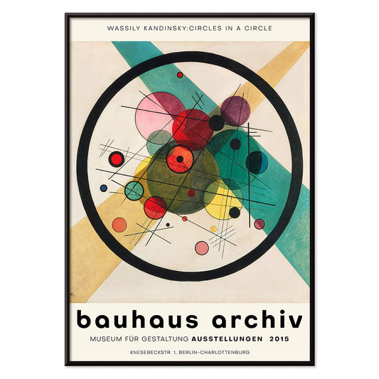
Cirkler i en cirkel Plakat
Wassily Kandinsky · 1923 · Strålende abstrakt plakat med lagdelte cirkler svævende på dyb sort baggrund
Plakat fra 69 kr · Indrammet fra 122,67 kr
Normalpris Fra 46,00 krNormalpris -
Tung Rød Plakat
Wassily Kandinsky · 1924 · Dynamisk abstrakt plakat centreret om en tung rød blok med skarpe geometriske accenter
Plakat fra 69 kr · Indrammet fra 122,67 kr
Normalpris Fra 46,00 krNormalpris -
Transmission Plakat
Wassily Kandinsky · 1935 · abstrakt geometrisk plakat med legende cirkler, linjer og farveaccents på varm baggrund
Plakat fra 69 kr · Indrammet fra 122,67 kr
Normalpris Fra 46,00 krNormalpris -
Orange Plakat
Wassily Kandinsky · 1923 · Geometrisk orange plakat med cirkler og skarpe linjer på luftig hvid bund
Plakat fra 69 kr · Indrammet fra 122,67 kr
Normalpris Fra 46,00 krNormalpris -
Diatomers frustler Plakat
Julius Wiesner · 1910 · cyanotypi med diatomers frustler, skarpt hvid mikrogeometri på dyb blå
Plakat fra 69 kr · Indrammet fra 122,67 kr
Normalpris Fra 46,00 krNormalpris -
Lyskreds Plakat
Wassily Kandinsky · 1922 · Geometrisk abstrakt plakat med lysende cirkler og skarpe vinkler på mørk bund
Plakat fra 69 kr · Indrammet fra 122,67 kr
Normalpris Fra 46,00 krNormalpris -
Bleu de Ciel Plakat
Wassily Kandinsky · 1925 · Luftigt abstrakt kunsttryk med flydende former på himmelblå bund med klare accenter
Plakat fra 69 kr · Indrammet fra 122,67 kr
Normalpris Fra 46,00 krNormalpris


72/197 items
- Les Lalanne Plakat
- Punch Boutique Plakat
- Jet Clipper til Hawaii Plakat
- Campari Soda Plakat
- Dansende figurer Matisse Plakat
- Parler Seul 2 Plakat
- Mahatmaernes nuværende standpunkt Plakat
- Tusmørkets Ring Plakat
- Parler Seul Plakat
- Fugl passerer gennem en sky Plakat
- Riley Blaze Plakat
- Almanaque Plakat
- Bauhaus 20 Plakat
- Bauhaus 21 Plakat
- Spis flere frugter Plakat
- Blå japansk trane Plakat
- Continental Hawaii Airline Plakat
- Sort kat 4 Plakat
- Sort kat 3 Plakat
- Mexicos vestkyst Plakat
- El Maestro 1 Plakat
- Sort kat 2 Plakat
- Gynge ind i bøger plakat
- Bauhausudstillingsplakat
- Prunus avium Plakat
- Flere farvede stjerner Plakat
- Colorations variées de la Lune Plakat
- Le Ciel Plakat
- Blomstermarkedet i Valencia Plakat
- Blomstermarked i Lissabon Plakat
- Blomstermarked Barcelona Plakat
- Pige med ørering Plakat
- Orange udklip Plakat
- Japansk kunst Plakat
- Udsigt over Eiffeltårnet Plakat
- Pegasus foran en sky Plakat
- Maskers Plakat
- Zoologischer Garten Plakat
- L'Art Hollandais contemporain Plakat
- Stærkt abstraheret halvfigur Plakat
- Bauhaus 19 Plakat
- Bauhaus Plakat 18
- Bauhaus 17 Plakat
- Lissabon Azulejo 1 Plakat
- Lissabon Azulejo 2 Plakat
- Auf Weiss II Plakat
- Cirkler i en cirkel Plakat
- Tung Rød Plakat
- Transmission Plakat
- Orange Plakat
- Lyskreds Plakat
- Bleu de Ciel Plakat
The pleasure of less
Minimalism in vintage poster culture is not about absence so much as selection: one clear idea given room to resonate. Here, graphic maps, Bauhaus geometry, and pared-back exhibition prints rely on line, circle, and margin to carry meaning. Blank space works like a pause in music, slowing the eye before it follows a route, a grid, or a single word. Some sheets borrow the cadence of architectural plans; others echo museum catalogues and mid-century wayfinding. Restraint links them all: limited palettes, confident typography, and compositions that feel measured rather than busy. For a wider context, the clean logic of Minimalist often overlaps with the sharper beats of Abstract posters and the crisp austerity of Black & White wall art.
Color theory and modernist structure
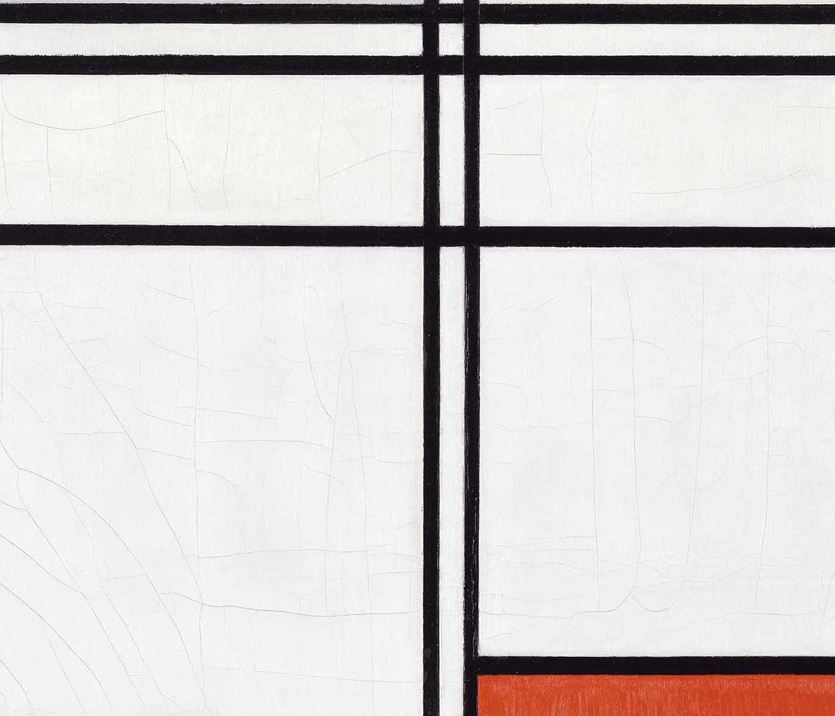
Several works treat modern color science as image, translating perception into simple, legible systems. Eugène Chevreul’s Cercle chromatique turns the spectrum into a disciplined ring, a reminder that nineteenth-century research on contrast and harmony fed later painting and graphic design alike. Lithography and early print reproduction favored flat tints and crisp edges, and that technical clarity suits the minimalist temperament. In a different register, Wassily Kandinsky’s Circles in a circle balances playful orbiting forms with a strict internal order, tying directly into the visual language gathered in Bauhaus. Bridget Riley’s Riley Blaze shows how reduced means can still produce physical sensation, as alternating bands and angles create optical vibration.
Where minimalist posters work at home
Minimalist posters suit interiors that already privilege light and texture: linen, pale oak, brushed steel, warm plaster, and matte ceramics. They also sit comfortably with concrete, terrazzo, and glass, where a spare composition stops the room from feeling over-specified. In an entryway, a city plan reads as a quiet landmark; pairing it with related sheets from Maps keeps the travel note subtle rather than touristic. In a studio or office, geometry mirrors shelving lines and desk edges, while a single saturated accent can echo a book spine or chair upholstery. If you want the calm to lean toward nature, a restrained landscape from Landscape can soften the harder angles without abandoning clarity.
Curating pairs and gallery walls
A strong gallery wall in this style depends less on quantity than on rhythm. Mix temperatures: hang Kamisaka Sekka’s Mount Fuji (1909) beside a typographic modernist sheet for a conversation between Japanese flatness and European grids, extending naturally into the broader visual traditions in Oriental. Introduce one organic counterpoint, such as a spare botanical study from Botanical, to keep the arrangement from feeling overly engineered. Keep spacing consistent, repeat one accent color across two prints, and let the largest piece act as the anchor so the wall reads as composed rather than accumulated.
Utility, craft, and a quiet finish
What keeps minimalist vintage wall art from turning clinical is its original purpose: exhibition posters, diagrams, travel graphics, and design studies made for public reading. That utilitarian origin gives paper grain and registration marks their own understated character. Even a decorative tile study like Lisbon Azulejo, Blue painted tile 2 holds craft inside a clean grid, where tiny irregularities reward close looking. For framing, thin black aluminium sharpens edges, while natural ash or oak softens bright accents; see Frames. Leave generous negative space around the work, and the room gains a steadier visual tempo.