


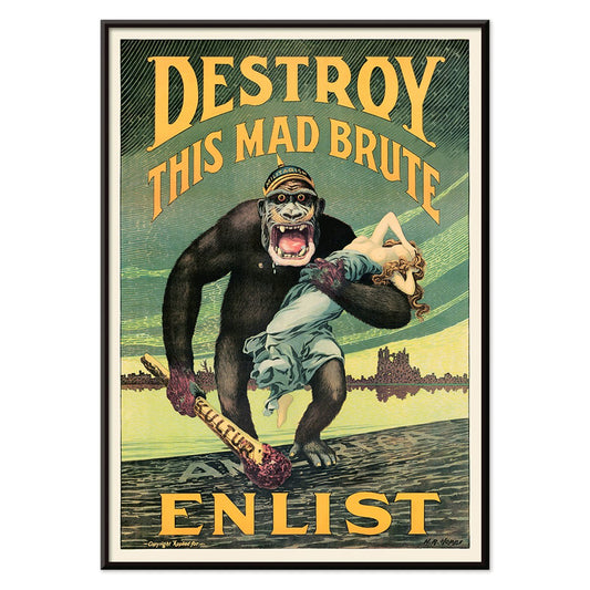
- Ødelæg dette rasende bæst Plakat
- Den gode nabo i Sydamerika Plakat
- Italien med Vatikanstaten Plakat
- Løg Plakat
- Bec-Kina Plakat
- Kohler Chocolat Plakat
- Jordbærtyven Plakat
- Tom Krojer Udstillingsplakat
- Ernst Kirchner udstillingsplakat Plakat
- El Comienzo Plakat
- Parler Seul 2 Plakat
- Tusmørkets Ring Plakat
- Parler Seul Plakat
- Faun og Nymfe Plakat
- Drømmen Plakat
- Le Concert Plakat
- Fugl passerer gennem en sky Plakat
- Kvindelig kunstner Plakat
- Pink Panthers hævn Plakat
- Kvinde og fugl om natten Plakat
- Bauhaus 20 Plakat
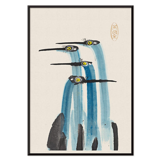
- Blå japansk trane Plakat
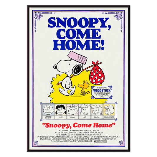
- Snoopy Come Home Plakat
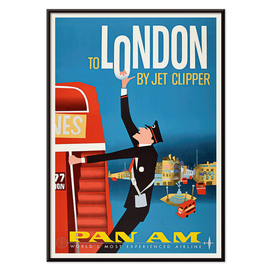
- Til London med Jet Clipper plakat
- Kyushu-Okinawa Plakat
- Xerez Pedro Domecq Plakat
- Balsam Aperitif Plakat
- Smør Plakat
- Crans-sur-Sierre Plakat
- Monte Carlo Plakat
- Øl og cigaret Plakat
- Mexicos vestkyst Plakat
- Rita Gaufres Plakat
- Hibiscus Plakat
-
Ødelæg dette rasende bæst Plakat
Harry Ryle Hopps · 1917 · Dramatisk krigsplakat med hjelmklædt gorilla, svingende kølle og fanget kvinde
Plakat fra 69 kr · Indrammet fra 122,67 kr
Normalpris Fra 46,00 krNormalpris -
Den gode nabo i Sydamerika Plakat
Ernest Dudley Chase · 1935 · lys, illustreret kortplakat over sydamerika med dyr, seværdigheder og søfartsruter
Plakat fra 69 kr · Indrammet fra 122,67 kr
Normalpris Fra 46,00 krNormalpris -
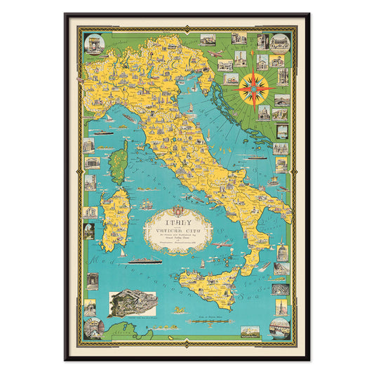
Italien med Vatikanstaten Plakat
Ernest Dudley Chase · 1935 · Illustreret italiensk kortplakat med vartegnsvignetter og klar linjeføring i levende farver
Plakat fra 69 kr · Indrammet fra 122,67 kr
Normalpris Fra 46,00 krNormalpris -
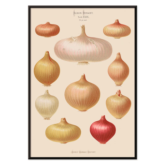
Løg Plakat
Ernst Benary · 1876 · botanisk løgtryk med detaljerede løgknolde, rødder og grønne skud i beige
Plakat fra 69 kr · Indrammet fra 122,67 kr
Normalpris Fra 46,00 krNormalpris -
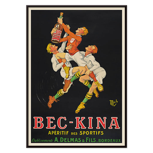
Bec-Kina Plakat
Michel Liebeaux · 1900 · Energisk rugbyplakat med markante figurer der rækker efter en flaske
Plakat fra 69 kr · Indrammet fra 122,67 kr
Normalpris Fra 46,00 krNormalpris -
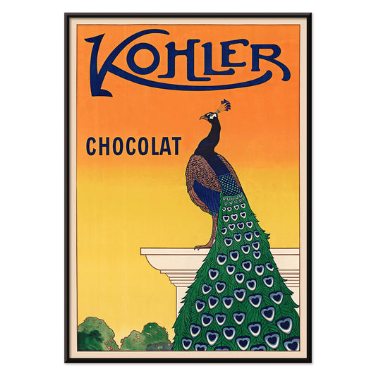
Kohler Chocolat Plakat
F. Champenois · 1914 · Elegant Art Nouveau-påfuglplakat til Kohler Chocolat på glødende orange baggrund
Plakat fra 69 kr · Indrammet fra 122,67 kr
Normalpris Fra 46,00 krNormalpris -
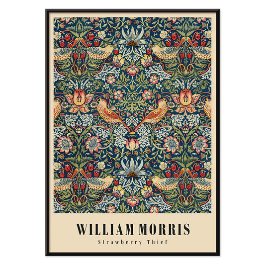
Jordbærtyven Plakat
William Morris · 1883 · Ikonisk Arts and Crafts plakat med drosler, jordbær og snoet løv i dybe blå farver
Plakat fra 69 kr · Indrammet fra 122,67 kr
Normalpris Fra 46,00 krNormalpris -
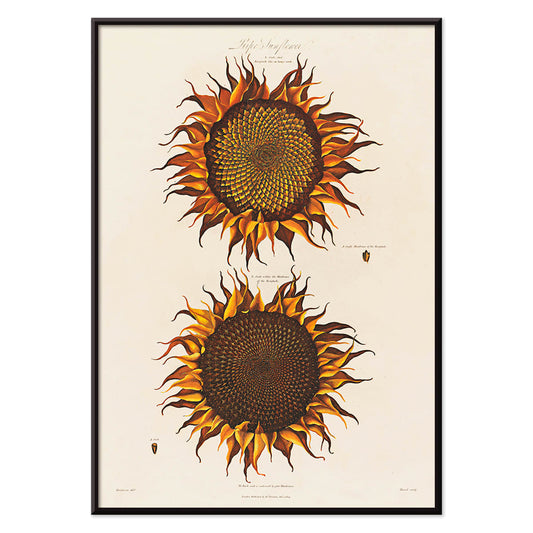
Moden solsikke Plakat
Robert John Thornton · 1799 · Moden solsikke kunsttryk med krøllede kronblade og frodige grønne blade
Plakat fra 69 kr · Indrammet fra 122,67 kr
Normalpris Fra 46,00 krNormalpris -
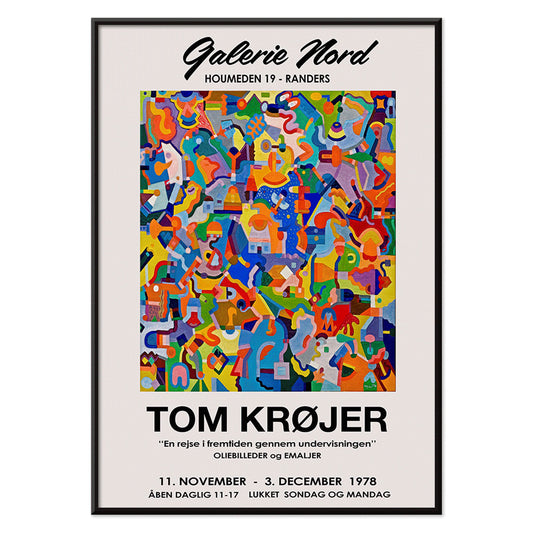
Tom Krojer Udstillingsplakat
Tom Krojer · 1989 · Dynamisk geometrisk udstillingsplakat med balancerende farveblokke og klar moderne typografi
Plakat fra 69 kr · Indrammet fra 122,67 kr
Normalpris Fra 46,00 krNormalpris -
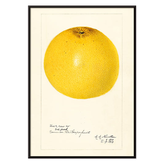
Citrus paradisi Plakat
Amanda Almira Newton · 1919 · Botanisk grapefrugttryk med videnskabelig klarhed og bløde akvarelskygger
Plakat fra 69 kr · Indrammet fra 122,67 kr
Normalpris Fra 46,00 krNormalpris -
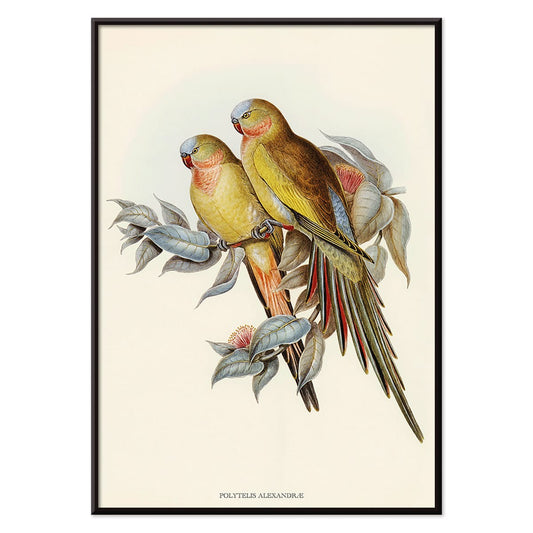
Polytelis Alexandrae Plakat
Ukendt kunstner · 1873 · Elegant papegoejetryk med to langhalede fugle i friske grønne og rosafarvede toner
Plakat fra 69 kr · Indrammet fra 122,67 kr
Normalpris Fra 46,00 krNormalpris -
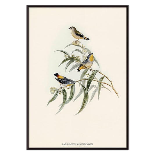
Pardalotus Xanthopygius Plakat
Ukendt kunstner · 1838 · Delikat pardalotetryk med tre fugle på eukalyptusgrene i bløde naturtoner
Plakat fra 69 kr · Indrammet fra 122,67 kr
Normalpris Fra 46,00 krNormalpris -
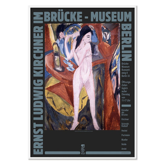
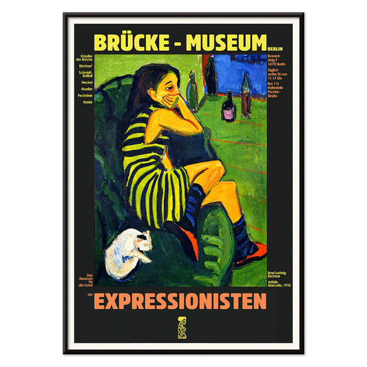
Ernst Kirchner udstillingsplakat Plakat
Ernst Kirchner · 1910 · expressionistisk udstillingsplakat med markante sorte konturer og levende blå og røde toner
Plakat fra 69 kr · Indrammet fra 122,67 kr
Normalpris Fra 46,00 krNormalpris -
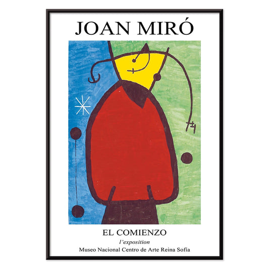
El Comienzo Plakat
Joan Miró · 1972 · Legende abstrakt plakat med biomorfe former og markante linjer i klare primærfarver
Plakat fra 69 kr · Indrammet fra 122,67 kr
Normalpris Fra 46,00 krNormalpris -
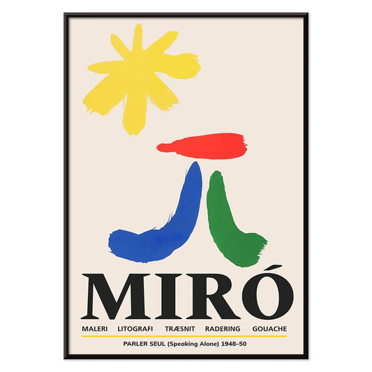
Parler Seul 2 Plakat
Joan Miró · 1948 · Legende biomorft plakat med svævende sorte linjer og orange, blå og gule accenter på beige
Plakat fra 69 kr · Indrammet fra 122,67 kr
Normalpris Fra 46,00 krNormalpris -
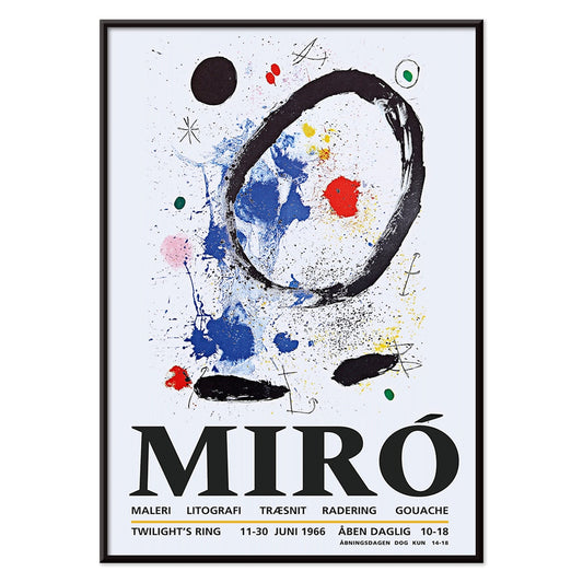
Tusmørkets Ring Plakat
Joan Miró · 2018 · Legende abstrakt plakat med orbitale former og stjernemærker på dyb blå
Plakat fra 69 kr · Indrammet fra 122,67 kr
Normalpris Fra 46,00 krNormalpris -
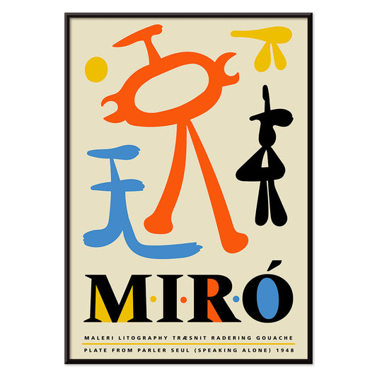
Parler Seul Plakat
Joan Miró · 1948 · Legende abstrakt plakat med flydende symboler, markante linjer og primære farvetoner i livligt udtryk
Plakat fra 69 kr · Indrammet fra 122,67 kr
Normalpris Fra 46,00 krNormalpris -
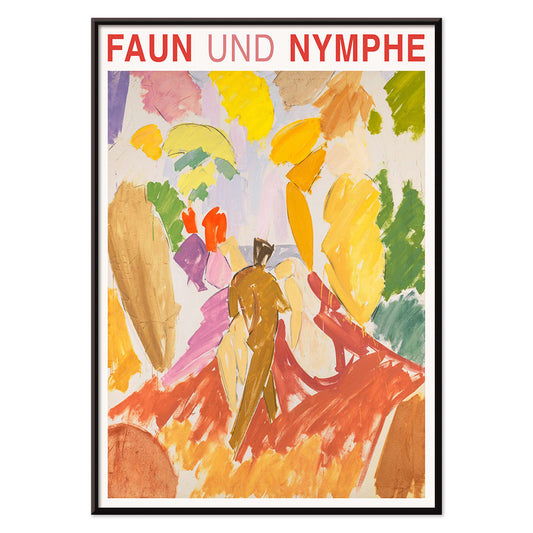
Faun og Nymfe Plakat
Edvard Weie · 1941 · ekspressivt mytisk plakattryk med faun og nymfe i kraftige modernistiske farveflader
Plakat fra 69 kr · Indrammet fra 122,67 kr
Normalpris Fra 46,00 krNormalpris -
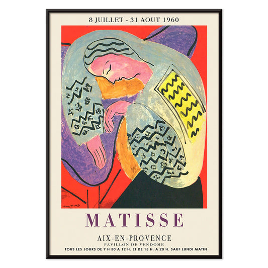
Drømmen Plakat
Henri Matisse · 1960 · Livfuld sovende figur plakat med flydende konturer og kraftige, flade farveflader
Plakat fra 69 kr · Indrammet fra 122,67 kr
Normalpris Fra 46,00 krNormalpris -
Le Concert Plakat
Hulusi Mercan · 1960 · Energetisk abstrakt plakat med musikinstrumenter i stærke røde, blå og gule former
Plakat fra 69 kr · Indrammet fra 122,67 kr
Normalpris Fra 46,00 krNormalpris -
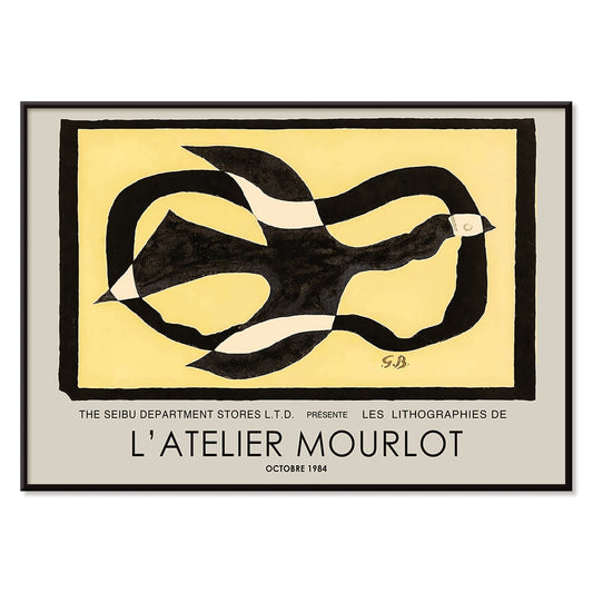
Fugl passerer gennem en sky Plakat
George Braque · 1957 · Abstrakt fugleplakat der skærer gennem en sky med klare sorte linjer i varm gul
Plakat fra 69 kr · Indrammet fra 122,67 kr
Normalpris Fra 46,00 krNormalpris -
Kvindelig kunstner Plakat
Ernst Ludwig Kirchner · 1910 · Kantet figurplakat i ekspressionistisk stil med markante sorte konturer og kontrastfulde farvefelter
Plakat fra 69 kr · Indrammet fra 122,67 kr
Normalpris Fra 46,00 krNormalpris -
Pink Panthers hævn Plakat
Ukendt kunstner · 1978 · Legesyg Pink Panther filmplakat med tronelignende stol og kraftfulde retrofarver
Plakat fra 69 kr · Indrammet fra 122,67 kr
Normalpris Fra 46,00 krNormalpris -
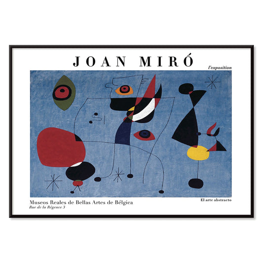
Kvinde og fugl om natten Plakat
Joan Miró · 1947 · Legende surrealistisk plakat i midnatsblåt med klare røde og gule accenter
Plakat fra 69 kr · Indrammet fra 122,67 kr
Normalpris Fra 46,00 krNormalpris -
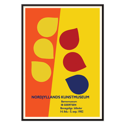
Ib Geertsen Plakat
Ib Geertsen · 1982 · Frodig geometrisk plakat med markante primærfarveblokke og stringent skandinavisk modernisme
Plakat fra 69 kr · Indrammet fra 122,67 kr
Normalpris Fra 46,00 krNormalpris -
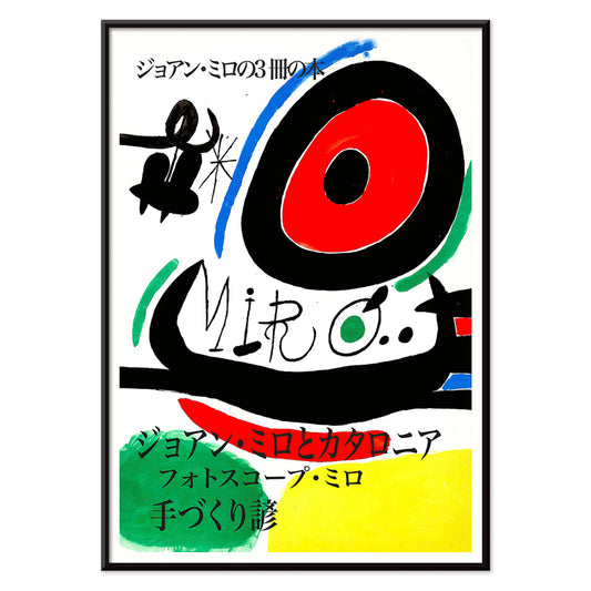
Joan Miró Osaka Plakat
Joan Miró · 1970 · Legende abstrakt plakat med kalligrafiske sorte former og klare primærfarver
Plakat fra 69 kr · Indrammet fra 122,67 kr
Normalpris Fra 46,00 krNormalpris -
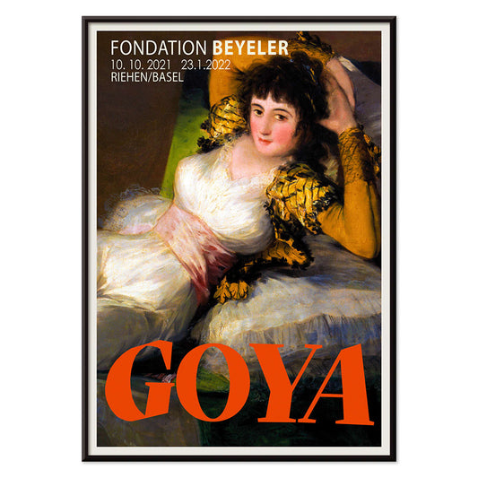
Den påklædte Maja Plakat
Francisco Goya · 1802 · Ikonisk liggende figur i kunsttryk med klare hvide partier, grønt bånd og gyldne puder
Plakat fra 69 kr · Indrammet fra 122,67 kr
Normalpris Fra 46,00 krNormalpris -
Bauhaus 20 Plakat
Ukendt kunstner · 1923 · Dynamisk Bauhausplakat med primære farvefelter, skarpe geometriske former og grafisk klarhed
Plakat fra 69 kr · Indrammet fra 122,67 kr
Normalpris Fra 46,00 krNormalpris -
Blå japansk trane Plakat
Ukendt kunstner · 1889 · stille japansk tranetryk i blå nuancer med luftig negativ plads
Plakat fra 69 kr · Indrammet fra 122,67 kr
Normalpris Fra 46,00 krNormalpris -
Snoopy Come Home Plakat
ukendt kunstner · 1972 · glædesfuld snoopy og woodstock plakat med klare linjer og stærke primærfarver
Plakat fra 69 kr · Indrammet fra 122,67 kr
Normalpris Fra 46,00 krNormalpris -
Til London med Jet Clipper plakat
Ukendt kunstner · 1955 · Rejseplakat fra 1950'erne med Pan Am-stewardesse og rød dobbeltdækkerbus
Plakat fra 69 kr · Indrammet fra 122,67 kr
Normalpris Fra 46,00 krNormalpris -
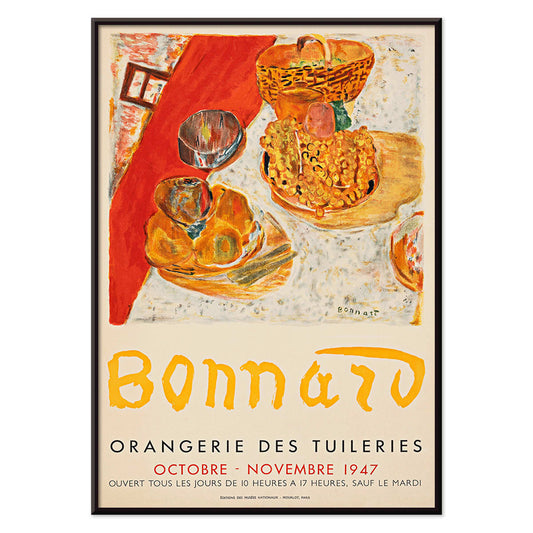
Bonnard udstillingsplakat
ukendt kunstner · 1947 · solbeskinnet stilleben plakat med stærke farveflader og elegant udstillingstypografi
Plakat fra 69 kr · Indrammet fra 122,67 kr
Normalpris Fra 46,00 krNormalpris -
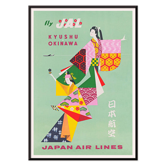
Kyushu-Okinawa Plakat
Ukendt kunstner · 1962 · Livlig japansk rejseplakat med traditionelle figurer og øernes motiver
Plakat fra 69 kr · Indrammet fra 122,67 kr
Normalpris Fra 46,00 krNormalpris -
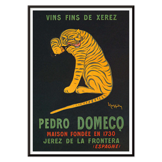
Xerez Pedro Domecq Plakat
Leonetto Cappiello · 1930 · Ikonisk tigerplakat med springende tiger mod dyb sort baggrund for Xerez Pedro Domecq sherry
Plakat fra 69 kr · Indrammet fra 122,67 kr
Normalpris Fra 46,00 krNormalpris -
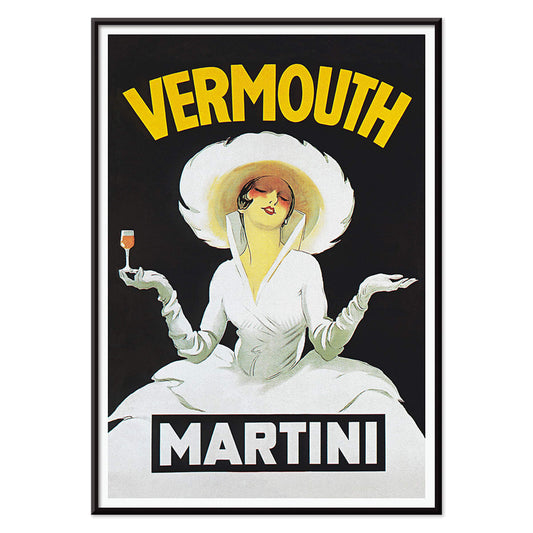
Vermouth Martini Plakat
Marcello Dudovich · 1918 · Stilfuld vermouthreklameplakat med en elegant kvinde i hvid og stærke gule accenter
Plakat fra 69 kr · Indrammet fra 122,67 kr
Normalpris Fra 46,00 krNormalpris -
Balsam Aperitif Plakat
Jean d'Ylen · 1923 · Legesyg Art Deco plakat med elegant kvinde ved et kæmpe cocktailglas
Plakat fra 69 kr · Indrammet fra 122,67 kr
Normalpris Fra 46,00 krNormalpris


36/706 items
- Ødelæg dette rasende bæst Plakat
- Den gode nabo i Sydamerika Plakat
- Italien med Vatikanstaten Plakat
- Løg Plakat
- Bec-Kina Plakat
- Kohler Chocolat Plakat
- Jordbærtyven Plakat
- Tom Krojer Udstillingsplakat
- Ernst Kirchner udstillingsplakat Plakat
- El Comienzo Plakat
- Parler Seul 2 Plakat
- Tusmørkets Ring Plakat
- Parler Seul Plakat
- Faun og Nymfe Plakat
- Drømmen Plakat
- Le Concert Plakat
- Fugl passerer gennem en sky Plakat
- Kvindelig kunstner Plakat
- Pink Panthers hævn Plakat
- Kvinde og fugl om natten Plakat
- Bauhaus 20 Plakat
- Blå japansk trane Plakat
- Snoopy Come Home Plakat
- Til London med Jet Clipper plakat
- Kyushu-Okinawa Plakat
- Xerez Pedro Domecq Plakat
- Balsam Aperitif Plakat
A Yellow Thread Through Art History
This collection is not about monochrome. It follows the way yellow behaves when it enters an image: as light, as warning, as ornament, as a quick lift of energy. In vintage poster culture it grabs attention from the street; in modern painting it becomes structure; in natural history it suggests pollen, rind, and sun-aged paper. Read these posters and prints as a vocabulary of warmth, from buttery highlights to sharp, electric notes that alter the temperature of wall art.
Gold, Citrus, and the Logic of Color
Few works show yellow as both luxury and technique as clearly as Gustav Klimt’s The Kiss (1907–1908), where metallic yellows behave like tesserae, turning paint into surface and surface into symbolism. At the opposite pole, Michel Eugène Chevreul’s Cercle chromatique treats hue as measurable information, a scientific diagram that still reads as decorative design. Together they explain why yellow persists across eras: it can signal opulence, illumination, or method, making a vintage art print feel both immediate and intellectually grounded.
Using Yellow Accents in Interior Decoration
In home decor, yellow works best when it has a job. A narrow hallway benefits from a small flare near a mirror; a kitchen welcomes yellows that feel citrus or grain-like; a study can take sharper, more analytic tones. Pair yellow posters with chalky whites, walnut, and linen for quiet warmth, or set them against deep greens and inky blues for contrast. For restraint and geometry, move between Minimalist and Abstract; for natural counterpoints, Botanical keeps the color tethered to stems, seed heads, and scientific observation.
Curating a Gallery Wall with Pattern and Structure
When building a gallery wall, think in rhythms: pattern, grid, then a single vivid note. William Morris’s Strawberry Thief (1883) brings textile density and a garden logic that softens modern furniture. Balance it with Piet Mondrian’s Composition in White, Red, and Yellow (1936), where yellow becomes a measured plane rather than atmosphere. Add controlled dynamism through Wassily Kandinsky’s Circles in a circle, Bauhaus exhibition (1923), a bridge between exhibition poster design and painting. To extend the mix, Advertising supports bolder typography, Bauhaus tightens the formal language, and Classic Art introduces quieter tonal anchors.
Why Yellow Feels So Present
Yellow is often dismissed as mere decoration, yet it is frequently a compositional strategy: guiding the eye, implying sunlight, or mapping a system. Hung with intention, a small yellow passage can make surrounding colors read cleaner or deeper, as if the room’s light has been adjusted without touching the lamps.