


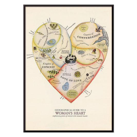
- Geografisk vejviser til en kvindes hjerte Plakat
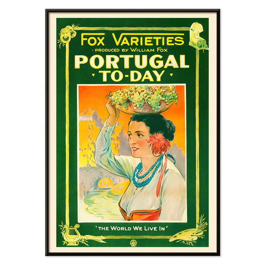
- Portugal i dag Plakat
- Øl og cigaret Plakat
- The New Yorker Plakat
- Zoologischer Garten Plakat
- Havbundens Plakat
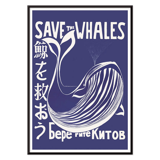
- Red hvalerne Plakat
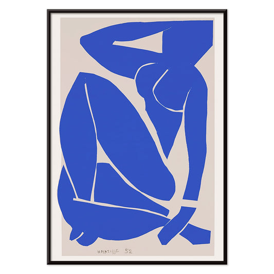
- Nu Bleu III Plakat
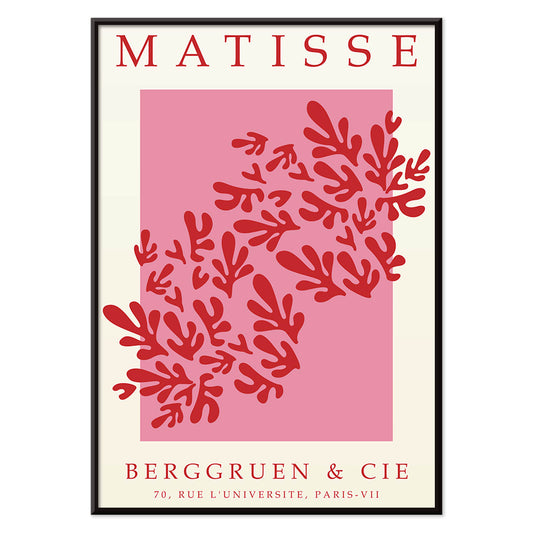
- Papiers découpés 3 Plakat
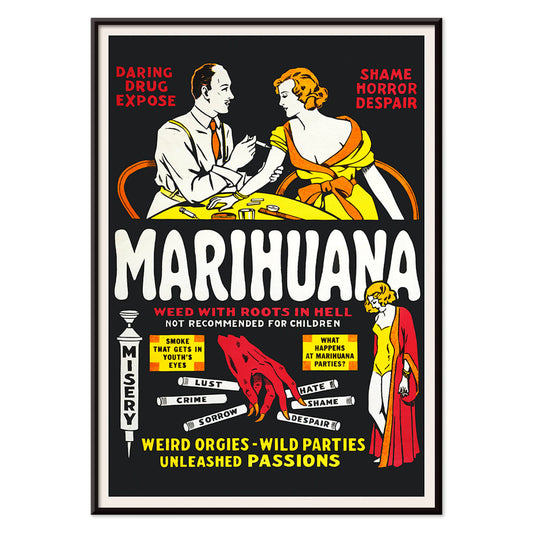
- Marihuana Plakat
- Grands Prix de France Plakat
- Den store bølge ved Kanagawa Plakat
- Porto Ramos-Pinto Plakat
- Solaris Plakat
- Sort kat 2 Plakat
- Dansende figurer Matisse Plakat
- Le Voyage de Babar Plakat
- Coffea arabica 3 Plakat
- Cordial Campari Plakat
- Sigmund Freud havde ret Plakat
- Panter Plakat
- Tiger fra Ryōkoku Plakat
- Babar i bil Plakat
- Vågn op og læs Plakat
- Drømmen Plakat
- Den store bølge plakat
- Barcelona Tekst Plakat
- Trikolore luftballon Plakat
- Nu Bleu II Plakat
- Star Wars AT-AT Patent Plakat
- Mickey Mouse Plakat
- Bauhaus 2 Plakat
- Bleu de Ciel Plakat
- Papiers découpés 1 Plakat
- Siddende kat set bagfra Plakat
- Bauhaus 11 Plakat
- Brazil 2 Plakat
- Sort leopard Plakat
- Histoire de Babar Plakat
- Asakusa Kinryuzan tempel Plakat
- Bauhaus 6 Plakat
- Kyssen Plakat
- Surfbrætspatent Plakat
- Sort kat 4 Plakat
- Siddende kat set fra venstre Plakat
- Vertigo Plakat
- Farverig arkitektur plakat
- La Paresse Plakat
- Rød krontrane Plakat
- Befolkningskort Plakat
-
Geografisk vejviser til en kvindes hjerte Plakat
Jo Lowery · 1960 · legesygt hjerteformet kort plakat fyldt med vittige stednavne og klare midt-20. århundredes farver
Plakat fra 69 kr · Indrammet fra 122,67 kr
Normalpris Fra 46,00 krNormalpris -
Portugal i dag Plakat
Ukendt kunstner · 1927 · Farverig Portugal i dag rejseplakat med kvinde i folkedragt og fyldt frugtkurv
Plakat fra 69 kr · Indrammet fra 122,67 kr
Normalpris Fra 46,00 krNormalpris -
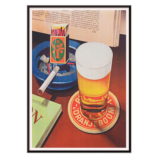
Øl og cigaret Plakat
Ukendt kunstner · 1935 · grafisk plakat med skummende glas og markante røde og blå accenter
Plakat fra 69 kr · Indrammet fra 122,67 kr
Normalpris Fra 46,00 krNormalpris -
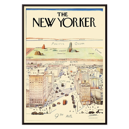
The New Yorker Plakat
Saul Steinberg · 1976 · kvikt New York bybillede plakat med kortagtigt perspektiv og legende skala
Plakat fra 69 kr · Indrammet fra 122,67 kr
Normalpris Fra 46,00 krNormalpris -
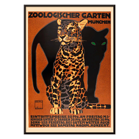
Zoologischer Garten Plakat
Ludwig Hohlwein · 1912 · Markant München zooplakat med en kraftfuld stribet stor kat og tydelig typografi
Plakat fra 69 kr · Indrammet fra 122,67 kr
Normalpris Fra 46,00 krNormalpris -
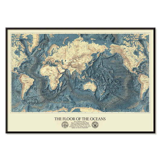
Havbundens Plakat
Ukendt kunstner · 1967 · Bathymetrisk verdenskortplakat med underhavskamme i kølige blå nuancer og varme beige toner
Plakat fra 69 kr · Indrammet fra 122,67 kr
Normalpris Fra 46,00 krNormalpris -
Red hvalerne Plakat
Lawrence Vint · 1973 · grafisk havbevaringsplakat med stiliseret hvid hval på dyb blå baggrund
Plakat fra 69 kr · Indrammet fra 122,67 kr
Normalpris Fra 46,00 krNormalpris -
Nu Bleu III Plakat
Henri Matisse · 1952 · Ikonisk blå nøgensilhuet kunsttryk med flydende udklipssilhuet på varm beige
Plakat fra 69 kr · Indrammet fra 122,67 kr
Normalpris Fra 46,00 krNormalpris -
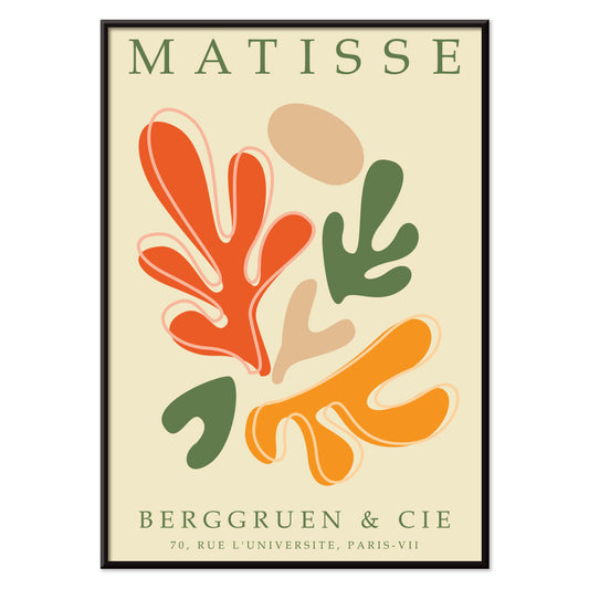
Papiers découpés 3 Plakat
MORYARTY · 1949 · Matisse-inspireret plakat med markante røde bladformer på luftig hvid og rosa
Plakat fra 69 kr · Indrammet fra 122,67 kr
Normalpris Fra 46,00 krNormalpris -
Marihuana Plakat
Ukendt kunstner · 1936 · Sensationel antimarihuana filmplakat med flammende typografi og advarende vignetter
Plakat fra 69 kr · Indrammet fra 122,67 kr
Normalpris Fra 46,00 krNormalpris -
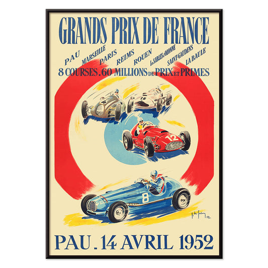
Grands Prix de France Plakat
Jean Des Gachons · 1952 · dynamisk racplakat med hurtige biler og banelister i markante 1950'er farver
Plakat fra 69 kr · Indrammet fra 122,67 kr
Normalpris Fra 46,00 krNormalpris -
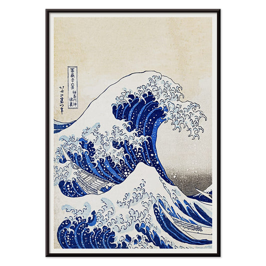
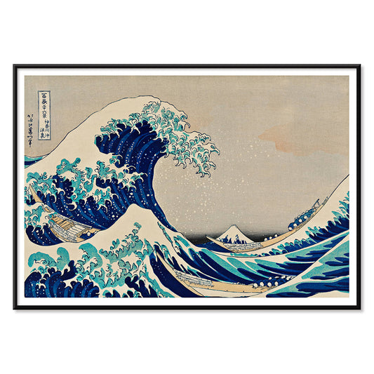
Den store bølge ved Kanagawa Plakat
Katsushika Hokusai · 1830 · Ikonisk ukiyo-e plakat med en tårnhøj bølge over både ved Mount Fuji
Plakat fra 69 kr · Indrammet fra 122,67 kr
Normalpris Fra 46,00 krNormalpris -
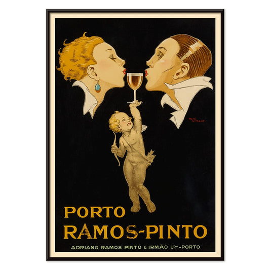
Porto Ramos-Pinto Plakat
René Vincent · 1925 · Art Deco plakat med et par der er ved at kysse mens en putto rækker et glas portvin
Plakat fra 69 kr · Indrammet fra 122,67 kr
Normalpris Fra 46,00 krNormalpris -
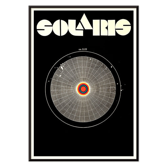
Solaris Plakat
Ukendt kunstner · 1972 · Hypnotisk, kosmisk plakat med kredsende former og markante rød og blå kontraster
Plakat fra 69 kr · Indrammet fra 122,67 kr
Normalpris Fra 46,00 krNormalpris -
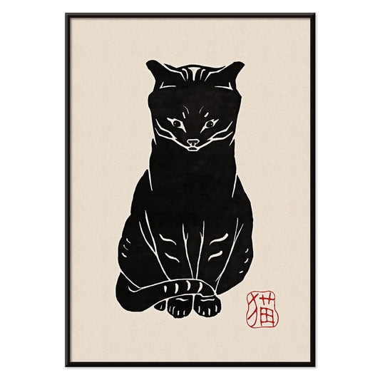
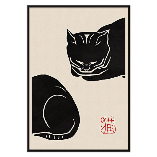
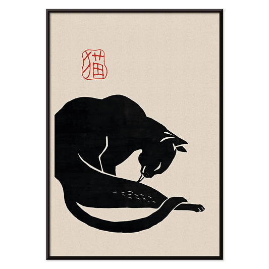
Sort kat 2 Plakat
Ukendt kunstner · 1750 · Minimalistisk sortkat vintage tryk med rødt segl på varm beige bund
Plakat fra 69 kr · Indrammet fra 122,67 kr
Normalpris Fra 46,00 krNormalpris -
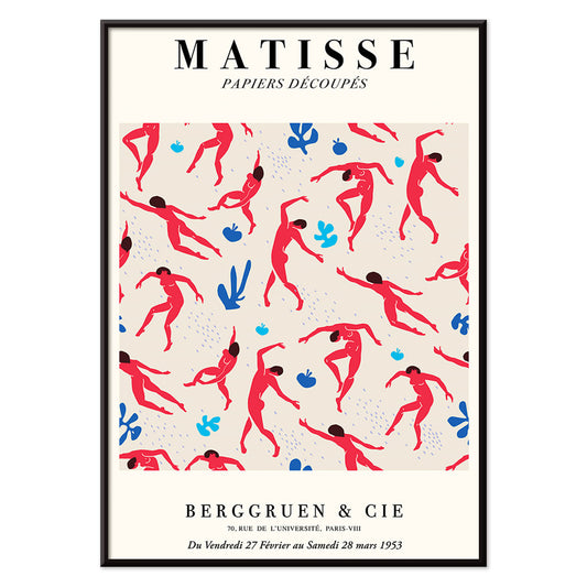
Dansende figurer Matisse Plakat
Henri Matisse · 1909 · Energisk plakat med dansende figurer og kraftige røde silhuetter mod dyb blå
Plakat fra 69 kr · Indrammet fra 122,67 kr
Normalpris Fra 46,00 krNormalpris -
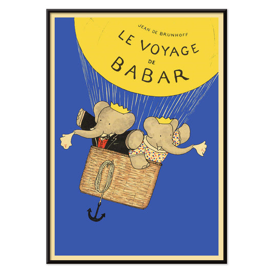
Le Voyage de Babar Plakat
Jean de Brunhoff · 1932 · Legende Babarrejseplakat med lysegul ballon mod klar blå himmel
Plakat fra 69 kr · Indrammet fra 122,67 kr
Normalpris Fra 46,00 krNormalpris -
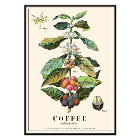
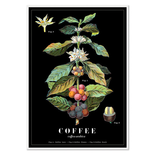
Coffea arabica 3 Plakat
Davis, Sacker & Perkins · 1870 · Detaljeret Coffea arabica botanisk tryk med blomster, blade og modnende bær
Plakat fra 69 kr · Indrammet fra 122,67 kr
Normalpris Fra 46,00 krNormalpris -
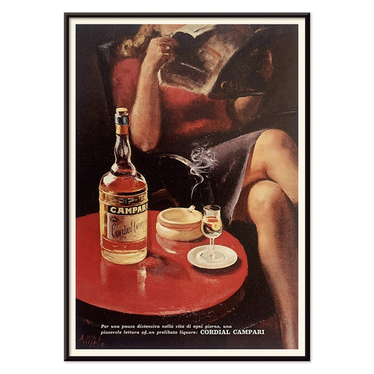
Cordial Campari Plakat
Ukendt kunstner · 1926 · Art Deco Campari plakat med en rolig kvinde og markante røde geometriske former
Plakat fra 69 kr · Indrammet fra 122,67 kr
Normalpris Fra 46,00 krNormalpris -
Sigmund Freud havde ret Plakat
Seymour Chwast · 1970 · Vittigt Freudportræt som plakat med poptypografi og surrealistiske symboler i grøn og orange
Plakat fra 69 kr · Indrammet fra 122,67 kr
Normalpris Fra 46,00 krNormalpris -
Panter Plakat
Ukendt kunstner · 1900 · legesyg panterplakat hvor en panter roder i et iskab efter pølser
Plakat fra 69 kr · Indrammet fra 122,67 kr
Normalpris Fra 46,00 krNormalpris -
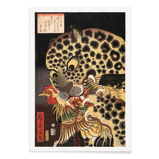
Tiger fra Ryōkoku Plakat
Utagawa Hirokage · 1860 · Dramatisk ukiyo-e kunsttryk af en tiger der griber en hane under markant kalligrafi
Plakat fra 69 kr · Indrammet fra 122,67 kr
Normalpris Fra 46,00 krNormalpris -
Babar i bil Plakat
Jean de Brunhoff · 1934 · legesygt Babar kører i en rød bil plakat med klar, eventyrlig streg
Plakat fra 69 kr · Indrammet fra 122,67 kr
Normalpris Fra 46,00 krNormalpris -
Vågn op og læs Plakat
Ukendt kunstner · 1961 · Modernistisk kampagneplakat for læsning i sort, rød og blå, energisk og ikonisk
Plakat fra 69 kr · Indrammet fra 122,67 kr
Normalpris Fra 46,00 krNormalpris -
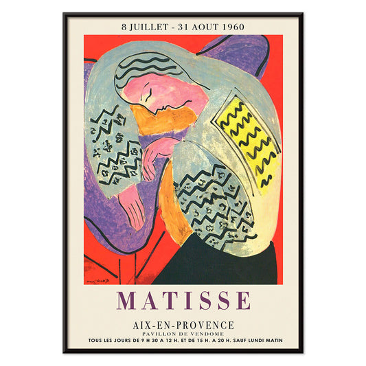
Drømmen Plakat
Henri Matisse · 1960 · Livfuld sovende figur plakat med flydende konturer og kraftige, flade farveflader
Plakat fra 69 kr · Indrammet fra 122,67 kr
Normalpris Fra 46,00 krNormalpris -
Den store bølge plakat
Katsushika Hokusai · 1831 · Ikonisk japansk bølgeplakat med Mount Fuji og både under tårnhøje bølger
Plakat fra 69 kr · Indrammet fra 122,67 kr
Normalpris Fra 46,00 krNormalpris -
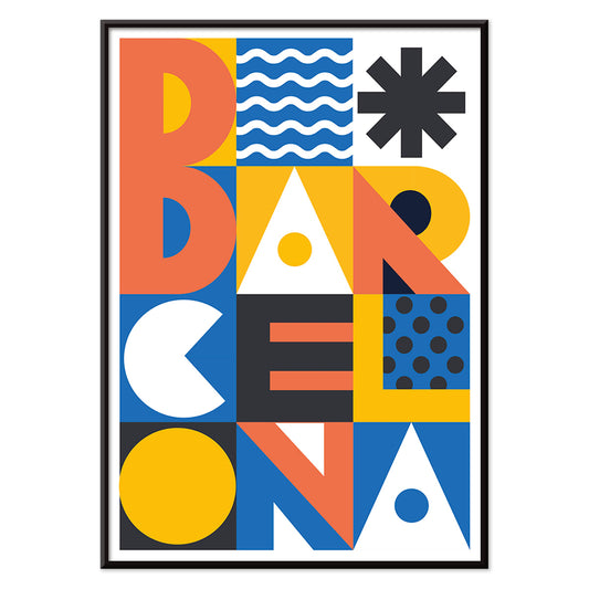
Barcelona Tekst Plakat
MORYARTY · 2021 · Moderne Barcelona plakat med kraftig stablet typografi og klare geometriske farveblokke
Plakat fra 69 kr · Indrammet fra 122,67 kr
Normalpris Fra 46,00 krNormalpris -
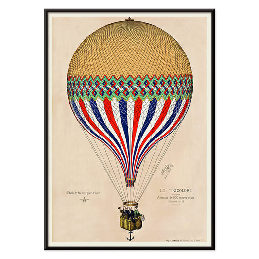
Trikolore luftballon Plakat
ukendt kunstner · 1874 · trikolore luftballon plakat driftende over paris i et stolt fransk farveskema
Plakat fra 69 kr · Indrammet fra 122,67 kr
Normalpris Fra 46,00 krNormalpris -
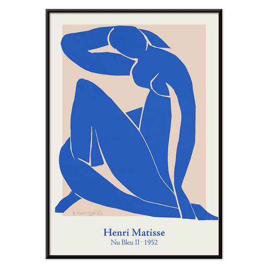
Nu Bleu II Plakat
Henri Matisse · 1952 · Ikonisk blå nøgenplakat i dristige papirklipformer mod varm beige bund
Plakat fra 69 kr · Indrammet fra 122,67 kr
Normalpris Fra 46,00 krNormalpris -
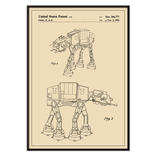
Star Wars AT-AT Patent Plakat
George Lucas · 1981 · Patentplakat i blueprintstil med flere visninger af AT-AT på varm beige
Plakat fra 69 kr · Indrammet fra 122,67 kr
Normalpris Fra 46,00 krNormalpris -
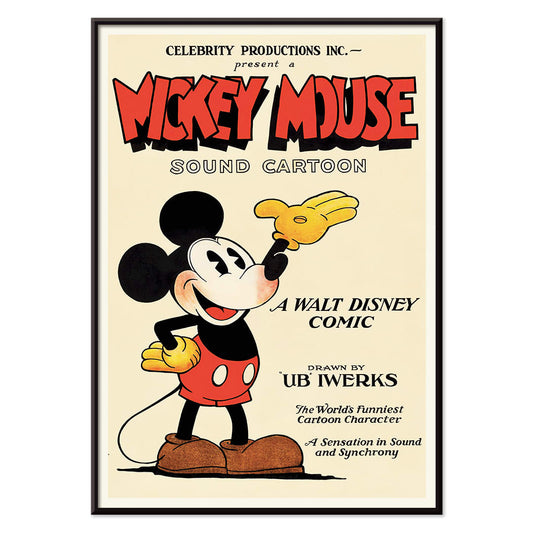
Mickey Mouse Plakat
Ukendt kunstner · 1928 · Munter Mickey Mouse plakat med markante sorte konturer og vintage animationsstil
Plakat fra 69 kr · Indrammet fra 122,67 kr
Normalpris Fra 46,00 krNormalpris -
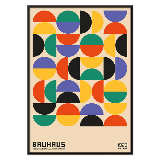
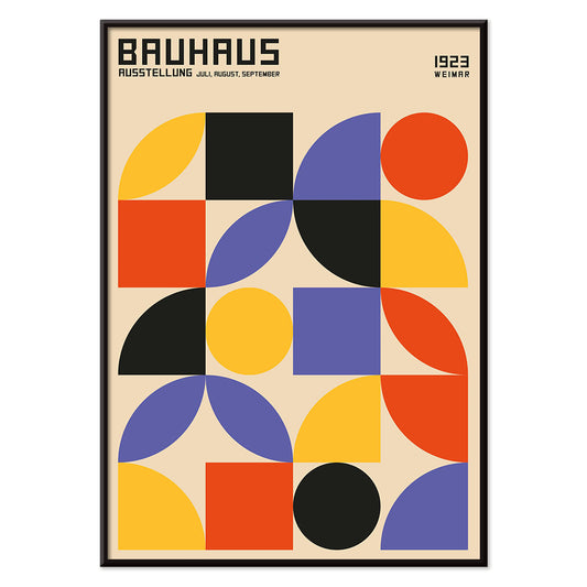
Bauhaus 2 Plakat
MORYARTY · 1923 · Bauhausinspireret geometrisk plakat med markante sorte, orange og blå former
Plakat fra 69 kr · Indrammet fra 122,67 kr
Normalpris Fra 46,00 krNormalpris -
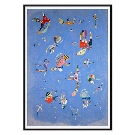
Bleu de Ciel Plakat
Wassily Kandinsky · 1925 · Luftigt abstrakt kunsttryk med flydende former på himmelblå bund med klare accenter
Plakat fra 69 kr · Indrammet fra 122,67 kr
Normalpris Fra 46,00 krNormalpris -
Papiers découpés 1 Plakat
MORYARTY · 2021 · Frodig udklipsabstrakt plakat med orange og grønne former på varm beige bund
Plakat fra 69 kr · Indrammet fra 122,67 kr
Normalpris Fra 46,00 krNormalpris -
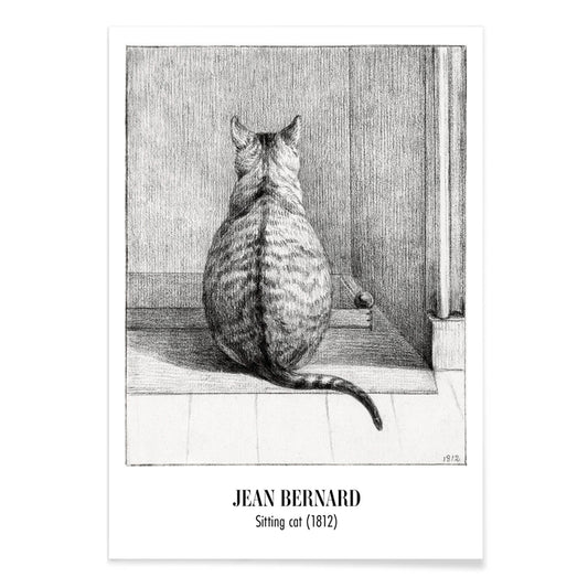
Siddende kat set bagfra Plakat
Jean Bernard · 1812 · Stille kat vintage tryk i bløde gråtoner set bagfra med roligt udtryk
Plakat fra 69 kr · Indrammet fra 122,67 kr
Normalpris Fra 46,00 krNormalpris -
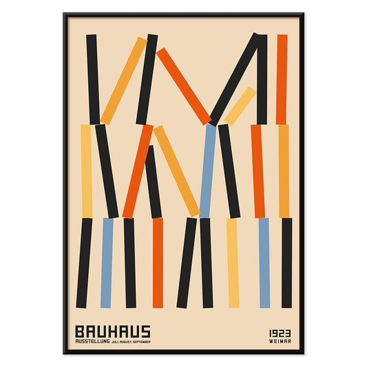
Bauhaus 11 Plakat
MORYARTY · 2023 · Nutidig geometrisk plakat med markante cirkler og diagonaler i primærfarver på hvid
Plakat fra 69 kr · Indrammet fra 122,67 kr
Normalpris Fra 46,00 krNormalpris -
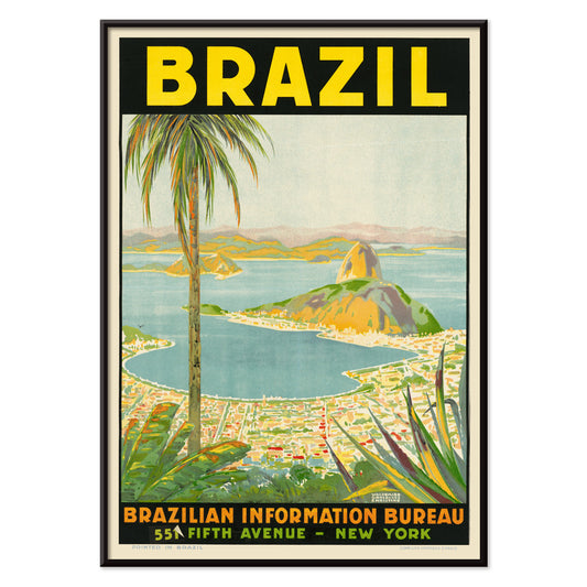
Brazil 2 Plakat
Waldomiro Goncalves Christino · 1970 · Livfuld brasiliansk rejseplakat med kraftfulde former og solvarm kyststemning
Plakat fra 69 kr · Indrammet fra 122,67 kr
Normalpris Fra 46,00 krNormalpris -
Sort leopard Plakat
Carken · 1936 · dramatisk zooplakat med en snigende sort leopard og kraftig moderne typografi
Plakat fra 69 kr · Indrammet fra 122,67 kr
Normalpris Fra 46,00 krNormalpris -
Histoire de Babar Plakat
Jean de Brunhoff · 1931 · legende Babarplakat med høfligt hatnik og eventyragtig klarhed
Plakat fra 69 kr · Indrammet fra 122,67 kr
Normalpris Fra 46,00 krNormalpris -
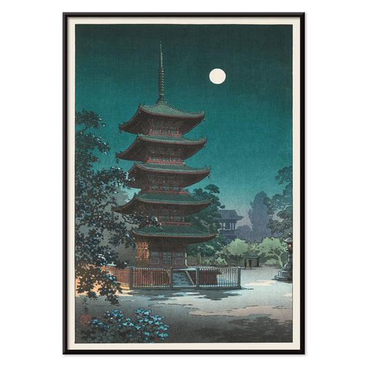
Asakusa Kinryuzan tempel Plakat
tsuchiya koitsu · 1938 · måneoplyst tempellandskab med varme lanterner og dyb blå nat
Plakat fra 69 kr · Indrammet fra 122,67 kr
Normalpris Fra 46,00 krNormalpris -
Bauhaus 6 Plakat
MORYARTY · 1923 · Bauhausinspireret abstrakt plakat med sorte linjer, orange detaljer og blå geometriske former
Plakat fra 69 kr · Indrammet fra 122,67 kr
Normalpris Fra 46,00 krNormalpris -
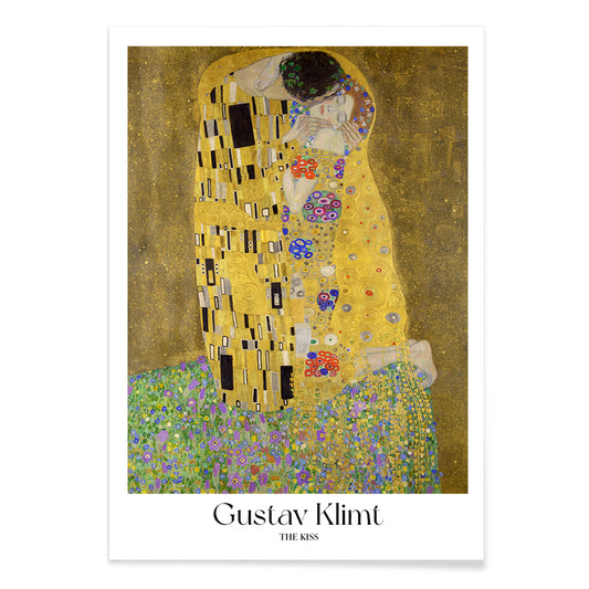
Kyssen Plakat
Gustav Klimt · 1908 · Lysende gyldent kunsttryk af et omfavnende par indhyllet i mønstrede klæder
Plakat fra 69 kr · Indrammet fra 122,67 kr
Normalpris Fra 46,00 krNormalpris -
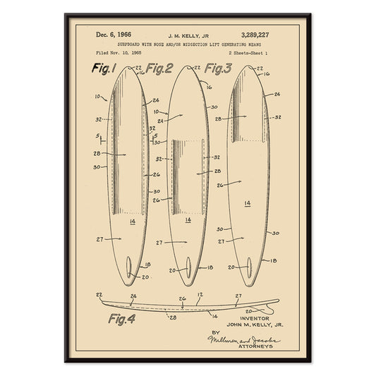
Surfbrætspatent Plakat
J.M. Kelly · 1935 · teknisk surfbrætspatent plakat med klart stregarbejde, nummererede detaljer og vintage udkastcharme
Plakat fra 69 kr · Indrammet fra 122,67 kr
Normalpris Fra 46,00 krNormalpris -
Sort kat 4 Plakat
Ukendt kunstner · 1750 · Fængslende vintage tryk af sort kat med markant silhuet på varm beige baggrund
Plakat fra 69 kr · Indrammet fra 122,67 kr
Normalpris Fra 46,00 krNormalpris -
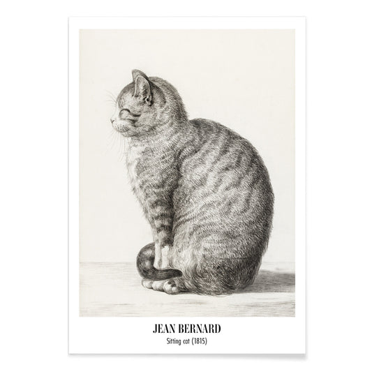
Siddende kat set fra venstre Plakat
Jean Bernard · 1815 · Roligt kattekunsttryk i bløde grafittoner, siddende set fra venstre profil
Plakat fra 69 kr · Indrammet fra 122,67 kr
Normalpris Fra 46,00 krNormalpris -
Vertigo Plakat
Saul Bass · 1958 · Hypnotisk spiral filmplakat med klare figurer der formidler ren psykologisk spænding
Plakat fra 69 kr · Indrammet fra 122,67 kr
Normalpris Fra 46,00 krNormalpris -
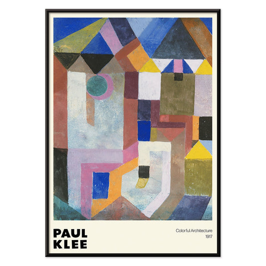
Farverig arkitektur plakat
Paul Klee · 1917 · Legende geometrisk arkitekturplakat med klare blå, lyserøde og gule flader
Plakat fra 69 kr · Indrammet fra 122,67 kr
Normalpris Fra 46,00 krNormalpris -
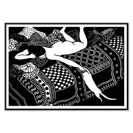
La Paresse Plakat
Félix Emile-Jean Vallotton · 1896 · Intimt sort-hvidt kunsttryk med liggende figur og årvågen kat
Plakat fra 69 kr · Indrammet fra 122,67 kr
Normalpris Fra 46,00 krNormalpris -
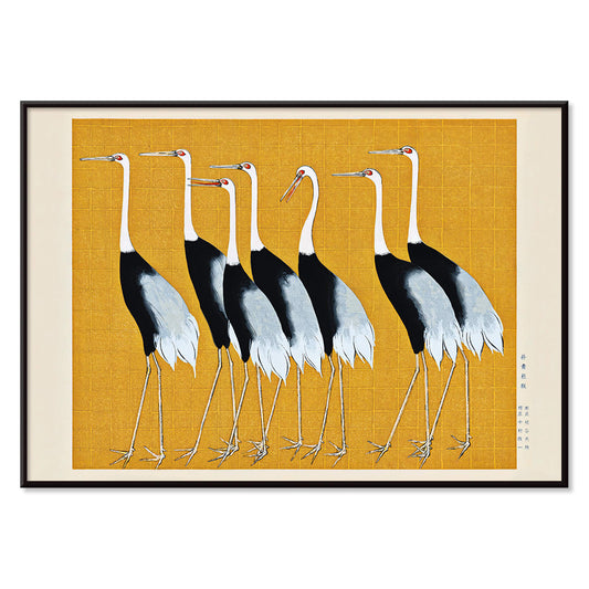
Rød krontrane Plakat
Ogata Korin · 1687 · Elegant rød krontrane kunsttryk i lyse gyldne toner med sort kontrast
Plakat fra 69 kr · Indrammet fra 122,67 kr
Normalpris Fra 46,00 krNormalpris -
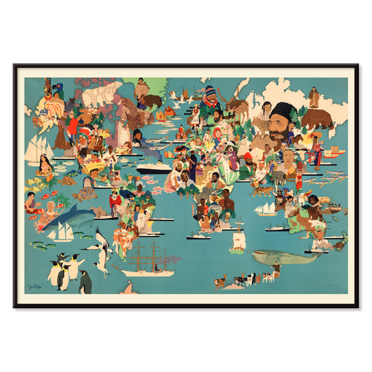
Befolkningskort Plakat
Ukendt kunstner · 2015 · Illustration af verdens befolkningskort med kulturelle ikoner og dyreliv på tværs af kontinenter
Plakat fra 69 kr · Indrammet fra 122,67 kr
Normalpris Fra 46,00 krNormalpris -
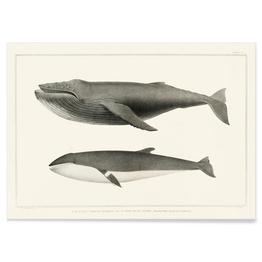
Pukkelhval og minkehval Plakat
Charles Melville Scammon · 1872 · videnskabeligt vintagetryk af pukkelhval og minkehval i afdæmpede grå toner
Plakat fra 69 kr · Indrammet fra 122,67 kr
Normalpris Fra 46,00 krNormalpris -
Avocado (Persea) Plakat
Amanda Almira Newton · 1916 · Fint botanisk tryk af avocado med grøn frugt og en halveret frugt med synlig kerne
Plakat fra 69 kr · Indrammet fra 122,67 kr
Normalpris Fra 46,00 krNormalpris -
Bauhaus 10 Plakat
MORYARTY · 1923 · Geometrisk Bauhaus plakat med cirkler og stænger i kraftige primærfarver
Plakat fra 69 kr · Indrammet fra 122,67 kr
Normalpris Fra 46,00 krNormalpris -
Coffea Arabica 2 Plakat
Davis, Sacker & Perkins · 1885 · frodigt botanisk tryk af kaffeplanten med hvide blomster og modnende røde bær
Plakat fra 69 kr · Indrammet fra 122,67 kr
Normalpris Fra 46,00 krNormalpris -
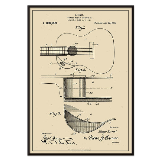
Musikinstrumentpatent Plakat
H. Ernst · 1916 · Detaljeret guitarpatenttryk med præcise diagrammer og nummererede markeringer på varm beige
Plakat fra 69 kr · Indrammet fra 122,67 kr
Normalpris Fra 46,00 krNormalpris -
Den moderne plakat
Will Bradley · 1895 · Stiliseret påfuglplakat med flydende art nouveau-linjer og klar blå og hvid kontrast
Plakat fra 69 kr · Indrammet fra 122,67 kr
Normalpris Fra 46,00 krNormalpris -
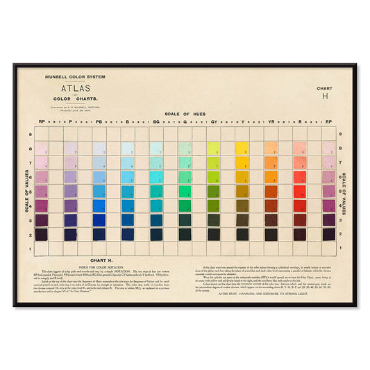
Atlas over Munsell farvesystem Plakat
Albert Henry Munsell · 1915 · Ikonisk farvesystemplakat der kortlægger nuancer, værdi og chroma i en ordnet skala
Plakat fra 69 kr · Indrammet fra 122,67 kr
Normalpris Fra 46,00 krNormalpris -
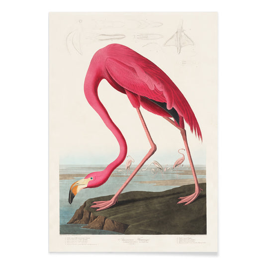
Rosa flamingo Plakat
John James Audubon · 1827 · Elegant flamingoplakat med krummet hals og lysende rosa fjerdragt på hvid
Plakat fra 69 kr · Indrammet fra 122,67 kr
Normalpris Fra 46,00 krNormalpris -
Aquarian Exposition ved White Lake Plakat
Ukendt kunstner · 1969 · Ikonisk Woodstockplakat med due på guitar i kraftig rød og retro festivaltypografi
Plakat fra 69 kr · Indrammet fra 122,67 kr
Normalpris Fra 46,00 krNormalpris -
Bananer Plakat
Ellen Isham Schutt · 1904 · soloplyste bananer kunsttryk med blid skygge og ren luftig baggrund
Plakat fra 69 kr · Indrammet fra 122,67 kr
Normalpris Fra 46,00 krNormalpris -
Røde læber plakat
Ikko Tanaka · 1972 · Ikonisk kontrastrig plakat med stiliseret ansigt og klare røde læber
Plakat fra 69 kr · Indrammet fra 122,67 kr
Normalpris Fra 46,00 krNormalpris -
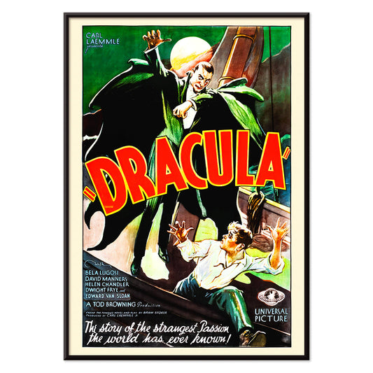
Dracula Plakat
ukendt kunstner · 1931 · dramatisk gyserplakat med truende hætteklædt vampyrsilhuet mod fuldmåne
Plakat fra 69 kr · Indrammet fra 122,67 kr
Normalpris Fra 46,00 krNormalpris -
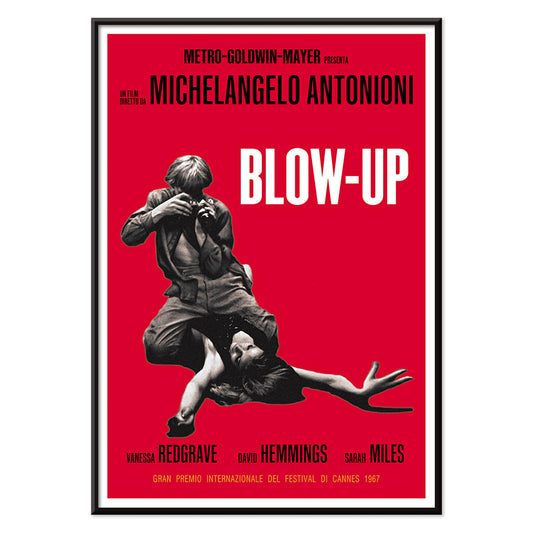
Blow Up plakat
Ukendt kunstner · 1966 · Grafisk filmplakat med kraftig rød flade og markant fotografisk fokus
Plakat fra 69 kr · Indrammet fra 122,67 kr
Normalpris Fra 46,00 krNormalpris -
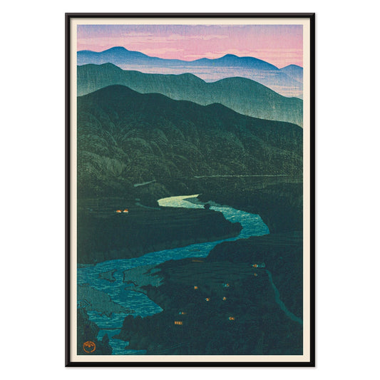
Ecchu Umidani bjergpas Plakat
Kawase Hasui · 1923 · Fredfyldt bjergpastryk med lagdelte blå bjergkamme og en snoet sti
Plakat fra 69 kr · Indrammet fra 122,67 kr
Normalpris Fra 46,00 krNormalpris -
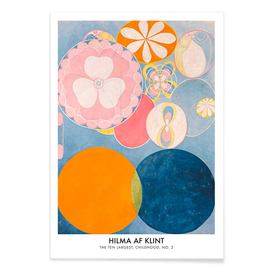
De ti største: barndom nr. 2 Plakat
Hilma af Klint · 1907 · lysende abstrakt kunsttryk med hvirvlende former i blå, pink, orange og gul
Plakat fra 69 kr · Indrammet fra 122,67 kr
Normalpris Fra 46,00 krNormalpris -
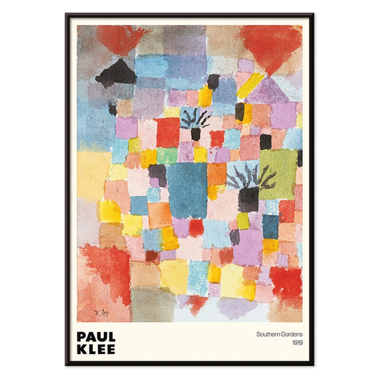
Sørlige haver Plakat
Paul Klee · 1919 · Livlig geometrisk haveplakat med rytmiske blokke i rød, blå, gul og grøn
Plakat fra 69 kr · Indrammet fra 122,67 kr
Normalpris Fra 46,00 krNormalpris -
Sort kat 3 Plakat
Ukendt kunstner · 1750 · Minimalistisk sort katteplakat med kraftig silhuet og rød kalligrafi på varm beige
Plakat fra 69 kr · Indrammet fra 122,67 kr
Normalpris Fra 46,00 krNormalpris -
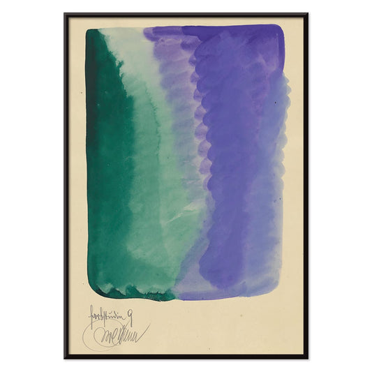
Farbstudien, 10 Blätter IX Plakat
Karl Wiener · 1923 · Abstrakt akvareltryk med grønne og violette vasker i rolig modernistisk rytme
Plakat fra 69 kr · Indrammet fra 122,67 kr
Normalpris Fra 46,00 krNormalpris -
Judith og Holofernes' hoved Plakat
Gustav Klimt · 1901 · Ikonisk forgyldt kunsttryk af Judith med Holofernes hoved i overdådig jugendstil
Plakat fra 69 kr · Indrammet fra 122,67 kr
Normalpris Fra 46,00 krNormalpris -
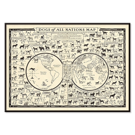
Hunde fra hele verden Plakat
E. Frantz · 1936 · Detaljeret hundekortplakat med racer fra hele verden i skarp sort streg
Plakat fra 69 kr · Indrammet fra 122,67 kr
Normalpris Fra 46,00 krNormalpris -
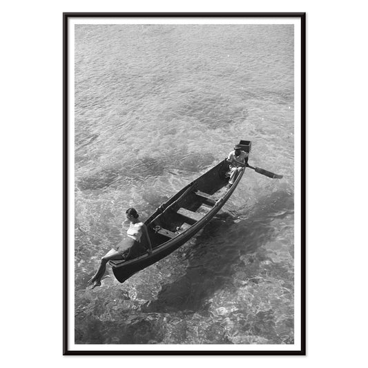
Model på bådkanten Plakat
Toni Frissell · 1946 · Elegant sort-hvid plakat med model siddende på bådkanten og et roligt kystudtryk
Plakat fra 69 kr · Indrammet fra 122,67 kr
Normalpris Fra 46,00 krNormalpris -
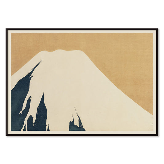
Fuji Plakat
Kamisaka Sekka · 1909 · Stilrent Fuji kunsttryk i rolige blå toner og klare, subtile konturer
Plakat fra 69 kr · Indrammet fra 122,67 kr
Normalpris Fra 46,00 krNormalpris


72/202 items
- Geografisk vejviser til en kvindes hjerte Plakat
- Portugal i dag Plakat
- Øl og cigaret Plakat
- The New Yorker Plakat
- Zoologischer Garten Plakat
- Havbundens Plakat
- Red hvalerne Plakat
- Nu Bleu III Plakat
- Papiers découpés 3 Plakat
- Marihuana Plakat
- Grands Prix de France Plakat
- Den store bølge ved Kanagawa Plakat
- Porto Ramos-Pinto Plakat
- Solaris Plakat
- Sort kat 2 Plakat
- Dansende figurer Matisse Plakat
- Le Voyage de Babar Plakat
- Coffea arabica 3 Plakat
- Cordial Campari Plakat
- Sigmund Freud havde ret Plakat
- Panter Plakat
- Tiger fra Ryōkoku Plakat
- Babar i bil Plakat
- Vågn op og læs Plakat
- Drømmen Plakat
- Den store bølge plakat
- Barcelona Tekst Plakat
- Trikolore luftballon Plakat
- Nu Bleu II Plakat
- Star Wars AT-AT Patent Plakat
- Mickey Mouse Plakat
- Bauhaus 2 Plakat
- Bleu de Ciel Plakat
- Papiers découpés 1 Plakat
- Siddende kat set bagfra Plakat
- Bauhaus 11 Plakat
- Brazil 2 Plakat
- Sort leopard Plakat
- Histoire de Babar Plakat
- Asakusa Kinryuzan tempel Plakat
- Bauhaus 6 Plakat
- Kyssen Plakat
- Surfbrætspatent Plakat
- Sort kat 4 Plakat
- Siddende kat set fra venstre Plakat
- Vertigo Plakat
- Farverig arkitektur plakat
- La Paresse Plakat
- Rød krontrane Plakat
- Befolkningskort Plakat
- Pukkelhval og minkehval Plakat
- Avocado (Persea) Plakat
- Bauhaus 10 Plakat
- Coffea Arabica 2 Plakat
- Musikinstrumentpatent Plakat
- Den moderne plakat
- Atlas over Munsell farvesystem Plakat
- Rosa flamingo Plakat
- Aquarian Exposition ved White Lake Plakat
- Bananer Plakat
- Røde læber plakat
- Dracula Plakat
- Blow Up plakat
- Ecchu Umidani bjergpas Plakat
- De ti største: barndom nr. 2 Plakat
- Sørlige haver Plakat
- Sort kat 3 Plakat
- Farbstudien, 10 Blätter IX Plakat
- Judith og Holofernes' hoved Plakat
- Model på bådkanten Plakat
- Fuji Plakat
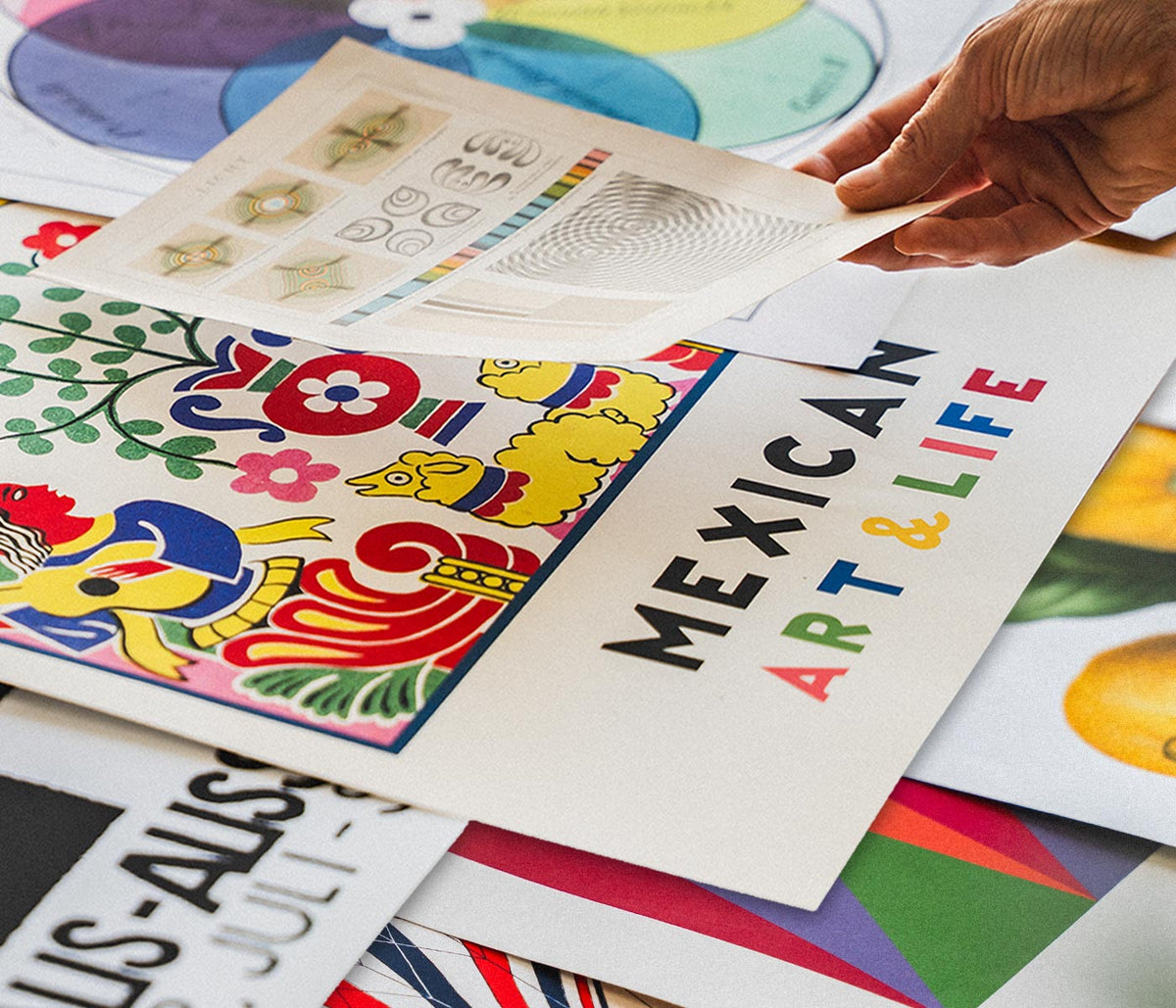
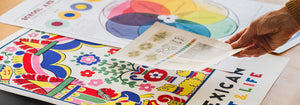
A curator-led cross section of poster culture
Our Selection gathers the kind of images that once lived on street corners, in shop windows, and on gallery walls, then learned how to behave in a home. It is not a single movement but a conversation between vintage poster design, modern art print sensibilities, and documentary photography. The common thread is legibility and atmosphere: work that reads clearly from a distance, then rewards a closer look with paper grain, ink edges, and deliberate restraint. For a broader overview of formats and eras, the main All Posters index helps place this edit in context.
Design history in miniature, from lithography to the photo screen
Classic posters were engineered for attention, which is why their compositions tend to be decisive: simplified shapes, high contrast, and typography that can hold its own against city noise. Many of the most memorable examples relied on lithography, where separate colour stones built flat fields that still feel fresh today. Later processes introduced halftone dots and photographic grain, adding a different kind of texture and realism. If you gravitate toward structure and reduced form, the language of abstract graphics often sits nearby; for an image with a quieter, observational pull, Photo offers a related sensibility. A more nervous, handwritten line can be found through Egon Schiele, where drawing becomes psychology as much as depiction.
Interior placement: how to use a varied edit room by room
Because the selection spans several visual registers, it works best when the room sets the volume. In living spaces with oak, linen, or boucle, choose a vintage poster with softened pigments or warm paper tones so the wall art feels integrated rather than loud. Hallways benefit from vertical emphasis and repeated intervals, which is where Vertical Posters can help establish rhythm. In kitchens and dining corners, sharper typography and botanical detail tend to feel natural; pairing with Botanical keeps the palette grounded in greens and off-whites. For bedrooms, lean toward lower contrast prints and calmer spacing, or move into the tonal discipline of Black & White to keep the light gentle.
Curating a gallery wall without forcing harmony
Good decoration relies on pacing: one assertive image, several quieter ones, and a repeated cue that ties the set together, such as a single ink colour or shared margin width. A practical approach is to anchor the group with a typographic or emblematic sheet, then add a photograph or landscape fragment as a softer counterweight. When you want a stronger graphic note, borrow a companion from Advertising; when you want slower, museum-like cadence, echo it with a piece from Classic Art. Frame choice does the final editing: pale wood lifts warm palettes, black metal sharpens linework, and a generous mount makes aged paper feel intentional. A simple route is to keep frames consistent while letting imagery vary, then adjust spacing until the negative space becomes part of the composition.
An edit that can evolve with your rooms
The strength of Our Selection is its openness: it behaves like a personal archive, ready to be re-sequenced as furniture shifts and colour choices mature. Some homes keep the mix eclectic; others gradually steer it toward a decade, a subject, or a single dominant hue. Either way, the poster and print languages here were made to coexist, and the most convincing gallery walls are the ones that look accumulated rather than planned.