
 "Smukke tryk, hurtig levering!"
 "Fantastisk udvalg af vintage plakater"
 "En skjult perle for kunstelskere"
"Smukke tryk, hurtig levering!"
"Fantastisk udvalg af vintage plakater"
"En skjult perle for kunstelskere"
"Smukke tryk, hurtig levering!"
"Fantastisk udvalg af vintage plakater"
"En skjult perle for kunstelskere"
"Smukke tryk, hurtig levering!"
"Fantastisk udvalg af vintage plakater"
"En skjult perle for kunstelskere"
"En skjult perle for kunstelskere"
"Smukke tryk, hurtig levering!"
"Fantastisk udvalg af vintage plakater"
"En skjult perle for kunstelskere"
"Smukke tryk, hurtig levering!"
"Fantastisk udvalg af vintage plakater"
"En skjult perle for kunstelskere"
"Smukke tryk, hurtig levering!"
"Fantastisk udvalg af vintage plakater"
"En skjult perle for kunstelskere"
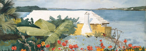
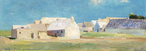
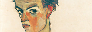
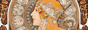
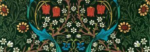
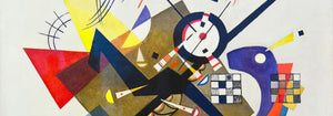

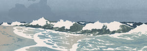

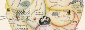

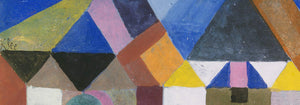
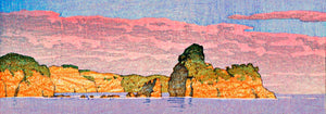
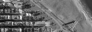
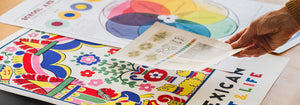
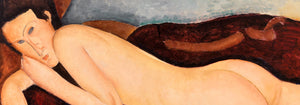
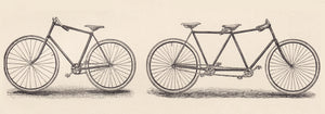
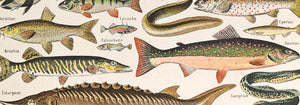
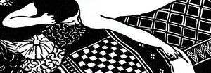
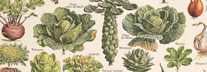
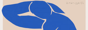

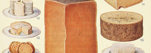

- Geografisk vejviser til en kvindes hjerte Plakat
- Øl og cigaret Plakat
- Portugal i dag Plakat
- The New Yorker Plakat
- Zoologischer Garten Plakat
- Red hvalerne Plakat
- Papiers découpés 3 Plakat
- Havbundens Plakat
- Vågn op og læs Plakat
- Nu Bleu III Plakat
- Marihuana Plakat
- Den store bølge ved Kanagawa Plakat
- Cordial Campari Plakat
- Sort kat 2 Plakat
- Le Voyage de Babar Plakat
- Porto Ramos-Pinto Plakat
- Coffea arabica 3 Plakat
- Dansende figurer Matisse Plakat
- Tiger fra Ryōkoku Plakat
- Babar i bil Plakat
- Solaris Plakat
- Sigmund Freud havde ret Plakat
- Panter Plakat
- Bleu de Ciel Plakat
- Barcelona Tekst Plakat
- Grands Prix de France Plakat
- Trikolore luftballon Plakat
- Nu Bleu II Plakat
- Den store bølge plakat
- Bauhaus 6 Plakat
- Drømmen Plakat
- Bauhaus 11 Plakat
- Histoire de Babar Plakat
- Bauhaus 2 Plakat
- La Paresse Plakat
- Bauhaus 10 Plakat
- Papiers découpés 1 Plakat
- Star Wars AT-AT Patent Plakat
- Mickey Mouse Plakat
- Befolkningskort Plakat
- Coffea Arabica 2 Plakat
- Farverig arkitektur plakat
- Vertigo Plakat
- Sort leopard Plakat
- Brazil 2 Plakat
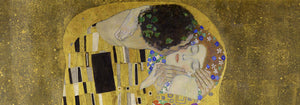
- Kyssen Plakat
- Surfbrætspatent Plakat
- Rød krontrane Plakat
- Siddende kat set bagfra Plakat
- Avocado (Persea) Plakat
-

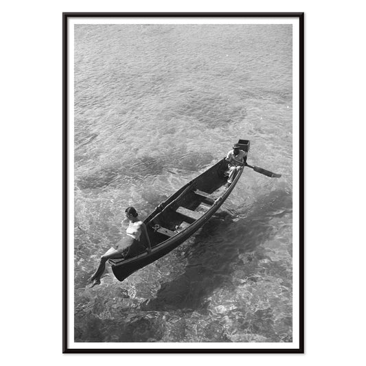
Model på bådkanten Plakat
Toni Frissell · 1946 · Elegant sort-hvid plakat med model siddende på bådkanten og et roligt kystudtryk
Plakat fra 69 kr · Indrammet fra 122,67 kr
-

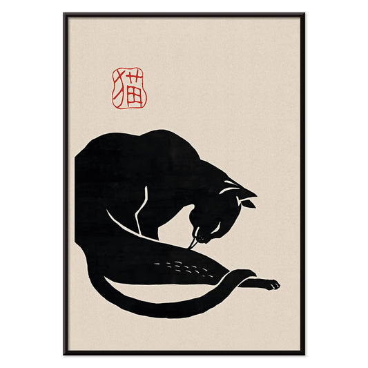
Sort kat 3 Plakat
Ukendt kunstner · 1750 · Minimalistisk sort katteplakat med kraftig silhuet og rød kalligrafi på varm beige
Plakat fra 69 kr · Indrammet fra 122,67 kr
-

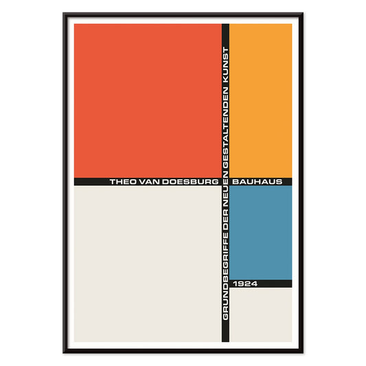
Bauhaus 21 Plakat
Ukendt kunstner · 1924 · geometrisk Bauhausplakat med orange cirkel, blå blok og skarpe sorte linjer
Plakat fra 69 kr · Indrammet fra 122,67 kr
-

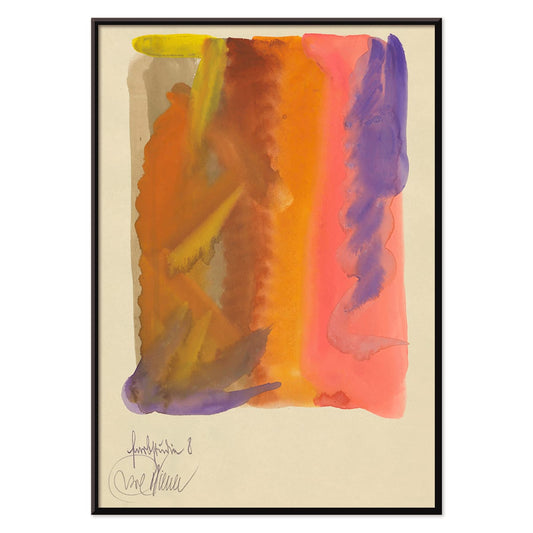
Farbstudien, 10 Blätter VIII Plakat
Karl Wiener · 1923 · Flydende abstrakt kunsttryk med varme gule vasker og dybe lilla bevægelser
Plakat fra 69 kr · Indrammet fra 122,67 kr
-


Nickerson Paine iført bikini Plakat
Toni Frissell · 1971 · Sort-hvid bikiniplakat med soloplyst kystkomposition og skarp, grafisk kontrast
Plakat fra 69 kr · Indrammet fra 122,67 kr
-

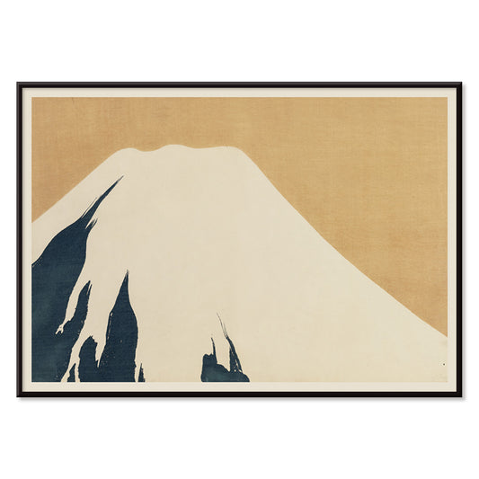
Fuji Plakat
Kamisaka Sekka · 1909 · Stilrent Fuji kunsttryk i rolige blå toner og klare, subtile konturer
Plakat fra 69 kr · Indrammet fra 122,67 kr
-

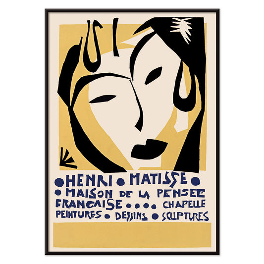
Maison de la Pensée française Plakat
Henri Matisse · 1950 · udstillingsplakat med maskelignende ansigt og blå typografi
Plakat fra 69 kr · Indrammet fra 122,67 kr
-

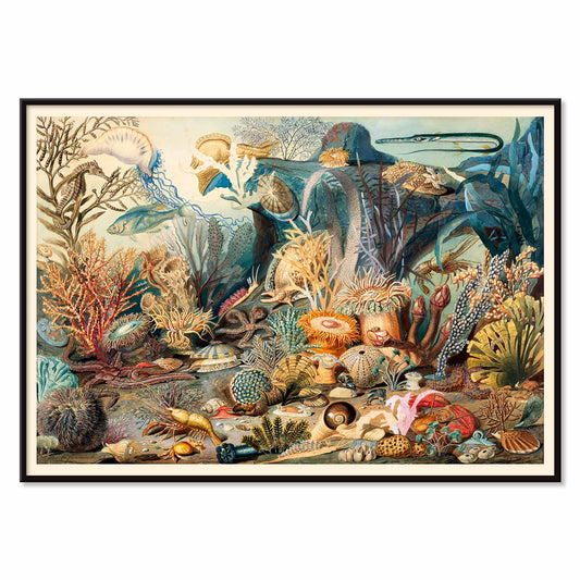
Havliv Plakat
James M. Sommerville · 1862 · Detaljeret havliv plakat med koraller, fisk og skaller i klare kysttoner
Plakat fra 69 kr · Indrammet fra 122,67 kr
-

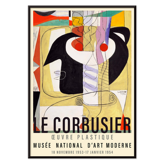
Métamorphose du violon Plakat
Le Corbusier · 1920 · modernistisk violinplakat der forvandler instrumentets kurver til klare geometriske rytmer i primærfarver
Plakat fra 69 kr · Indrammet fra 122,67 kr
-

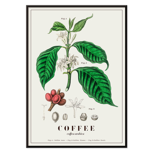
Coffea arabica Plakat
John Stephenson · 1836 · Detaljeret botanisk tryk af kaffetræ med hvide blomster og modne røde bær
Plakat fra 69 kr · Indrammet fra 122,67 kr
-

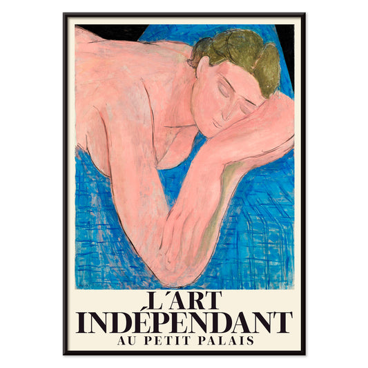
Le rêve plakat
Henri Matisse · 1935 · Drømmende liggende nøgenplakat med flydende sorte linjer og bløde rosa og blå flader
Plakat fra 69 kr · Indrammet fra 122,67 kr
-

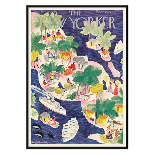
The New Yorker 1935 Plakat
Roger Duvoisin · 1935 · legesyg tropisk øplakat med kystdetaljer, klare farveblokke og nostalgisk stemning
Plakat fra 69 kr · Indrammet fra 122,67 kr
-

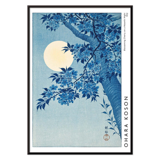
Blomstrende kirsebær på månenatten Plakat
Ohara Koson · 1932 · Måneoplyst kirsebærblomstertryk med lysende fuldmåne og rolig blå nat
Plakat fra 69 kr · Indrammet fra 122,67 kr
-

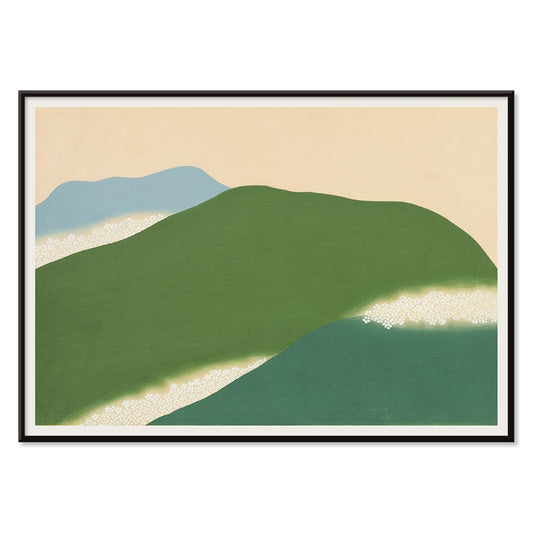
Yoshino Plakat
Kamisaka Sekka · 1909 · Fredfyldt japansk landskabsplakat med abstrakte grønne og blå bakker på varm beige
Plakat fra 69 kr · Indrammet fra 122,67 kr
-

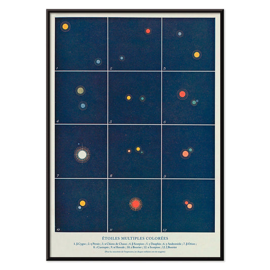
Flere farvede stjerner Plakat
Alphonse Berget · 1925 · Pædagogisk astronomiplakat der kortlægger flere stjernesystemer i klart blå med lyse stjernepunkter
Plakat fra 69 kr · Indrammet fra 122,67 kr
-

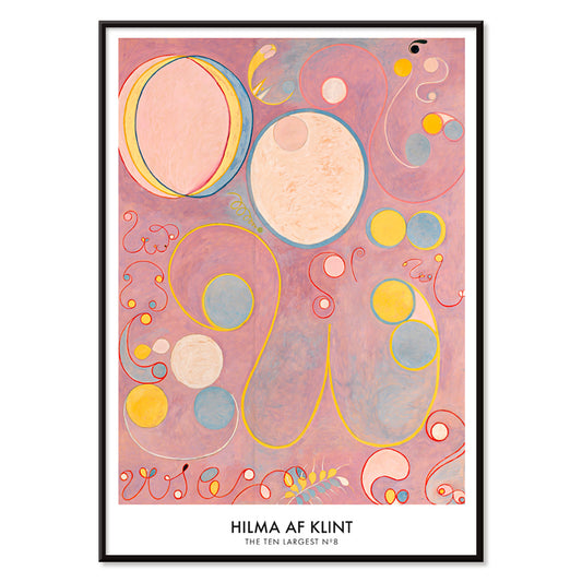
De ti største nr. 8 Plakat
Hilma af Klint · 1907 · æterisk abstrakt kunsttryk med spiraler og symbolske former i pink, gul og blå
Plakat fra 69 kr · Indrammet fra 122,67 kr
-

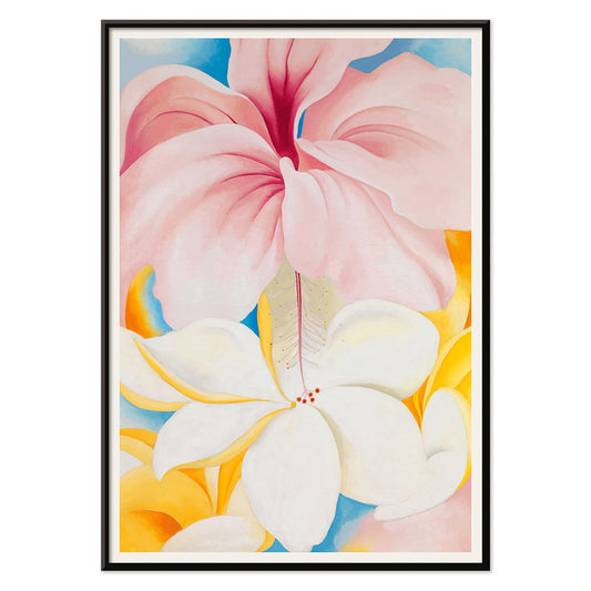
Hibiscus Plakat
Georgia O'Keeffe · 1939 · Lysende hibiscus kunsttryk med sanselige nærbillede kronblade og rolig modernistisk enkelhed
Plakat fra 69 kr · Indrammet fra 122,67 kr
-

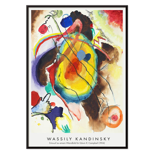
Vægmaleridesign Plakat
Wassily Kandinsky · 1914 · Energisk abstrakt plakat med geometriske former og rytmiske linjer i klare primærtoner
Plakat fra 69 kr · Indrammet fra 122,67 kr
-

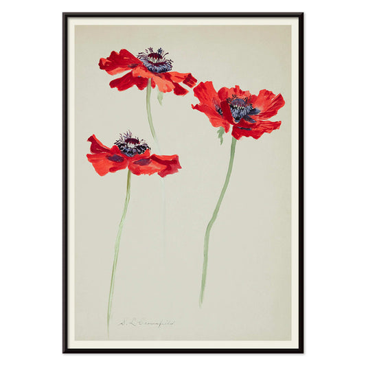
Tre studier af valmuer Plakat
Sophia Crownfield · 1900 · Fint botanisk tryk med tre valmuer i klare kronblade og slanke stilke
Plakat fra 69 kr · Indrammet fra 122,67 kr
-

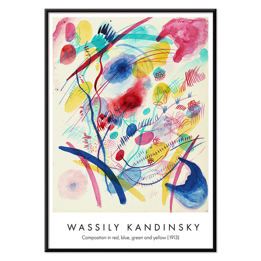
Komposition i rød, blå, grøn og gul Plakat
Wassily Kandinsky · 1913 · Energisk abstrakt kunsttryk med lagdelte cirkler, vinkler og klare primærfarver
Plakat fra 69 kr · Indrammet fra 122,67 kr
-

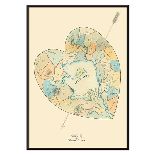
Kort over en kvindes hjerte 2 Plakat
Joseph Husson · 1840 · romantisk kortplakat med hjerteform, pastelfelter og en diagonal pil
Plakat fra 69 kr · Indrammet fra 122,67 kr
-

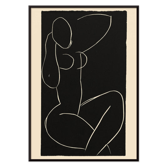
Siddende nøgen med krydsede ben I Plakat
Henri Matisse · 1941 · minimalistisk kunsttryk af en siddende nøgenfigur med krydsede ben i sort og hvid
Plakat fra 69 kr · Indrammet fra 122,67 kr
-

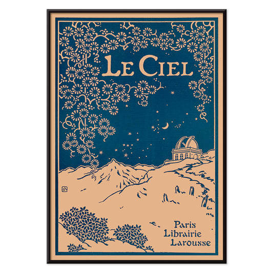
Le Ciel Plakat
Alphonse Berget · 1925 · Art Nouveau astronomiplakat med dyb blå himmel, detaljerede stjernekort og florale ornamenter
Plakat fra 69 kr · Indrammet fra 122,67 kr
-

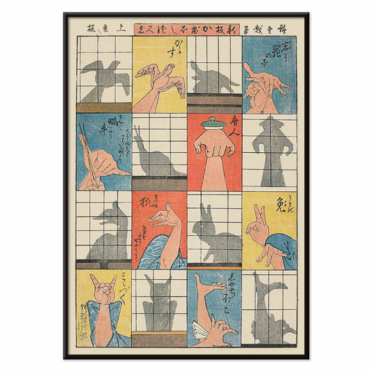
Otte skyggefigurer Plakat
Utagawa Hiroshige · 1842 · legende ukiyo-e-plakat med håndskygger og papirskærme
Plakat fra 69 kr · Indrammet fra 122,67 kr
-

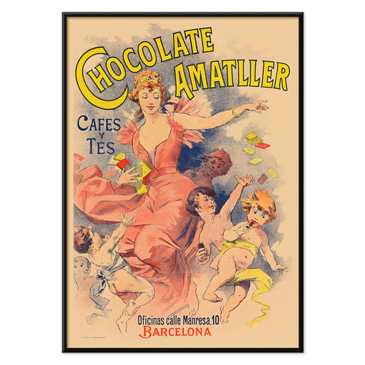
Chocolate Amatller Plakat
Ukendt kunstner · 1893 · livlig vintage plakat med Barcelona-reklame, dansende figur og lys typografi
Plakat fra 69 kr · Indrammet fra 122,67 kr
-

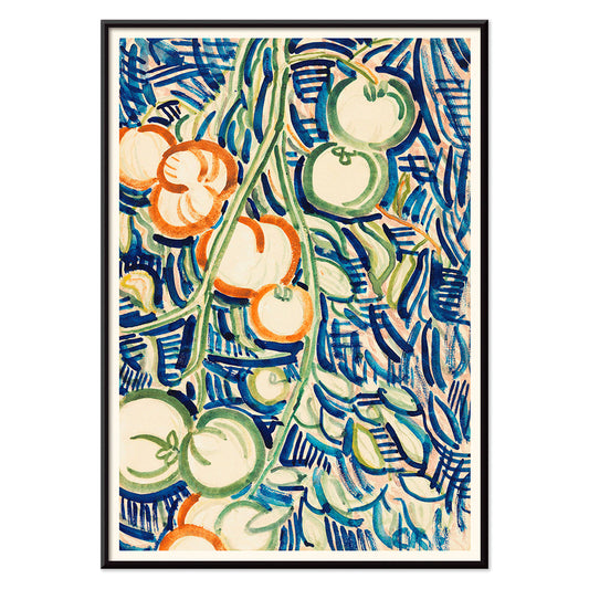
Røde og grønne tomater Plakat
Christian Rohlfs · 1906 · Udtryksfuldt stilleben kunsttryk af røde og grønne tomater med moderne farvespænding
Plakat fra 69 kr · Indrammet fra 122,67 kr
-

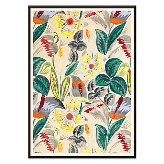
Tropiske blomster II Plakat
Ukendt kunstner · 1912 · Dekorativt tropisk blomstertryk med stiliseret løv og varm tidlig moderne mønsterrytme
Plakat fra 69 kr · Indrammet fra 122,67 kr
-

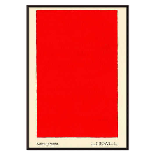
Karminvask Plakat
Elizabeth A. Nedwill · 1900 · Minimalistisk kunsttryk med en enkelt karminblok svævende på elfenben
Plakat fra 69 kr · Indrammet fra 122,67 kr
-

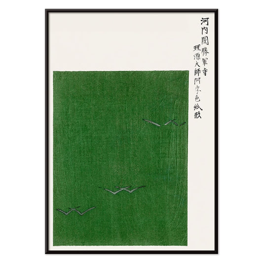
Yatsuo no tsubaki Plakat
Taguchi Tomoki · 1865 · roeligt kamelia- og fugletryk i klassisk japansk træsnitskomposition som plakat
Plakat fra 69 kr · Indrammet fra 122,67 kr
-

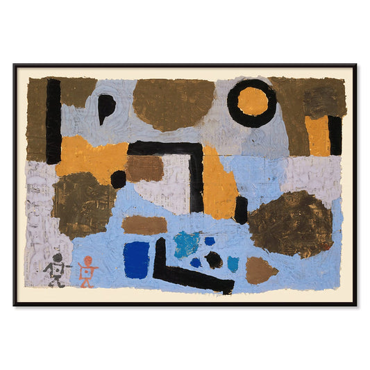
De to fortabte Plakat
Paul Klee · 1938 · Drømmeagtige abstrakte figurer i kunsttryk med sart streg og stille symbolik
Plakat fra 69 kr · Indrammet fra 122,67 kr
-

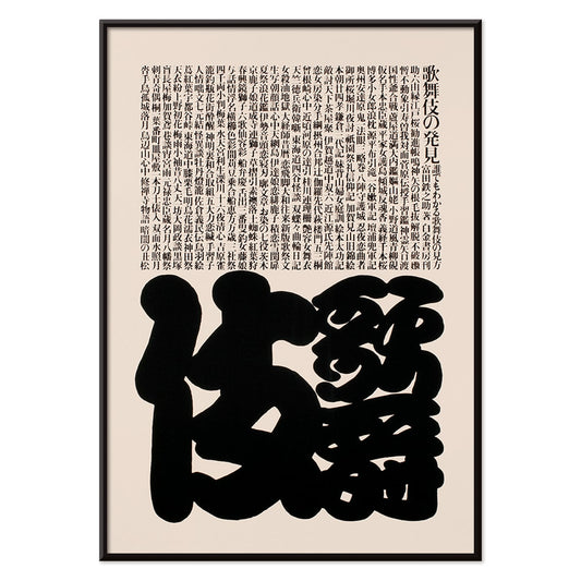
Kabuki Plakat
Ikko Tanaka · 1974 · Minimalistisk Kabukimaskplakat med markante sorte former og raffineret beige negativt rum
Plakat fra 69 kr · Indrammet fra 122,67 kr
-

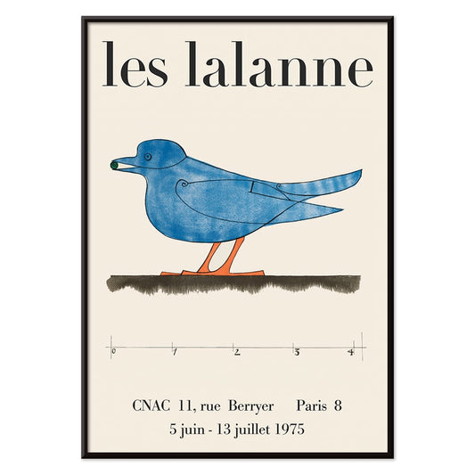
Les Lalanne Plakat
François-Xavier Lalanne · 1975 · minimal udstillingsplakat med en stiliseret blå fugl på varm beige baggrund
Plakat fra 69 kr · Indrammet fra 122,67 kr
-

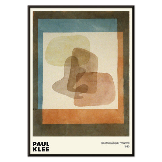
Frie former Plakat
Paul Klee · 1930 · Legesygt abstrakt plakat med friformsgeometri i blå og orange accenter
Plakat fra 69 kr · Indrammet fra 122,67 kr
-

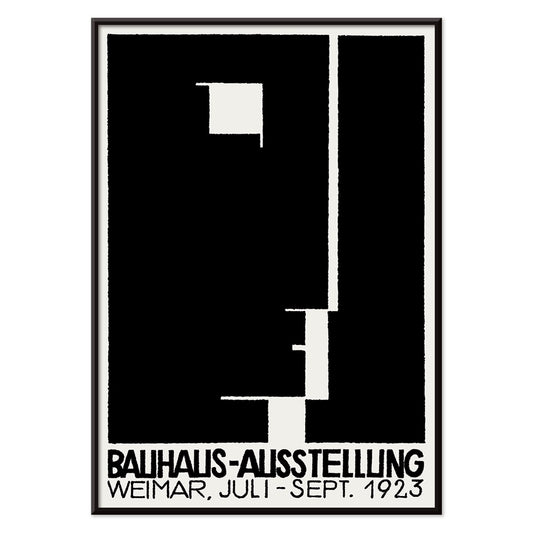
Bauhausudstillingsplakat
Ukendt kunstner · 1923 · Bauhausudstillingsplakat med dristig sort-hvid geometri og ren sans serif typografi
Plakat fra 69 kr · Indrammet fra 122,67 kr
-

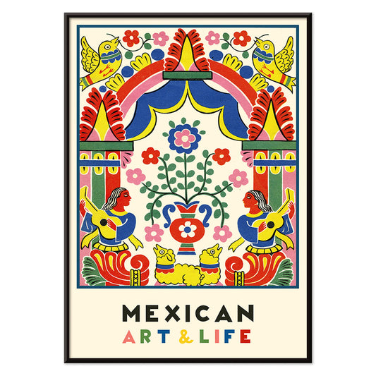
Mexicansk kunst og liv 1 Plakat
Ukendt kunstner · 1938 · Livlig modernistisk mexicansk plakat med kraftfuld folkinspireret geometri og levende farver
Plakat fra 69 kr · Indrammet fra 122,67 kr
-

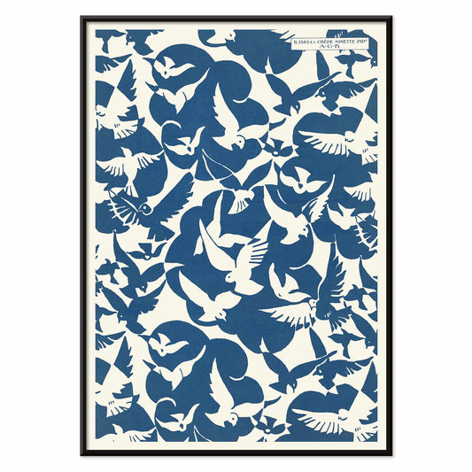
Lesbesse Crépe Ninette Plakat
Charles Goy · 1928 · minimalistisk fugleplakat med blå silhuetter på en cremefarvet reklameflade
Plakat fra 69 kr · Indrammet fra 122,67 kr
-

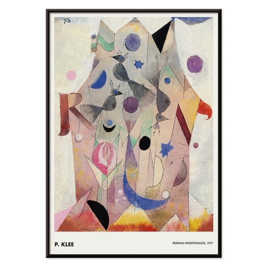
Persiske nattergale Plakat
Paul Klee · 1917 · Drømmeagtige fugleformer og juveltoner i et delikat abstrakt kunsttryk med kalligrafiske streger
Plakat fra 69 kr · Indrammet fra 122,67 kr
-


Exposition Matisse Plakat
Ukendt kunstner · 1980 · Minimalistisk udstillingsplakat med dansende figur i sort streg og rød tekst
Plakat fra 69 kr · Indrammet fra 122,67 kr
-

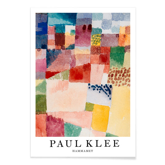
Hammamet Plakat
Paul Klee · 1914 · Strålende abstrakt kunsttryk der indfanger Hammamet med mosaiklignende blokke i rød, blå og gul
Plakat fra 69 kr · Indrammet fra 122,67 kr
-

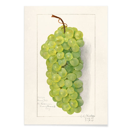
Klase af grønne druer Plakat
Amanda Almira Newton · 1896 · Fint botanisk tryk med druernes gennemsigtige skind og bløde skygger
Plakat fra 69 kr · Indrammet fra 122,67 kr
-

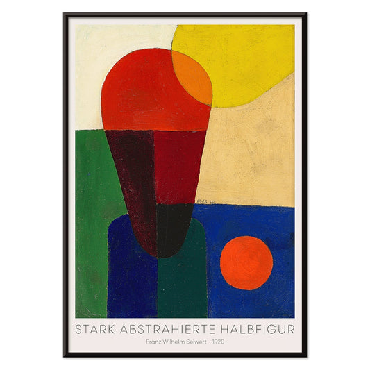
Stærkt abstraheret halvfigur Plakat
Franz Wilhelm Seiwert · 1920 · Geometrisk halvfigur kunsttryk med markante primærfarveblokke og klart modernistisk rytme
Plakat fra 69 kr · Indrammet fra 122,67 kr
-

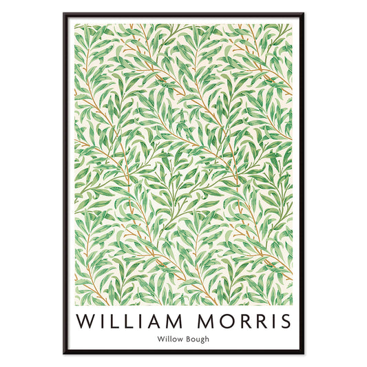
Pilegren Plakat
William Morris · 1887 · Flydende pilegrenstryk med gentagne blade og rolig Arts and Crafts-rytme
Plakat fra 69 kr · Indrammet fra 122,67 kr
-

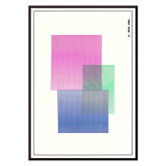
Rød, blå, grøn plakat
W. Soya · 1964 · Geometrisk farveblokplakat med skarpe linjer og klare røde, blå og grønne kontraster
Plakat fra 69 kr · Indrammet fra 122,67 kr
-

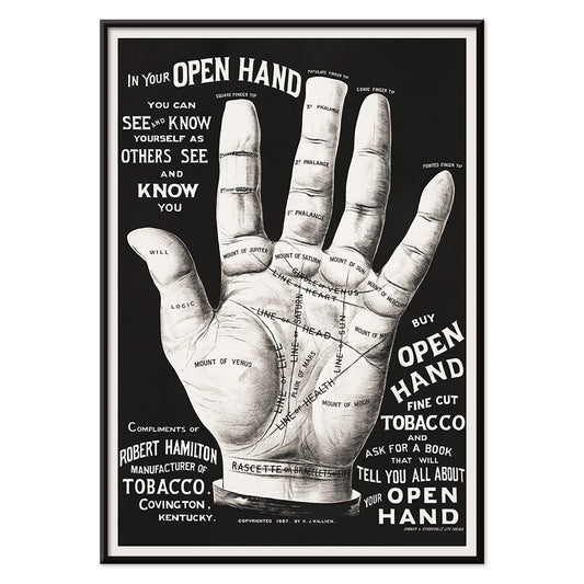
Håndlæsning Plakat
Ukendt kunstner · 2015 · Vintageinspireret håndlæsningplakat med åben hånd tegnet i indviklede sorte linjer
Plakat fra 69 kr · Indrammet fra 122,67 kr
-

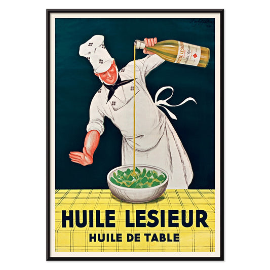
Huile Lesieur Plakat
Leonetto Cappiello · 1930 · Livlig reklameplakat med kok, gylden olie og kraftig rød typografi på sort baggrund
Plakat fra 69 kr · Indrammet fra 122,67 kr
-

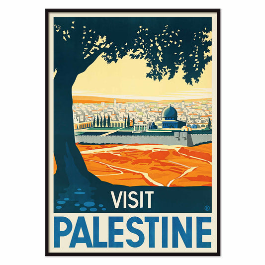
Visit Palestine Plakat
Franz Kraus · 1936 · solbeskinnet rejseplakat med Jerusalems blå kuppel under et monumentalt mørkt træ
Plakat fra 69 kr · Indrammet fra 122,67 kr
-

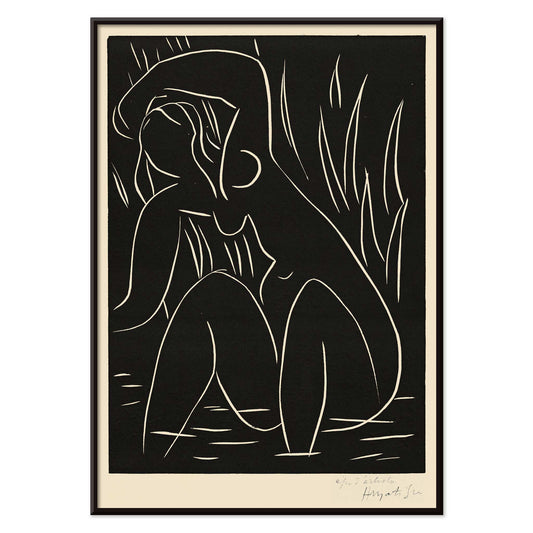
Eftermiddagen Plakat
Henri Matisse · 1941 · minimalistisk kunsttryk med en hvilende figur på mørk bund
Plakat fra 69 kr · Indrammet fra 122,67 kr
-

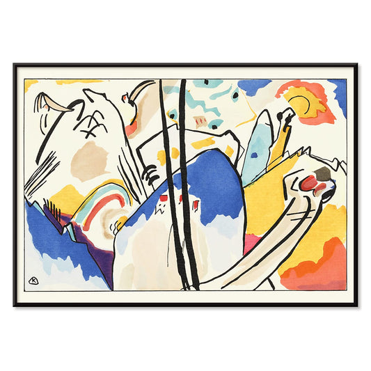
Der Blaue Reiter Plakat
Wassily Kandinsky · 1914 · Udtryksfuld abstrakt plakat med silhuet af en blå rytter og strålende farveflader
Plakat fra 69 kr · Indrammet fra 122,67 kr
-

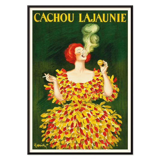
Cachou Lajaunie Plakat
Leonetto Cappiello · 1920 · Ikonisk fransk reklameplakat med en kvinde i rød dragt og hvirvlende gul røg
Plakat fra 69 kr · Indrammet fra 122,67 kr
-

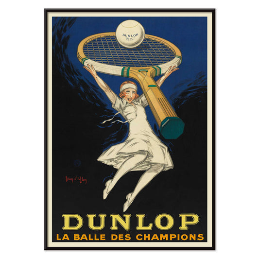
Dunlop, mesternes bold Plakat
Jean d Ylen · 1929 · dynamisk Dunlop plakat med tennisspiller under en overdimensioneret ketsjer
Plakat fra 69 kr · Indrammet fra 122,67 kr
-

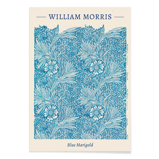
Blå morgenfrue Plakat
William Morris · 1875 · Indviklet blåt blomstertryk med morgenfrue i rytmisk Arts and Crafts-mønster
Plakat fra 69 kr · Indrammet fra 122,67 kr
-

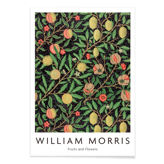
Frugtmønster Plakat
William Morris · 1862 · Frodigt frugt- og bladmønster tryk med rytmiske ranker på mørk bund
Plakat fra 69 kr · Indrammet fra 122,67 kr
-

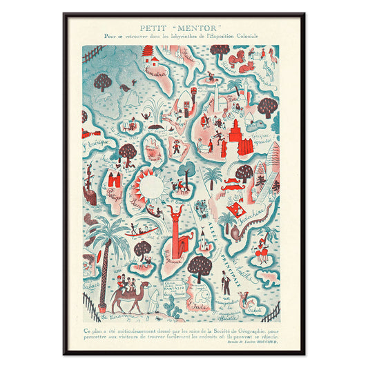
Petit Mentor Plakat
Lucien Boucher · 1931 · Legesyg Art Deco kortplakat med klare mærkater og livlige illustrationsdetaljer
Plakat fra 69 kr · Indrammet fra 122,67 kr
-


We Can Do It! Plakat
J. Howard Miller · 1942 · markant plakat med Rosie the Riveter og et stærkt krigstidsslogan
Plakat fra 69 kr · Indrammet fra 122,67 kr
-

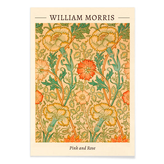
Rosa og Rose Plakat
William Morris · 1883 · Frodigt blomstertryk med indflettede roser og løv i varme vintagetoner
Plakat fra 69 kr · Indrammet fra 122,67 kr
-

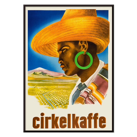
Cirkelkaffe Plakat
J. Olséns · 1945 · grafisk kaffeplakat med figur i bredskygget hat foran grønt landskab
Plakat fra 69 kr · Indrammet fra 122,67 kr
-

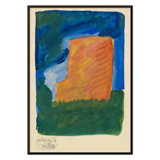
Farbstudien, 10 Blätter VI Plakat
Karl Wiener · 1923 · Livfuldt abstrakt kunsttryk med orange, blå og grønne flader på varm beige
Plakat fra 69 kr · Indrammet fra 122,67 kr
-

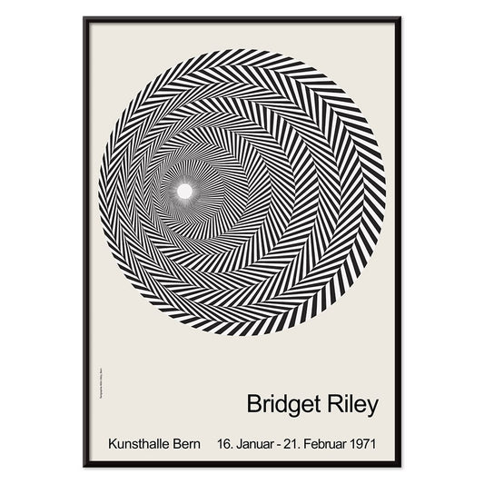
Riley Blaze Plakat
Bridget Riley · 1964 · Hypnotisk sort-hvid Op Art plakat med buede bånd der synes at pulsere
Plakat fra 69 kr · Indrammet fra 122,67 kr
-

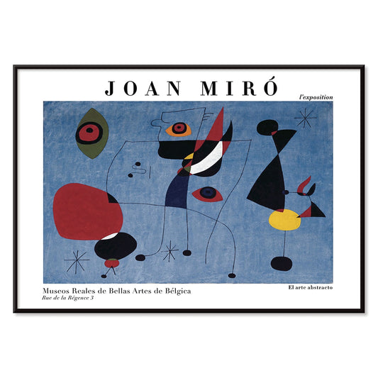
Kvinde og fugl om natten Plakat
Joan Miró · 1947 · Legende surrealistisk plakat i midnatsblåt med klare røde og gule accenter
Plakat fra 69 kr · Indrammet fra 122,67 kr
-

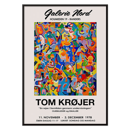
Tom Krojer Udstillingsplakat
Tom Krojer · 1989 · Dynamisk geometrisk udstillingsplakat med balancerende farveblokke og klar moderne typografi
Plakat fra 69 kr · Indrammet fra 122,67 kr
-

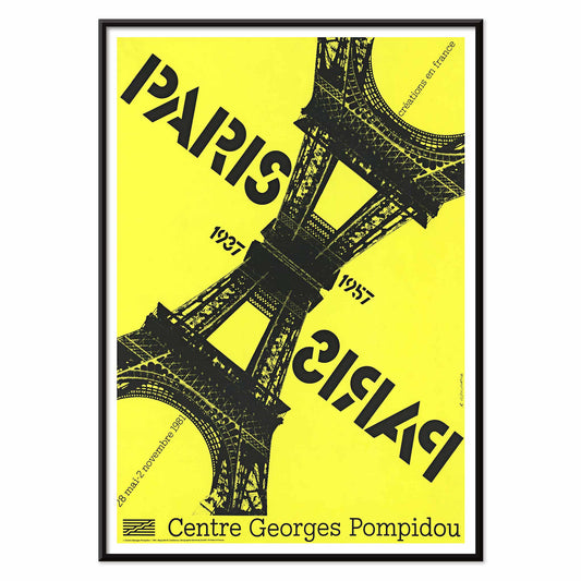
Paris-Paris 1937-1957 Plakat
Roman Cieślewicz · 1981 · parisisk plakat med spejlvendt Eiffeltårn og intens gul kontrast
Plakat fra 69 kr · Indrammet fra 122,67 kr
-

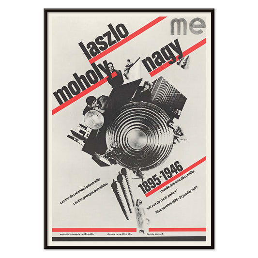
László Moholy-Nagy Plakat
Roman Cieślewicz · 1976 · Bauhausplakat med kraftig diagonal typografi og sort collagekerne
Plakat fra 69 kr · Indrammet fra 122,67 kr
-

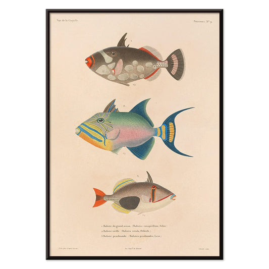
Voyage autour du monde Pl.016 Plakat
Louis-Isidore Duperrey · 1825 · håndkoloreret fiskevidenskabeligt tryk med præcis streg og levende akvatiske farver
Plakat fra 69 kr · Indrammet fra 122,67 kr
-

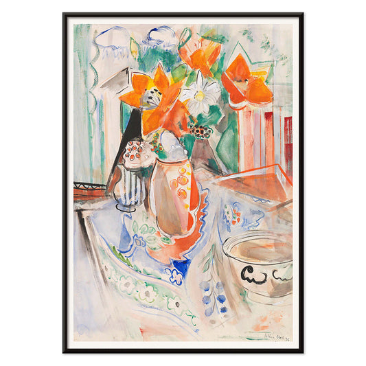
Stilleben med blomster og skål Plakat
Oskar Moll · 1902 · farverigt stillebentryk med fyldig buket og en rolig skål i fokus
Plakat fra 69 kr · Indrammet fra 122,67 kr
-

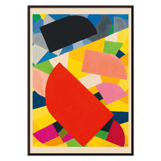
Komposition Plakat
Otto Freundlich · 1936 · Kraftfuldt geometrisk kunsttryk med sammenflettede farveflader og markant modernistisk energi
Plakat fra 69 kr · Indrammet fra 122,67 kr
-

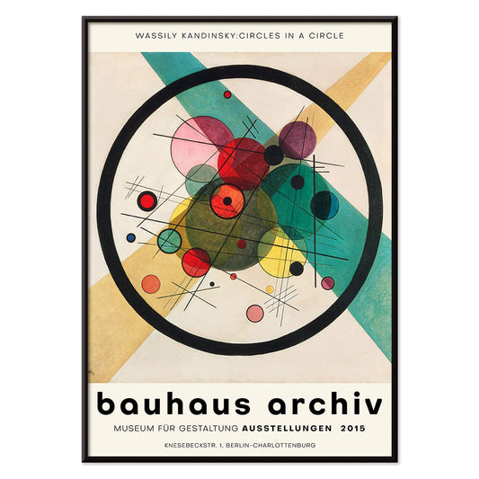
Cirkler i en cirkel Plakat
Wassily Kandinsky · 1923 · Strålende abstrakt plakat med lagdelte cirkler svævende på dyb sort baggrund
Plakat fra 69 kr · Indrammet fra 122,67 kr
-

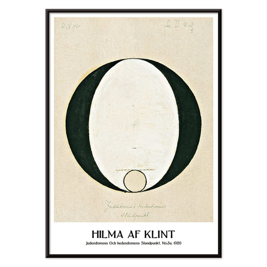
Jødedom og hedenskab, standpunkt Plakat
Hilma af Klint · 1920 · Mystisk geometrisk kunsttryk med klare sorte symboler på rolig beige baggrund
Plakat fra 69 kr · Indrammet fra 122,67 kr
-

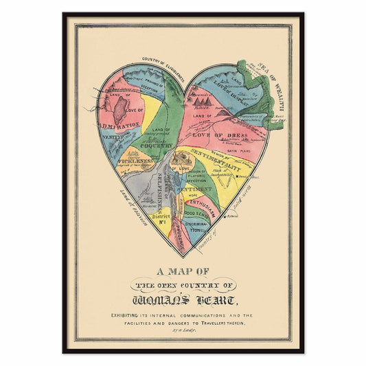
Kvindehjertets åbne land Plakat
E.B. & E.C. Kellogg · 1846 · et allegorisk hjertekort over farverige egne, veje og følelsesmæssige farer
Plakat fra 69 kr · Indrammet fra 122,67 kr
-

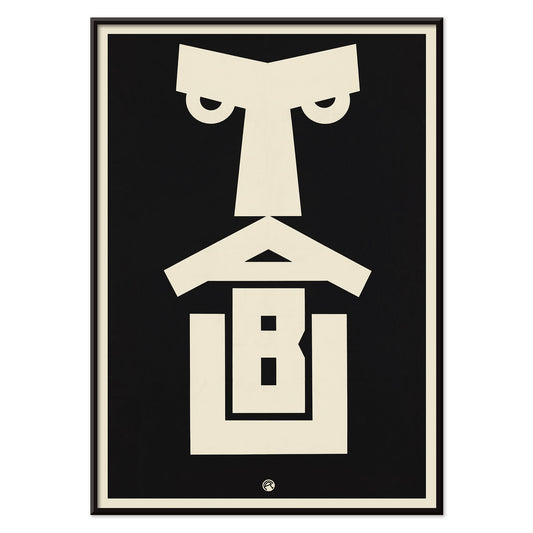
Tabu Plakat
Julius Klinger · 1919 · markant Tabu plakat med et stramt ansigt i lodret format
Plakat fra 69 kr · Indrammet fra 122,67 kr
-

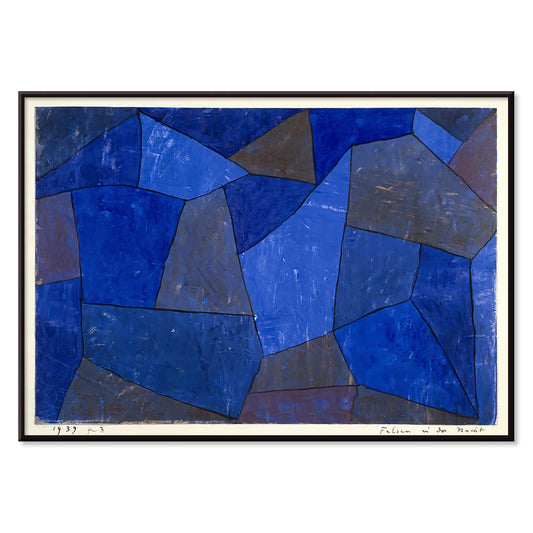
Klipper om natten Plakat
Paul Klee · 1939 · Drømmende abstrakt kunsttryk med stablede blå former der minder om klipper i natten
Plakat fra 69 kr · Indrammet fra 122,67 kr
-

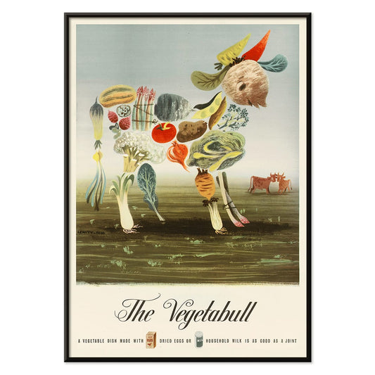
Grøntsagsokse Plakat
Lewitt-Him · 1933 · legesyg grøntsagsokse plakat med markedsstemning, kraftfulde grafiske former og varme farver
Plakat fra 69 kr · Indrammet fra 122,67 kr
-


Zodiakens tegn Plakat
Asa Smith · 1850 · Detaljeret zodiakdiagramtryk med stjernebilleder og præcis victoriansk stregføring
Plakat fra 69 kr · Indrammet fra 122,67 kr


72/222 items
- Model på bådkanten Plakat
- Sort kat 3 Plakat
- Bauhaus 21 Plakat
- Farbstudien, 10 Blätter VIII Plakat
- Nickerson Paine iført bikini Plakat
- Fuji Plakat
- Havliv Plakat
- Métamorphose du violon Plakat
- Coffea arabica Plakat
- Le rêve plakat
- The New Yorker 1935 Plakat
- Blomstrende kirsebær på månenatten Plakat
- Yoshino Plakat
- Flere farvede stjerner Plakat
- De ti største nr. 8 Plakat
- Hibiscus Plakat
- Vægmaleridesign Plakat
- Komposition i rød, blå, grøn og gul Plakat
- Le Ciel Plakat
- Røde og grønne tomater Plakat
- Tropiske blomster II Plakat
- Karminvask Plakat
- Yatsuo no tsubaki Plakat
- De to fortabte Plakat
- Kabuki Plakat
- Les Lalanne Plakat
- Frie former Plakat
- Bauhausudstillingsplakat
- Mexicansk kunst og liv 1 Plakat
- Persiske nattergale Plakat
- Hammamet Plakat
- Klase af grønne druer Plakat
- Stærkt abstraheret halvfigur Plakat
- Pilegren Plakat
- Rød, blå, grøn plakat
- Håndlæsning Plakat
- Huile Lesieur Plakat
- Der Blaue Reiter Plakat
- Cachou Lajaunie Plakat
- Blå morgenfrue Plakat
- Frugtmønster Plakat
- Petit Mentor Plakat
- Rosa og Rose Plakat
- Cirkelkaffe Plakat
- Riley Blaze Plakat
- Kvinde og fugl om natten Plakat
- Tom Krojer Udstillingsplakat
- Komposition Plakat
- Cirkler i en cirkel Plakat
- Jødedom og hedenskab, standpunkt Plakat
- Grøntsagsokse Plakat
- Zodiakens tegn Plakat
A curator-led cross section of poster culture
Our Selection gathers the kind of images that once lived on street corners, in shop windows, and on gallery walls, then learned how to behave in a home. It is not a single movement but a conversation between vintage poster design, modern art print sensibilities, and documentary photography. The common thread is legibility and atmosphere: work that reads clearly from a distance, then rewards a closer look with paper grain, ink edges, and deliberate restraint. For a broader overview of formats and eras, the main All Posters index helps place this edit in context.
Design history in miniature, from lithography to the photo screen
Classic posters were engineered for attention, which is why their compositions tend to be decisive: simplified shapes, high contrast, and typography that can hold its own against city noise. Many of the most memorable examples relied on lithography, where separate colour stones built flat fields that still feel fresh today. Later processes introduced halftone dots and photographic grain, adding a different kind of texture and realism. If you gravitate toward structure and reduced form, the language of abstract graphics often sits nearby; for an image with a quieter, observational pull, Photo offers a related sensibility. A more nervous, handwritten line can be found through Egon Schiele, where drawing becomes psychology as much as depiction.
Interior placement: how to use a varied edit room by room
Because the selection spans several visual registers, it works best when the room sets the volume. In living spaces with oak, linen, or boucle, choose a vintage poster with softened pigments or warm paper tones so the wall art feels integrated rather than loud. Hallways benefit from vertical emphasis and repeated intervals, which is where Vertical Posters can help establish rhythm. In kitchens and dining corners, sharper typography and botanical detail tend to feel natural; pairing with Botanical keeps the palette grounded in greens and off-whites. For bedrooms, lean toward lower contrast prints and calmer spacing, or move into the tonal discipline of Black & White to keep the light gentle.
Curating a gallery wall without forcing harmony
Good decoration relies on pacing: one assertive image, several quieter ones, and a repeated cue that ties the set together, such as a single ink colour or shared margin width. A practical approach is to anchor the group with a typographic or emblematic sheet, then add a photograph or landscape fragment as a softer counterweight. When you want a stronger graphic note, borrow a companion from Advertising; when you want slower, museum-like cadence, echo it with a piece from Classic Art. Frame choice does the final editing: pale wood lifts warm palettes, black metal sharpens linework, and a generous mount makes aged paper feel intentional. A simple route is to keep frames consistent while letting imagery vary, then adjust spacing until the negative space becomes part of the composition.
An edit that can evolve with your rooms
The strength of Our Selection is its openness: it behaves like a personal archive, ready to be re-sequenced as furniture shifts and colour choices mature. Some homes keep the mix eclectic; others gradually steer it toward a decade, a subject, or a single dominant hue. Either way, the poster and print languages here were made to coexist, and the most convincing gallery walls are the ones that look accumulated rather than planned.