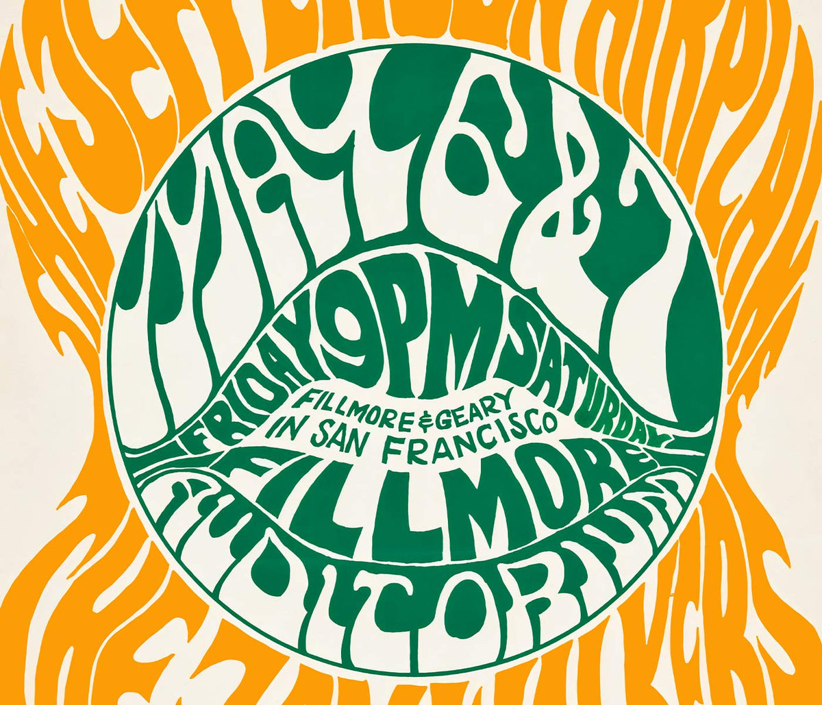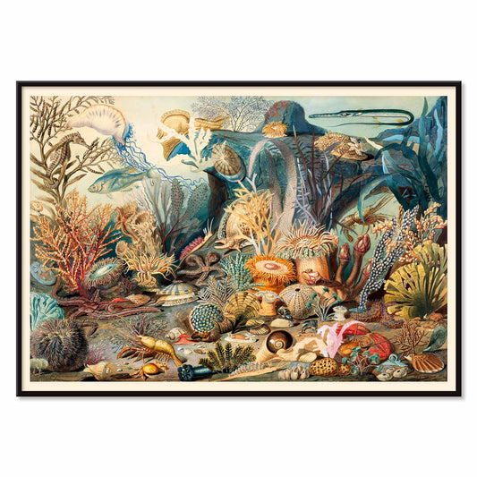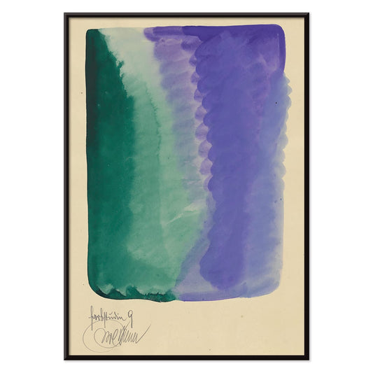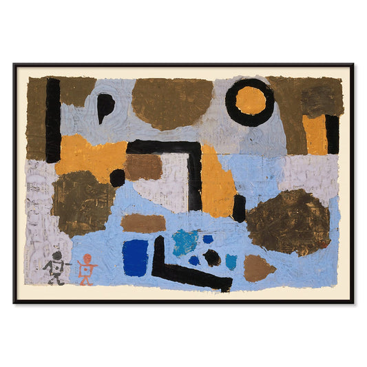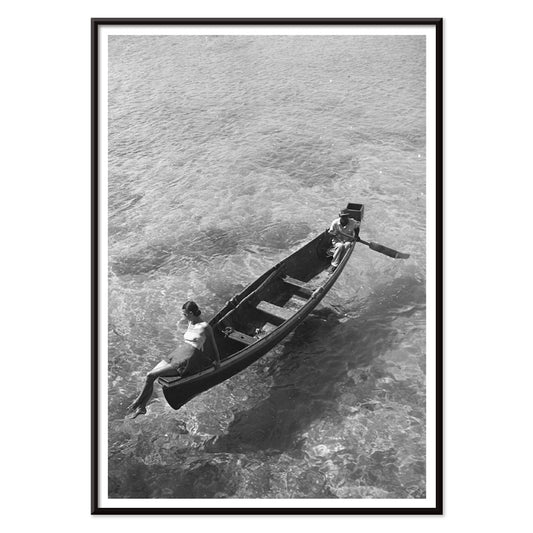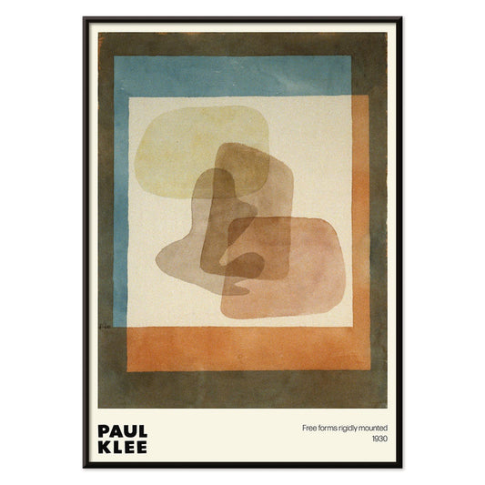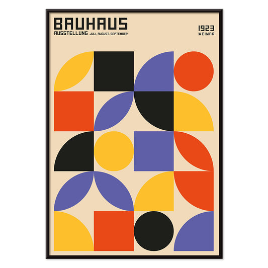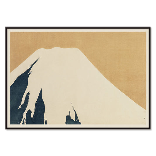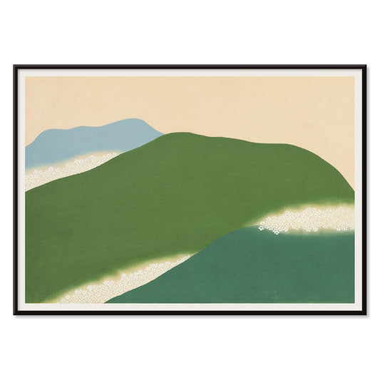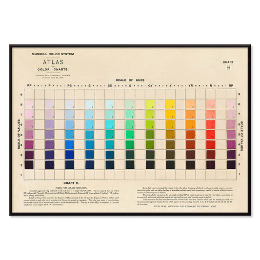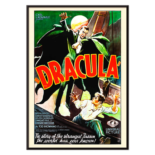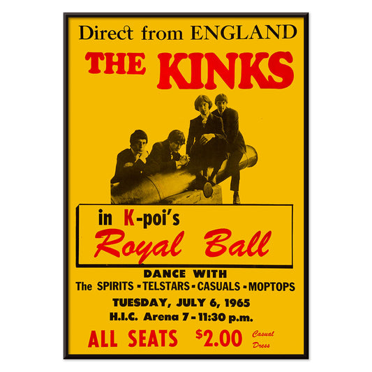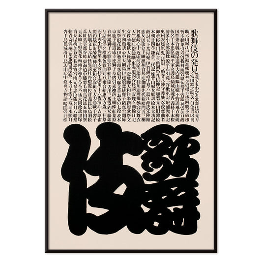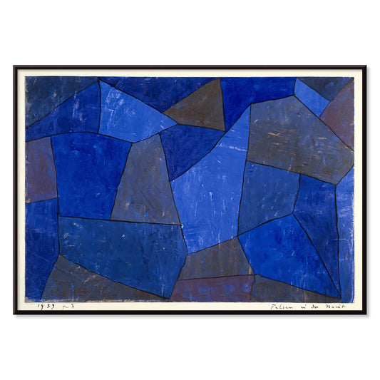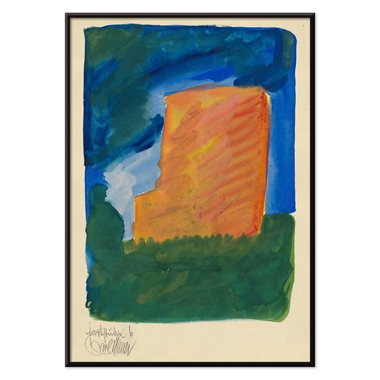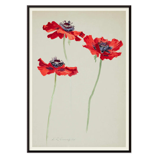




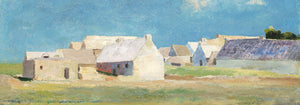


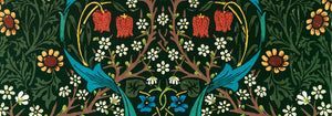
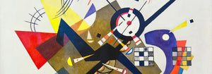

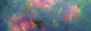

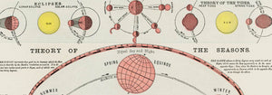
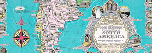
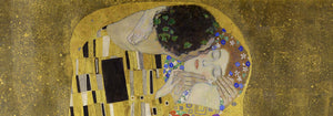






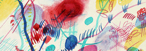
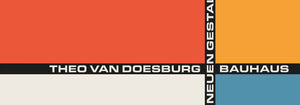
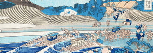


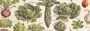



- Geografisk vejviser til en kvindes hjerte Plakat
- Red hvalerne Plakat
- Havbundens Plakat
- The New Yorker Plakat
- Vågn op og læs Plakat
- Coffea arabica 3 Plakat
- Sigmund Freud havde ret Plakat
- Den store bølge ved Kanagawa Plakat
- Den store bølge plakat
- Zoologischer Garten Plakat
- Øl og cigaret Plakat
- Ecchu Umidani bjergpas Plakat
- Sort kat 2 Plakat
- Le Voyage de Babar Plakat
- Panter Plakat
- Grands Prix de France Plakat
- Trikolore luftballon Plakat
- Nu Bleu II Plakat
- Histoire de Babar Plakat
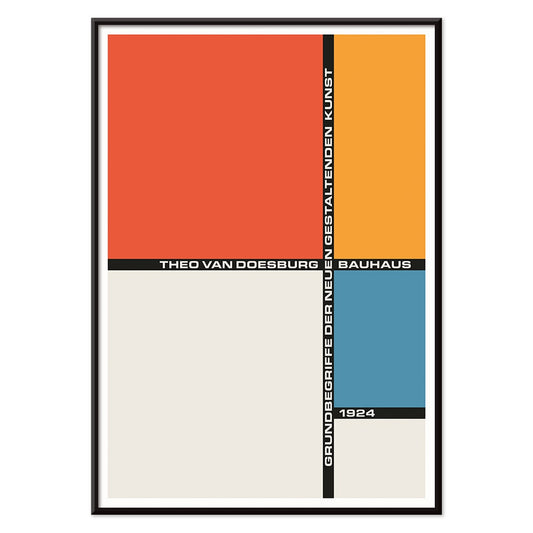
- Bauhaus 2 Plakat
- Bleu de Ciel Plakat
- Babar i bil Plakat
- Papiers découpés 3 Plakat
- Sort kat 4 Plakat
- Pukkelhval og minkehval Plakat
- Vertigo Plakat
- Tiger fra Ryōkoku Plakat
- Nu Bleu III Plakat
- Surfbrætspatent Plakat
- Musikinstrumentpatent Plakat
- Solaris Plakat
- Cordial Campari Plakat
- Dansende figurer Matisse Plakat
- Rød krontrane Plakat
- Sort leopard Plakat
- Mickey Mouse Plakat
- Drømmen Plakat
- Siddende kat set bagfra Plakat
- Siddende kat set fra venstre Plakat
- Asakusa Kinryuzan tempel Plakat
- Star Wars AT-AT Patent Plakat
- Papiers découpés 1 Plakat
- Marihuana Plakat
- Sort kat 3 Plakat
- Rosa flamingo Plakat
- Den moderne plakat
- Le Siniolchu Plakat
- Coffea Arabica 2 Plakat
- Yatsuo no tsubaki Plakat
- Befolkningskort Plakat
- Havliv Plakat
- Farbstudien, 10 Blätter IX Plakat
- De to fortabte Plakat
- Barcelona Tekst Plakat
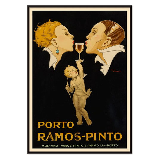
- Porto Ramos-Pinto Plakat
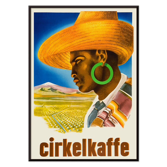
- Cirkelkaffe Plakat
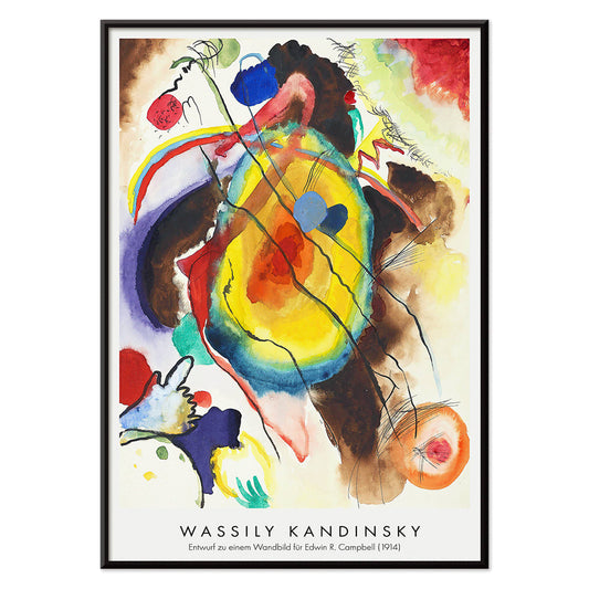
- Vægmaleridesign Plakat
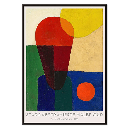
- Stærkt abstraheret halvfigur Plakat
- Bauhaus 21 Plakat
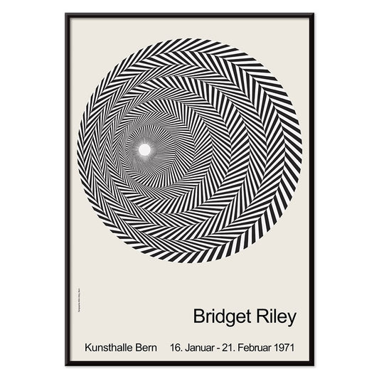
- Riley Blaze Plakat
- Model på bådkanten Plakat
- Nickerson Paine iført bikini Plakat
- Frie former Plakat
- Bauhaus 10 Plakat
- Fuji Plakat
- Yoshino Plakat
- Atlas over Munsell farvesystem Plakat
- Dracula Plakat
- The Kinks i Honolulu Plakat
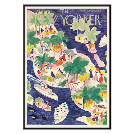
- The New Yorker 1935 Plakat
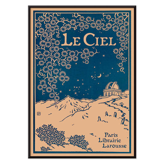
- Le Ciel Plakat
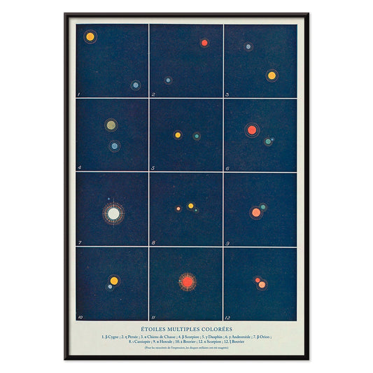
- Flere farvede stjerner Plakat
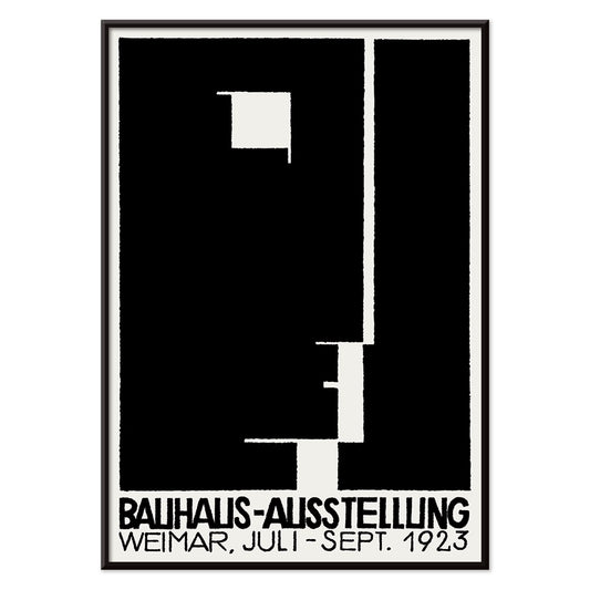
- Bauhausudstillingsplakat
- Kabuki Plakat
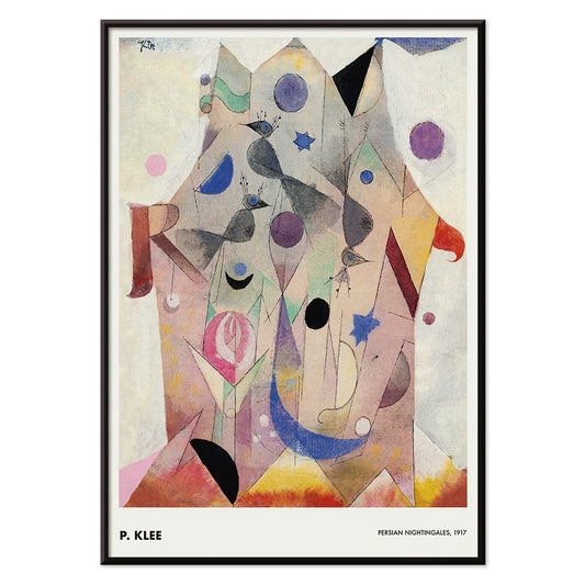
- Persiske nattergale Plakat
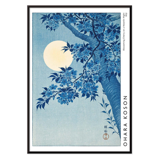
- Blomstrende kirsebær på månenatten Plakat
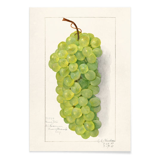
- Klase af grønne druer Plakat
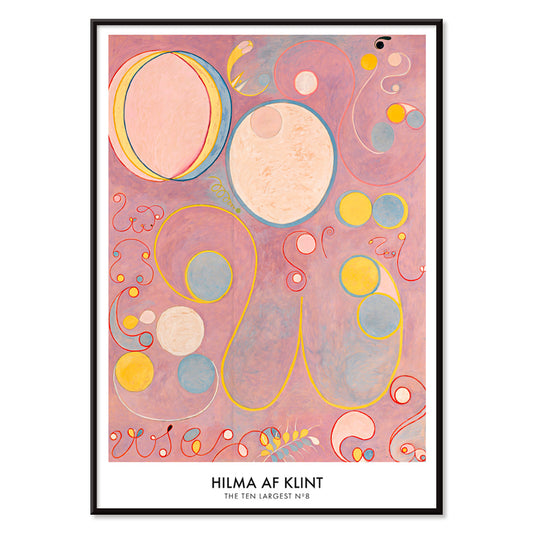
- De ti største nr. 8 Plakat
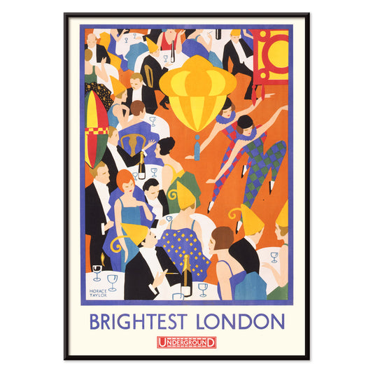
- Lysende London Plakat
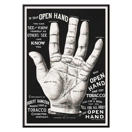
- Håndlæsning Plakat
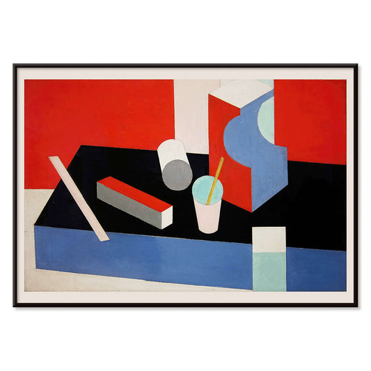
- Kubik Plakat


A curator-led cross section of poster culture
Our Selection gathers the kind of images that once lived on street corners, in shop windows, and on gallery walls, then learned how to behave in a home. It is not a single movement but a conversation between vintage poster design, modern art print sensibilities, and documentary photography. The common thread is legibility and atmosphere: work that reads clearly from a distance, then rewards a closer look with paper grain, ink edges, and deliberate restraint. For a broader overview of formats and eras, the main All Posters index helps place this edit in context.
Design history in miniature, from lithography to the photo screen
Classic posters were engineered for attention, which is why their compositions tend to be decisive: simplified shapes, high contrast, and typography that can hold its own against city noise. Many of the most memorable examples relied on lithography, where separate colour stones built flat fields that still feel fresh today. Later processes introduced halftone dots and photographic grain, adding a different kind of texture and realism. If you gravitate toward structure and reduced form, the language of abstract graphics often sits nearby; for an image with a quieter, observational pull, Photo offers a related sensibility. A more nervous, handwritten line can be found through Egon Schiele, where drawing becomes psychology as much as depiction.
Interior placement: how to use a varied edit room by room
Because the selection spans several visual registers, it works best when the room sets the volume. In living spaces with oak, linen, or boucle, choose a vintage poster with softened pigments or warm paper tones so the wall art feels integrated rather than loud. Hallways benefit from vertical emphasis and repeated intervals, which is where Vertical Posters can help establish rhythm. In kitchens and dining corners, sharper typography and botanical detail tend to feel natural; pairing with Botanical keeps the palette grounded in greens and off-whites. For bedrooms, lean toward lower contrast prints and calmer spacing, or move into the tonal discipline of Black & White to keep the light gentle.
Curating a gallery wall without forcing harmony
Good decoration relies on pacing: one assertive image, several quieter ones, and a repeated cue that ties the set together, such as a single ink colour or shared margin width. A practical approach is to anchor the group with a typographic or emblematic sheet, then add a photograph or landscape fragment as a softer counterweight. When you want a stronger graphic note, borrow a companion from Advertising; when you want slower, museum-like cadence, echo it with a piece from Classic Art. Frame choice does the final editing: pale wood lifts warm palettes, black metal sharpens linework, and a generous mount makes aged paper feel intentional. A simple route is to keep frames consistent while letting imagery vary, then adjust spacing until the negative space becomes part of the composition.
An edit that can evolve with your rooms
The strength of Our Selection is its openness: it behaves like a personal archive, ready to be re-sequenced as furniture shifts and colour choices mature. Some homes keep the mix eclectic; others gradually steer it toward a decade, a subject, or a single dominant hue. Either way, the poster and print languages here were made to coexist, and the most convincing gallery walls are the ones that look accumulated rather than planned.


