


- Geografisk vejviser til en kvindes hjerte Plakat
- Red hvalerne Plakat
- Portugal i dag Plakat
- The New Yorker Plakat
- Øl og cigaret Plakat
- Zoologischer Garten Plakat
- Den store bølge ved Kanagawa Plakat
- Porto Ramos-Pinto Plakat
- Havbundens Plakat
- Babar i bil Plakat
- Vågn op og læs Plakat
- Sort kat 2 Plakat
- Grands Prix de France Plakat
- Sigmund Freud havde ret Plakat
- Dansende figurer Matisse Plakat
- Trikolore luftballon Plakat
- Nu Bleu III Plakat
- Le Voyage de Babar Plakat
- Marihuana Plakat
- Solaris Plakat
- Panter Plakat
- Coffea arabica 3 Plakat
- Cordial Campari Plakat
- Drømmen Plakat
- Papiers découpés 3 Plakat
- Tiger fra Ryōkoku Plakat
- Papiers découpés 1 Plakat
- Den store bølge plakat
- Barcelona Tekst Plakat
- Bleu de Ciel Plakat
- Sort kat 4 Plakat
- Siddende kat set fra venstre Plakat
- Bauhaus 2 Plakat
- Asakusa Kinryuzan tempel Plakat
- Nu Bleu II Plakat
- Star Wars AT-AT Patent Plakat
- Histoire de Babar Plakat
- Surfbrætspatent Plakat
- Sort leopard Plakat
- Siddende kat set bagfra Plakat
- Bauhaus 6 Plakat
- Mickey Mouse Plakat
- Musikinstrumentpatent Plakat
- Vertigo Plakat
- Avocado (Persea) Plakat
- Brazil 2 Plakat
- Coffea Arabica 2 Plakat
- Befolkningskort Plakat
- Farverig arkitektur plakat
- Bauhaus 10 Plakat
-
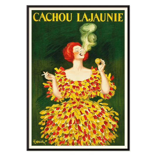
Cachou Lajaunie Plakat
Leonetto Cappiello · 1920 · Ikonisk fransk reklameplakat med en kvinde i rød dragt og hvirvlende gul røg
Plakat fra 69 kr · Indrammet fra 122,67 kr
Normalpris Fra 46,00 krNormalpris -
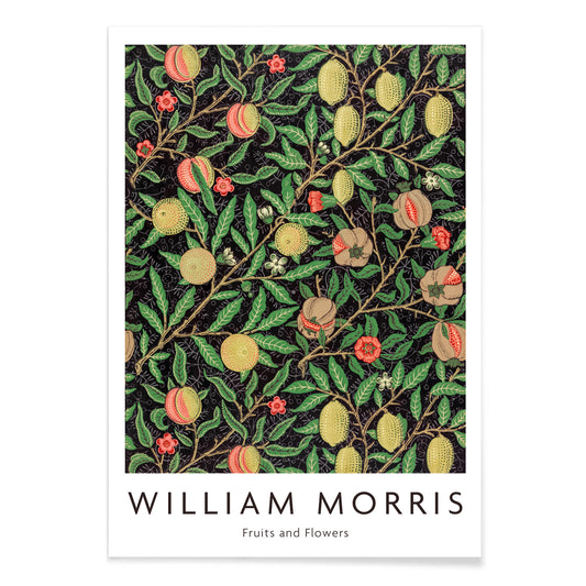
Frugtmønster Plakat
William Morris · 1862 · Frodigt frugt- og bladmønster tryk med rytmiske ranker på mørk bund
Plakat fra 69 kr · Indrammet fra 122,67 kr
Normalpris Fra 46,00 krNormalpris -
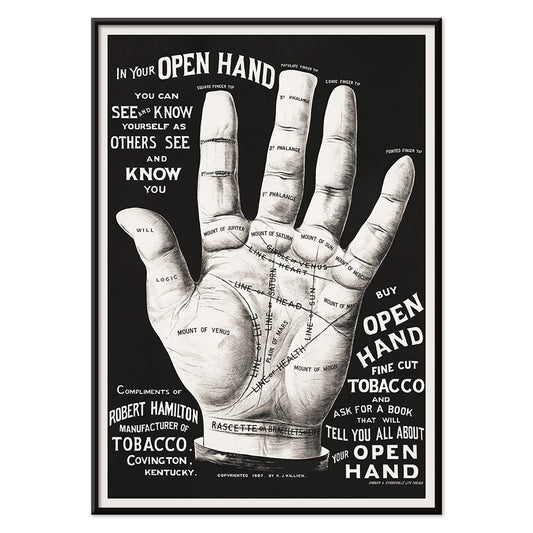
Håndlæsning Plakat
Ukendt kunstner · 2015 · Vintageinspireret håndlæsningplakat med åben hånd tegnet i indviklede sorte linjer
Plakat fra 69 kr · Indrammet fra 122,67 kr
Normalpris Fra 46,00 krNormalpris -
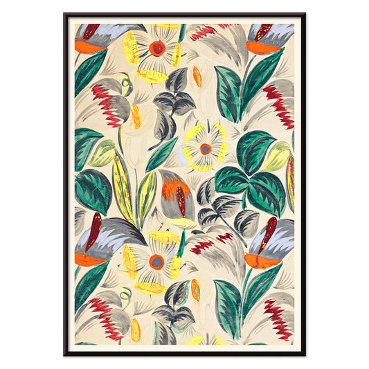
Tropiske blomster II Plakat
Ukendt kunstner · 1912 · Dekorativt tropisk blomstertryk med stiliseret løv og varm tidlig moderne mønsterrytme
Plakat fra 69 kr · Indrammet fra 122,67 kr
Normalpris Fra 46,00 krNormalpris -
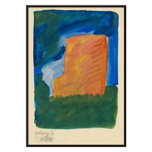
Farbstudien, 10 Blätter VI Plakat
Karl Wiener · 1923 · Livfuldt abstrakt kunsttryk med orange, blå og grønne flader på varm beige
Plakat fra 69 kr · Indrammet fra 122,67 kr
Normalpris Fra 46,00 krNormalpris -
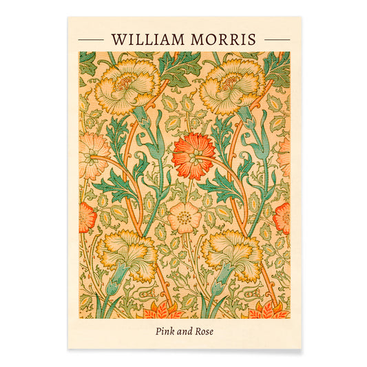
Rosa og Rose Plakat
William Morris · 1883 · Frodigt blomstertryk med indflettede roser og løv i varme vintagetoner
Plakat fra 69 kr · Indrammet fra 122,67 kr
Normalpris Fra 46,00 krNormalpris -
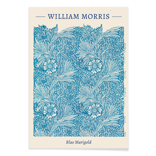
Blå morgenfrue Plakat
William Morris · 1875 · Indviklet blåt blomstertryk med morgenfrue i rytmisk Arts and Crafts-mønster
Plakat fra 69 kr · Indrammet fra 122,67 kr
Normalpris Fra 46,00 krNormalpris -
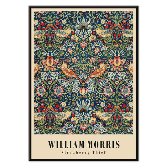
Jordbærtyven Plakat
William Morris · 1883 · Ikonisk Arts and Crafts plakat med drosler, jordbær og snoet løv i dybe blå farver
Plakat fra 69 kr · Indrammet fra 122,67 kr
Normalpris Fra 46,00 krNormalpris -
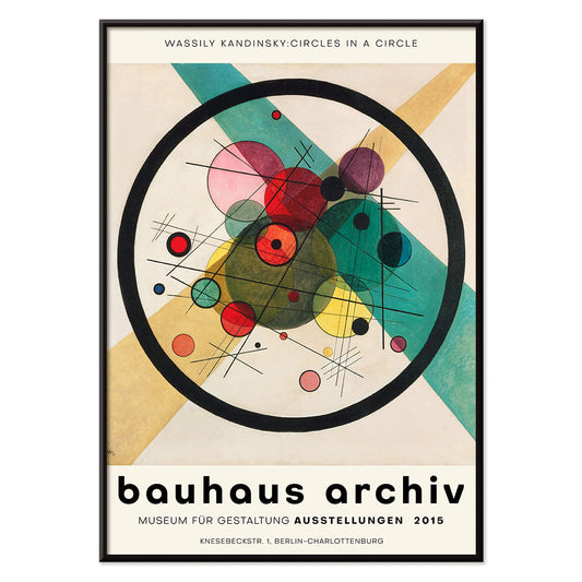
Cirkler i en cirkel Plakat
Wassily Kandinsky · 1923 · Strålende abstrakt plakat med lagdelte cirkler svævende på dyb sort baggrund
Plakat fra 69 kr · Indrammet fra 122,67 kr
Normalpris Fra 46,00 krNormalpris -
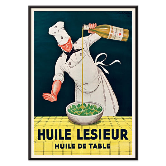
Huile Lesieur Plakat
Leonetto Cappiello · 1930 · Livlig reklameplakat med kok, gylden olie og kraftig rød typografi på sort baggrund
Plakat fra 69 kr · Indrammet fra 122,67 kr
Normalpris Fra 46,00 krNormalpris -
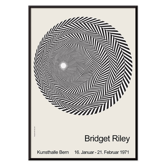
Riley Blaze Plakat
Bridget Riley · 1964 · Hypnotisk sort-hvid Op Art plakat med buede bånd der synes at pulsere
Plakat fra 69 kr · Indrammet fra 122,67 kr
Normalpris Fra 46,00 krNormalpris -
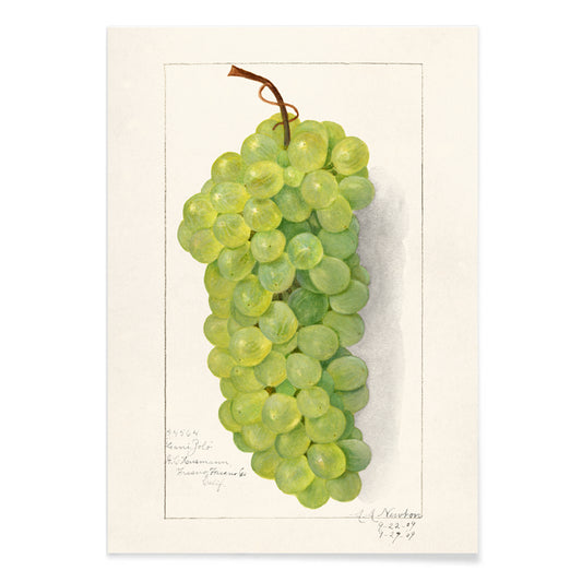
Klase af grønne druer Plakat
Amanda Almira Newton · 1896 · Fint botanisk tryk med druernes gennemsigtige skind og bløde skygger
Plakat fra 69 kr · Indrammet fra 122,67 kr
Normalpris Fra 46,00 krNormalpris -
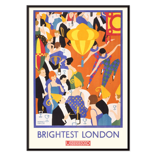
Lysende London Plakat
Horace Taylor · 1924 · Energisk London nattelivsplakat med varmt lys og strømlinet Underground typografi
Plakat fra 69 kr · Indrammet fra 122,67 kr
Normalpris Fra 46,00 krNormalpris -
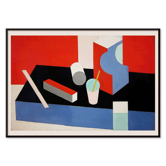
Kubik Plakat
Patrick Henry Bruce · 1917 · Geometrisk kubistisk kunsttryk med sammenflettede flader i rød, blå, sort og hvid
Plakat fra 69 kr · Indrammet fra 122,67 kr
Normalpris Fra 46,00 krNormalpris -
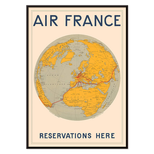
Air France Plakat
E. Giraud · 1938 · Art Deco verdenskortplakat med Air Frances ruter i kraftige røde linjer
Plakat fra 69 kr · Indrammet fra 122,67 kr
Normalpris Fra 46,00 krNormalpris -
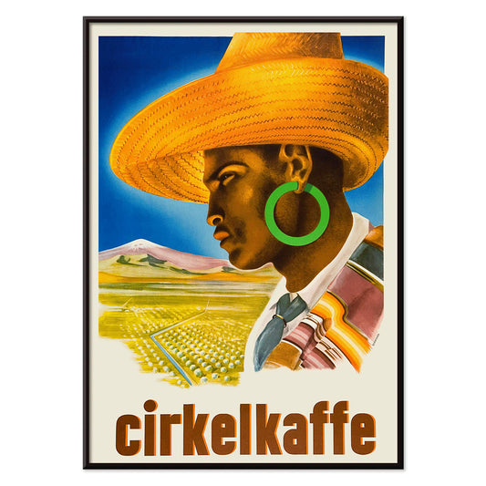
Cirkelkaffe Plakat
J. Olséns · 1945 · grafisk kaffeplakat med figur i bredskygget hat foran grønt landskab
Plakat fra 69 kr · Indrammet fra 122,67 kr
Normalpris Fra 46,00 krNormalpris -
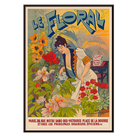
Le Floral Plakat
Ukendt kunstner · 1891 · Fint Art Nouveau plakat med en kvinde omgivet af farverige blomster og dekorative bogstaver
Plakat fra 69 kr · Indrammet fra 122,67 kr
Normalpris Fra 46,00 krNormalpris -
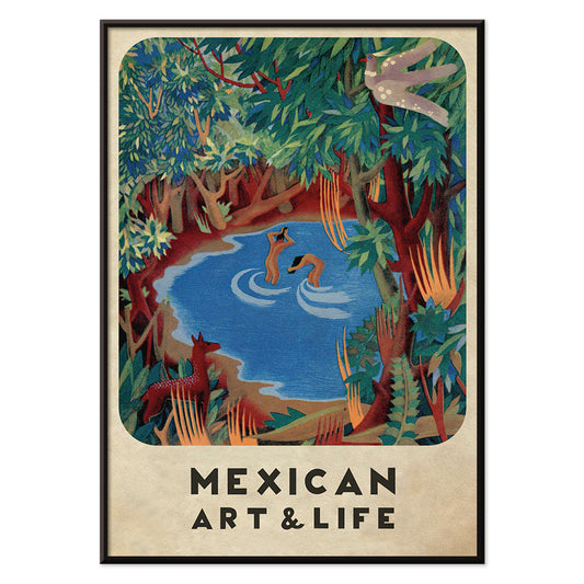
Mexican Art & Life 3 Plakat
Ukendt kunstner · 1938 · Modernistisk skovplakat med legende dyr og markant Mexican Art & Life typografi
Plakat fra 69 kr · Indrammet fra 122,67 kr
Normalpris Fra 46,00 krNormalpris -
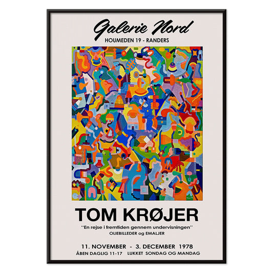
Tom Krojer Udstillingsplakat
Tom Krojer · 1989 · Dynamisk geometrisk udstillingsplakat med balancerende farveblokke og klar moderne typografi
Plakat fra 69 kr · Indrammet fra 122,67 kr
Normalpris Fra 46,00 krNormalpris -
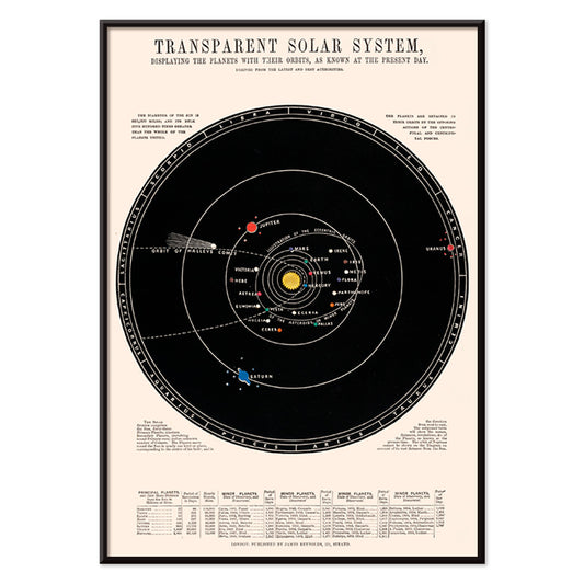
Gennemsigtigt solsystem Plakat
James Reynolds · 1851 · Detaljeret solsystem kunsttryk med mærkede baner og håndkolorerede planetdetaljer i diskrete farver
Plakat fra 69 kr · Indrammet fra 122,67 kr
Normalpris Fra 46,00 krNormalpris -
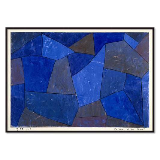
Klipper om natten Plakat
Paul Klee · 1939 · Drømmende abstrakt kunsttryk med stablede blå former der minder om klipper i natten
Plakat fra 69 kr · Indrammet fra 122,67 kr
Normalpris Fra 46,00 krNormalpris -
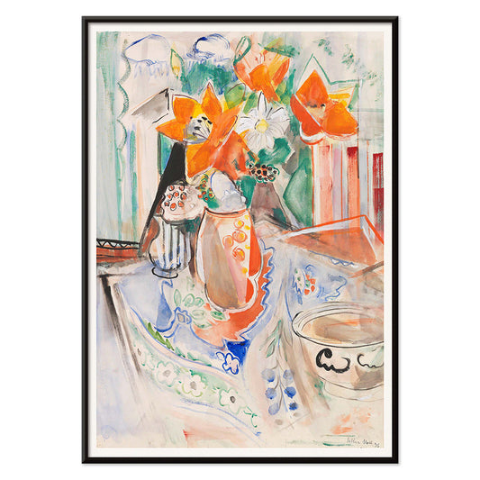
Stilleben med blomster og skål Plakat
Oskar Moll · 1902 · farverigt stillebentryk med fyldig buket og en rolig skål i fokus
Plakat fra 69 kr · Indrammet fra 122,67 kr
Normalpris Fra 46,00 krNormalpris -
Exposition Matisse Plakat
Ukendt kunstner · 1980 · Minimalistisk udstillingsplakat med dansende figur i sort streg og rød tekst
Plakat fra 69 kr · Indrammet fra 122,67 kr
Normalpris Fra 46,00 krNormalpris -
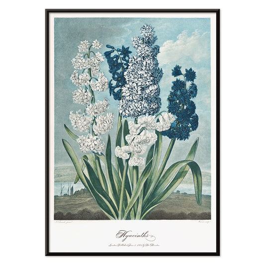
Hyacinter Plakat
Robert John Thornton · 1807 · Elegant hyacinttryk med lyse blomster og skulpturelle grønne blade
Plakat fra 69 kr · Indrammet fra 122,67 kr
Normalpris Fra 46,00 krNormalpris -
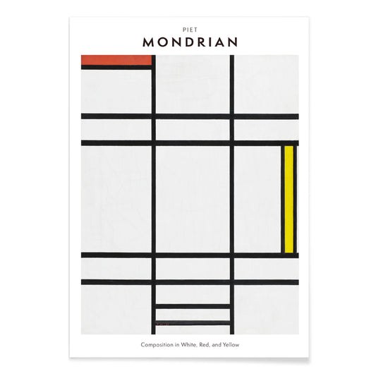
Komposition i hvid, rød og gul Plakat
Piet Mondrian · 1936 · Geometrisk kunsttryk der balancerer hvidt rum med skarpe sorte linjer og primære farveblokke
Plakat fra 69 kr · Indrammet fra 122,67 kr
Normalpris Fra 46,00 krNormalpris -
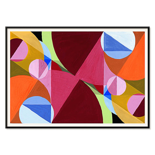
Areal brudt af vinkelrette linjer Plakat
Joseph Schillinger · 1934 · geometrisk abstrakt plakat med vinkelrette gitter og klare farveblokke i rytmisk balance
Plakat fra 69 kr · Indrammet fra 122,67 kr
Normalpris Fra 46,00 krNormalpris -
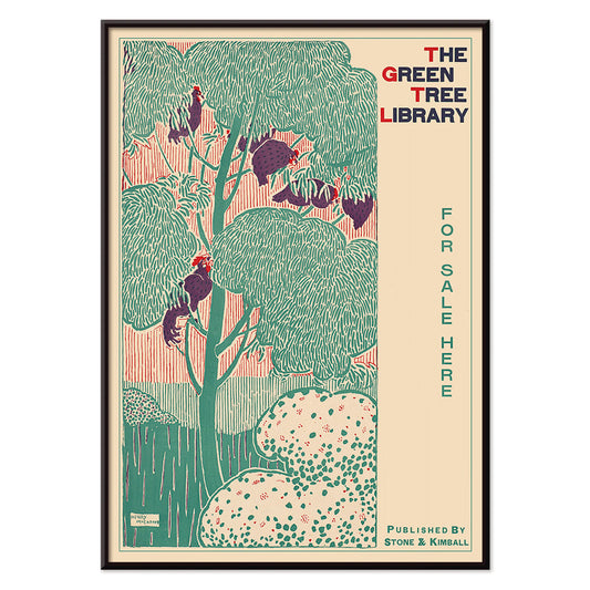
Det grønne træbibliotek Plakat
Henry McCarter · 1890 · Dekorativ bibliotekplakat med stiliseret grønt træ og kraftig art nouveautypografi
Plakat fra 69 kr · Indrammet fra 122,67 kr
Normalpris Fra 46,00 krNormalpris -
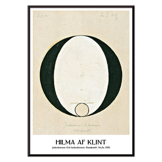
Jødedom og hedenskab, standpunkt Plakat
Hilma af Klint · 1920 · Mystisk geometrisk kunsttryk med klare sorte symboler på rolig beige baggrund
Plakat fra 69 kr · Indrammet fra 122,67 kr
Normalpris Fra 46,00 krNormalpris -
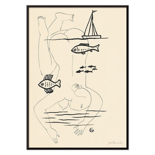
Druknet Plakat
Mikuláš Galanda · 1930 · Surrealistisk sort-hvid plakat med menneskelig skrøbelighed flettet ind i et fiskemotiv
Plakat fra 69 kr · Indrammet fra 122,67 kr
Normalpris Fra 46,00 krNormalpris -
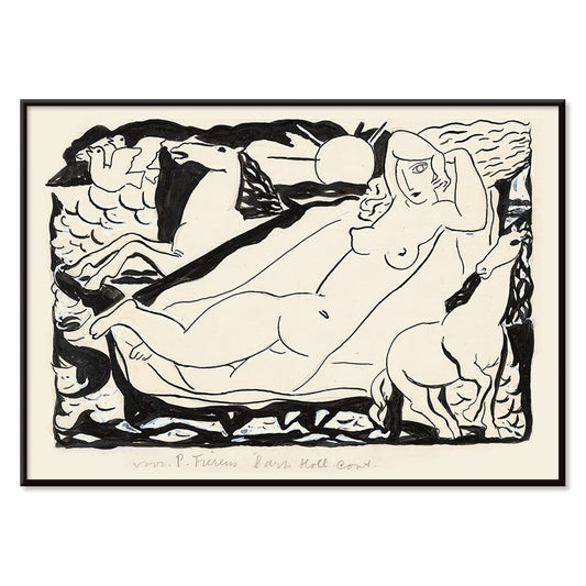
Venus Vignet Plakat
Leo Gestel · 1932 · monokrom kubistisk venus plakat med hurtige heste og markerede bevægelseslinjer
Plakat fra 69 kr · Indrammet fra 122,67 kr
Normalpris Fra 46,00 krNormalpris -
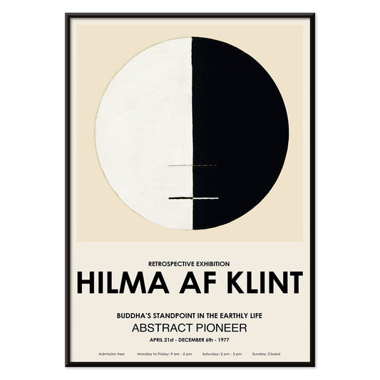
Buddhas ståsted i det jordiske liv Plakat
Hilma af Klint · 1917 · Meditativt abstrakt kunsttryk med buddhistiske symboler i en rolig cirkulær komposition
Plakat fra 69 kr · Indrammet fra 122,67 kr
Normalpris Fra 46,00 krNormalpris -
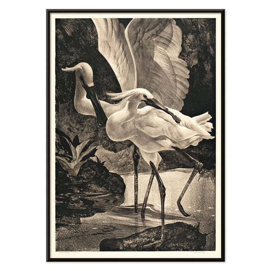
Skestorke Plakat
Adriaan van Hoff · 1923 · Elegant skestorkeplakat i skarpt sort og hvid med Art Deco-agtig ro
Plakat fra 69 kr · Indrammet fra 122,67 kr
Normalpris Fra 46,00 krNormalpris -
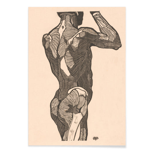
Ballemuskler Plakat
Reijer Jan Stolk · 1930 · Præcist anatomisk kunsttryk der kortlægger ballemuskler i sort streg på beige
Plakat fra 69 kr · Indrammet fra 122,67 kr
Normalpris Fra 46,00 krNormalpris -
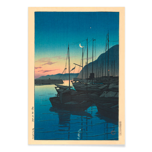
Morgen i Beppu Plakat
Kawase Hasui · 1937 · stille havn ved solopgang kunsttryk med både, tåge og lysende spejlinger
Plakat fra 69 kr · Indrammet fra 122,67 kr
Normalpris Fra 46,00 krNormalpris -
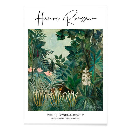
Den ækvatoriale jungle Plakat
Henri Julien Félix Rousseau · 1909 · Drømmeagtig jungelplakat med lagdelt grønt løv og skjulte dyr kigger frem
Plakat fra 69 kr · Indrammet fra 122,67 kr
Normalpris Fra 46,00 krNormalpris -
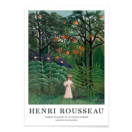
Kvinde gående i en eksotisk skov Plakat
Henri Julien Félix Rousseau · 1905 · Drømmeagtigt junglekunsttryk med en ensom kvinde midt i lagdelt tropisk løv
Plakat fra 69 kr · Indrammet fra 122,67 kr
Normalpris Fra 46,00 krNormalpris


- Cachou Lajaunie Plakat
- Frugtmønster Plakat
- Håndlæsning Plakat
- Tropiske blomster II Plakat
- Rosa og Rose Plakat
- Blå morgenfrue Plakat
- Jordbærtyven Plakat
- Cirkler i en cirkel Plakat
- Huile Lesieur Plakat
- Riley Blaze Plakat
- Klase af grønne druer Plakat
- Lysende London Plakat
- Kubik Plakat
- Air France Plakat
- Cirkelkaffe Plakat
- Le Floral Plakat
- Mexican Art & Life 3 Plakat
- Tom Krojer Udstillingsplakat
- Komposition i hvid, rød og gul Plakat
- Areal brudt af vinkelrette linjer Plakat
- Det grønne træbibliotek Plakat
- Jødedom og hedenskab, standpunkt Plakat
- Ballemuskler Plakat
- Morgen i Beppu Plakat
- Den ækvatoriale jungle Plakat
- Kvinde gående i en eksotisk skov Plakat
A curator-led cross section of poster culture
Our Selection gathers the kind of images that once lived on street corners, in shop windows, and on gallery walls, then learned how to behave in a home. It is not a single movement but a conversation between vintage poster design, modern art print sensibilities, and documentary photography. The common thread is legibility and atmosphere: work that reads clearly from a distance, then rewards a closer look with paper grain, ink edges, and deliberate restraint. For a broader overview of formats and eras, the main All Posters index helps place this edit in context.
Design history in miniature, from lithography to the photo screen
Classic posters were engineered for attention, which is why their compositions tend to be decisive: simplified shapes, high contrast, and typography that can hold its own against city noise. Many of the most memorable examples relied on lithography, where separate colour stones built flat fields that still feel fresh today. Later processes introduced halftone dots and photographic grain, adding a different kind of texture and realism. If you gravitate toward structure and reduced form, the language of abstract graphics often sits nearby; for an image with a quieter, observational pull, Photo offers a related sensibility. A more nervous, handwritten line can be found through Egon Schiele, where drawing becomes psychology as much as depiction.
Interior placement: how to use a varied edit room by room
Because the selection spans several visual registers, it works best when the room sets the volume. In living spaces with oak, linen, or boucle, choose a vintage poster with softened pigments or warm paper tones so the wall art feels integrated rather than loud. Hallways benefit from vertical emphasis and repeated intervals, which is where Vertical Posters can help establish rhythm. In kitchens and dining corners, sharper typography and botanical detail tend to feel natural; pairing with Botanical keeps the palette grounded in greens and off-whites. For bedrooms, lean toward lower contrast prints and calmer spacing, or move into the tonal discipline of Black & White to keep the light gentle.
Curating a gallery wall without forcing harmony
Good decoration relies on pacing: one assertive image, several quieter ones, and a repeated cue that ties the set together, such as a single ink colour or shared margin width. A practical approach is to anchor the group with a typographic or emblematic sheet, then add a photograph or landscape fragment as a softer counterweight. When you want a stronger graphic note, borrow a companion from Advertising; when you want slower, museum-like cadence, echo it with a piece from Classic Art. Frame choice does the final editing: pale wood lifts warm palettes, black metal sharpens linework, and a generous mount makes aged paper feel intentional. A simple route is to keep frames consistent while letting imagery vary, then adjust spacing until the negative space becomes part of the composition.
An edit that can evolve with your rooms
The strength of Our Selection is its openness: it behaves like a personal archive, ready to be re-sequenced as furniture shifts and colour choices mature. Some homes keep the mix eclectic; others gradually steer it toward a decade, a subject, or a single dominant hue. Either way, the poster and print languages here were made to coexist, and the most convincing gallery walls are the ones that look accumulated rather than planned.