




-

"Very nice Posters. The quality is amazing and we received it very quickly !"
-

"A shop to visit absolutely. Huge selection of posters. We spent more than an hour there !"
-

"Perfect to find gift. Price are very good. An they can frame and pack it on site"
About the Artist
Arlington Gregg puts his name on a memorable piece of American public-service design. In this 1936 Illinois WPA poster, Gregg turns a simple reminder about book care into a focused act of visual communication. The work connects his practice with the federally supported art programs that brought educational messages into libraries and civic settings during the Depression. Rather than relying on a commercial brand, the artist uses the direct language of advertising to reach readers. That purpose gives the Arlington Gregg art print a clear place in the history of American wall art, where practical instruction could also carry wit.
The Artwork
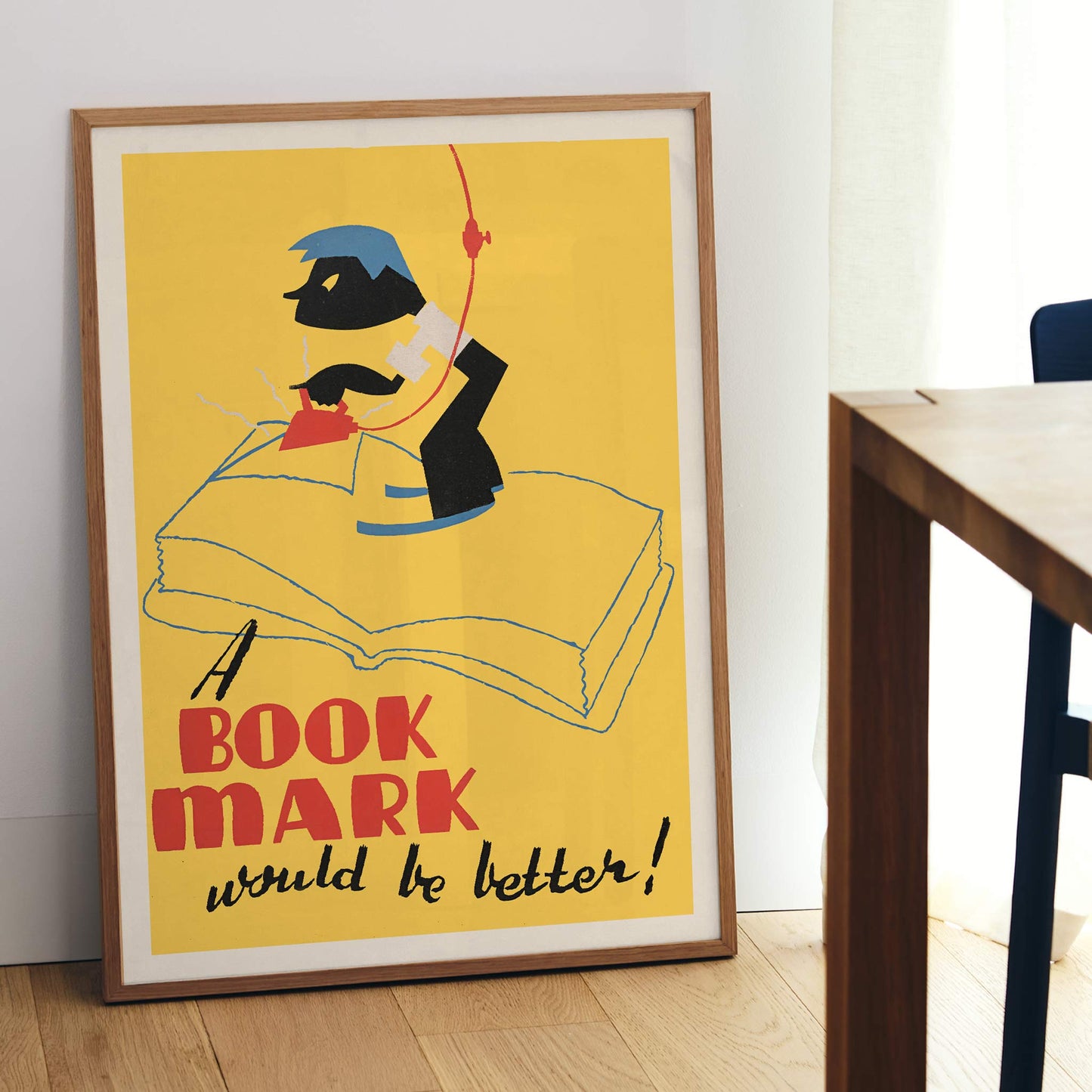
At the heart of A Book Mark Would Be Better! is a small act of public instruction: encouraging readers to use a bookmark instead of folding or pressing a page. The message belongs to the practical culture of the 1930s library, where shared books required everyday care from many users. Made through the Illinois WPA, the vintage poster carried a civic reminder into a setting where reading habits mattered. Its humor softens the correction, so the instruction feels like a friendly nudge rather than a reprimand. As a vintage print, the piece records how public art could support literacy and considerate behavior.
Style & Characteristics
The eye lands on the sunny yellow field before moving to the oversized red BOOK MARK lettering. Beneath it, black script spells out the rest of the message, giving the lower half a change of pace. Above, a stylized figure bends over the broad pages of an open book, with one dark trousered leg lifted beside the red iron. Blue linework traces page edges, while a loose cord rises toward the upper border. Beige framing and black ink keep the silkscreen colors firm. The result is a vintage poster whose ironing gesture becomes a comic visual surprise, while bold typography anchors the art print.
In Interior Design
Place the piece above a low bookcase in a dedicated reading nook, where its yellow ground can warm pale walls without turning the corner sugary. A simple black frame would echo the heavy lettering and outline, while a single brass lamp detail could repeat the red. Keep surrounding furniture quiet so the oversized book and comic ironing scene remain the focus. In this setting, the poster works as wall art with a useful subject: it adds a vintage note to home decor while reminding the reader why the nook exists. That role lets the fine art print contribute to interior decoration without crowding the corner.