


- Destroy this mad brute Poster
- Shaw or Irony Poster
- The good neighbor of South America Poster
- Italy with Vatican City Poster
- Onions Poster
- Radishes Poster
- Carrots Poster
- Les Lalanne Poster
- Punch Boutique Poster
- Dancing couple in the snow Poster
- Judaism and Paganism Standpoint Poster
- Jet Clipper to Hawaii Poster
- Campari Soda Poster
- Bec-Kina Poster
- Kohler Chocolat Poster
- Strawberry Thief Poster
- Matisse Dancing Figures Poster
- Tom Krojer Exhibition Poster Poster
- Berlin Street Scene Poster
- Ernst Kirchner Exhibition Poster
- Tour Eiffel 2 Poster
- Woman Seated Back Poster
- Red Hair Blue Hat Poster
- Park Near Lu Poster
- El Comienzo Poster
- Parler Seul 2 Poster
- The Current Standpoint of the Mahatmas Poster
- Twilight’s Ring Poster
- Parler Seul Poster
- Faun and Nymphe Poster
- The Dream Poster
- Le Concert Poster
- Bird passing through a Cloud Poster
-
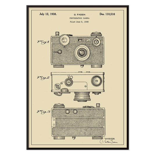
Photographic Camera Patent Poster
G. Fassin · 1938 · Precise camera patent print with numbered diagrams and crisp black linework
Poster from 69 kr · Framed from 122,67 kr
Regular price From 46,00 krRegular price -
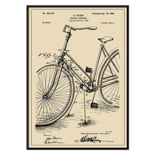
Bicycle-support Patent Poster
B. Peisen · 1899 · Detailed bicycle support vintage print with crisp patent diagrams and neat annotation
Poster from 69 kr · Framed from 122,67 kr
Regular price From 46,00 krRegular price -
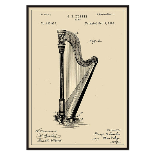
Harp Patent Poster
G.B. Durkee · 1890 · Crisp harp vintage print featuring precise patent diagrams and elegant archival typography
Poster from 69 kr · Framed from 122,67 kr
Regular price From 46,00 krRegular price -
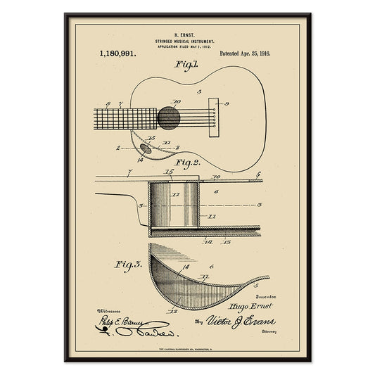
Musical Instrument Patent Poster
H. Ernst · 1916 · Intricate guitar patent print with precise diagrams and numbered callouts on warm beige
Poster from 69 kr · Framed from 122,67 kr
Regular price From 46,00 krRegular price -
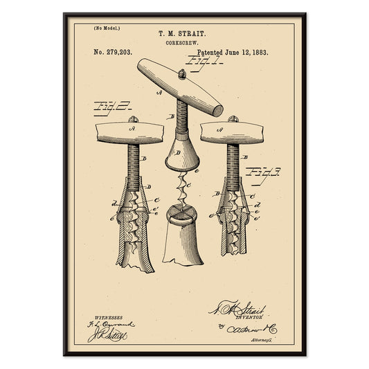
Corkscrew Patent Poster
T.M. Strait · 1883 · Detailed corkscrew patent vintage print with multiple technical views and annotations
Poster from 69 kr · Framed from 122,67 kr
Regular price From 46,00 krRegular price -
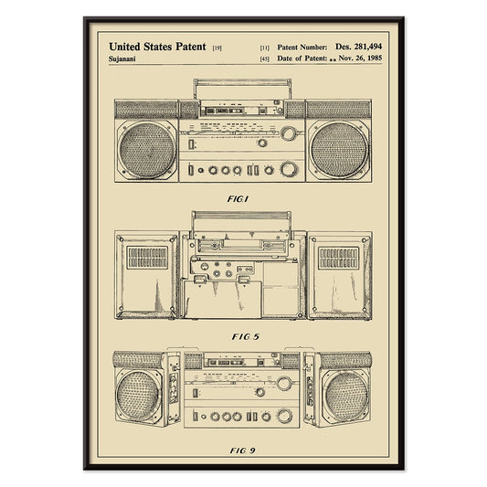
Cassette Player Patent Poster
Sujanani · 1985 · Crisp cassette player patent poster with precise black linework on warm beige background
Poster from 69 kr · Framed from 122,67 kr
Regular price From 46,00 krRegular price -
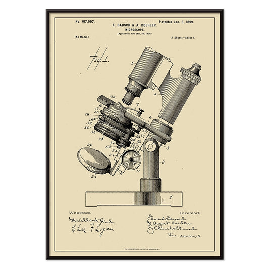
Microscope Patent Poster
E. Bausch · 1899 · Precise microscope patent print with crisp labeled linework on warm beige paper
Poster from 69 kr · Framed from 122,67 kr
Regular price From 46,00 krRegular price -
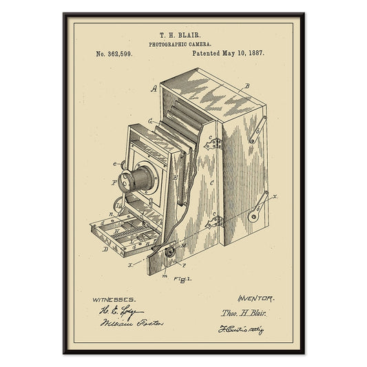
Photographic Camera Patent Poster
T.H Blair · 1887 · Detailed camera patent vintage print with crisp diagrams and numbered components
Poster from 69 kr · Framed from 122,67 kr
Regular price From 46,00 krRegular price -
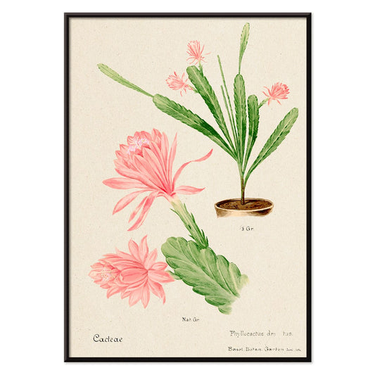
German empress cactus Poster
Unknown artist · 1899 · Delicate pink flowering cactus print with crisp botanical detail on warm beige ground
Poster from 69 kr · Framed from 122,67 kr
Regular price From 46,00 krRegular price -
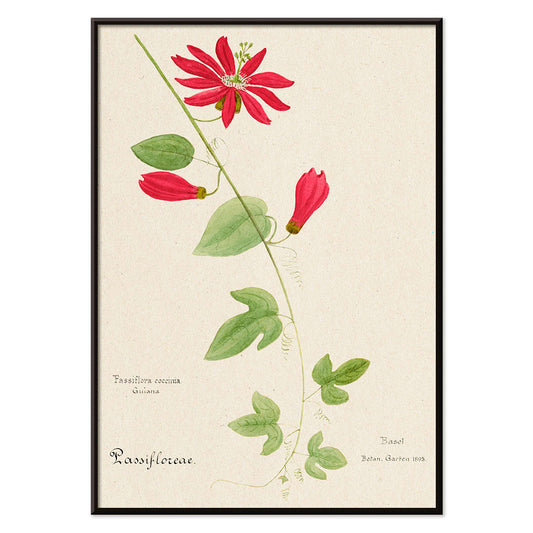
Red Granadilla Poster
Unknown artist · 1899 · Striking passionflower botanical print with scarlet blooms, green leaves, and airy beige background
Poster from 69 kr · Framed from 122,67 kr
Regular price From 46,00 krRegular price -
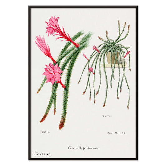
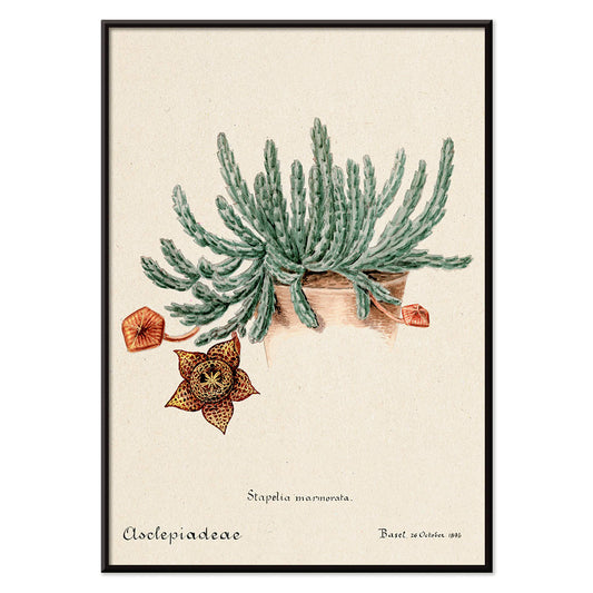
Rattail Cactus Poster
Unknown artist · 1899 · Elegant rattail cactus print with trailing green stems and red pink blossoms
Poster from 69 kr · Framed from 122,67 kr
Regular price From 46,00 krRegular price -
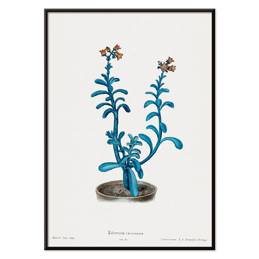
Brown sugar echeveria Poster
Unknown artist · 1899 · Detailed botanical print of echeveria racemosa with cool blue-green leaves and red-tipped blooms
Poster from 69 kr · Framed from 122,67 kr
Regular price From 46,00 krRegular price -
Beehive cactus Poster
Unknown artist · 1899 · Detailed beehive cactus botanical print with soft green tones and delicate red flowers
Poster from 69 kr · Framed from 122,67 kr
Regular price From 46,00 krRegular price -
Rainbow Pincushion cactus and Easter lily Poster
Unknown artist · 1899 · Detailed botanical print of cactus and lily contrasting spiny forms with soft white flowers
Poster from 69 kr · Framed from 122,67 kr
Regular price From 46,00 krRegular price -
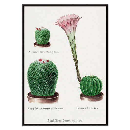
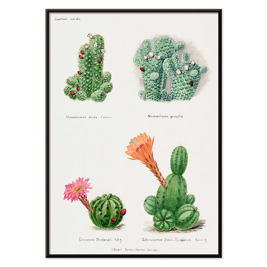
Assorted cacti Poster
Unknown artist · 1899 · Lively cactus botanical print with multiple forms and bright blossoms on clean paper
Poster from 69 kr · Framed from 122,67 kr
Regular price From 46,00 krRegular price -
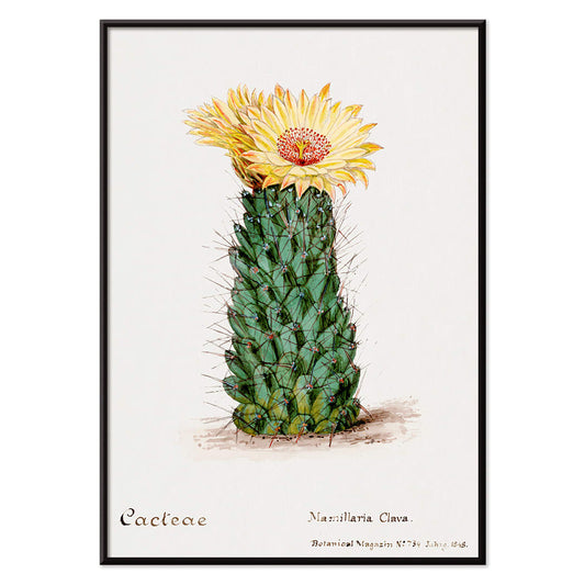
Starfish cactus Poster
Unknown artist · 1899 · Detailed starfish cactus botanical print featuring a dramatic speckled bloom on beige paper
Poster from 69 kr · Framed from 122,67 kr
Regular price From 46,00 krRegular price -
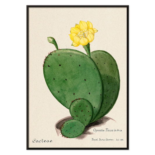
Indian fig opuntia cactus Poster
Unknown artist · 1899 · Detailed opuntia cactus botanical print with segmented green pads and a soft yellow bloom
Poster from 69 kr · Framed from 122,67 kr
Regular price From 46,00 krRegular price -
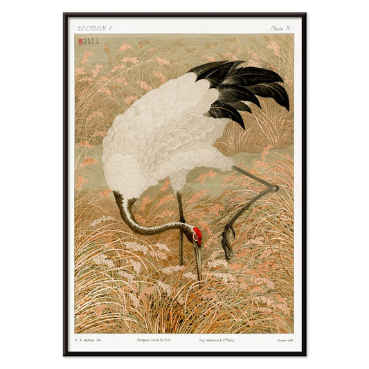
Sarus crane in rice field Poster
Unknown artist · 1884 · Graceful Sarus crane vintage print poised among rice stalks with warm beige calm
Poster from 69 kr · Framed from 122,67 kr
Regular price From 46,00 krRegular price -
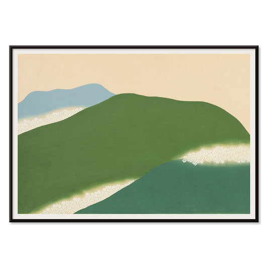
Yoshino Poster
Kamisaka Sekka · 1909 · Serene Japanese landscape poster with abstract green and blue hills on warm beige
Poster from 69 kr · Framed from 122,67 kr
Regular price From 46,00 krRegular price -
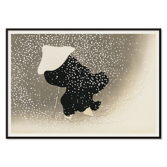
Ryoson Poster
Kamisaka Sekka · 1909 · Serene seascape art print with stylized waves and a quiet coastal silhouette
Poster from 69 kr · Framed from 122,67 kr
Regular price From 46,00 krRegular price -
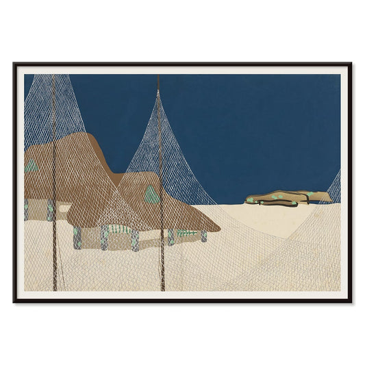
Tomoe no yuki Poster
Kamisaka Sekka · 1909 · Quiet snowfall art print balancing bold black curves with generous beige negative space
Poster from 69 kr · Framed from 122,67 kr
Regular price From 46,00 krRegular price -
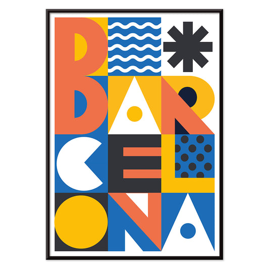
Barcelona Text poster Poster
MORYARTY · 2021 · Modern Barcelona poster with bold stacked typography and bright geometric color blocks
Poster from 69 kr · Framed from 122,67 kr
Regular price From 46,00 krRegular price -
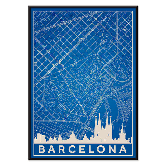
Map of Barcelona 2 Poster
MORYARTY · 2019 · Minimal blue and white Barcelona map poster pairing skyline outline with precise street lines
Poster from 69 kr · Framed from 122,67 kr
Regular price From 46,00 krRegular price -
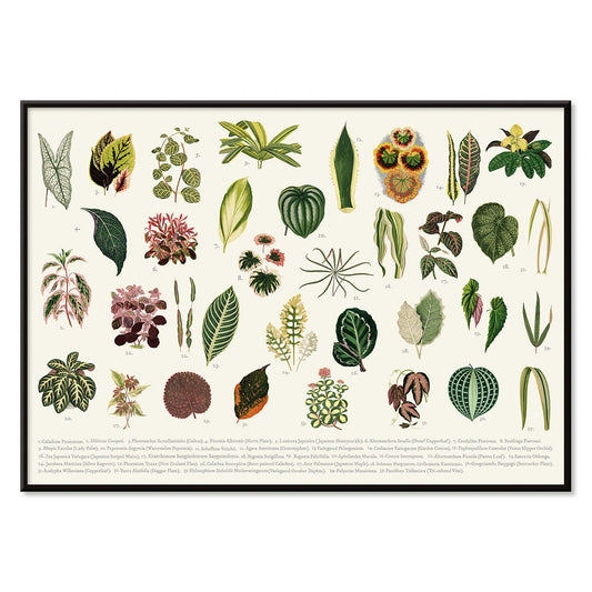
Collection of leaves Poster
Shirley Hibberd · 1855 · Delicate botanical print presenting varied leaf forms with fine veins on warm ivory paper
Poster from 69 kr · Framed from 122,67 kr
Regular price From 46,00 krRegular price -
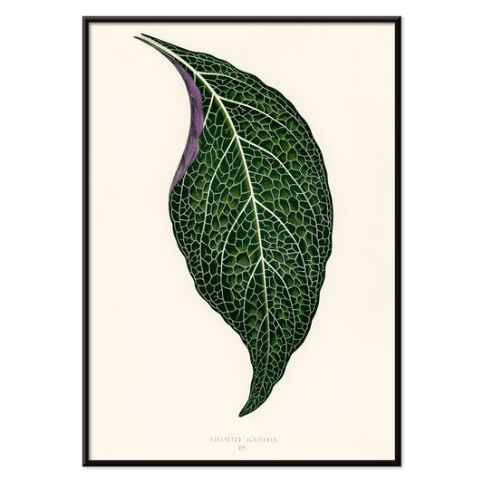
Adelaster Albivenis Poster
Shirley Hibberd · 1855 · Elegant botanical print of a single green leaf with purple veins on white
Poster from 69 kr · Framed from 122,67 kr
Regular price From 46,00 krRegular price -
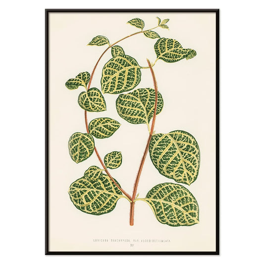
Lonicera Brachypoda Poster
Shirley Hibberd · 1855 · Elegant botanical print of honeysuckle foliage and blossoms on warm beige paper
Poster from 69 kr · Framed from 122,67 kr
Regular price From 46,00 krRegular price -
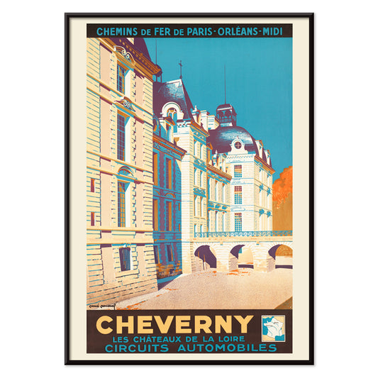
Cheverny Poster
René Roussel · 1952 · Elegant château travel poster balancing beige architecture with bold blue sky and warm highlights
Poster from 69 kr · Framed from 122,67 kr
Regular price From 46,00 krRegular price -
Minimalist Map of Barcelona Poster
MORYARTY · 2018 · Minimalist Barcelona map poster with bold red street lines on warm beige
Poster from 69 kr · Framed from 122,67 kr
Regular price From 46,00 krRegular price -
Prickly Pear cactus Poster
Unknown artist · 1899 · Detailed prickly pear botanical print with yellow flowers and rounded green pads
Poster from 69 kr · Framed from 122,67 kr
Regular price From 46,00 krRegular price -
Strawberry chromolithograph Poster
Abraham Jacobus Wendel · 1879 · Vivid strawberry print with crisp botanical detail and ripe fruit presence
Poster from 69 kr · Framed from 122,67 kr
Regular price From 46,00 krRegular price -
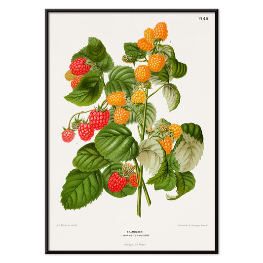
Raspberry chromolithograph Poster
Abraham Jacobus Wendel · 1879 · Detailed raspberry botanical print with ripe red berries and serrated green leaves
Poster from 69 kr · Framed from 122,67 kr
Regular price From 46,00 krRegular price -
Papiers découpés 5 Poster
MORYARTY · 2023 · Colorful abstract faces poster built from crisp cut-paper shapes on a soft ground
Poster from 69 kr · Framed from 122,67 kr
Regular price From 46,00 krRegular price -
Papiers découpés 4 Poster
MORYARTY · 1952 · Joyful cut-paper style abstract poster with bold red and blue shapes on beige
Poster from 69 kr · Framed from 122,67 kr
Regular price From 46,00 krRegular price -
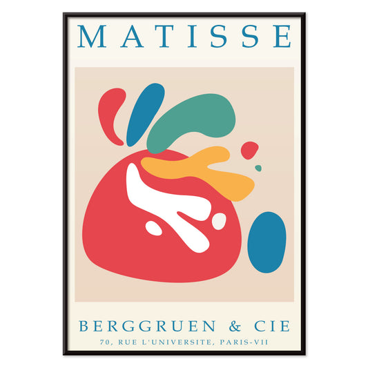
Papiers découpés 3 Poster
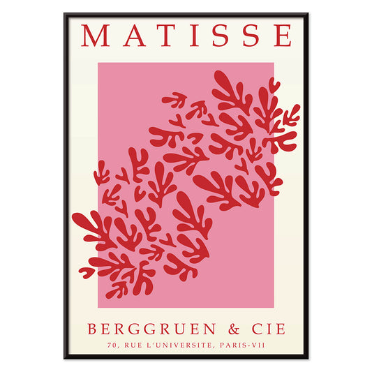
MORYARTY · 1949 · Matisse-inspired poster with bold red leaf shapes on airy white and pink
Poster from 69 kr · Framed from 122,67 kr
Regular price From 46,00 krRegular price -
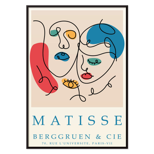
Papiers découpés 2 Poster
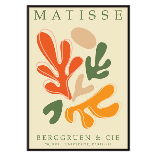
MORYARTY · 2023 · Matisse-inspired abstract poster featuring bold cut-paper shapes in vibrant primary colors
Poster from 69 kr · Framed from 122,67 kr
Regular price From 46,00 krRegular price -
Papiers découpés 1 Poster
MORYARTY · 2021 · Vibrant cut-paper abstract poster with orange and green shapes on warm beige ground
Poster from 69 kr · Framed from 122,67 kr
Regular price From 46,00 krRegular price


36/1749 items
- Photographic Camera Patent Poster
- Bicycle-support Patent Poster
- Musical Instrument Patent Poster
- Corkscrew Patent Poster
- Cassette Player Patent Poster
- Microscope Patent Poster
- Photographic Camera Patent Poster
- Yoshino Poster
- Ryoson Poster
- Tomoe no yuki Poster
- Barcelona Text poster Poster
- Map of Barcelona 2 Poster
- Collection of leaves Poster
- Adelaster Albivenis Poster
- Lonicera Brachypoda Poster
- Minimalist Map of Barcelona Poster
- Papiers découpés 5 Poster
- Papiers découpés 4 Poster
- Papiers découpés 3 Poster
- Papiers découpés 2 Poster
- Papiers découpés 1 Poster
An archive of images, not a single style
All Posters is where MORYARTY reads like a cabinet of curiosities: art print classics beside travel scenes, graphic experiments beside quiet studies of nature. Rather than a single movement, the selection suggests a social history of looking, where ink on paper met crowds, shops, salons, and stations. Across eras, certain instincts return: bold typography, expressive line, and the way a poster can adjust a room’s mood from café warmth to museum hush. For a tighter focus inside this breadth, move between Advertising and Classic Art to feel how public images and private taste often borrow from one another.
How posters were printed and why it matters
Many works in this collection were designed to be read at speed. Stone lithography made broad fields of colour possible, with velvety blacks and a softness at the edge that still feels human. Later processes, including offset printing, sharpened contours and allowed larger runs, changing how colour sits on the page. You can often spot the method in the surface: halftone dots, overprinted inks, and slight misregistration that gives vintage colour a gentle vibration. Those details are not flaws so much as evidence of making. If you enjoy disciplined negative space and line, the calm structure of Oriental pairs well with the spare clarity of Minimalist, where silence becomes part of the design.
Using wall art to shape a room
Because this is a wide spectrum, start with the room’s materials and light. In a kitchen with oak, stoneware, or terrazzo, a botanical poster can echo grain and scent-memory; Botanical brings greens that sit comfortably with warm neutrals. In a living room of chrome, glass, and clean-lined furniture, the geometry of Abstract keeps the atmosphere crisp, especially when you repeat one accent colour in textiles. Bedrooms often respond to restraint: Black & White prints read like quiet conversation and sit well with linen, wool, and low, warm lamps.
Curating, pairing, and framing across eras
A gallery wall works best when it has tempo. Pair one text-forward sheet with one image-led composition, then let margins do the pacing. If you mix periods, keep a shared element such as paper tone, repeated red, or consistent line weight. Thin black frames push graphic posters forward; pale oak softens high contrast and suits Scandinavian-leaning home decor. Hang larger posters slightly lower than you expect so the image meets the eye, then cluster smaller prints nearer shelves so objects can echo shapes on paper. When you want the wall to feel intentionally edited, one hero work and two supporting pieces often reads more clearly than a dense grid.
The pleasure of browsing widely
What holds the All Posters collection together is its democratic origin: images meant to be pinned, traded, and lived with. Choose one print that keeps your gaze for longer than expected, then build outward with neighbouring colours and related line. If you want structure while you browse, try switching between Vertical Posters and Horizontal Posters to see how format alone can change the feeling of a wall. For framing ideas, the calmer profile of Frames can help unify mixed eras without flattening their differences.