

 "Smukke tryk, hurtig levering!"
 "Fantastisk udvalg af vintage plakater"
 "En skjult perle for kunstelskere"
"Smukke tryk, hurtig levering!"
"Fantastisk udvalg af vintage plakater"
"En skjult perle for kunstelskere"
"Smukke tryk, hurtig levering!"
"Fantastisk udvalg af vintage plakater"
"En skjult perle for kunstelskere"
"Smukke tryk, hurtig levering!"
"Fantastisk udvalg af vintage plakater"
"En skjult perle for kunstelskere"


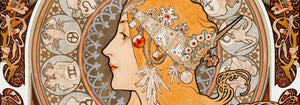
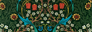
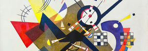













- Geografisk vejviser til en kvindes hjerte Plakat
- Blomstermarked i Lissabon Plakat
- Øl og cigaret Plakat
- Campari Soda Plakat
- Portugal i dag Plakat
- The New Yorker Plakat
- Snoopy Come Home Plakat
- Zoologischer Garten Plakat
- Red hvalerne Plakat
- Papiers découpés 3 Plakat
- Vågn op og læs Plakat
- Marihuana Plakat
- Blomstermarked Barcelona Plakat
- Cordial Campari Plakat
- Porto Ramos-Pinto Plakat
- Le Voyage de Babar Plakat
- Dansende figurer Matisse Plakat
- Falbalas et fanfreluches: La paresse Plakat
- Drik Coca-Cola plakat
- Babar i bil Plakat
- Solaris Plakat
- Sigmund Freud havde ret Plakat
- Panter Plakat
- Grands Prix de France Plakat
- Barcelona Tekst Plakat
- Trikolore luftballon Plakat
- Bauhaus 6 Plakat
- Pink Panthers hævn Plakat
- Drømmen Plakat
- Bauhaus 11 Plakat
- Babar en famille Plakat
- Histoire de Babar Plakat
- Bauhaus 2 Plakat
- Bauhaus 10 Plakat
- Papiers découpés 1 Plakat
- Mickey læser plakat
- Mickey Mouse Plakat
- Bauhaus 17 Plakat
- Vertigo Plakat
- Sort leopard Plakat
- Brazil 2 Plakat
- Optræden med Louis Armstrong Plakat
- Dracula Plakat
- Den moderne plakat
- Louis Armstrong Optræden 2 Plakat
- Jet Clipper til Hawaii Plakat
- Mars Plakat
- Den endeløse sommer Plakat
- Blow Up plakat
-


Bauhaus 13 Plakat
MORYARTY · 1923 · geometrisk Bauhaus plakat med markante primærfarver og skarpe sorte detaljer
Plakat fra 69 kr · Indrammet fra 122,67 kr
-

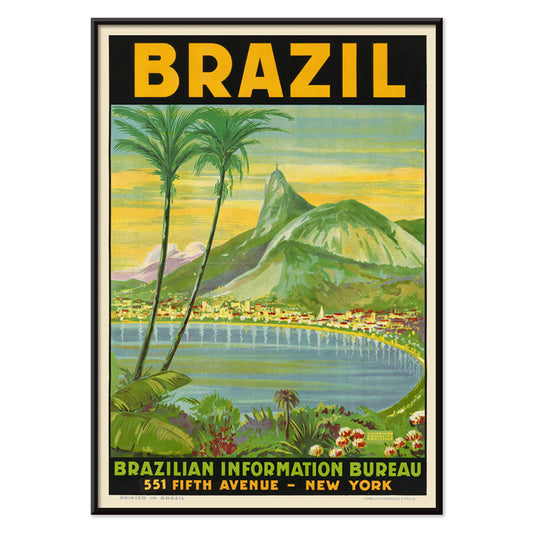
Brazil 1 Plakat
Waldomiro Goncalves Christino · 1984 · Solbeskinnet Rio rejseplakat med Sugarloaf-bjerget i kraftige farveflader og panoramisk komposition
Plakat fra 69 kr · Indrammet fra 122,67 kr
-


Bauhaus 15 Plakat
MORYARTY · 1926 · Geometrisk Bauhaus plakat med afbalancerede cirkler og kraftige farveblokke på ren hvid baggrund
Plakat fra 69 kr · Indrammet fra 122,67 kr
-

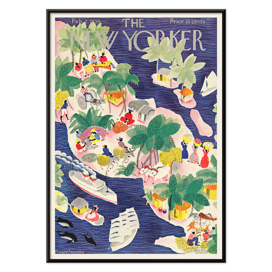
The New Yorker 1935 Plakat
Roger Duvoisin · 1935 · legesyg tropisk øplakat med kystdetaljer, klare farveblokke og nostalgisk stemning
Plakat fra 69 kr · Indrammet fra 122,67 kr
-

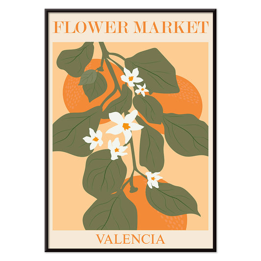
Blomstermarkedet i Valencia Plakat
MORYARTY · 2022 · Lys botanisk plakat med Valenciablade og hvide blomster på varm orange
Plakat fra 69 kr · Indrammet fra 122,67 kr
-


Bauhaus 5 Plakat
MORYARTY · 1923 · Geometrisk Bauhaus plakat med markante cirkler og stænger på varm beige bund
Plakat fra 69 kr · Indrammet fra 122,67 kr
-


Columbia Road blomstermarked Plakat
MORYARTY · 2017 · Frodig blomsterplakat med stiliseret vase og buket i klare moderne farver
Plakat fra 69 kr · Indrammet fra 122,67 kr
-

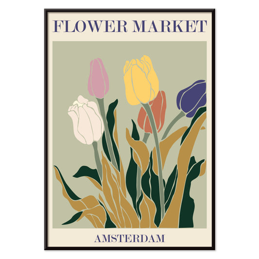
Blomstermarked i Amsterdam Plakat
MORYARTY · 2019 · retro tulipanmarkedplakat med jordnære farver, grafisk enkelhed og varm nostalgi
Plakat fra 69 kr · Indrammet fra 122,67 kr
-

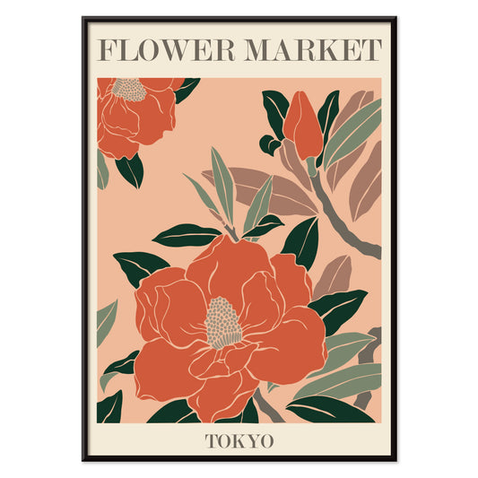
Blomstermarked - Tokyo Plakat
MORYARTY · 2021 · Livlig blomsterplakat med kraftige markedsblomster, klare former og friske grønne accenter
Plakat fra 69 kr · Indrammet fra 122,67 kr
-

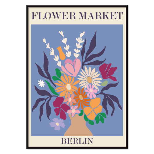
Blomstermarked - Berlin Plakat
MORYARTY · 2019 · Farverig blomsterbuketplakat med markant Berlin-typografi og livlig markedspuls
Plakat fra 69 kr · Indrammet fra 122,67 kr
-


Mirakler i junglen Plakat
Ukendt kunstner · 1921 · Dramatisk brølende leopardplakat med gennemtrængende grønne øjne og vild junglestemning
Plakat fra 69 kr · Indrammet fra 122,67 kr
-


Blomstermarked i Rom Plakat
MORYARTY · 2019 · Frodigt liljebuketplakat inspireret af romerske blomsterboder i varme pink og orange nuancer
Plakat fra 69 kr · Indrammet fra 122,67 kr
-


Blomstermarked - Kyoto Plakat
MORYARTY · 2021 · Livlig Kyoto blomstermarksplakat i klare farver med stiliserede blomster og rene grafiske linjer
Plakat fra 69 kr · Indrammet fra 122,67 kr
-


Bauhaus 16 Plakat
MORYARTY · 1923 · Geometrisk Bauhaus plakat med primære cirkler og markante sorte linjer på ren hvid
Plakat fra 69 kr · Indrammet fra 122,67 kr
-


Papirudskæringer 2 Plakat
MORYARTY · 2023 · Matisseinspireret abstrakt plakat med markante papirudskæringsformer i klare primærfarver
Plakat fra 69 kr · Indrammet fra 122,67 kr
-


El Maestro 1 Plakat
ukendt kunstner · 1921 · mexicansk blomsterplakat med kraftige røde blomster og stiliseret grøn kaktus på beige
Plakat fra 69 kr · Indrammet fra 122,67 kr
-

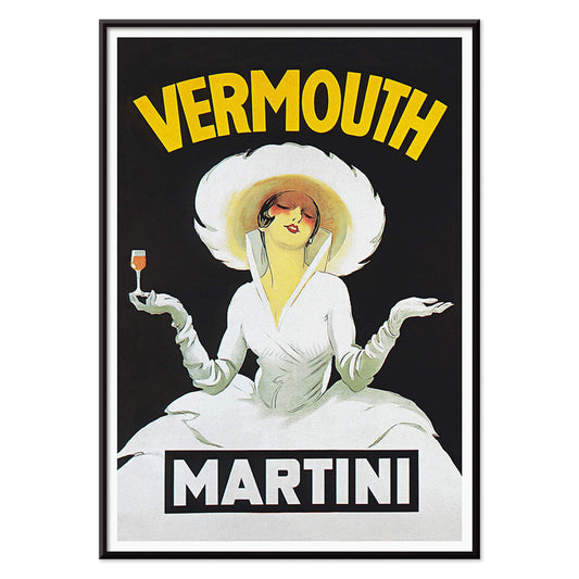
Vermouth Martini Plakat
Marcello Dudovich · 1918 · Stilfuld vermouthreklameplakat med en elegant kvinde i hvid og stærke gule accenter
Plakat fra 69 kr · Indrammet fra 122,67 kr
-


Contratto Plakat
Leonetto Cappiello · 1922 · Festlig champagneplakat med kraftig typografi og en fejende figur på sort
Plakat fra 69 kr · Indrammet fra 122,67 kr
-

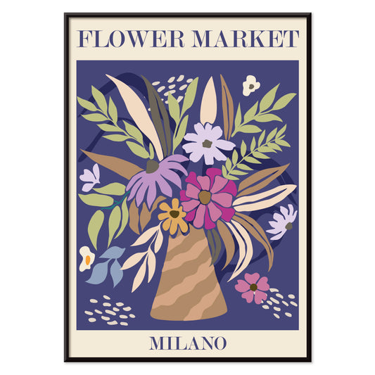
Blomstermarked - Milano Plakat
MORYARTY · 2022 · Farverig blomsterbuket plakat der indfanger det livlige islæt fra et milansk blomstermarked
Plakat fra 69 kr · Indrammet fra 122,67 kr
-

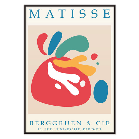
Papiers découpés 4 Plakat
MORYARTY · 1952 · Glædesfuldt udklipsinspireret plakat med markante røde og blå former på beige
Plakat fra 69 kr · Indrammet fra 122,67 kr
-


Blomstermarked - Seoul 2 Plakat
MORYARTY · 2021 · Energisk blomstermarkedplakat med kraftig orange flade og grafiske blomster i pink og lilla
Plakat fra 69 kr · Indrammet fra 122,67 kr
-

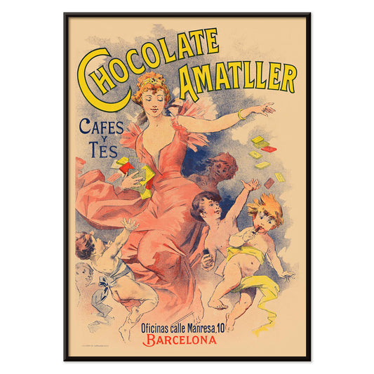
Chocolate Amatller Plakat
Ukendt kunstner · 1893 · livlig vintage plakat med Barcelona-reklame, dansende figur og lys typografi
Plakat fra 69 kr · Indrammet fra 122,67 kr
-


Blomstermarked New York Plakat
MORYARTY · 2019 · Farverig botanisk plakat med stiliserede markedsblomster og klar New York-tekst
Plakat fra 69 kr · Indrammet fra 122,67 kr
-


Blomstermarked i Seoul Plakat
MORYARTY · 2021 · grafisk blomsterplakat med lyserøde markedsbuketter og frodige grønne blade på beige baggrund
Plakat fra 69 kr · Indrammet fra 122,67 kr
-


Blomstermarked Delhi Plakat
MORYARTY · 2023 · Livlig Delhi blomstermarkedplakat med lagdelige blomster og grafisk feststemning
Plakat fra 69 kr · Indrammet fra 122,67 kr
-

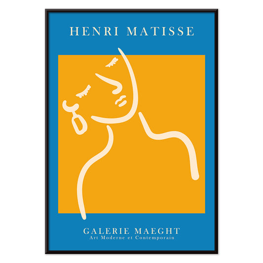
Pige med ørering Plakat
MORYARTY · 2022 · Matisse inspireret portrætplakat med blå baggrund, hvidt ansigt og gul ørering
Plakat fra 69 kr · Indrammet fra 122,67 kr
-

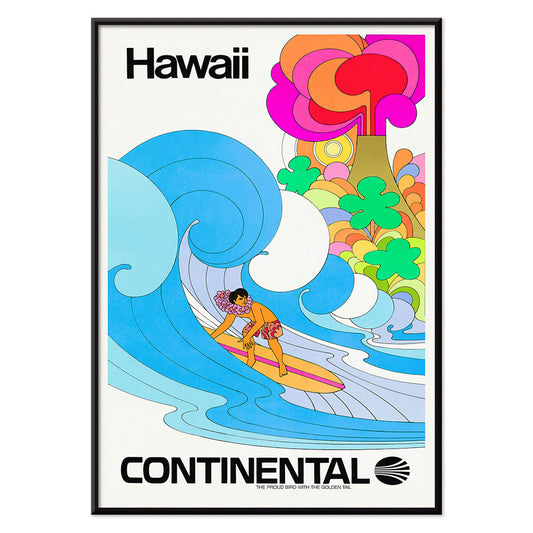
Continental Hawaii Airline Plakat
Ukendt kunstner · 1960 · Glædesfyldt Hawaii surfplakat med surfer iført lei i klare tropiske farver
Plakat fra 69 kr · Indrammet fra 122,67 kr
-


Schiele-udstilling i Galerie Arnot Plakat
Egon Schiele · 1915 · Ekspressionistisk udstillingsplakat med kantet figur, stærk orange farveaccent og grafisk kontrast
Plakat fra 69 kr · Indrammet fra 122,67 kr
-

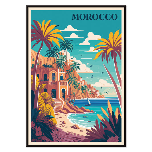
Rejse til Marokko Plakat
MORYARTY · 1930 · Solbeskinnet Marokko rejseplakat med palmer, hvid villa og roligt blåt hav
Plakat fra 69 kr · Indrammet fra 122,67 kr
-


Arbalète I Plakat
Le Corbusier · 1953 · Geometrisk modernistisk kunsttryk med armbrøstagtige former i rød, blå og sort
Plakat fra 69 kr · Indrammet fra 122,67 kr
-

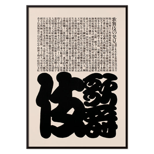
Kabuki Plakat
Ikko Tanaka · 1974 · Minimalistisk Kabukimaskplakat med markante sorte former og raffineret beige negativt rum
Plakat fra 69 kr · Indrammet fra 122,67 kr
-


Almanaque Plakat
Sebastião Rodrigues · 1960 · abstrakt løveplakat med kraftige orange og sorte geometriske former i midtårhundredets stil
Plakat fra 69 kr · Indrammet fra 122,67 kr
-

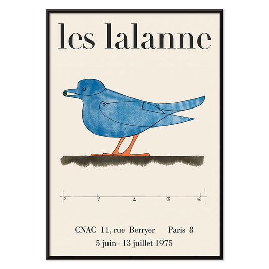
Les Lalanne Plakat
François-Xavier Lalanne · 1975 · minimal udstillingsplakat med en stiliseret blå fugl på varm beige baggrund
Plakat fra 69 kr · Indrammet fra 122,67 kr
-


Michelin cykeldæk Plakat
Marius Rossillon · 1908 · Michelin-cykelplakat med Bibendum, der kører uden hænder mod en klar blå baggrund
Plakat fra 69 kr · Indrammet fra 122,67 kr
-


Royal-Fabric cykel Plakat
Michel Liebeaux · 1922 · vintage cykelplakat med klatrende rytter og markant Royal-Fabric typografi
Plakat fra 69 kr · Indrammet fra 122,67 kr
-

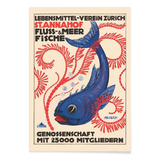
Food Association Zürich Plakat
Sebastian Oesch · 1914 · Livlig Zürich fiskplakat med markant typografi og skarpt litografisk kontrast
Plakat fra 69 kr · Indrammet fra 122,67 kr
-

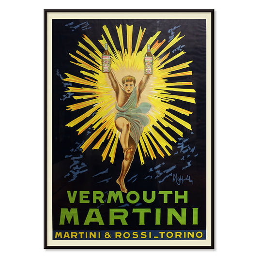
Vermouth Martini Plakat
Leonetto Cappiello · 1920 · Frodig Vermouth Martini plakat med gulklædt figur mod dramatisk sort baggrund
Plakat fra 69 kr · Indrammet fra 122,67 kr
-


Angrebet på den 50 fods kvinde Plakat
Reynold Brown · 1958 · Højenergisk sci-fi plakat med en kæmpekvinde, der dominerer biler og byens gader
Plakat fra 69 kr · Indrammet fra 122,67 kr
-

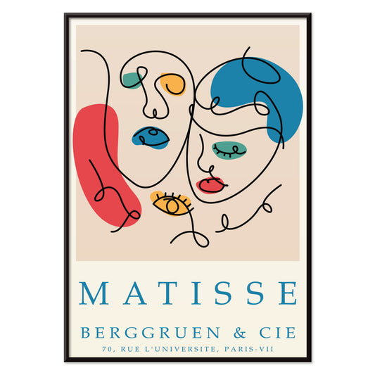
Papiers découpés 5 Plakat
MORYARTY · 2023 · farverige abstrakte ansigter plakat lavet af papirklip på en blød lys bund
Plakat fra 69 kr · Indrammet fra 122,67 kr
-


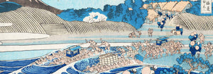
Åndernes tilflugt Plakat
Japanese Railways · 1930 · Stemningsfuld Kirishima rejseplakat i frodige grønne toner med varme vulkanske accenter
Plakat fra 69 kr · Indrammet fra 122,67 kr
-

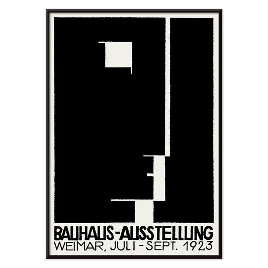
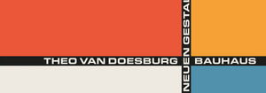
Bauhausudstillingsplakat
Ukendt kunstner · 1923 · Bauhausudstillingsplakat med dristig sort-hvid geometri og ren sans serif typografi
Plakat fra 69 kr · Indrammet fra 122,67 kr
-

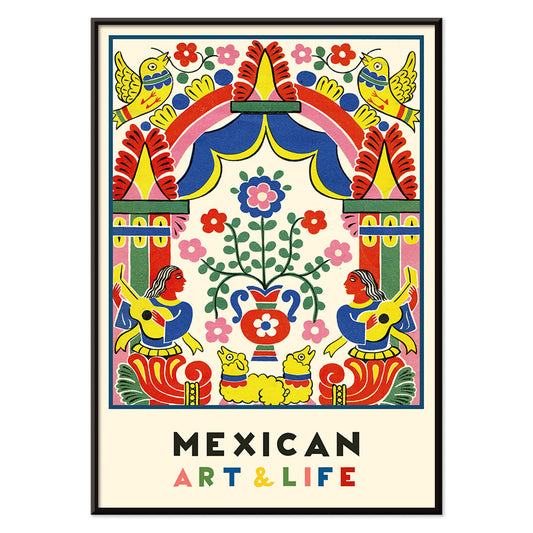
Mexicansk kunst og liv 1 Plakat
Ukendt kunstner · 1938 · Livlig modernistisk mexicansk plakat med kraftfuld folkinspireret geometri og levende farver
Plakat fra 69 kr · Indrammet fra 122,67 kr
-

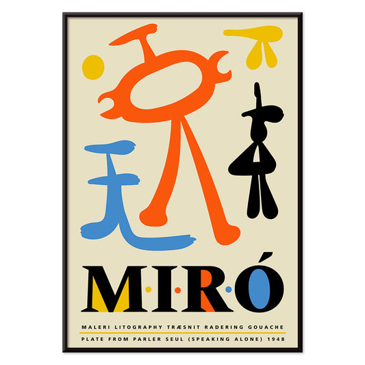
Parler Seul 2 Plakat
Joan Miró · 1948 · Legende biomorft plakat med svævende sorte linjer og orange, blå og gule accenter på beige
Plakat fra 69 kr · Indrammet fra 122,67 kr
-

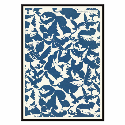
Lesbesse Crépe Ninette Plakat
Charles Goy · 1928 · minimalistisk fugleplakat med blå silhuetter på en cremefarvet reklameflade
Plakat fra 69 kr · Indrammet fra 122,67 kr
-


Le bas scandale Plakat
Paul Iribe · 1920 · vintage plakat i sort, rød og hvid med et dristigt modebudskab
Plakat fra 69 kr · Indrammet fra 122,67 kr
-

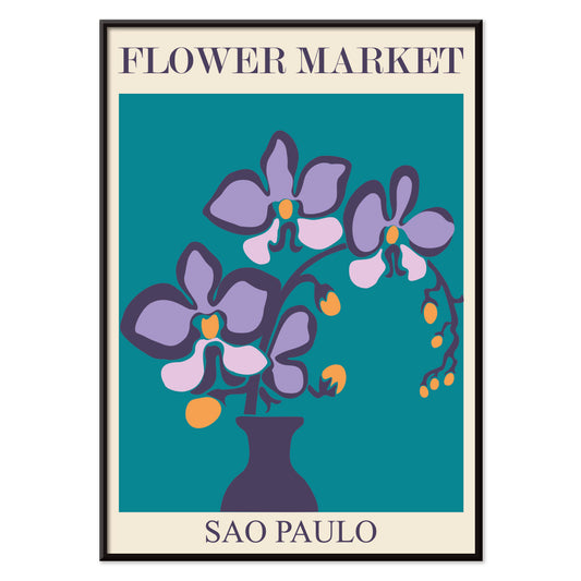
Blomstermarked São Paulo Plakat
MORYARTY · 2017 · Frodig plakat med lilla orkideer i ren vase mod dyb turkis baggrund
Plakat fra 69 kr · Indrammet fra 122,67 kr
-


Silicon Valley Kort Plakat
Kirby Scudder · 1986 · legende silicon valley kortplakat der forvandler usa til et vittigt 1980'er techpanorama
Plakat fra 69 kr · Indrammet fra 122,67 kr
-

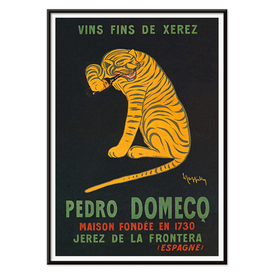
Xerez Pedro Domecq Plakat
Leonetto Cappiello · 1930 · Ikonisk tigerplakat med springende tiger mod dyb sort baggrund for Xerez Pedro Domecq sherry
Plakat fra 69 kr · Indrammet fra 122,67 kr
-

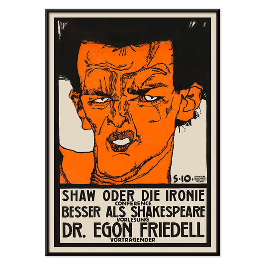
Shaw eller ironi Plakat
Egon Schiele · 1910 · ekspressiv plakat til forelæsning med kantet figur og varme orange accenter
Plakat fra 69 kr · Indrammet fra 122,67 kr
-


Cycles olympique Plakat
Affiches Gaillard · 1931 · vintage plakat med cykelrytter i fart og olympiske ringe
Plakat fra 69 kr · Indrammet fra 122,67 kr
-

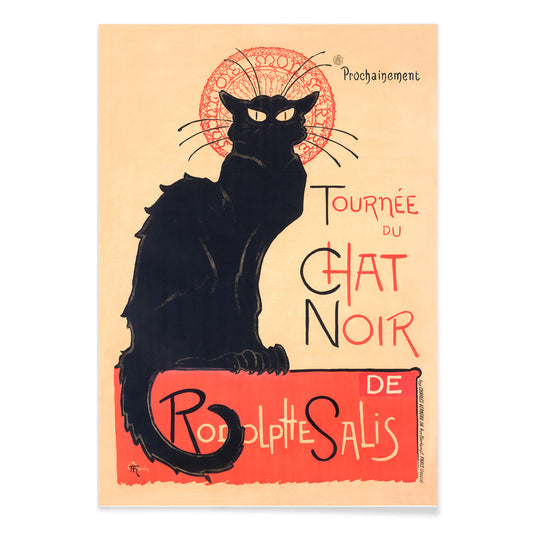
Tournée du Chat Noir Plakat
Théophile Alexandre Steinlen · 1896 · Ikonisk sort katteplakat med rød halo og markant kabaretskrift
Plakat fra 69 kr · Indrammet fra 122,67 kr
-


Chelsea blomstermarked Plakat
MORYARTY · 2023 · Livlig blomstermarkedplakat med markant typografi og friske botaniske silhuetter
Plakat fra 69 kr · Indrammet fra 122,67 kr
-


Blomstermarked - Cardiff Plakat
MORYARTY · 2010 · Grafisk påskeliljeplakat mod dyb lilla baggrund med klart varmt sæsonudtryk og tidløst blikfang
Plakat fra 69 kr · Indrammet fra 122,67 kr
-

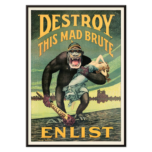
Ødelæg dette rasende bæst Plakat
Harry Ryle Hopps · 1917 · Dramatisk krigsplakat med hjelmklædt gorilla, svingende kølle og fanget kvinde
Plakat fra 69 kr · Indrammet fra 122,67 kr
-

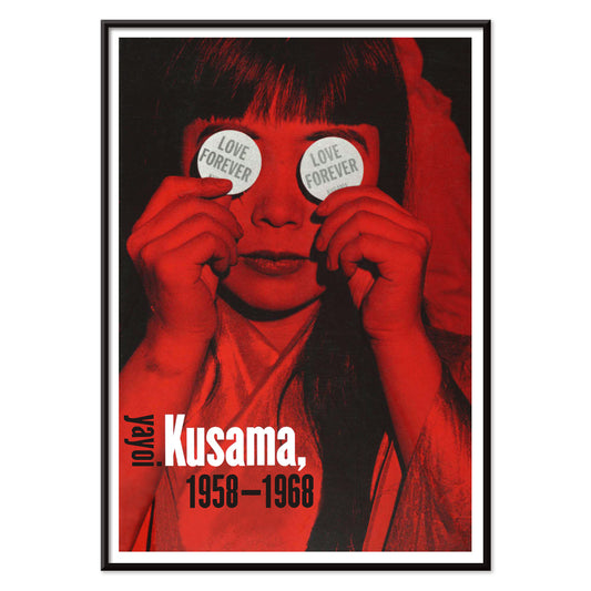
Evig kærlighed Plakat
Yayoi Kusama · 1966 · Hypnotisk plakat i rød og sort med kærlighedsmotiver og rytmiske prikmønstre
Plakat fra 69 kr · Indrammet fra 122,67 kr
-


Blomstermarked Mumbai Plakat
MORYARTY · 2022 · Frodig vandliljeplakat der vækker minder om Mumbais blomstermarkeder i lilla, grøn og blå
Plakat fra 69 kr · Indrammet fra 122,67 kr
-


Exposition Matisse Plakat
Ukendt kunstner · 1980 · Minimalistisk udstillingsplakat med dansende figur i sort streg og rød tekst
Plakat fra 69 kr · Indrammet fra 122,67 kr
-

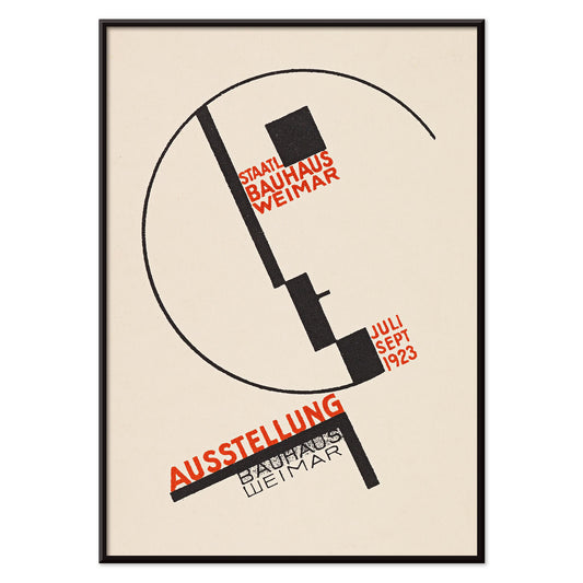
Bauhaus Weimar-udstilling Plakat
Dörte Helm · 1923 · Bauhaus-plakat med markant geometri og rød typografi på beige papir
Plakat fra 69 kr · Indrammet fra 122,67 kr
-

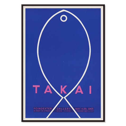
Takai Plakat
Teiji Takai · 1965 · Minimalistisk fiskplakat svævende på ultramarinblå baggrund med klare håndtegnede linjer
Plakat fra 69 kr · Indrammet fra 122,67 kr
-

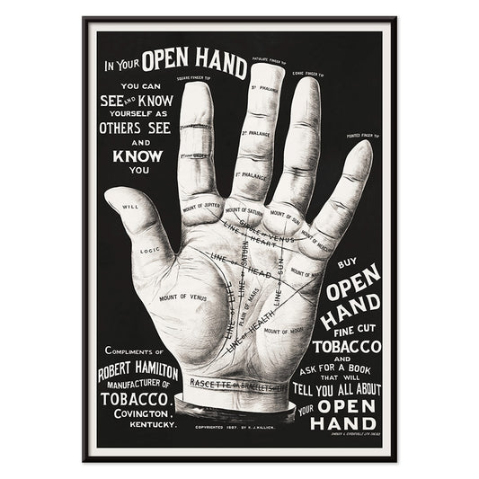
Håndlæsning Plakat
Ukendt kunstner · 2015 · Vintageinspireret håndlæsningplakat med åben hånd tegnet i indviklede sorte linjer
Plakat fra 69 kr · Indrammet fra 122,67 kr
-


Blomstermarked Cape Town Plakat
MORYARTY · 2013 · sprudlende paradisfuglplakat i abstrakte former der tilfører tropisk energi og stærke farver
Plakat fra 69 kr · Indrammet fra 122,67 kr
-

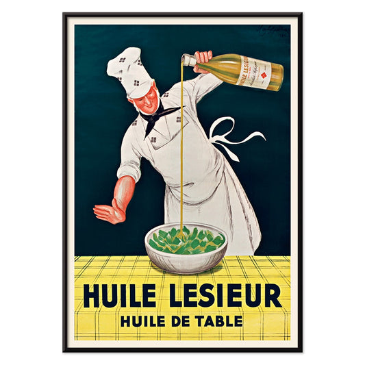
Huile Lesieur Plakat
Leonetto Cappiello · 1930 · Livlig reklameplakat med kok, gylden olie og kraftig rød typografi på sort baggrund
Plakat fra 69 kr · Indrammet fra 122,67 kr
-

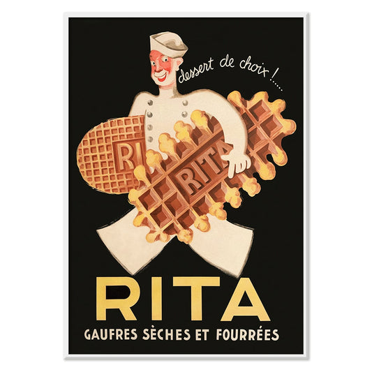
Rita Gaufres Plakat
Leon Dupin · 1933 · Legesyg vaffelplakat med smilende kok og varme gyldne toner i appetitvækkende udtryk
Plakat fra 69 kr · Indrammet fra 122,67 kr
-

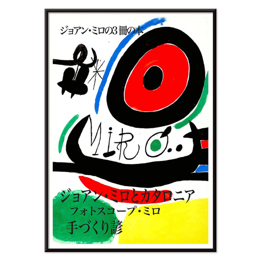
Joan Miró Osaka Plakat
Joan Miró · 1970 · Legende abstrakt plakat med kalligrafiske sorte former og klare primærfarver
Plakat fra 69 kr · Indrammet fra 122,67 kr
-

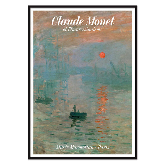
Soleil Levant Plakat
Claude Monet · 1872 · Diset havnesolopgang plakat med orange sol og blågrå vandreflektioner, fængslende
Plakat fra 69 kr · Indrammet fra 122,67 kr
-

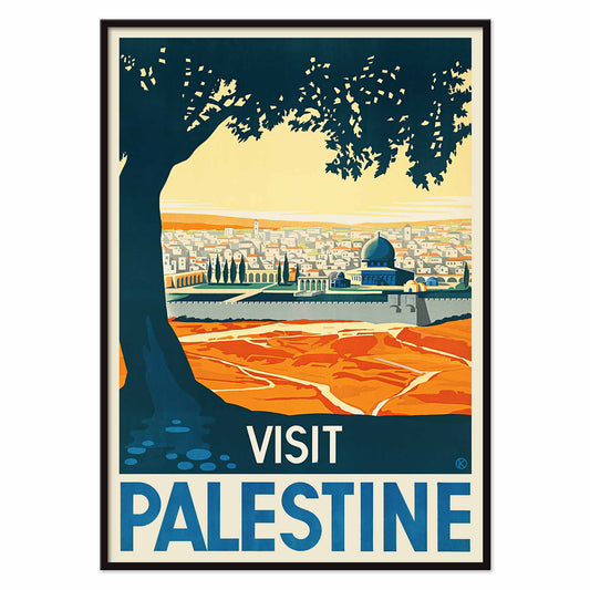
Visit Palestine Plakat
Franz Kraus · 1936 · solbeskinnet rejseplakat med Jerusalems blå kuppel under et monumentalt mørkt træ
Plakat fra 69 kr · Indrammet fra 122,67 kr
-


Cacao Suchard Plakat
Leonetto Cappiello · 1911 · vintage plakat som kakaotryk med en markant Suchard-dåse
Plakat fra 69 kr · Indrammet fra 122,67 kr
-


Cycles La Torpille Plakat
Michel Liebeaux · 1923 · cykelplakat med blomstrende humor, gule hjul og stærke Art Deco-farver
Plakat fra 69 kr · Indrammet fra 122,67 kr
-


Absinthe Robette Plakat
Privat Jean Baptiste Livemont · 1896 · Ikonisk Art Nouveau plakat med rødt hår og grønne absinthvirvler
Plakat fra 69 kr · Indrammet fra 122,67 kr
-

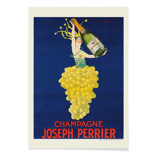
Champagne Joseph Perrier Plakat
Joseph Stall · 1902 · Festlig champagneplakat med elegant figur og svungne druemotiver i klare farver
Plakat fra 69 kr · Indrammet fra 122,67 kr
-


Bauhaus Plakat 8 Plakat
MORYARTY · 1923 · geometrisk plakat i bauhausstil med et markant kors af cirkler og kvadrater på varm beige
Plakat fra 69 kr · Indrammet fra 122,67 kr
-


Blomstermarked Jamaica Plakat
MORYARTY · 2016 · Tropisk blomstermarkedsplakat med lagdelige botaniske motiver og varme caribiske farver
Plakat fra 69 kr · Indrammet fra 122,67 kr


72/536 items
- Bauhaus 13 Plakat
- Bauhaus 15 Plakat
- The New Yorker 1935 Plakat
- Blomstermarkedet i Valencia Plakat
- Bauhaus 5 Plakat
- Columbia Road blomstermarked Plakat
- Blomstermarked i Amsterdam Plakat
- Blomstermarked - Tokyo Plakat
- Blomstermarked - Berlin Plakat
- Blomstermarked i Rom Plakat
- Blomstermarked - Kyoto Plakat
- Bauhaus 16 Plakat
- Papirudskæringer 2 Plakat
- El Maestro 1 Plakat
- Blomstermarked - Milano Plakat
- Papiers découpés 4 Plakat
- Blomstermarked - Seoul 2 Plakat
- Blomstermarked New York Plakat
- Blomstermarked i Seoul Plakat
- Blomstermarked Delhi Plakat
- Pige med ørering Plakat
- Continental Hawaii Airline Plakat
- Schiele-udstilling i Galerie Arnot Plakat
- Rejse til Marokko Plakat
- Arbalète I Plakat
- Kabuki Plakat
- Almanaque Plakat
- Les Lalanne Plakat
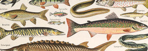
- Food Association Zürich Plakat
- Vermouth Martini Plakat
- Angrebet på den 50 fods kvinde Plakat
- Papiers découpés 5 Plakat
- Åndernes tilflugt Plakat
- Bauhausudstillingsplakat
- Mexicansk kunst og liv 1 Plakat
- Parler Seul 2 Plakat
- Blomstermarked São Paulo Plakat
- Silicon Valley Kort Plakat
- Xerez Pedro Domecq Plakat
- Shaw eller ironi Plakat
- Tournée du Chat Noir Plakat
- Chelsea blomstermarked Plakat
- Blomstermarked - Cardiff Plakat
- Ødelæg dette rasende bæst Plakat
- Evig kærlighed Plakat
- Blomstermarked Mumbai Plakat
- Takai Plakat
- Håndlæsning Plakat
- Blomstermarked Cape Town Plakat
- Huile Lesieur Plakat
- Rita Gaufres Plakat
- Champagne Joseph Perrier Plakat
- Blomstermarked Jamaica Plakat
The street as gallery
Advertising posters began as a public language, pasted to kiosks, tram stops, and café walls where images had seconds to do their work. From the Belle Époque to postwar modernism, the poster and the print evolved into everyday wall art that sat between news and theatre. Chromolithography offered velvety colour; later decades sharpened the message with blunt sans-serif typography and silhouettes legible from across a boulevard. These vintage sheets were never neutral decoration: they recorded what a city wanted to sell, celebrate, or warn against, with a pace set by crowds and streetlight.
Art Nouveau seduction and graphic simplification
At the turn of the century, Art Nouveau treated commerce as spectacle, wrapping everyday products in ornamental line and stylised figure. Alphonse Mucha’s Job (1897) builds its profile from looping contours and muted golds, with smoke rendered as pattern, not haze. Leonetto Cappiello pushed further toward instant recognition: Vermouth Martini (1920) stages lemon-yellow bottles against a night-black field, a lesson in contrast that anticipates modern branding. Théophile Alexandre Steinlen’s Tournée du Chat Noir (1896) adds Montmartre bite with flat red, sharp whiskers, and a stare calibrated for the street. For adjacent styles and signatures, move between Advertising, Alphonse Mucha, and Leonetto Cappiello.
Placing vintage wall art in contemporary rooms
Because these posters were designed for quick reading, they behave well as design objects at home. Start with scale: one large poster over a sideboard reads like a piece of architecture, while two medium prints stacked can stabilise a narrow wall. Pull colour cues from the room rather than matching everything; a single echo of carmine, olive, or brass is enough to let the print feel intentional. In a studio or hallway, the disciplined geometry of Bauhaus keeps the rhythm brisk; in a living room with curved furniture and velvet, Art Nouveau line sits naturally beside softer textures. If the room already has strong pattern, consider calmer companions from Black & White to give the eye a rest.
Cinema modernism and Japanese graphic punch
Mid-century design traded flourish for impact, and film posters became a laboratory for visual economy. Saul Bass’s Vertigo (1958) is practically a diagram of anxiety: spiral, figure, and off-kilter title arranged to deny stillness. Nearby, in Japanese modernism, Ikko Tanaka’s Kabuki (1974) treats black calligraphy as a drumbeat, letting white paper function as active space rather than background. These prints pair well with lacquer, walnut, brushed aluminium, and clean-lined shelving. To extend the same graphic cadence across eras, connect Movie with the calmer emphasis of Minimalist and the brisk motion cues in Bike.
Curating a wall that feels lived-in
To build a coherent gallery wall, repeat one constraint and vary everything else: keep margins consistent, or hold a tight palette while letting typography and illustration shift from piece to piece. Mixing vertical and horizontal formats can create a more editorial rhythm; Vertical Posters make strong anchors, while a single landscape print can act as a pause line. Frame choice matters less than proportion: a narrow black or walnut frame keeps type crisp, while a generous mat turns a commercial image into a considered art print. If you want a broad survey while keeping the theme, All Posters provides the wider context for building your own timeline of vintage decoration.