


- Shaw eller ironi Plakat
- Løg Plakat
- Radiser Plakat
- Gulerødder Plakat
- Les Lalanne Plakat
- Punch Boutique Plakat
- Jødedom og hedenskab, standpunkt Plakat
- Jordbærtyven Plakat
- Dansende figurer Matisse Plakat
- Siddende kvinde set bagfra Plakat
- Rødt hår blå hat Plakat
- Parler Seul 2 Plakat
- Mahatmaernes nuværende standpunkt Plakat
- Fugl passerer gennem en sky Plakat
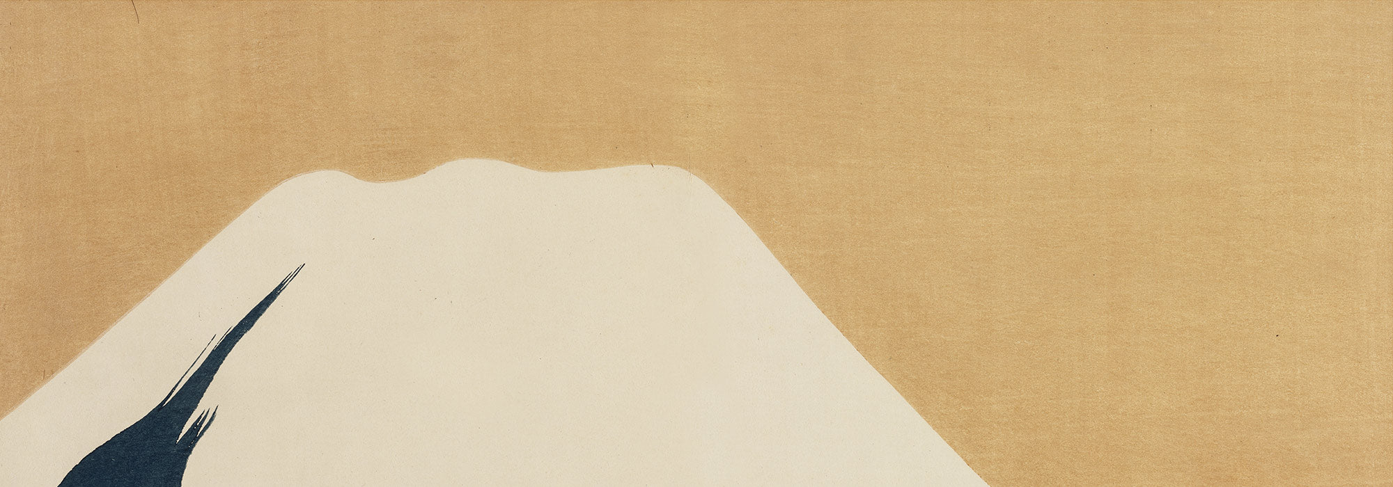
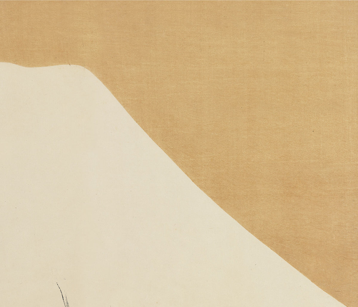
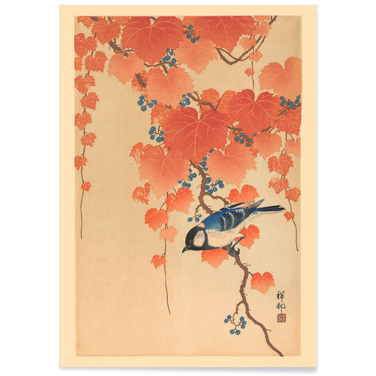
- Blå japansk trane Plakat
- Sort kat 4 Plakat
- Sort kat 3 Plakat
- El Maestro 1 Plakat
- Rita Gaufres Plakat
- Sort kat 2 Plakat
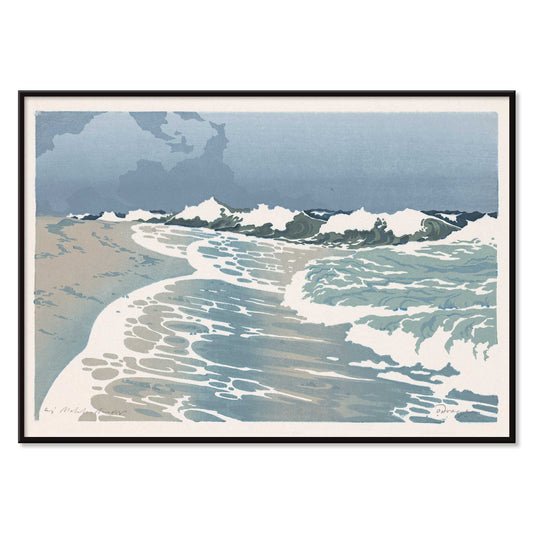
- Den store bølge ved Kanagawa Plakat
- Cannabisplade 2 Plakat
- L'Art Independant Plakat
- Kabuki Plakat
- Prunus avium Plakat
- Le Ciel Plakat
- Blomstermarkedet i Valencia Plakat
- Morgen i Dotonbori Plakat
- Blomstermarked i Lissabon Plakat
- Blomstermarked Barcelona Plakat
-
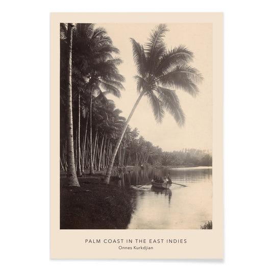
Palmekysten Plakat
Onnes Kurkdjian · 1895 · Tropisk kystplakat med høje palmer og roligt vand i dæmpede beige toner
Plakat fra 69 kr · Indrammet fra 122,67 kr
Normalpris Fra 46,00 krNormalpris -
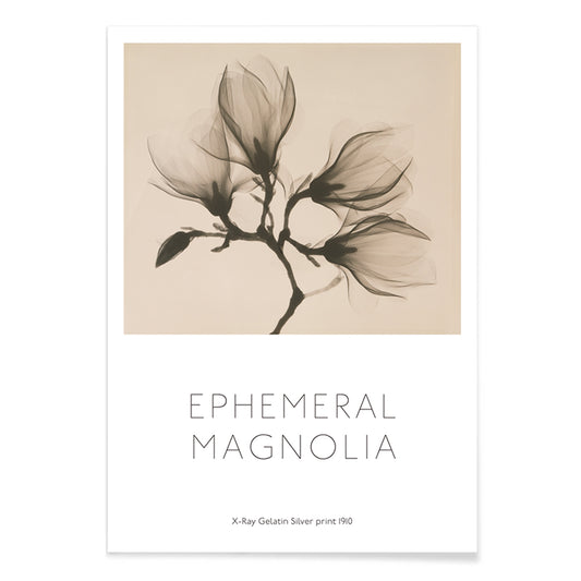
Magnoliagren Plakat
Kazutoshi Sugiura · 1864 · Kontrastfuldt magnoliabotanisk tryk med fire blomster svævende mod dyb sort
Plakat fra 69 kr · Indrammet fra 122,67 kr
Normalpris Fra 46,00 krNormalpris -
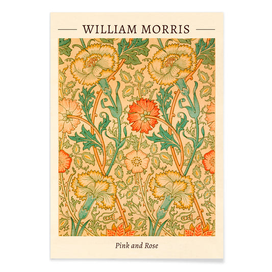
Rosa og Rose Plakat
William Morris · 1883 · Frodigt blomstertryk med indflettede roser og løv i varme vintagetoner
Plakat fra 69 kr · Indrammet fra 122,67 kr
Normalpris Fra 46,00 krNormalpris -
Potteplante Plakat
Jean Bernard Cerisier · 1824 · Delikat blyanttegnet botanisk tryk af en potteplante med rolige gråtoner på varm beige
Plakat fra 69 kr · Indrammet fra 122,67 kr
Normalpris Fra 46,00 krNormalpris -
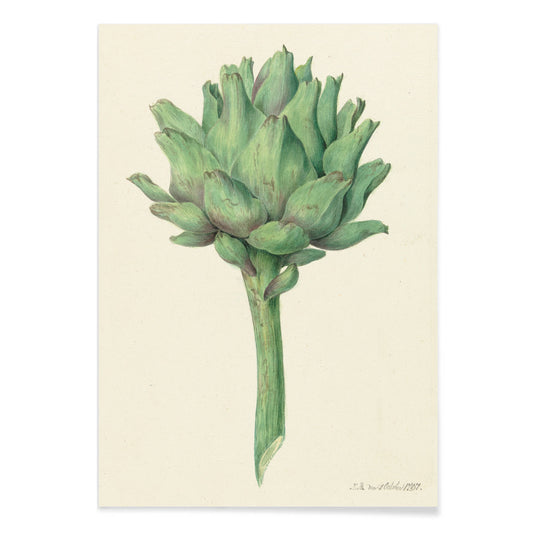
Artiskok Plakat
Jean Bernard Restout · 1830 · Detaljeret botanisk tryk af en artiskok med lagdelte skæl på beige papir
Plakat fra 69 kr · Indrammet fra 122,67 kr
Normalpris Fra 46,00 krNormalpris -
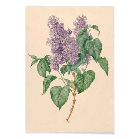
Lilla syrener Plakat
Maria Geertruida Barbiers-Snabilié · 1815 · Fin botanisk plakat med sart syrengren, bløde lilla klaser og friske grønne blade
Plakat fra 69 kr · Indrammet fra 122,67 kr
Normalpris Fra 46,00 krNormalpris -
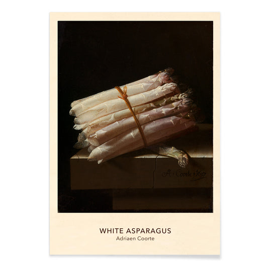
Asparges Plakat
Adriaen Coorte · 1697 · stilleben kunsttryk af hvide asparges glødende mod en dyb sort baggrund
Plakat fra 69 kr · Indrammet fra 122,67 kr
Normalpris Fra 46,00 krNormalpris -
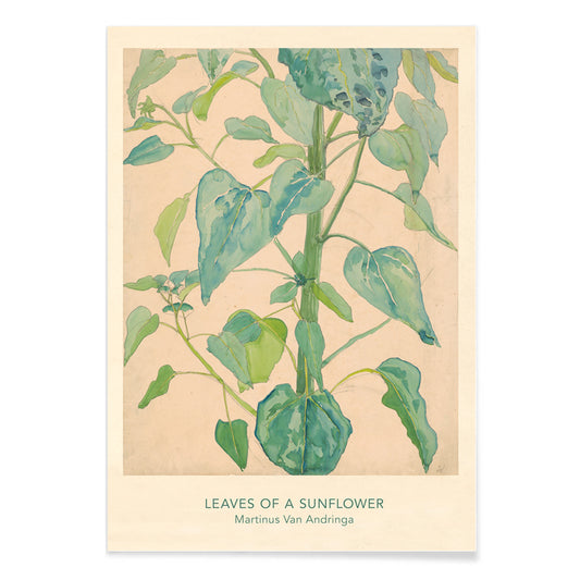
Solsikkeblade Plakat
Martinus van Andringa · 1899 · Elegant solsikkebladtryk med klare årer og blid grøn akvarelskygge
Plakat fra 69 kr · Indrammet fra 122,67 kr
Normalpris Fra 46,00 krNormalpris -
Blade og frugter Plakat
Paul Poiret · 1912 · stiliseret blad og frugttryk i dristige grønne og lilla former på beige
Plakat fra 69 kr · Indrammet fra 122,67 kr
Normalpris Fra 46,00 krNormalpris -
Blade og blomster Plakat
Paul Poiret · 1920 · Glædelig blomsterplakat med stiliserede blade og blomster på varm beige
Plakat fra 69 kr · Indrammet fra 122,67 kr
Normalpris Fra 46,00 krNormalpris -
Grene og blade Plakat
Paul Poiret · 1919 · Dekorativ plakat med stiliserede grene og blade i varme orange og grønne toner
Plakat fra 69 kr · Indrammet fra 122,67 kr
Normalpris Fra 46,00 krNormalpris -
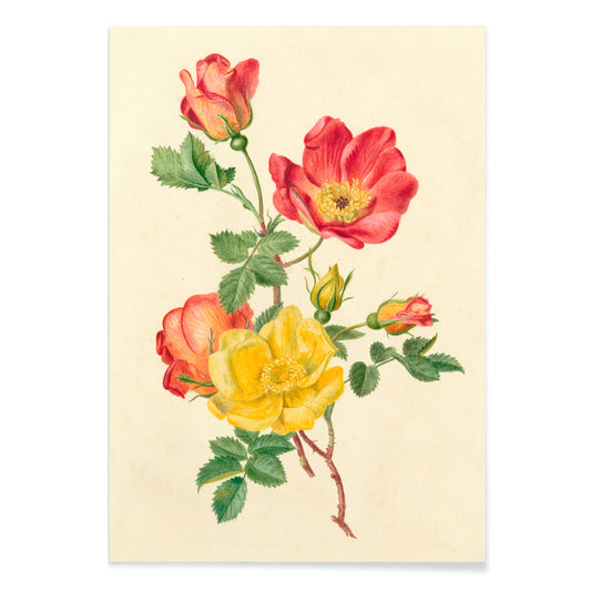
Kvist af vilde roser Plakat
Antoinette Apolonia Luden · 1890 · Yndefuldt vildrosetryk med luftige blomster, knopper og grønne blade
Plakat fra 69 kr · Indrammet fra 122,67 kr
Normalpris Fra 46,00 krNormalpris -
Blå drueklase Plakat
Jean Bernard Klée · 1810 · Realistisk drueklasetryk med dybblå druer og friske grønne blade
Plakat fra 69 kr · Indrammet fra 122,67 kr
Normalpris Fra 46,00 krNormalpris -
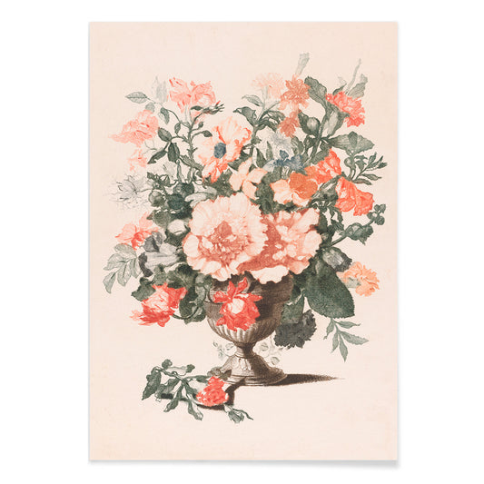
Stenvase med blomster Plakat
Jean-Baptiste Monnoyer · 1690 · barok kunsttryk med en stenvase fyldt med en frodig havebuket
Plakat fra 69 kr · Indrammet fra 122,67 kr
Normalpris Fra 46,00 krNormalpris -
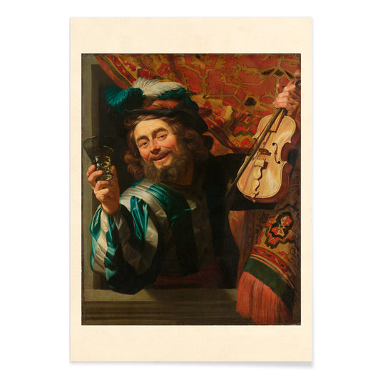
Den muntre violinist Plakat
Gerard van Honthorst · 1623 · dramatiske barokkunsttryk med en grinende violinist med violin og løftet glas
Plakat fra 69 kr · Indrammet fra 122,67 kr
Normalpris Fra 46,00 krNormalpris -
Vintagecykler Plakat
Józef Mehoffer · 1913 · En encyklopedisk cykelplakat med klare sorte linjetegninger på varm beige papir og teknisk præcision
Plakat fra 69 kr · Indrammet fra 122,67 kr
Normalpris Fra 46,00 krNormalpris -
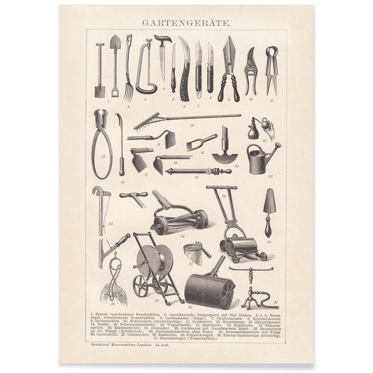
Haveværktøj Plakat
Adolf Engelbert Fischer · 1913 · Præcist vintage tryk med klassiske haveværktøjer i ryddeligt kataloglayout
Plakat fra 69 kr · Indrammet fra 122,67 kr
Normalpris Fra 46,00 krNormalpris -
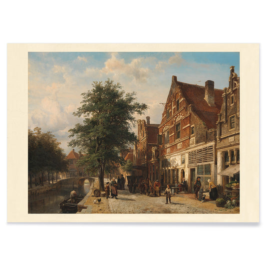
Byudsigt Plakat
Cornelis Springer · 1850 · Lys hollandsk byplakat med klare facader, kanalens spejlinger og gående figurer
Plakat fra 69 kr · Indrammet fra 122,67 kr
Normalpris Fra 46,00 krNormalpris -
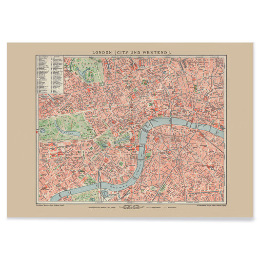
Gammelt kort over London Plakat
Friedrich Arnold Brockhaus · 1899 · Detaljeret London kortplakat der følger Themsen og gadenettet i afdæmpede toner
Plakat fra 69 kr · Indrammet fra 122,67 kr
Normalpris Fra 46,00 krNormalpris -
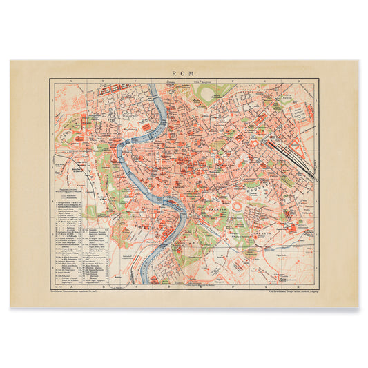
Antikt kort over Rom Plakat
Friedrich Arnold Brockhaus · 1883 · Detaljeret romkort vintagetryk der følger Tiberen med klare, mærkede kvarterer
Plakat fra 69 kr · Indrammet fra 122,67 kr
Normalpris Fra 46,00 krNormalpris -
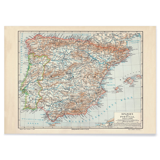
Antikt kort over Spanien Plakat
Carl Diercke · 1905 · Detaljeret vintagetryk af Den iberiske halvø med regionale grænser og bløde beige og blå farver
Plakat fra 69 kr · Indrammet fra 122,67 kr
Normalpris Fra 46,00 krNormalpris -
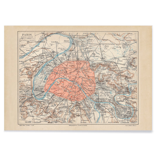
Gammelt Paris-kort Plakat
Friedrich Arnold Brockhaus · 1894 · Detaljeret Paris-bykort i vintage tryk med Seine i blå og røde nuancer
Plakat fra 69 kr · Indrammet fra 122,67 kr
Normalpris Fra 46,00 krNormalpris -
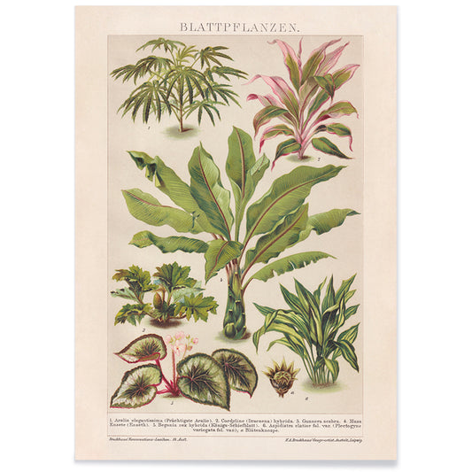
Planternes løv Plakat
Friedrich Wilhelm Kuhnert · 1885 · Delikat botanisk tryk med grønt løv og diskrete lyserøde accenter på varm beige
Plakat fra 69 kr · Indrammet fra 122,67 kr
Normalpris Fra 46,00 krNormalpris -
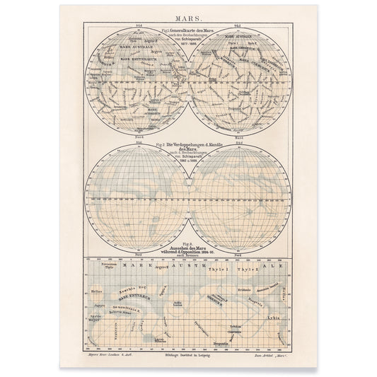
Kort over Mars Plakat
Friedrich Wilhelm Putzger · 1908 · Detaljeret vintage kort over Mars med klart koordinatnet og tydeligt mærkede overfladeregioner
Plakat fra 69 kr · Indrammet fra 122,67 kr
Normalpris Fra 46,00 krNormalpris -
Jordens poler Plakat
Friedrich Arnold Brockhaus · 1897 · Detaljeret polarområde vintage tryk med blå havflader og præcise sorte kortlinjer
Plakat fra 69 kr · Indrammet fra 122,67 kr
Normalpris Fra 46,00 krNormalpris -
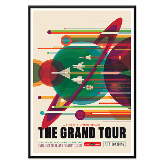
Grand Tour Plakat
Karlyn Murphy · 1977 · Livligt retro solsystemplakat med brede baner og ikoniske planetformer i klare farver
Plakat fra 69 kr · Indrammet fra 122,67 kr
Normalpris Fra 46,00 krNormalpris -
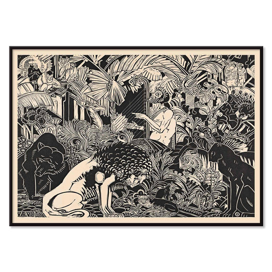
Orpheus Plakat
Henri van der Stok · 1899 · Mytisk Orpheus plakat med harpespiller der beroliger fugle og skovdyr
Plakat fra 69 kr · Indrammet fra 122,67 kr
Normalpris Fra 46,00 krNormalpris -
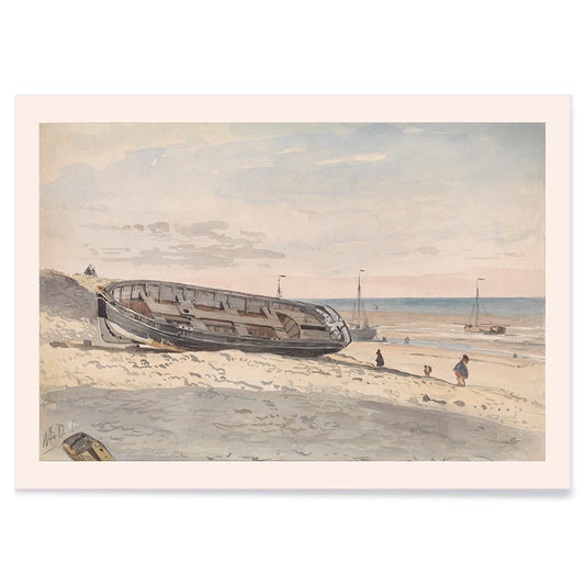
Pramme på stranden Plakat
Willem Anthonie van Deventer · 1870 · Stille kystkunsttryk med optrukne pramme og dæmpede beige, grå og blå toner
Plakat fra 69 kr · Indrammet fra 122,67 kr
Normalpris Fra 46,00 krNormalpris -
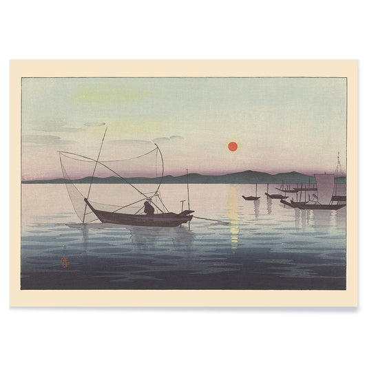
Både ved solnedgang Plakat
Ohara Matao · 1927 · rolige både ved solnedgang plakat med rød sol over blå vand i tusmørke
Plakat fra 69 kr · Indrammet fra 122,67 kr
Normalpris Fra 46,00 krNormalpris -
Paulovnitrægren Plakat
Ohara Koson · 1910 · Elegant blåfugletryk på paulovnitrægren med varme efterårsblade og modne bær
Plakat fra 69 kr · Indrammet fra 122,67 kr
Normalpris Fra 46,00 krNormalpris -
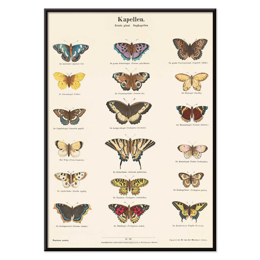
Sommerfugleplakat
Ernst Fröhlich · 1840 · Detaljeret sommerfugletryk med atten arter mærket på hollandsk og latin
Plakat fra 69 kr · Indrammet fra 122,67 kr
Normalpris Fra 46,00 krNormalpris -
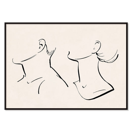
Hals Plakat
Hans Borrebach · 1930 · Minimalistisk plakat med sammenflettede halsprofiler i sort på varm beige
Plakat fra 69 kr · Indrammet fra 122,67 kr
Normalpris Fra 46,00 krNormalpris -
Merkur spiller på sin fløjte Plakat
Willem van Nieulandt · 1627 · mytologisk kunsttryk af Merkur på sin fløjte mens dyr samles i en skov
Plakat fra 69 kr · Indrammet fra 122,67 kr
Normalpris Fra 46,00 krNormalpris -
Kysten Plakat
Orest Droegly · 1970 · Fredfyldt bølgeplakat i lagdelte blå bånd med let hvidt skum
Plakat fra 69 kr · Indrammet fra 122,67 kr
Normalpris Fra 46,00 krNormalpris -
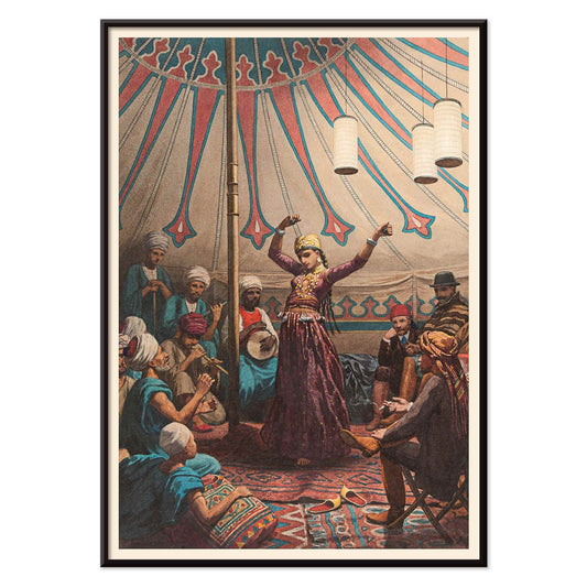
Egyptisk danser plakat
Willem de Famars Testas · 1870 · Intimt orientalsk kunsttryk af en egyptisk danser med musikere og tilskuere
Plakat fra 69 kr · Indrammet fra 122,67 kr
Normalpris Fra 46,00 krNormalpris -
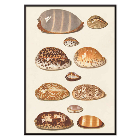
Tropiske skaller Plakat
Johann Gustav Hoch · 1837 · Detaljeret skalletryk med elleve tropiske arter i rolige beige og umbratoner
Plakat fra 69 kr · Indrammet fra 122,67 kr
Normalpris Fra 46,00 krNormalpris


A Palette of Calm: Beige as a Design Filter
Beige is less a color than an atmosphere: sun-warmed paper, linen, unglazed clay, the quiet glow of age. This collection gathers poster and art print images whose grounds lean creamy, sandy, or parchment-like. It echoes sketchbooks, catalogues, and ephemera where margins deepen over time. As a backdrop, it softens contrast and lets graphite, watercolor, and saturated inks breathe. Many vintage posters began as lithographs, woodblocks, or studio plates printed on ivory stock; that mellow base brings the hand closer, turning wall art into intimate decoration.
Paper, Pattern, and the Mechanics of Print
A warm ground changes how detail reads. The paper becomes part of the motif, reminding you that a print was handled, posted, folded, or saved. William Morris’s Strawberry Thief (1883) carries Arts and Crafts ideals into dense rhythm, with indigo birds and pomegranate reds tempered by a vintage base; it sits naturally near the William Morris collection for more ornament-led prints. Japanese woodblock traditions also prize warm stock: Kawase Hasui’s Morning at Dotonbori (1935) translates canal light into layered inks, where separate blocks build tonal veils that feel like weather. In a different register, Katsushika Hokusai’s The Great Wave off Kanagawa (c. 1830) gains extra bite when foam and line cut across a creamy sky rather than stark white, a useful bridge toward Oriental wall art.
Room-by-Room: Working with Warm Neutrals
In living rooms, beige prints settle comfortably among oak, walnut, bouclé, and stone, acting as a visual pause between darker furniture and brighter objects. Pair them with paint shades like ecru, olive, and dusty terracotta, then repeat materials already in the space: linen curtains, a rattan lamp, or matte ceramics. If you want a natural cue without going fully colorful, introduce one restrained botanical plate from Botanical. In corridors and kitchens, a line-led image keeps home decor deliberate; Maps adds soft geography, while Minimalist and Black & White supply structure that still respects a gentle, vintage paper tone.
Curating the Mix: Contrast, Typography, and Frames
Beige does not require quiet composition. Ikko Tanaka’s Kabuki (1974) treats black calligraphy like architecture, and it pairs well with geometry from Abstract or the disciplined systems of Bauhaus. For a sharper jolt, Leonetto Cappiello’s Cachou Lajaunie (1920) introduces a theatrical silhouette and a citrus note that still sits politely on warm stock, echoing the streetwise energy of Advertising. To keep a gallery wall coherent, choose consistent margins and let frames do the joining: oak or walnut for a tonal stack, or brushed brass for a crisp edge; options live in Frames.
Why Beige Reads as Contemporary
Against glossy screens and bright whites, beige wall art restores tempo: fibers, plate marks, and faint aging become part of what you look at. The result is coherence without sameness, where pattern can sit beside seascape or typography beside ornament, held together by a shared warmth that suits both vintage decoration and modern restraint.