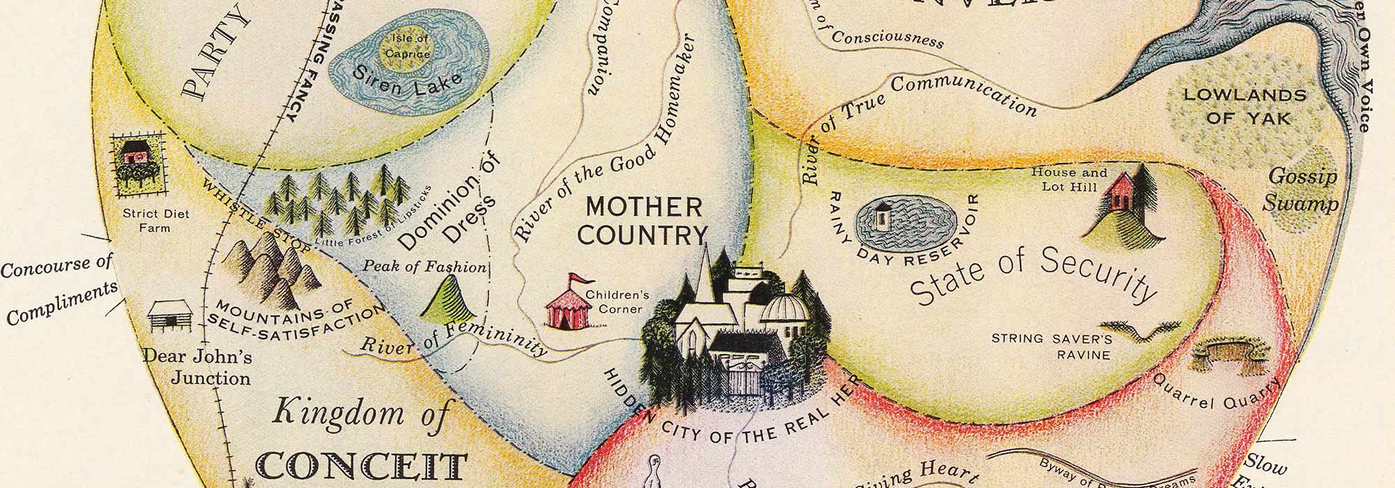
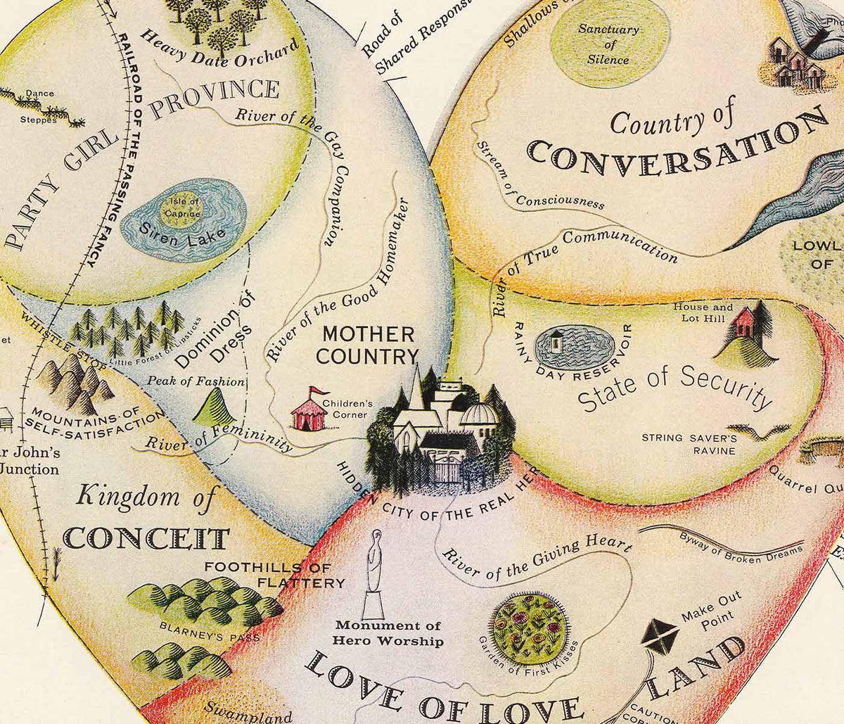


- Geografisk vejviser til en kvindes hjerte Plakat
- Blomstermarked i Lissabon Plakat
- Lissabon Azulejo 1 Plakat
- Lissabon Azulejo 2 Plakat
- Lissabon Sporvogn 28 Plakat
- Minimalistisk Lissabonkort Plakat
- Lissabons bro Plakat
- Red hvalerne Plakat
- Blå japansk trane Plakat
- Portugal i dag Plakat
- 25. april-broen Plakat
- The New Yorker Plakat
- Blomstermarked Barcelona Plakat
- Øl og cigaret Plakat
- Zoologischer Garten Plakat
- Den store bølge ved Kanagawa Plakat
- Porto Ramos-Pinto Plakat
- Snoopy Come Home Plakat
- Havbundens Plakat
- Babar i bil Plakat
- Campari Soda Plakat
- Vågn op og læs Plakat
- Sort kat 2 Plakat
- Grands Prix de France Plakat
- Sigmund Freud havde ret Plakat
- Dansende figurer Matisse Plakat
- Trikolore luftballon Plakat
- Nu Bleu III Plakat
- Rosa himmel Plakat
- Le Voyage de Babar Plakat
- Marihuana Plakat
- Solaris Plakat
- Panter Plakat
- Coffea arabica 3 Plakat
- Cordial Campari Plakat
- Drømmen Plakat
- Papiers découpés 3 Plakat
- Tiger fra Ryōkoku Plakat
- Papiers découpés 1 Plakat
- Den store bølge plakat
- Minimalistisk kort over Barcelona Plakat
- Japansk kvede (Eriobotrya japonica) Plakat
- Surfere på Venice Beach Plakat
- Barcelona Tekst Plakat
- Bleu de Ciel Plakat
- Daggry over Yamanaka-sø Plakat
- Sort kat 4 Plakat
- Fotografisk kamerapatent plakat
- Drik Coca-Cola plakat
- Lissabons gamle by 2 Plakat
-
Whitbreads nye plan over London Plakat
J. Whitbread · 1853 · Detaljeret London plakat med Themsens kurver og fremhævede gader på varm beige
Plakat fra 69 kr · Indrammet fra 122,67 kr
Normalpris Fra 46,00 krNormalpris -
Cocos Schizophylla Plakat
Carl Friedrich Philipp von Martius · 1823 · Detaljeret botanisk tryk af en palme med blade og frugt
Plakat fra 69 kr · Indrammet fra 122,67 kr
Normalpris Fra 46,00 krNormalpris -
Astrocaryum murumuru Plakat
Carl Friedrich Philipp von Martius · 1823 · Detaljeret botanisk palmeplakat med pigget stamme og frugtstudier på beige baggrund
Plakat fra 69 kr · Indrammet fra 122,67 kr
Normalpris Fra 46,00 krNormalpris -
Corypha Cerifera Arruda Plakat
Carl Friedrich Philipp von Martius · 1823 · Detaljeret botanisk plakat af palme med vifteblade og præcise studier
Plakat fra 69 kr · Indrammet fra 122,67 kr
Normalpris Fra 46,00 krNormalpris -
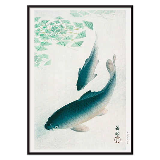
Koi Plakat
Ohara Koson · 1926 · Fredfyldt koi plakat med en driftende karpe i roligt blåt vand
Plakat fra 69 kr · Indrammet fra 122,67 kr
Normalpris Fra 46,00 krNormalpris -
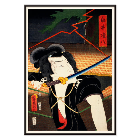
Ofte spillede roller Plakat
Toyohara Kunichika · 1880 · Dramatisk kabuki samuraiplakat med intenst blik og mønstret kostume
Plakat fra 69 kr · Indrammet fra 122,67 kr
Normalpris Fra 46,00 krNormalpris -
Lufthansa Verdenskort Plakat
Ukendt kunstner · 1969 · vintage Lufthansa-verdenskort plakat med fly, skibe og legende rejsedetaljer
Plakat fra 69 kr · Indrammet fra 122,67 kr
Normalpris Fra 46,00 krNormalpris -
Geologisk verdenskort Plakat
James Reynolds · 1850 · Detaljeret geologisk vintagetryk med farvekodede lag og tydelige victorianske betegnelser
Plakat fra 69 kr · Indrammet fra 122,67 kr
Normalpris Fra 46,00 krNormalpris -
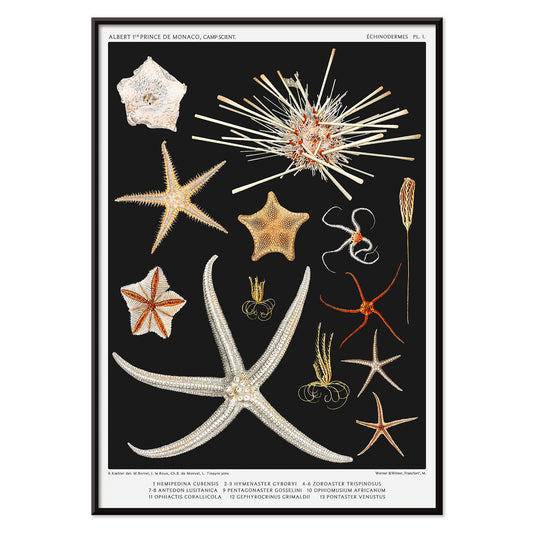
Søstjernearter 1 Plakat
Albert I · 1892 · Detaljeret videnskabeligt tryk med søstjerneeksemplarer arrangeret som en museumsreferenceplade
Plakat fra 69 kr · Indrammet fra 122,67 kr
Normalpris Fra 46,00 krNormalpris -
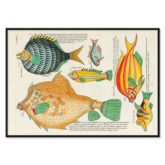
Farverige og surrealistiske fiskillustrationer nr. 5 Plakat
Louis Renard · 1754 · Frodigt tropisk fisketryk med ornamenterede mønstre og klare farver på lys baggrund
Plakat fra 69 kr · Indrammet fra 122,67 kr
Normalpris Fra 46,00 krNormalpris -
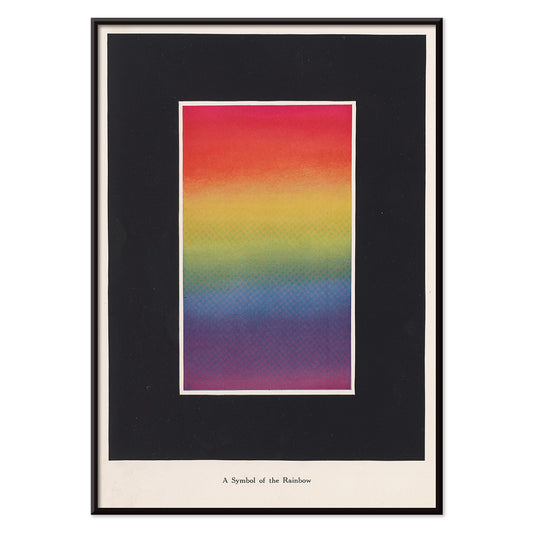
Teori og praksis om farve Plakat
Bonnie E. Snow · 1918 · Strålende regnbueskema plakat med bløde gradienter og klart pædagogisk typografi
Plakat fra 69 kr · Indrammet fra 122,67 kr
Normalpris Fra 46,00 krNormalpris -
Skuespilleren Kawarazaki Gonjuro Plakat
Utagawa Kunisada II · 1864 · dramatisk kabuki tryk med markante kostumemønstre og intenst blik
Plakat fra 69 kr · Indrammet fra 122,67 kr
Normalpris Fra 46,00 krNormalpris -
Utopia Ltd Plakat
Dietmar Winkler · 1969 · Geometrisk typografisk plakat på dyb blå baggrund med klare kraftfulde farveaccenter
Plakat fra 69 kr · Indrammet fra 122,67 kr
Normalpris Fra 46,00 krNormalpris -
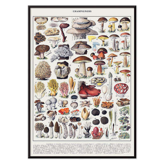
Farveplade med svampe 1 Plakat
Larousse · 1932 · Detaljeret videnskabeligt svampetryk med varierede hætter og lameller i jordnære toner
Plakat fra 69 kr · Indrammet fra 122,67 kr
Normalpris Fra 46,00 krNormalpris -
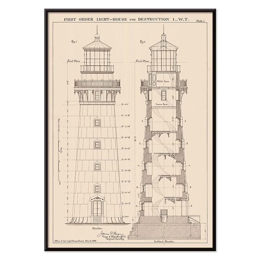
Snit og opstalt af fyrtårn Plakat
Ukendt kunstner · 1889 · Præcist fyrtårnsopstalt vintage tryk med snitdetaljer i skarp sort stregarbejde
Plakat fra 69 kr · Indrammet fra 122,67 kr
Normalpris Fra 46,00 krNormalpris -
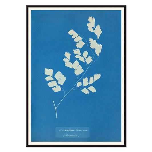
Adiantum tenerum Plakat
Anna Atkins · 1850 · Delikat cyanotypitryk med skarpe hvide bregneflige på dyb blå bund
Plakat fra 69 kr · Indrammet fra 122,67 kr
Normalpris Fra 46,00 krNormalpris -
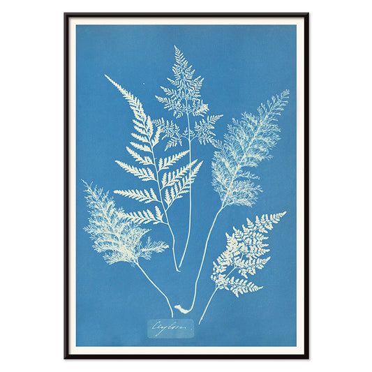
Ceylon Plakat
Anna Atkins · 1850 · Lysende bregnetryk i klassisk cyanotypi blå med fine hvide botaniske silhuetter
Plakat fra 69 kr · Indrammet fra 122,67 kr
Normalpris Fra 46,00 krNormalpris -
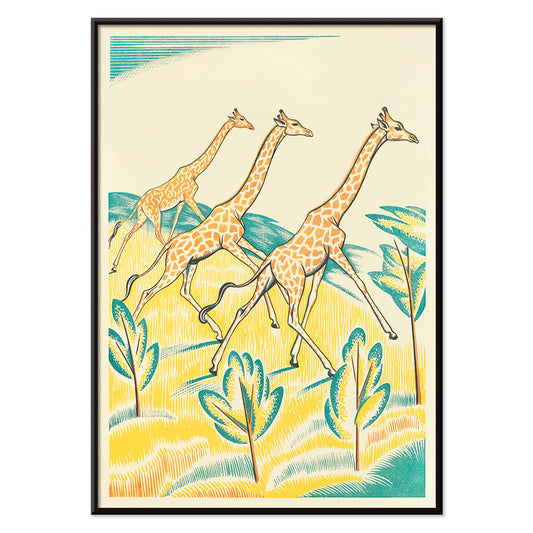
Picnic i junglen 4 Plakat
Clifford Webb · 1934 · legende girafkunsttryk med tre løbende giraffer som snor sig gennem en lys jungle
Plakat fra 69 kr · Indrammet fra 122,67 kr
Normalpris Fra 46,00 krNormalpris -
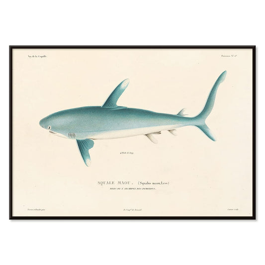
Voyage autour du monde Pl.008 Plakat
Louis-Isidore Duperrey · 1825 · Detaljeret hajvidenskabeligt tryk i profil med præcis skyggeføring og studieangivelser
Plakat fra 69 kr · Indrammet fra 122,67 kr
Normalpris Fra 46,00 krNormalpris -
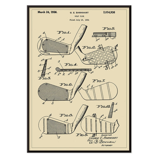
Golfkølle Patent 2 Plakat
G.E. Barnhart · 1931 · Detaljeret patenttryk af golfkølle med klare diagrammer og etiketterede ingeniørkomponenter
Plakat fra 69 kr · Indrammet fra 122,67 kr
Normalpris Fra 46,00 krNormalpris -
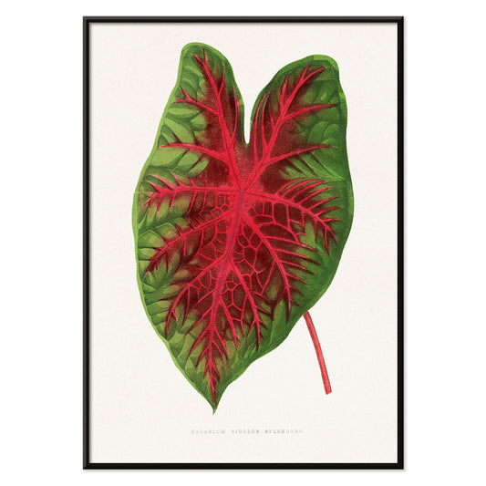
Caladium bicolor Plakat
Alexander Francis Lydon · 1865 · elegant caladium bicolor botanisk tryk med markant grønt blad og røde årer
Plakat fra 69 kr · Indrammet fra 122,67 kr
Normalpris Fra 46,00 krNormalpris -
Grøn Caladium Mirabile Plakat
Benjamin Fawsett · 1865 · Frodigt caladium botanisk tryk med årer i grønne nuancer og delikate hvide striber
Plakat fra 69 kr · Indrammet fra 122,67 kr
Normalpris Fra 46,00 krNormalpris -
Minimalistisk Rio de Janeiro Plakat
MORYARTY · 2021 · Minimalistisk Rio de Janeiro plakat med indviklet gadenet og markant blå bysilhuet
Plakat fra 69 kr · Indrammet fra 122,67 kr
Normalpris Fra 46,00 krNormalpris -
Enhver person med en idé Plakat
Ken White · 1974 · konceptuel plakat med sommerfugle omkring en lysende glødepære i kraftigt gul og sort
Plakat fra 69 kr · Indrammet fra 122,67 kr
Normalpris Fra 46,00 krNormalpris -
Japan målkort Plakat
Ernest Dudley Chase · 1942 · Dynamisk anden verdenskrigskortplakat med Japan i centrum, målmotiv og markante kortikoner
Plakat fra 69 kr · Indrammet fra 122,67 kr
Normalpris Fra 46,00 krNormalpris -
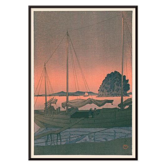
Ukiyo-e Havnesolnedgang Plakat
Kawase Hasui · 1935 · Fængslende kunsttryk af en havnesolnedgang med mørke silhouetter og glødende himmel over roligt vand
Plakat fra 69 kr · Indrammet fra 122,67 kr
Normalpris Fra 46,00 krNormalpris -
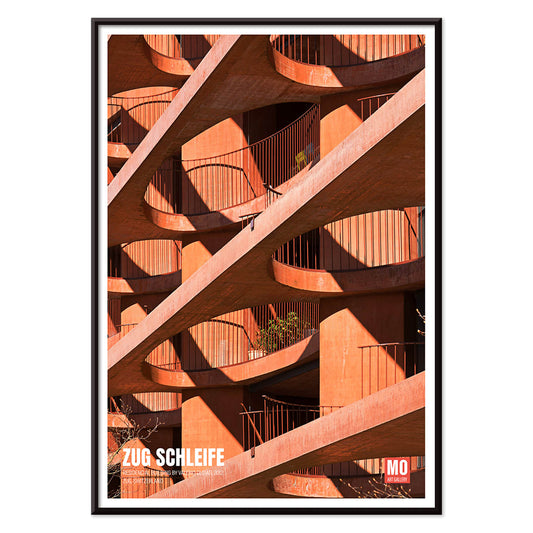
Zug Schleife Plakat
Mo Art Gallery · 2023 · Grafisk arkitekturplakat med en loopende geometrisk form i kraftig orange og sort
Plakat fra 69 kr · Indrammet fra 122,67 kr
Normalpris Fra 46,00 krNormalpris -
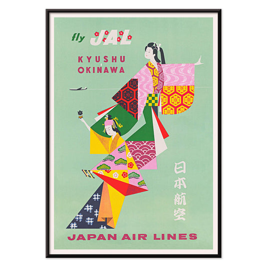
Kyushu-Okinawa Plakat
Ukendt kunstner · 1962 · Livlig japansk rejseplakat med traditionelle figurer og øernes motiver
Plakat fra 69 kr · Indrammet fra 122,67 kr
Normalpris Fra 46,00 krNormalpris -
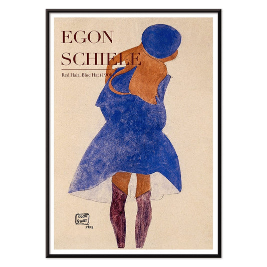
Rødt hår blå hat Plakat
Egon Schiele · 1908 · ekspressivt portrætkunsttryk med flammende hår og kølig blå hat i varmt farvespil
Plakat fra 69 kr · Indrammet fra 122,67 kr
Normalpris Fra 46,00 krNormalpris -
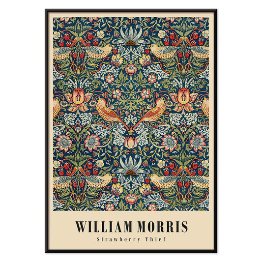
Jordbærtyven Plakat
William Morris · 1883 · Ikonisk Arts and Crafts plakat med drosler, jordbær og snoet løv i dybe blå farver
Plakat fra 69 kr · Indrammet fra 122,67 kr
Normalpris Fra 46,00 krNormalpris -
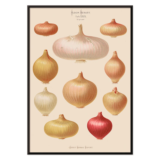
Løg Plakat
Ernst Benary · 1876 · botanisk løgtryk med detaljerede løgknolde, rødder og grønne skud i beige
Plakat fra 69 kr · Indrammet fra 122,67 kr
Normalpris Fra 46,00 krNormalpris -
Den gode nabo i Sydamerika Plakat
Ernest Dudley Chase · 1935 · lys, illustreret kortplakat over sydamerika med dyr, seværdigheder og søfartsruter
Plakat fra 69 kr · Indrammet fra 122,67 kr
Normalpris Fra 46,00 krNormalpris -
Bitterappelsiner Plakat
Pierre-Joseph Redouté · 1810 · Fint botanisk tryk af en bitterappelsingren med frugter, blade og blomster
Plakat fra 69 kr · Indrammet fra 122,67 kr
Normalpris Fra 46,00 krNormalpris -
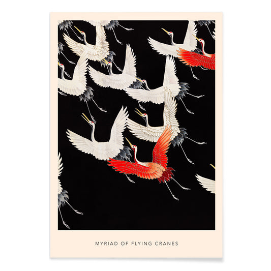
Myriade af flyvende traner Plakat
Katsunosuke Kuroki · 1915 · Yndefuld plakat med traneflugt i rød, sort og hvid og rytmisk mønster
Plakat fra 69 kr · Indrammet fra 122,67 kr
Normalpris Fra 46,00 krNormalpris -
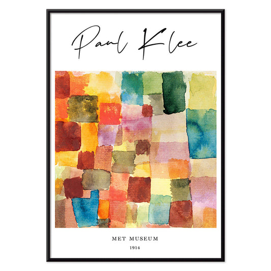
Farvelapværk Plakat
Paul Klee · 1914 · Legende abstrakt kunsttryk med lapværk af varme røde og kølige blå toner
Plakat fra 69 kr · Indrammet fra 122,67 kr
Normalpris Fra 46,00 krNormalpris -
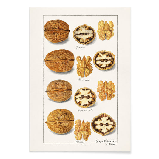
Valnødder Plakat
Amanda Almira Newton · 1911 · Detaljeret botanisk tryk af valnødder med skaller, blade og naturlig skygge
Plakat fra 69 kr · Indrammet fra 122,67 kr
Normalpris Fra 46,00 krNormalpris


- Whitbreads nye plan over London Plakat
- Cocos Schizophylla Plakat
- Astrocaryum murumuru Plakat
- Corypha Cerifera Arruda Plakat
- Koi Plakat
- Ofte spillede roller Plakat
- Lufthansa Verdenskort Plakat
- Geologisk verdenskort Plakat
- Søstjernearter 1 Plakat
- Farverige og surrealistiske fiskillustrationer nr. 5 Plakat
- Teori og praksis om farve Plakat
- Skuespilleren Kawarazaki Gonjuro Plakat
- Utopia Ltd Plakat
- Farveplade med svampe 1 Plakat
- Snit og opstalt af fyrtårn Plakat
- Adiantum tenerum Plakat
- Ceylon Plakat
- Picnic i junglen 4 Plakat
- Voyage autour du monde Pl.008 Plakat
- Golfkølle Patent 2 Plakat
- Caladium bicolor Plakat
- Grøn Caladium Mirabile Plakat
- Minimalistisk Rio de Janeiro Plakat
- Enhver person med en idé Plakat
- Japan målkort Plakat
- Ukiyo-e Havnesolnedgang Plakat
- Zug Schleife Plakat
- Kyushu-Okinawa Plakat
- Rødt hår blå hat Plakat
- Jordbærtyven Plakat
- Løg Plakat
- Den gode nabo i Sydamerika Plakat
- Bitterappelsiner Plakat
- Myriade af flyvende traner Plakat
- Farvelapværk Plakat
- Valnødder Plakat
Hvad bestsellere betyder på en væg med vintage plakater
I en samling af vintage plakater handler bestsellere mindre om larm end om genkendelse: billeder, der bliver ved med at trække et ekstra blik. Udvalget fungerer som et kort over fælles instinkter, hvor grafisk kraft og stille atmosfære kan stå side om side. Rejsemotiver, botaniske studier og ren abstraktion vender tilbage, fordi de hurtigt giver et rum form og rytme. Vil du se de temaer, der ofte ligger bag favoritterne, kan du gå videre til Reklame, Landskaber og Abstrakt.
Hvorfor bestemte billeder bliver ved med at vende tilbage
Mange populære tryk løser et kompositorisk problem med usædvanlig præcision. En stærk silhuet rammer hurtigere end detaljer; en begrænset farveskala holder længere i rummet; typografi kan fungere som arkitektur og sætte retningen for alt omkring sig. Plakatkunstens tradition med flade farver og presset perspektiv forklarer, hvorfor reklamegrafik stadig er tydelig på afstand. Den målte rytme i Bauhaus skærper den tanke, mens figuration hos berømte kunstnere tilfører en menneskelig puls, som moderne rum ofte savner. Vil du sammenligne grafisk tæthed, viser mødet mellem Sort og Hvid og farvestyrede udvalg som Blå, hvordan valør og nuance styrer blikket.
Sådan fungerer bestsellere i rigtige rum
Fordi disse billeder allerede er afprøvet af mange øjne, er de ofte fleksible som vægkunst og vægdekoration, men placeringen betyder stadig noget. I en entré giver en vintage plakat med klar horisont eller central figur retning, idet man træder ind. I et køkken eller en spisekrog ligger typografi og forenklede former godt op ad emalje, krom og åbne hylder; et beslægtet udvalg findes under Køkken. I soveværelset virker mildere kontrast bedst, med luft omkring billedet, så væggen føles rolig frem for tætpakket.
Par, serier og rammer
Begynd med ét bærende kunsttryk, og lad de næste billeder svare på det. Et kraftigt grafisk blad kan dæmpes af en mere stilfærdig udsigt; en enkel komposition kan få tyngde af tættere bogstaver. Hold margenerne ens, så blandede perioder virker bevidste, og lad én tilbagevendende farve samle helheden. Lys eg varmer kølige paletter, sort aluminium gør dem skarpere, og en brækket hvid passepartout kan sænke tempoet i mættede vintage billeder. Hvis du skifter ofte, kan referencerne i Rammer hjælpe med at holde væggen stabil, mens selve udvalget af tryk ændrer sig.
Værker, der forklarer tiltrækningen
Leonetto Cappiellos plakatdesign viser, hvordan ét overdrevet motiv kan bære en hel komposition. Kawase Hasuis sne- og natscener arbejder modsat: kontrollerede overgange og åbne flader, der giver en næsten arkitektonisk ro i rammen. Til rum med mønstre bygger William Morris’ dekorative tryk bro mellem fine art og designhistorie og fungerer smukt ved tekstiler og træ. Disse bestsellere dikterer ikke smag; de viser solide strukturer til en væg, der føles beboet, ikke arrangeret.