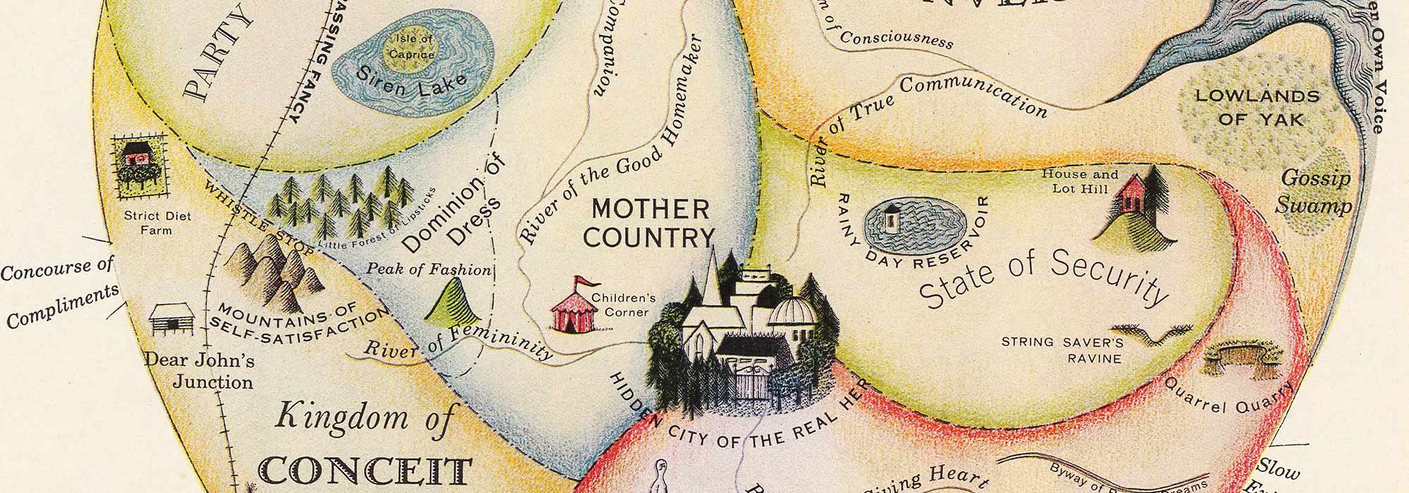
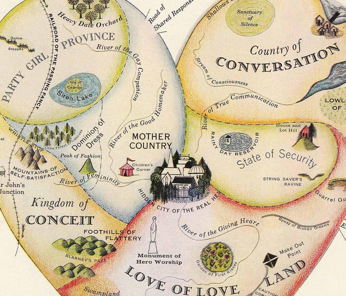


- Geografisk vejviser til en kvindes hjerte Plakat
- Blomstermarked i Lissabon Plakat
- Lissabon Azulejo 1 Plakat
- Lissabon Azulejo 2 Plakat
- Lissabon Sporvogn 28 Plakat
- Minimalistisk Lissabonkort Plakat
- Lissabons bro Plakat
- Red hvalerne Plakat
- Blå japansk trane Plakat
- Portugal i dag Plakat
- 25. april-broen Plakat
- The New Yorker Plakat
- Blomstermarked Barcelona Plakat
- Øl og cigaret Plakat
- Zoologischer Garten Plakat
- Den store bølge ved Kanagawa Plakat
- Porto Ramos-Pinto Plakat
- Snoopy Come Home Plakat
- Havbundens Plakat
- Babar i bil Plakat
- Campari Soda Plakat
- Vågn op og læs Plakat
- Sort kat 2 Plakat
- Grands Prix de France Plakat
- Sigmund Freud havde ret Plakat
- Dansende figurer Matisse Plakat
- Trikolore luftballon Plakat
- Nu Bleu III Plakat
- Rosa himmel Plakat
- Le Voyage de Babar Plakat
- Marihuana Plakat
- Solaris Plakat
- Panter Plakat
- Coffea arabica 3 Plakat
- Cordial Campari Plakat
- Drømmen Plakat
- Papiers découpés 3 Plakat
- Tiger fra Ryōkoku Plakat
- Papiers découpés 1 Plakat
- Den store bølge plakat
- Minimalistisk kort over Barcelona Plakat
- Japansk kvede (Eriobotrya japonica) Plakat
- Surfere på Venice Beach Plakat
- Barcelona Tekst Plakat
- Bleu de Ciel Plakat
- Daggry over Yamanaka-sø Plakat
- Sort kat 4 Plakat
- Fotografisk kamerapatent plakat
- Drik Coca-Cola plakat
- Lissabons gamle by 2 Plakat
-
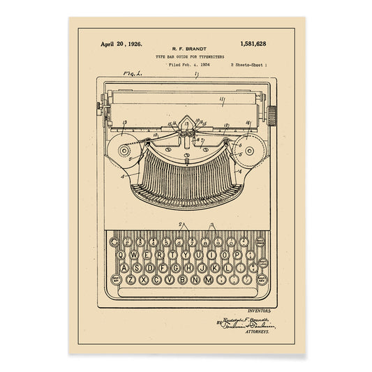
Skrivemaskinepatent Plakat
Robert F. Brandt · 1878 · Præcist tryk af skrivemaskinemekanisme med mærkede diagrammer på varmt beige patentpapir
Plakat fra 69 kr · Indrammet fra 122,67 kr
Normalpris Fra 46,00 krNormalpris -
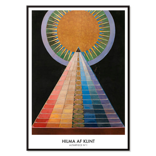
Altertavle nr. 1 Plakat
Hilma af Klint · 1915 · Strålende geometrisk kunsttryk med centralt solmotiv og markante former på sort baggrund
Plakat fra 69 kr · Indrammet fra 122,67 kr
Normalpris Fra 46,00 krNormalpris -
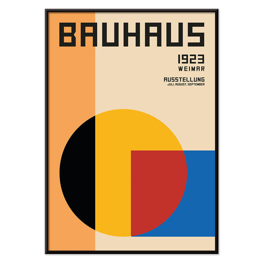
Bauhaus Plakat 1
MORYARTY · 1923 · Geometrisk Bauhaus plakat med lagdelte former og stærke modernistiske farvekontraster
Plakat fra 69 kr · Indrammet fra 122,67 kr
Normalpris Fra 46,00 krNormalpris -
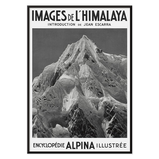
Le Siniolchu Plakat
Vittorio Sella · 1899 · monokrom plakat af Le Siniolchu med klart alpellys, dybe sorttoner og dramatiske snerygge
Plakat fra 69 kr · Indrammet fra 122,67 kr
Normalpris Fra 46,00 krNormalpris -
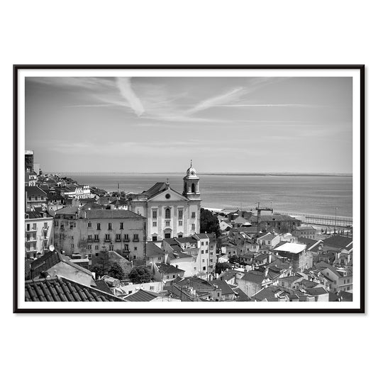
Lissabon gamle by 1 Plakat
MORYARTY · 2017 · sort-hvid Lissabon plakat med lagdelte tage og roligt hav og stille kystlinje
Plakat fra 69 kr · Indrammet fra 122,67 kr
Normalpris Fra 46,00 krNormalpris -
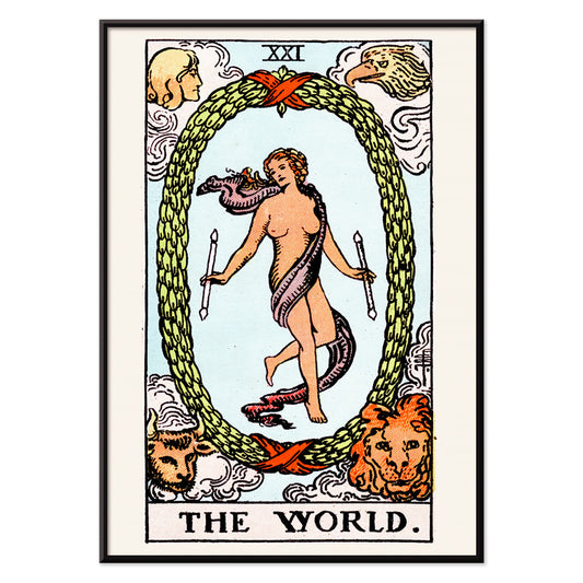
Verden tarotplakat
Rider Waite · 1910 · Mystisk tarotplakat med dansende figur i laurbærkrans og fire vogtere
Plakat fra 69 kr · Indrammet fra 122,67 kr
Normalpris Fra 46,00 krNormalpris -
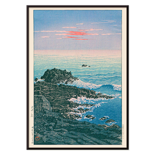
Morgen ved Kap Inubō Plakat
Kawase Hasui · 1931 · Fredfyldt havplakat med morgenhimmel, skummende bølger og en fjern fyr
Plakat fra 69 kr · Indrammet fra 122,67 kr
Normalpris Fra 46,00 krNormalpris -
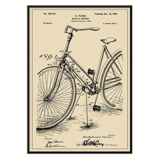
Cykelpatent Plakat
Charles D. Rice · 1896 · Detaljeret cykelpatenttryk med tekniske diagrammer i skarp sort på beige
Plakat fra 69 kr · Indrammet fra 122,67 kr
Normalpris Fra 46,00 krNormalpris -
Stenbukken Plakat
Henri van der Stok · 1913 · Symbolsk Stenbukken plakat med markante sorte former og roligt himmelsk udtryk
Plakat fra 69 kr · Indrammet fra 122,67 kr
Normalpris Fra 46,00 krNormalpris -
Krebs Plakat
Henri van der Stok · 1913 · Drømmeagtig Krebsplakat med krabbe under stjerner i elegant sort på beige
Plakat fra 69 kr · Indrammet fra 122,67 kr
Normalpris Fra 46,00 krNormalpris -
Jomfruen Plakat
Henri van der Stok · 1900 · Art Nouveau jomfruen plakat med en rolig jomfru omgivet af udsmykkede stjernetegnsmotiver
Plakat fra 69 kr · Indrammet fra 122,67 kr
Normalpris Fra 46,00 krNormalpris -
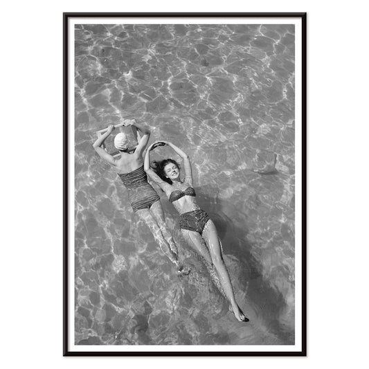
Nickerson Paine iført bikini Plakat
Toni Frissell · 1971 · Sort-hvid bikiniplakat med soloplyst kystkomposition og skarp, grafisk kontrast
Plakat fra 69 kr · Indrammet fra 122,67 kr
Normalpris Fra 46,00 krNormalpris -
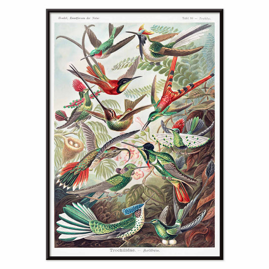
Trochilidae Plakat
Ernst Haeckel · 1904 · Detaljeret videnskabeligt tryk af kolibrier med naturhistorisk præcision og ornamentel elegance
Plakat fra 69 kr · Indrammet fra 122,67 kr
Normalpris Fra 46,00 krNormalpris -
Yatsuo no tsubaki Plakat
Taguchi Tomoki · 1865 · roeligt kamelia- og fugletryk i klassisk japansk træsnitskomposition som plakat
Plakat fra 69 kr · Indrammet fra 122,67 kr
Normalpris Fra 46,00 krNormalpris -
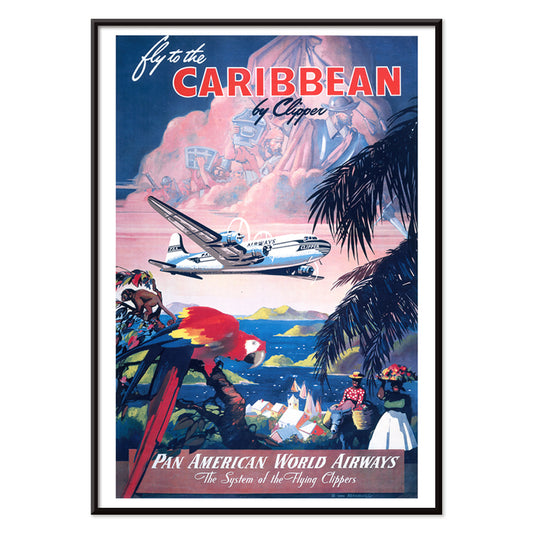
Fly til Caribien Plakat
Mark Von Arenburg · 1949 · Solbeskinnet Caribien rejseplakat med en Clipper over palmer og sejlbåde
Plakat fra 69 kr · Indrammet fra 122,67 kr
Normalpris Fra 46,00 krNormalpris -
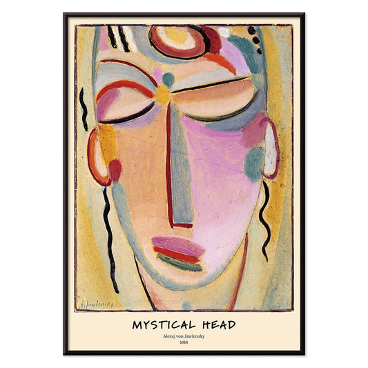
Mystisk hoved Plakat
Alexej von Jawlensky · 1918 · Strålende abstrakt ansigtskunsttryk med markante konturer og meditativ symmetri
Plakat fra 69 kr · Indrammet fra 122,67 kr
Normalpris Fra 46,00 krNormalpris -
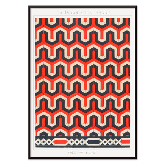
La Décoration Arabe 3 Plakat
Emile Prisses d’Avennes · 1885 · Detaljeret geometrisk plakat i rød, sort og hvid symmetri
Plakat fra 69 kr · Indrammet fra 122,67 kr
Normalpris Fra 46,00 krNormalpris -
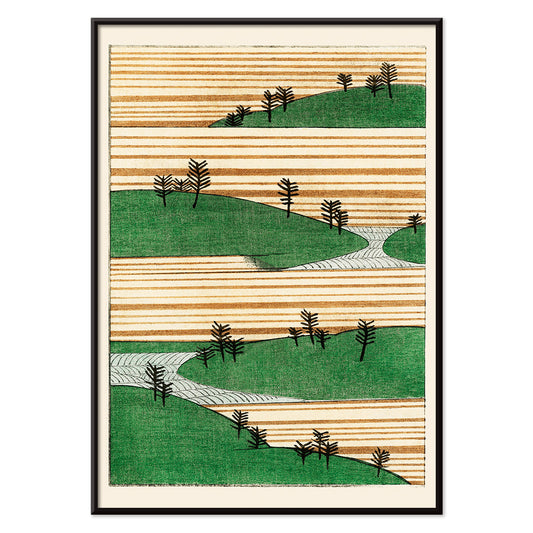
Grønt landskab Plakat
Watanabe Seitei · 1900 · Roligt japansk landskabskunsttryk med lagdelte grønne bakker og luftig stemning
Plakat fra 69 kr · Indrammet fra 122,67 kr
Normalpris Fra 46,00 krNormalpris -
Columbia Road blomstermarked Plakat
MORYARTY · 2017 · Frodig blomsterplakat med stiliseret vase og buket i klare moderne farver
Plakat fra 69 kr · Indrammet fra 122,67 kr
Normalpris Fra 46,00 krNormalpris -
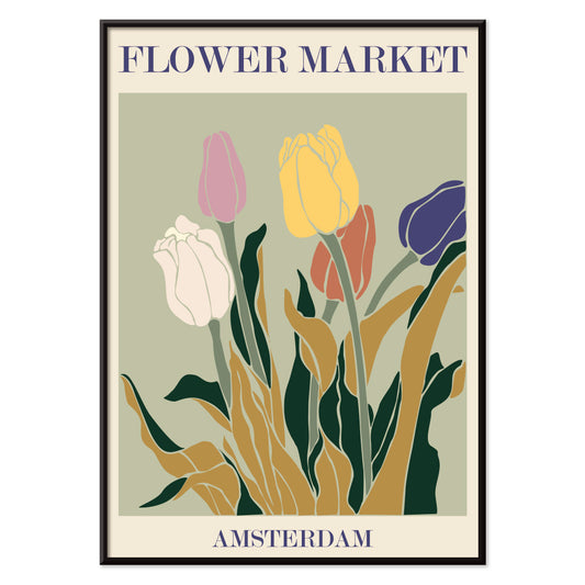
Blomstermarked i Amsterdam Plakat
MORYARTY · 2019 · retro tulipanmarkedplakat med jordnære farver, grafisk enkelhed og varm nostalgi
Plakat fra 69 kr · Indrammet fra 122,67 kr
Normalpris Fra 46,00 krNormalpris -
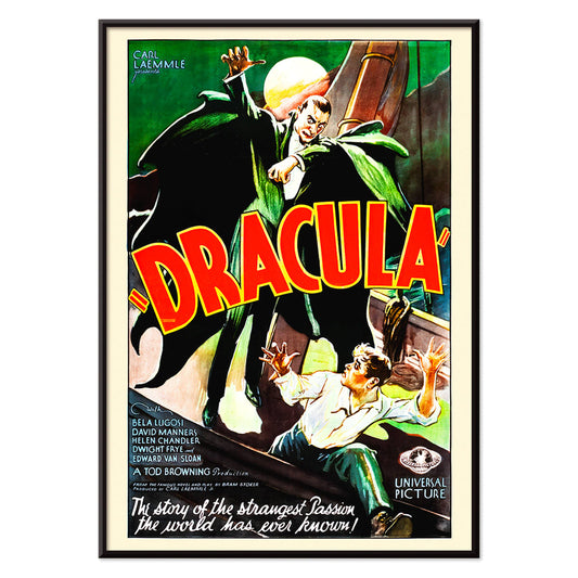
Dracula Plakat
ukendt kunstner · 1931 · dramatisk gyserplakat med truende hætteklædt vampyrsilhuet mod fuldmåne
Plakat fra 69 kr · Indrammet fra 122,67 kr
Normalpris Fra 46,00 krNormalpris -
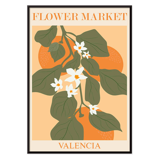
Blomstermarkedet i Valencia Plakat
MORYARTY · 2022 · Lys botanisk plakat med Valenciablade og hvide blomster på varm orange
Plakat fra 69 kr · Indrammet fra 122,67 kr
Normalpris Fra 46,00 krNormalpris -
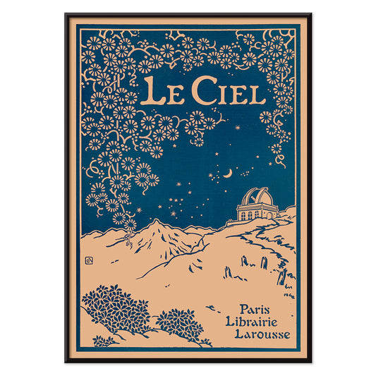
Le Ciel Plakat
Alphonse Berget · 1925 · Art Nouveau astronomiplakat med dyb blå himmel, detaljerede stjernekort og florale ornamenter
Plakat fra 69 kr · Indrammet fra 122,67 kr
Normalpris Fra 46,00 krNormalpris -
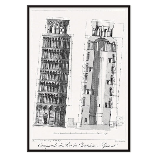
Campanile di Pisa Plakat
G.L. Taylor · 1837 · Præcist arkitekturtryk af det skæve tårn i Pisa i klar monokrom
Plakat fra 69 kr · Indrammet fra 122,67 kr
Normalpris Fra 46,00 krNormalpris -
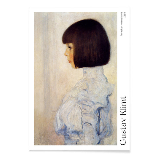
Portræt af Helene Plakat
Gustav Klimt · 1898 · Blidt profilportræt kunsttryk med blød grafittoning på varmt beige papir
Plakat fra 69 kr · Indrammet fra 122,67 kr
Normalpris Fra 46,00 krNormalpris -
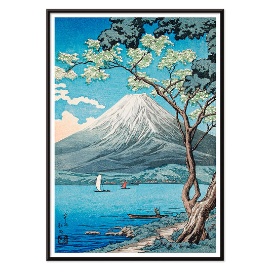
Fujibjerget fra Yamanaka-søen Plakat
Hiroaki Takahashi · 1929 · Fredfyldt japansk landskabskunsttryk med sejlbåde på Yamanaka-søen under det sneklædte Fujibjerg
Plakat fra 69 kr · Indrammet fra 122,67 kr
Normalpris Fra 46,00 krNormalpris -
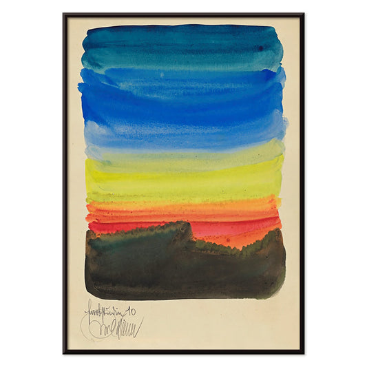
Farbstudien, 10 Blätter X Plakat
Karl Wiener · 1923 · modernistisk abstrakt kunsttryk med geometriske former i afdæmpet blå, okker og sort
Plakat fra 69 kr · Indrammet fra 122,67 kr
Normalpris Fra 46,00 krNormalpris -
Avocado (Persea) Plakat
Amanda Almira Newton · 1916 · detaljeret avocadotryk med modne frugthalvdele og blanke grønne blade
Plakat fra 69 kr · Indrammet fra 122,67 kr
Normalpris Fra 46,00 krNormalpris -
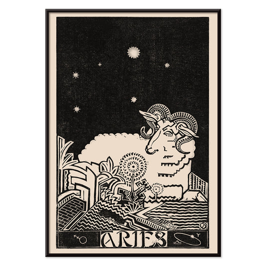
Vædderen Plakat
Henri van der Stok · 1900 · Grafisk Vædderen plakat med markant væddersilhuet og stjernehimmel
Plakat fra 69 kr · Indrammet fra 122,67 kr
Normalpris Fra 46,00 krNormalpris -
Modeller i badetøj ved poolen Plakat
Toni Frissell · 1921 · Stilfuldt kunsttryk ved poolen med delikate badedragtssilhuetter på glitrende vand
Plakat fra 69 kr · Indrammet fra 122,67 kr
Normalpris Fra 46,00 krNormalpris -
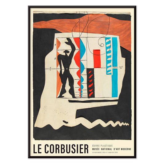
Le Modulor Plakat
Le Corbusier · 1950 · Ikonisk proportionalmandplakat med sort linjetegning og røde og blå accenter
Plakat fra 69 kr · Indrammet fra 122,67 kr
Normalpris Fra 46,00 krNormalpris -
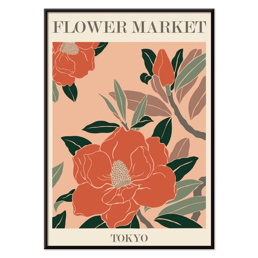
Blomstermarked - Tokyo Plakat
MORYARTY · 2021 · Livlig blomsterplakat med kraftige markedsblomster, klare former og friske grønne accenter
Plakat fra 69 kr · Indrammet fra 122,67 kr
Normalpris Fra 46,00 krNormalpris -
Blomstermarked i Rom Plakat
MORYARTY · 2019 · Frodigt liljebuketplakat inspireret af romerske blomsterboder i varme pink og orange nuancer
Plakat fra 69 kr · Indrammet fra 122,67 kr
Normalpris Fra 46,00 krNormalpris -
Papirudskæringer 2 Plakat
MORYARTY · 2023 · Matisseinspireret abstrakt plakat med markante papirudskæringsformer i klare primærfarver
Plakat fra 69 kr · Indrammet fra 122,67 kr
Normalpris Fra 46,00 krNormalpris -
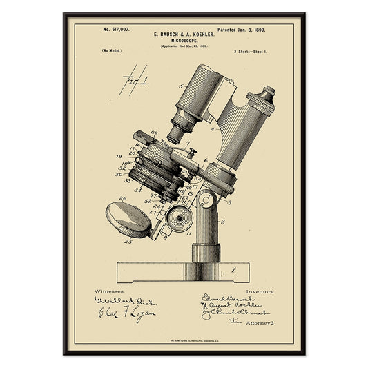
Mikroskoppatent Plakat
E. Bausch · 1899 · Præcist mikroskoppatenttryk med skarpe, tydeligt mærkede linjer på varmt beige papir
Plakat fra 69 kr · Indrammet fra 122,67 kr
Normalpris Fra 46,00 krNormalpris -
Cykelstøtte Plakat
B. Peisen · 1899 · Detaljeret vintagetryk af cykelstøtte med klare patentskitser og præcise noter
Plakat fra 69 kr · Indrammet fra 122,67 kr
Normalpris Fra 46,00 krNormalpris


- Skrivemaskinepatent Plakat
- Altertavle nr. 1 Plakat
- Bauhaus Plakat 1
- Le Siniolchu Plakat
- Lissabon gamle by 1 Plakat
- Verden tarotplakat
- Morgen ved Kap Inubō Plakat
- Cykelpatent Plakat
- Stenbukken Plakat
- Krebs Plakat
- Jomfruen Plakat
- Nickerson Paine iført bikini Plakat
- Trochilidae Plakat
- Yatsuo no tsubaki Plakat
- Fly til Caribien Plakat
- Mystisk hoved Plakat
- La Décoration Arabe 3 Plakat
- Grønt landskab Plakat
- Columbia Road blomstermarked Plakat
- Blomstermarked i Amsterdam Plakat
- Dracula Plakat
- Blomstermarkedet i Valencia Plakat
- Le Ciel Plakat
- Campanile di Pisa Plakat
- Portræt af Helene Plakat
- Fujibjerget fra Yamanaka-søen Plakat
- Farbstudien, 10 Blätter X Plakat
- Avocado (Persea) Plakat
- Vædderen Plakat
- Modeller i badetøj ved poolen Plakat
- Le Modulor Plakat
- Blomstermarked - Tokyo Plakat
- Blomstermarked i Rom Plakat
- Papirudskæringer 2 Plakat
- Mikroskoppatent Plakat
- Cykelstøtte Plakat
Hvad bestsellere betyder på en væg med vintage plakater
I en samling af vintage plakater handler bestsellere mindre om larm end om genkendelse: billeder, der bliver ved med at trække et ekstra blik. Udvalget fungerer som et kort over fælles instinkter, hvor grafisk kraft og stille atmosfære kan stå side om side. Rejsemotiver, botaniske studier og ren abstraktion vender tilbage, fordi de hurtigt giver et rum form og rytme. Vil du se de temaer, der ofte ligger bag favoritterne, kan du gå videre til Reklame, Landskaber og Abstrakt.
Hvorfor bestemte billeder bliver ved med at vende tilbage
Mange populære tryk løser et kompositorisk problem med usædvanlig præcision. En stærk silhuet rammer hurtigere end detaljer; en begrænset farveskala holder længere i rummet; typografi kan fungere som arkitektur og sætte retningen for alt omkring sig. Plakatkunstens tradition med flade farver og presset perspektiv forklarer, hvorfor reklamegrafik stadig er tydelig på afstand. Den målte rytme i Bauhaus skærper den tanke, mens figuration hos berømte kunstnere tilfører en menneskelig puls, som moderne rum ofte savner. Vil du sammenligne grafisk tæthed, viser mødet mellem Sort og Hvid og farvestyrede udvalg som Blå, hvordan valør og nuance styrer blikket.
Sådan fungerer bestsellere i rigtige rum
Fordi disse billeder allerede er afprøvet af mange øjne, er de ofte fleksible som vægkunst og vægdekoration, men placeringen betyder stadig noget. I en entré giver en vintage plakat med klar horisont eller central figur retning, idet man træder ind. I et køkken eller en spisekrog ligger typografi og forenklede former godt op ad emalje, krom og åbne hylder; et beslægtet udvalg findes under Køkken. I soveværelset virker mildere kontrast bedst, med luft omkring billedet, så væggen føles rolig frem for tætpakket.
Par, serier og rammer
Begynd med ét bærende kunsttryk, og lad de næste billeder svare på det. Et kraftigt grafisk blad kan dæmpes af en mere stilfærdig udsigt; en enkel komposition kan få tyngde af tættere bogstaver. Hold margenerne ens, så blandede perioder virker bevidste, og lad én tilbagevendende farve samle helheden. Lys eg varmer kølige paletter, sort aluminium gør dem skarpere, og en brækket hvid passepartout kan sænke tempoet i mættede vintage billeder. Hvis du skifter ofte, kan referencerne i Rammer hjælpe med at holde væggen stabil, mens selve udvalget af tryk ændrer sig.
Værker, der forklarer tiltrækningen
Leonetto Cappiellos plakatdesign viser, hvordan ét overdrevet motiv kan bære en hel komposition. Kawase Hasuis sne- og natscener arbejder modsat: kontrollerede overgange og åbne flader, der giver en næsten arkitektonisk ro i rammen. Til rum med mønstre bygger William Morris’ dekorative tryk bro mellem fine art og designhistorie og fungerer smukt ved tekstiler og træ. Disse bestsellere dikterer ikke smag; de viser solide strukturer til en væg, der føles beboet, ikke arrangeret.