


- Ødelæg dette rasende bæst Plakat
- Shaw eller ironi Plakat
- Les Lalanne Plakat
- Punch Boutique Plakat
- Jødedom og hedenskab, standpunkt Plakat
- Jet Clipper til Hawaii Plakat
- Campari Soda Plakat
- Bec-Kina Plakat
- Berlin gadescene Plakat
- Ernst Kirchner udstillingsplakat Plakat
- Eiffeltårnet 2 Plakat
- Siddende kvinde set bagfra Plakat
- Park nær Lu Plakat
- El Comienzo Plakat
- Parler Seul 2 Plakat
- Mahatmaernes nuværende standpunkt Plakat
- Tusmørkets Ring Plakat
- Parler Seul Plakat
- Drømmen Plakat
- Le Concert Plakat
- Fugl passerer gennem en sky Plakat
- Kvindelig kunstner Plakat
- Pink Panthers hævn Plakat
- Kvinde og fugl om natten Plakat
- Riley Blaze Plakat
- Almanaque Plakat
- Bauhaus 20 Plakat
- Bauhaus 21 Plakat
- Spis flere frugter Plakat
- Blå japansk trane Plakat
- Snoopy Come Home Plakat
- Til London med Jet Clipper plakat
- La Paresse Plakat
- Xerez Pedro Domecq Plakat
- Balsam Aperitif Plakat
- Crans-sur-Sierre Plakat
-
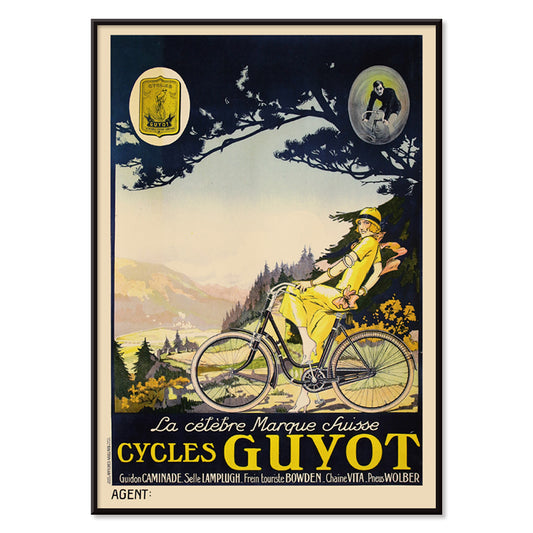
Cycles Guyot Plakat
Ukendt kunstner · 1920 · Slående cykelplakat med en gulklædt rytter og kraftig sort typografi
Plakat fra 69 kr · Indrammet fra 122,67 kr
Normalpris Fra 46,00 krNormalpris -
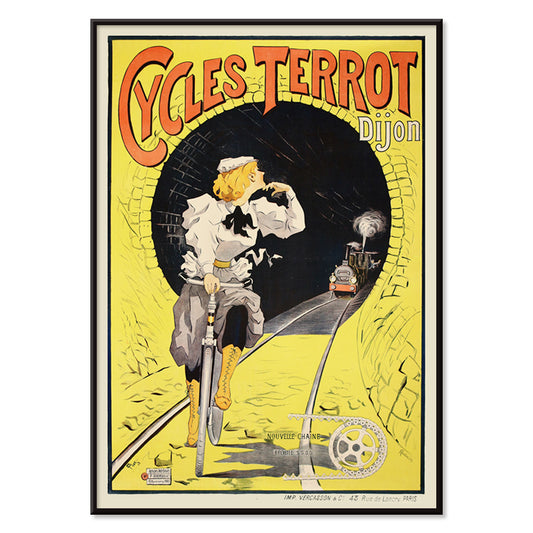
Cycles Terrot Dijon Plakat
Ukendt kunstner · 1900 · Dramatiske franske cykelplakat med cyklist i fuld fart forbi tunnel og tog
Plakat fra 69 kr · Indrammet fra 122,67 kr
Normalpris Fra 46,00 krNormalpris -
Rebecca Salsbury Strand Plakat
Alfred Stieglitz · 1922 · intimt sort-hvidt kunsttryk med rolig modernistisk intensitet og tidløs, underspillet elegance
Plakat fra 69 kr · Indrammet fra 122,67 kr
Normalpris Fra 46,00 krNormalpris -
Vivaudous Mavis Plakat
Fred L. Parker · 1920 · glamorøs Art Deco parfumeplakat med elegant figur og juveltonede flasker
Plakat fra 69 kr · Indrammet fra 122,67 kr
Normalpris Fra 46,00 krNormalpris -
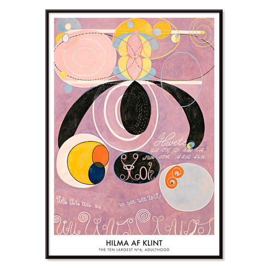
De ti største nr. 6 Plakat
Hilma af Klint · 1907 · Strålende abstrakt plakat med hvirvlende former og symboler i bløde rosa og lilla
Plakat fra 69 kr · Indrammet fra 122,67 kr
Normalpris Fra 46,00 krNormalpris -
Mapamundi 2 Plakat
Paluzie Lucena · 1938 · Detaljeret verdenskortplakat med klare sorte navne og varme beige og grønne toner
Plakat fra 69 kr · Indrammet fra 122,67 kr
Normalpris Fra 46,00 krNormalpris -
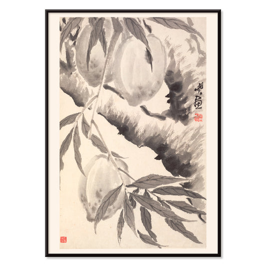
Ferskner Plakat
Min Zhen · 1788 · elegant kunsttryk med ferskner i sparsomme sorte blækstreger og luftig negativ plads
Plakat fra 69 kr · Indrammet fra 122,67 kr
Normalpris Fra 46,00 krNormalpris -
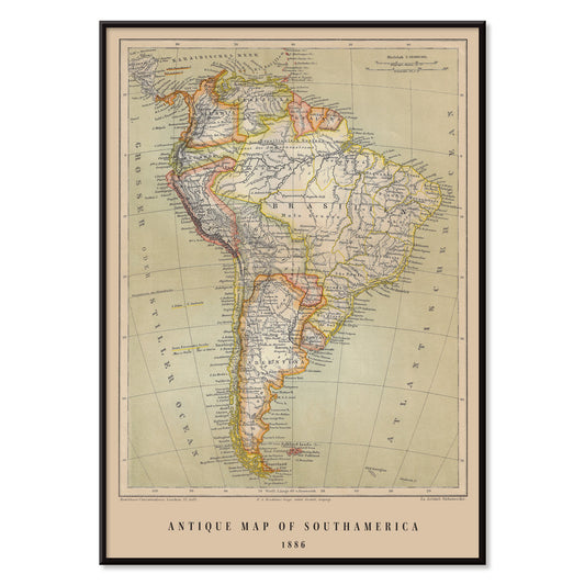
Antikt kort over Brasilien Plakat
Institute of Leipzig · 1886 · detaljeret brasilien vintage tryk med skarpe rammer og tysk typografi
Plakat fra 69 kr · Indrammet fra 122,67 kr
Normalpris Fra 46,00 krNormalpris -
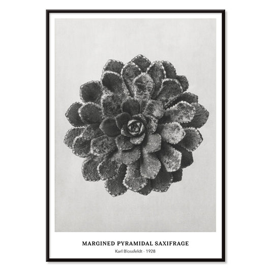
Kantet pyramidesaxifrage Plakat
Karl Blossfeldt · 1928 · Skulpturelt saxifragekunsttryk med skarp sort-hvid kontrast og arkitektonisk symmetri
Plakat fra 69 kr · Indrammet fra 122,67 kr
Normalpris Fra 46,00 krNormalpris -
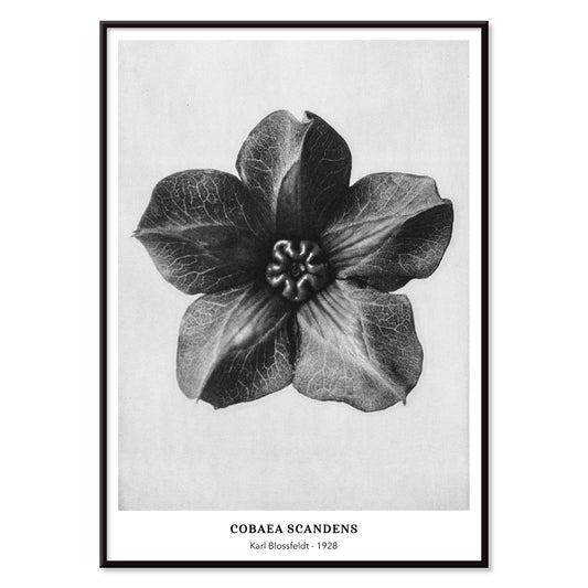
Cobea scandens Plakat
Karl Blossfeldt · 1928 · skulpturelt plakattryk af mexicansk vedbend i klar sort hvid tonalitet med snoede slyngtråde
Plakat fra 69 kr · Indrammet fra 122,67 kr
Normalpris Fra 46,00 krNormalpris -
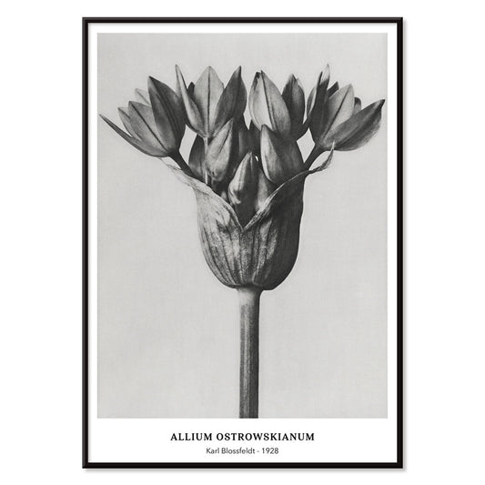
Allium Ostroroskianum Plakat
Karl Blossfeldt · 1928 · modernistisk botanisk tryk der afslører alliums struktur i skarp sort-hvid detalje
Plakat fra 69 kr · Indrammet fra 122,67 kr
Normalpris Fra 46,00 krNormalpris -
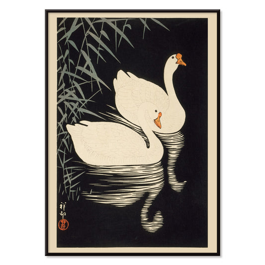
Hvide kinesiske gæs Plakat
Ohara Koson · 1928 · Fredfyldt naturtryk med to hvide gæs glidende mellem siv over stille vand
Plakat fra 69 kr · Indrammet fra 122,67 kr
Normalpris Fra 46,00 krNormalpris -
Duer nr. 2 Plakat
Hilma af Klint · 1915 · Lyrisk abstrakt kunsttryk med duesymbolik og pastelfarvede geometriske former
Plakat fra 69 kr · Indrammet fra 122,67 kr
Normalpris Fra 46,00 krNormalpris -
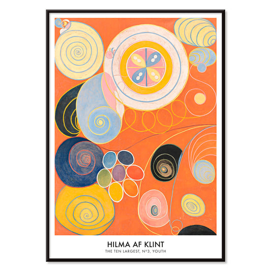
De ti største, nr. 3 Plakat
Hilma af Klint · 1907 · Strålende abstrakt kunsttryk med spiraler, bladformede motiver og flydende symboler på orange bund
Plakat fra 69 kr · Indrammet fra 122,67 kr
Normalpris Fra 46,00 krNormalpris -
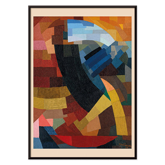
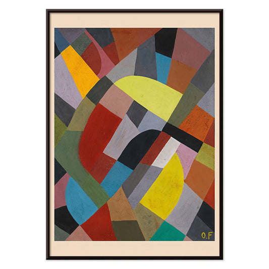
Fragments de figure Plakat
Otto Freundlich · 1928 · Livlig geometrisk plakat med fragmenteret figur og markante sorte konturer
Plakat fra 69 kr · Indrammet fra 122,67 kr
Normalpris Fra 46,00 krNormalpris -
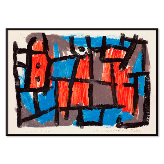
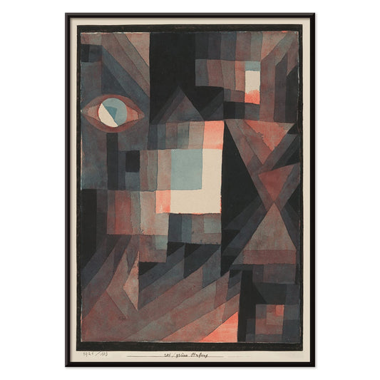
Timen før natten Plakat
Paul Klee · 1940 · Drømmeagtigt abstrakt plakat med sorte linjer og røde og blå former på dæmpet baggrund
Plakat fra 69 kr · Indrammet fra 122,67 kr
Normalpris Fra 46,00 krNormalpris -
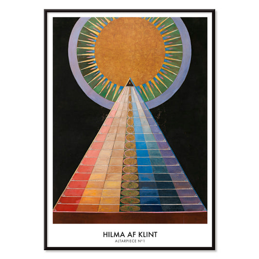
Altertavle nr. 1 Plakat
Hilma af Klint · 1915 · Strålende geometrisk kunsttryk med centralt solmotiv og markante former på sort baggrund
Plakat fra 69 kr · Indrammet fra 122,67 kr
Normalpris Fra 46,00 krNormalpris -
Rød og grøn gradation Plakat
Paul Klee · 1921 · modernistisk plakat med graduerede røde og grønne blokke og fine sorte linjer
Plakat fra 69 kr · Indrammet fra 122,67 kr
Normalpris Fra 46,00 krNormalpris -
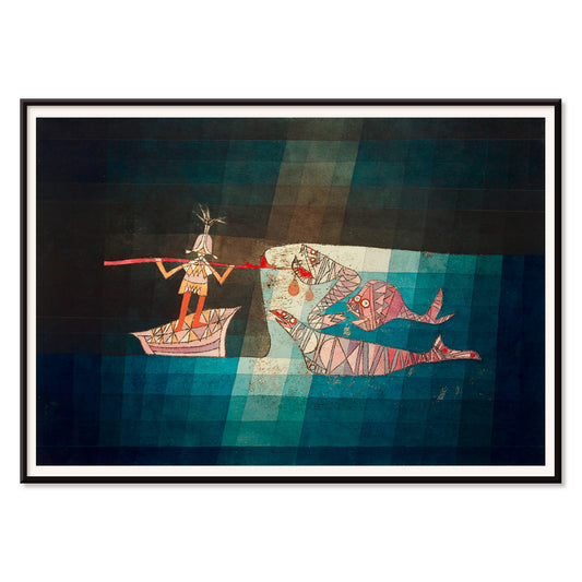
Sejleren Plakat
Paul Klee · 1923 · Legende abstrakt søfartsplakat med rytmiske symboler der fremmaner musik og havrejse
Plakat fra 69 kr · Indrammet fra 122,67 kr
Normalpris Fra 46,00 krNormalpris -
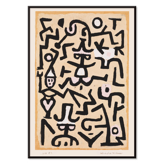
Komikernes løbeseddel Plakat
Paul Klee · 1938 · Legesyg abstrakt plakat med sceneagtige figurer i spredte sorte streger på beige
Plakat fra 69 kr · Indrammet fra 122,67 kr
Normalpris Fra 46,00 krNormalpris -
Composition Abstraite Plakat
Otto Freundlich · 1937 · Frodigt geometrisk kunsttryk med sammenflettede farveblokke afgrænset af sorte linjer
Plakat fra 69 kr · Indrammet fra 122,67 kr
Normalpris Fra 46,00 krNormalpris -
Komposition Plakat
Otto Freundlich · 1936 · Kraftfuldt geometrisk kunsttryk med sammenflettede farveflader og markant modernistisk energi
Plakat fra 69 kr · Indrammet fra 122,67 kr
Normalpris Fra 46,00 krNormalpris -
Osnovnoye design Plakat
Gustavs Klucis · 1920 · Dynamisk konstruktivistisk plakat med kyrillisk typografi og markante røde geometriske former
Plakat fra 69 kr · Indrammet fra 122,67 kr
Normalpris Fra 46,00 krNormalpris -
Gegenwart plakat
Karl Wiener · 1923 · Modernistisk abstrakt plakat med sort gitter mod et glødende solfelt
Plakat fra 69 kr · Indrammet fra 122,67 kr
Normalpris Fra 46,00 krNormalpris -
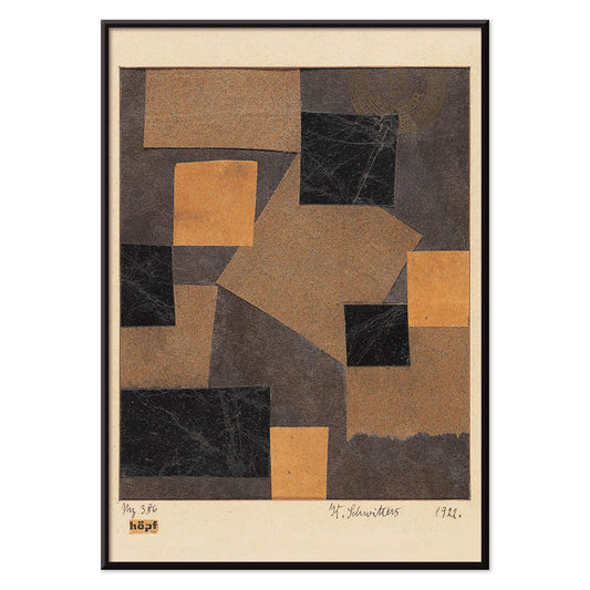
Mz 386 Hopf Plakat
Kurt Schwitters · 1922 · Dynamisk abstrakt plakat bygget af collagestumper og skarp geometrisk spænding
Plakat fra 69 kr · Indrammet fra 122,67 kr
Normalpris Fra 46,00 krNormalpris -
Farbstudien, 10 Blätter X Plakat
Karl Wiener · 1923 · modernistisk abstrakt kunsttryk med geometriske former i afdæmpet blå, okker og sort
Plakat fra 69 kr · Indrammet fra 122,67 kr
Normalpris Fra 46,00 krNormalpris -
Farvepatchwork Plakat
Otto Freundlich · 1936 · Vovet abstrakt plakat med sammenflettede farvefliser samlet af kraftige sorte konturer
Plakat fra 69 kr · Indrammet fra 122,67 kr
Normalpris Fra 46,00 krNormalpris -
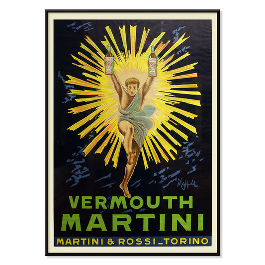
Vermouth Martini Plakat
Leonetto Cappiello · 1920 · Frodig Vermouth Martini plakat med gulklædt figur mod dramatisk sort baggrund
Plakat fra 69 kr · Indrammet fra 122,67 kr
Normalpris Fra 46,00 krNormalpris -
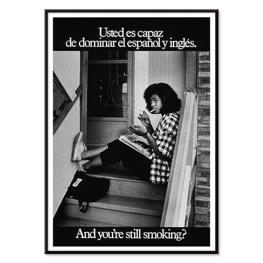
Ryger du stadig Plakat
U.S. Department of Health & Human Services · 1977 · Tosproget antirygningsplakat med tydelig typografi og sort-hvidt trappefoto
Plakat fra 69 kr · Indrammet fra 122,67 kr
Normalpris Fra 46,00 krNormalpris -
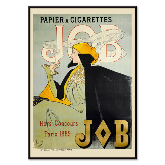
Papier à Cigarettes JOB Plakat
Jane Atché · 1896 · Ikonisk Art Nouveau plakat med en selvsikker rygende kvinde indrammet af svejpende orange og sorte kurver
Plakat fra 69 kr · Indrammet fra 122,67 kr
Normalpris Fra 46,00 krNormalpris -
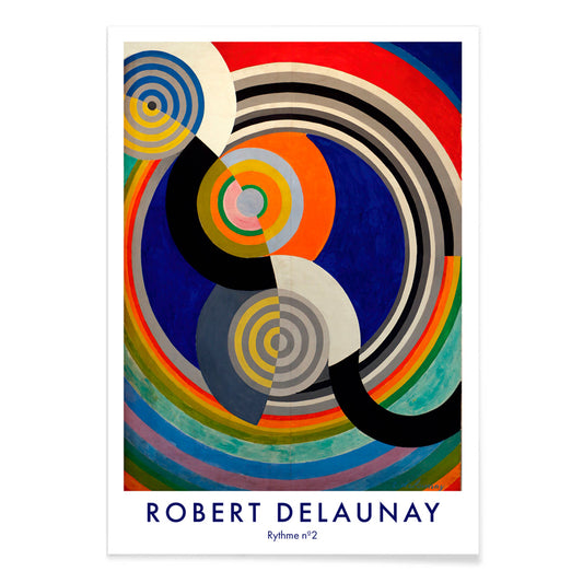
Rythme n°2 Plakat
Robert Delaunay · 1938 · Grafisk kunsttryk med rytmiske, sammenflettede cirkler i stærke primærfarver og kontraster
Plakat fra 69 kr · Indrammet fra 122,67 kr
Normalpris Fra 46,00 krNormalpris -
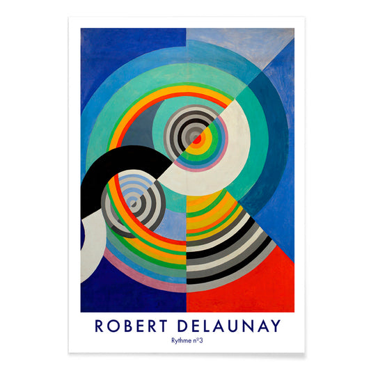
Rythme n°3 Plakat
Robert Delaunay · 1938 · energisk abstrakt plakat med koncentriske cirkler i blå, rød, gul og grøn
Plakat fra 69 kr · Indrammet fra 122,67 kr
Normalpris Fra 46,00 krNormalpris -
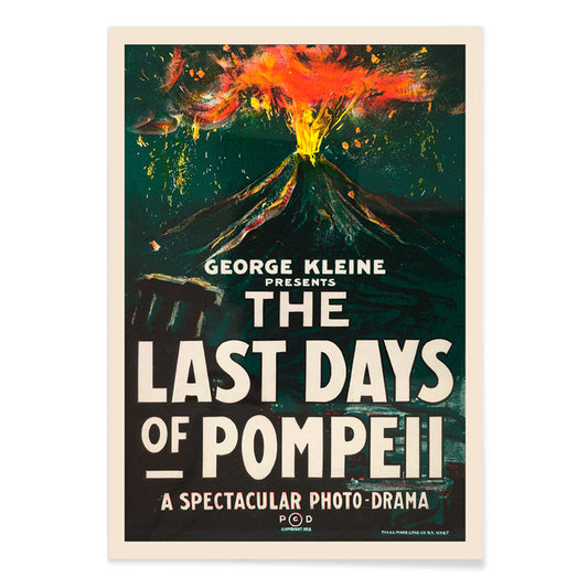
De sidste dage i Pompeji Plakat
H.C. Miner · 1913 · Dramatisk vulkanudbrud filmposter med markant typografi og glødende orange røg
Plakat fra 69 kr · Indrammet fra 122,67 kr
Normalpris Fra 46,00 krNormalpris -
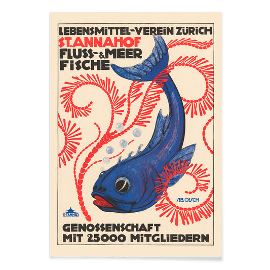
Food Association Zürich Plakat
Sebastian Oesch · 1914 · Livlig Zürich fiskplakat med markant typografi og skarpt litografisk kontrast
Plakat fra 69 kr · Indrammet fra 122,67 kr
Normalpris Fra 46,00 krNormalpris -
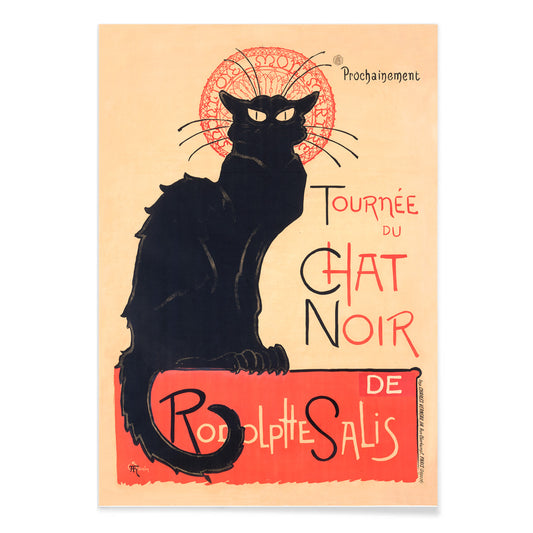
Tournée du Chat Noir Plakat
Théophile Alexandre Steinlen · 1896 · Ikonisk sort katteplakat med rød halo og markant kabaretskrift
Plakat fra 69 kr · Indrammet fra 122,67 kr
Normalpris Fra 46,00 krNormalpris -
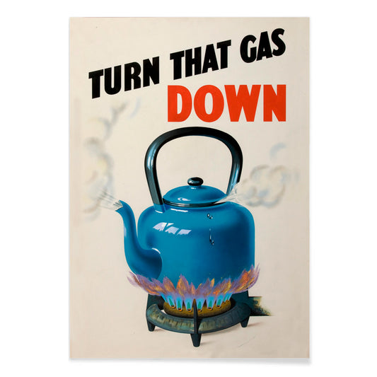
Skru ned for gassen Plakat
Ukendt kunstner · 1943 · legesyg blå kedel plakat med markante røde flammer og livlig damp fra krigstidens Storbritannien
Plakat fra 69 kr · Indrammet fra 122,67 kr
Normalpris Fra 46,00 krNormalpris


36/819 items
- Rebecca Salsbury Strand Plakat
- Vivaudous Mavis Plakat
- De ti største nr. 6 Plakat
- Mapamundi 2 Plakat
- Ferskner Plakat
- Kantet pyramidesaxifrage Plakat
- Cobea scandens Plakat
- Allium Ostroroskianum Plakat
- Duer nr. 2 Plakat
- De ti største, nr. 3 Plakat
- Fragments de figure Plakat
- Altertavle nr. 1 Plakat
- Komposition Plakat
- Farbstudien, 10 Blätter X Plakat
- Farvepatchwork Plakat
- Vermouth Martini Plakat
- Ryger du stadig Plakat
- Rythme n°2 Plakat
- Rythme n°3 Plakat
- De sidste dage i Pompeji Plakat
- Food Association Zürich Plakat
- Tournée du Chat Noir Plakat
- Skru ned for gassen Plakat
Black as structure in vintage poster design
Black often behaves less like a colour and more like a framework. In vintage poster design, it sharpens edges, steadies ornament, and gives breathing space to colour. This Black collection gathers posters where darkness appears as ink, silhouette, night sky, or typographic spine, an editorial filter rather than a monochrome rule. It is a useful thread for wall art and decoration, especially when you want a room to feel composed without feeling severe. Pair these prints with materials that already carry a dark note, such as iron hardware, a matte lamp base, or a charcoal textile, and the rest of the palette reads more intentional.
How artists used black to hold the image together
In Gustav Klimt’s The Kiss (1907–1908), black works like velvet behind the gold, making the surface feel lit from within and helping the ornament stay legible. Théophile Alexandre Steinlen’s Tournée du Chat Noir (1896) turns a flat midnight field into theatre, proving how silhouette can carry character and humour with almost no modelling. Modernist balance comes through in Wassily Kandinsky’s Circles in a Circle (1923), where black lines act as a scaffold for colour and motion. Even advertising bravura depends on darkness: Leonetto Cappiello’s Vermouth Martini (1920) uses deep shadow to make citrus yellow and skin tones snap into focus, a classic poster trick for instant readability.
Placing black-accent wall art in home decor
Because black reads as structure, these poster choices suit spaces that benefit from visual order: entryways, kitchens, and work corners. Against pale walls, black-accent prints look crisp and architectural; against saturated paint, they create tension and depth. In bedrooms, a dark outline or border can quiet a busy palette, while in dining rooms it behaves like a tailored jacket, giving candlelight and ceramics a clearer stage. For high-contrast companions, see Black & White; for restrained compositions, Minimalist keeps the rhythm clean. If you prefer period graphics and signage energy, Advertising adds bold lettering and dramatic figure-ground play.
Curating pairings, subjects, and frames
On a mixed gallery wall, let black be the repeating note: one graphic poster, one figurative plate, one abstract print. A wildlife sheet like Abbott Handerson Thayer’s Tiger’s Head (1911) brings dense brushwork and shadowed fur that sits naturally with brass, leather, and dark wood. For measured spacing and typographic discipline, mix in geometry from Bauhaus; for natural subjects, Animals keeps imagery coherent while still letting black linework recur. If you want a more symbolic register, Esoteric introduces tarot-like borders, stars, and diagrams that echo scientific line culture. Framing matters: black ash or thin walnut can mirror the ink without making the room heavy, while a generous white mat adds air around intricate contours and small type.
A dark accent that stays flexible
Black details are often what persist in memory: the outline of a cat, a modernist grid, the thin border around a label. Treat this collection as a tool for decoration, choosing one vintage print to anchor a room and letting colour, texture, and light shift around it over time. When black is used as a finishing note rather than a statement, posters feel less like period nostalgia and more like clear-eyed design.