


- Ødelæg dette rasende bæst Plakat
- Den gode nabo i Sydamerika Plakat
- Italien med Vatikanstaten Plakat
- Les Lalanne Plakat
- Dansende par i sneen Plakat
- Jet Clipper til Hawaii Plakat
- Kohler Chocolat Plakat
- Jordbærtyven Plakat
- Dansende figurer Matisse Plakat
- Tom Krojer Udstillingsplakat
- Berlin gadescene Plakat
- Ernst Kirchner udstillingsplakat Plakat
- Siddende kvinde set bagfra Plakat
- Rødt hår blå hat Plakat
- Park nær Lu Plakat
- El Comienzo Plakat
- Parler Seul 2 Plakat
- Tusmørkets Ring Plakat
- Parler Seul Plakat
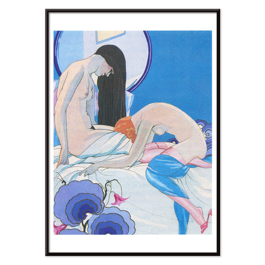
- Drømmen Plakat
- Le Concert Plakat
- Kvindelig kunstner Plakat
- Pink Panthers hævn Plakat
- Kvinde og fugl om natten Plakat
- Besøg Puerto Rico Plakat
- Bauhaus 20 Plakat
- Bauhaus 21 Plakat
- Spis flere frugter Plakat
- Blå japansk trane Plakat
- Snoopy Come Home Plakat
- Til London med Jet Clipper plakat
- Crans-sur-Sierre Plakat
- Monte Carlo Plakat
- Pacific Vibrations Plakat
- Continental Hawaii Airline Plakat
- Øl og cigaret Plakat
- Mexicos vestkyst Plakat
-
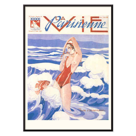
La Vie Parisienne Plakat
Umberto Brunelleschi · 1932 · Art Deco plakat med selvsikker kvinde i rød badedragt mod blå og hvid baggrund
Plakat fra 69 kr · Indrammet fra 122,67 kr
Normalpris Fra 46,00 krNormalpris -
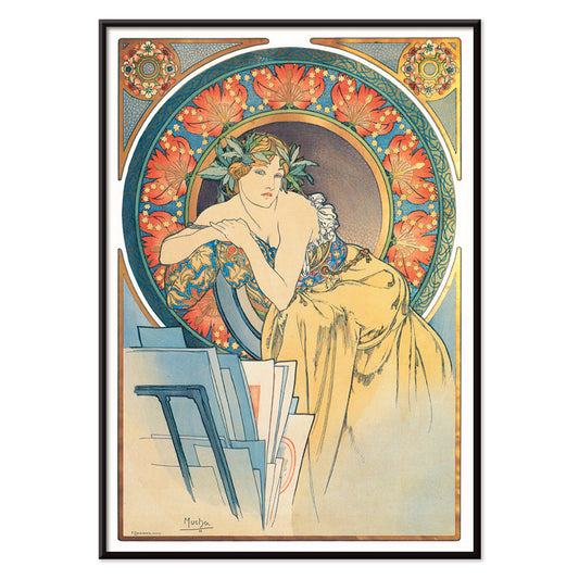
Kvindeportræt med valmuer af Alphonse Mucha Plakat
Alphonse Mucha · 1899 · elegant Art Nouveau plakat med en rolig kvinde omgivet af klare røde valmuer
Plakat fra 69 kr · Indrammet fra 122,67 kr
Normalpris Fra 46,00 krNormalpris -
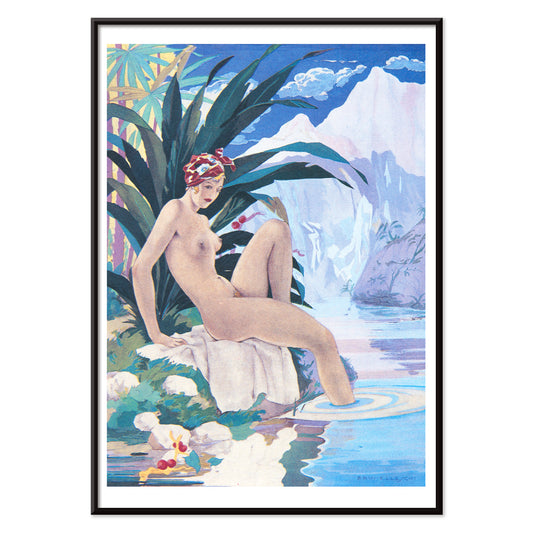
Paul et Virginie af B. de Saint-Pierre Plakat
Umberto Brunelleschli · 1940 · Sanselig Art Deco plakat med en liggende nøgenkvinde omgivet af tropiske palmer
Plakat fra 69 kr · Indrammet fra 122,67 kr
Normalpris Fra 46,00 krNormalpris -
Les Aventures du Roi Pausole Plakat
Umberto Brunelleschi · 1935 · Art Deco erotisk plakat med en stiliseret figur i kølig blå og blød lyserød
Plakat fra 69 kr · Indrammet fra 122,67 kr
Normalpris Fra 46,00 krNormalpris -
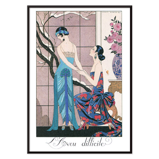
L’aveu Difficile Plakat
George Barbier · 1924 · Art Deco plakat med to elegante kvinder i juveltoner og teatralsk elegance
Plakat fra 69 kr · Indrammet fra 122,67 kr
Normalpris Fra 46,00 krNormalpris -
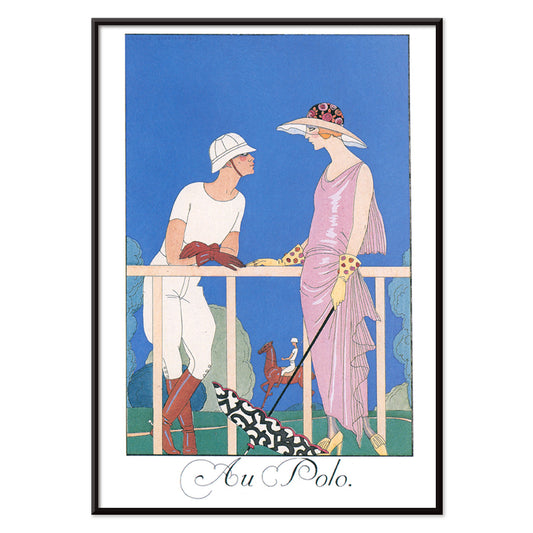
Au Polo Plakat
George Barbier · 1924 · elegant Art Deco polo plakat med afmålte silhuetter og raffinerede farvekontraster
Plakat fra 69 kr · Indrammet fra 122,67 kr
Normalpris Fra 46,00 krNormalpris -
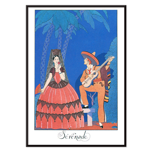
Sérénade Plakat
George Barbier · 1924 · Elegant Art Deco plakat med blåklædt musiker og kvinde i orange
Plakat fra 69 kr · Indrammet fra 122,67 kr
Normalpris Fra 46,00 krNormalpris -
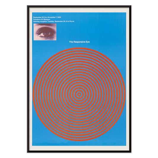
Det responsive øje Plakat
Patrick Blackwell · 1965 · op art-plakat med røde koncentriske cirkler og et stirrende øje på blå baggrund
Plakat fra 69 kr · Indrammet fra 122,67 kr
Normalpris Fra 46,00 krNormalpris -
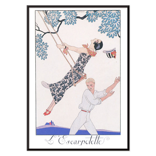
L’Escarpotette Plakat
George Barbier · 1924 · Legesyg Art Deco plakat med en elegant figur på en gynge i blå
Plakat fra 69 kr · Indrammet fra 122,67 kr
Normalpris Fra 46,00 krNormalpris -
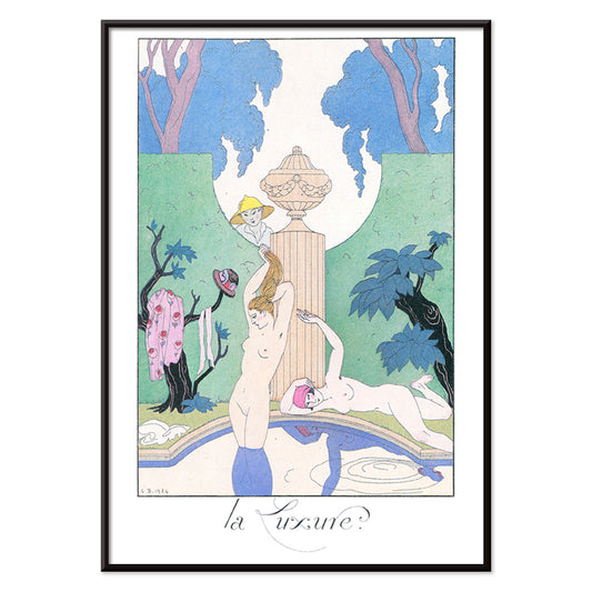
La Luxure Plakat
George Barbier · 1924 · Sensuelt Art Deco-tryk med stiliserede nøgne skikkelser omgivet af frodige havemotiver
Plakat fra 69 kr · Indrammet fra 122,67 kr
Normalpris Fra 46,00 krNormalpris -
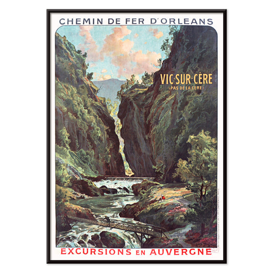
Vic-sur-Cère Plakat
Louis Tauzin · 1905 · Raffineret fransk rejseplakat med Vic-sur-Cère kløft og flod i Auvergne
Plakat fra 69 kr · Indrammet fra 122,67 kr
Normalpris Fra 46,00 krNormalpris -
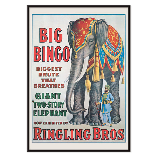
Big Bingo Plakat
Ukendt kunstner · 1916 · Frodig cirkusplakat med en tårnhøj elefant ved sin elegante træner
Plakat fra 69 kr · Indrammet fra 122,67 kr
Normalpris Fra 46,00 krNormalpris -
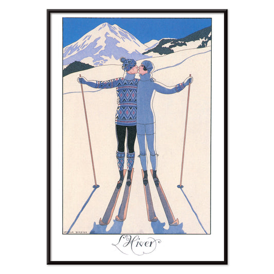
L’Hiver Plakat
George Barbier · 1924 · romantisk art deco plakat med et par i favntag i et klart vinterlandskab
Plakat fra 69 kr · Indrammet fra 122,67 kr
Normalpris Fra 46,00 krNormalpris -
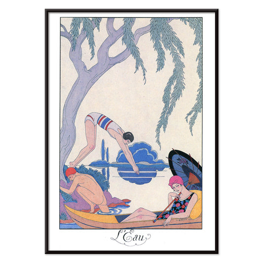
L’Eau Plakat
George Barbier · 1924 · Elegant Art Deco plakat med vandsideidyl i levende blå og lyserøde accenter
Plakat fra 69 kr · Indrammet fra 122,67 kr
Normalpris Fra 46,00 krNormalpris -
La Terre Plakat
George Barbier · 1924 · elegant Art Deco-plakat med kvinder og barn der høster frugt i en stiliseret have
Plakat fra 69 kr · Indrammet fra 122,67 kr
Normalpris Fra 46,00 krNormalpris -
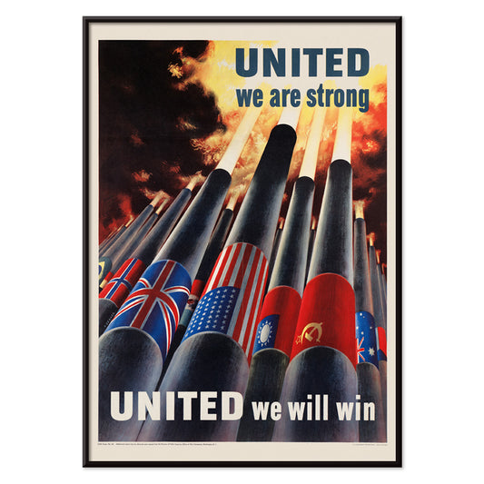
Forenede står vi stærke Plakat
Henry Koerner · 1943 · Anden verdenskrig plakat med allierede flag over kanoner i kraftfuldt grafisk udtryk
Plakat fra 69 kr · Indrammet fra 122,67 kr
Normalpris Fra 46,00 krNormalpris -
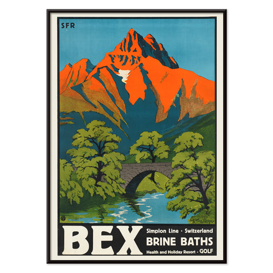
Bex saltsbade Plakat
Aime-Felix Nicollerat · 1896 · Alpin spa- og kurplakat med stenet bro, strømmende flod og strålende bjergtoppe
Plakat fra 69 kr · Indrammet fra 122,67 kr
Normalpris Fra 46,00 krNormalpris -
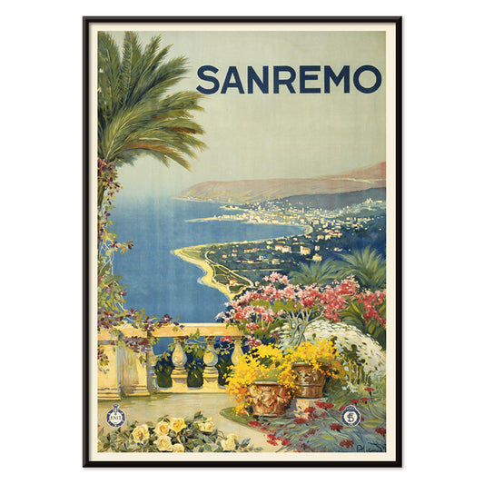
Sanremo Plakat
Ukendt kunstner · 1920 · Solfyldt Sanremo rejseplakat med blomsterforgrund, palmer og klar middelhavsbølge
Plakat fra 69 kr · Indrammet fra 122,67 kr
Normalpris Fra 46,00 krNormalpris -
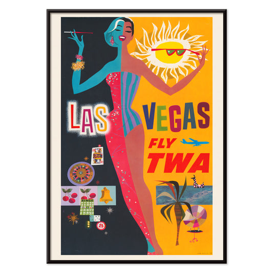
Las Vegas – TWA-fly Plakat
David Klein · 1962 · Livligt Las Vegas rejseplakat med showgirl, neonlys og TWA-stemning
Plakat fra 69 kr · Indrammet fra 122,67 kr
Normalpris Fra 46,00 krNormalpris -
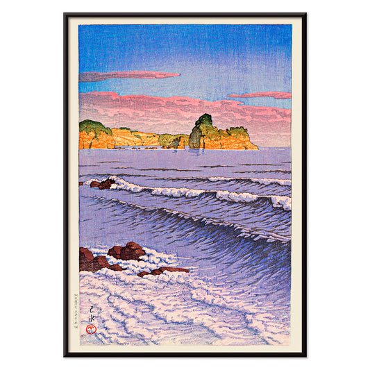
Souvenirs fra mine rejser Plakat
Kawase Hasui · 1940 · Rolig kystplakat med en hule i mørke klipper over lyse brændinger
Plakat fra 69 kr · Indrammet fra 122,67 kr
Normalpris Fra 46,00 krNormalpris -
Morgenhav ved Bikuni i Shiribeshi Plakat
Kawase Hasui · 1933 · Stilfuldt shin hanga kunsttryk af fiskerbåde på roligt blåt hav under tåget horisont
Plakat fra 69 kr · Indrammet fra 122,67 kr
Normalpris Fra 46,00 krNormalpris -
Hawaii med flyvende clipper Plakat
Ukendt kunstner · 1938 · Ikonisk Hawaii rejseplakat med Pan American clipper-søfly og velkomstlei
Plakat fra 69 kr · Indrammet fra 122,67 kr
Normalpris Fra 46,00 krNormalpris -
Den moderne plakat
Will Bradley · 1895 · Stiliseret påfuglplakat med flydende art nouveau-linjer og klar blå og hvid kontrast
Plakat fra 69 kr · Indrammet fra 122,67 kr
Normalpris Fra 46,00 krNormalpris -
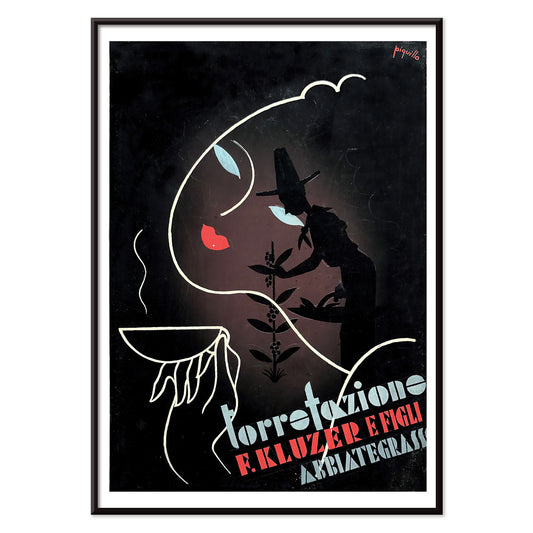
Torrefazione F.Kluzer Plakat
Carlo Piquillo Pandolfi · 1930 · Italiensk Art Deco kaffeplakat med markant koppemotiv og geometriske farveflader
Plakat fra 69 kr · Indrammet fra 122,67 kr
Normalpris Fra 46,00 krNormalpris -
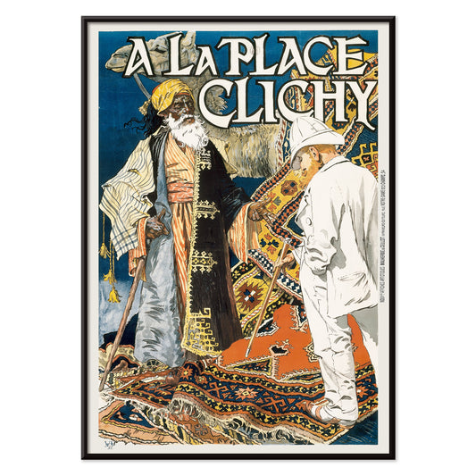
A la Place Clichy Plakat
Eugène Grasset · 1891 · Art Nouveau plakat fra Paris med elegant kvindefigur og blå og orange palet
Plakat fra 69 kr · Indrammet fra 122,67 kr
Normalpris Fra 46,00 krNormalpris -
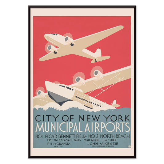
New Yorks kommunale lufthavne Plakat
ukendt kunstner · 1938 · strømlinet Art Deco plakat med New Yorks lufthavne over stiliseret vand og skyline
Plakat fra 69 kr · Indrammet fra 122,67 kr
Normalpris Fra 46,00 krNormalpris -
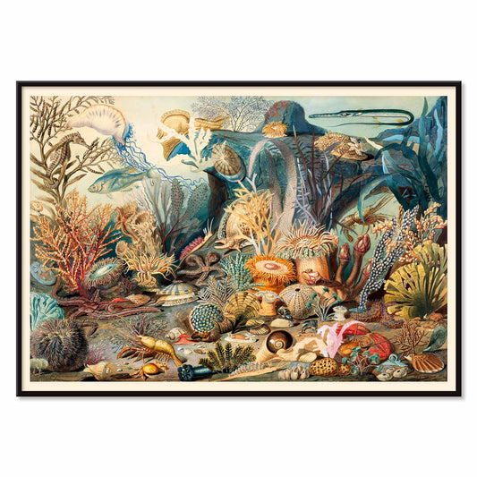
Havliv Plakat
James M. Sommerville · 1862 · Detaljeret havliv plakat med koraller, fisk og skaller i klare kysttoner
Plakat fra 69 kr · Indrammet fra 122,67 kr
Normalpris Fra 46,00 krNormalpris -
Milano Plakat
Alessandro Pomi · 1920 · Stiliseret Milano plakat med Duomo-silhuet under en strålende himmel og byens skyline
Plakat fra 69 kr · Indrammet fra 122,67 kr
Normalpris Fra 46,00 krNormalpris -
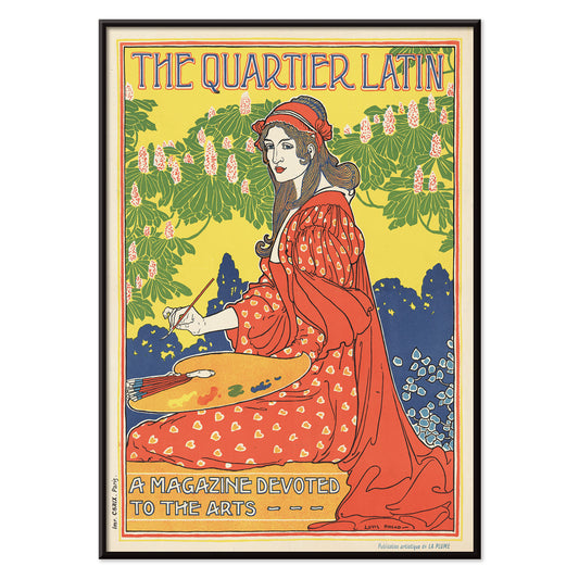
Quartier Latin Plakat
Louis Rhead · 1890 · Frodig Art Nouveau plakat med selvsikker kvinde og markant parisertypografi
Plakat fra 69 kr · Indrammet fra 122,67 kr
Normalpris Fra 46,00 krNormalpris -
Cie. Cle Transatlantique Plakat
Fernand Le Quesne · 1901 · elegant Alger dampersplakat med kraftfuld typografi og varme middelhavstoner
Plakat fra 69 kr · Indrammet fra 122,67 kr
Normalpris Fra 46,00 krNormalpris -
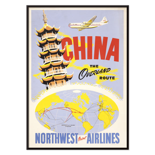
Kina overlandruten Plakat
Ukendt kunstner · 1950 · midcentury Kina rejseplakat med tempelmotiver, klart overlandskort og stærke farver
Plakat fra 69 kr · Indrammet fra 122,67 kr
Normalpris Fra 46,00 krNormalpris -
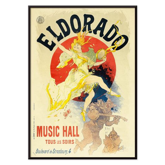
Eldorado Plakat
Jules Chéret · 1894 · Livligt kabaretplakat med dansers svingende gult skørt og markant Belle Époque typografi
Plakat fra 69 kr · Indrammet fra 122,67 kr
Normalpris Fra 46,00 krNormalpris -
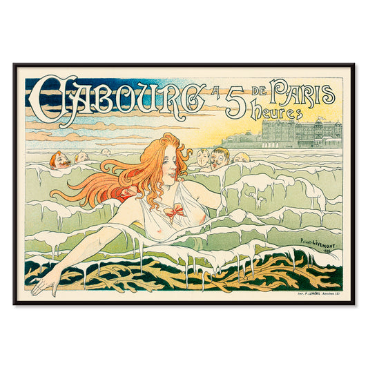
Casino De Cabourg Plakat
Henri Privat-Livemont · 1896 · Art Nouveau strandplakat med rødharret svømmer i rytmiske blå bølger
Plakat fra 69 kr · Indrammet fra 122,67 kr
Normalpris Fra 46,00 krNormalpris -
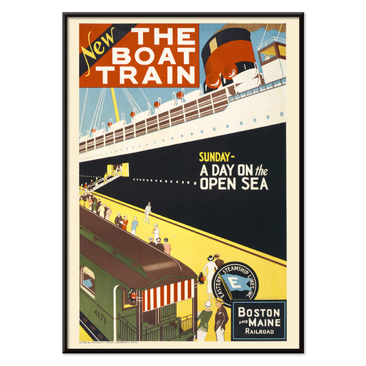
Bådtoget Plakat
Charles W. Holmes · 1925 · Dynamisk Art Deco rejseplakat der viser et hurtigt tog sammen med en oceanliner
Plakat fra 69 kr · Indrammet fra 122,67 kr
Normalpris Fra 46,00 krNormalpris -
Broen ved Ōkawa-floden Plakat
Kobayashi Kiyochika · 1884 · Regnfuldt flodbredsplakat med brosilhuetter og glimtende refleksioner i dybe blå toner
Plakat fra 69 kr · Indrammet fra 122,67 kr
Normalpris Fra 46,00 krNormalpris -
Kiso-kløften i sne Plakat
Hiroshige II · 1859 · Stilrent vinterlandskab vintage tryk med snoet blå flod under sneklædte klipper
Plakat fra 69 kr · Indrammet fra 122,67 kr
Normalpris Fra 46,00 krNormalpris


- La Vie Parisienne Plakat
- Det responsive øje Plakat
- Bex saltsbade Plakat
- Sanremo Plakat
- Las Vegas – TWA-fly Plakat
- Souvenirs fra mine rejser Plakat
- Morgenhav ved Bikuni i Shiribeshi Plakat
- Hawaii med flyvende clipper Plakat
- Den moderne plakat
- New Yorks kommunale lufthavne Plakat
- Havliv Plakat
- Bådtoget Plakat
- Kiso-kløften i sne Plakat
Blue as atmosphere, not just a hue
Blue rarely behaves like a single color. In vintage poster design it becomes distance, weather, depth, and even time, shifting from Prussian ink to pale sky wash as the subject changes. This collection treats blue as a structural element in wall art decoration: it can cool a room, clarify a line, and make paper feel archival. You see it in coastal imagery, in diagrammatic plates, and in graphic compositions where the blue field is the main event rather than a background. For adjacent moods, the pared-back restraint of Minimalist posters and the tonal focus of Black & White prints offer clean counterpoints.
Indigo, cyanotype, and the modernist sky
Historically, blue arrives through different technologies as much as through taste. Textile indigo moved between craft and industry, while cyanotype made photographic images from chemistry and sunlight, producing that unmistakable blueprint blue. William Morris’s Strawberry Thief (1883) sets rich indigo behind fruit and birds, turning repetition into a kind of domestic architecture that reads as both pattern and pictorial scene. Anna Atkins’s Fern (1850) cyanotype shows how the same color can act as evidence: the plant appears as a precise silhouette, halfway between specimen and lacework. In modern abstraction, Wassily Kandinsky’s Bleu de Ciel (1925) uses blue as a stage for floating signs, linking painting to the era’s fascination with music, science, and mapping the unseen. Related worlds of form and color sit in Abstract and Bauhaus.
Placing blue wall art in a home palette
In home decor, blue is easiest to live with when it is anchored by materials. Warm woods and sandy neutrals keep deep blues from feeling cold, while brushed steel and glass make pale blues feel deliberate rather than decorative. In an entryway, a blue print can act like a visual compass; in a bedroom, it reads as quieter when echoed in linen or a rug. For kitchens, blue beside white tile tends to feel crisp, especially when the imagery is botanical or cartographic. If you want recognizable subjects with blue emphasis, look toward Maps, Sea & Ocean, and Botanical; if the room already has strong color, a simpler sheet from Classic Art can keep the balance.
Curating: rhythm, scale, and framing choices
Blue makes curating easier because it can unify mixed imagery across a gallery wall. Start with one dominant piece, then add one or two quieter companions that repeat its temperature without copying its subject. Hokusai’s The Great Wave off Kanagawa (1830) is an obvious anchor: the wave’s blue is not atmospheric but architectural, built from carved contour and foam, almost like typography. Pair it with Kawase Hasui’s Morning at Cape Inubō (1931), where the sea is reduced to bands and gradients, creating a calmer cadence. To keep the set from becoming too nautical, insert a map plate or an abstract composition as a visual pause. Framing finishes also steer the mood: light oak keeps blues breathable, a white mat gives dark inks air, and a slim black frame heightens contrast; options live in Frames.
Blue as ink, dye, pigment, and data
What holds these posters together is not a single era or subject but the way blue carries information. It can read as craft dye, printing ink, mineral pigment, or scientific notation, which is why it fits rooms that mix ceramics, books, and travel objects without looking staged. As vintage wall art, blue often suggests both the sea and the library: a color associated with horizons and with study. That tension between sensation and structure is the collection’s real thread, and it is what makes blue feel steady in everyday decoration.