


- Ødelæg dette rasende bæst Plakat
- Den gode nabo i Sydamerika Plakat
- Italien med Vatikanstaten Plakat
- Les Lalanne Plakat
- Dansende par i sneen Plakat
- Jet Clipper til Hawaii Plakat
- Kohler Chocolat Plakat
- Jordbærtyven Plakat
- Dansende figurer Matisse Plakat
- Tom Krojer Udstillingsplakat
- Berlin gadescene Plakat
- Ernst Kirchner udstillingsplakat Plakat
- Siddende kvinde set bagfra Plakat
- Rødt hår blå hat Plakat
- Park nær Lu Plakat
- El Comienzo Plakat
- Parler Seul 2 Plakat
- Tusmørkets Ring Plakat
- Parler Seul Plakat
- Drømmen Plakat
- Le Concert Plakat
- Kvindelig kunstner Plakat
- Pink Panthers hævn Plakat
- Kvinde og fugl om natten Plakat
- Besøg Puerto Rico Plakat
- Bauhaus 20 Plakat
- Bauhaus 21 Plakat
- Spis flere frugter Plakat
- Blå japansk trane Plakat
- Snoopy Come Home Plakat
- Til London med Jet Clipper plakat
- Crans-sur-Sierre Plakat
- Monte Carlo Plakat
- Pacific Vibrations Plakat
- Continental Hawaii Airline Plakat
- Øl og cigaret Plakat
- Mexicos vestkyst Plakat
-
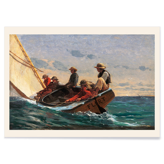
Flørten Plakat
Winslow Homer · 1874 · Vindblæst sejlskibsplakat der indfanger kystflirt og 1800-tals fritid
Plakat fra 69 kr · Indrammet fra 122,67 kr
Normalpris Fra 46,00 krNormalpris -
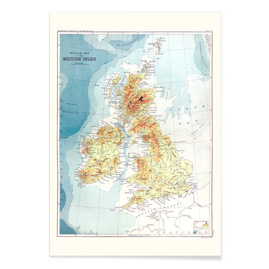
Stedregister over de britiske øer Plakat
John Bartholomew · 1887 · Detaljeret vintage tryk af de britiske øer med klare stednavne og atlasagtigt layout
Plakat fra 69 kr · Indrammet fra 122,67 kr
Normalpris Fra 46,00 krNormalpris -
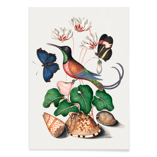
Karmin-topas kolibri Plakat
James Bolton · 1768 · Delikat naturhistorisk kunsttryk med karminkolibri, skaller, sommerfugle og cyklamen i naturtro farver
Plakat fra 69 kr · Indrammet fra 122,67 kr
Normalpris Fra 46,00 krNormalpris -
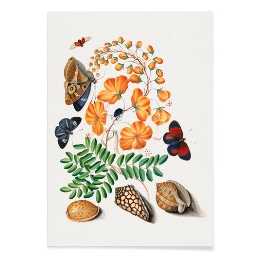
Caesalpinoid Plakat
James Bolton · 1768 · Delikat naturhistorisk tryk med sommerfugl, biller og skaller på cremet baggrund
Plakat fra 69 kr · Indrammet fra 122,67 kr
Normalpris Fra 46,00 krNormalpris -
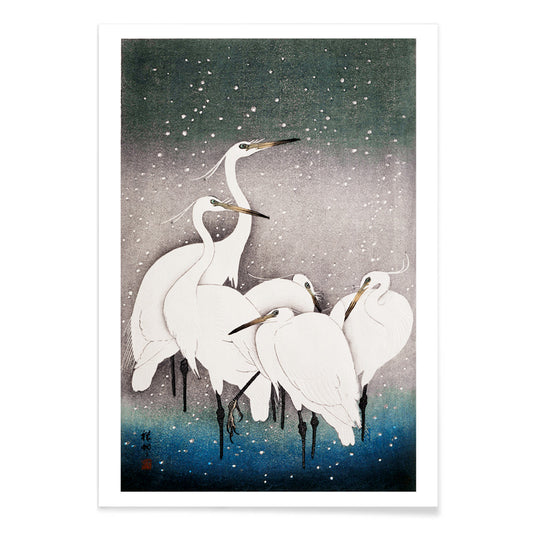
Gruppe af hejrer Plakat
Ohara Koson · 1925 · Stille hejretryk i vinterro med bløde blå skygger og klare sorte kontraster
Plakat fra 69 kr · Indrammet fra 122,67 kr
Normalpris Fra 46,00 krNormalpris -
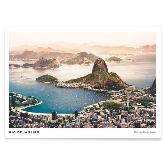
Rio de Janeiro Plakat
Agnieszka Ciesielska · 2019 · Vintageinspireret Rio de Janeiro plakat med Sugarloafsilhuet, brede strande og både
Plakat fra 69 kr · Indrammet fra 122,67 kr
Normalpris Fra 46,00 krNormalpris -
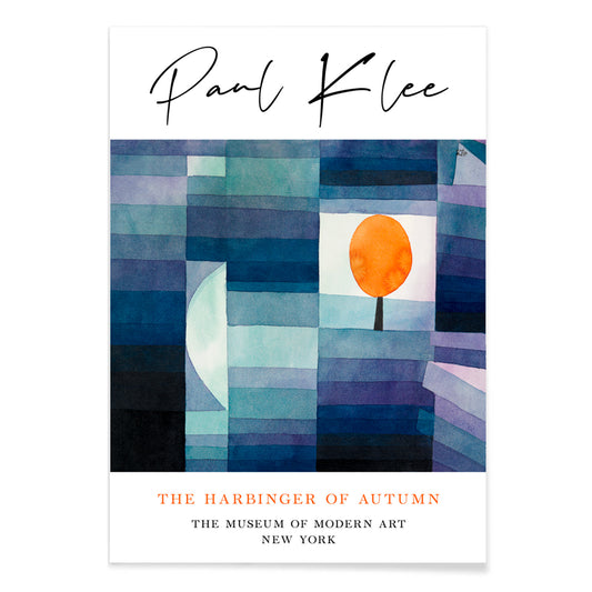
Efterårets budbringer Plakat
Paul Klee · 1922 · Modernistisk kunsttryk af et orange træ i legende blå og orange geometri
Plakat fra 69 kr · Indrammet fra 122,67 kr
Normalpris Fra 46,00 krNormalpris -
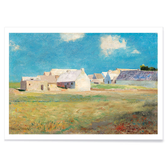
Breton Landsby Plakat
Odilon Redon · 1890 · drømmende breton landsby kunsttryk i blå og grønne toner med bløde tage
Plakat fra 69 kr · Indrammet fra 122,67 kr
Normalpris Fra 46,00 krNormalpris -
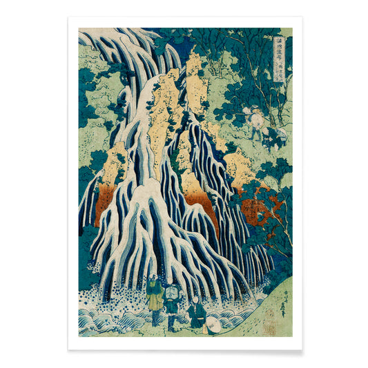
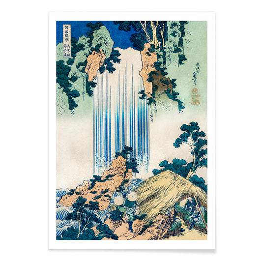
Shimotsuke Kurokami-Yama Kurifuri no Taki Plakat
Katsushika Hokusai · 1832 · dramatisk vandfaldstryk i vintagestil med små rejsende ved kaskaderne
Plakat fra 69 kr · Indrammet fra 122,67 kr
Normalpris Fra 46,00 krNormalpris -
Yoro Vandfald Plakat
Katsushika Hokusai · 1832 · ikonisk japansk vintage tryk af Yoro Vandfald med svælgende fald og roligt bjerglandskab
Plakat fra 69 kr · Indrammet fra 122,67 kr
Normalpris Fra 46,00 krNormalpris -
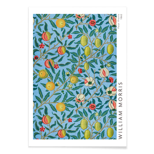
Mønster med fire frugter Plakat
William Morris · 1862 · Frodigt mønster med frugt og løv på dyb blå baggrund som kunsttryk
Plakat fra 69 kr · Indrammet fra 122,67 kr
Normalpris Fra 46,00 krNormalpris -
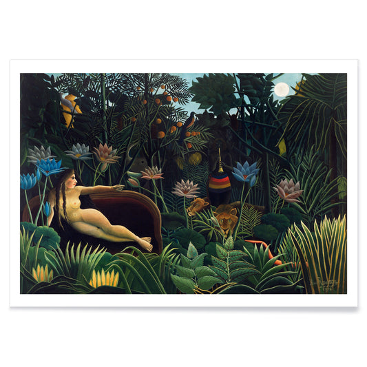
Drømmen Plakat
Henri Rousseau · 1910 · Drømmende jungelplakat med liggende figur, månebelyste løv og diskrete dyr
Plakat fra 69 kr · Indrammet fra 122,67 kr
Normalpris Fra 46,00 krNormalpris -
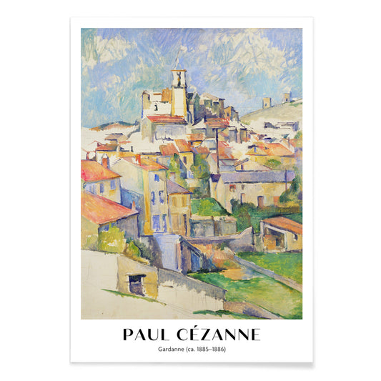
Gardanne Plakat
Paul Cézanne · 1886 · Struktureret provencalsk landsbytryk med terracotta tage og kølig blå himmel
Plakat fra 69 kr · Indrammet fra 122,67 kr
Normalpris Fra 46,00 krNormalpris -
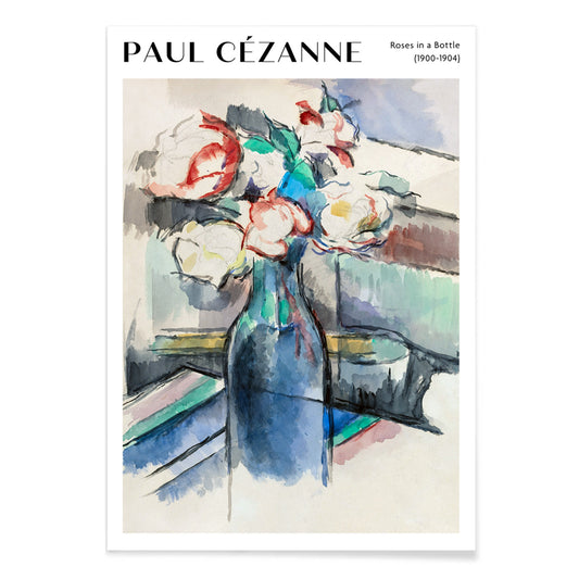
Roser i en flaske Plakat
Paul Cézanne · 1902 · Lysende roser i en flaske, kunsttryk i bløde blå og grønne toner
Plakat fra 69 kr · Indrammet fra 122,67 kr
Normalpris Fra 46,00 krNormalpris -
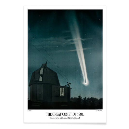
Den store komet fra 1881 Plakat
Étienne Léopold Trouvelot · 1881 · Lysende kometkunsttryk der fejer gennem en stjernefyldt nattehimmel i dyb indigo
Plakat fra 69 kr · Indrammet fra 122,67 kr
Normalpris Fra 46,00 krNormalpris -
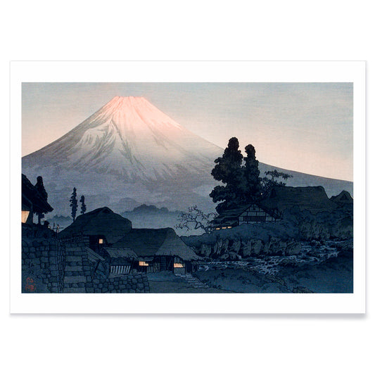
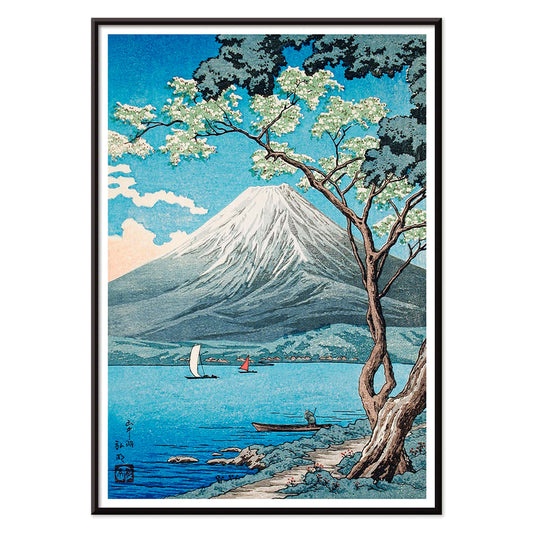
Mount Fuji fra Mizukubo Plakat
Hiroaki Takahashi · 1932 · Stille Mount Fuji kunsttryk med landsbytag under blid skumringshimmel i blågrå toner
Plakat fra 69 kr · Indrammet fra 122,67 kr
Normalpris Fra 46,00 krNormalpris -
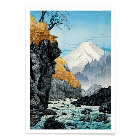
Foden af Mount Ashitaka Plakat
Hiroaki Takahashi · 1932 · Fredfyldt flodlandskabsplakat i dæmpede toner med gyldne træer og fjerntliggende blåt bjerg
Plakat fra 69 kr · Indrammet fra 122,67 kr
Normalpris Fra 46,00 krNormalpris -
Fujibjerget fra Yamanaka-søen Plakat
Hiroaki Takahashi · 1929 · Fredfyldt japansk landskabskunsttryk med sejlbåde på Yamanaka-søen under det sneklædte Fujibjerg
Plakat fra 69 kr · Indrammet fra 122,67 kr
Normalpris Fra 46,00 krNormalpris -
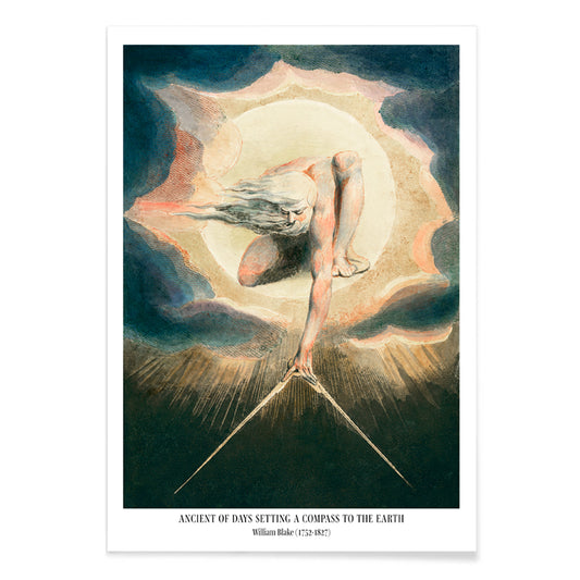
Den ældste af dage Plakat
William Blake · 1794 · Den ældste af dage plakat med brændende solskive og kompas over midnatsblåt
Plakat fra 69 kr · Indrammet fra 122,67 kr
Normalpris Fra 46,00 krNormalpris -
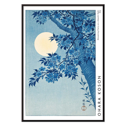
Blomstrende kirsebær på månenatten Plakat
Ohara Koson · 1932 · Måneoplyst kirsebærblomstertryk med lysende fuldmåne og rolig blå nat
Plakat fra 69 kr · Indrammet fra 122,67 kr
Normalpris Fra 46,00 krNormalpris -
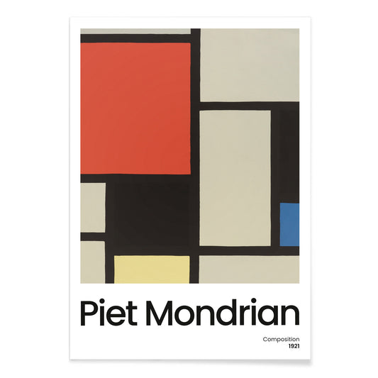
Komposition med stor rød flade Plakat
Pieter Cornelis Mondriaan · 1921 · Geometrisk abstrakt kunsttryk med stor rød flade og skarp sort gitter
Plakat fra 69 kr · Indrammet fra 122,67 kr
Normalpris Fra 46,00 krNormalpris -
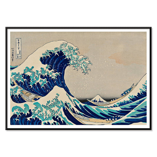
Den store bølge plakat
Katsushika Hokusai · 1831 · Ikonisk japansk bølgeplakat med Mount Fuji og både under tårnhøje bølger
Plakat fra 69 kr · Indrammet fra 122,67 kr
Normalpris Fra 46,00 krNormalpris -
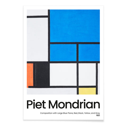
Komposition med stor blå flade Plakat
Pieter Cornelis Mondriaan · 1921 · Geometrisk De Stijl kunsttryk med en stor blå flade og klare sorte linjer
Plakat fra 69 kr · Indrammet fra 122,67 kr
Normalpris Fra 46,00 krNormalpris -
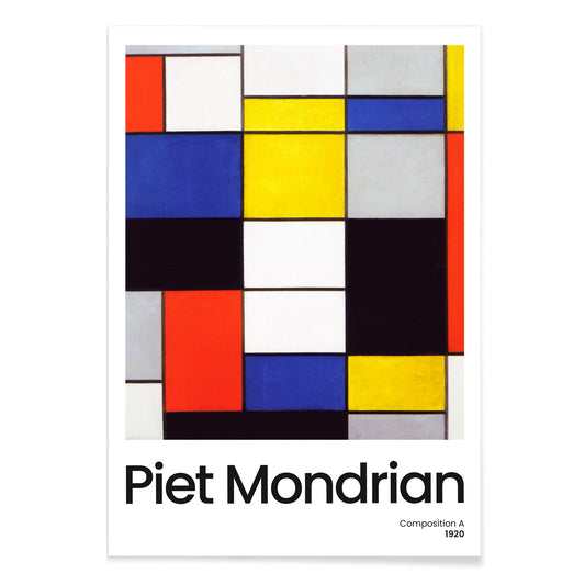
Composition A Plakat
Piet Mondrian · 1920 · Geometrisk abstrakt kunsttryk med sort gitter og primærfarver på hvid
Plakat fra 69 kr · Indrammet fra 122,67 kr
Normalpris Fra 46,00 krNormalpris -
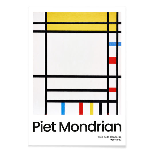
Place de la Concorde Plakat
Piet Mondrian · 1941 · Geometrisk abstrakt plakat med sort gitter og røde, gule og blå flader
Plakat fra 69 kr · Indrammet fra 122,67 kr
Normalpris Fra 46,00 krNormalpris -
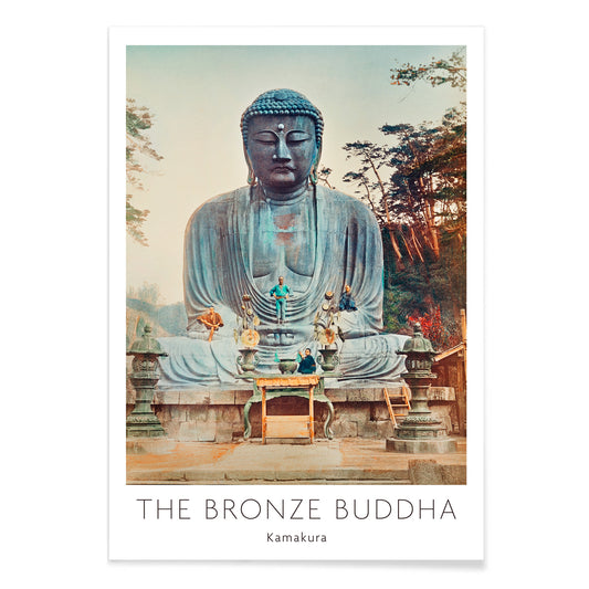
Bronzebuddha i Kamakura Plakat
Kazumasa Ogawa · 1897 · Stille håndkoloreret fotografisk plakat af Kamakuras store buddha indrammet af grønt
Plakat fra 69 kr · Indrammet fra 122,67 kr
Normalpris Fra 46,00 krNormalpris -
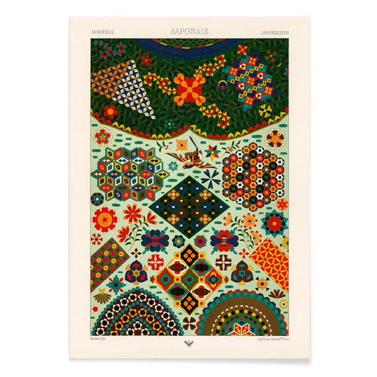
Japansk mønster Plakat
Albert-Charles-Auguste Racinet · 1888 · farverig japansk mønsterplakat med blomster og geometrimotiver i varme toner
Plakat fra 69 kr · Indrammet fra 122,67 kr
Normalpris Fra 46,00 krNormalpris -
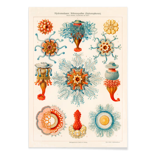
Vintage vandmandsillustration Plakat
Ernst Haeckel · 1904 · Detaljeret videnskabeligt tryk af vandmænd med svævende klokker, frynsede kanter og lange tentakler
Plakat fra 69 kr · Indrammet fra 122,67 kr
Normalpris Fra 46,00 krNormalpris -
Jomfruen Plakat
Gustav Klimt · 1913 · Sanselig symbolistisk plakat med sammenflettede kvinder i violette og blå mønstre
Plakat fra 69 kr · Indrammet fra 122,67 kr
Normalpris Fra 46,00 krNormalpris -
Kirche in Cassone Plakat
Gustav Klimt · 1913 · Lysende søplakat med kirke, skinnende reflektioner og mosaiklignende stemningsfulde farveflader
Plakat fra 69 kr · Indrammet fra 122,67 kr
Normalpris Fra 46,00 krNormalpris -
Judith og Holofernes' hoved Plakat
Gustav Klimt · 1901 · Ikonisk forgyldt kunsttryk af Judith med Holofernes hoved i overdådig jugendstil
Plakat fra 69 kr · Indrammet fra 122,67 kr
Normalpris Fra 46,00 krNormalpris -
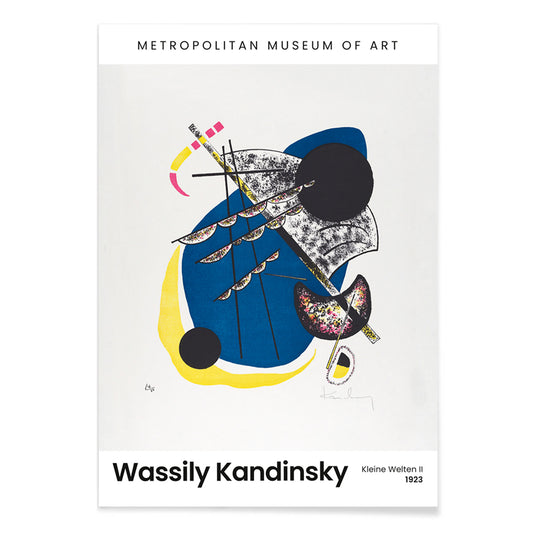
Kleine Welten II Plakat
Wassily Kandinsky · 1922 · Rytmisk geometrisk kunsttryk med flydende cirkler, skarpe linjer og markant sort baggrund
Plakat fra 69 kr · Indrammet fra 122,67 kr
Normalpris Fra 46,00 krNormalpris -
Kleine Welten IV Plakat
Wassily Kandinsky · 1922 · Abstrakt kunsttryk med cirkler og skarpe linjer og klare blå, gule og grønne accenter
Plakat fra 69 kr · Indrammet fra 122,67 kr
Normalpris Fra 46,00 krNormalpris -
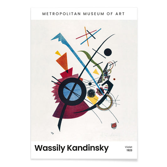
Violet Plakat
Wassily Kandinsky · 1923 · Geometrisk abstrakt kunsttryk med violet, blå og gule former på lys baggrund
Plakat fra 69 kr · Indrammet fra 122,67 kr
Normalpris Fra 46,00 krNormalpris -
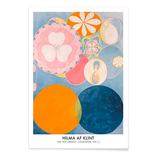
De ti største: barndom nr. 2 Plakat
Hilma af Klint · 1907 · lysende abstrakt kunsttryk med hvirvlende former i blå, pink, orange og gul
Plakat fra 69 kr · Indrammet fra 122,67 kr
Normalpris Fra 46,00 krNormalpris -
Kleine Welten V Plakat
Wassily Kandinsky · 1922 · Rytmisk geometrisk plakat med cirkler og skarpe linjer mod en dyb sort baggrund
Plakat fra 69 kr · Indrammet fra 122,67 kr
Normalpris Fra 46,00 krNormalpris


- Karmin-topas kolibri Plakat
- Rio de Janeiro Plakat
- Efterårets budbringer Plakat
- Shimotsuke Kurokami-Yama Kurifuri no Taki Plakat
- Yoro Vandfald Plakat
- Mønster med fire frugter Plakat
- Drømmen Plakat
- Den store komet fra 1881 Plakat
- Foden af Mount Ashitaka Plakat
- Fujibjerget fra Yamanaka-søen Plakat
- Blomstrende kirsebær på månenatten Plakat
- Komposition med stor rød flade Plakat
- Den store bølge plakat
- Place de la Concorde Plakat
- Jomfruen Plakat
- Judith og Holofernes' hoved Plakat
- Kleine Welten IV Plakat
- Violet Plakat
- De ti største: barndom nr. 2 Plakat
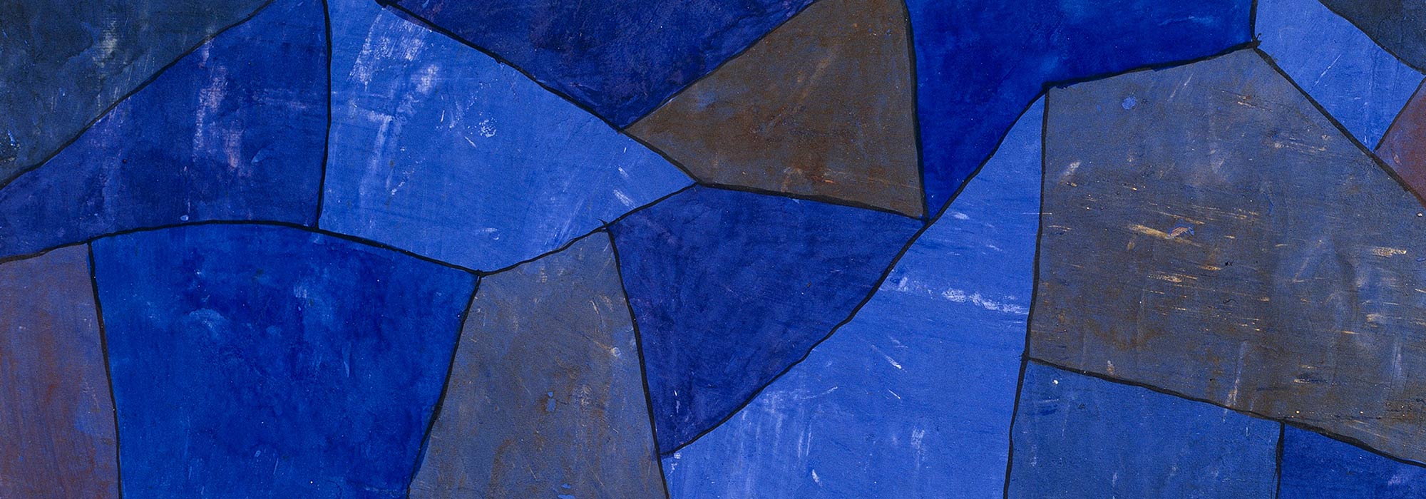
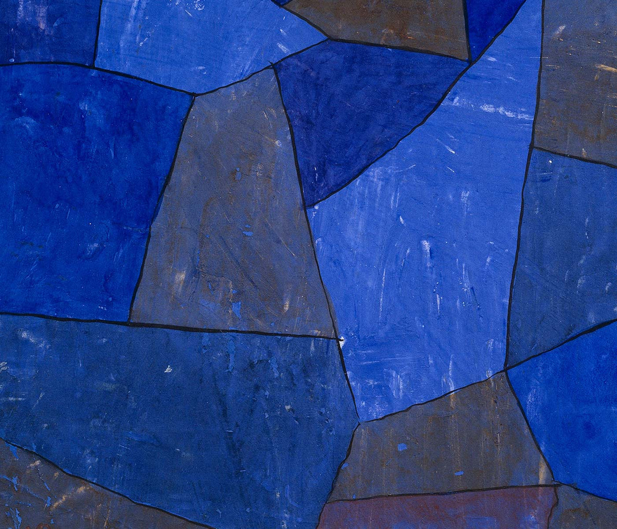
Blue as atmosphere, not just a hue
Blue rarely behaves like a single color. In vintage poster design it becomes distance, weather, depth, and even time, shifting from Prussian ink to pale sky wash as the subject changes. This collection treats blue as a structural element in wall art decoration: it can cool a room, clarify a line, and make paper feel archival. You see it in coastal imagery, in diagrammatic plates, and in graphic compositions where the blue field is the main event rather than a background. For adjacent moods, the pared-back restraint of Minimalist posters and the tonal focus of Black & White prints offer clean counterpoints.
Indigo, cyanotype, and the modernist sky
Historically, blue arrives through different technologies as much as through taste. Textile indigo moved between craft and industry, while cyanotype made photographic images from chemistry and sunlight, producing that unmistakable blueprint blue. William Morris’s Strawberry Thief (1883) sets rich indigo behind fruit and birds, turning repetition into a kind of domestic architecture that reads as both pattern and pictorial scene. Anna Atkins’s Fern (1850) cyanotype shows how the same color can act as evidence: the plant appears as a precise silhouette, halfway between specimen and lacework. In modern abstraction, Wassily Kandinsky’s Bleu de Ciel (1925) uses blue as a stage for floating signs, linking painting to the era’s fascination with music, science, and mapping the unseen. Related worlds of form and color sit in Abstract and Bauhaus.
Placing blue wall art in a home palette
In home decor, blue is easiest to live with when it is anchored by materials. Warm woods and sandy neutrals keep deep blues from feeling cold, while brushed steel and glass make pale blues feel deliberate rather than decorative. In an entryway, a blue print can act like a visual compass; in a bedroom, it reads as quieter when echoed in linen or a rug. For kitchens, blue beside white tile tends to feel crisp, especially when the imagery is botanical or cartographic. If you want recognizable subjects with blue emphasis, look toward Maps, Sea & Ocean, and Botanical; if the room already has strong color, a simpler sheet from Classic Art can keep the balance.
Curating: rhythm, scale, and framing choices
Blue makes curating easier because it can unify mixed imagery across a gallery wall. Start with one dominant piece, then add one or two quieter companions that repeat its temperature without copying its subject. Hokusai’s The Great Wave off Kanagawa (1830) is an obvious anchor: the wave’s blue is not atmospheric but architectural, built from carved contour and foam, almost like typography. Pair it with Kawase Hasui’s Morning at Cape Inubō (1931), where the sea is reduced to bands and gradients, creating a calmer cadence. To keep the set from becoming too nautical, insert a map plate or an abstract composition as a visual pause. Framing finishes also steer the mood: light oak keeps blues breathable, a white mat gives dark inks air, and a slim black frame heightens contrast; options live in Frames.
Blue as ink, dye, pigment, and data
What holds these posters together is not a single era or subject but the way blue carries information. It can read as craft dye, printing ink, mineral pigment, or scientific notation, which is why it fits rooms that mix ceramics, books, and travel objects without looking staged. As vintage wall art, blue often suggests both the sea and the library: a color associated with horizons and with study. That tension between sensation and structure is the collection’s real thread, and it is what makes blue feel steady in everyday decoration.