


- Ødelæg dette rasende bæst Plakat
- Den gode nabo i Sydamerika Plakat
- Italien med Vatikanstaten Plakat
- Radiser Plakat
- Gulerødder Plakat
- Campari Soda Plakat
- Bec-Kina Plakat
- Kohler Chocolat Plakat
- Jordbærtyven Plakat
- Tom Krojer Udstillingsplakat
- Berlin gadescene Plakat
- Siddende kvinde set bagfra Plakat
- Park nær Lu Plakat
- El Comienzo Plakat
- Parler Seul Plakat
- Faun og Nymfe Plakat
- Kvindelig kunstner Plakat
- Besøg Puerto Rico Plakat
- The Jefferson Airplane Plakat
- Kyushu-Okinawa Plakat
- Xerez Pedro Domecq Plakat
- Continental Hawaii Airline Plakat
- Øl og cigaret Plakat
- Mexicos vestkyst Plakat
- El Maestro 1 Plakat
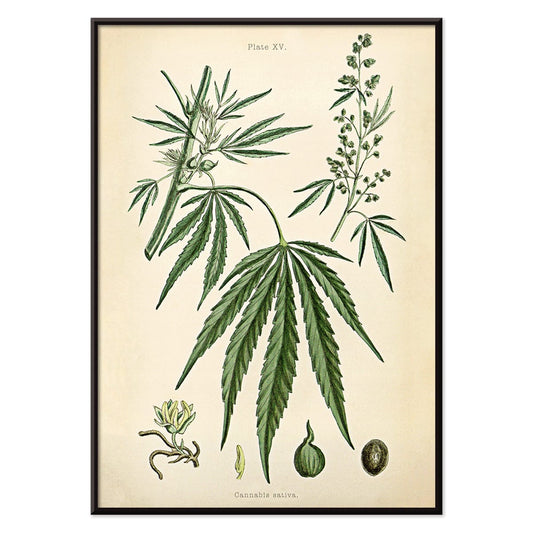
- Cannabisplade 2 Plakat
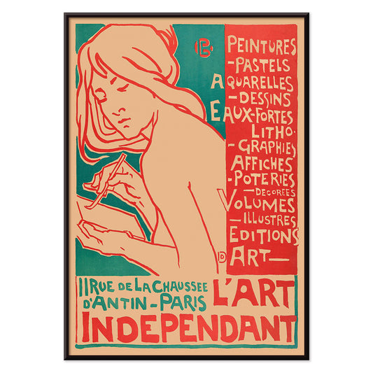
- L'Art Independant Plakat
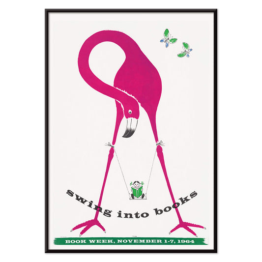
- Gynge ind i bøger plakat
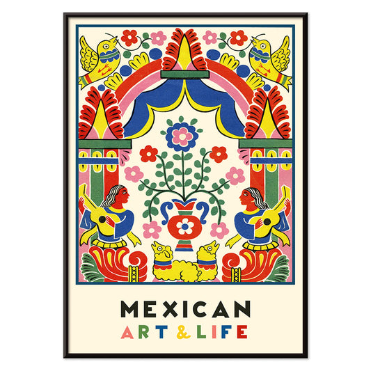
- Mexicansk kunst og liv 1 Plakat
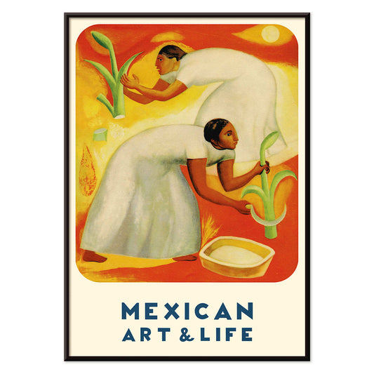
- Mexicansk kunst og liv 4 Plakat
- Mexican Art & Life 3 Plakat
- Ornamentale kunstarter fra Japan IX Plakat
- Glædesbjerg Plakat
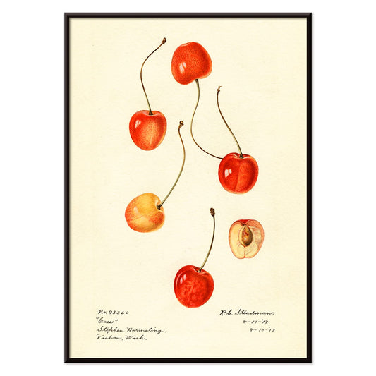
- Prunus avium Plakat
-
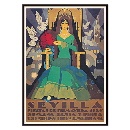
Sevilla forårsfejringer Plakat
ukendt kunstner · 1929 · Art Deco festivalplakat fra Sevilla med en grønklædt figur og to hvide duer
Plakat fra 69 kr · Indrammet fra 122,67 kr
Normalpris Fra 46,00 krNormalpris -
El Maestro 1 Plakat
ukendt kunstner · 1921 · mexicansk blomsterplakat med kraftige røde blomster og stiliseret grøn kaktus på beige
Plakat fra 69 kr · Indrammet fra 122,67 kr
Normalpris Fra 46,00 krNormalpris -
Exposition Cantonale Neuchateloise Plakat
Edmond Boitel · 1908 · Frodig Belle Époque plakat med overdådig buket og tydelige udstillingsbogstaver
Plakat fra 69 kr · Indrammet fra 122,67 kr
Normalpris Fra 46,00 krNormalpris -
Cannabisplade 2 Plakat
Ukendt kunstner · 1876 · Detaljeret cannabistryk med blade, blomsterstande og frø på aldret papir
Plakat fra 69 kr · Indrammet fra 122,67 kr
Normalpris Fra 46,00 krNormalpris -
L'Art Independant Plakat
Emile Berchmans · 1915 · Art Nouveau plakat med kvindelig kunstner i flydende linjer og markante røde detaljer
Plakat fra 69 kr · Indrammet fra 122,67 kr
Normalpris Fra 46,00 krNormalpris -
Gynge ind i bøger plakat
Ukendt kunstner · 1964 · Legesyg bogugeplakat med et læsende barn på en flamingo
Plakat fra 69 kr · Indrammet fra 122,67 kr
Normalpris Fra 46,00 krNormalpris -
Mexicansk kunst og liv 1 Plakat
Ukendt kunstner · 1938 · Livlig modernistisk mexicansk plakat med kraftfuld folkinspireret geometri og levende farver
Plakat fra 69 kr · Indrammet fra 122,67 kr
Normalpris Fra 46,00 krNormalpris -
Mexicansk kunst og liv 4 Plakat
Ukendt kunstner · 1938 · Frodig mexicansk høstplakat med to markarbejdere under en strålende sol
Plakat fra 69 kr · Indrammet fra 122,67 kr
Normalpris Fra 46,00 krNormalpris -
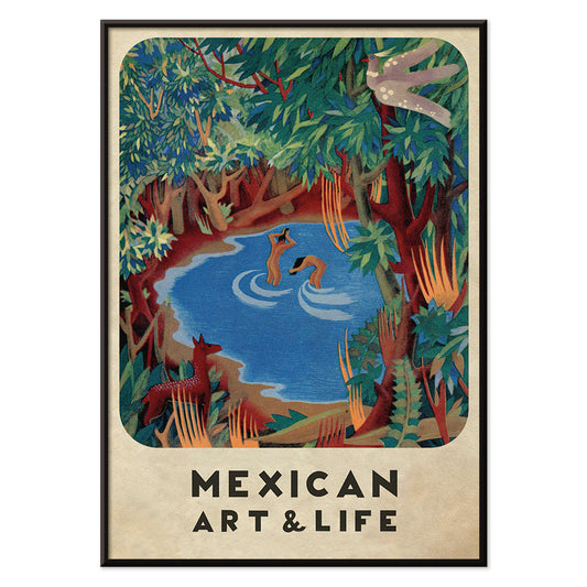
Mexican Art & Life 3 Plakat
Ukendt kunstner · 1938 · Modernistisk skovplakat med legende dyr og markant Mexican Art & Life typografi
Plakat fra 69 kr · Indrammet fra 122,67 kr
Normalpris Fra 46,00 krNormalpris -
Ornamentale kunstarter fra Japan IX Plakat
G.A. Audsley · 1884 · Raffineret vintage tryk med stiliserede blomster og rytmisk løv i varme toner
Plakat fra 69 kr · Indrammet fra 122,67 kr
Normalpris Fra 46,00 krNormalpris -
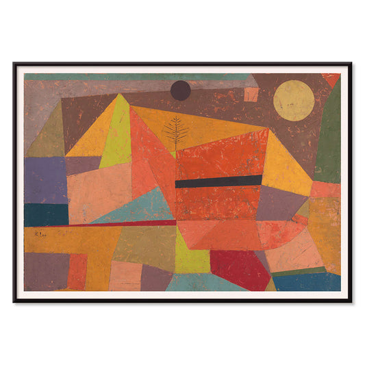
Glædesbjerg Plakat
Paul Klee · 1929 · Abstrakt bjergtryk i rytmiske farveblokke og fine sorte linjer med varme
Plakat fra 69 kr · Indrammet fra 122,67 kr
Normalpris Fra 46,00 krNormalpris -
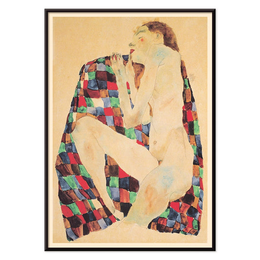
Nøgen kvinde på ternet stof Plakat
Egon Schiele · 1911 · Intensivt nøgentryk på rød og blå ternet stof på en bleg beige baggrund
Plakat fra 69 kr · Indrammet fra 122,67 kr
Normalpris Fra 46,00 krNormalpris -
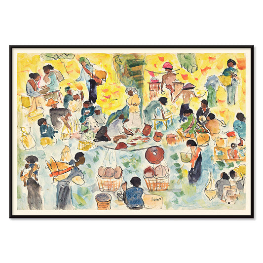
Markedscene i det hollandske Østindien Plakat
Pierre Jean Apol · 1912 · Solbeskinnet tropemarked kunsttryk med travle figurer og klare gadefarver
Plakat fra 69 kr · Indrammet fra 122,67 kr
Normalpris Fra 46,00 krNormalpris -
Prunus avium Plakat
Charles Steadman · 1917 · Delikat botanisk kirsebærtryk med modne klynger og friske grønne blade
Plakat fra 69 kr · Indrammet fra 122,67 kr
Normalpris Fra 46,00 krNormalpris -
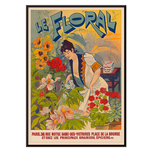
Le Floral Plakat
Ukendt kunstner · 1891 · Fint Art Nouveau plakat med en kvinde omgivet af farverige blomster og dekorative bogstaver
Plakat fra 69 kr · Indrammet fra 122,67 kr
Normalpris Fra 46,00 krNormalpris -
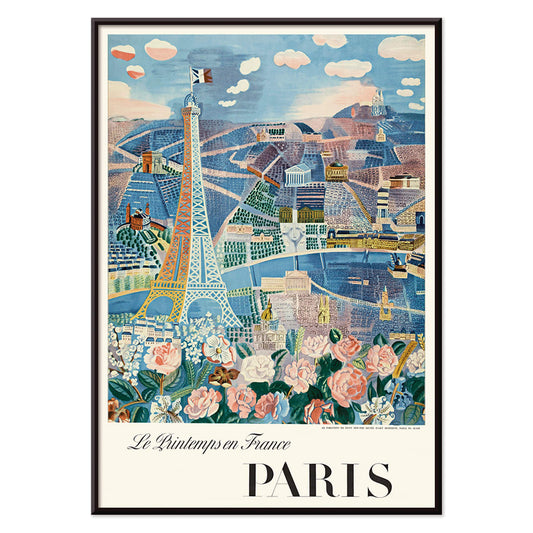
Le Printemps en France Plakat
Raoul Dufy · 1925 · Livlig eiffeltårnsplakat med luftige forårslinjer, fransk lys og parisenergi stemning
Plakat fra 69 kr · Indrammet fra 122,67 kr
Normalpris Fra 46,00 krNormalpris -
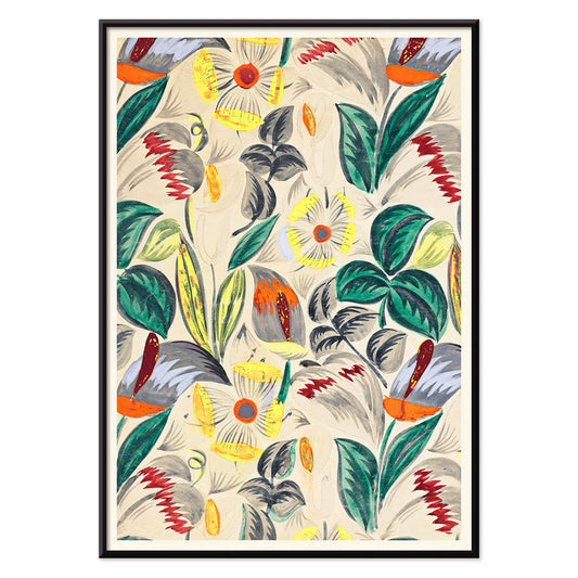
Tropiske blomster II Plakat
Ukendt kunstner · 1912 · Dekorativt tropisk blomstertryk med stiliseret løv og varm tidlig moderne mønsterrytme
Plakat fra 69 kr · Indrammet fra 122,67 kr
Normalpris Fra 46,00 krNormalpris -
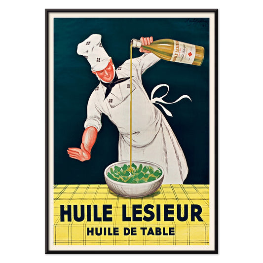
Huile Lesieur Plakat
Leonetto Cappiello · 1930 · Livlig reklameplakat med kok, gylden olie og kraftig rød typografi på sort baggrund
Plakat fra 69 kr · Indrammet fra 122,67 kr
Normalpris Fra 46,00 krNormalpris -
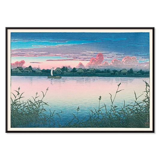
Tidligt efterår i Urayasu Plakat
Kawase Hasui · 1931 · Stille vandkantplakat med tusmørk himmel, stille landsbysilhuetter og rolige spejlinger
Plakat fra 69 kr · Indrammet fra 122,67 kr
Normalpris Fra 46,00 krNormalpris -
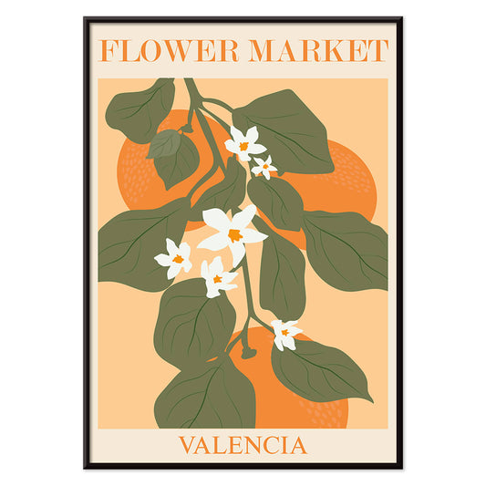
Blomstermarkedet i Valencia Plakat
MORYARTY · 2022 · Lys botanisk plakat med Valenciablade og hvide blomster på varm orange
Plakat fra 69 kr · Indrammet fra 122,67 kr
Normalpris Fra 46,00 krNormalpris -
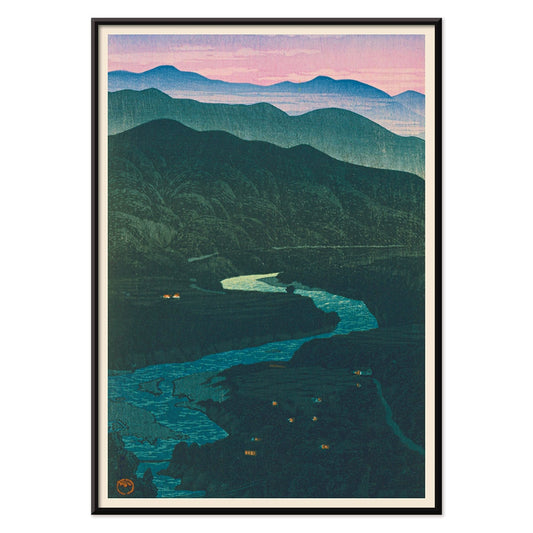
Ecchu Umidani bjergpas Plakat
Kawase Hasui · 1923 · Fredfyldt bjergpastryk med lagdelte blå bjergkamme og en snoet sti
Plakat fra 69 kr · Indrammet fra 122,67 kr
Normalpris Fra 46,00 krNormalpris -
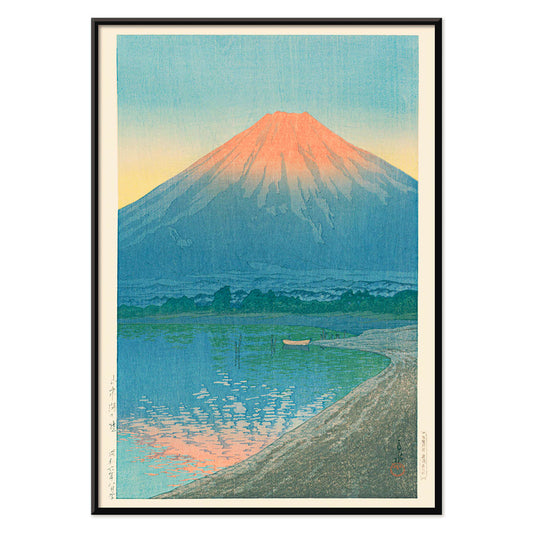
Daggry over Yamanaka-sø Plakat
Kawase Hasui · 1931 · roligt Mount Fujis solopgangstryk med spejlede søreflektioner i kølige blå nuancer
Plakat fra 69 kr · Indrammet fra 122,67 kr
Normalpris Fra 46,00 krNormalpris -
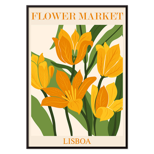
Blomstermarked i Lissabon Plakat
MORYARTY · 2019 · Solfyldt Lissabon blomsterplakat med markante blomster og frodige grønne blade
Plakat fra 69 kr · Indrammet fra 122,67 kr
Normalpris Fra 46,00 krNormalpris -
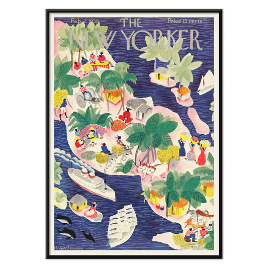
The New Yorker 1935 Plakat
Roger Duvoisin · 1935 · legesyg tropisk øplakat med kystdetaljer, klare farveblokke og nostalgisk stemning
Plakat fra 69 kr · Indrammet fra 122,67 kr
Normalpris Fra 46,00 krNormalpris -
Orange udklip Plakat
MORYARTY · 2022 · Abstrakt udklipsplakat med orange former og grønne accenter på varm beige
Plakat fra 69 kr · Indrammet fra 122,67 kr
Normalpris Fra 46,00 krNormalpris -
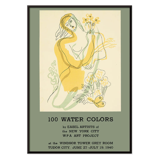
100 akvareller Plakat
WPA Art Project · 1940 · Modernistisk plakat med stiliseret kvinde med blomster i stærke gule og grønne toner
Plakat fra 69 kr · Indrammet fra 122,67 kr
Normalpris Fra 46,00 krNormalpris -
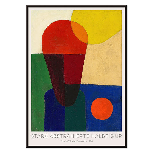
Stærkt abstraheret halvfigur Plakat
Franz Wilhelm Seiwert · 1920 · Geometrisk halvfigur kunsttryk med markante primærfarveblokke og klart modernistisk rytme
Plakat fra 69 kr · Indrammet fra 122,67 kr
Normalpris Fra 46,00 krNormalpris -
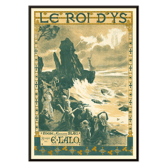
Le roi d'Ys Plakat
Auguste François-Marie Gorguet · 1888 · Stemningsfuld dramatisk havsceneplakat med vindpiskede bølger og gyldent kystlys
Plakat fra 69 kr · Indrammet fra 122,67 kr
Normalpris Fra 46,00 krNormalpris -
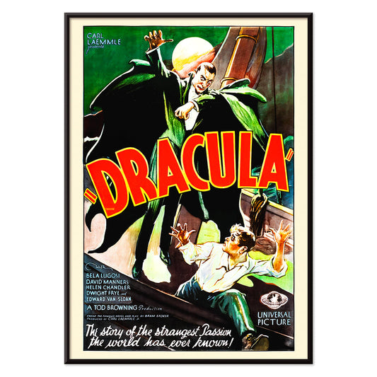
Dracula Plakat
ukendt kunstner · 1931 · dramatisk gyserplakat med truende hætteklædt vampyrsilhuet mod fuldmåne
Plakat fra 69 kr · Indrammet fra 122,67 kr
Normalpris Fra 46,00 krNormalpris -
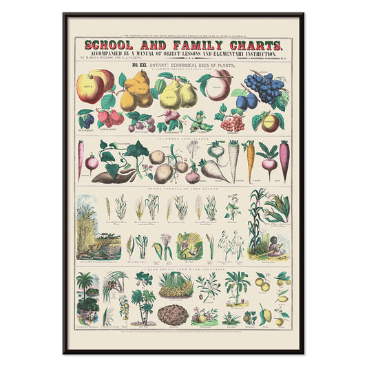
Økonomisk brug af planter Plakat
Marcius Willson · 1865 · Detaljeret botanisk plakat, der kortlægger planters praktiske anvendelser i klare, mærkede vignetter
Plakat fra 69 kr · Indrammet fra 122,67 kr
Normalpris Fra 46,00 krNormalpris -
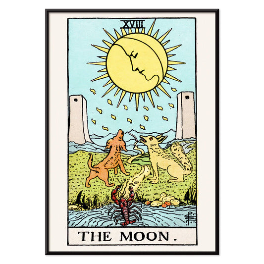
Månen Plakat
Rider Waite · 1910 · mystisk måne tarotplakat med to hunde, snoet sti og drømmende natpalet
Plakat fra 69 kr · Indrammet fra 122,67 kr
Normalpris Fra 46,00 krNormalpris -
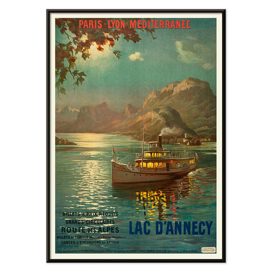
Lac d’Annecy 2 Plakat
François-Charles Cachoud · 1902 · rolig søplakat med en ensom båd og bløde alpine skumringsnuancer
Plakat fra 69 kr · Indrammet fra 122,67 kr
Normalpris Fra 46,00 krNormalpris -
Elskerne Plakat
Rider Waite · 1910 · Ikonisk vintage tryk af en engel, der velsigner elskende under symbolske træer
Plakat fra 69 kr · Indrammet fra 122,67 kr
Normalpris Fra 46,00 krNormalpris -
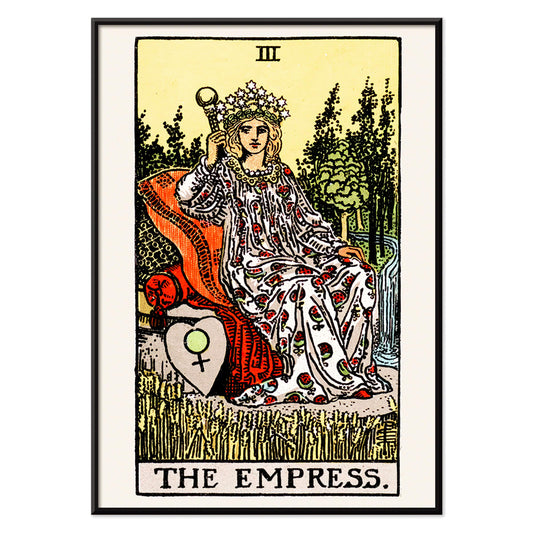
Kejserinden Tarotplakat
Rider Waite · 1910 · Symbolsk Kejserinden tarotplakat med stjernekronen, kornmarker og Venusskjold i varme farvetoner
Plakat fra 69 kr · Indrammet fra 122,67 kr
Normalpris Fra 46,00 krNormalpris -
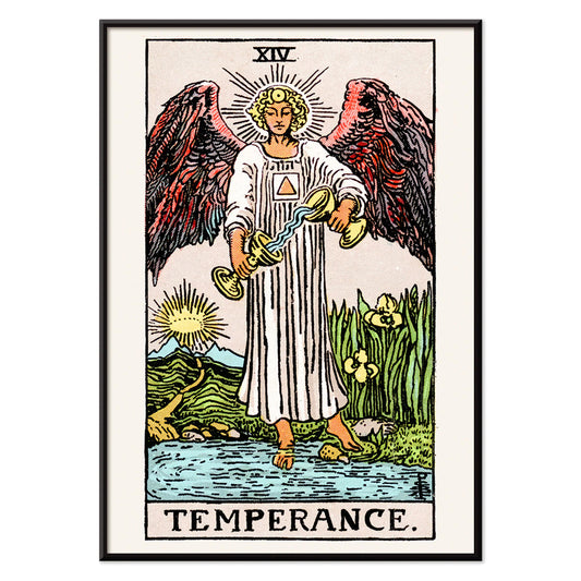
Mådehold Plakat
Rider Waite · 1910 · Ikonisk mådehold tarotplakat med en engel, der hælder vand mellem to bægre
Plakat fra 69 kr · Indrammet fra 122,67 kr
Normalpris Fra 46,00 krNormalpris -
Den hængte mand Plakat
Rider Waite · 1910 · Symbolsk Den hængte mand tarotplakat med rolig blå himmel og strålende glorie
Plakat fra 69 kr · Indrammet fra 122,67 kr
Normalpris Fra 46,00 krNormalpris


36/712 items
- El Maestro 1 Plakat
- Cannabisplade 2 Plakat
- L'Art Independant Plakat
- Gynge ind i bøger plakat
- Mexicansk kunst og liv 1 Plakat
- Mexicansk kunst og liv 4 Plakat
- Mexican Art & Life 3 Plakat
- Ornamentale kunstarter fra Japan IX Plakat
- Glædesbjerg Plakat
- Prunus avium Plakat
- Le Floral Plakat
- Le Printemps en France Plakat
- Tropiske blomster II Plakat
- Huile Lesieur Plakat
- Tidligt efterår i Urayasu Plakat
- Blomstermarkedet i Valencia Plakat
- Ecchu Umidani bjergpas Plakat
- Daggry over Yamanaka-sø Plakat
- Blomstermarked i Lissabon Plakat
- The New Yorker 1935 Plakat
- Orange udklip Plakat
- Stærkt abstraheret halvfigur Plakat
- Dracula Plakat
- Månen Plakat
Why green keeps returning
Green in vintage poster culture is rarely a single hue; it works as a punctuation mark, chlorophyll against cream paper, emerald shadows in a lithograph, a muted olive that softens a room. From 19th-century verdigris to mid-century inks, green signaled gardens, hygiene, and new leisure. This is a color-led way to build wall art and decoration, moving easily between botanical and abstract, without forcing everything to match.
Pattern, pigment, and a little science
Designers have long used green to make surfaces feel alive. In Eugène Chevreul’s Cercle chromatique, the spectrum is laid out like a tidy argument: greens bloom between yellow and blue, then dissolve into cooler notes. That logic shaped 19th-century taste, from painters’ palettes to dyed textiles. Chevreul’s ideas traveled through poster studios, where lithographers layered translucent greens to suggest depth without heavy shading, an approach that made small green details capable of anchoring an entire composition.
How craft traditions use green
Ornament and repeat pattern give green a different job: not accent, but environment. William Morris turns theory into domestic structure in Strawberry Thief (1883) by William Morris, where birds and curling leaves lock into a repeat that feels both medieval and modern. Seen beside related work in William Morris and the broader context of classic art, the poster becomes a lesson in how green can hold busy drawing together without flattening it.
Where green wall art works hardest
In a kitchen or dining corner, green reads as appetite and freshness; pair it with matte ceramics and warm woods, or echo it with herbs on the counter. In bedrooms, choose dusty sage or forest tones to quiet bright lighting, then let linen and brass do the rest. For a restrained gallery wall, start with green-accented pieces and add neutrals from black and white; the contrast keeps the decoration from tipping into a theme. Entryways like a sharper green at eye level, while a living room can handle layered greens across two or three prints.
Curating across eras and framing choices
Green also bridges styles. Gustav Klimt’s The Kiss (1907–1908) by Gustav Klimt carries a deep, garden-like green that keeps the gold mosaic grounded; hang it near dark walnut or moss velvet for a softer glow. For airier calm, try the dusk gradients and river reflections of Early Autumn in Urayasu (1931) by Kawase Hasui, then connect it to panoramic companions from landscape or the wider world of oriental prints. When you want graphic punch, Hans Schleger’s Eat Greens for Health by Hans Schleger sits naturally beside advertising and bauhaus posters, where green often acts as a calm counterweight to red or black. Treat framing as part of the palette: pale oak for herbal charts, black for modern geometry, and a slim brass edge when the design already carries metallic warmth.