


- Eiffeltårnet 2 Plakat
- Bauhaus 21 Plakat
- Campanile di Pisa Plakat
- Tokyo nat Plakat
- Phacelia tanacetifolia Plakat
- Achillea Clypeolata Plakat
- Chrysanthemum parthenium Plakat
- Asclepias Syriaca Plakat
- Cirsium Canum Plakat
- New York, USA Plakat
- Gade i Barcelona Plakat
- Udsigt over Barcelona Plakat
- Geologisk verdenskort Plakat
- Asa–dsuma–bune Plakat
- Nami–chi–dori Plakat
- Iris kæmpferi Plakat
- Den store Bartholdistatue Plakat
- School of Visual Arts Plakat
- Familiehunde Plakat
- Løvinne Plakat
- Magnolie Plakat
- Antikt statuehoved Plakat
-
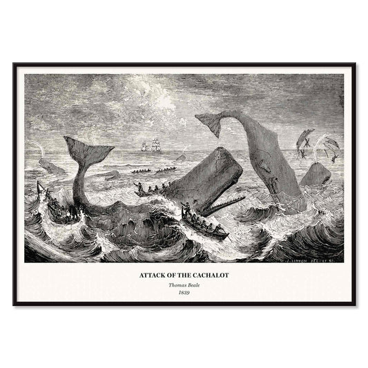
Kaskelottens angreb Plakat
Thomas Beale · 1839 · Dramatiske maritime vintagetryk med kaskelotangreb i skarpe sort, hvid og grå kontraster
Plakat fra 69 kr · Indrammet fra 122,67 kr
Normalpris Fra 46,00 krNormalpris -
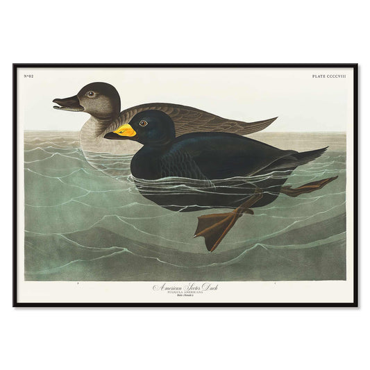
Amerikansk skallesluger Plakat
John James Audubon · 1827 · Slående havandetryk med blank sort fjerdragt og gul næb
Plakat fra 69 kr · Indrammet fra 122,67 kr
Normalpris Fra 46,00 krNormalpris -
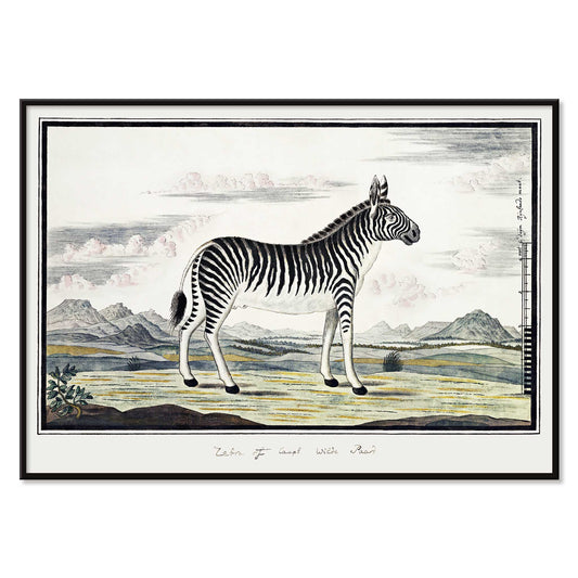
Bjergzebra Plakat
Robert Jacob Gordon · 1786 · naturhistorisk zebratryk i klar streg med rolig åben baggrund
Plakat fra 69 kr · Indrammet fra 122,67 kr
Normalpris Fra 46,00 krNormalpris -
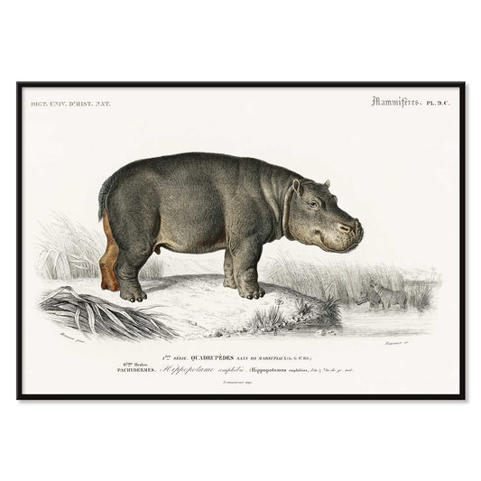
Hippopotame Amphibie Plakat
Charles Dessalines D'Orbigny · 1868 · Naturhistorisk flodhestetryk med roligt profiludsnit og fint skyggelag
Plakat fra 69 kr · Indrammet fra 122,67 kr
Normalpris Fra 46,00 krNormalpris -
Familiehunde Plakat
Ukendt kunstner · 1874 · viktoriansk familiehundetryk arrangeret som naturhistorisk plade i blide neutrale toner
Plakat fra 69 kr · Indrammet fra 122,67 kr
Normalpris Fra 46,00 krNormalpris -
Jorden og levende natur Plakat
Oliver Goldsmith · 1820 · Detaljeret vintage tryk med dyr arrangeret som naturhistorisk plade i klart monokromt
Plakat fra 69 kr · Indrammet fra 122,67 kr
Normalpris Fra 46,00 krNormalpris -
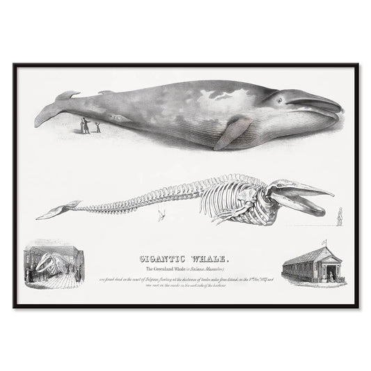
Baloena Musculus Plakat
George Johann Scharf · 1758 · Detaljeret tryk af hval og skelet med præcis stregføring og arkivagtig ro
Plakat fra 69 kr · Indrammet fra 122,67 kr
Normalpris Fra 46,00 krNormalpris -
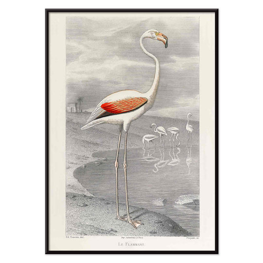
Le Flammant Plakat
Edouard Travies · 1853 · Elegant flamingotryk i blødt gråt vand med koral accenter og ro
Plakat fra 69 kr · Indrammet fra 122,67 kr
Normalpris Fra 46,00 krNormalpris -
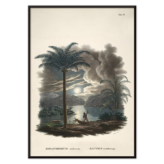
Bactris Acanthocarpa Plakat
Carl Friedrich Philipp von Martius · 1823 · Detaljeret botanisk tryk af tornet Bactrispalme med navngivne studier af frugt og blomster
Plakat fra 69 kr · Indrammet fra 122,67 kr
Normalpris Fra 46,00 krNormalpris -
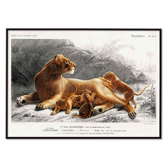
Løvinne Plakat
Charles Dessalines D'Orbigny · 1849 · Fint løvinnetryk med unger i bløde brune og grå toner
Plakat fra 69 kr · Indrammet fra 122,67 kr
Normalpris Fra 46,00 krNormalpris -
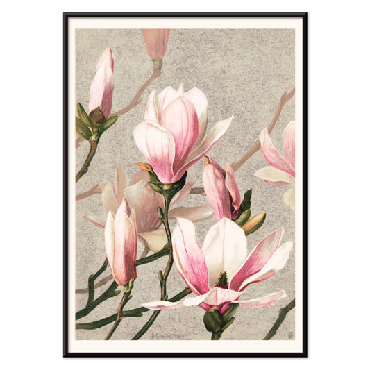
Magnolie Plakat
L. Prang & Co · 1886 · Fint botanisk magnoliatryk med bløde lyserøde kronblade, knopper og blanke blade
Plakat fra 69 kr · Indrammet fra 122,67 kr
Normalpris Fra 46,00 krNormalpris -
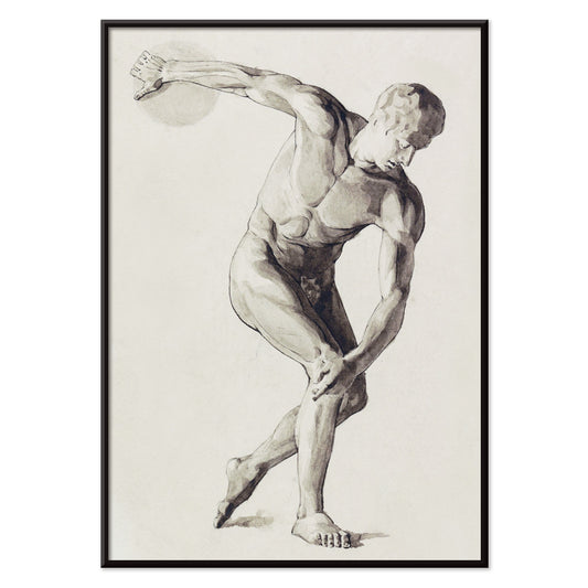
Diskoskaster Plakat
Jan Veth · 1912 · skulpturelt nøgent atletisk kunsttryk der indkapsler den opspændte bevægelse i diskoskastet
Plakat fra 69 kr · Indrammet fra 122,67 kr
Normalpris Fra 46,00 krNormalpris -
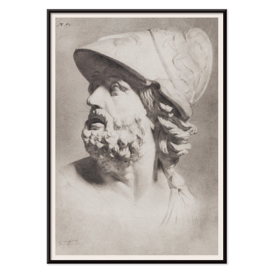
Romersk hoved med hjelm Plakat
Gerrit Willem Dijsselhof · 1900 · Fint romersk hoved med hjelm kunsttryk tegnet i grafit med skulpturel, klassisk ro
Plakat fra 69 kr · Indrammet fra 122,67 kr
Normalpris Fra 46,00 krNormalpris -
Antikt statuehoved Plakat
Johannes Tavenraat · 1854 · Akademisk klassisk hovedkunsttryk med blid grafitskygge på lys bund
Plakat fra 69 kr · Indrammet fra 122,67 kr
Normalpris Fra 46,00 krNormalpris -
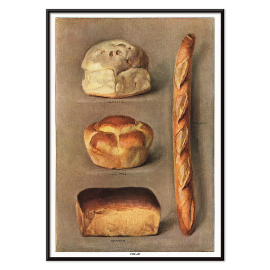
Bagte brød Plakat
Ukendt kunstner · 1911 · Detaljeret vintage tryk af forskellige bagte brød med omhyggelig skyggeføring
Plakat fra 69 kr · Indrammet fra 122,67 kr
Normalpris Fra 46,00 krNormalpris -
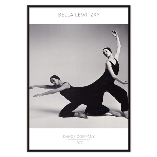
Bella Lewitzky danskompagni plakat
Ukendt kunstner · 1977 · højkontrast moderne danseplakat med markant figurfoto og ren, selvsikker typografi
Plakat fra 69 kr · Indrammet fra 122,67 kr
Normalpris Fra 46,00 krNormalpris -
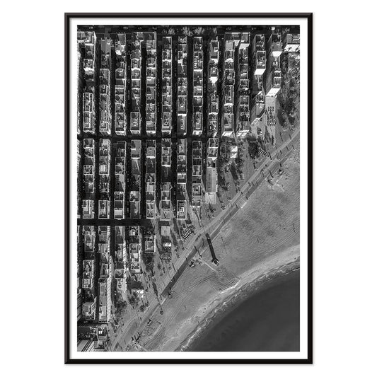
Barceloneta Plakat
ukendt kunstner · 1992 · højkontrast luftfoto af Barceloneta plakat der balancerer tætte gadenet og det åbne Middelhav
Plakat fra 69 kr · Indrammet fra 122,67 kr
Normalpris Fra 46,00 krNormalpris -
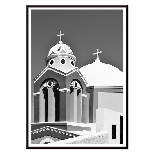
Santorini Plakat
Ukendt kunstner · 2004 · monokrom Santorini plakat med kirkekuppel og korsets silhuet mod ægæisk himmel
Plakat fra 69 kr · Indrammet fra 122,67 kr
Normalpris Fra 46,00 krNormalpris -
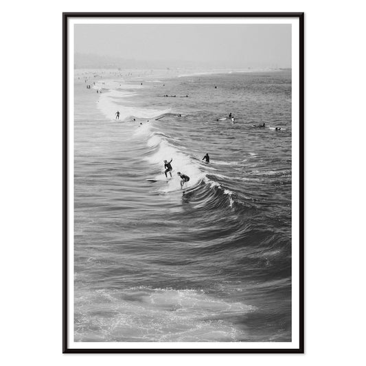
Surfere på Venice Beach Plakat
Ukendt kunstner · 2011 · Sort-hvidt kunsttryk med surfere der bærer surfbrætter langs Venice Beach
Plakat fra 69 kr · Indrammet fra 122,67 kr
Normalpris Fra 46,00 krNormalpris -
Gal Ab I Plakat
László Moholy-Nagy · 1930 · Dynamisk Bauhaus plakat med cirkler og diagonaler i klar gul og dyb sort
Plakat fra 69 kr · Indrammet fra 122,67 kr
Normalpris Fra 46,00 krNormalpris -
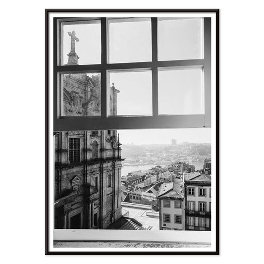
Porto Plakat
Ukendt kunstner · 2020 · Sort-hvidt Porto bymotiv med klare linjer og en kontemplativ vinduesudsigt
Plakat fra 69 kr · Indrammet fra 122,67 kr
Normalpris Fra 46,00 krNormalpris -
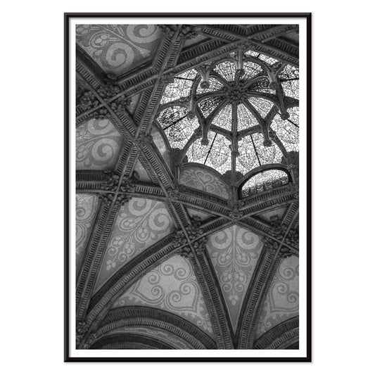
Hospital de Sant Pau Plakat
Ukendt kunstner · 1901 · Monokrom arkitektonisk plakat der indfanger Sant Paus hvælvede lofter med dramatisk lys og skygge
Plakat fra 69 kr · Indrammet fra 122,67 kr
Normalpris Fra 46,00 krNormalpris -
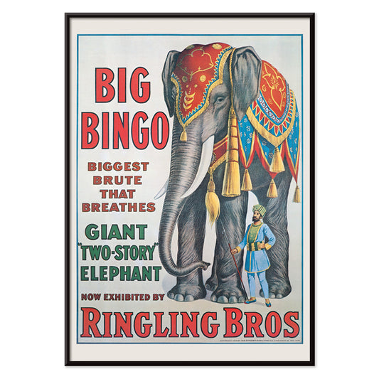
Big Bingo Plakat
Ukendt kunstner · 1916 · Frodig cirkusplakat med en tårnhøj elefant ved sin elegante træner
Plakat fra 69 kr · Indrammet fra 122,67 kr
Normalpris Fra 46,00 krNormalpris -
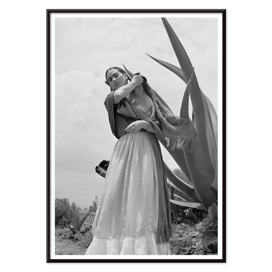
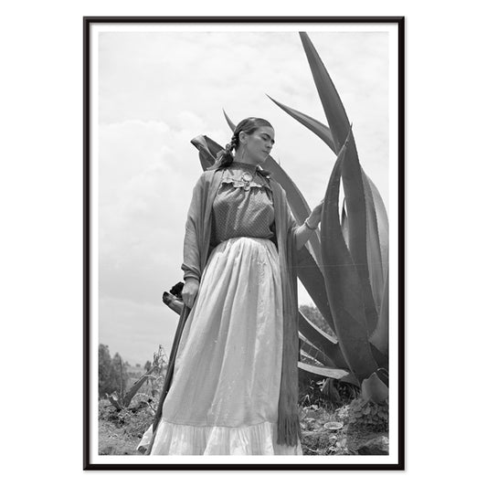
Frida Kahlo stående ved en agaveplante Plakat
Toni Frissell · 1937 · Ikonisk sort-hvid plakat af Frida Kahlo stående ved en markant agaveplante
Plakat fra 69 kr · Indrammet fra 122,67 kr
Normalpris Fra 46,00 krNormalpris -
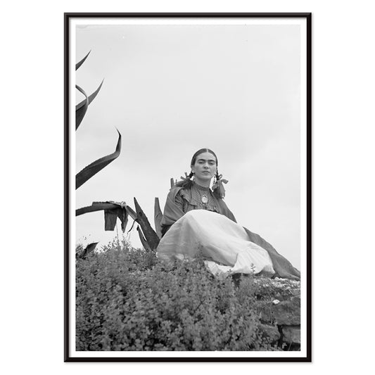
Frida Kahlo siddende ved en agaveplante Plakat
Toni Frissell · 1937 · Slående sort-hvidt portrætplakat af Frida Kahlo siddende ved en agave
Plakat fra 69 kr · Indrammet fra 122,67 kr
Normalpris Fra 46,00 krNormalpris -
Markis af Tavistock Plakat
Toni Frissell · 1955 · Elegant sort-hvid plakat med par i Bermudas afdæmpede resortstemning
Plakat fra 69 kr · Indrammet fra 122,67 kr
Normalpris Fra 46,00 krNormalpris -
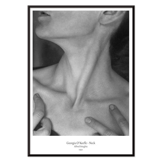
Georgia O'Keeffe - Nakke Plakat
Alfred Stieglitz · 1921 · Intimt sort hvidt kunsttryk med nakke og kæbelinje i skulpturel abstraktion
Plakat fra 69 kr · Indrammet fra 122,67 kr
Normalpris Fra 46,00 krNormalpris -
Frida Kahlo stående ved en agave Plakat
Toni Frissell · 1937 · Ikonisk sort-hvid plakat af Frida Kahlo ved en monumental agavesilhuet
Plakat fra 69 kr · Indrammet fra 122,67 kr
Normalpris Fra 46,00 krNormalpris -
modemodel i tennisoutfit plakat
Toni Frissell · 1947 · elegant tennisplakat med en yndefuld model foran et bjerglandskab
Plakat fra 69 kr · Indrammet fra 122,67 kr
Normalpris Fra 46,00 krNormalpris -
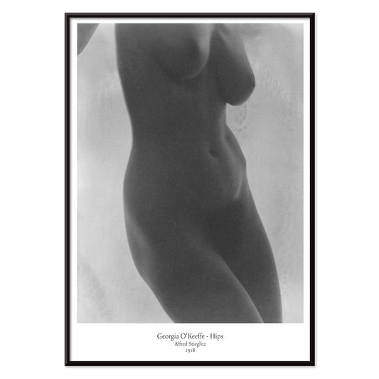
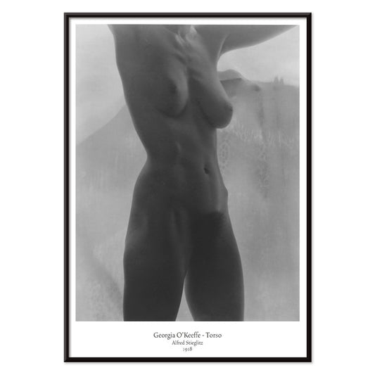
Georgia O'Keeffe - Hofter Plakat
Alfred Stieglitz · 1918 · Intimt modernistisk nøgentryk med skulpturel beskæring og fløjlsagtige sort-hvide toner
Plakat fra 69 kr · Indrammet fra 122,67 kr
Normalpris Fra 46,00 krNormalpris -
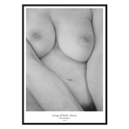
Georgia O'Keeffe - Bryster Plakat
Alfred Stieglitz · 1919 · Intimt sort-hvidt nøgenplakat med skulpturelle kurver og blødt stemningsfuldt studielys
Plakat fra 69 kr · Indrammet fra 122,67 kr
Normalpris Fra 46,00 krNormalpris -
Georgia O'Keeffe Kropsstudie Plakat
Alfred Stieglitz · 1918 · Beskåret sort-hvidt kropsstudiekunsttryk med blødt lys og skulpturel modernistisk intimitet
Plakat fra 69 kr · Indrammet fra 122,67 kr
Normalpris Fra 46,00 krNormalpris -
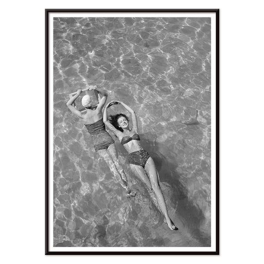
Modeller i badetøj ved poolen Plakat
Toni Frissell · 1921 · Stilfuldt kunsttryk ved poolen med delikate badedragtssilhuetter på glitrende vand
Plakat fra 69 kr · Indrammet fra 122,67 kr
Normalpris Fra 46,00 krNormalpris -
Nickerson Paine iført bikini Plakat
Toni Frissell · 1971 · Sort-hvid bikiniplakat med soloplyst kystkomposition og skarp, grafisk kontrast
Plakat fra 69 kr · Indrammet fra 122,67 kr
Normalpris Fra 46,00 krNormalpris -
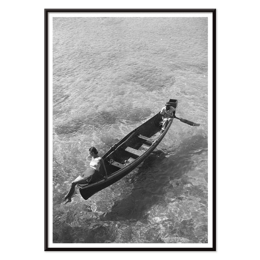
Model på bådkanten Plakat
Toni Frissell · 1946 · Elegant sort-hvid plakat med model siddende på bådkanten og et roligt kystudtryk
Plakat fra 69 kr · Indrammet fra 122,67 kr
Normalpris Fra 46,00 krNormalpris -
Weeki Wachee-kilde Plakat
Toni Frissell · 1947 · Drømmende undervandsplakat med svævende figur i sort-hvid og tidløs elegance
Plakat fra 69 kr · Indrammet fra 122,67 kr
Normalpris Fra 46,00 krNormalpris


- Familiehunde Plakat
- Løvinne Plakat
- Magnolie Plakat
- Antikt statuehoved Plakat
- Bagte brød Plakat
- Barceloneta Plakat
- Surfere på Venice Beach Plakat
- Porto Plakat
- Hospital de Sant Pau Plakat
- Frida Kahlo stående ved en agaveplante Plakat
- Frida Kahlo siddende ved en agaveplante Plakat
- Markis af Tavistock Plakat
- Frida Kahlo stående ved en agave Plakat
- modemodel i tennisoutfit plakat
- Modeller i badetøj ved poolen Plakat
- Nickerson Paine iført bikini Plakat
- Model på bådkanten Plakat
- Weeki Wachee-kilde Plakat
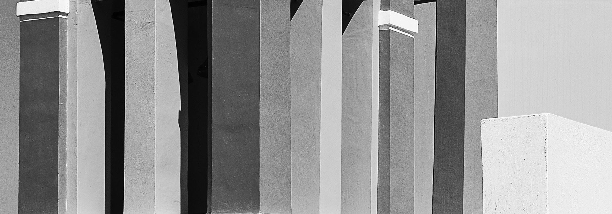
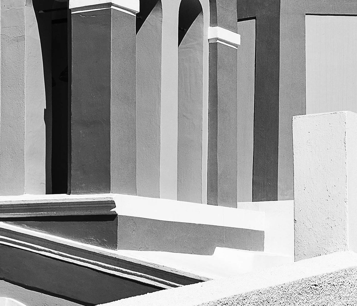
Grey as a design atmosphere
Grey rarely reads as a single colour on the wall. It shifts between graphite, pewter, fog, ash, and concrete, carrying the atmosphere of streets after rain or paper warmed by time. In vintage poster culture, grey often emerges through limited inks, photographic grain, or the deliberate restraint of modernist design. The result is wall art that feels architectural: less about spectacle, more about structure, surface, and the way light moves across a room.
Modernism and the discipline of restraint
Many twentieth-century artists used neutral tones to make form legible. In Wassily Kandinsky’s Four Parts (1932), muted colour keeps attention on the choreography of circles, bars, and floating planes, a language shared with the wider experiments gathered in Abstract. A related logic appears in Piet Mondrian’s Composition No. 1 Gray-Red (1935), where greys act as measured intervals that intensify the few charged notes of red. Even symbolism can stay controlled: Hilma af Klint’s Group IX, UW No. 25, The Dove, No. 1 (1915) uses subdued tone so geometry, not drama, carries the meaning.
Placing grey posters in the home
Grey prints work especially well when the room already has expressive materials. Think oak floors, linen upholstery, brushed steel, travertine, or handmade ceramics; the poster becomes a mediator between textures rather than a competing accent. In bedrooms, grey wall art can keep the visual field calm; in hallways, it rewards changing daylight with subtle shifts in contrast. For sharper edges, the tonal discipline of Black & White pairs easily, while Minimalist and Bauhaus reinforce clarity when you want the composition to feel deliberate.
Curating a gallery wall with nuance
A grey-led gallery wall stays coherent even when subjects vary, because value and texture do the unifying work. A botanical close-up can sit beside travel photography without feeling like a compromise. Karl Blossfeldt’s Adiantum pedatum (1928) brings sculptural detail that echoes metal fixtures and carved wood, and it connects naturally to the structural calm of Botanical. For figure and fashion-era linework, George Barbier’s La Vasque (1914) adds human presence without breaking the palette. When you want depth and distance, borrow airier companions from Landscape or tonal continuity from Photo.
Neutral, but never blank
The most convincing grey decoration is precise rather than bland. Vintage prints often carry patina, paper grain, and the evidence of older reproduction methods, so neutrality becomes a record of process as much as a colour choice. Lived with over time, grey posters teach the eye to notice proportion, margins, and negative space, and those small decisions start to shape the entire room.