


- Den gode nabo i Sydamerika Plakat
- Dansende par i sneen Plakat
- Ernst Kirchner udstillingsplakat Plakat
- Pink Panthers hævn Plakat
- Besøg Puerto Rico Plakat
- Kyushu-Okinawa Plakat
- Pacific Vibrations Plakat
- Continental Hawaii Airline Plakat
- Hibiscus Plakat
- Gynge ind i bøger plakat
- Mexicansk kunst og liv 1 Plakat
- Ornamentale kunstarter fra Japan IX Plakat
- Le Printemps en France Plakat
- Tidligt efterår i Urayasu Plakat
- Morgen ved Kap Inubō Plakat
- Ecchu Umidani bjergpas Plakat
- The New Yorker 1935 Plakat
- Japansk kunst Plakat
- Zoologischer Garten Plakat
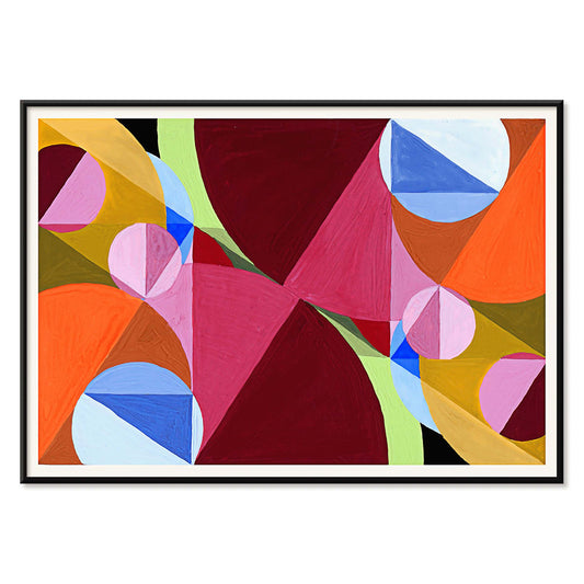
- Cirkler i en cirkel Plakat
- Tung Rød Plakat
- Bleu de Ciel Plakat
- Den endeløse sommer Plakat
- Coffea arabica 3 Plakat
- Coffea arabica Plakat
- Coffea Arabica 2 Plakat
- Generel naturhistorie for alle klasser PI.048 Plakat
- Grøn Caladium Chantini Plakat
- Zoologischer Garten München 2 Plakat
- Atlas over Munsell farvesystem Plakat
-
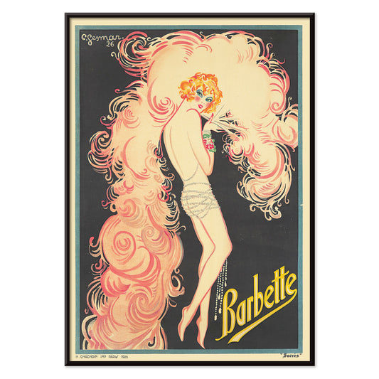
Barbette Plakat
Charles Gesmar · 1926 · Glamourøs kabaretplakat med Barbette omgivet af hvirvlende lyserøde fjer og klare gule højlys
Plakat fra 69 kr · Indrammet fra 122,67 kr
Normalpris Fra 46,00 krNormalpris -
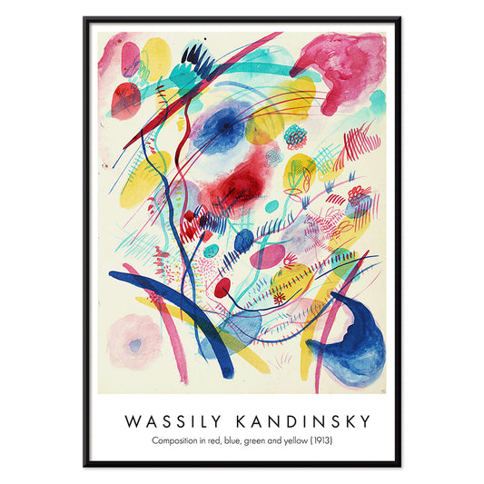
Komposition i rød, blå, grøn og gul Plakat
Wassily Kandinsky · 1913 · Energisk abstrakt kunsttryk med lagdelte cirkler, vinkler og klare primærfarver
Plakat fra 69 kr · Indrammet fra 122,67 kr
Normalpris Fra 46,00 krNormalpris -
Warszawa Aftener Plakat
Romuald Kamil Witkowski · 1932 · Drømmende Warszawa plakat med abstrakte frugtmotiver og stiliseret bysilhuet
Plakat fra 69 kr · Indrammet fra 122,67 kr
Normalpris Fra 46,00 krNormalpris -
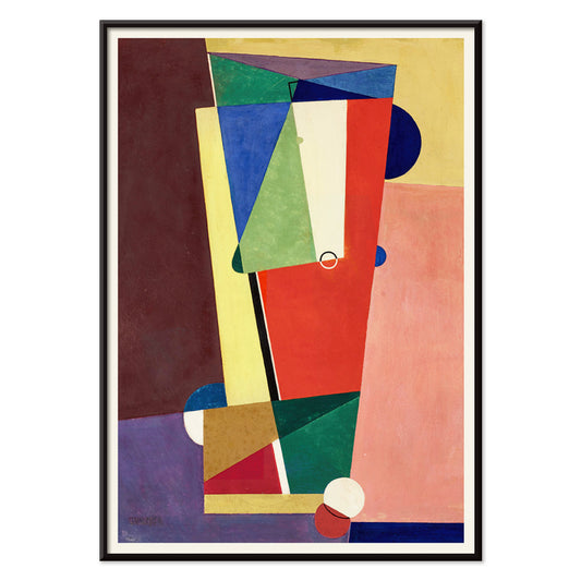
Komposition Plakat
Georges Valmier · 1921 · Dynamisk abstrakt kunsttryk med sammenflettede former og kraftfulde farveflader i bevægelse
Plakat fra 69 kr · Indrammet fra 122,67 kr
Normalpris Fra 46,00 krNormalpris -
Berührung Plakat
Wassily Kandinsky · 1924 · Dynamisk abstrakt plakat med krydsende cirkler, skrå linjer og markante røde og orange accenter
Plakat fra 69 kr · Indrammet fra 122,67 kr
Normalpris Fra 46,00 krNormalpris -
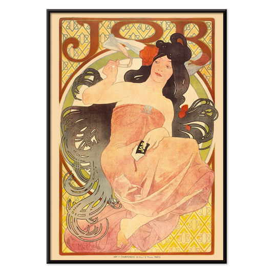
Job Plakat
Alphonse Mucha · 1897 · Ikonisk Art Nouveau plakat med roligt kvindeportræt der ryger omgivet af flydende hår
Plakat fra 69 kr · Indrammet fra 122,67 kr
Normalpris Fra 46,00 krNormalpris -
Falbalas et fanfreluches - Orgueil Plakat
George Barbier · 1925 · Art Deco plakat med en yndefuld kvinde i markante gule og sorte toner
Plakat fra 69 kr · Indrammet fra 122,67 kr
Normalpris Fra 46,00 krNormalpris -
Cigarrillos Paris Plakat
Aleardo Villa · 1901 · Elegant Belle Époque plakat med en liggende kvinde omgivet af rosa og lilla blomster
Plakat fra 69 kr · Indrammet fra 122,67 kr
Normalpris Fra 46,00 krNormalpris -
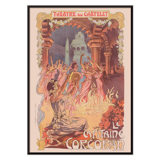
Le Capitaine Corcoran Plakat
Vincent Lorant-Heilbronn · 1902 · Festlig teaterplakat med dansere omkring et bål og Art Nouveau-blomster
Plakat fra 69 kr · Indrammet fra 122,67 kr
Normalpris Fra 46,00 krNormalpris -
Svømmende polypper Plakat
Institute of Liepzig · 2018 · Detaljeret marint videnskabeligt tryk med svømmende polypper og vandmænd i kølige havtoner
Plakat fra 69 kr · Indrammet fra 122,67 kr
Normalpris Fra 46,00 krNormalpris -
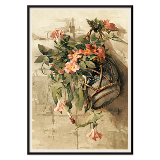
Lyserøde blomster i hængende vase Plakat
Annie Nowell · 1880 · Delikat botanisk tryk af lyserøde blomster i en hængende vase på varm beige baggrund
Plakat fra 69 kr · Indrammet fra 122,67 kr
Normalpris Fra 46,00 krNormalpris -
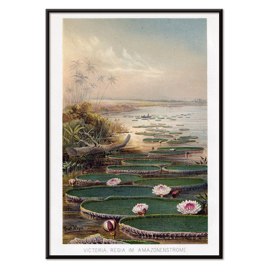
Vandlilje i Amazonas Plakat
Institute of Liepzieg · 2017 · Stilfuld Amazonas plakat med vandliljer, frodige grønne blade og sarte lyserøde blomster
Plakat fra 69 kr · Indrammet fra 122,67 kr
Normalpris Fra 46,00 krNormalpris -
Cactus cochenillifer Plakat
Pierre-Joseph Redouté · 1828 · Fint botanisk tryk af opuntiekaktusplader og blomster i bløde naturtoner
Plakat fra 69 kr · Indrammet fra 122,67 kr
Normalpris Fra 46,00 krNormalpris -
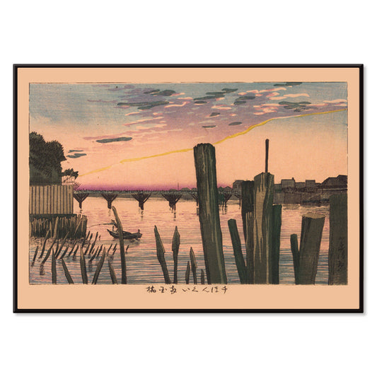
Bølgebrydere og Ryōgoku-broen Plakat
Kobayashi Kiyochika · 1881 · Fredfuldt flodkunsttryk med Ryōgoku-broen og bølgebryderpæle i tusmørke
Plakat fra 69 kr · Indrammet fra 122,67 kr
Normalpris Fra 46,00 krNormalpris -
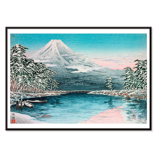
Fuji fra Tagonoura Plakat
Takahashi Hiroaki · 1932 · Stille japansk kunsttryk af Fuji spejlet i rolige kystfarvande
Plakat fra 69 kr · Indrammet fra 122,67 kr
Normalpris Fra 46,00 krNormalpris -
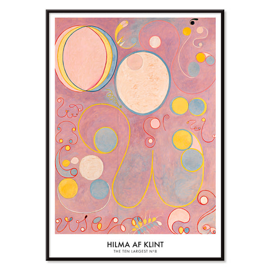
De ti største nr. 9 Alderdom Plakat
Hilma af Klint · 1907 · Strålende abstrakt plakat med pink bund og svævende former der antyder livets sene år
Plakat fra 69 kr · Indrammet fra 122,67 kr
Normalpris Fra 46,00 krNormalpris -
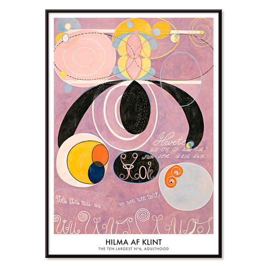
De ti største nr. 6 Plakat
Hilma af Klint · 1907 · Strålende abstrakt plakat med hvirvlende former og symboler i bløde rosa og lilla
Plakat fra 69 kr · Indrammet fra 122,67 kr
Normalpris Fra 46,00 krNormalpris -
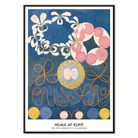
Barndom Gruppe IV Plakat
Hilma af Klint · 1907 · Strålende abstrakt kunsttryk med spiralformer og pastelfarver der vækker barndommens energi
Plakat fra 69 kr · Indrammet fra 122,67 kr
Normalpris Fra 46,00 krNormalpris -
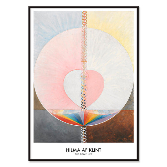
Duen nr. 1 Plakat
Hilma af Klint · 1915 · Mystisk abstrakt plakat opbygget af hellig geometri i blød rosa, gul og grå
Plakat fra 69 kr · Indrammet fra 122,67 kr
Normalpris Fra 46,00 krNormalpris -
Antikt kort over Skandinavien Plakat
Institute of Leipzig · 1867 · Detaljeret skandinavientryk med pastelfarver og blå havflader
Plakat fra 69 kr · Indrammet fra 122,67 kr
Normalpris Fra 46,00 krNormalpris -
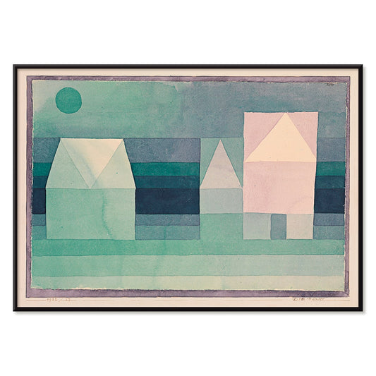
Tre huse Plakat
Paul Klee · 1922 · geometrisk kunsttryk med tre stiliserede huse i blød grøn, blå og rosa
Plakat fra 69 kr · Indrammet fra 122,67 kr
Normalpris Fra 46,00 krNormalpris -
Duer nr. 2 Plakat
Hilma af Klint · 1915 · Lyrisk abstrakt kunsttryk med duesymbolik og pastelfarvede geometriske former
Plakat fra 69 kr · Indrammet fra 122,67 kr
Normalpris Fra 46,00 krNormalpris -
De ti største nr. 8 Plakat
Hilma af Klint · 1907 · æterisk abstrakt kunsttryk med spiraler og symbolske former i pink, gul og blå
Plakat fra 69 kr · Indrammet fra 122,67 kr
Normalpris Fra 46,00 krNormalpris -
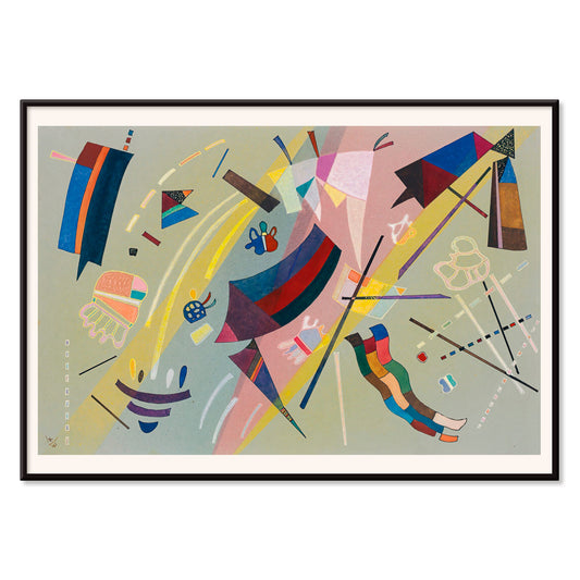
Kandinsky 1941 Plakat
Wassily Kandinsky · 1941 · Lyrisk abstrakt plakat med svævende geometriske former i blå, gul, lyserød og rød
Plakat fra 69 kr · Indrammet fra 122,67 kr
Normalpris Fra 46,00 krNormalpris -
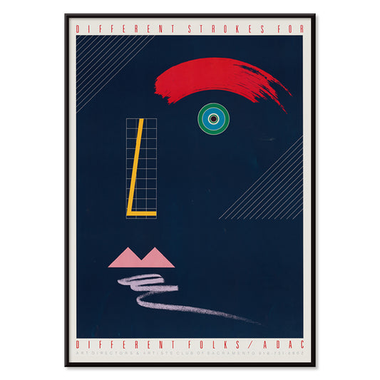
Forskellige streger til forskellige mennesker Plakat
McRay Magleby · 1942 · Legesygt geometrisk plakat med klare farveblokke i midcentury stil
Plakat fra 69 kr · Indrammet fra 122,67 kr
Normalpris Fra 46,00 krNormalpris -
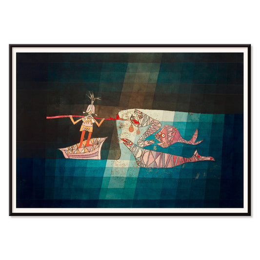
Sejleren Plakat
Paul Klee · 1923 · Legende abstrakt søfartsplakat med rytmiske symboler der fremmaner musik og havrejse
Plakat fra 69 kr · Indrammet fra 122,67 kr
Normalpris Fra 46,00 krNormalpris -
Areal brudt af vinkelrette linjer Plakat
Joseph Schillinger · 1934 · geometrisk abstrakt plakat med vinkelrette gitter og klare farveblokke i rytmisk balance
Plakat fra 69 kr · Indrammet fra 122,67 kr
Normalpris Fra 46,00 krNormalpris -
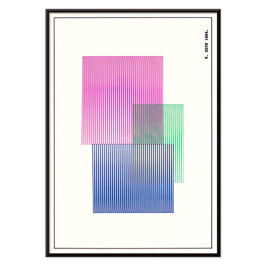
Rød, blå, grøn plakat
W. Soya · 1964 · Geometrisk farveblokplakat med skarpe linjer og klare røde, blå og grønne kontraster
Plakat fra 69 kr · Indrammet fra 122,67 kr
Normalpris Fra 46,00 krNormalpris -
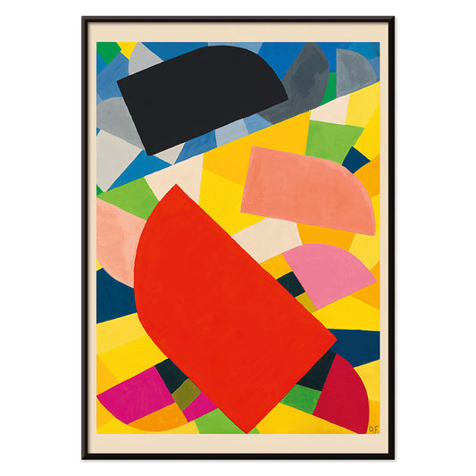
Komposition Plakat
Otto Freundlich · 1936 · Kraftfuldt geometrisk kunsttryk med sammenflettede farveflader og markant modernistisk energi
Plakat fra 69 kr · Indrammet fra 122,67 kr
Normalpris Fra 46,00 krNormalpris -
Farbstudien, 10 Blätter III Plakat
Karl Wiener · 1923 · Energisk abstrakt plakat med kontrasterende farvefelter og modernistisk rytme
Plakat fra 69 kr · Indrammet fra 122,67 kr
Normalpris Fra 46,00 krNormalpris -
Le Lac d’Annecy Plakat
Frederic Hugo d'Alési · 1900 · stille Le Lac d’Annecy plakat med solnedgang, bjerge og spejlblankt vand
Plakat fra 69 kr · Indrammet fra 122,67 kr
Normalpris Fra 46,00 krNormalpris -
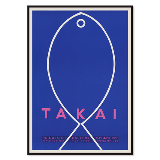
Takai Plakat
Teiji Takai · 1965 · Minimalistisk fiskplakat svævende på ultramarinblå baggrund med klare håndtegnede linjer
Plakat fra 69 kr · Indrammet fra 122,67 kr
Normalpris Fra 46,00 krNormalpris -
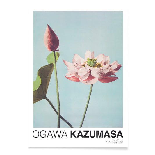
Lotusblomster Plakat
Ogawa Kazumasa · 1892 · Stille lotusplakat med sarte lyserøde blomster mod blåt vand og frodige blade
Plakat fra 69 kr · Indrammet fra 122,67 kr
Normalpris Fra 46,00 krNormalpris -
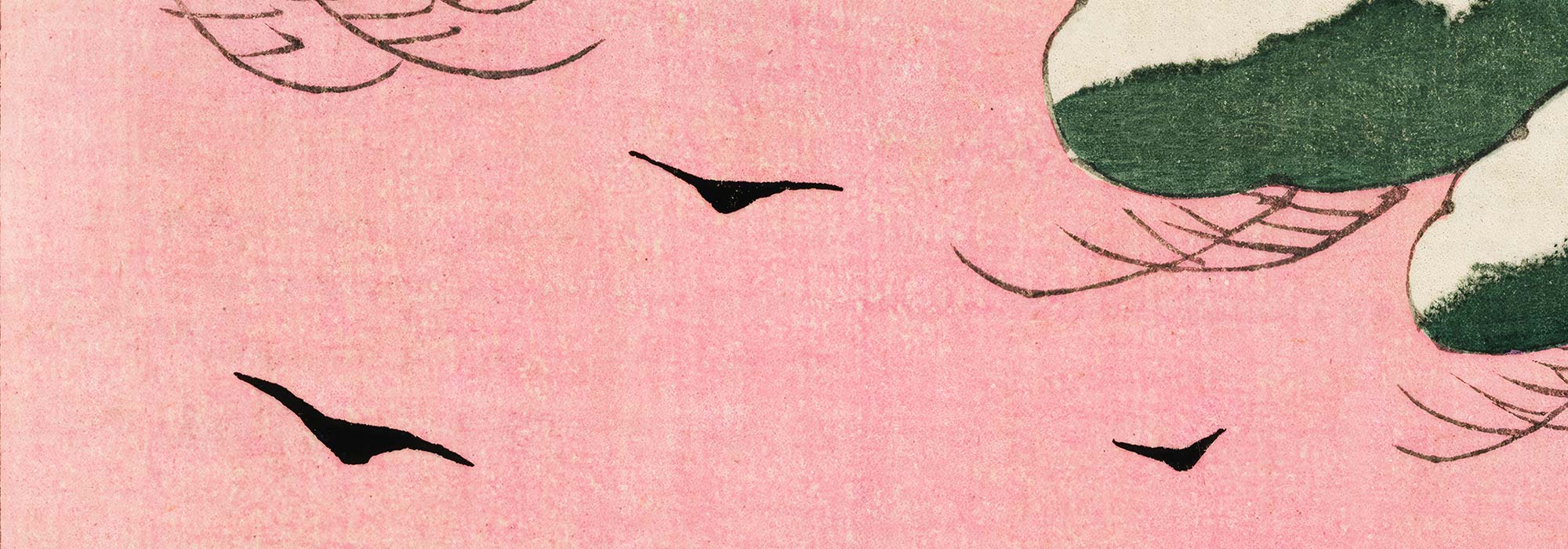
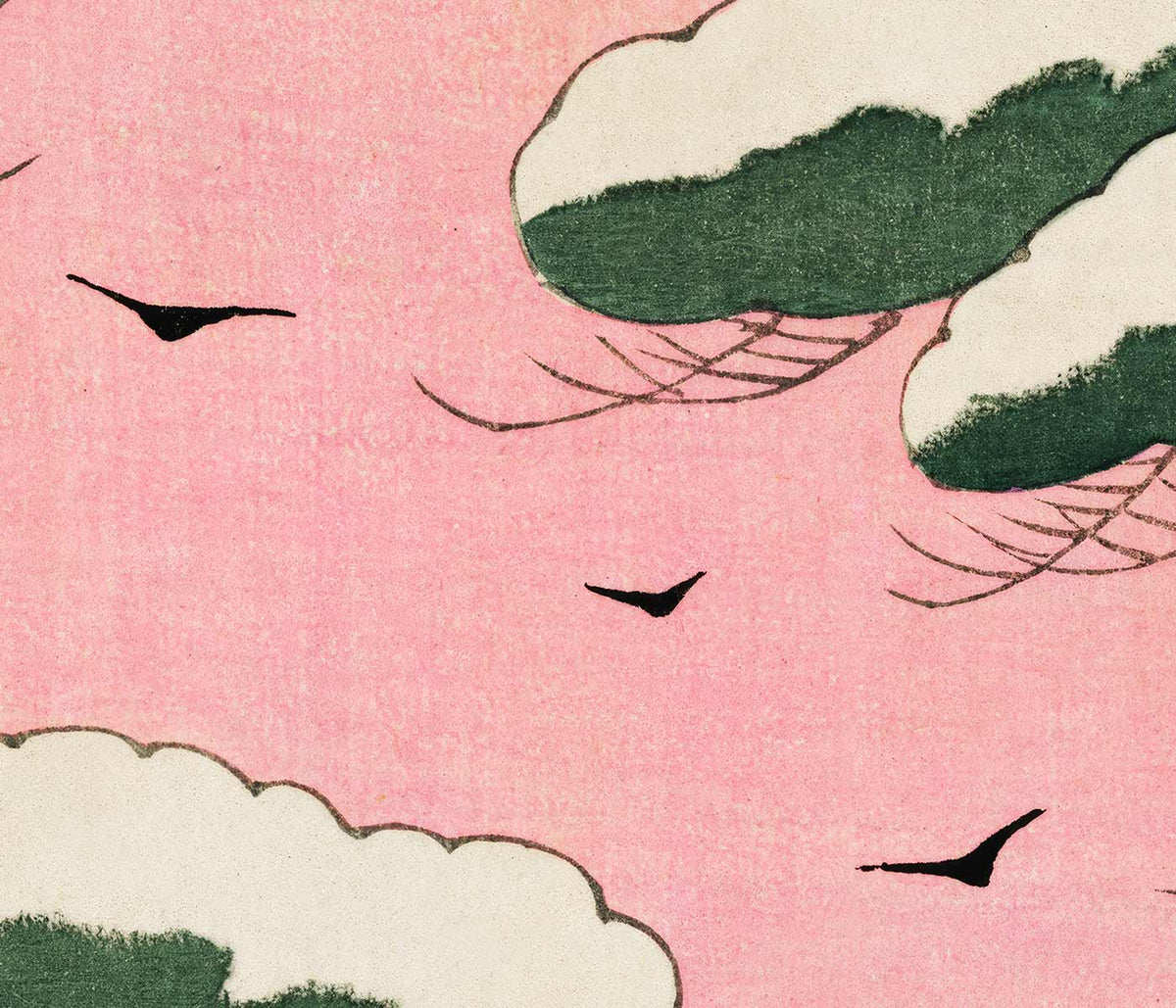
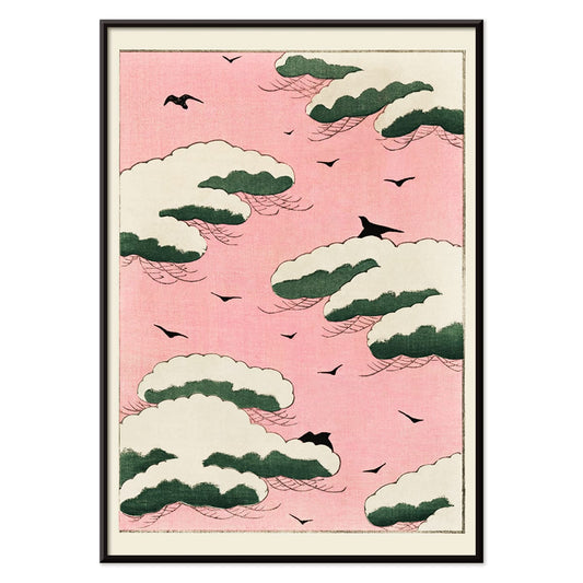
Rosa himmel Plakat
Watanabe Seitei · 1895 · Luftig himmel og fugleplakat med blød rosa dis og svævende grønne skyformer
Plakat fra 69 kr · Indrammet fra 122,67 kr
Normalpris Fra 46,00 krNormalpris -
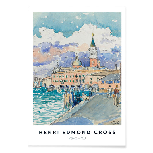
Venedig Plakat
Henri-Edmond Cross · 1903 · Strålende Venedig kunsttryk med skinnende lagunereflektioner i blå og lyserøde toner
Plakat fra 69 kr · Indrammet fra 122,67 kr
Normalpris Fra 46,00 krNormalpris -
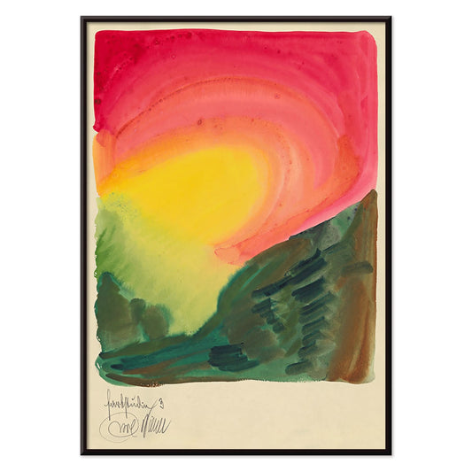
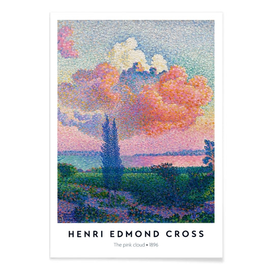
Den lyserøde sky Plakat
Henri-Edmond Cross · 1896 · Pointillistisk kystkunsttryk med en strålende lyserød sky over roligt blåt vand
Plakat fra 69 kr · Indrammet fra 122,67 kr
Normalpris Fra 46,00 krNormalpris


36/214 items
- Barbette Plakat
- Komposition i rød, blå, grøn og gul Plakat
- Warszawa Aftener Plakat
- Komposition Plakat
- Job Plakat
- Cigarrillos Paris Plakat
- Svømmende polypper Plakat
- Cactus cochenillifer Plakat
- De ti største nr. 9 Alderdom Plakat
- De ti største nr. 6 Plakat
- Barndom Gruppe IV Plakat
- Duen nr. 1 Plakat
- Duer nr. 2 Plakat
- De ti største nr. 8 Plakat
- Kandinsky 1941 Plakat
- Forskellige streger til forskellige mennesker Plakat
- Areal brudt af vinkelrette linjer Plakat
- Rød, blå, grøn plakat
- Komposition Plakat
- Farbstudien, 10 Blätter III Plakat
- Le Lac d’Annecy Plakat
- Takai Plakat
- Lotusblomster Plakat
- Rosa himmel Plakat
- Den lyserøde sky Plakat
Pink as an Accent, Not a Theme
In vintage poster culture, pink is rarely a single-note blush; it often arrives as a tint in skies, paper stock, petals, and lithographic ink. This collection gathers posters, prints, and wall art where rose, salmon, or fuchsia works like punctuation, warming a composition rather than dominating it. You will notice pink drifting through botanical illustration, modern geometry, and coastal light, where the colour reads as atmosphere or weather instead of sweetness. Because many of these images were made for books, exhibitions, or the street, their pinks feel like working ink and aged pigment, not a cosmetic overlay. For adjacent moods, the Abstract and Landscape collections extend the same quiet logic of colour and space.
From Belle Époque Lithography to Modernist Ink
Late nineteenth-century advertising and early twentieth-century modernism both used pink to seize attention, but with different tools. In Alphonse Mucha’s Job (1897), warm tones glow through ornamental line, giving commercial imagery the cadence of a salon poster. Decades later, Wassily Kandinsky’s Circles in a circle – Bauhaus exhibition (1923) uses pink as a counterpoint to black and teal, energising a disciplined field of forms. For a painterly bridge between the two, Henri-Edmond Cross’s The Pink Cloud (1896) breaks light into pointillist touches, showing how softness can be built from structure and repetition. If you want to trace those lineages further, Alphonse Mucha and Bauhaus give useful historical context.
Where Pink Works in Interiors
As home decor, pink-led decoration works best when it answers something already present: terracotta tile, oak, walnut, brass, or a striped textile. Kitchens and dining corners handle rosy botanicals particularly well, since the subject matter echoes ceramics and linen; pair this selection with Kitchen and Botanical. In calmer rooms, let pink sit beside graphite and cream by mixing in Black & White prints to keep contrast crisp. If your walls run cool grey, choose pieces where pink leans coral or violet rather than baby pastel; the hue will read as warmth against mineral tones. For a more illustrative, specimen-like approach to colour, the Animals collection often uses pink as anatomical signal rather than decoration.
Curating, Pairing, and Framing
Curate by temperature and subject. A travel or advertising poster with a hot pink accent can lift a quiet corridor; placing it near typography-forward work from Advertising keeps the rhythm graphic. For a softer narrative, Kawase Hasui’s Early Autumn in Urayasu (1931) sets pink into dusk light, especially convincing with pale wood or ash frames and an off-white mat. Natural history brings a strong silhouette: John James Audubon’s Pink Flamingo from Birds of America (1827) reads almost fashion-like when hung near blue glass, and it pairs cleanly with ocean hues from Sea & Ocean. To anchor a wall, introduce cartographic structure from Maps, letting pink appear as the surprise highlight rather than the headline.
A Colour That Behaves Like Light
What unites these vintage pieces is not a single palette, but the way pink behaves: sometimes opaque ink, sometimes a translucent wash, sometimes a paper-aged bloom. As wall art, it acts like light passing through a room, drawing attention to line, pattern, and negative space. Black lacquer frames push pink toward drama; pale timber keeps it airy, closer to pigment and paper.