


- Ødelæg dette rasende bæst Plakat
- Shaw eller ironi Plakat
- Den gode nabo i Sydamerika Plakat
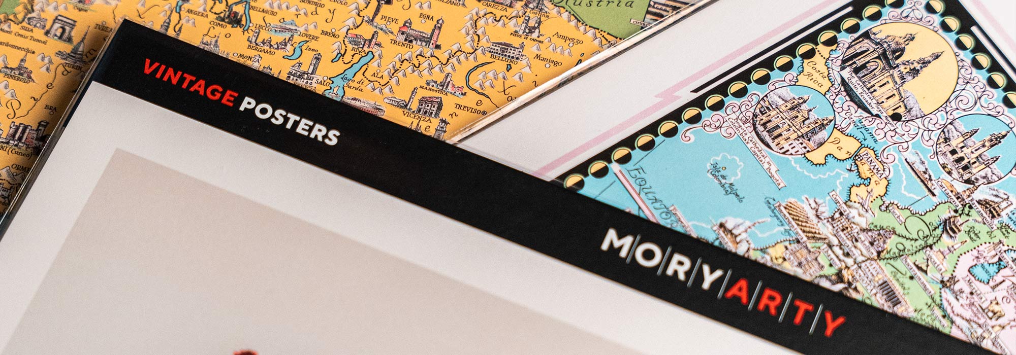
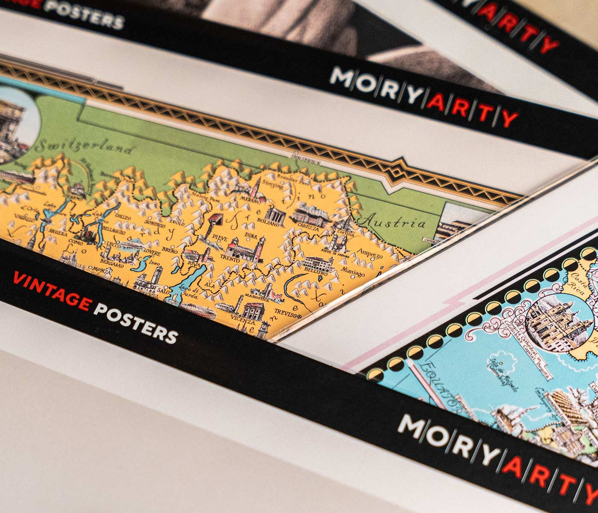
- Italien med Vatikanstaten Plakat
- Løg Plakat
- Radiser Plakat
- Gulerødder Plakat
- Les Lalanne Plakat
- Punch Boutique Plakat
- Dansende par i sneen Plakat
- Jødedom og hedenskab, standpunkt Plakat
- Jet Clipper til Hawaii Plakat
- Campari Soda Plakat
- Bec-Kina Plakat
- Kohler Chocolat Plakat
- Jordbærtyven Plakat
- Dansende figurer Matisse Plakat
- Tom Krojer Udstillingsplakat
- Berlin gadescene Plakat
- Ernst Kirchner udstillingsplakat Plakat
- Eiffeltårnet 2 Plakat
- Siddende kvinde set bagfra Plakat
- Rødt hår blå hat Plakat
- Park nær Lu Plakat
- El Comienzo Plakat
- Parler Seul 2 Plakat
- Mahatmaernes nuværende standpunkt Plakat
- Tusmørkets Ring Plakat
- Parler Seul Plakat
- Faun og Nymfe Plakat
- Drømmen Plakat
- Le Concert Plakat
- Fugl passerer gennem en sky Plakat
-
Drengene bader Plakat
Edvard Munch · 1896 · Drømmende kystkunsttryk med drenge der bader i dæmpede blå og grønne toner
Plakat fra 69 kr · Indrammet fra 122,67 kr
Normalpris Fra 46,00 krNormalpris -
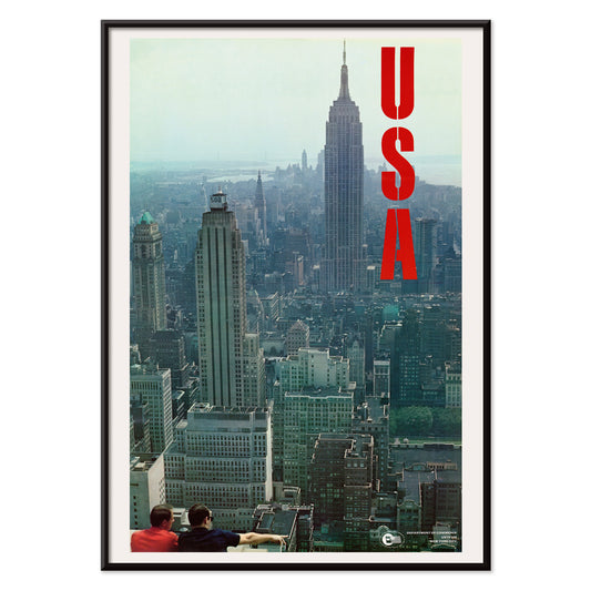
New York, USA Plakat
U.S. Information Agency · 1955 · Tidløs New York skyline plakat med markant typografi og kølige blågrå silhouetter
Plakat fra 69 kr · Indrammet fra 122,67 kr
Normalpris Fra 46,00 krNormalpris -
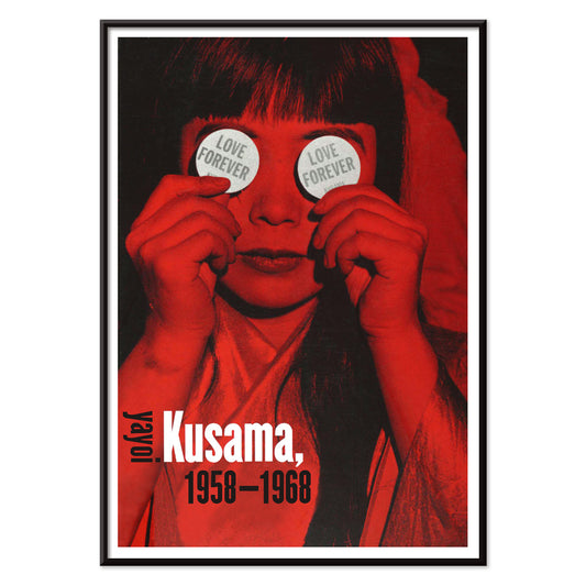
Evig kærlighed Plakat
Yayoi Kusama · 1966 · Hypnotisk plakat i rød og sort med kærlighedsmotiver og rytmiske prikmønstre
Plakat fra 69 kr · Indrammet fra 122,67 kr
Normalpris Fra 46,00 krNormalpris -
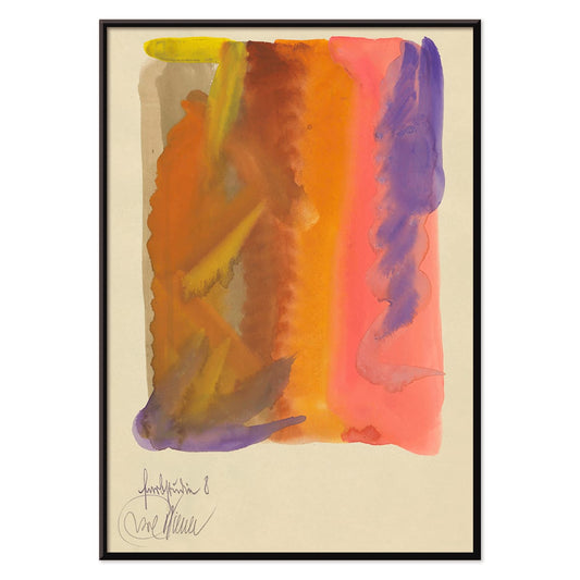
Farbstudien, 10 Blätter VIII Plakat
Karl Wiener · 1923 · Flydende abstrakt kunsttryk med varme gule vasker og dybe lilla bevægelser
Plakat fra 69 kr · Indrammet fra 122,67 kr
Normalpris Fra 46,00 krNormalpris -
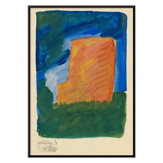
Farbstudien, 10 Blätter VI Plakat
Karl Wiener · 1923 · Livfuldt abstrakt kunsttryk med orange, blå og grønne flader på varm beige
Plakat fra 69 kr · Indrammet fra 122,67 kr
Normalpris Fra 46,00 krNormalpris -
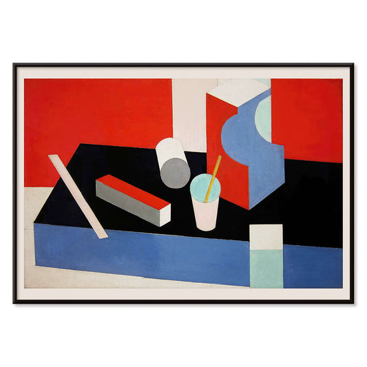
Kubik Plakat
Patrick Henry Bruce · 1917 · Geometrisk kubistisk kunsttryk med sammenflettede flader i rød, blå, sort og hvid
Plakat fra 69 kr · Indrammet fra 122,67 kr
Normalpris Fra 46,00 krNormalpris -
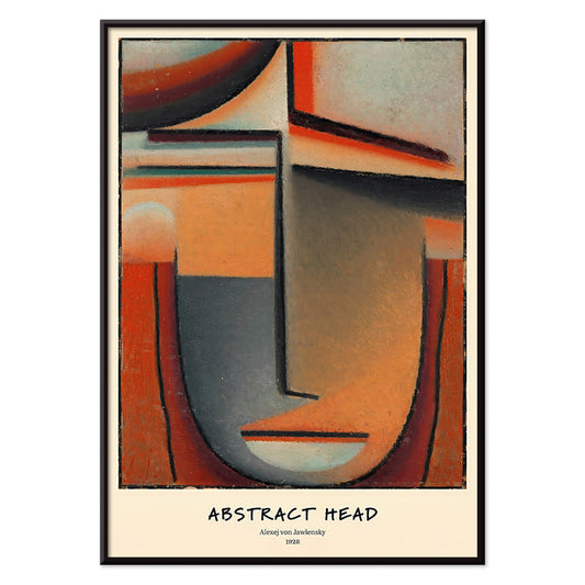
Abstrakt hoved plakat
Alexej von Jawlensky · 1928 · Ikonisk abstrakt hovedkunsttryk med stærke sorte linjer og ildfulde farveflader
Plakat fra 69 kr · Indrammet fra 122,67 kr
Normalpris Fra 46,00 krNormalpris -
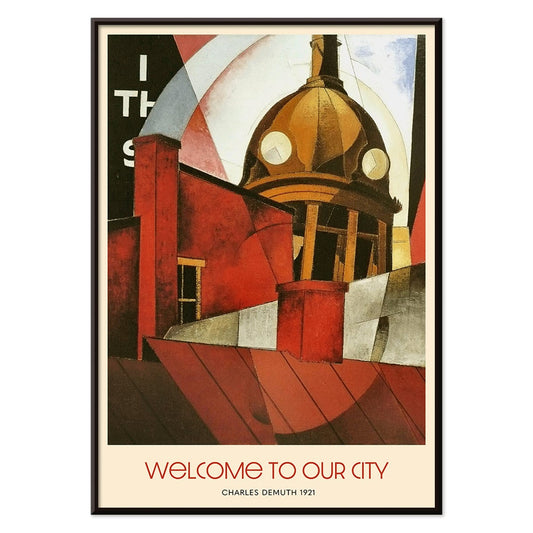
Velkommen til vores by Plakat
Charles Demuth · 1921 · dynamisk arkitektonisk bylandskabsplakat med kraftfuld geometri, typografi og industriel rytme
Plakat fra 69 kr · Indrammet fra 122,67 kr
Normalpris Fra 46,00 krNormalpris -
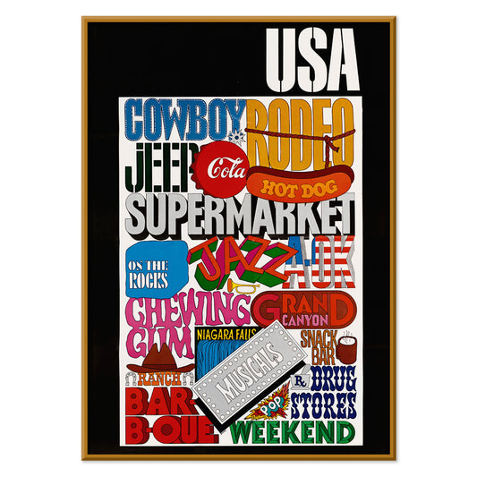
USA Plakat
U.S. Information Agency · 1942 · kraftfuld usa typografiplakat med blokbogstaver og flaginspirerede stjerner
Plakat fra 69 kr · Indrammet fra 122,67 kr
Normalpris Fra 46,00 krNormalpris -
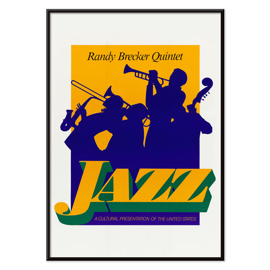
Randy Brecker Kvintet Plakat
U.S. Information Agency · 1987 · Grafisk jazzplakat med silhuetter af musikere på kraftig lilla baggrund med grønne accenter
Plakat fra 69 kr · Indrammet fra 122,67 kr
Normalpris Fra 46,00 krNormalpris -
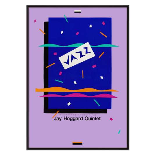
Jay Hoggard Quintet Plakat
U.S. Information Agency · 1985 · Energetisk abstrakt jazzplakat med geometriske rytmer der klinger som vibrafonimprovisationer
Plakat fra 69 kr · Indrammet fra 122,67 kr
Normalpris Fra 46,00 krNormalpris -
Louis Armstrong Optræden 2 Plakat
U.S. Information Agency · 1955 · Energisk Louis Armstrong plakat med kraftige primærfarver og livlige silhuetter af bandet
Plakat fra 69 kr · Indrammet fra 122,67 kr
Normalpris Fra 46,00 krNormalpris -
Bevaring året rundt Plakat
U.S. Information Agency · 1953 · Klar bevaringsplakat med sprudlende fugle på en frodig trækrone
Plakat fra 69 kr · Indrammet fra 122,67 kr
Normalpris Fra 46,00 krNormalpris -
Optræden med Louis Armstrong Plakat
U.S. Information Agency · 1959 · Energisk Louis Armstrong plakat med trompet i fokus og højkontrastdesign
Plakat fra 69 kr · Indrammet fra 122,67 kr
Normalpris Fra 46,00 krNormalpris -
Kærlighed og smultringe Plakat
Ukendt kunstner · 1921 · Legesyg kokplakat med flyvende smultringe, køkkenkaos og klassisk stumfilmshumor og romantisk tone
Plakat fra 69 kr · Indrammet fra 122,67 kr
Normalpris Fra 46,00 krNormalpris -
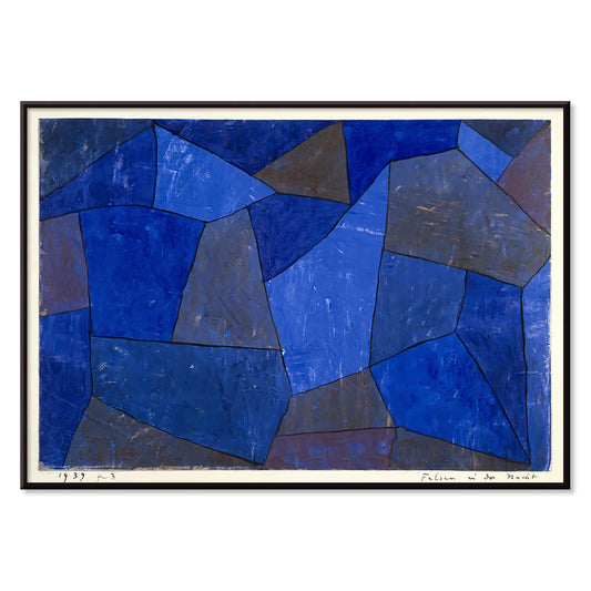
Klipper om natten Plakat
Paul Klee · 1939 · Drømmende abstrakt kunsttryk med stablede blå former der minder om klipper i natten
Plakat fra 69 kr · Indrammet fra 122,67 kr
Normalpris Fra 46,00 krNormalpris -
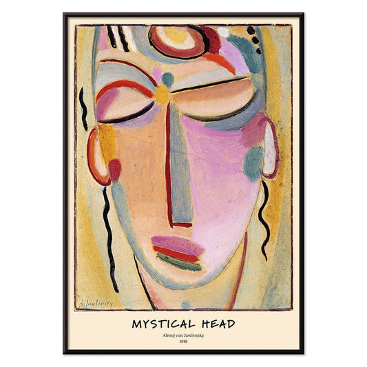
Mystisk hoved Plakat
Alexej von Jawlensky · 1918 · Strålende abstrakt ansigtskunsttryk med markante konturer og meditativ symmetri
Plakat fra 69 kr · Indrammet fra 122,67 kr
Normalpris Fra 46,00 krNormalpris -
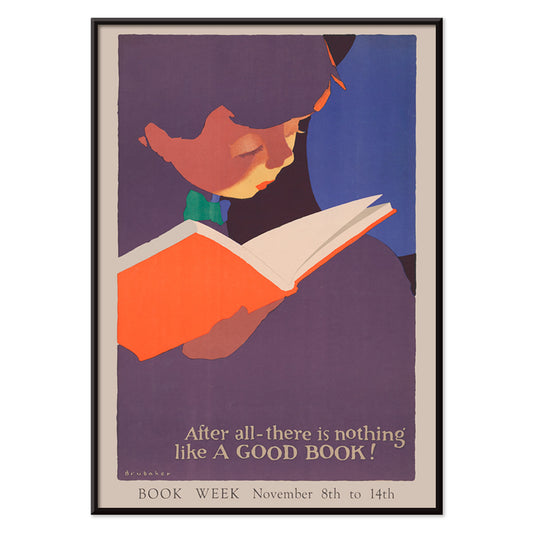
Intet slår en god bog Plakat
Jon O Brubaker · 1925 · munter pige læser i en grafisk 1920'erplakat med lilla, rød og beige toner
Plakat fra 69 kr · Indrammet fra 122,67 kr
Normalpris Fra 46,00 krNormalpris -
Contratto Plakat
Leonetto Cappiello · 1922 · Festlig champagneplakat med kraftig typografi og en fejende figur på sort
Plakat fra 69 kr · Indrammet fra 122,67 kr
Normalpris Fra 46,00 krNormalpris -
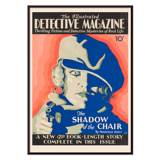
Detective Magazine Plakat
Winold Reiss · 1930 · Dramatiske detektivplakat med kraftige røde og blå accenter og noiræstetik
Plakat fra 69 kr · Indrammet fra 122,67 kr
Normalpris Fra 46,00 krNormalpris -
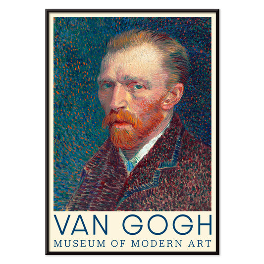
Selvportræt Plakat
Vincent van Gogh · 1887 · levende selvportræt i blåt med virvlende penselstrøg og markant orange skæg
Plakat fra 69 kr · Indrammet fra 122,67 kr
Normalpris Fra 46,00 krNormalpris -
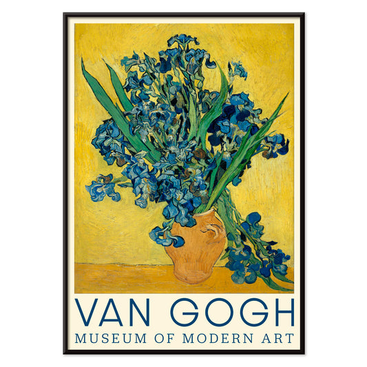
Irisser Plakat
Vincent van Gogh · 1890 · Udtryksfuldt iristryk med hvirvlende penselstrøg og markante blå blomster
Plakat fra 69 kr · Indrammet fra 122,67 kr
Normalpris Fra 46,00 krNormalpris -
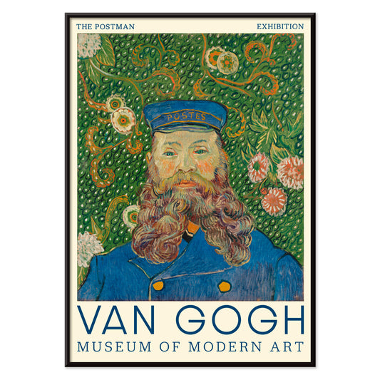
Portræt af Joseph Roulin Plakat
Vincent van Gogh · 1889 · Udtryksfuldt portrætplakat af Joseph Roulin med markant penselføring og blomsterbaggrund
Plakat fra 69 kr · Indrammet fra 122,67 kr
Normalpris Fra 46,00 krNormalpris -
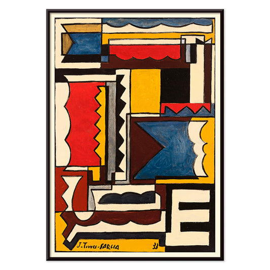
Struktur med former Plakat
Joaquín Torres-García · 1933 · Gitterbaseret abstrakt plakat med symbolske former og primærfarver samt markante sorte linjer
Plakat fra 69 kr · Indrammet fra 122,67 kr
Normalpris Fra 46,00 krNormalpris -
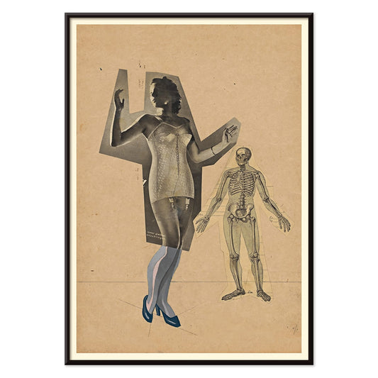
Pige og Død Plakat
Karl Wiener · 1941 · Surrealistisk memento mori plakat med ung kvinde og skelet i blå-sort nuancer
Plakat fra 69 kr · Indrammet fra 122,67 kr
Normalpris Fra 46,00 krNormalpris -
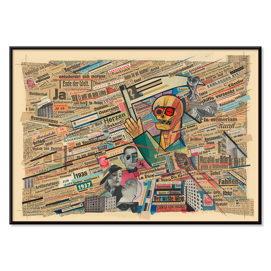
Politisk collage Plakat
Karl Wiener · 1938 · Aviscollageplakat med lag af overskrifter og markante symboler fra forkrigstidens Europa
Plakat fra 69 kr · Indrammet fra 122,67 kr
Normalpris Fra 46,00 krNormalpris -
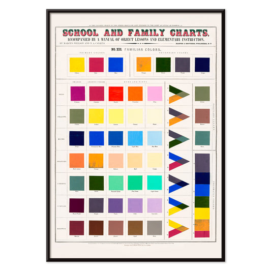
Velkendte farver Plakat
Marcius Willson · 1890 · Pædagogisk farvekortplakat med geometriske firkanter og trekanter i klare primærfarver
Plakat fra 69 kr · Indrammet fra 122,67 kr
Normalpris Fra 46,00 krNormalpris -
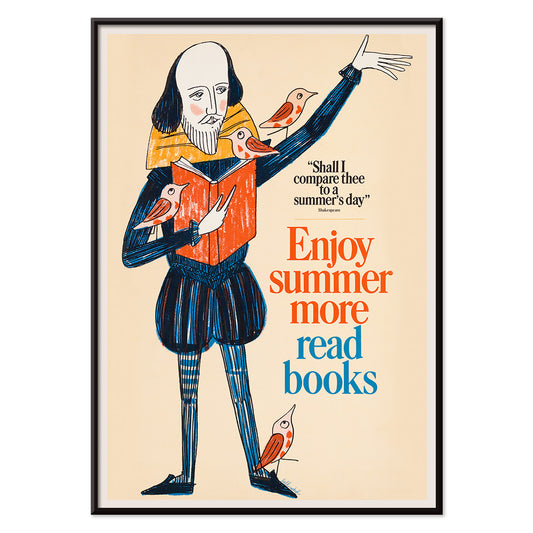
Nyd sommeren Plakat
Bill Sokol · 1966 · Legesyg Shakespeareplakat med fugle og bøger i klare 1960'ers farver
Plakat fra 69 kr · Indrammet fra 122,67 kr
Normalpris Fra 46,00 krNormalpris -
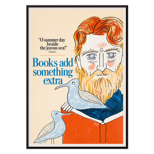
Bøger tilføjer noget Plakat
Bill Sokol · 1966 · Legesyg plakat fra midten af århundredet hvor bøger løfter en skægget drømmer mod mågernes himmel
Plakat fra 69 kr · Indrammet fra 122,67 kr
Normalpris Fra 46,00 krNormalpris -
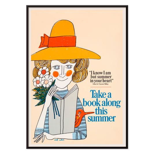
Tag en bog Plakat
Bill Sokol · 1966 · plakat i midten af århundredet med kvinde der læser i gul hat og sommerlig afslappet stemning
Plakat fra 69 kr · Indrammet fra 122,67 kr
Normalpris Fra 46,00 krNormalpris -
Drik brasiliansk kaffe Plakat
Jean d'Ylen · 1931 · Kraftfuld Art Deco kaffeplakat med en levende rød figur og klar typografi
Plakat fra 69 kr · Indrammet fra 122,67 kr
Normalpris Fra 46,00 krNormalpris -
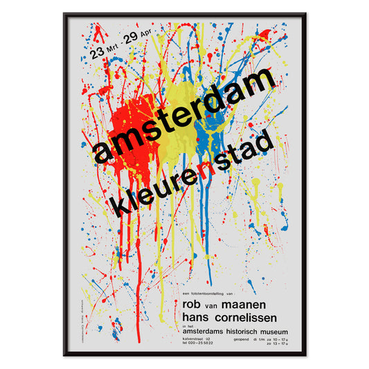
Amsterdam farvestad Plakat
Hans Cornelissen · 1984 · Energetisk abstrakt Amsterdam plakat med splatterformer og stærke primærfarver
Plakat fra 69 kr · Indrammet fra 122,67 kr
Normalpris Fra 46,00 krNormalpris -
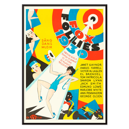
Follies fra 1930 Plakat
Eric Rohman · 1930 · Art Deco plakat med stiliserede dansere og musikere i stærke primærfarver
Plakat fra 69 kr · Indrammet fra 122,67 kr
Normalpris Fra 46,00 krNormalpris -
Femogtyve nøgne plakat
Eric Gill · 1951 · stilrent plakattryk med femogtyve linjestudier af nøgne figurer
Plakat fra 69 kr · Indrammet fra 122,67 kr
Normalpris Fra 46,00 krNormalpris -
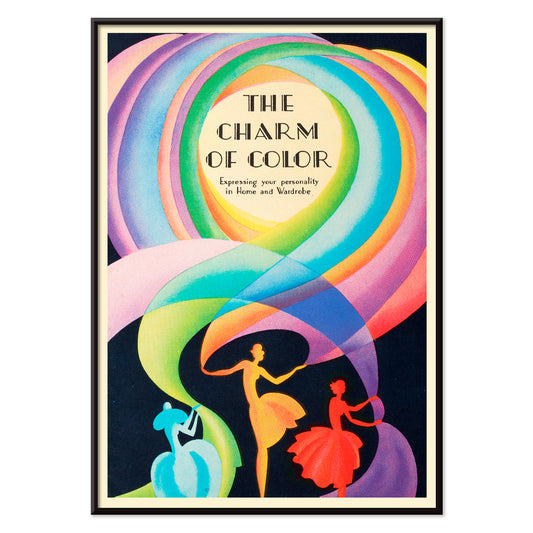
Farvens charme Plakat
Marie Josephine Carr · 1928 · Livlig Art Deco danseplakat med hvirvlende figurer og regnbuefarvede kostumer
Plakat fra 69 kr · Indrammet fra 122,67 kr
Normalpris Fra 46,00 krNormalpris -
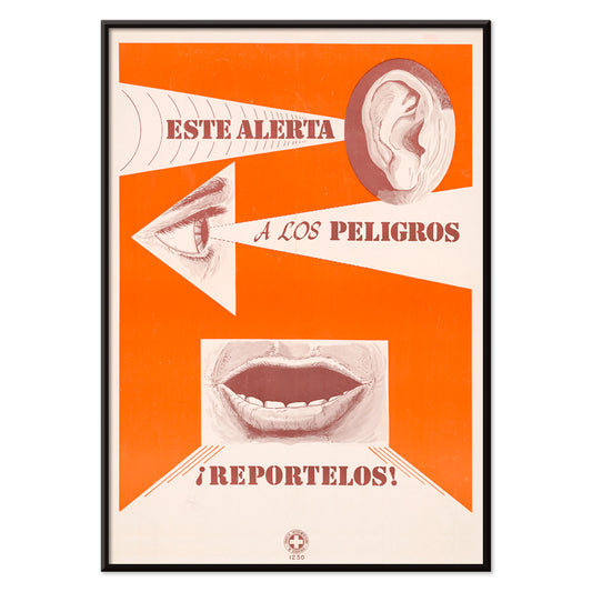
Reportelos Plakat
Ukendt kunstner · 1963 · Markant orange sikkerhedsplakat med øre, øje og mund i rene hvide former
Plakat fra 69 kr · Indrammet fra 122,67 kr
Normalpris Fra 46,00 krNormalpris


36/1754 items
- Drengene bader Plakat
- New York, USA Plakat
- Evig kærlighed Plakat
- Farbstudien, 10 Blätter VIII Plakat
- Kubik Plakat
- Abstrakt hoved plakat
- USA Plakat
- Randy Brecker Kvintet Plakat
- Louis Armstrong Optræden 2 Plakat
- Optræden med Louis Armstrong Plakat
- Mystisk hoved Plakat
- Intet slår en god bog Plakat
- Selvportræt Plakat
- Irisser Plakat
- Portræt af Joseph Roulin Plakat
- Velkendte farver Plakat
- Farvens charme Plakat
An archive of images, not a single style
All Posters is where MORYARTY reads like a cabinet of curiosities: art print classics beside travel scenes, graphic experiments beside quiet studies of nature. Rather than a single movement, the selection suggests a social history of looking, where ink on paper met crowds, shops, salons, and stations. Across eras, certain instincts return: bold typography, expressive line, and the way a poster can adjust a room’s mood from café warmth to museum hush. For a tighter focus inside this breadth, move between Advertising and Classic Art to feel how public images and private taste often borrow from one another.
How posters were printed and why it matters
Many works in this collection were designed to be read at speed. Stone lithography made broad fields of colour possible, with velvety blacks and a softness at the edge that still feels human. Later processes, including offset printing, sharpened contours and allowed larger runs, changing how colour sits on the page. You can often spot the method in the surface: halftone dots, overprinted inks, and slight misregistration that gives vintage colour a gentle vibration. Those details are not flaws so much as evidence of making. If you enjoy disciplined negative space and line, the calm structure of Oriental pairs well with the spare clarity of Minimalist, where silence becomes part of the design.
Using wall art to shape a room
Because this is a wide spectrum, start with the room’s materials and light. In a kitchen with oak, stoneware, or terrazzo, a botanical poster can echo grain and scent-memory; Botanical brings greens that sit comfortably with warm neutrals. In a living room of chrome, glass, and clean-lined furniture, the geometry of Abstract keeps the atmosphere crisp, especially when you repeat one accent colour in textiles. Bedrooms often respond to restraint: Black & White prints read like quiet conversation and sit well with linen, wool, and low, warm lamps.
Curating, pairing, and framing across eras
A gallery wall works best when it has tempo. Pair one text-forward sheet with one image-led composition, then let margins do the pacing. If you mix periods, keep a shared element such as paper tone, repeated red, or consistent line weight. Thin black frames push graphic posters forward; pale oak softens high contrast and suits Scandinavian-leaning home decor. Hang larger posters slightly lower than you expect so the image meets the eye, then cluster smaller prints nearer shelves so objects can echo shapes on paper. When you want the wall to feel intentionally edited, one hero work and two supporting pieces often reads more clearly than a dense grid.
The pleasure of browsing widely
What holds the All Posters collection together is its democratic origin: images meant to be pinned, traded, and lived with. Choose one print that keeps your gaze for longer than expected, then build outward with neighbouring colours and related line. If you want structure while you browse, try switching between Vertical Posters and Horizontal Posters to see how format alone can change the feeling of a wall. For framing ideas, the calmer profile of Frames can help unify mixed eras without flattening their differences.