


- Ødelæg dette rasende bæst Plakat
- Shaw eller ironi Plakat
- Den gode nabo i Sydamerika Plakat
- Italien med Vatikanstaten Plakat
- Løg Plakat
- Radiser Plakat
- Gulerødder Plakat
- Les Lalanne Plakat
- Punch Boutique Plakat
- Dansende par i sneen Plakat
- Jødedom og hedenskab, standpunkt Plakat
- Jet Clipper til Hawaii Plakat
- Campari Soda Plakat
- Bec-Kina Plakat
- Kohler Chocolat Plakat
- Jordbærtyven Plakat
- Dansende figurer Matisse Plakat
- Tom Krojer Udstillingsplakat
- Berlin gadescene Plakat
- Ernst Kirchner udstillingsplakat Plakat
- Eiffeltårnet 2 Plakat
- Siddende kvinde set bagfra Plakat
- Rødt hår blå hat Plakat
- Park nær Lu Plakat
- El Comienzo Plakat
- Parler Seul 2 Plakat
- Mahatmaernes nuværende standpunkt Plakat
- Tusmørkets Ring Plakat
- Parler Seul Plakat
- Faun og Nymfe Plakat
- Drømmen Plakat
- Le Concert Plakat
- Fugl passerer gennem en sky Plakat
-
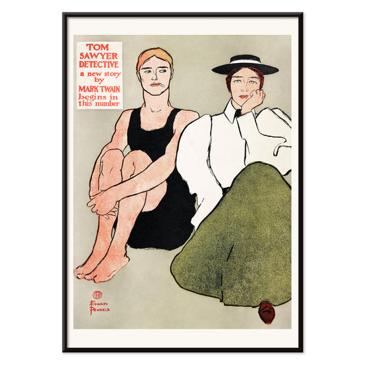
To siddende kvinder Plakat
Edward Penfield · 1896 · Elegant vintage plakat med to siddende kvinder, markante konturer og dæmpede toner
Plakat fra 69 kr · Indrammet fra 122,67 kr
Normalpris Fra 46,00 krNormalpris -
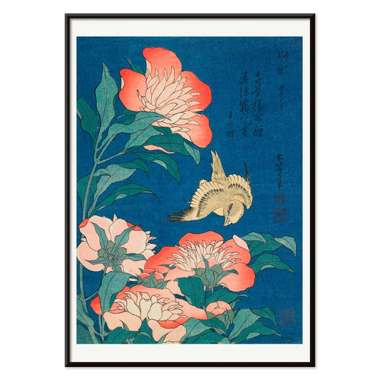
Pæoner og kanariefugl Plakat
Katsushika Hokusai · 1834 · Fint kunsttryk af kanariefugl og pæoner med skarpe ukiyo-e konturlinjer
Plakat fra 69 kr · Indrammet fra 122,67 kr
Normalpris Fra 46,00 krNormalpris -
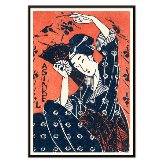
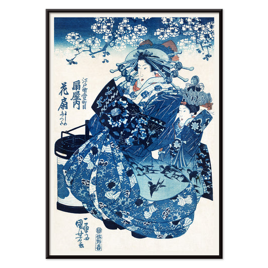
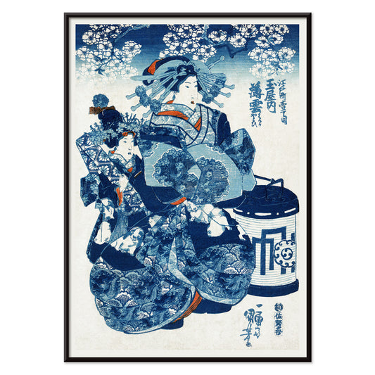
Japansk kvinde Plakat
Utagawa Hiroshige · 1935 · Stille ukiyo-e plakat med kimonoklædt kvinde og vifte i blå og rød
Plakat fra 69 kr · Indrammet fra 122,67 kr
Normalpris Fra 46,00 krNormalpris -
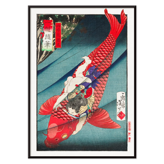
Saitō no Oniwakamaru Plakat
Tsukioka Yoshitoshi · 1872 · Dramatisk ukiyo-e plakat med kriger i kamp mod en kæmpe karpe i brusende bølger
Plakat fra 69 kr · Indrammet fra 122,67 kr
Normalpris Fra 46,00 krNormalpris -
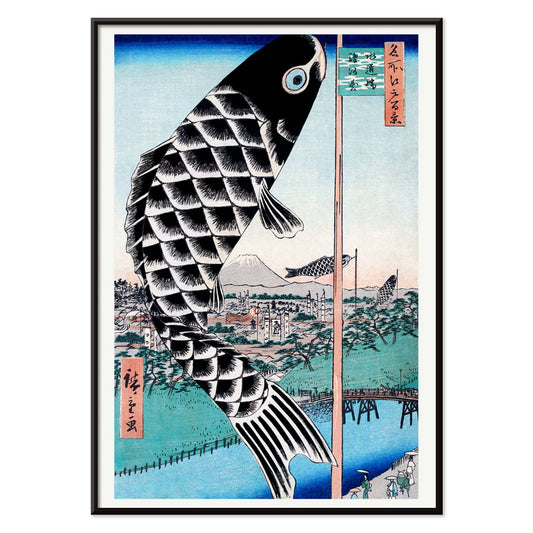
Suidobashi bro og Surugadai Plakat
Utagawa Hiroshige · 1857 · Luftigt Edo flodparti vintage tryk med karpevimpel over Suidobashi bro
Plakat fra 69 kr · Indrammet fra 122,67 kr
Normalpris Fra 46,00 krNormalpris -
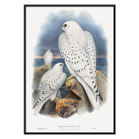
Grønlandsfalk Plakat
John Gould · 1862 · Detaljeret falketryk med tre hvide fugle over en stormfuld nordkyst
Plakat fra 69 kr · Indrammet fra 122,67 kr
Normalpris Fra 46,00 krNormalpris -
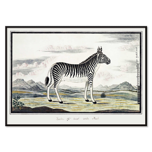
Bjergzebra Plakat
Robert Jacob Gordon · 1786 · naturhistorisk zebratryk i klar streg med rolig åben baggrund
Plakat fra 69 kr · Indrammet fra 122,67 kr
Normalpris Fra 46,00 krNormalpris -
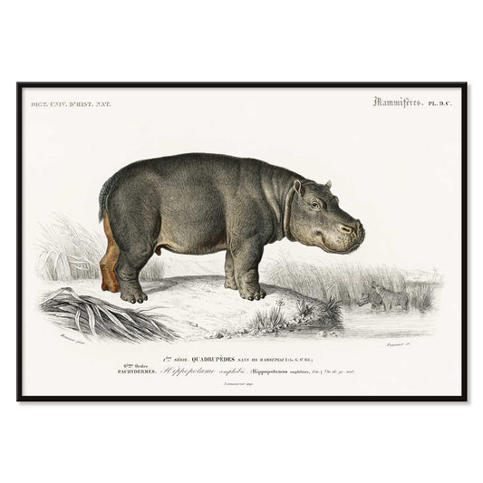
Hippopotame Amphibie Plakat
Charles Dessalines D'Orbigny · 1868 · Naturhistorisk flodhestetryk med roligt profiludsnit og fint skyggelag
Plakat fra 69 kr · Indrammet fra 122,67 kr
Normalpris Fra 46,00 krNormalpris -
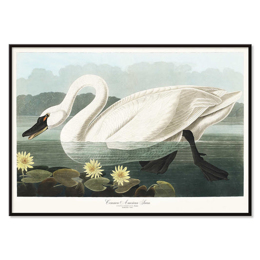
Amerikansk Svane Plakat
John James Audubon · 1827 · elegant amerikansk svane plakat med svanen blandt vandliljer og naturtro detaljer
Plakat fra 69 kr · Indrammet fra 122,67 kr
Normalpris Fra 46,00 krNormalpris -
Familiehunde Plakat
Ukendt kunstner · 1874 · viktoriansk familiehundetryk arrangeret som naturhistorisk plade i blide neutrale toner
Plakat fra 69 kr · Indrammet fra 122,67 kr
Normalpris Fra 46,00 krNormalpris -
Forskellige fisketyper Plakat
Charles Dessalines d'Orbigny · 1868 · Detaljeret videnskabeligt tryk med forskellige fisk i blå, grønne og gule vasker
Plakat fra 69 kr · Indrammet fra 122,67 kr
Normalpris Fra 46,00 krNormalpris -
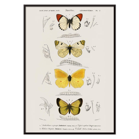
Forskellige sommerfuglearter Plakat
Charles Dessalines D'Orbigny · 1849 · Detaljeret sommerfugletryk med klare gule, hvide og sorte vinger
Plakat fra 69 kr · Indrammet fra 122,67 kr
Normalpris Fra 46,00 krNormalpris -
Jorden og levende natur Plakat
Oliver Goldsmith · 1820 · Detaljeret vintage tryk med dyr arrangeret som naturhistorisk plade i klart monokromt
Plakat fra 69 kr · Indrammet fra 122,67 kr
Normalpris Fra 46,00 krNormalpris -
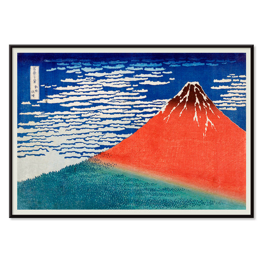
Fin vind, klar morgen Plakat
Katsushika Hokusai · 1829 · Ikonisk Mount Fuji plakat med rød top under klar blå himmel
Plakat fra 69 kr · Indrammet fra 122,67 kr
Normalpris Fra 46,00 krNormalpris -
Japansk kvinde 2 Plakat
Utagawa Kuniyoshi · 1829 · Elegant ukiyo-e kunsttryk af en kvinde i kimono i kølige blå og hvide toner
Plakat fra 69 kr · Indrammet fra 122,67 kr
Normalpris Fra 46,00 krNormalpris -
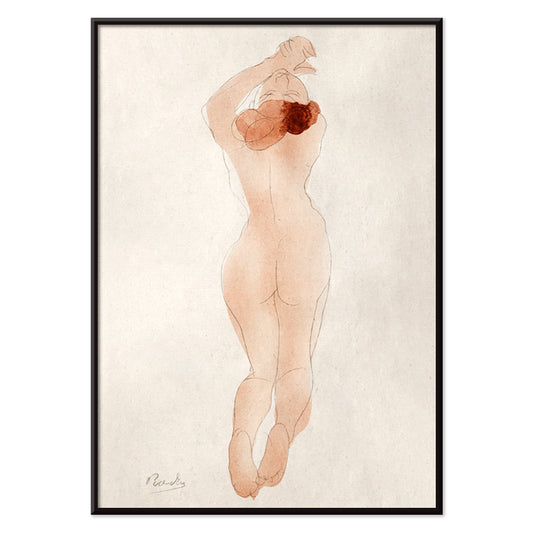
Caresse moi donc chéri Plakat
Auguste Rodin · 1882 · Intimt nøgenfigurtryk der fanger et stille kærtegn i flydende linjer
Plakat fra 69 kr · Indrammet fra 122,67 kr
Normalpris Fra 46,00 krNormalpris -
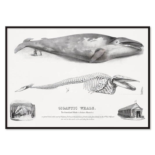
Baloena Musculus Plakat
George Johann Scharf · 1758 · Detaljeret tryk af hval og skelet med præcis stregføring og arkivagtig ro
Plakat fra 69 kr · Indrammet fra 122,67 kr
Normalpris Fra 46,00 krNormalpris -
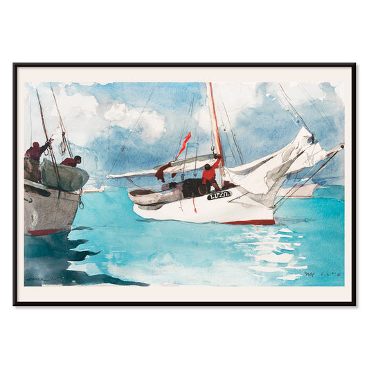
Fiskerbåde Plakat
Winslow Homer · 1903 · soloplyst fiskerbådstryk med turkis vand og klare hvide sejl
Plakat fra 69 kr · Indrammet fra 122,67 kr
Normalpris Fra 46,00 krNormalpris -
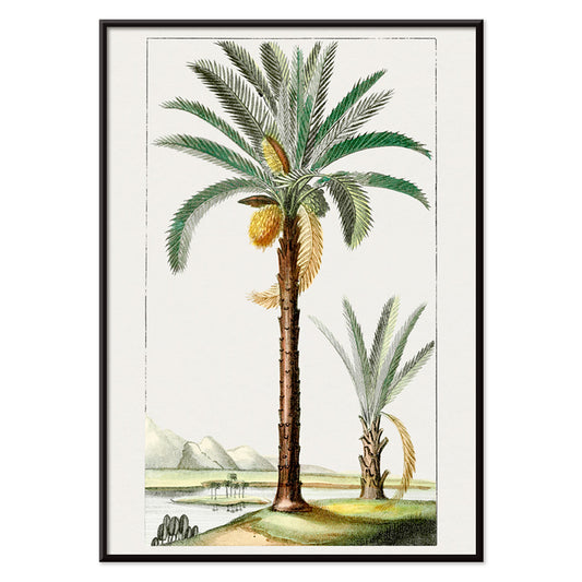
Håndtegnet palme Plakat
Ukendt kunstner · 1878 · Delikat håndtegnet palmeplakat med fin streg og rolige solblegede naturtoner
Plakat fra 69 kr · Indrammet fra 122,67 kr
Normalpris Fra 46,00 krNormalpris -
Japansk kvinde Plakat
Utagawa Kuniyoshi · 1831 · Elegant ukiyo-e vintage tryk af en kimonoklædt kvinde i kølige blå toner
Plakat fra 69 kr · Indrammet fra 122,67 kr
Normalpris Fra 46,00 krNormalpris -
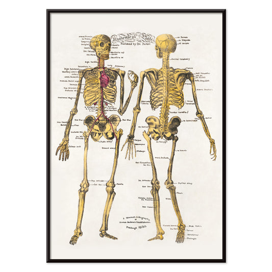
Anatomiske plader Plakat
Dr. Parker · 1850 · Detaljeret skelet videnskabeligt tryk med tydelige mærkninger og varm arkival papirtone
Plakat fra 69 kr · Indrammet fra 122,67 kr
Normalpris Fra 46,00 krNormalpris -
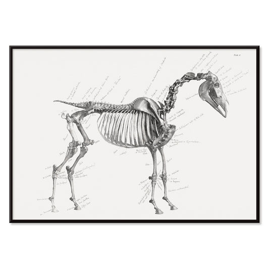
Hestens anatomi plakat
George Stubbs · 1853 · Slående hesteanatomitryk i sort-hvid med detaljerede mærkede studier
Plakat fra 69 kr · Indrammet fra 122,67 kr
Normalpris Fra 46,00 krNormalpris -
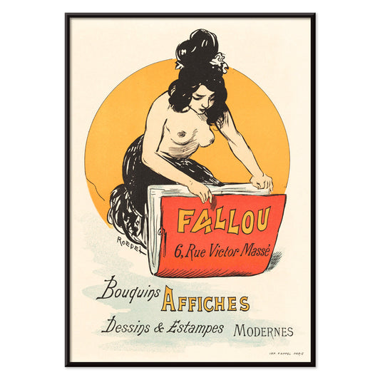
Fallou Plakat
Auguste Roedel · 1888 · parisisk boghandelplakat med en rød bog foran en markant gul cirkel
Plakat fra 69 kr · Indrammet fra 122,67 kr
Normalpris Fra 46,00 krNormalpris -
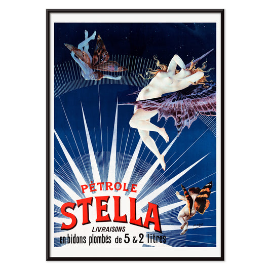
Pétrole Stella Plakat
Henri Boulanger · 1897 · Drømmende Art Nouveau plakat med en bevinget kvindefigur der reklamerer for Pétrole Stella
Plakat fra 69 kr · Indrammet fra 122,67 kr
Normalpris Fra 46,00 krNormalpris -
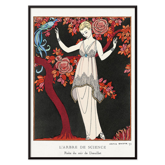
L'Arbre de science Plakat
George Barbier · 1914 · Elegant Art Deco modeplakat med en rank kvinde under et blomstrende træ
Plakat fra 69 kr · Indrammet fra 122,67 kr
Normalpris Fra 46,00 krNormalpris -
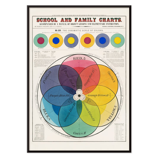
Kromatisk farveskala Plakat
Marcius Willson · 1890 · Nøjagtigt mærket kromatisk farveskala plakat med klar geometri og levende spektrum
Plakat fra 69 kr · Indrammet fra 122,67 kr
Normalpris Fra 46,00 krNormalpris -
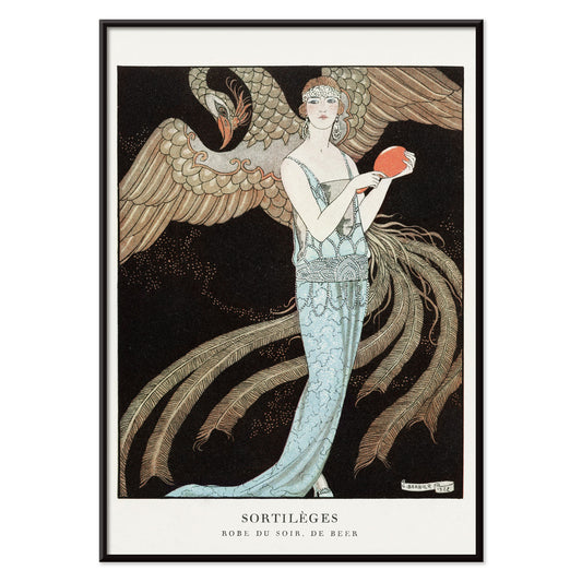
Sortilèges Plakat
George Barbier · 1922 · Elegant Art Deco modeplakat med flydende blå kjole og storslået fugl
Plakat fra 69 kr · Indrammet fra 122,67 kr
Normalpris Fra 46,00 krNormalpris -
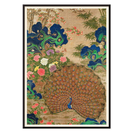
Kinesisk påfugl og blomster plakat
Ukendt kunstner · 1650 · Yndefuldt påfuglekunsttryk blandt blomster, taihu-sten og varme brune samt juvelblå toner
Plakat fra 69 kr · Indrammet fra 122,67 kr
Normalpris Fra 46,00 krNormalpris -
Chez la Marchande de Pavots Plakat
George Barbier · 1920 · Art Deco plakat med liggende figurer og en blå drage i kraftige røde accenter
Plakat fra 69 kr · Indrammet fra 122,67 kr
Normalpris Fra 46,00 krNormalpris -
Kinesisk landskab Plakat
Lan Ying · 1279 · tåget bjerglandskab kunsttryk med varmt rødt løv og luftige blækvasker
Plakat fra 69 kr · Indrammet fra 122,67 kr
Normalpris Fra 46,00 krNormalpris -
Fugle og solnedgang Plakat
Katsushika Hokusai · 1814 · Fredfyldt plakat med traner mod dybrød sol og varm beige himmel
Plakat fra 69 kr · Indrammet fra 122,67 kr
Normalpris Fra 46,00 krNormalpris -
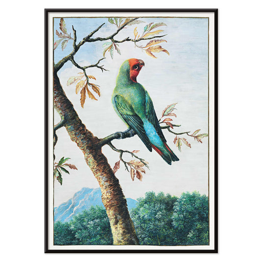
Fuglestudie Plakat
George Edwards · 1747 · Detaljeret papegøjetryk med levende grøn, rød og blå fjerdragt på lys baggrund
Plakat fra 69 kr · Indrammet fra 122,67 kr
Normalpris Fra 46,00 krNormalpris -
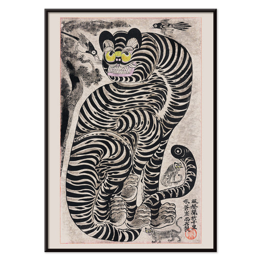
Talismanisk tiger plakat
Ukendt kunstner · 1950 · Talismanisk tiger plakat med kraftige blækstriber og vågent blik på varm beige
Plakat fra 69 kr · Indrammet fra 122,67 kr
Normalpris Fra 46,00 krNormalpris -
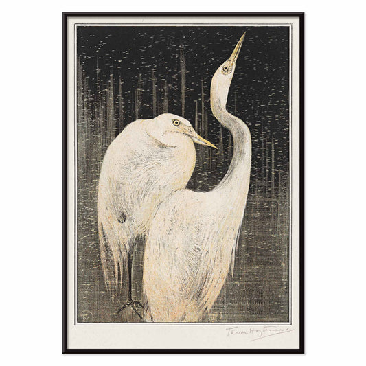
To sølvhejrer Plakat
Theo van Hoytema · 1892 · Elegant hejretryk med delikat linjeføring og dramatisk sort baggrund
Plakat fra 69 kr · Indrammet fra 122,67 kr
Normalpris Fra 46,00 krNormalpris -
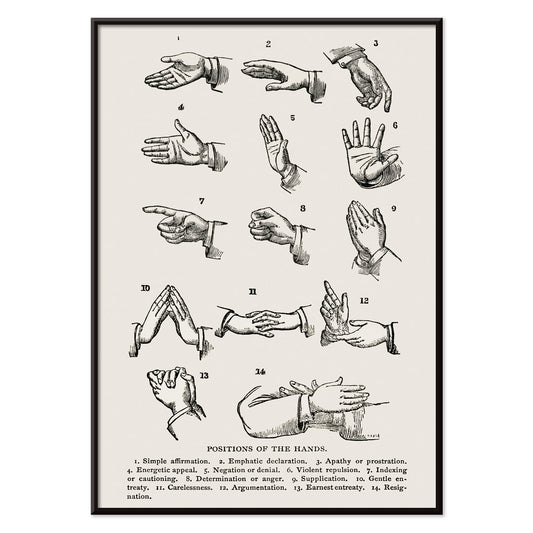
Håndpositioner Plakat
Joseph Gibbons Richardson · 1910 · Pædagogisk tegnsprogsplakat med håndpositioner i klart, sort linjetryk og grafisk elegance
Plakat fra 69 kr · Indrammet fra 122,67 kr
Normalpris Fra 46,00 krNormalpris -
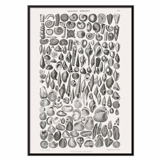
Organiske rester Plakat
Oliver Goldsmith · 1820 · Detaljeret videnskabeligt tryk af fossilskaller med præcis sort stregføring på hvid baggrund
Plakat fra 69 kr · Indrammet fra 122,67 kr
Normalpris Fra 46,00 krNormalpris


36/1749 items
- To siddende kvinder Plakat
- Pæoner og kanariefugl Plakat
- Japansk kvinde Plakat
- Suidobashi bro og Surugadai Plakat
- Familiehunde Plakat
- Fin vind, klar morgen Plakat
- Caresse moi donc chéri Plakat
- Fiskerbåde Plakat
- Fallou Plakat
- Kromatisk farveskala Plakat
- Kinesisk påfugl og blomster plakat
- Kinesisk landskab Plakat
- Fugle og solnedgang Plakat
- Talismanisk tiger plakat
An archive of images, not a single style
All Posters is where MORYARTY reads like a cabinet of curiosities: art print classics beside travel scenes, graphic experiments beside quiet studies of nature. Rather than a single movement, the selection suggests a social history of looking, where ink on paper met crowds, shops, salons, and stations. Across eras, certain instincts return: bold typography, expressive line, and the way a poster can adjust a room’s mood from café warmth to museum hush. For a tighter focus inside this breadth, move between Advertising and Classic Art to feel how public images and private taste often borrow from one another.
How posters were printed and why it matters
Many works in this collection were designed to be read at speed. Stone lithography made broad fields of colour possible, with velvety blacks and a softness at the edge that still feels human. Later processes, including offset printing, sharpened contours and allowed larger runs, changing how colour sits on the page. You can often spot the method in the surface: halftone dots, overprinted inks, and slight misregistration that gives vintage colour a gentle vibration. Those details are not flaws so much as evidence of making. If you enjoy disciplined negative space and line, the calm structure of Oriental pairs well with the spare clarity of Minimalist, where silence becomes part of the design.
Using wall art to shape a room
Because this is a wide spectrum, start with the room’s materials and light. In a kitchen with oak, stoneware, or terrazzo, a botanical poster can echo grain and scent-memory; Botanical brings greens that sit comfortably with warm neutrals. In a living room of chrome, glass, and clean-lined furniture, the geometry of Abstract keeps the atmosphere crisp, especially when you repeat one accent colour in textiles. Bedrooms often respond to restraint: Black & White prints read like quiet conversation and sit well with linen, wool, and low, warm lamps.
Curating, pairing, and framing across eras
A gallery wall works best when it has tempo. Pair one text-forward sheet with one image-led composition, then let margins do the pacing. If you mix periods, keep a shared element such as paper tone, repeated red, or consistent line weight. Thin black frames push graphic posters forward; pale oak softens high contrast and suits Scandinavian-leaning home decor. Hang larger posters slightly lower than you expect so the image meets the eye, then cluster smaller prints nearer shelves so objects can echo shapes on paper. When you want the wall to feel intentionally edited, one hero work and two supporting pieces often reads more clearly than a dense grid.
The pleasure of browsing widely
What holds the All Posters collection together is its democratic origin: images meant to be pinned, traded, and lived with. Choose one print that keeps your gaze for longer than expected, then build outward with neighbouring colours and related line. If you want structure while you browse, try switching between Vertical Posters and Horizontal Posters to see how format alone can change the feeling of a wall. For framing ideas, the calmer profile of Frames can help unify mixed eras without flattening their differences.