


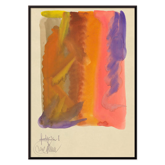
- Faun og Nymfe Plakat
- Drømmen Plakat
- Besøg Puerto Rico Plakat
- Smør Plakat
- Ecchu Umidani bjergpas Plakat
- Det grønne træbibliotek Plakat
- Atlas over Munsell farvesystem Plakat
- Adelaster Albivenis Plakat
- Blomstermarked Mumbai Plakat
- Blomstermarked - Kyoto Plakat
- Blomstermarked Delhi Plakat
- Blomstermarked Cape Town Plakat
- Blomstermarked - Cardiff Plakat
- Blomstermarked - Seoul 2 Plakat
- Blomstermarked São Paulo Plakat
- Blomstermarked i Rom Plakat
- Blomstermarked - Milano Plakat
- Blomstermarked - Berlin Plakat
- Blomstermarked i Amsterdam Plakat
- Columbia Road blomstermarked Plakat
- Japansk legetøj 2 Plakat
- Shinobazu-sø Plakat
- Teori og praksis om farve Plakat
- Grøntsager og krydderurter Plakat
- Métamorphose du violon Plakat
- Bauhaus 11 Plakat
- Bauhaus 10 Plakat
- Faust, tragedie af Goethe Plakat
- Farbstudien, 10 Blätter IX Plakat
- Farbstudien, 10 Blätter VIII Plakat
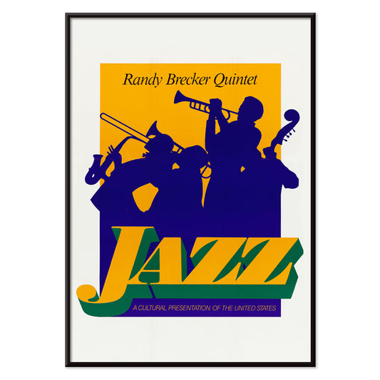
- Randy Brecker Kvintet Plakat
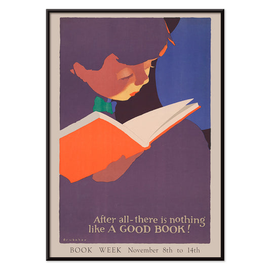
- Intet slår en god bog Plakat
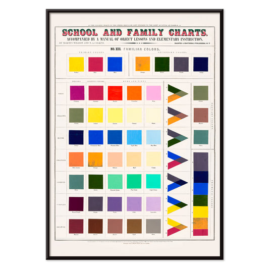
- Velkendte farver Plakat
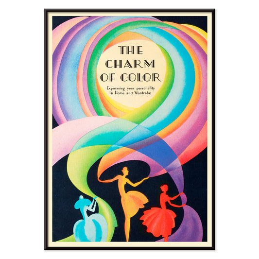
- Farvens charme Plakat
-
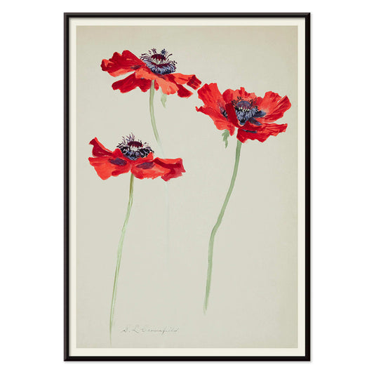
Tre studier af valmuer Plakat
Sophia Crownfield · 1900 · Fint botanisk tryk med tre valmuer i klare kronblade og slanke stilke
Plakat fra 69 kr · Indrammet fra 122,67 kr
Normalpris Fra 46,00 krNormalpris -
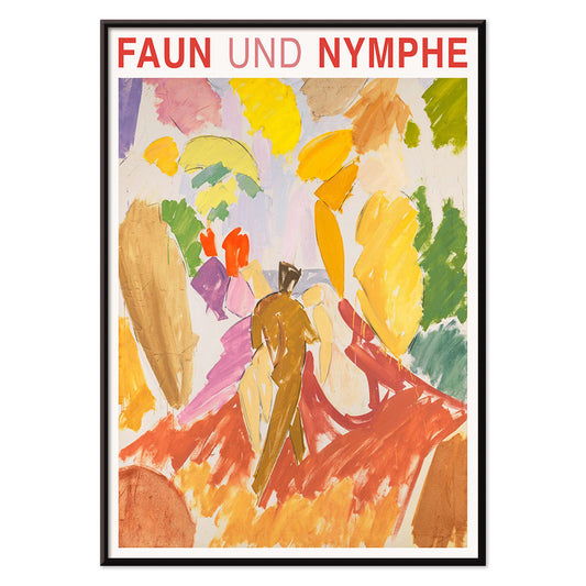
Faun og Nymfe Plakat
Edvard Weie · 1941 · ekspressivt mytisk plakattryk med faun og nymfe i kraftige modernistiske farveflader
Plakat fra 69 kr · Indrammet fra 122,67 kr
Normalpris Fra 46,00 krNormalpris -
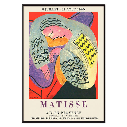
Drømmen Plakat
Henri Matisse · 1960 · Livfuld sovende figur plakat med flydende konturer og kraftige, flade farveflader
Plakat fra 69 kr · Indrammet fra 122,67 kr
Normalpris Fra 46,00 krNormalpris -
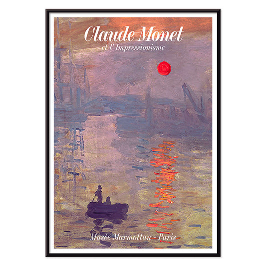
Soleil Levant Plakat
Claude Monet · 1872 · Diset havnesolopgang plakat med orange sol og blågrå vandreflektioner, fængslende
Plakat fra 69 kr · Indrammet fra 122,67 kr
Normalpris Fra 46,00 krNormalpris -
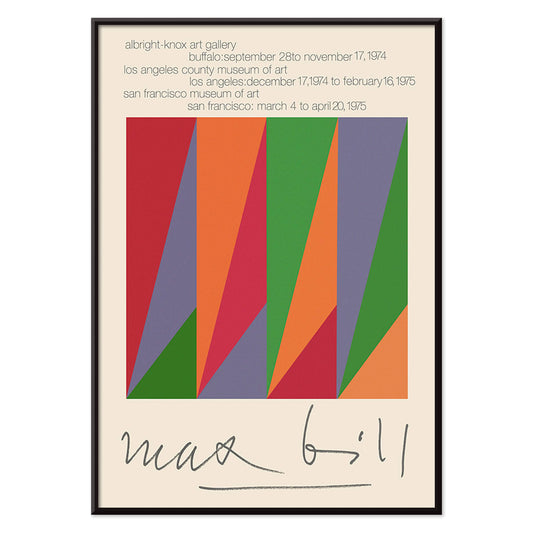
Max Bill Plakat
Max Bill · 1974 · Geometrisk abstrakt plakat med sammenflettede former i klare røde, orange, grønne og lilla toner
Plakat fra 69 kr · Indrammet fra 122,67 kr
Normalpris Fra 46,00 krNormalpris -
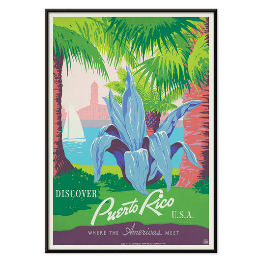
Besøg Puerto Rico Plakat
Ukendt kunstner · 1950 · midt århundredes Puerto Rico rejseplakat med sejlbåd, palmer og kystfort
Plakat fra 69 kr · Indrammet fra 122,67 kr
Normalpris Fra 46,00 krNormalpris -
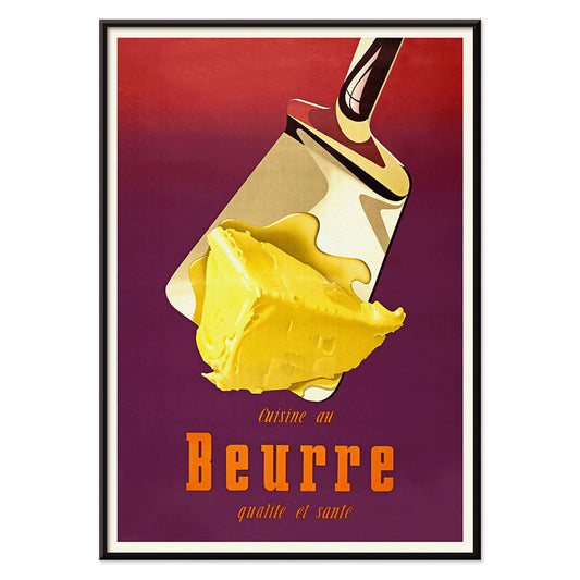
Smør Plakat
Donald Brun · 1951 · Legesyg smørplakat med blød airbrushskygge og tydelig 1950'er schweizisk klarhed
Plakat fra 69 kr · Indrammet fra 122,67 kr
Normalpris Fra 46,00 krNormalpris -
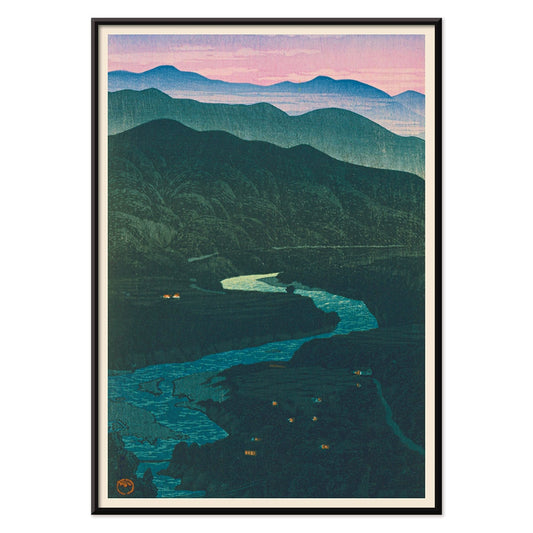
Ecchu Umidani bjergpas Plakat
Kawase Hasui · 1923 · Fredfyldt bjergpastryk med lagdelte blå bjergkamme og en snoet sti
Plakat fra 69 kr · Indrammet fra 122,67 kr
Normalpris Fra 46,00 krNormalpris -
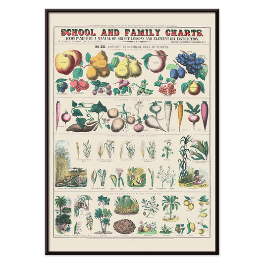
Økonomisk brug af planter Plakat
Marcius Willson · 1865 · Detaljeret botanisk plakat, der kortlægger planters praktiske anvendelser i klare, mærkede vignetter
Plakat fra 69 kr · Indrammet fra 122,67 kr
Normalpris Fra 46,00 krNormalpris -
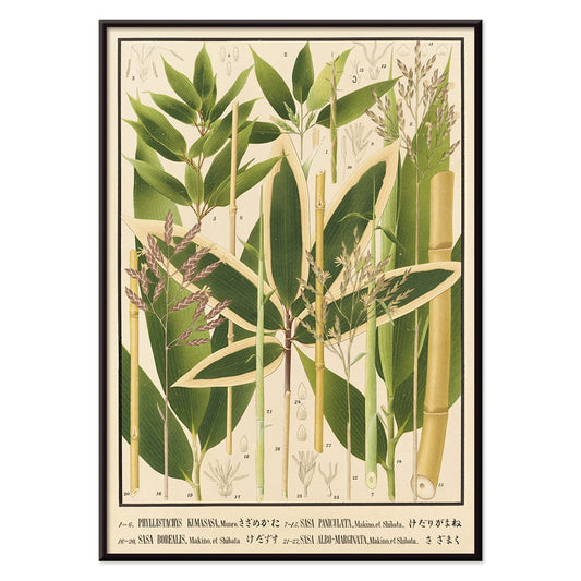
Nihon chikurui zufu Pl.11 Plakat
Yasuyoshi Shirasawa · 1912 · japansk bambus kunsttryk med slanke stængler og lette blade på creme
Plakat fra 69 kr · Indrammet fra 122,67 kr
Normalpris Fra 46,00 krNormalpris -
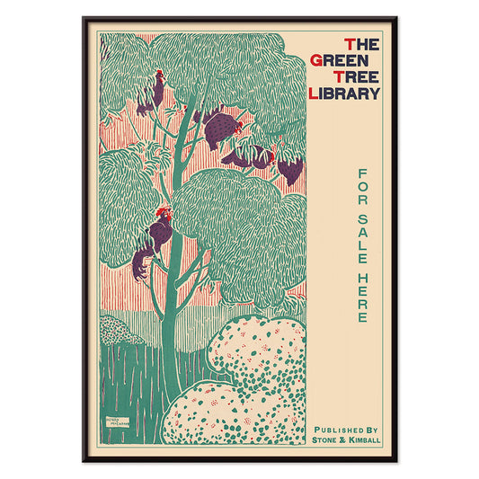
Det grønne træbibliotek Plakat
Henry McCarter · 1890 · Dekorativ bibliotekplakat med stiliseret grønt træ og kraftig art nouveautypografi
Plakat fra 69 kr · Indrammet fra 122,67 kr
Normalpris Fra 46,00 krNormalpris -
Yachigusa Pl.24 Plakat
Seikō Ueno · 1902 · Stiliseret rød sejlform og lilla blomster vintage tryk med rolig, luftig japansk elegance
Plakat fra 69 kr · Indrammet fra 122,67 kr
Normalpris Fra 46,00 krNormalpris -
Yachigusa Pl.06 Plakat
Seikō Ueno · 1902 · Virvlende orange kimonomønster i vintage tryk med rytmiske kurver og klar negativ plads
Plakat fra 69 kr · Indrammet fra 122,67 kr
Normalpris Fra 46,00 krNormalpris -
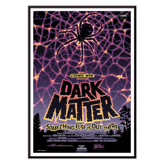
Mørkt stof Plakat
NASA · 2016 · mørkt stof plakat med kosmisk edderkoppenet og neontråde i sort og lilla kontrast
Plakat fra 69 kr · Indrammet fra 122,67 kr
Normalpris Fra 46,00 krNormalpris -
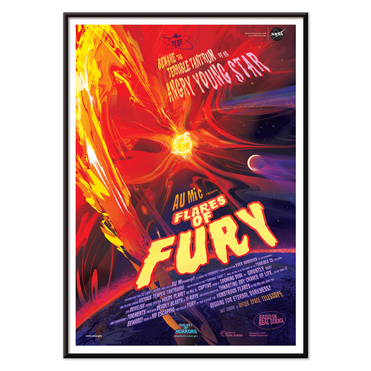
Soludbrud Plakat
NASA · 2012 · Eksplosiv solflammeplakat med ildfulde buer omkring en glødende stjerne i det dybe rum
Plakat fra 69 kr · Indrammet fra 122,67 kr
Normalpris Fra 46,00 krNormalpris -
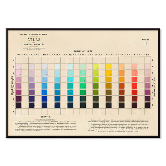
Atlas over Munsell farvesystem Plakat
Albert Henry Munsell · 1915 · Ikonisk farvesystemplakat der kortlægger nuancer, værdi og chroma i en ordnet skala
Plakat fra 69 kr · Indrammet fra 122,67 kr
Normalpris Fra 46,00 krNormalpris -
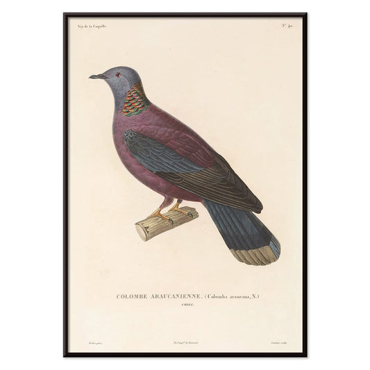
Voyage autour du monde Pl. 148 Plakat
Louis-Isidore Duperrey · 1825 · Naturhistorisk fugletryk med rank profil og delikat håndkolorering
Plakat fra 69 kr · Indrammet fra 122,67 kr
Normalpris Fra 46,00 krNormalpris -
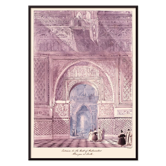
Ambassadørernes Hal Plakat
Charles Hamilton Smith · 1835 · Detaljeret arkitekturtryk af Alcazars sal med rytmiske mauriske buer
Plakat fra 69 kr · Indrammet fra 122,67 kr
Normalpris Fra 46,00 krNormalpris -
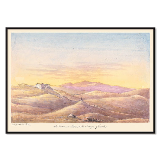
La Fuen de Munia Plakat
Charles Hamilton Smith · 1835 · Fredfyldt solnedgangsplakat over landsby med bløde bakker og aftnende middelhavshimmel
Plakat fra 69 kr · Indrammet fra 122,67 kr
Normalpris Fra 46,00 krNormalpris -
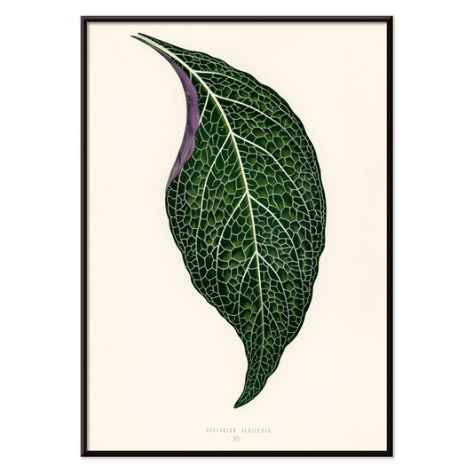
Adelaster Albivenis Plakat
Shirley Hibberd · 1855 · Elegant botanisk tryk af ét grønt blad med lilla årer på hvid
Plakat fra 69 kr · Indrammet fra 122,67 kr
Normalpris Fra 46,00 krNormalpris -
Blomstermarked Mumbai Plakat
MORYARTY · 2022 · Frodig vandliljeplakat der vækker minder om Mumbais blomstermarkeder i lilla, grøn og blå
Plakat fra 69 kr · Indrammet fra 122,67 kr
Normalpris Fra 46,00 krNormalpris -
Blomstermarked - Kyoto Plakat
MORYARTY · 2021 · Livlig Kyoto blomstermarksplakat i klare farver med stiliserede blomster og rene grafiske linjer
Plakat fra 69 kr · Indrammet fra 122,67 kr
Normalpris Fra 46,00 krNormalpris -
Blomstermarked Delhi Plakat
MORYARTY · 2023 · Livlig Delhi blomstermarkedplakat med lagdelige blomster og grafisk feststemning
Plakat fra 69 kr · Indrammet fra 122,67 kr
Normalpris Fra 46,00 krNormalpris -
Blomstermarked Cape Town Plakat
MORYARTY · 2013 · sprudlende paradisfuglplakat i abstrakte former der tilfører tropisk energi og stærke farver
Plakat fra 69 kr · Indrammet fra 122,67 kr
Normalpris Fra 46,00 krNormalpris -
Blomstermarked - Cardiff Plakat
MORYARTY · 2010 · Grafisk påskeliljeplakat mod dyb lilla baggrund med klart varmt sæsonudtryk og tidløst blikfang
Plakat fra 69 kr · Indrammet fra 122,67 kr
Normalpris Fra 46,00 krNormalpris -
Blomstermarked - Seoul 2 Plakat
MORYARTY · 2021 · Energisk blomstermarkedplakat med kraftig orange flade og grafiske blomster i pink og lilla
Plakat fra 69 kr · Indrammet fra 122,67 kr
Normalpris Fra 46,00 krNormalpris -
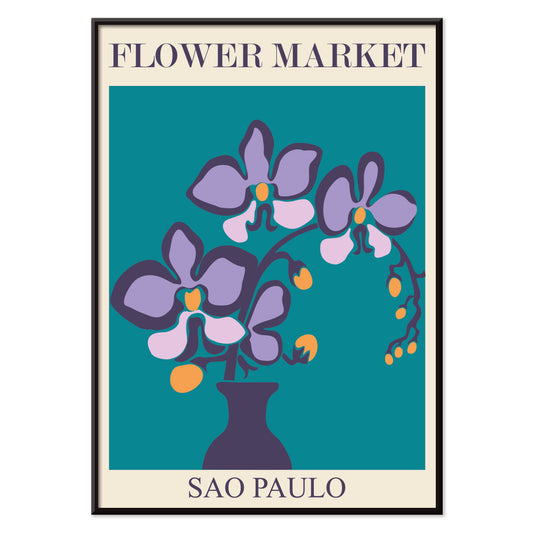
Blomstermarked São Paulo Plakat
MORYARTY · 2017 · Frodig plakat med lilla orkideer i ren vase mod dyb turkis baggrund
Plakat fra 69 kr · Indrammet fra 122,67 kr
Normalpris Fra 46,00 krNormalpris -
Blomstermarked i Rom Plakat
MORYARTY · 2019 · Frodigt liljebuketplakat inspireret af romerske blomsterboder i varme pink og orange nuancer
Plakat fra 69 kr · Indrammet fra 122,67 kr
Normalpris Fra 46,00 krNormalpris -
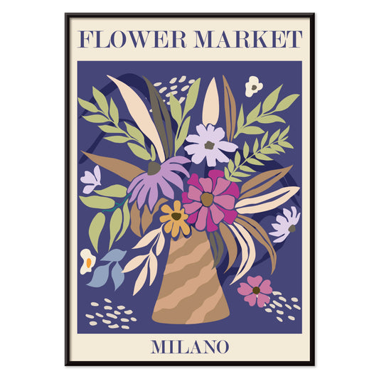
Blomstermarked - Milano Plakat
MORYARTY · 2022 · Farverig blomsterbuket plakat der indfanger det livlige islæt fra et milansk blomstermarked
Plakat fra 69 kr · Indrammet fra 122,67 kr
Normalpris Fra 46,00 krNormalpris -
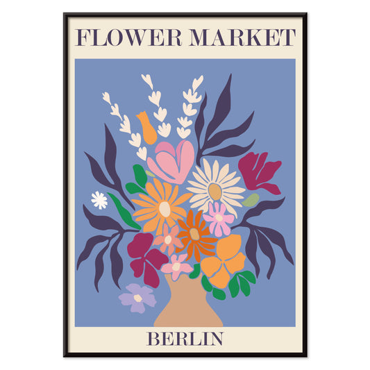
Blomstermarked - Berlin Plakat
MORYARTY · 2019 · Farverig blomsterbuketplakat med markant Berlin-typografi og livlig markedspuls
Plakat fra 69 kr · Indrammet fra 122,67 kr
Normalpris Fra 46,00 krNormalpris -
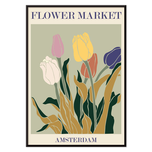
Blomstermarked i Amsterdam Plakat
MORYARTY · 2019 · retro tulipanmarkedplakat med jordnære farver, grafisk enkelhed og varm nostalgi
Plakat fra 69 kr · Indrammet fra 122,67 kr
Normalpris Fra 46,00 krNormalpris -
Columbia Road blomstermarked Plakat
MORYARTY · 2017 · Frodig blomsterplakat med stiliseret vase og buket i klare moderne farver
Plakat fra 69 kr · Indrammet fra 122,67 kr
Normalpris Fra 46,00 krNormalpris -
Tom tallerken plakat
James Fitton · 1950 · Madplakat fra midten af århundredet med grafisk tallerken og budskab om madspild
Plakat fra 69 kr · Indrammet fra 122,67 kr
Normalpris Fra 46,00 krNormalpris -
Japansk legetøj 2 Plakat
Kawasaki Kyosen · 1919 · Legende kattelegetøjsplakat med klare konturer og festlige røde, gule og lilla accenter
Plakat fra 69 kr · Indrammet fra 122,67 kr
Normalpris Fra 46,00 krNormalpris -
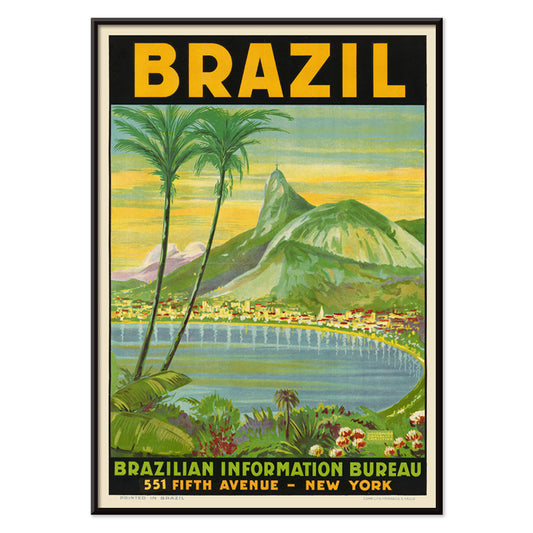
Brazil 1 Plakat
Waldomiro Goncalves Christino · 1984 · Solbeskinnet Rio rejseplakat med Sugarloaf-bjerget i kraftige farveflader og panoramisk komposition
Plakat fra 69 kr · Indrammet fra 122,67 kr
Normalpris Fra 46,00 krNormalpris -
Shinobazu-sø Plakat
Kasamatsu Shirô · 1938 · Regnfuldt aftentryk fra Shinobazu-søen med en ensom vandrer og spejlinger
Plakat fra 69 kr · Indrammet fra 122,67 kr
Normalpris Fra 46,00 krNormalpris -
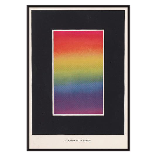
Teori og praksis om farve Plakat
Bonnie E. Snow · 1918 · Strålende regnbueskema plakat med bløde gradienter og klart pædagogisk typografi
Plakat fra 69 kr · Indrammet fra 122,67 kr
Normalpris Fra 46,00 krNormalpris -
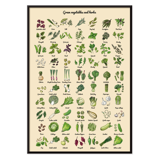
Grøntsager og krydderurter Plakat
MORYARTY · 2012 · Friskt grøntsagstryk og krydderurtetryk arrangeret som et rent botanisk studie
Plakat fra 69 kr · Indrammet fra 122,67 kr
Normalpris Fra 46,00 krNormalpris -
Métamorphose du violon Plakat
Le Corbusier · 1920 · modernistisk violinplakat der forvandler instrumentets kurver til klare geometriske rytmer i primærfarver
Plakat fra 69 kr · Indrammet fra 122,67 kr
Normalpris Fra 46,00 krNormalpris -
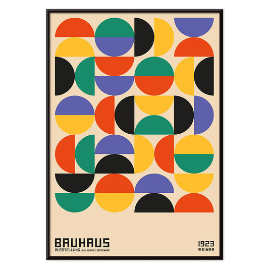
Bauhaus 11 Plakat
MORYARTY · 2023 · Nutidig geometrisk plakat med markante cirkler og diagonaler i primærfarver på hvid
Plakat fra 69 kr · Indrammet fra 122,67 kr
Normalpris Fra 46,00 krNormalpris -
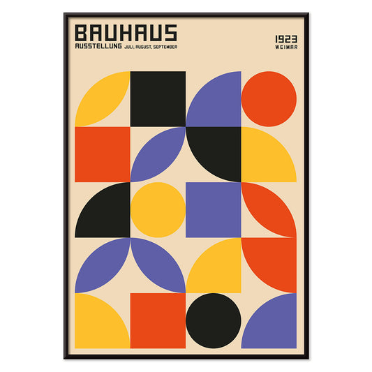
Bauhaus 10 Plakat
MORYARTY · 1923 · Geometrisk Bauhaus plakat med cirkler og stænger i kraftige primærfarver
Plakat fra 69 kr · Indrammet fra 122,67 kr
Normalpris Fra 46,00 krNormalpris -
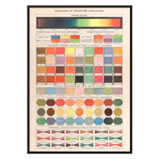
Peinture et Teinture Plakat
Claude Augé · 1908 · undervisningsfarvekort plakat med franske betegnelser og ordnede pigmentprøver i detaljeret grafik
Plakat fra 69 kr · Indrammet fra 122,67 kr
Normalpris Fra 46,00 krNormalpris -
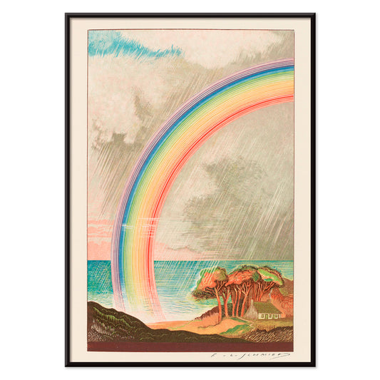
Faust, tragedie af Goethe Plakat
F. L. Schmied · 1925 · Drømmende Faust plakat med strålende regnbue over roligt hav og kyst
Plakat fra 69 kr · Indrammet fra 122,67 kr
Normalpris Fra 46,00 krNormalpris -
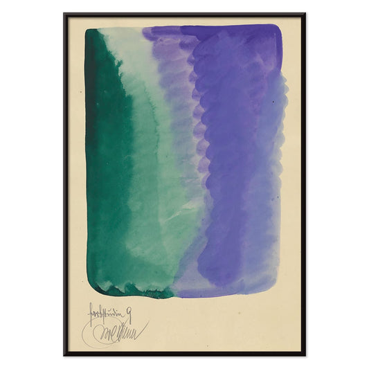
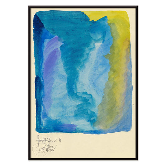
Farbstudien, 10 Blätter IX Plakat
Karl Wiener · 1923 · Abstrakt akvareltryk med grønne og violette vasker i rolig modernistisk rytme
Plakat fra 69 kr · Indrammet fra 122,67 kr
Normalpris Fra 46,00 krNormalpris -
Farbstudien, 10 Blätter VIII Plakat
Karl Wiener · 1923 · Flydende abstrakt kunsttryk med varme gule vasker og dybe lilla bevægelser
Plakat fra 69 kr · Indrammet fra 122,67 kr
Normalpris Fra 46,00 krNormalpris -
Randy Brecker Kvintet Plakat
U.S. Information Agency · 1987 · Grafisk jazzplakat med silhuetter af musikere på kraftig lilla baggrund med grønne accenter
Plakat fra 69 kr · Indrammet fra 122,67 kr
Normalpris Fra 46,00 krNormalpris -
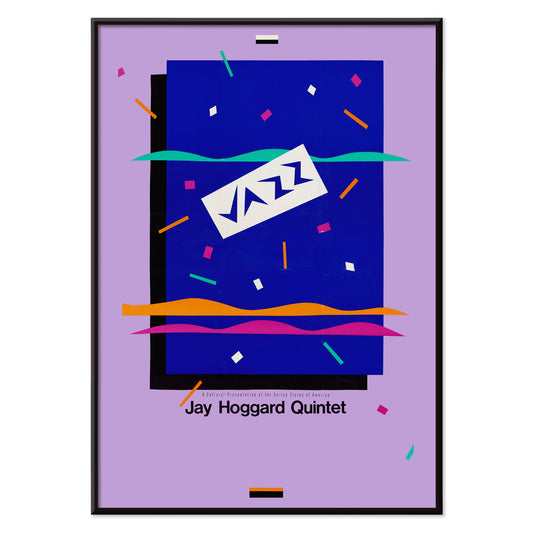
Jay Hoggard Quintet Plakat
U.S. Information Agency · 1985 · Energetisk abstrakt jazzplakat med geometriske rytmer der klinger som vibrafonimprovisationer
Plakat fra 69 kr · Indrammet fra 122,67 kr
Normalpris Fra 46,00 krNormalpris -
Intet slår en god bog Plakat
Jon O Brubaker · 1925 · munter pige læser i en grafisk 1920'erplakat med lilla, rød og beige toner
Plakat fra 69 kr · Indrammet fra 122,67 kr
Normalpris Fra 46,00 krNormalpris -
Velkendte farver Plakat
Marcius Willson · 1890 · Pædagogisk farvekortplakat med geometriske firkanter og trekanter i klare primærfarver
Plakat fra 69 kr · Indrammet fra 122,67 kr
Normalpris Fra 46,00 krNormalpris -
Farvens charme Plakat
Marie Josephine Carr · 1928 · Livlig Art Deco danseplakat med hvirvlende figurer og regnbuefarvede kostumer
Plakat fra 69 kr · Indrammet fra 122,67 kr
Normalpris Fra 46,00 krNormalpris -
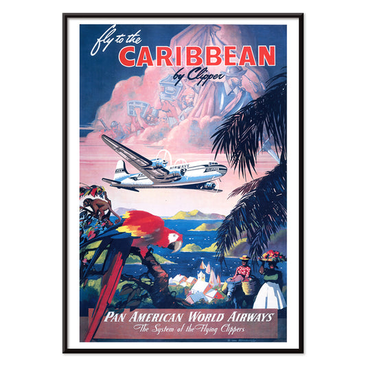
Fly til Caribien Plakat
Mark Von Arenburg · 1949 · Solbeskinnet Caribien rejseplakat med en Clipper over palmer og sejlbåde
Plakat fra 69 kr · Indrammet fra 122,67 kr
Normalpris Fra 46,00 krNormalpris -
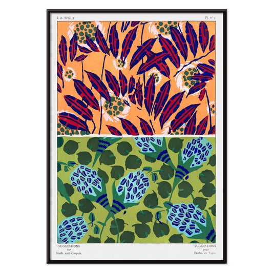
Vintage blomstermønstre Plakat
E. A. Séguy · 1925 · Art Deco blomstermønsterplakat med juveltoner og velordnet gitterstruktur
Plakat fra 69 kr · Indrammet fra 122,67 kr
Normalpris Fra 46,00 krNormalpris -
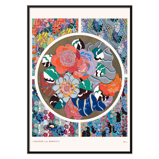
Art Deco blomstermønster 11 Plakat
Édouard Bénédictus · 1928 · Farverigt Art Deco vintage tryk med geometriske kronblade og rytmisk symmetri
Plakat fra 69 kr · Indrammet fra 122,67 kr
Normalpris Fra 46,00 krNormalpris -
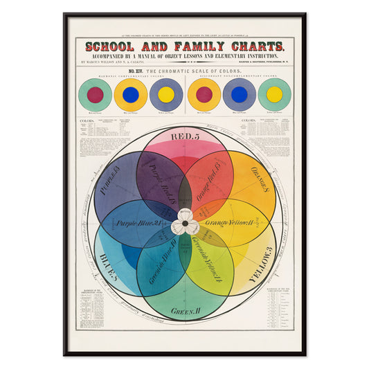
Kromatisk farveskala Plakat
Marcius Willson · 1890 · Nøjagtigt mærket kromatisk farveskala plakat med klar geometri og levende spektrum
Plakat fra 69 kr · Indrammet fra 122,67 kr
Normalpris Fra 46,00 krNormalpris -
Iriartea ventricosa Plakat
Carl Friedrich Philipp von Martius · 1823 · Elegant botanisk palmetryk med luftige blade og videnskabelig detalje
Plakat fra 69 kr · Indrammet fra 122,67 kr
Normalpris Fra 46,00 krNormalpris -
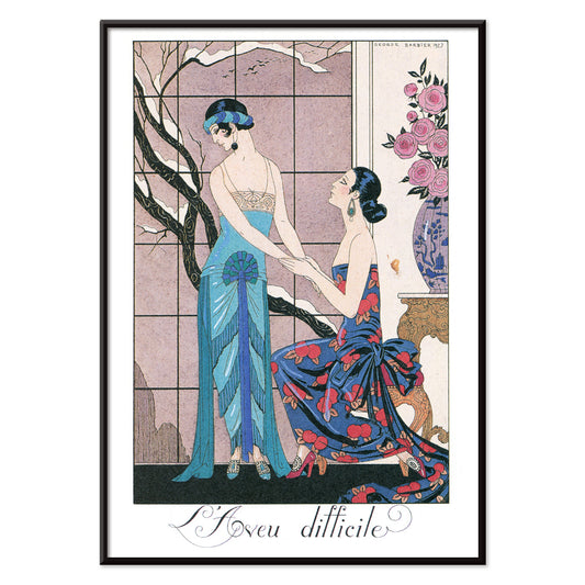
L’aveu Difficile Plakat
George Barbier · 1924 · Art Deco plakat med to elegante kvinder i juveltoner og teatralsk elegance
Plakat fra 69 kr · Indrammet fra 122,67 kr
Normalpris Fra 46,00 krNormalpris -
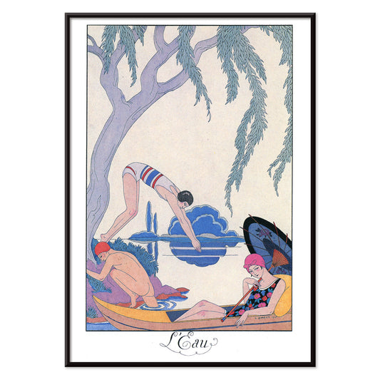
L’Eau Plakat
George Barbier · 1924 · Elegant Art Deco plakat med vandsideidyl i levende blå og lyserøde accenter
Plakat fra 69 kr · Indrammet fra 122,67 kr
Normalpris Fra 46,00 krNormalpris -
La Terre Plakat
George Barbier · 1924 · elegant Art Deco-plakat med kvinder og barn der høster frugt i en stiliseret have
Plakat fra 69 kr · Indrammet fra 122,67 kr
Normalpris Fra 46,00 krNormalpris -
Komposition Plakat
Robert Delaunay · 1930 · Strålende abstrakt kunsttryk med indflettede cirkler og vinkelformede farveflader i bevægelse
Plakat fra 69 kr · Indrammet fra 122,67 kr
Normalpris Fra 46,00 krNormalpris -
Zartes Gemüt Plakat
Wassily Kandinsky · 1925 · Geometrisk abstrakt kunsttryk med skarpe sorte linjer, gule højdepunkter og bløde lilla former
Plakat fra 69 kr · Indrammet fra 122,67 kr
Normalpris Fra 46,00 krNormalpris -
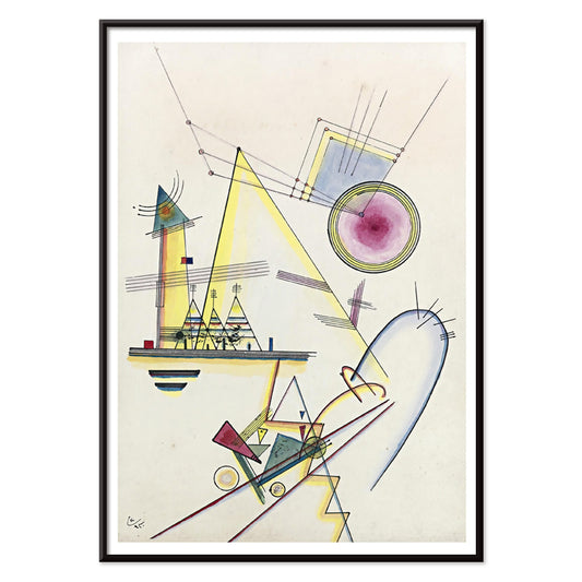
Deutliche Verbindung Plakat
Wassily Kandinsky · 1925 · Geometrisk abstrakt kunsttryk med cirkler og vinkler i energiske primærfarver og lilla
Plakat fra 69 kr · Indrammet fra 122,67 kr
Normalpris Fra 46,00 krNormalpris -
Kvindeportræt med blomster Plakat
Louis Rhead · 1890 · Art Nouveau parfumeplakat med et kvindeportræt med blomster i gul og lilla
Plakat fra 69 kr · Indrammet fra 122,67 kr
Normalpris Fra 46,00 krNormalpris -
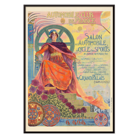
Automobile Club De France Plakat
Georges Antoine Rochegrosse · 1901 · elegant art nouveau plakat med en allegorisk muse i blomster og motordele
Plakat fra 69 kr · Indrammet fra 122,67 kr
Normalpris Fra 46,00 krNormalpris -
Cigarrillos Paris Plakat
Aleardo Villa · 1901 · Elegant Belle Époque plakat med en liggende kvinde omgivet af rosa og lilla blomster
Plakat fra 69 kr · Indrammet fra 122,67 kr
Normalpris Fra 46,00 krNormalpris -
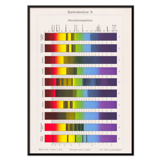
Spektralanalyse Plakat
The Institute of Liepzig · 1973 · Livlige spektrebånd plakat med laboratoriegrafik og præcis videnskabelig geometri
Plakat fra 69 kr · Indrammet fra 122,67 kr
Normalpris Fra 46,00 krNormalpris -
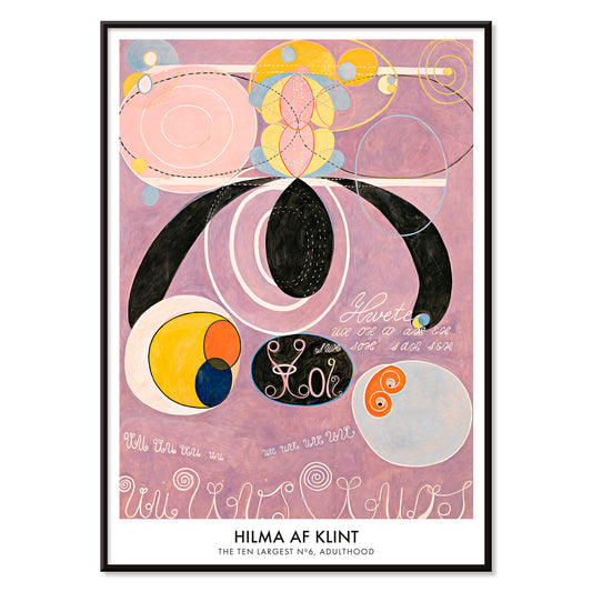
De ti største nr. 6 Plakat
Hilma af Klint · 1907 · Strålende abstrakt plakat med hvirvlende former og symboler i bløde rosa og lilla
Plakat fra 69 kr · Indrammet fra 122,67 kr
Normalpris Fra 46,00 krNormalpris -
Duer nr. 2 Plakat
Hilma af Klint · 1915 · Lyrisk abstrakt kunsttryk med duesymbolik og pastelfarvede geometriske former
Plakat fra 69 kr · Indrammet fra 122,67 kr
Normalpris Fra 46,00 krNormalpris -
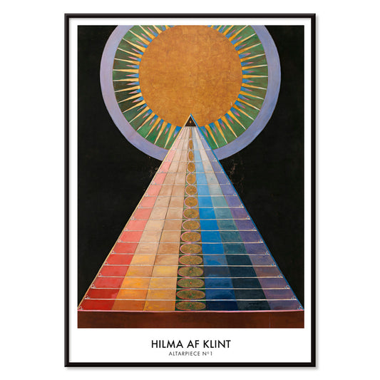
Altertavle nr. 1 Plakat
Hilma af Klint · 1915 · Strålende geometrisk kunsttryk med centralt solmotiv og markante former på sort baggrund
Plakat fra 69 kr · Indrammet fra 122,67 kr
Normalpris Fra 46,00 krNormalpris -
Farbstudien, 10 Blätter IV Plakat
Karl Wiener · 1923 · Lysende abstrakt akvareltryk med lagdelte farvefelter i blå, lilla og gul
Plakat fra 69 kr · Indrammet fra 122,67 kr
Normalpris Fra 46,00 krNormalpris -
Fly til Sydhavsøerne med Pan Am Plakat
Paul George Lawler · 1938 · Frodig Sydhavsøerne rejseplakat med Pan Am-vandfly og tropisk kystlinje
Plakat fra 69 kr · Indrammet fra 122,67 kr
Normalpris Fra 46,00 krNormalpris -
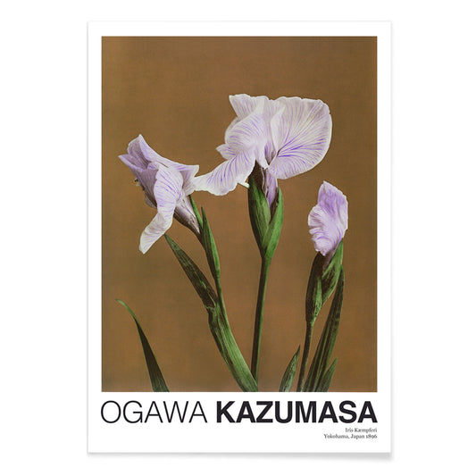
Iris Kæmpferi Plakat
Ogawa Kazumasa · 1896 · Håndkoloreret iris botanisk tryk med slanke grønne blade og bløde lilla kronblade
Plakat fra 69 kr · Indrammet fra 122,67 kr
Normalpris Fra 46,00 krNormalpris -
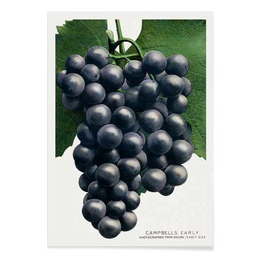
Campbells tidlige drue Plakat
Rochester Lithographing and Printing Company · 1895 · Frodigt botanisk tryk med klaser af lilla druer omgivet af sprøde grønne vinblade
Plakat fra 69 kr · Indrammet fra 122,67 kr
Normalpris Fra 46,00 krNormalpris


72/97 items
- Faun og Nymfe Plakat
- Drømmen Plakat
- Besøg Puerto Rico Plakat
- Smør Plakat
- Ecchu Umidani bjergpas Plakat
- Det grønne træbibliotek Plakat
- Atlas over Munsell farvesystem Plakat
- Adelaster Albivenis Plakat
- Blomstermarked Mumbai Plakat
- Blomstermarked - Kyoto Plakat
- Blomstermarked Delhi Plakat
- Blomstermarked Cape Town Plakat
- Blomstermarked - Cardiff Plakat
- Blomstermarked - Seoul 2 Plakat
- Blomstermarked São Paulo Plakat
- Blomstermarked i Rom Plakat
- Blomstermarked - Milano Plakat
- Blomstermarked - Berlin Plakat
- Blomstermarked i Amsterdam Plakat
- Columbia Road blomstermarked Plakat
- Japansk legetøj 2 Plakat
- Shinobazu-sø Plakat
- Teori og praksis om farve Plakat
- Grøntsager og krydderurter Plakat
- Métamorphose du violon Plakat
- Bauhaus 11 Plakat
- Bauhaus 10 Plakat
- Faust, tragedie af Goethe Plakat
- Farbstudien, 10 Blätter IX Plakat
- Farbstudien, 10 Blätter VIII Plakat
- Randy Brecker Kvintet Plakat
- Intet slår en god bog Plakat
- Velkendte farver Plakat
- Farvens charme Plakat
- Fly til Caribien Plakat
- Vintage blomstermønstre Plakat
- Art Deco blomstermønster 11 Plakat
- Kromatisk farveskala Plakat
- Iriartea ventricosa Plakat
- Komposition Plakat
- Kvindeportræt med blomster Plakat
- Cigarrillos Paris Plakat
- Spektralanalyse Plakat
- De ti største nr. 6 Plakat
- Duer nr. 2 Plakat
- Altertavle nr. 1 Plakat
- Farbstudien, 10 Blätter IV Plakat
- Fly til Sydhavsøerne med Pan Am Plakat
A Color That Thinks in Shadows
Purple behaves like dusk in interior decoration: it deepens neutrals, cools bright whites, and makes brass read warmer. In the history of the vintage poster and art print, violet also signals modern chemistry and modern taste, from late nineteenth-century inks to mid-century screen processes. This selection gathers posters and wall art where purple appears as pigment, twilight, or a single accent note, moving between floral studies, symbolist reverie, and studio-style diagrams. For nearby palettes, it pairs naturally with Black & White contrast, the open air of Landscape scenes, and the quiet structure of Minimalist compositions.
From Secession Ornament to Visionary Abstraction
Gustav Klimt used pattern as atmosphere, and violet shadows help hold his surfaces together. In The Kiss (1907–1908) by Gustav Klimt, the gold mosaic reads like textile and icon at once, while the surrounding purples keep the embrace grounded rather than sugary. Hilma af Klint treats purple less as mood than as a register of thought: The Ten Largest, No. 6 (1907) by Hilma af Klint uses lilac and violet as structural cues, guiding the eye through spirals, seed forms, and annotated curves. This lineage connects easily to the symbolic undercurrents in Esoteric imagery and the lyrical experiments of Abstract art.
Where Purple Works at Home
Purple is most convincing when it operates as an accent rather than a single-note statement. In a bedroom, a violet-heavy poster above stone, oat, or chalk textiles reads calm without turning sweet; in a living room, it negotiates between walnut, bouclé, chrome, and smoked glass. It also flatters greenery: place a purple print near terracotta pots or dried grasses, then echo the hue with one plum cushion or a muted rug detail. If you want the color to feel botanically anchored, hang it near plates from Botanical studies; if you prefer sharper rhythm, let it sit beside strict geometry from Bauhaus.
Modernist Color Lessons You Can Live With
Some works here feel like studio notes turned into wall art, where hue is both subject and method. Robert Delaunay’s Composition (1930) by Robert Delaunay stacks circular intervals of plum, emerald, and lemon to create depth without traditional perspective. Albert Henry Munsell goes the other way: Atlas of the Munsell color system Pl.01 (1915) by Albert Henry Munsell maps color with measured clarity, useful in a studio corner, kitchen, or hallway where you want structure. For related graphic sensibilities, the wit of Advertising posters and the measured diagrams of Science prints keep purple from drifting into pure romance.
Curating Dusk, Distance, and Paper
To keep violet from feeling precious, combine it with scenes that carry weather and space. Ecchu Umidani Pass (1923) by Kawase Hasui offers indigo quiet and a single lantern glow, linking the palette to Japanese printmaking and the broader language of Oriental works. In framing, purple rewards breathing room: a pale mat clarifies lilac tones, while a walnut or black frame gives aubergine weight. Mixing one horizontal piece with a smaller vertical print keeps a gallery wall paced rather than symmetrical, letting the color appear, recede, and return like evening light.