


- Løg Plakat
- Radiser Plakat
- Dansende par i sneen Plakat
- Jet Clipper til Hawaii Plakat
- Campari Soda Plakat
- Bec-Kina Plakat
- Jordbærtyven Plakat
- Dansende figurer Matisse Plakat
- Tom Krojer Udstillingsplakat
- Berlin gadescene Plakat
- Ernst Kirchner udstillingsplakat Plakat
- Park nær Lu Plakat
- El Comienzo Plakat
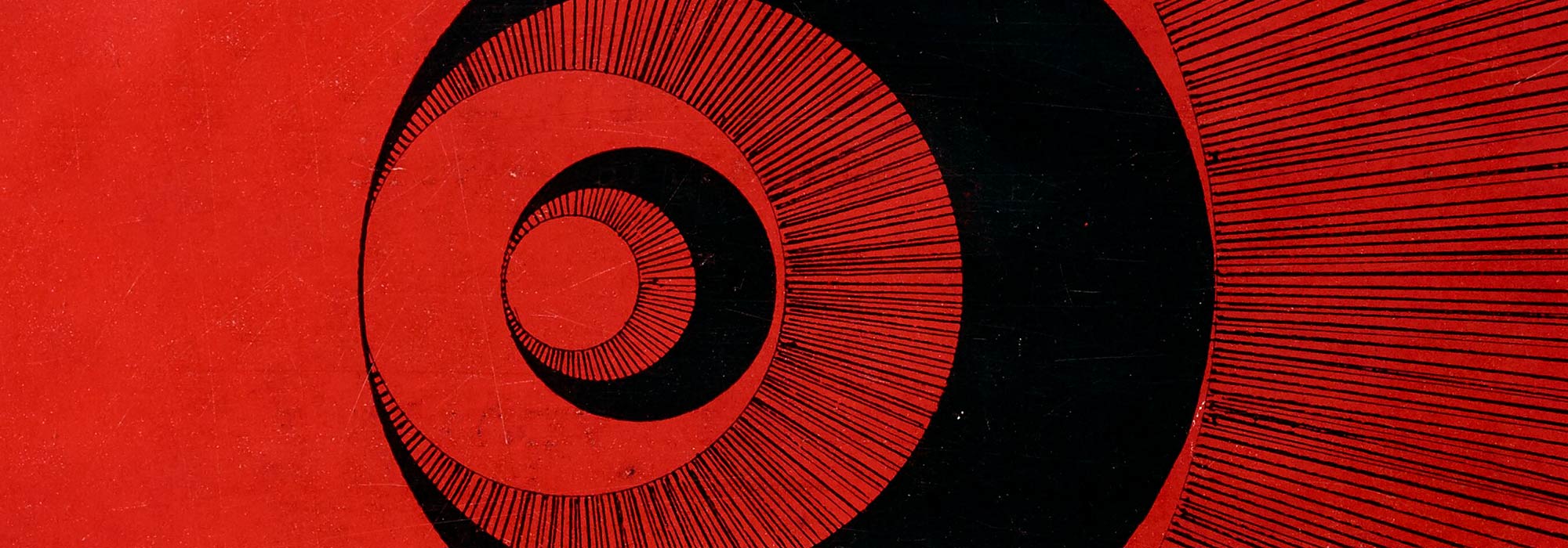
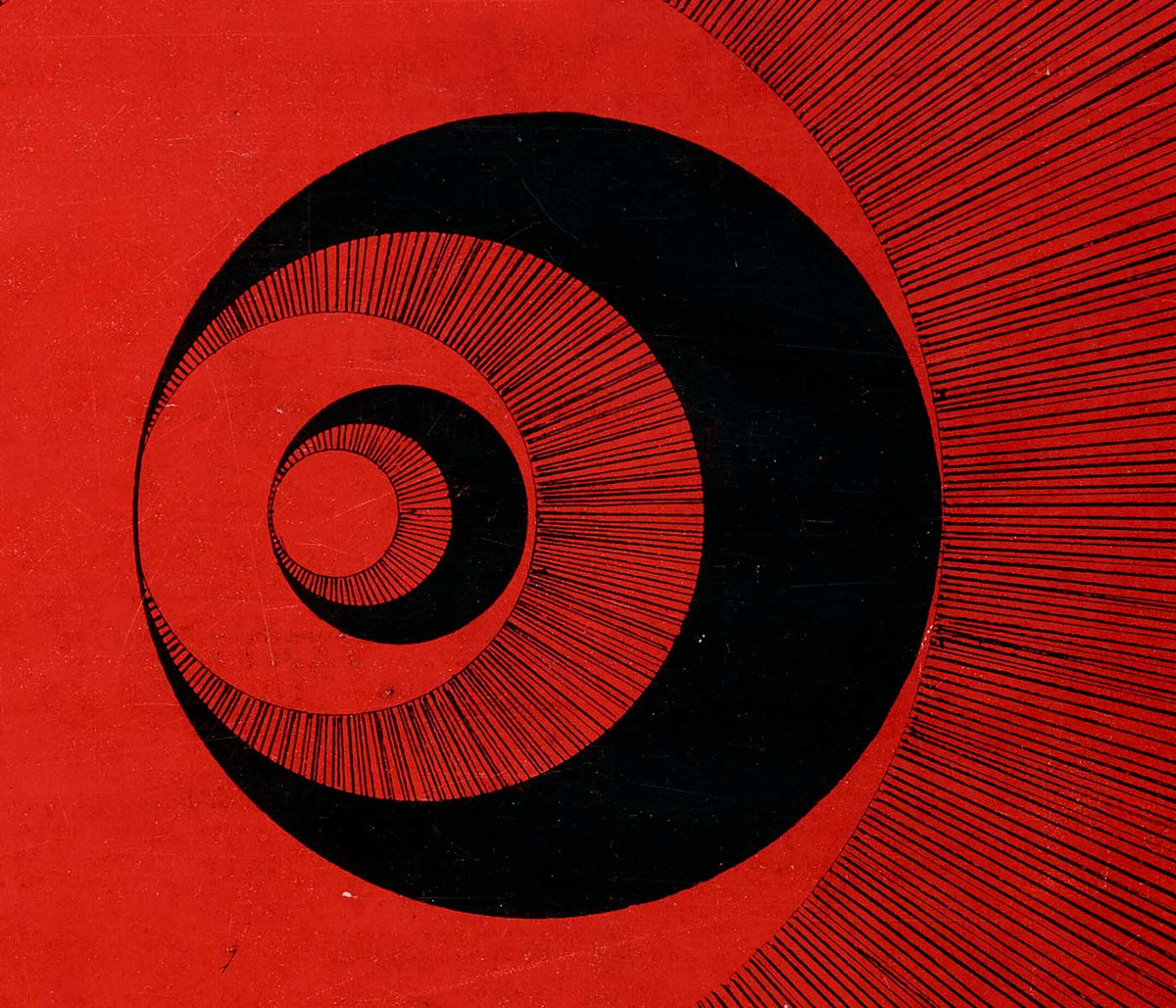
- Tusmørkets Ring Plakat
- Parler Seul Plakat
- Faun og Nymfe Plakat
- Drømmen Plakat
- Le Concert Plakat
- Kvinde og fugl om natten Plakat
- Bauhaus 20 Plakat
- Bauhaus 21 Plakat
- Spis flere frugter Plakat
- Snoopy Come Home Plakat
- Til London med Jet Clipper plakat
- Kyushu-Okinawa Plakat
- Xerez Pedro Domecq Plakat
- Balsam Aperitif Plakat
- Smør Plakat
- Crans-sur-Sierre Plakat
- Monte Carlo Plakat
- Pacific Vibrations Plakat
- Continental Hawaii Airline Plakat
- Sort kat 4 Plakat
- Sort kat 3 Plakat
- Øl og cigaret Plakat
-
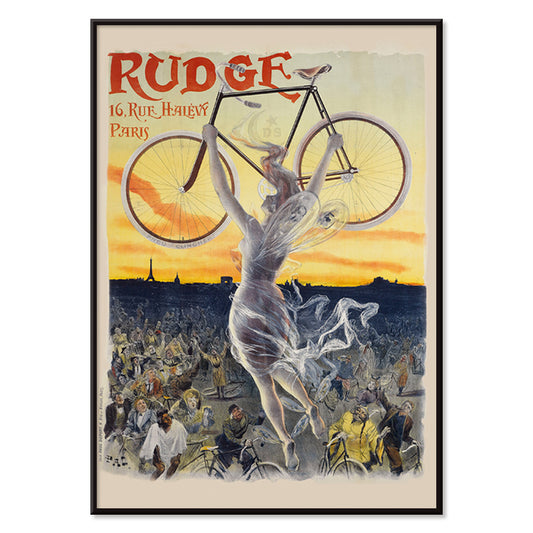
Rudge Plakat
Jean de Paleologue · 1898 · Art Nouveau cykelplakat med en vinget muse der løfter en skinnende cykel over et beundrende publikum
Plakat fra 69 kr · Indrammet fra 122,67 kr
Normalpris Fra 46,00 krNormalpris -
Vivaudous Mavis Plakat
Fred L. Parker · 1920 · glamorøs Art Deco parfumeplakat med elegant figur og juveltonede flasker
Plakat fra 69 kr · Indrammet fra 122,67 kr
Normalpris Fra 46,00 krNormalpris -
Antikt kort over Afrika Plakat
Institut i Leipzig · 1851 · Detaljeret vintage kort over Afrika med gitterkoordinater og tæt tekst
Plakat fra 69 kr · Indrammet fra 122,67 kr
Normalpris Fra 46,00 krNormalpris -
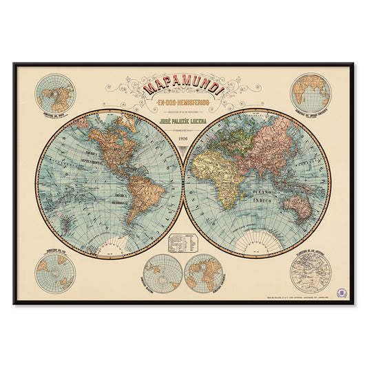
Verdenskort Plakat
Josep Paluzie Lucena · 1900 · Detaljeret vintage verdenskort plakat med blå oceaner og varmt beige papir
Plakat fra 69 kr · Indrammet fra 122,67 kr
Normalpris Fra 46,00 krNormalpris -
Duer nr. 2 Plakat
Hilma af Klint · 1915 · Lyrisk abstrakt kunsttryk med duesymbolik og pastelfarvede geometriske former
Plakat fra 69 kr · Indrammet fra 122,67 kr
Normalpris Fra 46,00 krNormalpris -
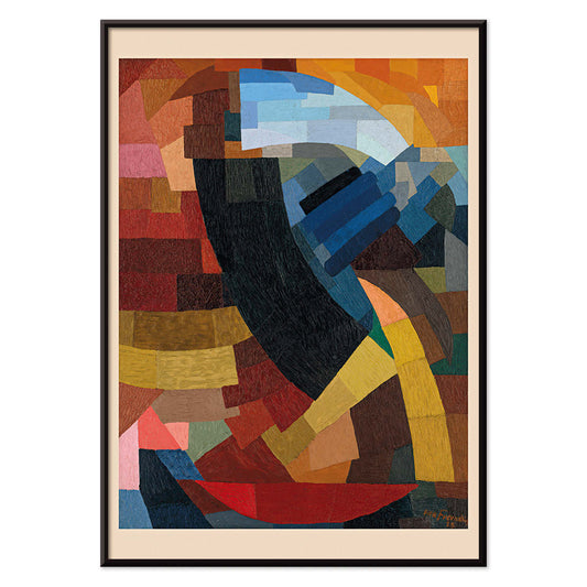
Fragments de figure Plakat
Otto Freundlich · 1928 · Livlig geometrisk plakat med fragmenteret figur og markante sorte konturer
Plakat fra 69 kr · Indrammet fra 122,67 kr
Normalpris Fra 46,00 krNormalpris -
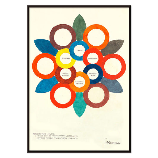
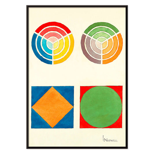
Centrum for rene farver Plakat
Elizabeth A. Nedwill · 1900 · abstrakt farvehjul plakat med overlappende ringe i varme og kolde nuancer
Plakat fra 69 kr · Indrammet fra 122,67 kr
Normalpris Fra 46,00 krNormalpris -
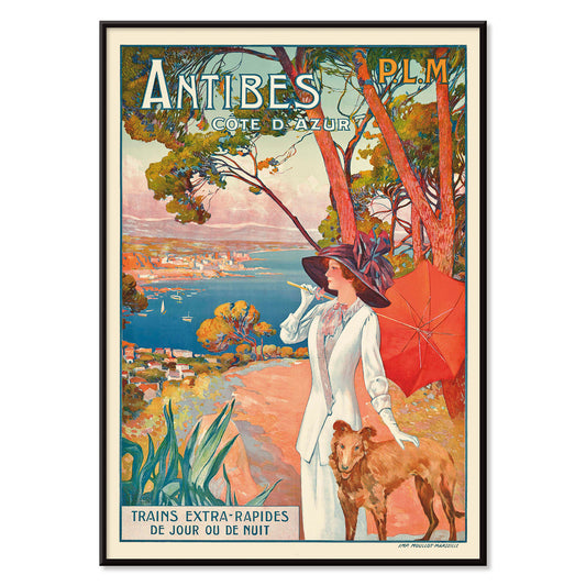
Antibes Plakat
David Dellepiane · 1910 · Belle Époque Antibes plakat med en elegant kvinde og hund over middelhavet
Plakat fra 69 kr · Indrammet fra 122,67 kr
Normalpris Fra 46,00 krNormalpris -
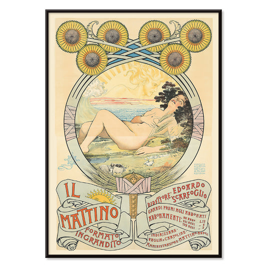
II Mattino Plakat
Giovanni Mataloni · 1896 · Lyrisk Art Nouveau plakat med liggende kvinde omkranset af glødende solsikker
Plakat fra 69 kr · Indrammet fra 122,67 kr
Normalpris Fra 46,00 krNormalpris -
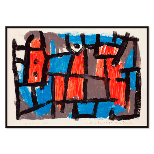
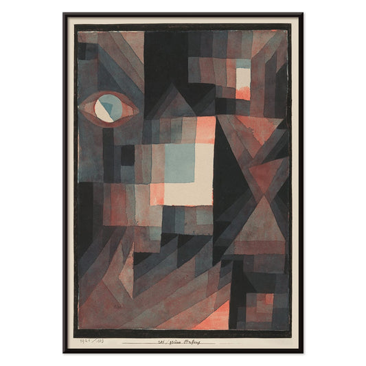
Timen før natten Plakat
Paul Klee · 1940 · Drømmeagtigt abstrakt plakat med sorte linjer og røde og blå former på dæmpet baggrund
Plakat fra 69 kr · Indrammet fra 122,67 kr
Normalpris Fra 46,00 krNormalpris -
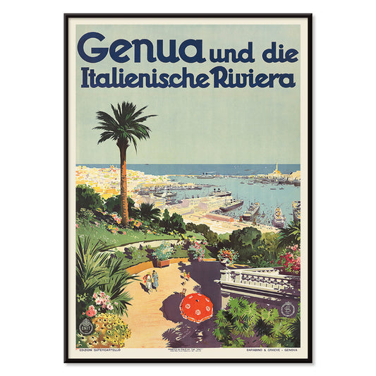
Genua Plakat
Aurelio Craffonara · 1931 · Genua havneplakat i solrige toner med stiliserede både og klare kystsilhuetter
Plakat fra 69 kr · Indrammet fra 122,67 kr
Normalpris Fra 46,00 krNormalpris -
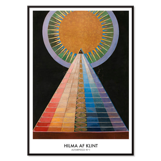
Altertavle nr. 1 Plakat
Hilma af Klint · 1915 · Strålende geometrisk kunsttryk med centralt solmotiv og markante former på sort baggrund
Plakat fra 69 kr · Indrammet fra 122,67 kr
Normalpris Fra 46,00 krNormalpris -
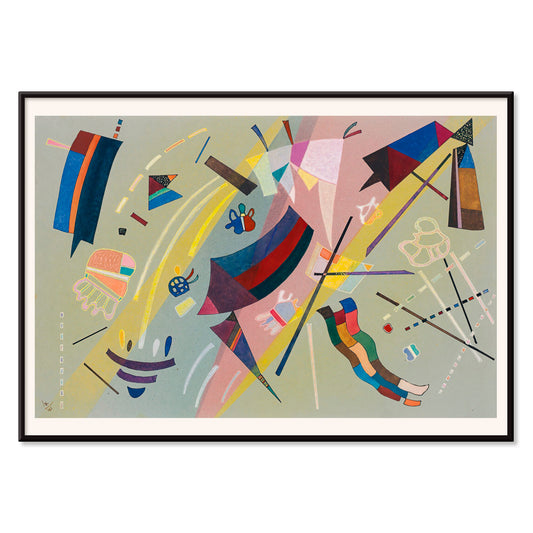
Kandinsky 1941 Plakat
Wassily Kandinsky · 1941 · Lyrisk abstrakt plakat med svævende geometriske former i blå, gul, lyserød og rød
Plakat fra 69 kr · Indrammet fra 122,67 kr
Normalpris Fra 46,00 krNormalpris -
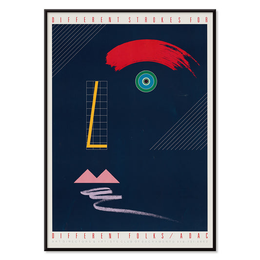
Forskellige streger til forskellige mennesker Plakat
McRay Magleby · 1942 · Legesygt geometrisk plakat med klare farveblokke i midcentury stil
Plakat fra 69 kr · Indrammet fra 122,67 kr
Normalpris Fra 46,00 krNormalpris -
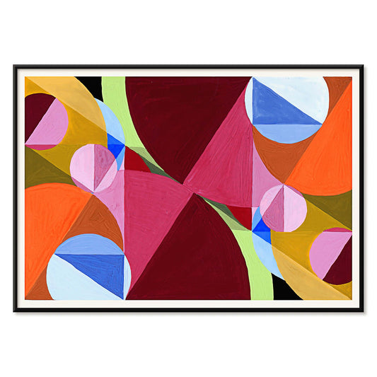
Rød og grøn gradation Plakat
Paul Klee · 1921 · modernistisk plakat med graduerede røde og grønne blokke og fine sorte linjer
Plakat fra 69 kr · Indrammet fra 122,67 kr
Normalpris Fra 46,00 krNormalpris -
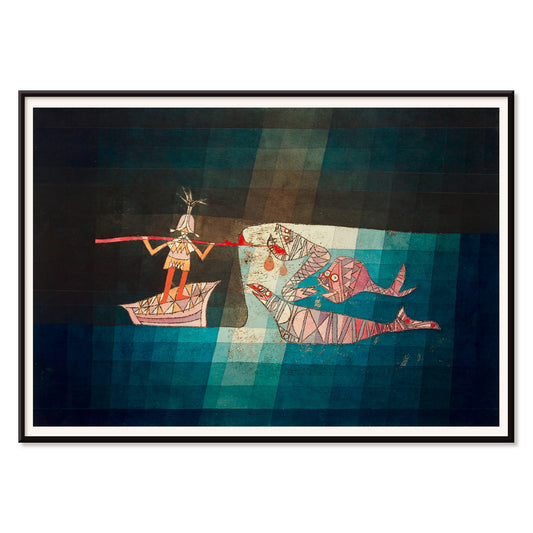
Sejleren Plakat
Paul Klee · 1923 · Legende abstrakt søfartsplakat med rytmiske symboler der fremmaner musik og havrejse
Plakat fra 69 kr · Indrammet fra 122,67 kr
Normalpris Fra 46,00 krNormalpris -
Areal brudt af vinkelrette linjer Plakat
Joseph Schillinger · 1934 · geometrisk abstrakt plakat med vinkelrette gitter og klare farveblokke i rytmisk balance
Plakat fra 69 kr · Indrammet fra 122,67 kr
Normalpris Fra 46,00 krNormalpris -
Composition Abstraite Plakat
Otto Freundlich · 1937 · Frodigt geometrisk kunsttryk med sammenflettede farveblokke afgrænset af sorte linjer
Plakat fra 69 kr · Indrammet fra 122,67 kr
Normalpris Fra 46,00 krNormalpris -
Komposition Plakat
Otto Freundlich · 1936 · Kraftfuldt geometrisk kunsttryk med sammenflettede farveflader og markant modernistisk energi
Plakat fra 69 kr · Indrammet fra 122,67 kr
Normalpris Fra 46,00 krNormalpris -
Osnovnoye design Plakat
Gustavs Klucis · 1920 · Dynamisk konstruktivistisk plakat med kyrillisk typografi og markante røde geometriske former
Plakat fra 69 kr · Indrammet fra 122,67 kr
Normalpris Fra 46,00 krNormalpris -
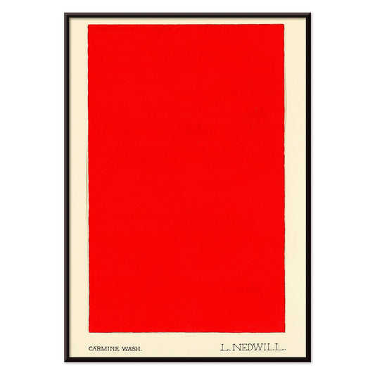
Karminvask Plakat
Elizabeth A. Nedwill · 1900 · Minimalistisk kunsttryk med en enkelt karminblok svævende på elfenben
Plakat fra 69 kr · Indrammet fra 122,67 kr
Normalpris Fra 46,00 krNormalpris -
Historisk Ornament Plakat
Elizabeth A. Nedwill · 1900 · Frodigt geometrisk ornament vintagetryk der balancerer historisk mønster og moderne rytme
Plakat fra 69 kr · Indrammet fra 122,67 kr
Normalpris Fra 46,00 krNormalpris -
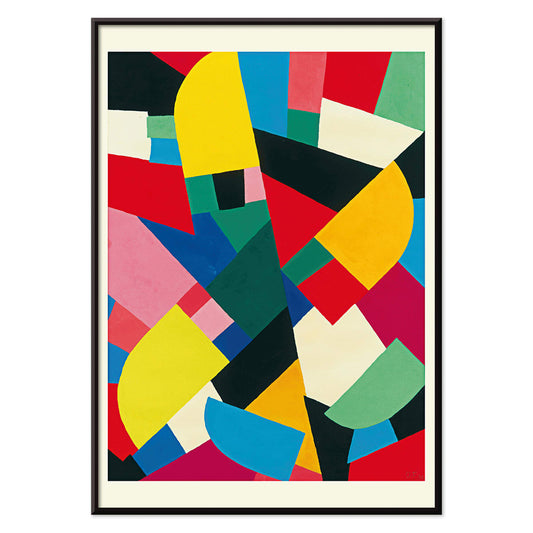
Farvepatchwork Plakat
Otto Freundlich · 1936 · Vovet abstrakt plakat med sammenflettede farvefliser samlet af kraftige sorte konturer
Plakat fra 69 kr · Indrammet fra 122,67 kr
Normalpris Fra 46,00 krNormalpris -
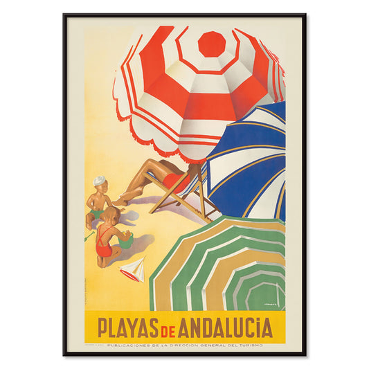
Playas de Andalucia Plakat
José Morell · 1939 · Livlig andalusisk strandplakat med solbadere, blåt hav, både og markant typografi i varme farver
Plakat fra 69 kr · Indrammet fra 122,67 kr
Normalpris Fra 46,00 krNormalpris -
Fly til Sydhavsøerne med Pan Am Plakat
Paul George Lawler · 1938 · Frodig Sydhavsøerne rejseplakat med Pan Am-vandfly og tropisk kystlinje
Plakat fra 69 kr · Indrammet fra 122,67 kr
Normalpris Fra 46,00 krNormalpris -
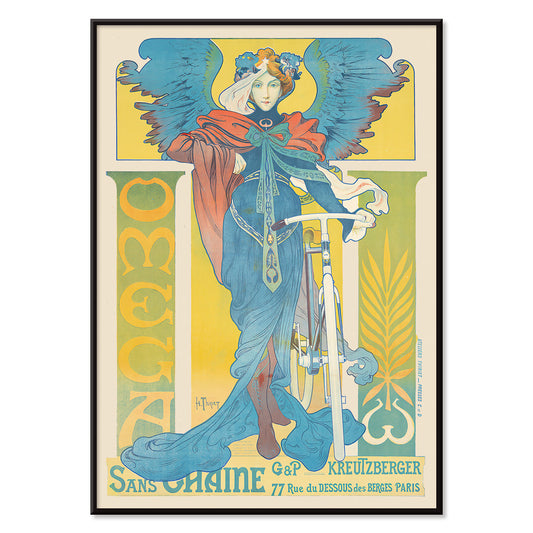
Omega Plakat
Henri Thiriet · 1897 · Art Nouveau cykelplakat med en vinget kvinde i markante blå nuancer
Plakat fra 69 kr · Indrammet fra 122,67 kr
Normalpris Fra 46,00 krNormalpris -
La Grande Roue Plakat
Ukendt kunstner · 1899 · Belle Époque Paris plakat med elegante kvinder foran pariserhjulet i solnedgang
Plakat fra 69 kr · Indrammet fra 122,67 kr
Normalpris Fra 46,00 krNormalpris -
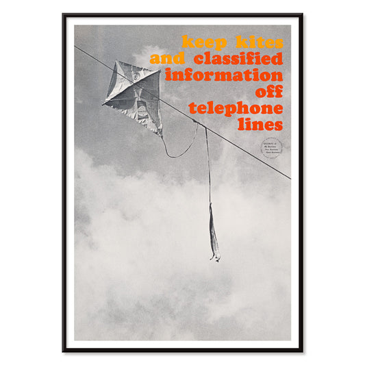
Hold telefonledningerne fri Plakat
Ukendt kunstner · 1964 · Vovet sikkerhedsplakat med drage viklet i telefonledningerne i sort-hvid
Plakat fra 69 kr · Indrammet fra 122,67 kr
Normalpris Fra 46,00 krNormalpris -
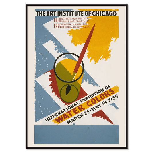
International udstilling af akvareller Plakat
Arlington Gregg · 1939 · Grafisk udstillingsplakat med primærfarveblokke og en pensel i et glas
Plakat fra 69 kr · Indrammet fra 122,67 kr
Normalpris Fra 46,00 krNormalpris -
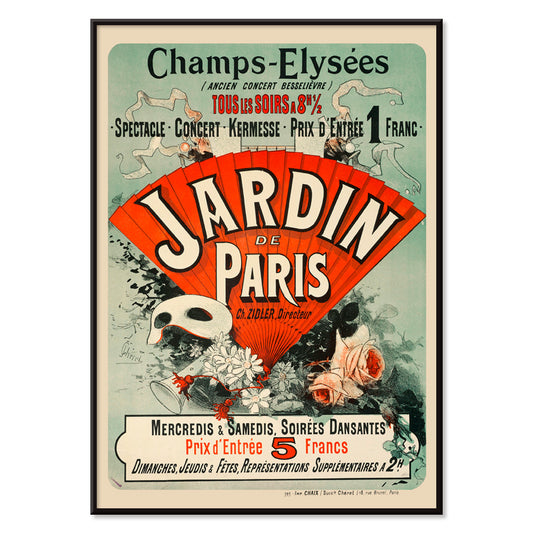
Jardin De Paris Plakat
Jules Chéret · 1884 · Livlig Belle Époque plakat med dansende figur, masker og blomsterkonfetti
Plakat fra 69 kr · Indrammet fra 122,67 kr
Normalpris Fra 46,00 krNormalpris -
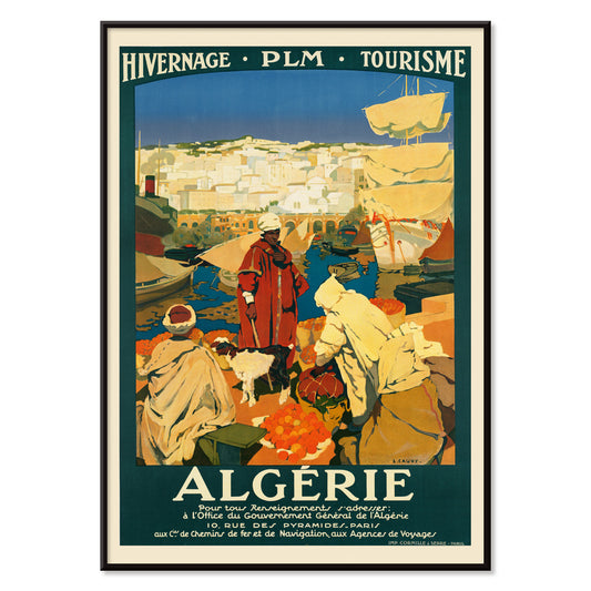
Algérie Plakat
Léon Cauvy · 1930 · Frodig algerisk havneplakat med tydelig typografi og solvarm middelhavsstemning
Plakat fra 69 kr · Indrammet fra 122,67 kr
Normalpris Fra 46,00 krNormalpris -
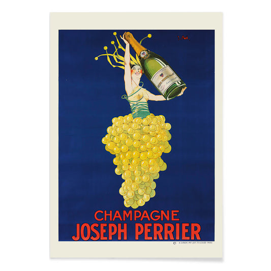
Champagne Joseph Perrier Plakat
Joseph Stall · 1902 · Festlig champagneplakat med elegant figur og svungne druemotiver i klare farver
Plakat fra 69 kr · Indrammet fra 122,67 kr
Normalpris Fra 46,00 krNormalpris -
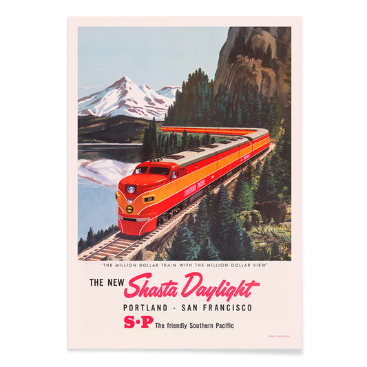
Den nye Shasta Daylight Plakat
Ukendt kunstner · 1950 · strømlinet rød togplakat der snor sig gennem bjerglandskaber i midten af århundredet
Plakat fra 69 kr · Indrammet fra 122,67 kr
Normalpris Fra 46,00 krNormalpris -
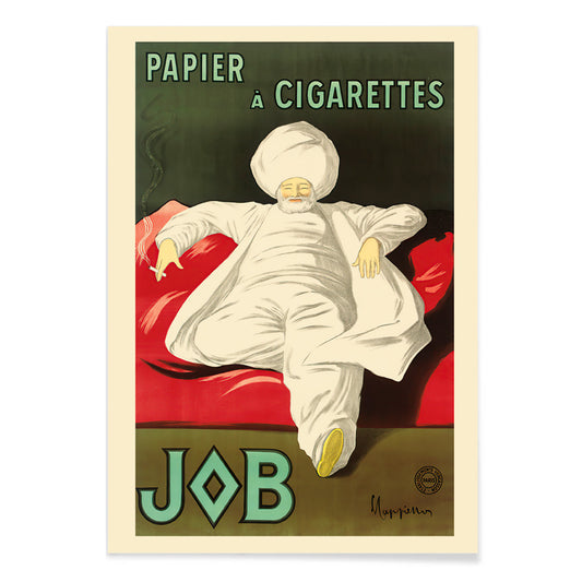
Cigaretpapirjob Plakat
Leonetto Cappiello · 1933 · Elegant reklameplakat med en hvidklædt figur på levende grøn baggrund
Plakat fra 69 kr · Indrammet fra 122,67 kr
Normalpris Fra 46,00 krNormalpris -
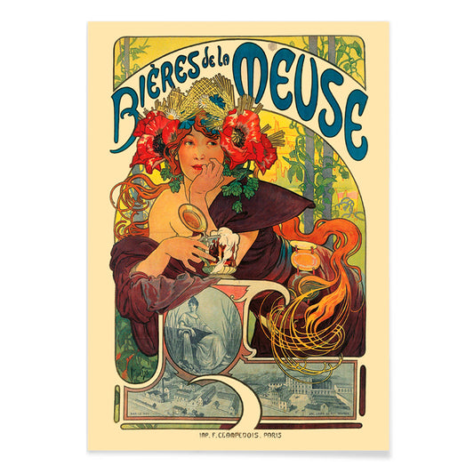
Bières De La Meuse Plakat
Alphonse Mucha · 1897 · Strålende Art Nouveau plakat Bières De La Meuse med blomsterkranset kvinde og flagrende hår
Plakat fra 69 kr · Indrammet fra 122,67 kr
Normalpris Fra 46,00 krNormalpris -
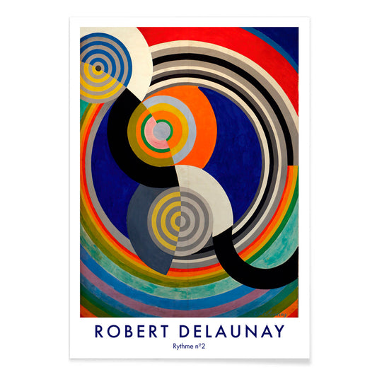
Rythme n°2 Plakat
Robert Delaunay · 1938 · Grafisk kunsttryk med rytmiske, sammenflettede cirkler i stærke primærfarver og kontraster
Plakat fra 69 kr · Indrammet fra 122,67 kr
Normalpris Fra 46,00 krNormalpris


36/761 items
- Rudge Plakat
- Vivaudous Mavis Plakat
- Verdenskort Plakat
- Duer nr. 2 Plakat
- Fragments de figure Plakat
- Centrum for rene farver Plakat
- Antibes Plakat
- Genua Plakat
- Altertavle nr. 1 Plakat
- Kandinsky 1941 Plakat
- Forskellige streger til forskellige mennesker Plakat
- Areal brudt af vinkelrette linjer Plakat
- Komposition Plakat
- Karminvask Plakat
- Historisk Ornament Plakat
- Farvepatchwork Plakat
- Playas de Andalucia Plakat
- Fly til Sydhavsøerne med Pan Am Plakat
- La Grande Roue Plakat
- Hold telefonledningerne fri Plakat
- Jardin De Paris Plakat
- Champagne Joseph Perrier Plakat
- Den nye Shasta Daylight Plakat
- Cigaretpapirjob Plakat
- Rythme n°2 Plakat
Red, the most intentional accent
In the Red collection, color operates less as a subject than as a signal: a poppy stamp, a lacquered headline, a warm blush on paper. These posters move between illustration, modernism, travel graphics, and diagrammatic prints, yet each relies on red to steer attention. Vermilion against cream, brick against graphite, or a single scarlet form in calm space can change how a room reads. As wall art, red behaves like seasoning in home decor: a small accent energizes a gallery wall, while a larger field establishes a focal point and a sense of direction in decoration.
Craft, pigment, and the art of persuasion
Red has carried technical and cultural weight across print history. Early dyes and pigments such as cochineal and madder informed textiles and the decorative arts, while lithography made bold red lettering and flat color fields central to public visual culture. William Morris’s Strawberry Thief (1883) by William Morris uses red as a structural note inside the repeat, keeping birds and fruit in rhythmic tension. In Hygieia (1907) by Gustav Klimt, the robe reads as both emblem and warning, with crimson acting like a boundary around the figure. Wassily Kandinsky’s Heavy Red (1924) by Wassily Kandinsky shows red as mass, a plane that pushes adjacent shapes into motion and makes geometry feel physical.
Where red posters live best
Red accents settle most naturally alongside honest materials: walnut, terracotta, brass, linen, and worn stone. In kitchens and dining corners, fruit studies and plant imagery echo table colors and ceramics, which makes Botanical prints an easy companion to red-led decoration. In hallways and entryways, one bold red element helps pull the eye through a narrow space; the graphic logic of Advertising works well with mirrors, coat hooks, and darker floorboards. For bedrooms, keep red smaller and warmer, leaning toward brick or rose rather than primary scarlet, and balance it with pale bedding and low, amber light. If the room opens onto greenery, red becomes a clear counterpoint; quieter scenes from Landscape help keep the palette grounded.
Pairing, framing, and building a gallery wall
To keep red from dominating, treat it as one voice within a measured palette. A white mount gives red air, while a slim black frame sharpens saturated areas and echoes the discipline of Black & White imagery. For structured pairings, place a red-led poster beside geometric work from Bauhaus, where red often appears as a controlled block rather than a flourish. For a more theatrical register, Leonetto Cappiello’s Cachou Lajaunie (1920) by Leonetto Cappiello plays like streetlight against deep wood tones and muted walls. When arranging a gallery wall, repeat red twice, once as a larger area and once as a small accent, so the eye has a clear path between prints.
A closing thought on red
Red is also a useful clue for reading images: in travel graphics it signals heat, nightlife, and appetite; in modernist composition it marks the point where wandering attention snaps into focus. That is why this selection can jump from pattern to symbolist figure to hard-edged abstraction without losing coherence. Leave breathing space around the loudest red field, and let neighboring prints carry quieter tones such as sand, ink, and sea-glass green. Used this way, red becomes rhythm rather than noise, and decoration starts to feel intentional without becoming strict.