


- Løg Plakat
- Radiser Plakat
- Dansende par i sneen Plakat
- Jet Clipper til Hawaii Plakat
- Campari Soda Plakat
- Bec-Kina Plakat
- Jordbærtyven Plakat
- Dansende figurer Matisse Plakat
- Tom Krojer Udstillingsplakat
- Berlin gadescene Plakat
- Ernst Kirchner udstillingsplakat Plakat
- Park nær Lu Plakat
- El Comienzo Plakat
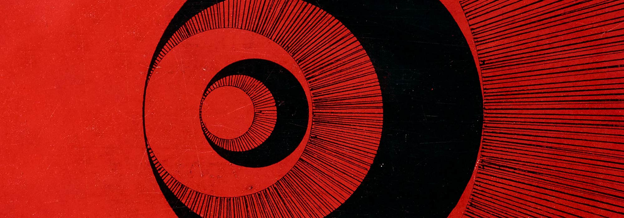
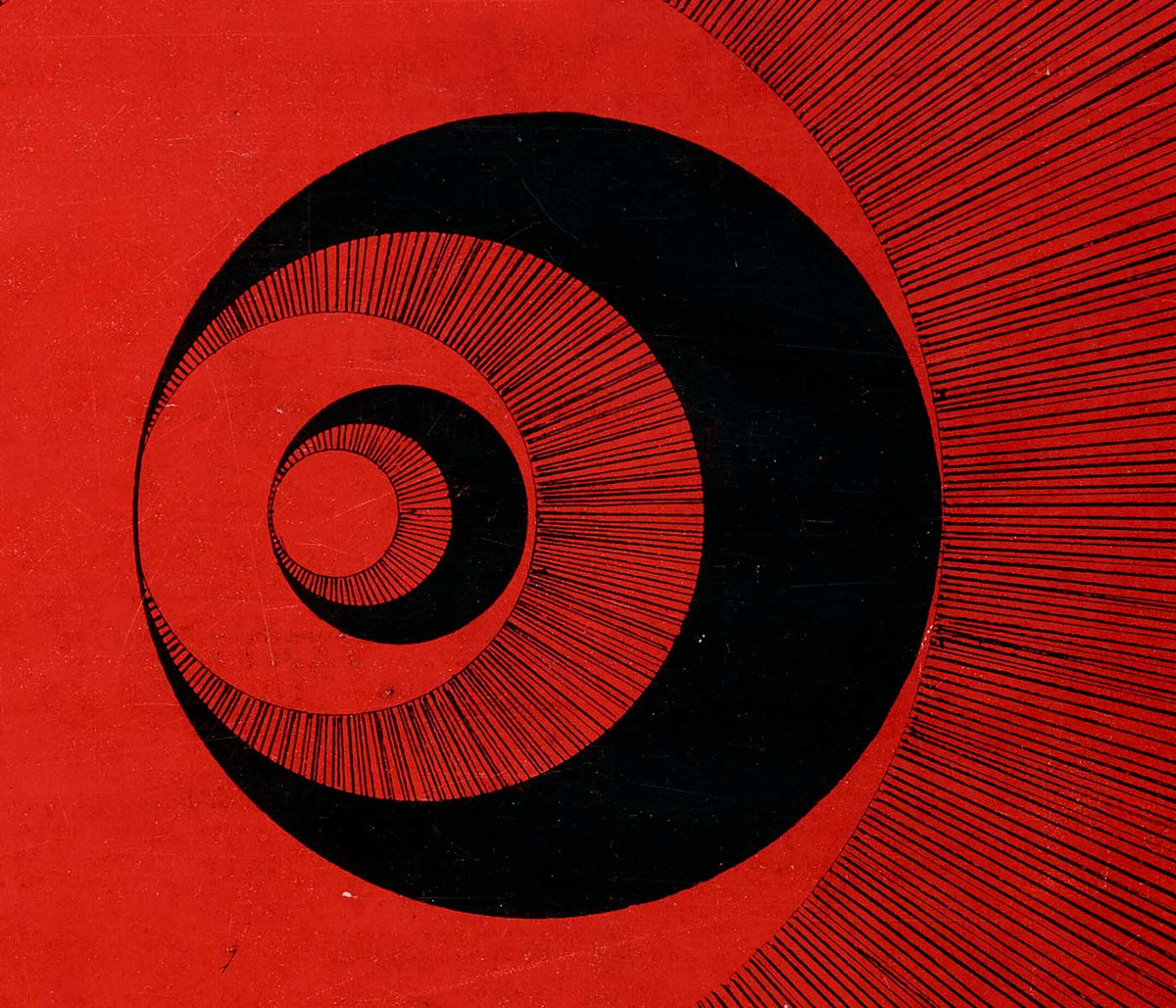
- Tusmørkets Ring Plakat
- Parler Seul Plakat
- Faun og Nymfe Plakat
- Drømmen Plakat
- Le Concert Plakat
- Kvinde og fugl om natten Plakat
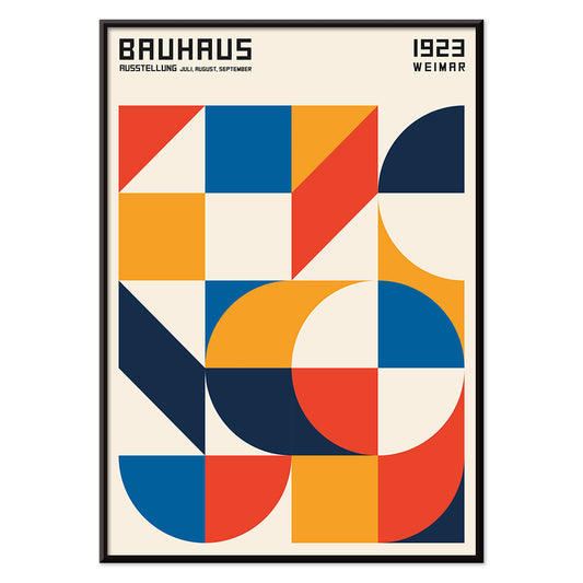
- Bauhaus 20 Plakat
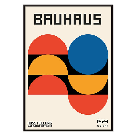
- Bauhaus 21 Plakat
- Spis flere frugter Plakat
- Snoopy Come Home Plakat
- Til London med Jet Clipper plakat
- Kyushu-Okinawa Plakat
- Xerez Pedro Domecq Plakat
- Balsam Aperitif Plakat
- Smør Plakat
- Crans-sur-Sierre Plakat
- Monte Carlo Plakat
- Pacific Vibrations Plakat
- Continental Hawaii Airline Plakat
- Sort kat 4 Plakat
- Sort kat 3 Plakat
- Øl og cigaret Plakat
-
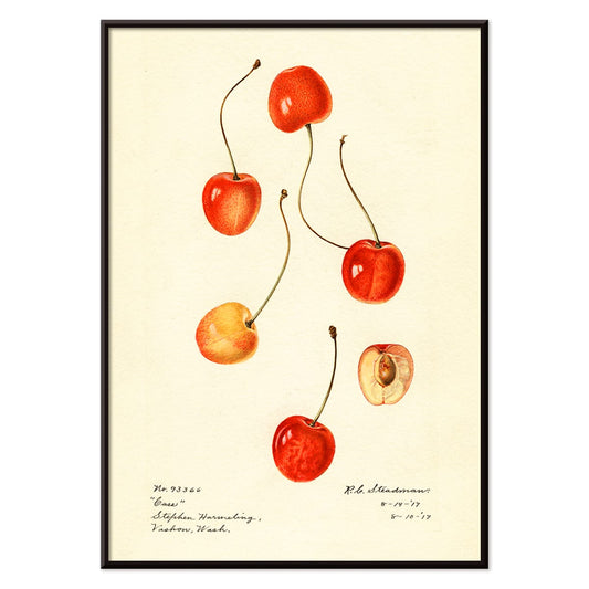
Prunus avium Plakat
Charles Steadman · 1917 · Delikat botanisk kirsebærtryk med modne klynger og friske grønne blade
Plakat fra 69 kr · Indrammet fra 122,67 kr
Normalpris Fra 46,00 krNormalpris -
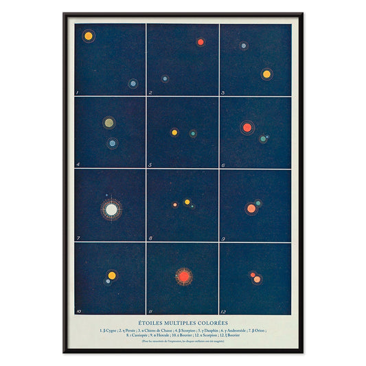
Flere farvede stjerner Plakat
Alphonse Berget · 1925 · Pædagogisk astronomiplakat der kortlægger flere stjernesystemer i klart blå med lyse stjernepunkter
Plakat fra 69 kr · Indrammet fra 122,67 kr
Normalpris Fra 46,00 krNormalpris -
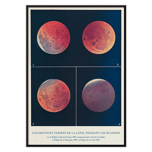
Colorations variées de la Lune Plakat
Alphonse Berget · 1925 · Diagrammatisk videnskabeligt tryk af måneformørkelser, måner skifter fra hvid til kobberrød
Plakat fra 69 kr · Indrammet fra 122,67 kr
Normalpris Fra 46,00 krNormalpris -
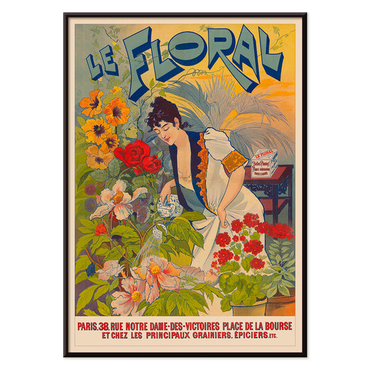
Le Floral Plakat
Ukendt kunstner · 1891 · Fint Art Nouveau plakat med en kvinde omgivet af farverige blomster og dekorative bogstaver
Plakat fra 69 kr · Indrammet fra 122,67 kr
Normalpris Fra 46,00 krNormalpris -
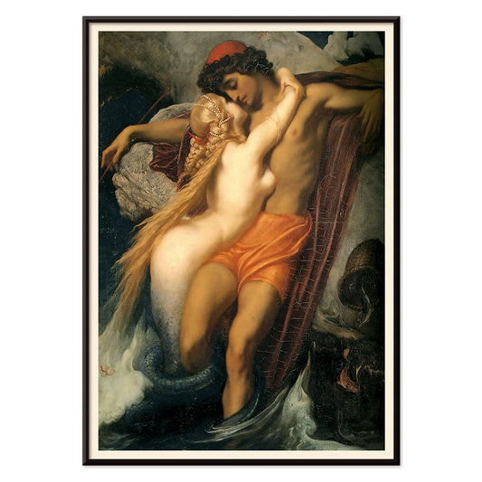
Fiskeren og Syren Plakat
Frederic Leighton · 1856 · Sanseligt mytologisk kunsttryk hvor en sirene omfavner en fisker ved mørke vande
Plakat fra 69 kr · Indrammet fra 122,67 kr
Normalpris Fra 46,00 krNormalpris -
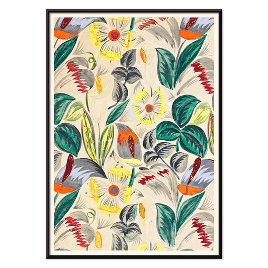
Tropiske blomster II Plakat
Ukendt kunstner · 1912 · Dekorativt tropisk blomstertryk med stiliseret løv og varm tidlig moderne mønsterrytme
Plakat fra 69 kr · Indrammet fra 122,67 kr
Normalpris Fra 46,00 krNormalpris -
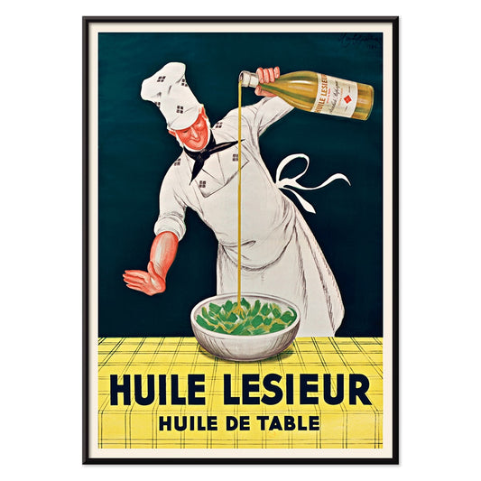
Huile Lesieur Plakat
Leonetto Cappiello · 1930 · Livlig reklameplakat med kok, gylden olie og kraftig rød typografi på sort baggrund
Plakat fra 69 kr · Indrammet fra 122,67 kr
Normalpris Fra 46,00 krNormalpris -
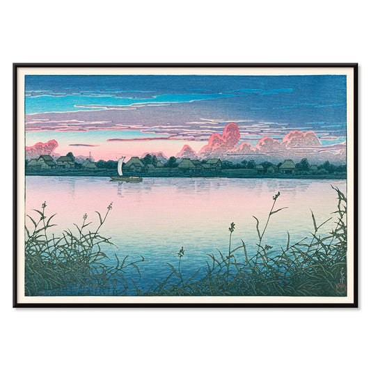
Tidligt efterår i Urayasu Plakat
Kawase Hasui · 1931 · Stille vandkantplakat med tusmørk himmel, stille landsbysilhuetter og rolige spejlinger
Plakat fra 69 kr · Indrammet fra 122,67 kr
Normalpris Fra 46,00 krNormalpris -
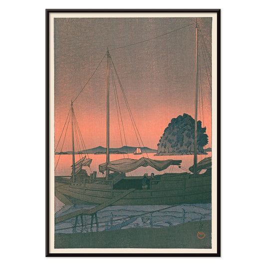
Ukiyo-e Havnesolnedgang Plakat
Kawase Hasui · 1935 · Fængslende kunsttryk af en havnesolnedgang med mørke silhouetter og glødende himmel over roligt vand
Plakat fra 69 kr · Indrammet fra 122,67 kr
Normalpris Fra 46,00 krNormalpris -
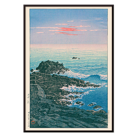
Morgen ved Kap Inubō Plakat
Kawase Hasui · 1931 · Fredfyldt havplakat med morgenhimmel, skummende bølger og en fjern fyr
Plakat fra 69 kr · Indrammet fra 122,67 kr
Normalpris Fra 46,00 krNormalpris -
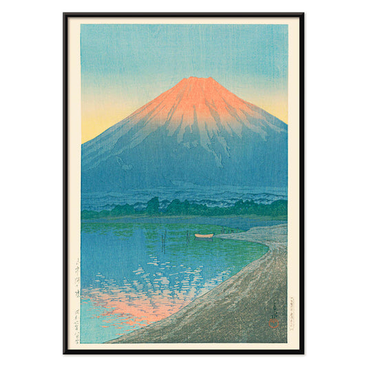
Daggry over Yamanaka-sø Plakat
Kawase Hasui · 1931 · roligt Mount Fujis solopgangstryk med spejlede søreflektioner i kølige blå nuancer
Plakat fra 69 kr · Indrammet fra 122,67 kr
Normalpris Fra 46,00 krNormalpris -
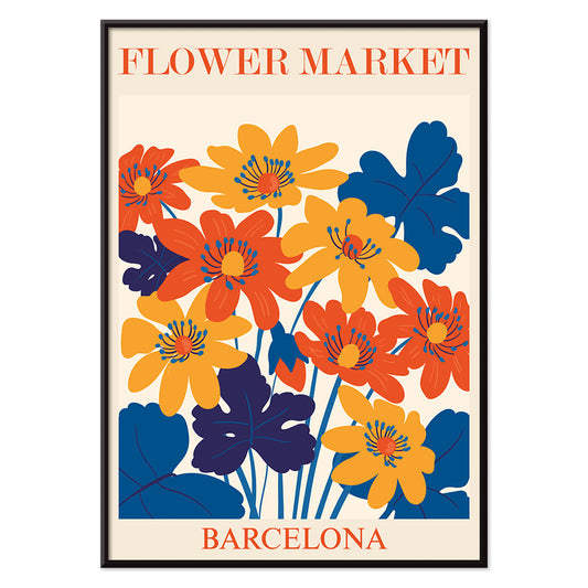
Blomstermarked Barcelona Plakat
MORYARTY · 2022 · livlig plakat med blomsterflisemotiv i stærke mediterranske farver og ren geometri
Plakat fra 69 kr · Indrammet fra 122,67 kr
Normalpris Fra 46,00 krNormalpris -
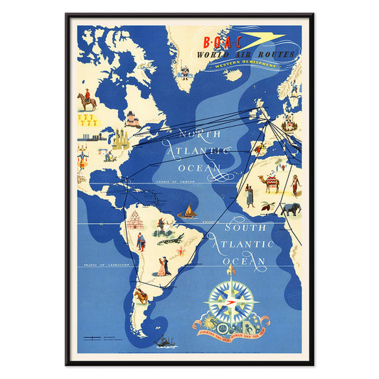
British Overseas Airways Plakat
Seymour E.O. · 1949 · Farverig BOAC-plakat med bølgende ruter henover en stiliseret globus
Plakat fra 69 kr · Indrammet fra 122,67 kr
Normalpris Fra 46,00 krNormalpris -
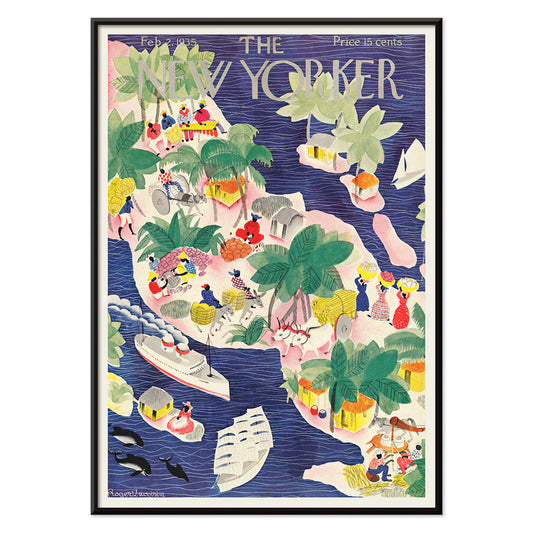
The New Yorker 1935 Plakat
Roger Duvoisin · 1935 · legesyg tropisk øplakat med kystdetaljer, klare farveblokke og nostalgisk stemning
Plakat fra 69 kr · Indrammet fra 122,67 kr
Normalpris Fra 46,00 krNormalpris -
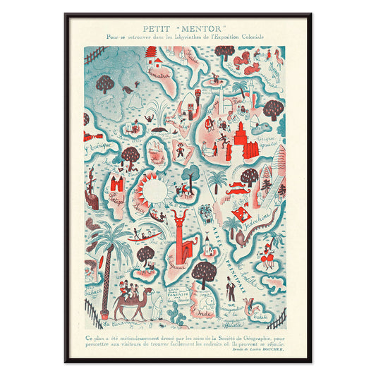
Petit Mentor Plakat
Lucien Boucher · 1931 · Legesyg Art Deco kortplakat med klare mærkater og livlige illustrationsdetaljer
Plakat fra 69 kr · Indrammet fra 122,67 kr
Normalpris Fra 46,00 krNormalpris -
Silicon Valley Kort Plakat
Kirby Scudder · 1986 · legende silicon valley kortplakat der forvandler usa til et vittigt 1980'er techpanorama
Plakat fra 69 kr · Indrammet fra 122,67 kr
Normalpris Fra 46,00 krNormalpris -
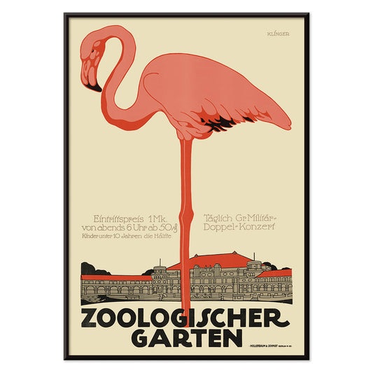
Zoologischer Garten Plakat
Julius Klinger · 1910 · Elegant flamingo plakat med jugendstiltypografi og luftig arkitektonisk ramme
Plakat fra 69 kr · Indrammet fra 122,67 kr
Normalpris Fra 46,00 krNormalpris -
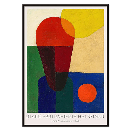
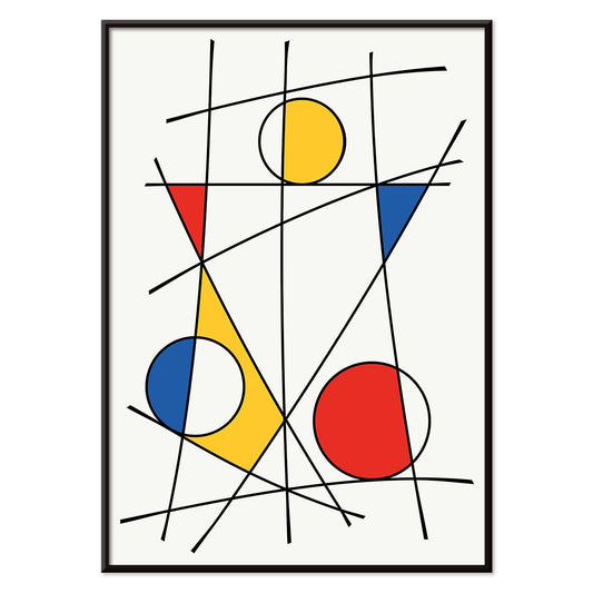
Stærkt abstraheret halvfigur Plakat
Franz Wilhelm Seiwert · 1920 · Geometrisk halvfigur kunsttryk med markante primærfarveblokke og klart modernistisk rytme
Plakat fra 69 kr · Indrammet fra 122,67 kr
Normalpris Fra 46,00 krNormalpris -
Bauhaus 19 Plakat
MORYARTY · 1923 · Geometrisk Bauhaus plakat med balancerede cirkler og kvadrater i klare primærfarver
Plakat fra 69 kr · Indrammet fra 122,67 kr
Normalpris Fra 46,00 krNormalpris -
Bauhaus Plakat 18
MORYARTY · 1926 · Plakat med geometriske cirkler og bjælker i primærfarver til skarpe modernistiske vægge
Plakat fra 69 kr · Indrammet fra 122,67 kr
Normalpris Fra 46,00 krNormalpris -
Bauhaus 17 Plakat
MORYARTY · Geometrisk Bauhaus plakat med krydsende cirkler og primærfarver på varm beige
Plakat fra 69 kr · Indrammet fra 122,67 kr
Normalpris Fra 46,00 krNormalpris -
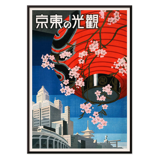
Kom til Tokyo Plakat
Ukendt kunstner · 1930 · Livfuld Tokyo rejseplakat med rød lanterne og kirsebærblomster på dyb blå
Plakat fra 69 kr · Indrammet fra 122,67 kr
Normalpris Fra 46,00 krNormalpris -
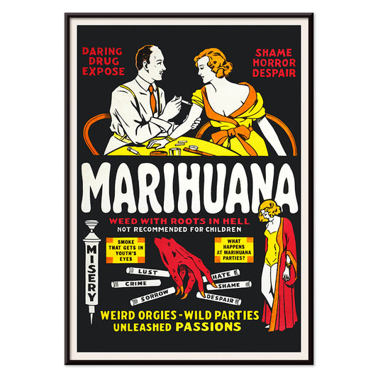
Marihuana Plakat
Ukendt kunstner · 1936 · Sensationel antimarihuana filmplakat med flammende typografi og advarende vignetter
Plakat fra 69 kr · Indrammet fra 122,67 kr
Normalpris Fra 46,00 krNormalpris -
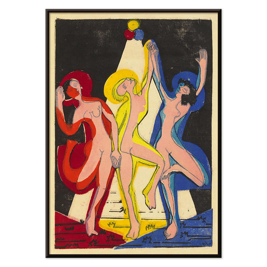
Farvernes dans Plakat
Ernst Ludwig Kirchner · 1933 · Kinetisk ekspressionistisk plakat med kraftige sorte konturer og levende primærfarvefelter
Plakat fra 69 kr · Indrammet fra 122,67 kr
Normalpris Fra 46,00 krNormalpris -
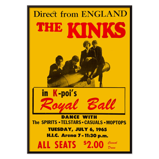
The Kinks i Honolulu Plakat
Ukendt kunstner · 1965 · Markant rød og gul koncertplakat for The Kinks live i Honolulu
Plakat fra 69 kr · Indrammet fra 122,67 kr
Normalpris Fra 46,00 krNormalpris -
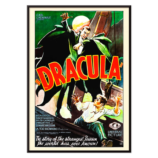
Dracula Plakat
ukendt kunstner · 1931 · dramatisk gyserplakat med truende hætteklædt vampyrsilhuet mod fuldmåne
Plakat fra 69 kr · Indrammet fra 122,67 kr
Normalpris Fra 46,00 krNormalpris -
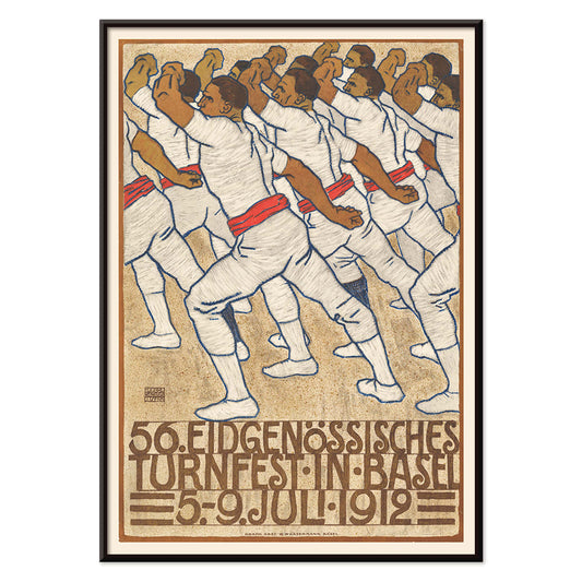
Gymnastikfestival i Basel Plakat
Eduard Renggli · 1912 · Energisk schweizisk gymnastikplakat med markant atletfigur, klare farvefelter og Basel typografi
Plakat fra 69 kr · Indrammet fra 122,67 kr
Normalpris Fra 46,00 krNormalpris -
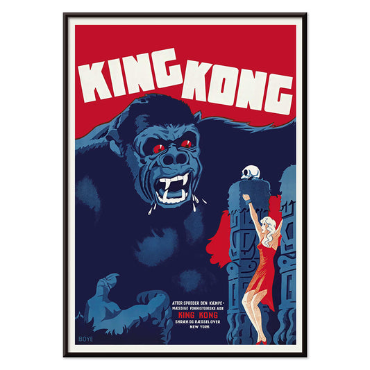
King Kong Plakat
Boye · 1933 · dramatisk King Kong-plakat med gennemtrængende røde øjne og en heltinde i klar rød
Plakat fra 69 kr · Indrammet fra 122,67 kr
Normalpris Fra 46,00 krNormalpris -
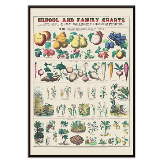
Økonomisk brug af planter Plakat
Marcius Willson · 1865 · Detaljeret botanisk plakat, der kortlægger planters praktiske anvendelser i klare, mærkede vignetter
Plakat fra 69 kr · Indrammet fra 122,67 kr
Normalpris Fra 46,00 krNormalpris -
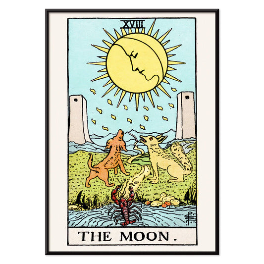
Månen Plakat
Rider Waite · 1910 · mystisk måne tarotplakat med to hunde, snoet sti og drømmende natpalet
Plakat fra 69 kr · Indrammet fra 122,67 kr
Normalpris Fra 46,00 krNormalpris -
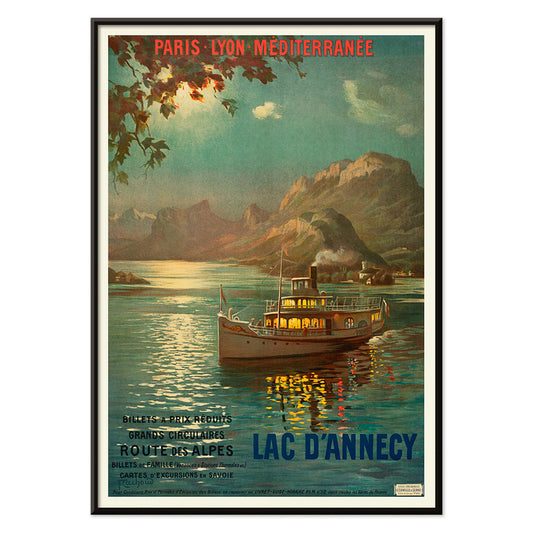
Lac d’Annecy 2 Plakat
François-Charles Cachoud · 1902 · rolig søplakat med en ensom båd og bløde alpine skumringsnuancer
Plakat fra 69 kr · Indrammet fra 122,67 kr
Normalpris Fra 46,00 krNormalpris -
Elskerne Plakat
Rider Waite · 1910 · Ikonisk vintage tryk af en engel, der velsigner elskende under symbolske træer
Plakat fra 69 kr · Indrammet fra 122,67 kr
Normalpris Fra 46,00 krNormalpris -
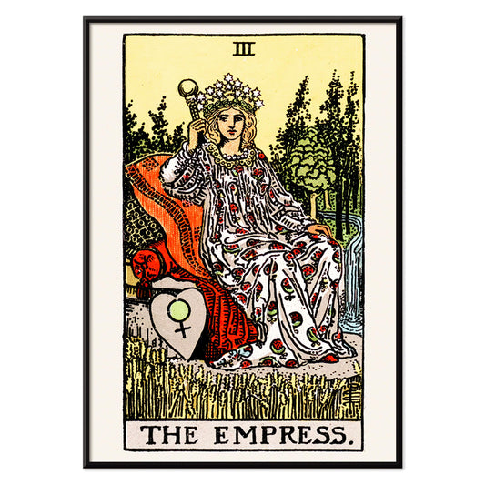
Kejserinden Tarotplakat
Rider Waite · 1910 · Symbolsk Kejserinden tarotplakat med stjernekronen, kornmarker og Venusskjold i varme farvetoner
Plakat fra 69 kr · Indrammet fra 122,67 kr
Normalpris Fra 46,00 krNormalpris -
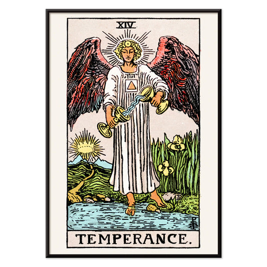
Mådehold Plakat
Rider Waite · 1910 · Ikonisk mådehold tarotplakat med en engel, der hælder vand mellem to bægre
Plakat fra 69 kr · Indrammet fra 122,67 kr
Normalpris Fra 46,00 krNormalpris -
Den hængte mand Plakat
Rider Waite · 1910 · Symbolsk Den hængte mand tarotplakat med rolig blå himmel og strålende glorie
Plakat fra 69 kr · Indrammet fra 122,67 kr
Normalpris Fra 46,00 krNormalpris -
Tarot - Skæbnens hjul Plakat
Rider Waite · 1910 · Mystisk tarotplakat med gyldent hjul, sfinks og vingede hjørnefigurer i symbolsk komposition
Plakat fra 69 kr · Indrammet fra 122,67 kr
Normalpris Fra 46,00 krNormalpris -
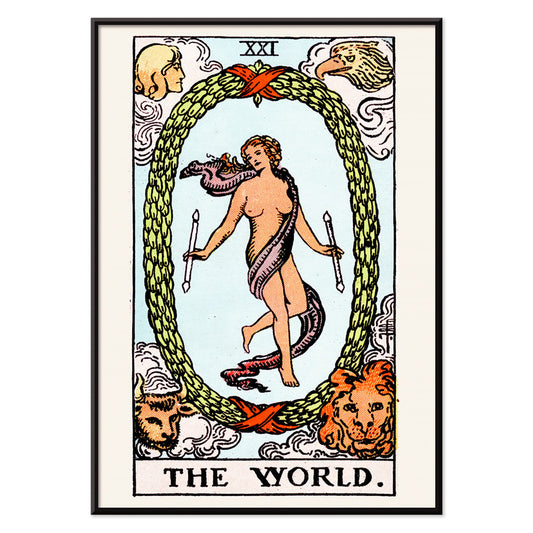
Verden tarotplakat
Rider Waite · 1910 · Mystisk tarotplakat med dansende figur i laurbærkrans og fire vogtere
Plakat fra 69 kr · Indrammet fra 122,67 kr
Normalpris Fra 46,00 krNormalpris -
Tarot - Dommen Plakat
Rider Waite · 1910 · ikonisk Dommen tarotplakat med engel der blæser i trompet og opstigende figurer over blå vand
Plakat fra 69 kr · Indrammet fra 122,67 kr
Normalpris Fra 46,00 krNormalpris -
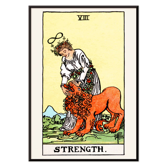
Tarot Styrke Plakat
Rider Waite · 1910 · symbolsk styrke tarotplakat med en rolig ungkvinde og løve under et uendelighedstegn
Plakat fra 69 kr · Indrammet fra 122,67 kr
Normalpris Fra 46,00 krNormalpris -
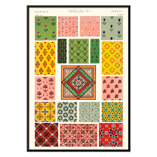
Persisk 1 Plakat
Owen Jones · 1899 · Ornamentalt persisk plakattryk med indflettede blomster, medaljoner og levende juveltoner
Plakat fra 69 kr · Indrammet fra 122,67 kr
Normalpris Fra 46,00 krNormalpris -
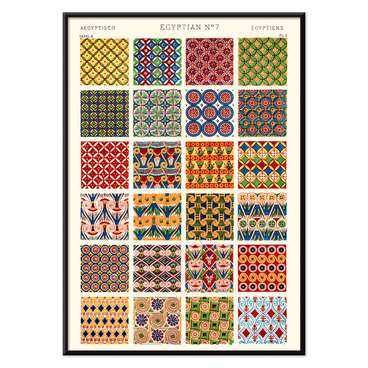
Egyptisk 7 Plakat
Owen Jones · 1899 · Markant egyptisk mønsterplakat med lagdelte geometriske motiver i kraftig rød og blå
Plakat fra 69 kr · Indrammet fra 122,67 kr
Normalpris Fra 46,00 krNormalpris -
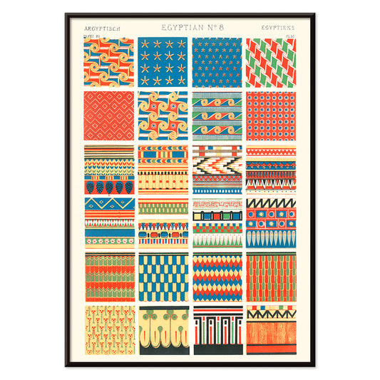
Egyptisk 8 Plakat
Owen Jones · 1899 · Frodig egyptisk mønsterplakat med stiliserede motiver og skarpe geometriske bånd
Plakat fra 69 kr · Indrammet fra 122,67 kr
Normalpris Fra 46,00 krNormalpris -
Japan målkort Plakat
Ernest Dudley Chase · 1942 · Dynamisk anden verdenskrigskortplakat med Japan i centrum, målmotiv og markante kortikoner
Plakat fra 69 kr · Indrammet fra 122,67 kr
Normalpris Fra 46,00 krNormalpris -
Blomstermønster Plakat
Owen Jones · 1912 · Fint blomstermønster plakat i rød og blå på hvid baggrund
Plakat fra 69 kr · Indrammet fra 122,67 kr
Normalpris Fra 46,00 krNormalpris -
Rødt blomstermønster plakat
Owen Jones · 1912 · Ornamenteret blomsterplakat med hvide blomster og slyngende vinranker på dybrød
Plakat fra 69 kr · Indrammet fra 122,67 kr
Normalpris Fra 46,00 krNormalpris -
Stilleben med blomster og skål Plakat
Oskar Moll · 1902 · farverigt stillebentryk med fyldig buket og en rolig skål i fokus
Plakat fra 69 kr · Indrammet fra 122,67 kr
Normalpris Fra 46,00 krNormalpris -
Opfyldelse Plakat
Gustav Klimt · 1910 · ornamentalt omfavnelse kunsttryk med mosaikagtige gyldne mønstre og nænsom symbolsk intimitet
Plakat fra 69 kr · Indrammet fra 122,67 kr
Normalpris Fra 46,00 krNormalpris -
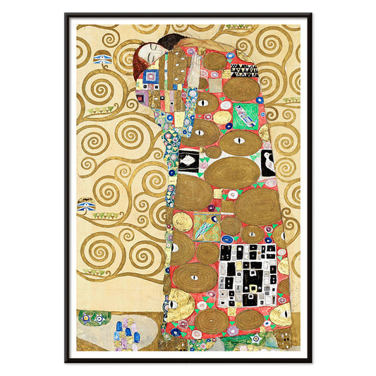
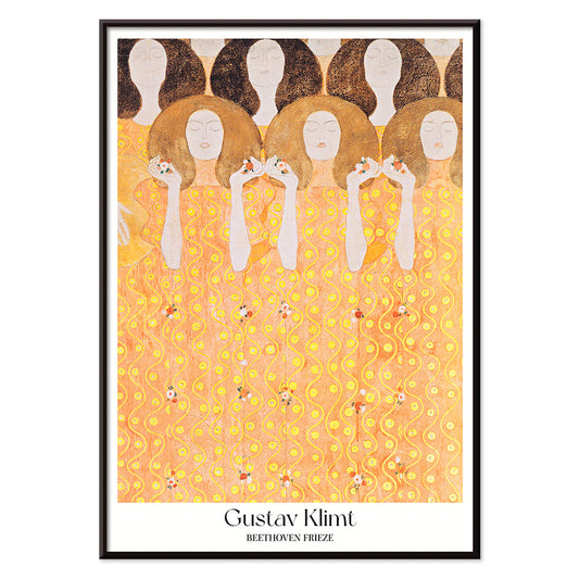
Beethovenfrisen Plakat
Gustav Klimt · 1919 · Ornamentalt plakatmotiv med figurgrupper i strålende guld og varme røde accenter
Plakat fra 69 kr · Indrammet fra 122,67 kr
Normalpris Fra 46,00 krNormalpris -
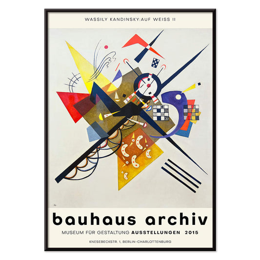
Auf Weiss II Plakat
Wassily Kandinsky · 1923 · Abstrakt geometrisk plakat på hvid baggrund med primærfarver og skarpe sorte linjer
Plakat fra 69 kr · Indrammet fra 122,67 kr
Normalpris Fra 46,00 krNormalpris -
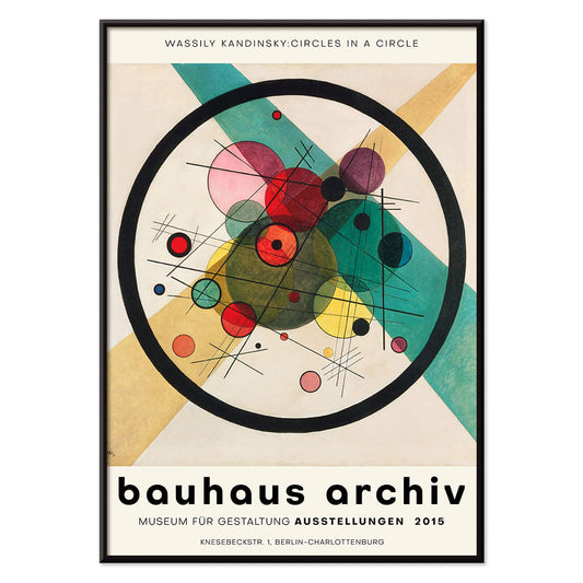
Cirkler i en cirkel Plakat
Wassily Kandinsky · 1923 · Strålende abstrakt plakat med lagdelte cirkler svævende på dyb sort baggrund
Plakat fra 69 kr · Indrammet fra 122,67 kr
Normalpris Fra 46,00 krNormalpris -
Tung Rød Plakat
Wassily Kandinsky · 1924 · Dynamisk abstrakt plakat centreret om en tung rød blok med skarpe geometriske accenter
Plakat fra 69 kr · Indrammet fra 122,67 kr
Normalpris Fra 46,00 krNormalpris -
Transmission Plakat
Wassily Kandinsky · 1935 · abstrakt geometrisk plakat med legende cirkler, linjer og farveaccents på varm baggrund
Plakat fra 69 kr · Indrammet fra 122,67 kr
Normalpris Fra 46,00 krNormalpris -
Orange Plakat
Wassily Kandinsky · 1923 · Geometrisk orange plakat med cirkler og skarpe linjer på luftig hvid bund
Plakat fra 69 kr · Indrammet fra 122,67 kr
Normalpris Fra 46,00 krNormalpris -
Lyskreds Plakat
Wassily Kandinsky · 1922 · Geometrisk abstrakt plakat med lysende cirkler og skarpe vinkler på mørk bund
Plakat fra 69 kr · Indrammet fra 122,67 kr
Normalpris Fra 46,00 krNormalpris -
Bleu de Ciel Plakat
Wassily Kandinsky · 1925 · Luftigt abstrakt kunsttryk med flydende former på himmelblå bund med klare accenter
Plakat fra 69 kr · Indrammet fra 122,67 kr
Normalpris Fra 46,00 krNormalpris -
Byzantinsk 3 Plakat
Owen Jones · 1899 · byzantinsk geometrisk mønster plakat med klar symmetri og stærke historiske farver
Plakat fra 69 kr · Indrammet fra 122,67 kr
Normalpris Fra 46,00 krNormalpris -
Persisk 2 Plakat
Owen Jones · 1899 · Persiskinspireret geometrisk mønsterplakat i varme røde, grønne og beige toner
Plakat fra 69 kr · Indrammet fra 122,67 kr
Normalpris Fra 46,00 krNormalpris -
Rosa blomstermønster Plakat
Owen Jones · 1897 · Dekorativ blomsterplakat med gentagne rosa rosetter og stiliserede blade i skarp symmetri
Plakat fra 69 kr · Indrammet fra 122,67 kr
Normalpris Fra 46,00 krNormalpris -
Kinesisk botanisk illustration Plakat
Owen Jones · 1897 · Dekorativ kinesisk botanisk tryk med stiliserede blomster og balanceret ornamentalsymmetri
Plakat fra 69 kr · Indrammet fra 122,67 kr
Normalpris Fra 46,00 krNormalpris -
Shakyamuni Buddha Plakat
ukendt kunstner · 535 · narrativt buddhistisk kunsttryk med Shakyamuni Buddha i centrum blandt levende hengivne scener
Plakat fra 69 kr · Indrammet fra 122,67 kr
Normalpris Fra 46,00 krNormalpris -
Geometriske linjer og farver 3 Plakat
MORYARTY · 2017 · Bauhausinspireret geometrisk plakat med skarpe sorte linjer og blokke i primærfarver
Plakat fra 69 kr · Indrammet fra 122,67 kr
Normalpris Fra 46,00 krNormalpris -
Geometriske linjer og farver 2 Plakat
MORYARTY · 2018 · Dynamisk geometrisk plakat med krydsende sorte linjer og markante primære former på hvid
Plakat fra 69 kr · Indrammet fra 122,67 kr
Normalpris Fra 46,00 krNormalpris -
Geometriske linjer og farver 1 Plakat
MORYARTY · 1920 · Bauhausinspireret abstrakt plakat med krydsende sorte linjer og blokke i rød, blå og gul
Plakat fra 69 kr · Indrammet fra 122,67 kr
Normalpris Fra 46,00 krNormalpris -
Bauhaus 16 Plakat
MORYARTY · 1923 · Geometrisk Bauhaus plakat med primære cirkler og markante sorte linjer på ren hvid
Plakat fra 69 kr · Indrammet fra 122,67 kr
Normalpris Fra 46,00 krNormalpris -
Bauhaus 15 Plakat
MORYARTY · 1926 · Geometrisk Bauhaus plakat med afbalancerede cirkler og kraftige farveblokke på ren hvid baggrund
Plakat fra 69 kr · Indrammet fra 122,67 kr
Normalpris Fra 46,00 krNormalpris -
Redlands Bicycle Classic Plakat
Karlis Smiltens · 1991 · Dynamisk cykelplakat med kraftige røde, blå og grønne ryttere i bevægelse
Plakat fra 69 kr · Indrammet fra 122,67 kr
Normalpris Fra 46,00 krNormalpris -
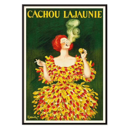
Cachou Lajaunie Plakat
Leonetto Cappiello · 1920 · Ikonisk fransk reklameplakat med en kvinde i rød dragt og hvirvlende gul røg
Plakat fra 69 kr · Indrammet fra 122,67 kr
Normalpris Fra 46,00 krNormalpris -
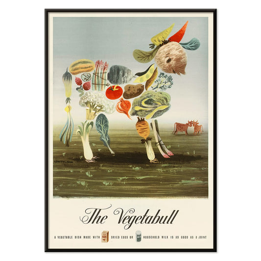
Grøntsagsokse Plakat
Lewitt-Him · 1933 · legesyg grøntsagsokse plakat med markedsstemning, kraftfulde grafiske former og varme farver
Plakat fra 69 kr · Indrammet fra 122,67 kr
Normalpris Fra 46,00 krNormalpris -
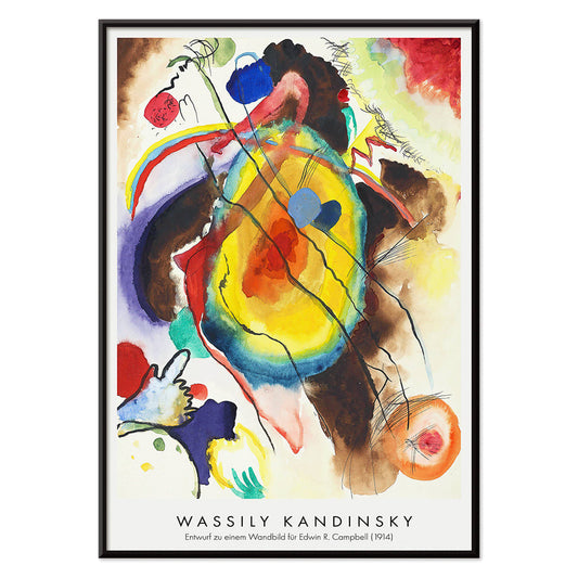
Vægmaleridesign Plakat
Wassily Kandinsky · 1914 · Energisk abstrakt plakat med geometriske former og rytmiske linjer i klare primærtoner
Plakat fra 69 kr · Indrammet fra 122,67 kr
Normalpris Fra 46,00 krNormalpris -
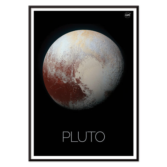
Pluto Plakat
NASA · 1994 · Minimal Pluto plakat med tekstureret planetdisk på dyb sort baggrund
Plakat fra 69 kr · Indrammet fra 122,67 kr
Normalpris Fra 46,00 krNormalpris -
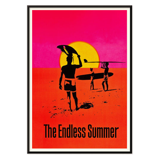
Den endeløse sommer Plakat
Ukendt kunstner · 1966 · Ikonisk surfplakat med sorte surfersilhuetter der krydser en glødende solcirkel
Plakat fra 69 kr · Indrammet fra 122,67 kr
Normalpris Fra 46,00 krNormalpris -
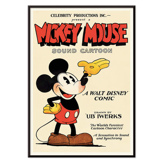
Mickey Mouse Plakat
Ukendt kunstner · 1928 · Munter Mickey Mouse plakat med markante sorte konturer og vintage animationsstil
Plakat fra 69 kr · Indrammet fra 122,67 kr
Normalpris Fra 46,00 krNormalpris


72/772 items
- Prunus avium Plakat
- Flere farvede stjerner Plakat
- Colorations variées de la Lune Plakat
- Le Floral Plakat
- Tropiske blomster II Plakat
- Huile Lesieur Plakat
- Tidligt efterår i Urayasu Plakat
- Ukiyo-e Havnesolnedgang Plakat
- Morgen ved Kap Inubō Plakat
- Daggry over Yamanaka-sø Plakat
- Blomstermarked Barcelona Plakat
- British Overseas Airways Plakat
- The New Yorker 1935 Plakat
- Petit Mentor Plakat
- Silicon Valley Kort Plakat
- Zoologischer Garten Plakat
- Stærkt abstraheret halvfigur Plakat
- Bauhaus 19 Plakat
- Bauhaus Plakat 18
- Bauhaus 17 Plakat
- Marihuana Plakat
- Farvernes dans Plakat
- The Kinks i Honolulu Plakat
- Dracula Plakat
- King Kong Plakat
- Månen Plakat
- Verden tarotplakat
- Japan målkort Plakat
- Beethovenfrisen Plakat
- Auf Weiss II Plakat
- Cirkler i en cirkel Plakat
- Tung Rød Plakat
- Transmission Plakat
- Orange Plakat
- Lyskreds Plakat
- Bleu de Ciel Plakat
- Bauhaus 16 Plakat
- Bauhaus 15 Plakat
- Redlands Bicycle Classic Plakat
- Cachou Lajaunie Plakat
- Grøntsagsokse Plakat
- Vægmaleridesign Plakat
- Den endeløse sommer Plakat
- Mickey Mouse Plakat
Red, the most intentional accent
In the Red collection, color operates less as a subject than as a signal: a poppy stamp, a lacquered headline, a warm blush on paper. These posters move between illustration, modernism, travel graphics, and diagrammatic prints, yet each relies on red to steer attention. Vermilion against cream, brick against graphite, or a single scarlet form in calm space can change how a room reads. As wall art, red behaves like seasoning in home decor: a small accent energizes a gallery wall, while a larger field establishes a focal point and a sense of direction in decoration.
Craft, pigment, and the art of persuasion
Red has carried technical and cultural weight across print history. Early dyes and pigments such as cochineal and madder informed textiles and the decorative arts, while lithography made bold red lettering and flat color fields central to public visual culture. William Morris’s Strawberry Thief (1883) by William Morris uses red as a structural note inside the repeat, keeping birds and fruit in rhythmic tension. In Hygieia (1907) by Gustav Klimt, the robe reads as both emblem and warning, with crimson acting like a boundary around the figure. Wassily Kandinsky’s Heavy Red (1924) by Wassily Kandinsky shows red as mass, a plane that pushes adjacent shapes into motion and makes geometry feel physical.
Where red posters live best
Red accents settle most naturally alongside honest materials: walnut, terracotta, brass, linen, and worn stone. In kitchens and dining corners, fruit studies and plant imagery echo table colors and ceramics, which makes Botanical prints an easy companion to red-led decoration. In hallways and entryways, one bold red element helps pull the eye through a narrow space; the graphic logic of Advertising works well with mirrors, coat hooks, and darker floorboards. For bedrooms, keep red smaller and warmer, leaning toward brick or rose rather than primary scarlet, and balance it with pale bedding and low, amber light. If the room opens onto greenery, red becomes a clear counterpoint; quieter scenes from Landscape help keep the palette grounded.
Pairing, framing, and building a gallery wall
To keep red from dominating, treat it as one voice within a measured palette. A white mount gives red air, while a slim black frame sharpens saturated areas and echoes the discipline of Black & White imagery. For structured pairings, place a red-led poster beside geometric work from Bauhaus, where red often appears as a controlled block rather than a flourish. For a more theatrical register, Leonetto Cappiello’s Cachou Lajaunie (1920) by Leonetto Cappiello plays like streetlight against deep wood tones and muted walls. When arranging a gallery wall, repeat red twice, once as a larger area and once as a small accent, so the eye has a clear path between prints.
A closing thought on red
Red is also a useful clue for reading images: in travel graphics it signals heat, nightlife, and appetite; in modernist composition it marks the point where wandering attention snaps into focus. That is why this selection can jump from pattern to symbolist figure to hard-edged abstraction without losing coherence. Leave breathing space around the loudest red field, and let neighboring prints carry quieter tones such as sand, ink, and sea-glass green. Used this way, red becomes rhythm rather than noise, and decoration starts to feel intentional without becoming strict.