


- Dansende par i sneen Plakat
- Jødedom og hedenskab, standpunkt Plakat
- Jet Clipper til Hawaii Plakat
- Campari Soda Plakat
- Bec-Kina Plakat
- Kohler Chocolat Plakat
- Eiffeltårnet 2 Plakat
- Mahatmaernes nuværende standpunkt Plakat
- Tusmørkets Ring Plakat
- Riley Blaze Plakat
- Almanaque Plakat
- Bauhaus 20 Plakat
- The Jefferson Airplane Plakat
- Snoopy Come Home Plakat
- Til London med Jet Clipper plakat
- Kyushu-Okinawa Plakat
- La Paresse Plakat
- Balsam Aperitif Plakat
- Crans-sur-Sierre Plakat
- Monte Carlo Plakat
- Pacific Vibrations Plakat
- Continental Hawaii Airline Plakat
- Sherlock Holmes Plakat
- Øl og cigaret Plakat
- Mexicos vestkyst Plakat
- Rita Gaufres Plakat
- Den store bølge ved Kanagawa Plakat
- Cordial Campari Plakat
- Solaris Plakat
- Blow Up plakat
- Hibiscus Plakat
- Campanile di Pisa Plakat
- Røde læber plakat
- Gynge ind i bøger plakat
- Mexicansk kunst og liv 4 Plakat
- Bauhausudstillingsplakat
-
Zodiakens tegn Plakat
Asa Smith · 1850 · Detaljeret zodiakdiagramtryk med stjernebilleder og præcis victoriansk stregføring
Plakat fra 69 kr · Indrammet fra 122,67 kr
Normalpris Fra 46,00 krNormalpris -
Redlands Bicycle Classic Plakat
Karlis Smiltens · 1991 · Dynamisk cykelplakat med kraftige røde, blå og grønne ryttere i bevægelse
Plakat fra 69 kr · Indrammet fra 122,67 kr
Normalpris Fra 46,00 krNormalpris -
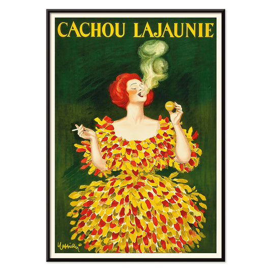
Cachou Lajaunie Plakat
Leonetto Cappiello · 1920 · Ikonisk fransk reklameplakat med en kvinde i rød dragt og hvirvlende gul røg
Plakat fra 69 kr · Indrammet fra 122,67 kr
Normalpris Fra 46,00 krNormalpris -
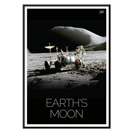
Mand på Månen 1 Plakat
NASA · 1969 · Historisk månetryk med astronaut og rover under en dyb sort himmel
Plakat fra 69 kr · Indrammet fra 122,67 kr
Normalpris Fra 46,00 krNormalpris -
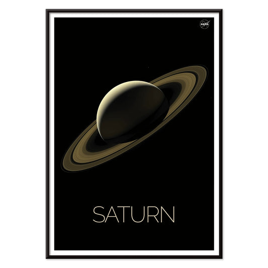
Saturn Plakat
NASA · 2018 · strømlinet saturn plakat med lysende ringe over et dybt sort stjernebillede og ro
Plakat fra 69 kr · Indrammet fra 122,67 kr
Normalpris Fra 46,00 krNormalpris -
Enhver person med en idé Plakat
Ken White · 1974 · konceptuel plakat med sommerfugle omkring en lysende glødepære i kraftigt gul og sort
Plakat fra 69 kr · Indrammet fra 122,67 kr
Normalpris Fra 46,00 krNormalpris -
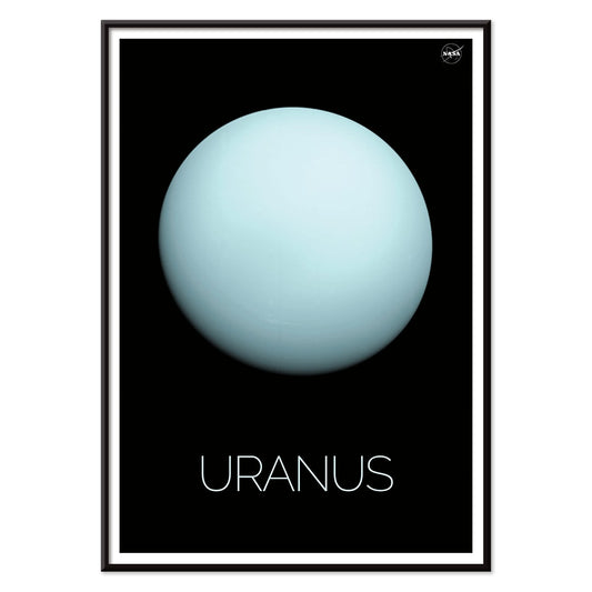
Uranus Plakat
NASA · 1986 · Minimalistisk Uranus plakat med sart blå planet mod dyb sort rum
Plakat fra 69 kr · Indrammet fra 122,67 kr
Normalpris Fra 46,00 krNormalpris -
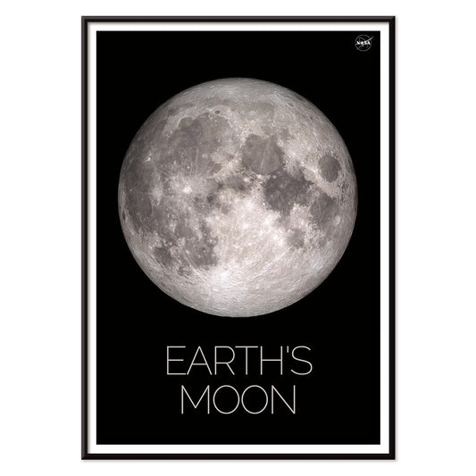
Måne Plakat
NASA · 1969 · skarp måneplakat i sort-hvid med høje kontraster og markante kratere
Plakat fra 69 kr · Indrammet fra 122,67 kr
Normalpris Fra 46,00 krNormalpris -
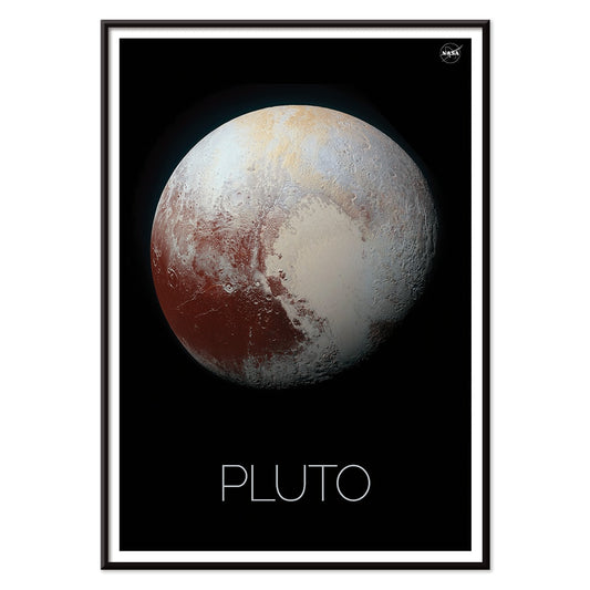
Pluto Plakat
NASA · 1994 · Minimal Pluto plakat med tekstureret planetdisk på dyb sort baggrund
Plakat fra 69 kr · Indrammet fra 122,67 kr
Normalpris Fra 46,00 krNormalpris -
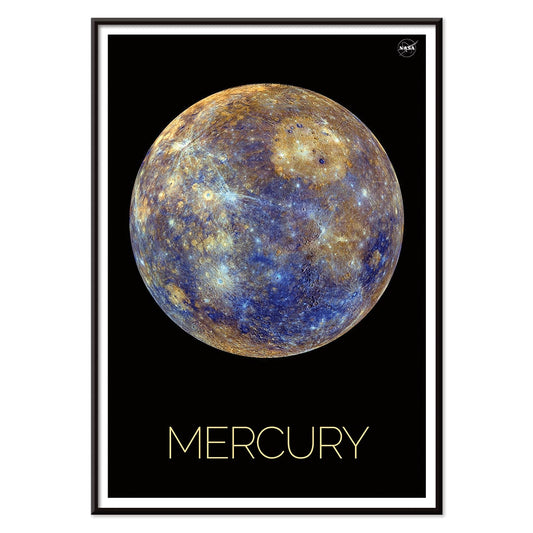
Merkur Plakat
NASA · 1979 · Robust kratret Merkurplakat med dyb sort baggrund og varme okkertoner
Plakat fra 69 kr · Indrammet fra 122,67 kr
Normalpris Fra 46,00 krNormalpris -
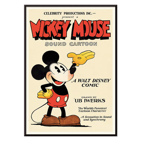
Mickey Mouse Plakat
Ukendt kunstner · 1928 · Munter Mickey Mouse plakat med markante sorte konturer og vintage animationsstil
Plakat fra 69 kr · Indrammet fra 122,67 kr
Normalpris Fra 46,00 krNormalpris -
Ben-Hur Plakat
Ukendt kunstner · 1959 · dramatiske Ben-Hur plakat der fanger det legendariske vognløb i episk stil
Plakat fra 69 kr · Indrammet fra 122,67 kr
Normalpris Fra 46,00 krNormalpris -
Jorden fra rummet 2 Plakat
NASA · 1990 · Fængslende plakat med jordens blå oceaner og hvirvlende hvide skyer
Plakat fra 69 kr · Indrammet fra 122,67 kr
Normalpris Fra 46,00 krNormalpris -
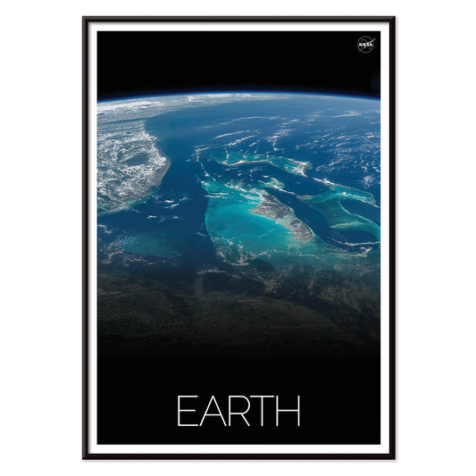
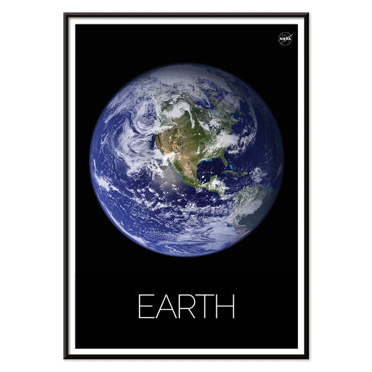
Jorden fra rummet 1 Plakat
NASA · 1969 · Ikonisk Jorden fra rummet plakat med hvirvlende hvide skyer over dybblå oceaner
Plakat fra 69 kr · Indrammet fra 122,67 kr
Normalpris Fra 46,00 krNormalpris -
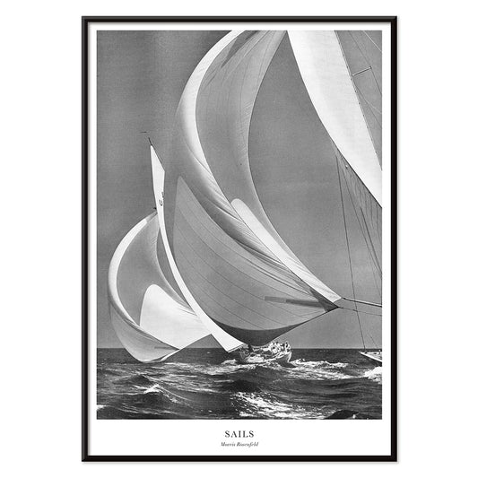
Sejl Plakat
Morris Rosenfeld · 1946 · Højkontrast sejlplakat med klyngede yachtsejl og frisk, saltet havbris og tydelig bevægelse
Plakat fra 69 kr · Indrammet fra 122,67 kr
Normalpris Fra 46,00 krNormalpris -
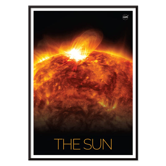
Solen 1 Plakat
NASA · 2019 · Intens soludbrudsplakat der fanger solens urolige overflade mod det dybe rum
Plakat fra 69 kr · Indrammet fra 122,67 kr
Normalpris Fra 46,00 krNormalpris -
Solsurfing Plakat
NASA · 1979 · Geometrisk rumplakat med rumfartøj på solbuer i varme energiske soltoner
Plakat fra 69 kr · Indrammet fra 122,67 kr
Normalpris Fra 46,00 krNormalpris -
Den ristede planet Plakat
NASA · 2021 · dramatisk exoplanet plakat med en forkullet planet der gløder ved en fjern stjerne
Plakat fra 69 kr · Indrammet fra 122,67 kr
Normalpris Fra 46,00 krNormalpris -
Jorden 1 Plakat
NASA · 1972 · Stærk satellitplakat med sneklædte bjergkamme, dyb blå atmosfære og rumfornemmelse
Plakat fra 69 kr · Indrammet fra 122,67 kr
Normalpris Fra 46,00 krNormalpris -
Graveurs français Plakat
Ukendt kunstner · 1785 · Sanselig vintage tryk af en kvinde der læser ved vinduet i bløde toner
Plakat fra 69 kr · Indrammet fra 122,67 kr
Normalpris Fra 46,00 krNormalpris -
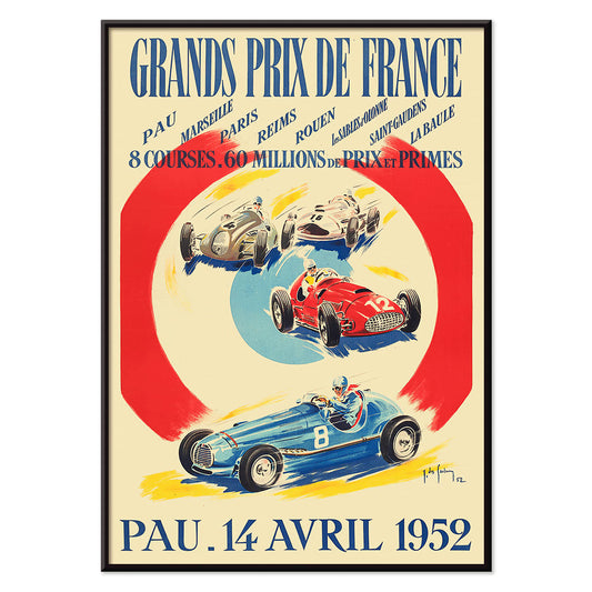
Grands Prix de France Plakat
Jean Des Gachons · 1952 · dynamisk racplakat med hurtige biler og banelister i markante 1950'er farver
Plakat fra 69 kr · Indrammet fra 122,67 kr
Normalpris Fra 46,00 krNormalpris -
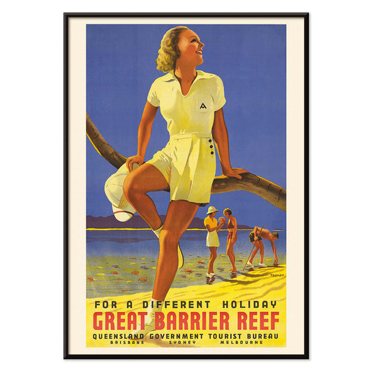
Kvinde siddende på en gren Plakat
Percival Albert Trompf · 1939 · Solbeskinnet rejseplakat med en kvinde i rød badedragt over blåt hav
Plakat fra 69 kr · Indrammet fra 122,67 kr
Normalpris Fra 46,00 krNormalpris -
Amsterdam minimalistisk kort Plakat
MORYARTY · 2020 · Blå og hvid Amsterdam kortplakat med klare kanalstreger og luftig minimalisme
Plakat fra 69 kr · Indrammet fra 122,67 kr
Normalpris Fra 46,00 krNormalpris -
Hong Kong minimalistisk kort Plakat
MORYARTY · 2017 · Minimalistisk Hong Kong kortplakat med fine gadelinjer og en rolig silhuet af skylinen
Plakat fra 69 kr · Indrammet fra 122,67 kr
Normalpris Fra 46,00 krNormalpris -
Cordoba minimalistisk kort Plakat
MORYARTY · 2020 · Minimalistisk Cordoba bykortplakat med blå og hvide toner og arkitektonisk skyline
Plakat fra 69 kr · Indrammet fra 122,67 kr
Normalpris Fra 46,00 krNormalpris -
New York minimalistisk kort Plakat
MORYARTY · 2018 · Minimalistisk New York kortplakat i klar blå med hvidt gadenet
Plakat fra 69 kr · Indrammet fra 122,67 kr
Normalpris Fra 46,00 krNormalpris -
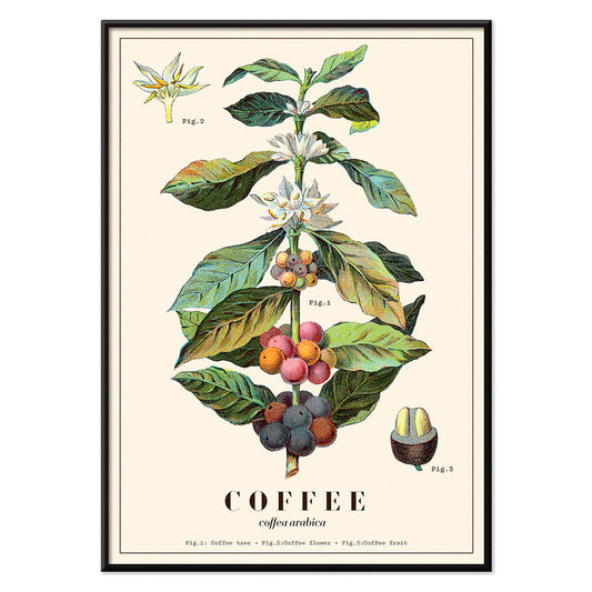
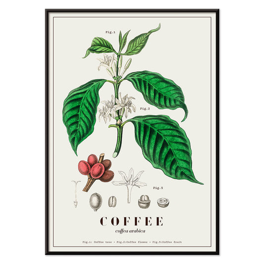
Coffea arabica 3 Plakat
Davis, Sacker & Perkins · 1870 · Detaljeret Coffea arabica botanisk tryk med blomster, blade og modnende bær
Plakat fra 69 kr · Indrammet fra 122,67 kr
Normalpris Fra 46,00 krNormalpris -
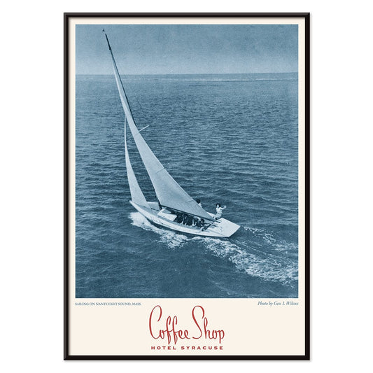
Kaffebar Syracuse Plakat
Ukendt kunstner · 2015 · blå sejlskibsplakat med roligt vand og markant Kaffebar Syracuse typografi
Plakat fra 69 kr · Indrammet fra 122,67 kr
Normalpris Fra 46,00 krNormalpris -
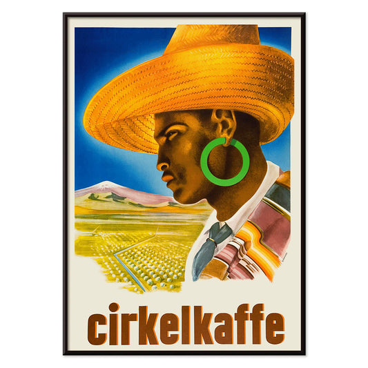
Cirkelkaffe Plakat
J. Olséns · 1945 · grafisk kaffeplakat med figur i bredskygget hat foran grønt landskab
Plakat fra 69 kr · Indrammet fra 122,67 kr
Normalpris Fra 46,00 krNormalpris -
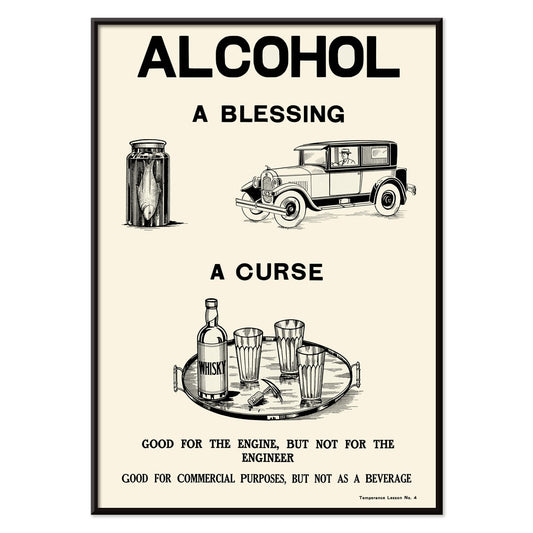
Afholdenhed mod alkohol 1912 Plakat
Dominion Scientific Temperance Committee · 1912 · Kraftfuld afholdsplakat med kontrast mellem moderne liv og flaske i skarp monokrom
Plakat fra 69 kr · Indrammet fra 122,67 kr
Normalpris Fra 46,00 krNormalpris -
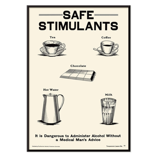
Afholdsbevægelse 2 Plakat
Dominion Scientific Temperance Committee · 1912 · undervisende afholdsplakat der viser te og kaffe som sikre daglige stimulanser
Plakat fra 69 kr · Indrammet fra 122,67 kr
Normalpris Fra 46,00 krNormalpris -
Coffea arabica Plakat
John Stephenson · 1836 · Detaljeret botanisk tryk af kaffetræ med hvide blomster og modne røde bær
Plakat fra 69 kr · Indrammet fra 122,67 kr
Normalpris Fra 46,00 krNormalpris -
Coffea Arabica 2 Plakat
Davis, Sacker & Perkins · 1885 · frodigt botanisk tryk af kaffeplanten med hvide blomster og modnende røde bær
Plakat fra 69 kr · Indrammet fra 122,67 kr
Normalpris Fra 46,00 krNormalpris -
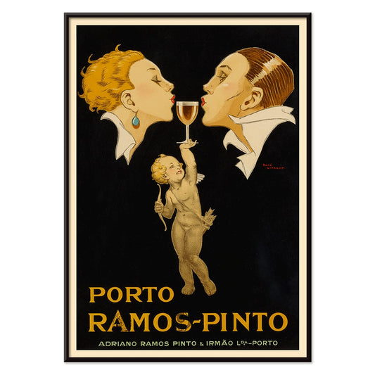
Porto Ramos-Pinto Plakat
René Vincent · 1925 · Art Deco plakat med et par der er ved at kysse mens en putto rækker et glas portvin
Plakat fra 69 kr · Indrammet fra 122,67 kr
Normalpris Fra 46,00 krNormalpris -
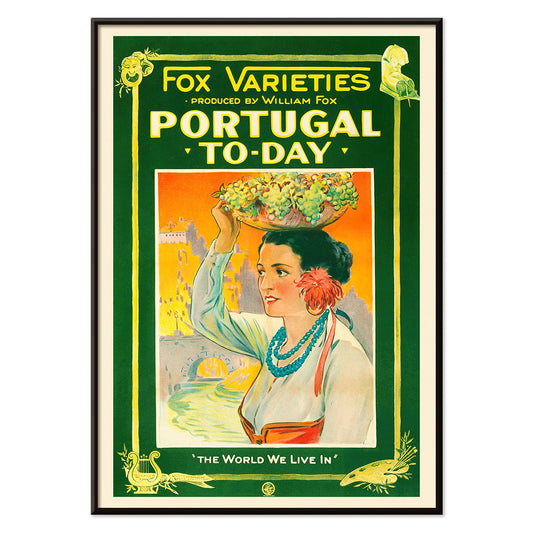
Portugal i dag Plakat
Ukendt kunstner · 1927 · Farverig Portugal i dag rejseplakat med kvinde i folkedragt og fyldt frugtkurv
Plakat fra 69 kr · Indrammet fra 122,67 kr
Normalpris Fra 46,00 krNormalpris -
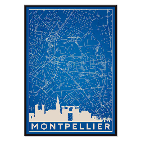
Minimalistisk Montpellier-kort Plakat
MORYARTY · 2018 · Minimalistisk blåhvid Montpellier kortplakat med klare linjer og luftig negativt rum
Plakat fra 69 kr · Indrammet fra 122,67 kr
Normalpris Fra 46,00 krNormalpris -
Minimalistisk Toulouse plakat
MORYARTY · 2022 · Minimalistisk blåhvid Toulouse plakat i kølige toner med skyline-silhuetter og præcis gadegeometri
Plakat fra 69 kr · Indrammet fra 122,67 kr
Normalpris Fra 46,00 krNormalpris -
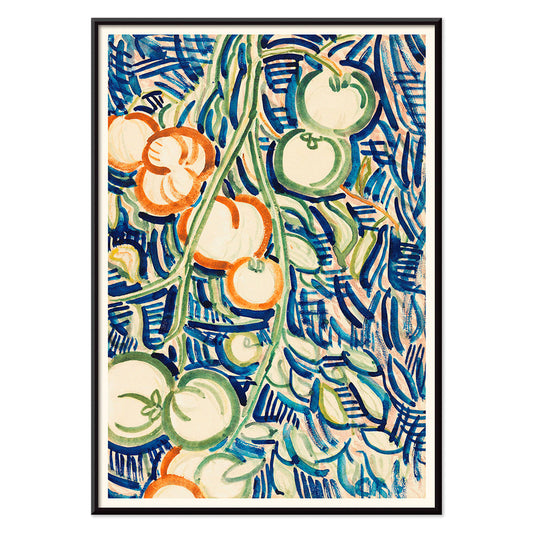
Røde og grønne tomater Plakat
Christian Rohlfs · 1906 · Udtryksfuldt stilleben kunsttryk af røde og grønne tomater med moderne farvespænding
Plakat fra 69 kr · Indrammet fra 122,67 kr
Normalpris Fra 46,00 krNormalpris -
Minimalistisk Pariskort Plakat
MORYARTY · 2018 · Minimalistisk Pariskort plakat med klare blå linjer og diskret Eiffeltårnssymbol
Plakat fra 69 kr · Indrammet fra 122,67 kr
Normalpris Fra 46,00 krNormalpris -
Minimalistisk Valencia Plakat
MORYARTY · 2021 · Minimalistisk blå og hvid Valencia kortplakat med præcise gadelinjer og bysilhuet
Plakat fra 69 kr · Indrammet fra 122,67 kr
Normalpris Fra 46,00 krNormalpris -
Minimalistisk Madrid-kort plakat
MORYARTY · 2018 · Minimalistisk Madrid-kort plakat med klare blå og hvide linjer i moderne interiører
Plakat fra 69 kr · Indrammet fra 122,67 kr
Normalpris Fra 46,00 krNormalpris -
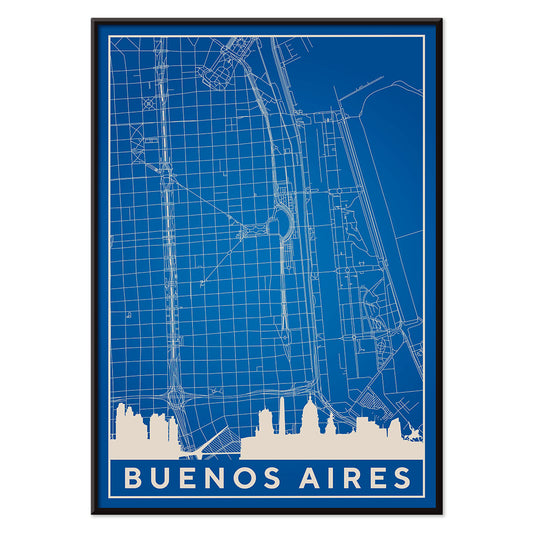
Minimalistisk Buenos Aires kort Plakat
MORYARTY · 2019 · Minimalistisk Buenos Aires plakat med skarpe hvide gader på dyb blå baggrund
Plakat fra 69 kr · Indrammet fra 122,67 kr
Normalpris Fra 46,00 krNormalpris -
Minimalistisk São Paulo kort Plakat
MORYARTY · 2021 · Minimalistisk blåhvid São Paulo kortplakat med klare linjer og roligt negativrum
Plakat fra 69 kr · Indrammet fra 122,67 kr
Normalpris Fra 46,00 krNormalpris -
Minimalistisk Rio de Janeiro Plakat
MORYARTY · 2021 · Minimalistisk Rio de Janeiro plakat med indviklet gadenet og markant blå bysilhuet
Plakat fra 69 kr · Indrammet fra 122,67 kr
Normalpris Fra 46,00 krNormalpris -
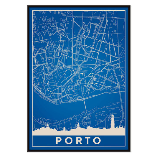
Minimalistisk Porto Plakat
MORYARTY · 2018 · Minimalistisk Porto plakat med rene hvide gadelinjer på dyb blå baggrund
Plakat fra 69 kr · Indrammet fra 122,67 kr
Normalpris Fra 46,00 krNormalpris -
Minimalistisk Lissabonkort Plakat
MORYARTY · 2018 · Minimalistisk Lissabonkort i blå og hvid med rolig arkitektonisk silhuet
Plakat fra 69 kr · Indrammet fra 122,67 kr
Normalpris Fra 46,00 krNormalpris -
Minimalistisk Londonkort Plakat
Ukendt kunstner · 2018 · Minimalistisk Londonkort plakat i klare blå og hvide toner med markører ved vartegn
Plakat fra 69 kr · Indrammet fra 122,67 kr
Normalpris Fra 46,00 krNormalpris -
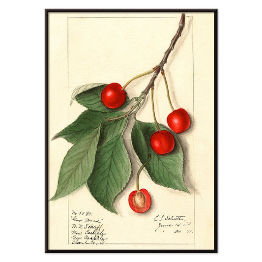
Governor Wood Plakat
Ellen Isham Schutt · 1911 · Naturtro kirsebærkunsttryk med blanke røde frugter og klare grønne blade
Plakat fra 69 kr · Indrammet fra 122,67 kr
Normalpris Fra 46,00 krNormalpris -
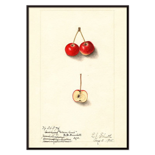
Kirsebærkrabæble Plakat
Ellen Isham Schutt · 1905 · Fin botanisk akvarel med krabæbler i rubinrødt og sprøde grønne blade på hvid bund
Plakat fra 69 kr · Indrammet fra 122,67 kr
Normalpris Fra 46,00 krNormalpris -
Yachigusa Pl.06 Plakat
Seikō Ueno · 1902 · Virvlende orange kimonomønster i vintage tryk med rytmiske kurver og klar negativ plads
Plakat fra 69 kr · Indrammet fra 122,67 kr
Normalpris Fra 46,00 krNormalpris -
Yachigusa Pl.23 Plakat
Seikō Ueno · 1902 · Vovet vintage tryk i rød med hvide traner i let glidende mønster
Plakat fra 69 kr · Indrammet fra 122,67 kr
Normalpris Fra 46,00 krNormalpris -
Eksotiske sommerfugle Pl.093 Plakat
Otto Staudinger · 1888 · Detaljeret sommerfugletryk med juveltonede vinger arrangeret som en samlerplade i rige farver
Plakat fra 69 kr · Indrammet fra 122,67 kr
Normalpris Fra 46,00 krNormalpris -
Eksotiske sommerfugle Pl.021 Plakat
Otto Staudinger · 1888 · Detaljeret sommerfugletryk som specimenside med sart naturalistisk farveholdning og tydelig taxonomisk opstilling
Plakat fra 69 kr · Indrammet fra 122,67 kr
Normalpris Fra 46,00 krNormalpris -
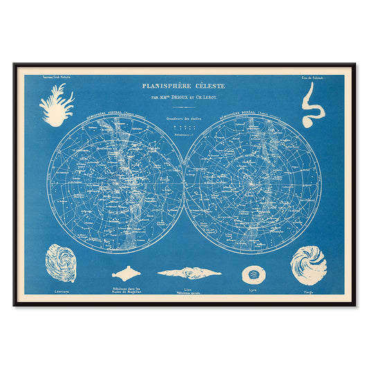
Planisfære celeste Plakat
Claude-Joseph Drioux · 1886 · Detaljeret vintage stjernekort med to halvkugler og fint stregværk
Plakat fra 69 kr · Indrammet fra 122,67 kr
Normalpris Fra 46,00 krNormalpris -
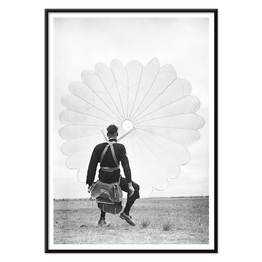
Flyvevåbenets faldskærmsspringer Plakat
Ray Olsen · 1939 · Dramatiske luftfartsplakat med faldskærmsspringer i højkontrast sort, hvid og grå komposition
Plakat fra 69 kr · Indrammet fra 122,67 kr
Normalpris Fra 46,00 krNormalpris -
Grøn Caladium Mirabile Plakat
Benjamin Fawsett · 1865 · Frodigt caladium botanisk tryk med årer i grønne nuancer og delikate hvide striber
Plakat fra 69 kr · Indrammet fra 122,67 kr
Normalpris Fra 46,00 krNormalpris -
Grøn Caladium Chantini Plakat
Benjamin Fawsett · 1865 · Elegant botanisk tryk af caladiumblade med grønne årer og blid rosa tone
Plakat fra 69 kr · Indrammet fra 122,67 kr
Normalpris Fra 46,00 krNormalpris -
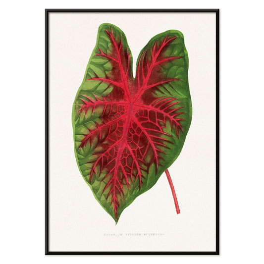
Caladium bicolor Plakat
Alexander Francis Lydon · 1865 · elegant caladium bicolor botanisk tryk med markant grønt blad og røde årer
Plakat fra 69 kr · Indrammet fra 122,67 kr
Normalpris Fra 46,00 krNormalpris -
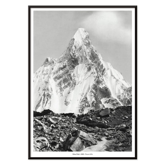
Mitre Peak Plakat
Vittorio Sella · 1909 · dramatisk sort-hvidt kunsttryk af Mitre Peak der indfanger stejle klipper og alpin tåge
Plakat fra 69 kr · Indrammet fra 122,67 kr
Normalpris Fra 46,00 krNormalpris -
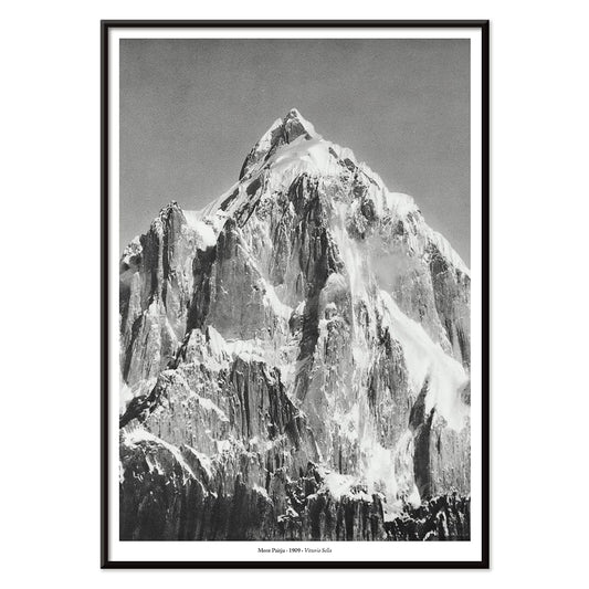
Le mont Paitju Plakat
Vittorio Sella · 1909 · dramatiske sort-hvide bjergplakat der indfanger Mont Paitju i klart alpelys
Plakat fra 69 kr · Indrammet fra 122,67 kr
Normalpris Fra 46,00 krNormalpris -
Broad Peak 2 Plakat
Vittorio Sella · 1909 · Markant alpine vintagetryk der viser klatrere på en gletsjer under den tårnhøje Broad Peak
Plakat fra 69 kr · Indrammet fra 122,67 kr
Normalpris Fra 46,00 krNormalpris -
Le Siniolchu Plakat
Vittorio Sella · 1899 · monokrom plakat af Le Siniolchu med klart alpellys, dybe sorttoner og dramatiske snerygge
Plakat fra 69 kr · Indrammet fra 122,67 kr
Normalpris Fra 46,00 krNormalpris -
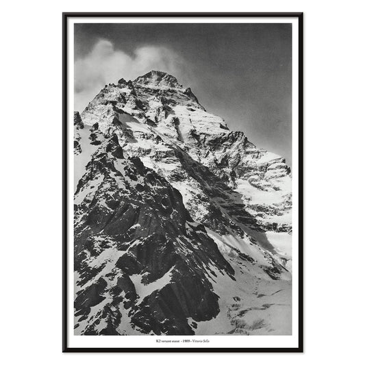
K2s vestflanke Plakat
Vittorio Sella · 1909 · Monumentalt K2 vintagetryk i klare sorte og sølvgrå toner med stærk kontrast
Plakat fra 69 kr · Indrammet fra 122,67 kr
Normalpris Fra 46,00 krNormalpris -
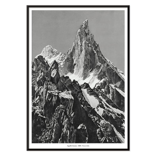
Kalkstensnål Plakat
Vittorio Sella · 1909 · Slående sort-hvidt bjergtryk med dramatisk, stærk kalkstensnål mod åben himmel
Plakat fra 69 kr · Indrammet fra 122,67 kr
Normalpris Fra 46,00 krNormalpris -
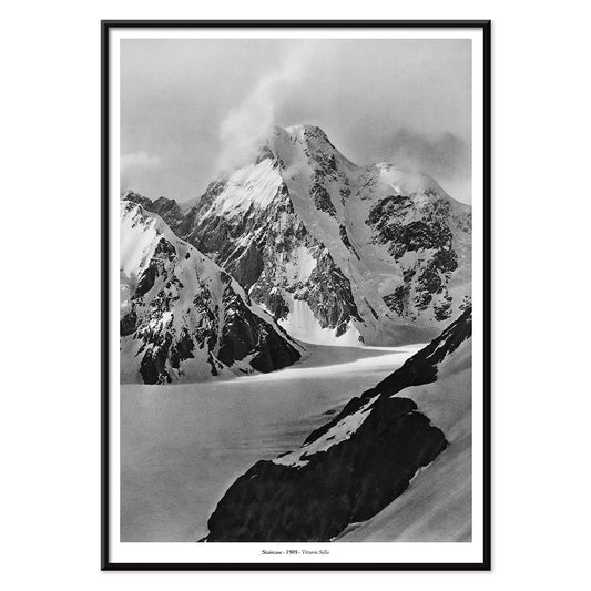
Trappe Plakat
Vittorio Sella · 1887 · iøjnefaldende sort-hvidt bjergtryk med trappeformede kamme der rækker mod himlen i minimalistisk indretning
Plakat fra 69 kr · Indrammet fra 122,67 kr
Normalpris Fra 46,00 krNormalpris -
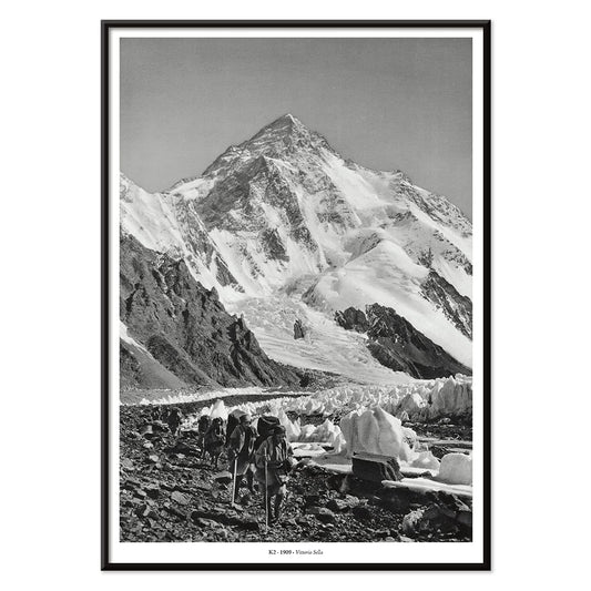
Toppen af K2 Plakat
Vittorio Sella · 1909 · Dramatisk sort-hvid K2 gletsjerplakat med markante rygkamme og ekspeditionsstemning i kølige toner
Plakat fra 69 kr · Indrammet fra 122,67 kr
Normalpris Fra 46,00 krNormalpris -
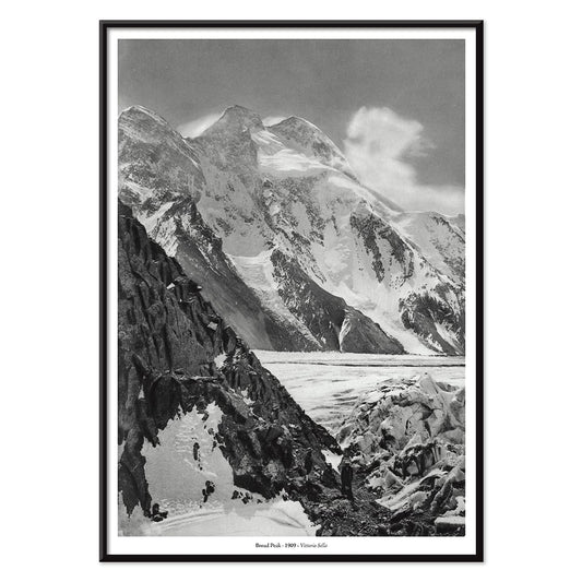
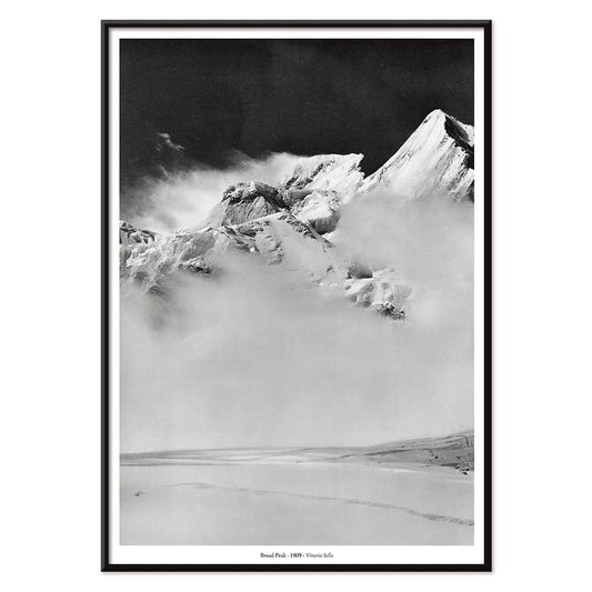
Broad Peak Plakat
Vittorio Sella · 1909 · Dramatiske sort-hvide bjergkunsttryk med skyindhyllet top og dybe skygger
Plakat fra 69 kr · Indrammet fra 122,67 kr
Normalpris Fra 46,00 krNormalpris -
Nudestudie Plakat
Kenyon Cox · 1896 · Akademisk nudestudie kunsttryk af en siddende læser i delikat grafitskygge
Plakat fra 69 kr · Indrammet fra 122,67 kr
Normalpris Fra 46,00 krNormalpris -
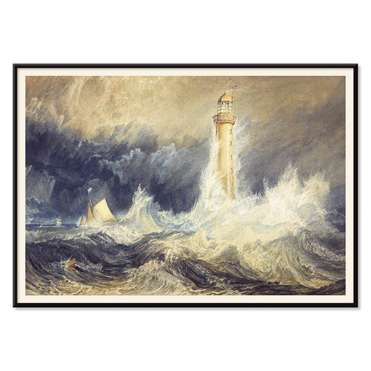
Bell Rock fyrtårn Plakat
Joseph Mallord William Turner · 1819 · Dramatiske sømotiv kunsttryk med Bell Rock fyrtårn i brudende bølger
Plakat fra 69 kr · Indrammet fra 122,67 kr
Normalpris Fra 46,00 krNormalpris -
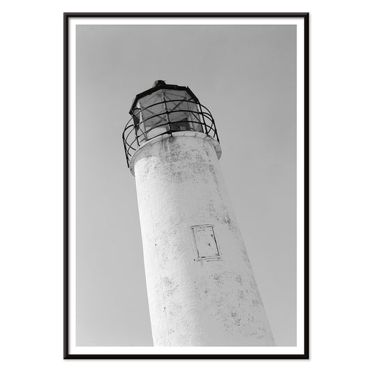
Cape Saint George Fyr 2 Plakat
Ukendt kunstner · 1933 · Stemningsfuldt vintage tryk af fyr i sort-hvid med klart fokus og kysthorisont
Plakat fra 69 kr · Indrammet fra 122,67 kr
Normalpris Fra 46,00 krNormalpris -
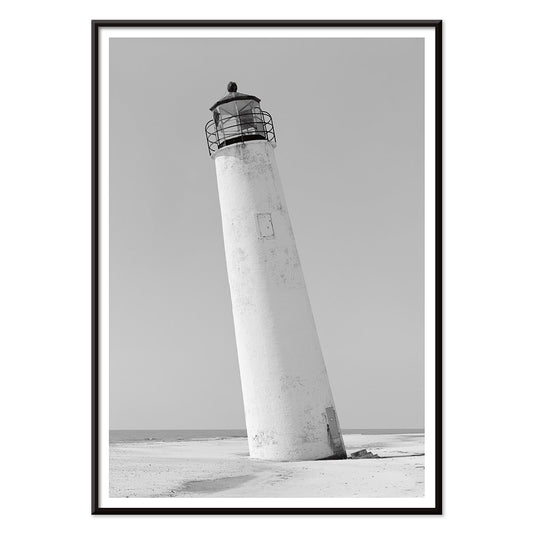
Cape Saint George fyr Plakat
Ukendt kunstner · 1933 · Stærk kystplakat i sort-hvid af et hældende fyr over stille klitter
Plakat fra 69 kr · Indrammet fra 122,67 kr
Normalpris Fra 46,00 krNormalpris -
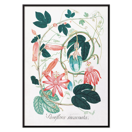
Passiflora Incarnata Plakat
Ukendt kunstner · 1847 · Delikat passionblomsttryk med fligede grønne blade og sart rosa og hvid blomst
Plakat fra 69 kr · Indrammet fra 122,67 kr
Normalpris Fra 46,00 krNormalpris


72/940 items
- Zodiakens tegn Plakat
- Redlands Bicycle Classic Plakat
- Cachou Lajaunie Plakat
- Enhver person med en idé Plakat
- Mickey Mouse Plakat
- Sejl Plakat
- Grands Prix de France Plakat
- Kvinde siddende på en gren Plakat
- New York minimalistisk kort Plakat
- Coffea arabica 3 Plakat
- Cirkelkaffe Plakat
- Coffea arabica Plakat
- Coffea Arabica 2 Plakat
- Porto Ramos-Pinto Plakat
- Portugal i dag Plakat
- Røde og grønne tomater Plakat
- Minimalistisk Pariskort Plakat
- Minimalistisk Valencia Plakat
- Minimalistisk Madrid-kort plakat
- Minimalistisk Buenos Aires kort Plakat
- Minimalistisk São Paulo kort Plakat
- Minimalistisk Rio de Janeiro Plakat
- Minimalistisk Porto Plakat
- Minimalistisk Lissabonkort Plakat
- Minimalistisk Londonkort Plakat
- Flyvevåbenets faldskærmsspringer Plakat
- Grøn Caladium Mirabile Plakat
- Grøn Caladium Chantini Plakat
- Caladium bicolor Plakat
- Mitre Peak Plakat
- Le mont Paitju Plakat
- Le Siniolchu Plakat
- Kalkstensnål Plakat
- Trappe Plakat
- Toppen af K2 Plakat
- Broad Peak Plakat
- Cape Saint George Fyr 2 Plakat
- Cape Saint George fyr Plakat
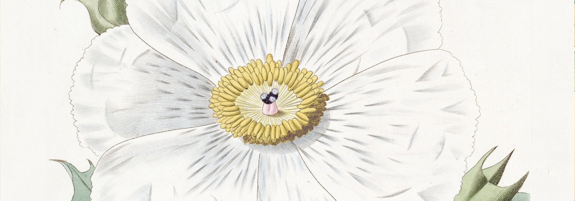
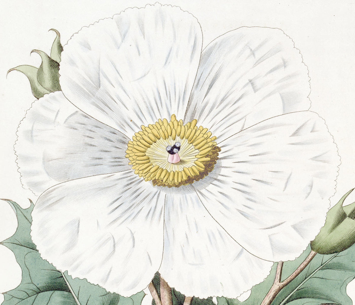
White as a canvas
White is not a theme so much as a breathing space. This collection gathers poster and print designs where generous margins, pale grounds, and paper-toned light do the heavy lifting. Think studio walls, quiet libraries, coastal apartments: white becomes a deliberate kind of decoration, not an absence. You will see it across Advertising graphics, modernist abstraction, scientific plates, and minimalist cartography. Because the background stays open, you notice the texture of ink, the pause between shapes, and the way a title line sits on the page. It is wall art for rooms that crave clarity and air.
When the background becomes the subject
Look closely and the white becomes an active surface. In Anna Atkins’s Fern (1850), the cyanotype process fixes Prussian blue on sensitized paper, turning blankness into a halo around every frond and making the sheet itself feel like an image. Wassily Kandinsky’s Four Parts (1932) uses crisp intervals of empty ground so its geometry reads like music on a staff, each form given room to sound. For a different kind of graphic poise, Kohler Chocolat (1914) by F. Champenois floats ornament and typography on a clean field, letting the peacock motif feel almost sculptural. Even Gustav Klimt’s Portrait of Adele Bloch-Bauer I (1907) reads brighter when the pale surround sets off gold and pattern.
Where white prints live best at home
In interiors, this kind of wall art behaves like daylight: it spreads rather than crowds. In a narrow hallway, a white-led art print extends the sense of depth; in a kitchen, it keeps busy shelves and countertops from feeling visually noisy. Bedrooms benefit too, especially above linen headboards where the paper tone echoes fabric. Pair these prints with oak, travertine, rattan, and brushed steel, then pull small accents from the room: sage tiles, terracotta ceramics, or ink-black hardware. For higher contrast, see Black & White; for pared-back structure, Minimalist; for delicate linework, Botanical; and for graphic cartography, Maps.
Building a gallery wall with air
Curating a gallery wall with white space is about rhythm and distance. Start with one assertive image, then give it quieter neighbors, keeping 5 to 8 cm between frames so the wall itself reads as part of the composition. The sweeping curve of Hokusai’s The Great Wave off Kanagawa (c. 1830) can sit beside modernist geometry, especially works linked to Bauhaus where circles and grids echo the surf. For a softer counterpoint, travel scenes and woodblock traditions in Oriental add misty gradients and calligraphic line. Choose off-white mats if your walls are bright white; that small shift keeps a vintage print from looking clinical under LEDs.
The quiet power of restraint
What ties the collection together is not a single school, but a shared respect for the blank. White carries pencil marks, lithographic dots, and ink washes; it also holds the story of age, like a page pulled from an archive and pinned up again. That is why these posters sit comfortably beside objects with patina: ceramics, worn wood, brass, or a stack of art books. If you want the same sense of air with a more photographic register, Photo offers pale tonal fields and controlled contrast. Chosen as a poster or art print, this vintage-minded decoration leaves room for furniture and for light to move across the wall.