


- Ødelæg dette rasende bæst Plakat
- Den gode nabo i Sydamerika Plakat
- Italien med Vatikanstaten Plakat
- Løg Plakat
- Bec-Kina Plakat
- Kohler Chocolat Plakat
- Jordbærtyven Plakat
- Tom Krojer Udstillingsplakat
- Ernst Kirchner udstillingsplakat Plakat
- El Comienzo Plakat
- Parler Seul 2 Plakat
- Tusmørkets Ring Plakat
- Parler Seul Plakat
- Faun og Nymfe Plakat
- Drømmen Plakat
- Le Concert Plakat
- Fugl passerer gennem en sky Plakat
- Kvindelig kunstner Plakat
- Pink Panthers hævn Plakat
- Kvinde og fugl om natten Plakat
- Bauhaus 20 Plakat
- Blå japansk trane Plakat
- Snoopy Come Home Plakat
- Til London med Jet Clipper plakat
- Kyushu-Okinawa Plakat
- Xerez Pedro Domecq Plakat
- Balsam Aperitif Plakat
- Smør Plakat
- Crans-sur-Sierre Plakat
- Monte Carlo Plakat
- Øl og cigaret Plakat
- Mexicos vestkyst Plakat
- Rita Gaufres Plakat
- Hibiscus Plakat
-
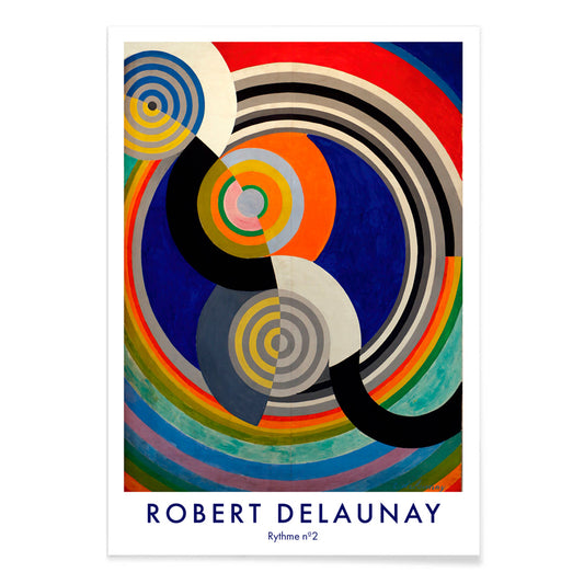
Rythme n°2 Plakat
Robert Delaunay · 1938 · Grafisk kunsttryk med rytmiske, sammenflettede cirkler i stærke primærfarver og kontraster
Plakat fra 69 kr · Indrammet fra 122,67 kr
Normalpris Fra 46,00 krNormalpris -
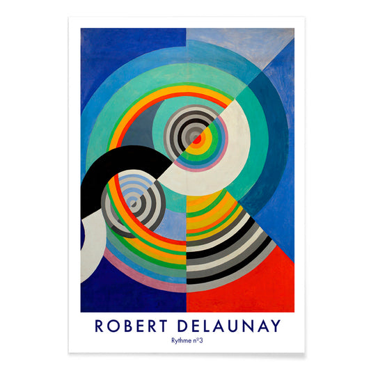
Rythme n°3 Plakat
Robert Delaunay · 1938 · energisk abstrakt plakat med koncentriske cirkler i blå, rød, gul og grøn
Plakat fra 69 kr · Indrammet fra 122,67 kr
Normalpris Fra 46,00 krNormalpris -
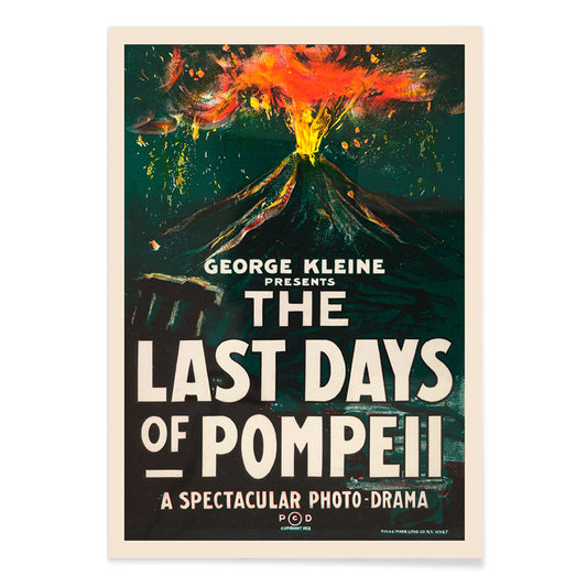
De sidste dage i Pompeji Plakat
H.C. Miner · 1913 · Dramatisk vulkanudbrud filmposter med markant typografi og glødende orange røg
Plakat fra 69 kr · Indrammet fra 122,67 kr
Normalpris Fra 46,00 krNormalpris -
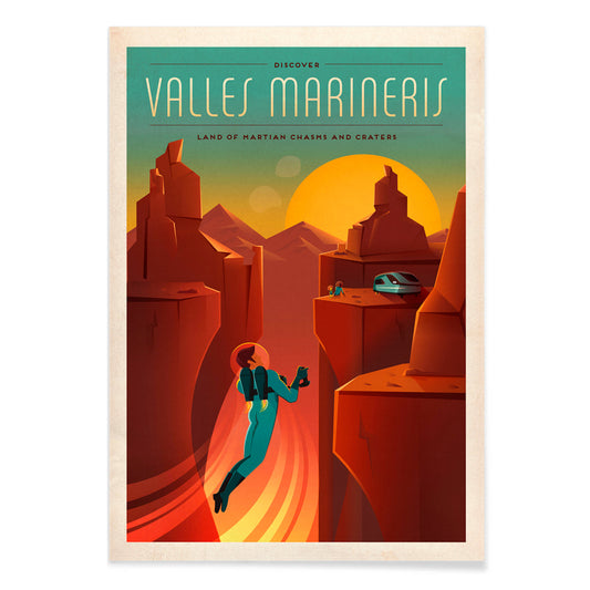
Valles Marineris Plakat
SpaceX · 2015 · Vintageinspireret Marskløftplakat med astronautsilhuet i gylden solnedgang, grafisk og stemningsfuld
Plakat fra 69 kr · Indrammet fra 122,67 kr
Normalpris Fra 46,00 krNormalpris -
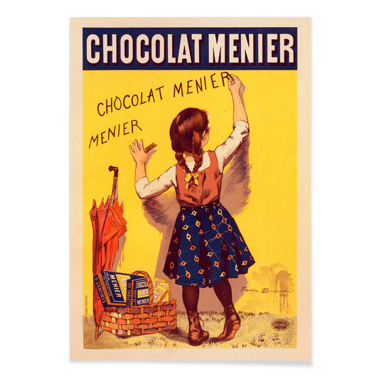
Chocolat Menier Plakat
Firmin Bouisset · 1896 · legende fransk reklameplakat med en pige der kridter Chocolat Menier på en gul væg
Plakat fra 69 kr · Indrammet fra 122,67 kr
Normalpris Fra 46,00 krNormalpris -
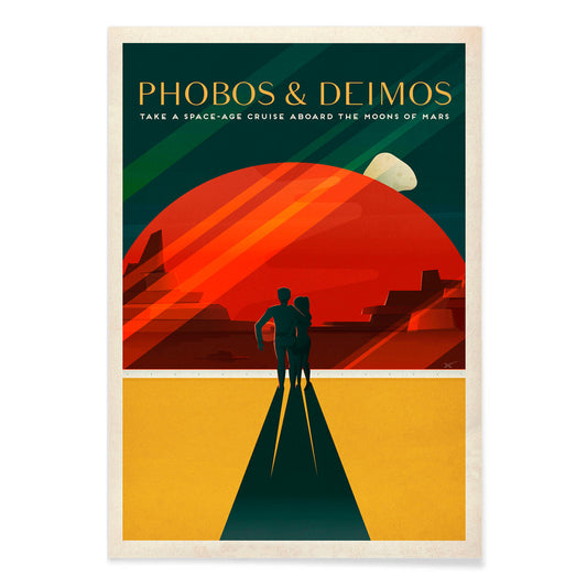
Phobos & Deimos Plakat
SpaceX · 2020 · Retro Mars rejseplakat med par under Phobos og Deimos i røde toner
Plakat fra 69 kr · Indrammet fra 122,67 kr
Normalpris Fra 46,00 krNormalpris -
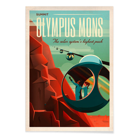
Olympus Mons Plakat
SpaceX · 2021 · Retrofuturistisk Mars rejseplakat med kabelvogne på Olympus Mons' røde skråninger i dramatiske farver
Plakat fra 69 kr · Indrammet fra 122,67 kr
Normalpris Fra 46,00 krNormalpris -
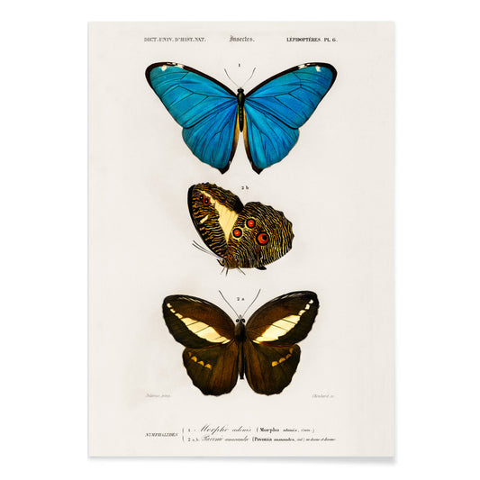
Blå og brune sommerfugle Plakat
Charles Dessalines D' Orbigny · 1806 · Fin sommerfugletryk med blå vinger og varme brune nuancer
Plakat fra 69 kr · Indrammet fra 122,67 kr
Normalpris Fra 46,00 krNormalpris -
Linum glandulosum Plakat
Charles Dessalines D' Orbigny · 1847 · Delikat gul hør botanisk tryk med præcis stregføring på blødt patineret papir
Plakat fra 69 kr · Indrammet fra 122,67 kr
Normalpris Fra 46,00 krNormalpris -
Buddhahoved Plakat
Reijer Stolk · 1943 · Buddhahoved kunsttryk i varme gyldne nuancer og bløde grafitkonturer til rolige rum
Plakat fra 69 kr · Indrammet fra 122,67 kr
Normalpris Fra 46,00 krNormalpris -
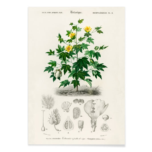
Gossypium vitifolium Plakat
Charles Dessalines d'Orbigny · 1849 · Fint botanisk tryk af Sea Island-bomuld med takkede blade, lyse blomster og bomuldkapsler
Plakat fra 69 kr · Indrammet fra 122,67 kr
Normalpris Fra 46,00 krNormalpris -
Avocado Persea Plakat
Amada Almira Newton · 1916 · Detaljeret botanisk tryk af avocado med skåret frugt, stor kerne og blanke blade
Plakat fra 69 kr · Indrammet fra 122,67 kr
Normalpris Fra 46,00 krNormalpris -
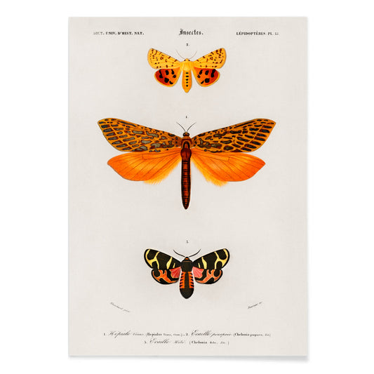
Orange møl Plakat
Charles Dessalines D' Orbigny · 1841 · livligt orange natsværmertryk arrangeret som en nøjagtig naturhistorisk plakat
Plakat fra 69 kr · Indrammet fra 122,67 kr
Normalpris Fra 46,00 krNormalpris -
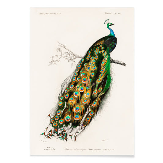
Pavo Cristatus Plakat
Charles Dessalines D' Orbigny · 1849 · Elegant indisk påfugletryk med juveltonede fjer og fine naturhistoriske detaljer
Plakat fra 69 kr · Indrammet fra 122,67 kr
Normalpris Fra 46,00 krNormalpris -
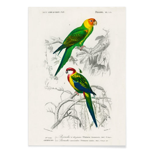
Parakit Plakat
Charles Dessalines D' Orbigny · 1806 · Levende parakittryk med siddende fugle og præcise naturhistoriske detaljer
Plakat fra 69 kr · Indrammet fra 122,67 kr
Normalpris Fra 46,00 krNormalpris -
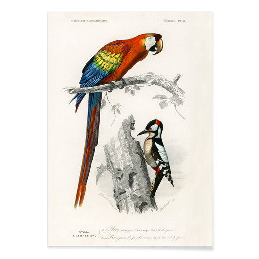
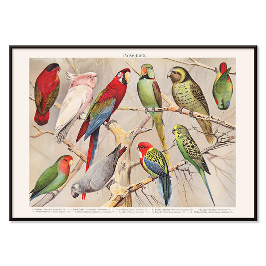
Papegøjer III Plakat
Charles Dessalines D' Orbigny · 1841 · Farverigt papegøjetryk med ranke fugle på en gren og præcis naturalistisk detalje
Plakat fra 69 kr · Indrammet fra 122,67 kr
Normalpris Fra 46,00 krNormalpris -
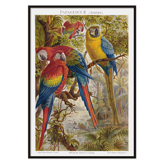
Papegøjer II Plakat
Institutet i Leipzig · 1895 · Frodigt papegøjetryk med tre farverige araer på tropiske grene
Plakat fra 69 kr · Indrammet fra 122,67 kr
Normalpris Fra 46,00 krNormalpris -
Papegøjer I Plakat
Institut of Leipzig · 1972 · Livligt papegøjetryk arrangeret som en naturhistorisk plade med skarpe videnskabelige detaljer
Plakat fra 69 kr · Indrammet fra 122,67 kr
Normalpris Fra 46,00 krNormalpris -
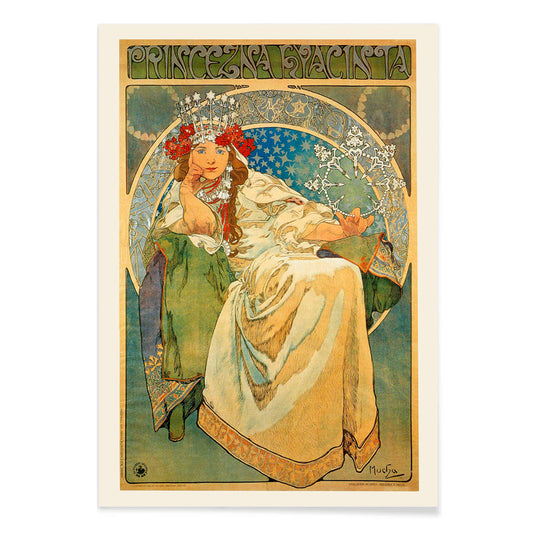
Princezna Hyacinta Plakat
Alfons Mucha · 1911 · Elegant Art Nouveau plakat med kronet prinsesse omgivet af blomsterrig ornamentik
Plakat fra 69 kr · Indrammet fra 122,67 kr
Normalpris Fra 46,00 krNormalpris -
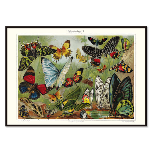
Sommerfugle II Plakat
Institut i Leipzig · 1971 · Vintage sommerfugleplakat med farverige eksemplarer arrangeret i en præcis undervisningsopstilling
Plakat fra 69 kr · Indrammet fra 122,67 kr
Normalpris Fra 46,00 krNormalpris -
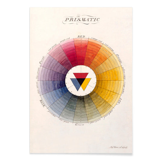
Prismatisk farvehjul Plakat
Moses Harris · 1766 · Oplysningstidens farvehjulstryk med strålende primære og sekundære farver i præcis opstilling
Plakat fra 69 kr · Indrammet fra 122,67 kr
Normalpris Fra 46,00 krNormalpris -
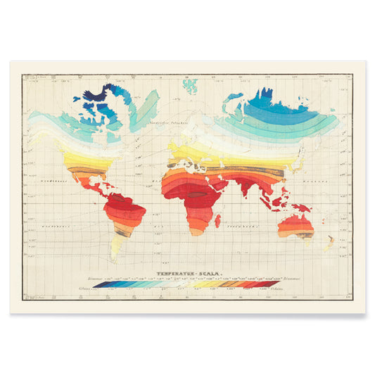
Temperaturverdenskort Plakat
Wilhelm Ebel · 1850 · Detaljeret temperaturverdenskort i vintage tryk med bløde gradientbånd der kortlægger klimazoner
Plakat fra 69 kr · Indrammet fra 122,67 kr
Normalpris Fra 46,00 krNormalpris -
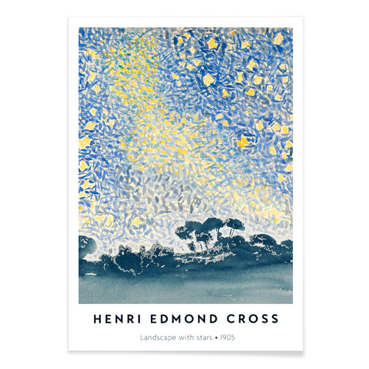
Landskab med stjerner Plakat
Henri-Edmond Cross · 1907 · Pointillistisk natlandskabstryk med glimtende stjerner, rolig og stemningsfuld middelhavsatmosfære
Plakat fra 69 kr · Indrammet fra 122,67 kr
Normalpris Fra 46,00 krNormalpris -
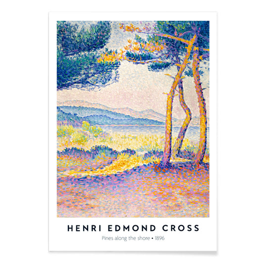
Fyrretræer langs kysten Plakat
Henri-Edmond Cross · 1896 · Lysende pointillistisk kystkunsttryk med fyrretræer, klipper og blinkende blåt vand
Plakat fra 69 kr · Indrammet fra 122,67 kr
Normalpris Fra 46,00 krNormalpris -
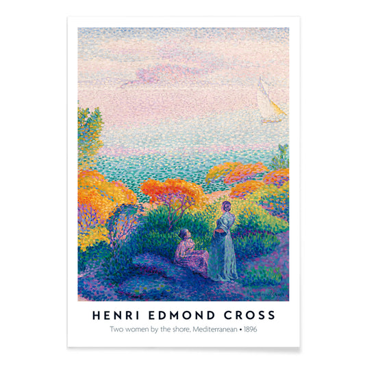
To kvinder ved kysten Plakat
Henri-Edmond Cross · 1896 · Strålende kystkunsttryk med to kvinder i skinnende lys og rolige horisonter
Plakat fra 69 kr · Indrammet fra 122,67 kr
Normalpris Fra 46,00 krNormalpris -
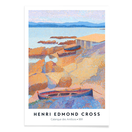
Calanque des Antibois Plakat
Henri-Edmond Cross · 1891 · neoimpressionistisk kystkunsttryk med glimtende blå hav, varme klipper og sommerlys
Plakat fra 69 kr · Indrammet fra 122,67 kr
Normalpris Fra 46,00 krNormalpris -
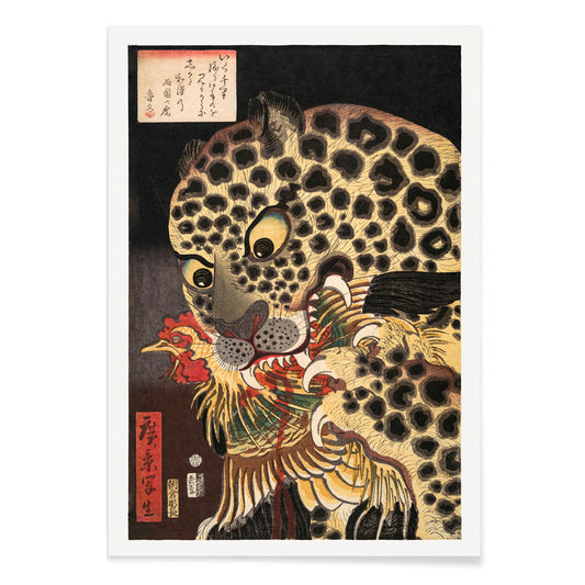
Tiger fra Ryōkoku Plakat
Utagawa Hirokage · 1860 · Dramatisk ukiyo-e kunsttryk af en tiger der griber en hane under markant kalligrafi
Plakat fra 69 kr · Indrammet fra 122,67 kr
Normalpris Fra 46,00 krNormalpris -
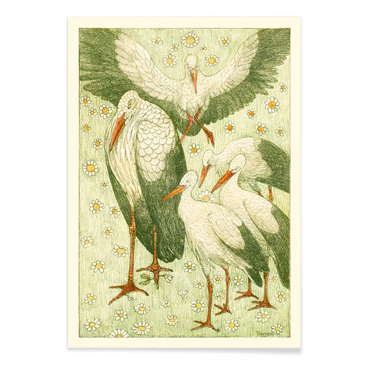
Fem storke i en eng Plakat
Theo van Hoytema · 1898 · Fredfyldt storketryk i en eng med let linjeføring og bløde grønne toner
Plakat fra 69 kr · Indrammet fra 122,67 kr
Normalpris Fra 46,00 krNormalpris -
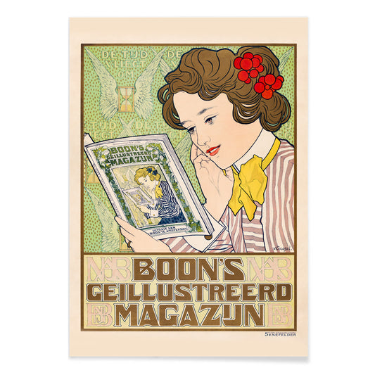
Boon Plakat
Johann Georg van Caspel · 1904 · Art Nouveau plakat med en læsende kvinde omgivet af blomster
Plakat fra 69 kr · Indrammet fra 122,67 kr
Normalpris Fra 46,00 krNormalpris -
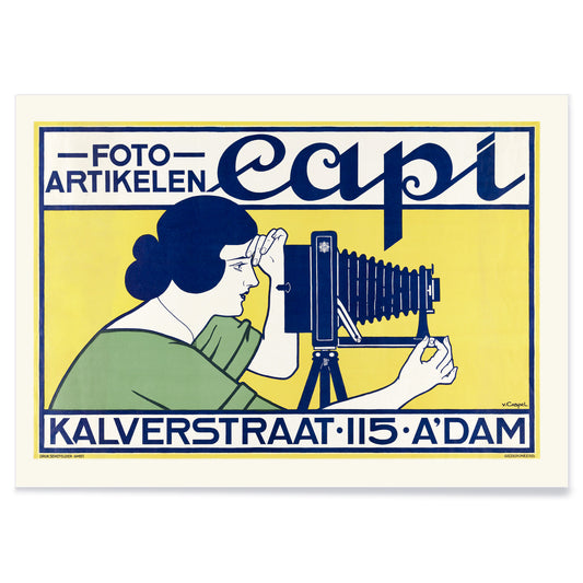
Capi Plakat
Johann Georg van Caspel · 1912 · Elegant Art Nouveau plakat med kvinde med kamera og markante blå accenter
Plakat fra 69 kr · Indrammet fra 122,67 kr
Normalpris Fra 46,00 krNormalpris -
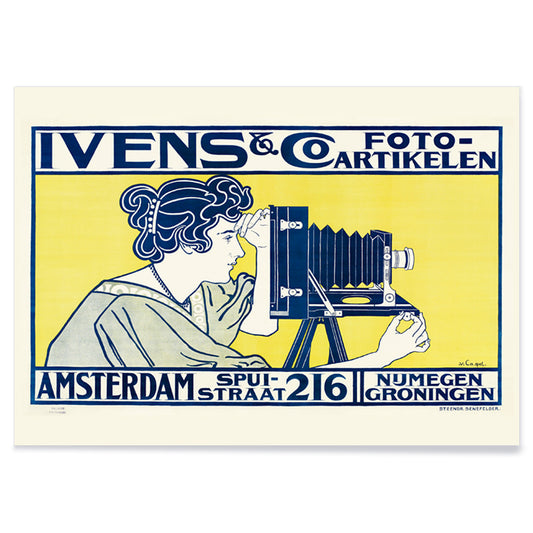
Ivens & Co. Plakat
Johann Georg van Caspel · 1899 · Art Nouveau-plakat med kameramotiv, elegant figur og blå og gule kontraster
Plakat fra 69 kr · Indrammet fra 122,67 kr
Normalpris Fra 46,00 krNormalpris -
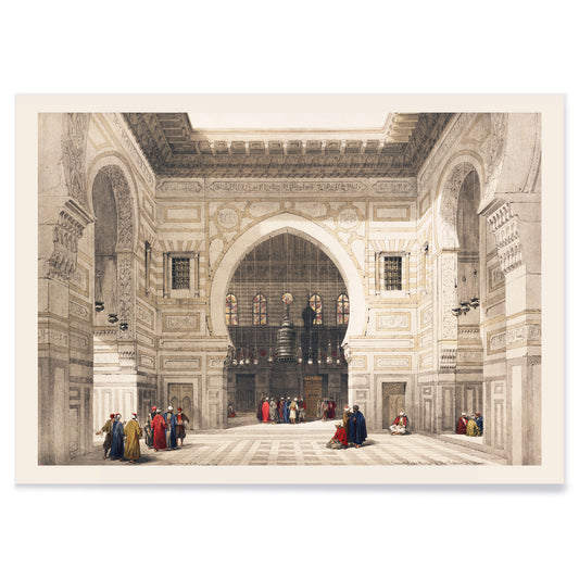
Moskeinteriør Plakat
David Roberts · 1839 · stemningsfuld moskeinteriørplakat med høje buer, blødt lys og stille figurer
Plakat fra 69 kr · Indrammet fra 122,67 kr
Normalpris Fra 46,00 krNormalpris -
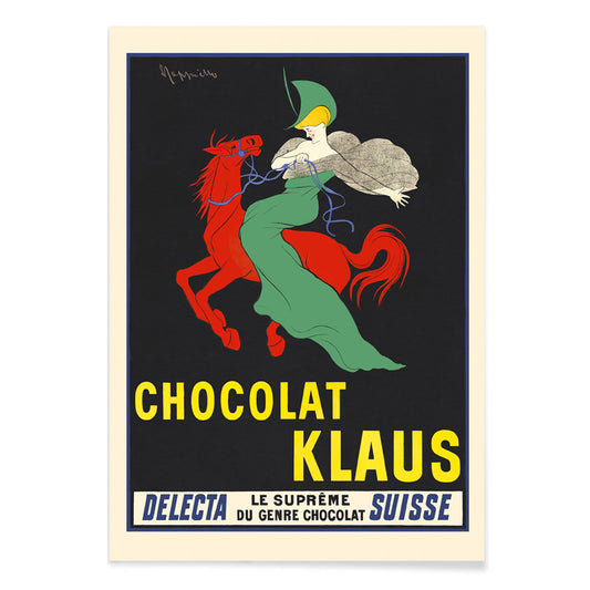
Chocolat Klaus Plakat
Leonetto Cappiello · 1903 · Slående rød hest og rytter i grønt plakat med stærk Belle Époque kontrast
Plakat fra 69 kr · Indrammet fra 122,67 kr
Normalpris Fra 46,00 krNormalpris -
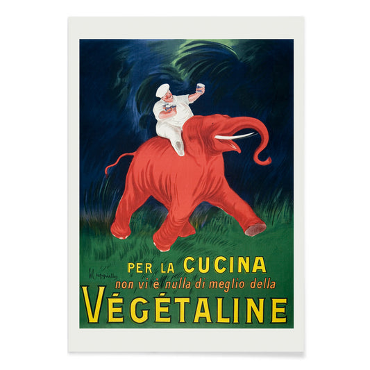
Vegetaline Plakat
Leonetto Cappiello · 1910 · Legesyg kok på en rød elefant i markant fransk reklameplakat
Plakat fra 69 kr · Indrammet fra 122,67 kr
Normalpris Fra 46,00 krNormalpris -
Cordial-Médoc Plakat
Leonetto Cappiello · 1907 · Livlig likørplakat med gulklædt danser omgivet af faldende druer i bevægelse
Plakat fra 69 kr · Indrammet fra 122,67 kr
Normalpris Fra 46,00 krNormalpris -
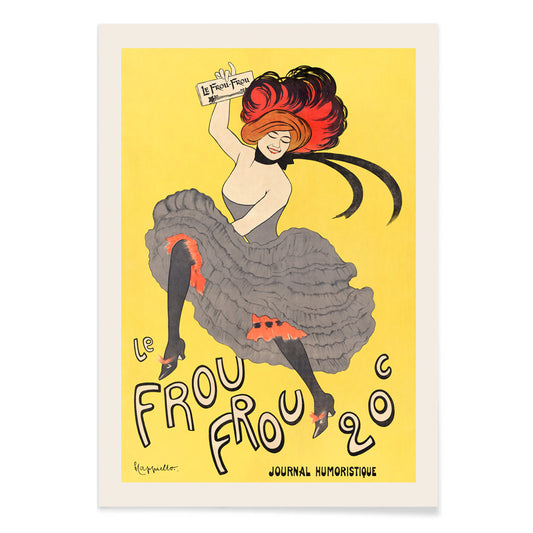
Le Frou Frou Plakat
Leonetto Cappiello · 1899 · Livlig cancanplakat med dristig typografi og Belle Époque natstemning
Plakat fra 69 kr · Indrammet fra 122,67 kr
Normalpris Fra 46,00 krNormalpris


36/706 items
- Rythme n°2 Plakat
- Rythme n°3 Plakat
- De sidste dage i Pompeji Plakat
- Valles Marineris Plakat
- Chocolat Menier Plakat
- Phobos & Deimos Plakat
- Olympus Mons Plakat
- Prismatisk farvehjul Plakat
- Landskab med stjerner Plakat
- Fyrretræer langs kysten Plakat
- To kvinder ved kysten Plakat
- Calanque des Antibois Plakat
- Tiger fra Ryōkoku Plakat
- Boon Plakat
- Vegetaline Plakat
A Yellow Thread Through Art History
This collection is not about monochrome. It follows the way yellow behaves when it enters an image: as light, as warning, as ornament, as a quick lift of energy. In vintage poster culture it grabs attention from the street; in modern painting it becomes structure; in natural history it suggests pollen, rind, and sun-aged paper. Read these posters and prints as a vocabulary of warmth, from buttery highlights to sharp, electric notes that alter the temperature of wall art.
Gold, Citrus, and the Logic of Color
Few works show yellow as both luxury and technique as clearly as Gustav Klimt’s The Kiss (1907–1908), where metallic yellows behave like tesserae, turning paint into surface and surface into symbolism. At the opposite pole, Michel Eugène Chevreul’s Cercle chromatique treats hue as measurable information, a scientific diagram that still reads as decorative design. Together they explain why yellow persists across eras: it can signal opulence, illumination, or method, making a vintage art print feel both immediate and intellectually grounded.
Using Yellow Accents in Interior Decoration
In home decor, yellow works best when it has a job. A narrow hallway benefits from a small flare near a mirror; a kitchen welcomes yellows that feel citrus or grain-like; a study can take sharper, more analytic tones. Pair yellow posters with chalky whites, walnut, and linen for quiet warmth, or set them against deep greens and inky blues for contrast. For restraint and geometry, move between Minimalist and Abstract; for natural counterpoints, Botanical keeps the color tethered to stems, seed heads, and scientific observation.
Curating a Gallery Wall with Pattern and Structure
When building a gallery wall, think in rhythms: pattern, grid, then a single vivid note. William Morris’s Strawberry Thief (1883) brings textile density and a garden logic that softens modern furniture. Balance it with Piet Mondrian’s Composition in White, Red, and Yellow (1936), where yellow becomes a measured plane rather than atmosphere. Add controlled dynamism through Wassily Kandinsky’s Circles in a circle, Bauhaus exhibition (1923), a bridge between exhibition poster design and painting. To extend the mix, Advertising supports bolder typography, Bauhaus tightens the formal language, and Classic Art introduces quieter tonal anchors.
Why Yellow Feels So Present
Yellow is often dismissed as mere decoration, yet it is frequently a compositional strategy: guiding the eye, implying sunlight, or mapping a system. Hung with intention, a small yellow passage can make surrounding colors read cleaner or deeper, as if the room’s light has been adjusted without touching the lamps.