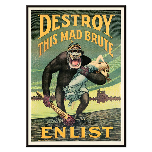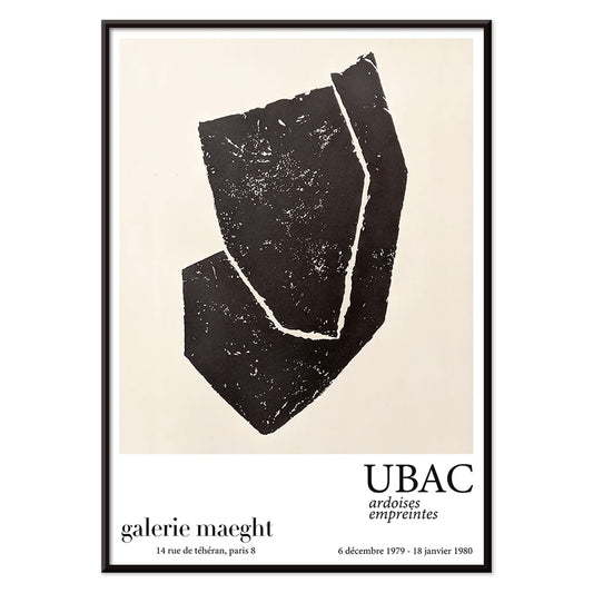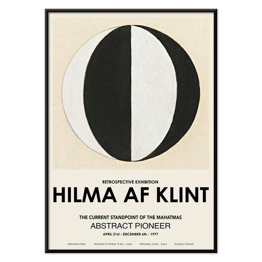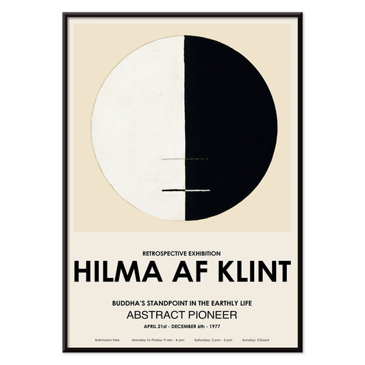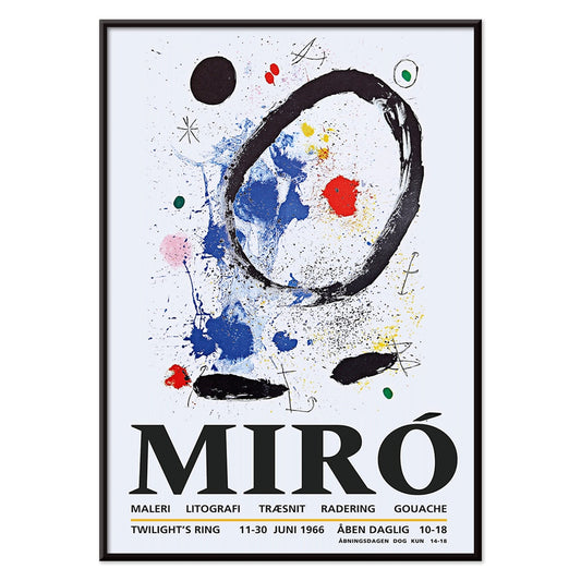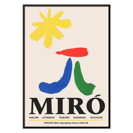




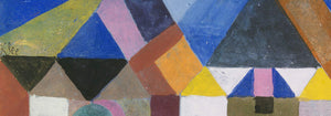
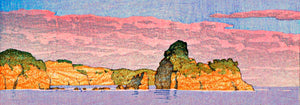

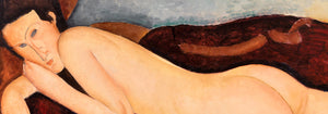
- Ødelæg dette rasende bæst Plakat
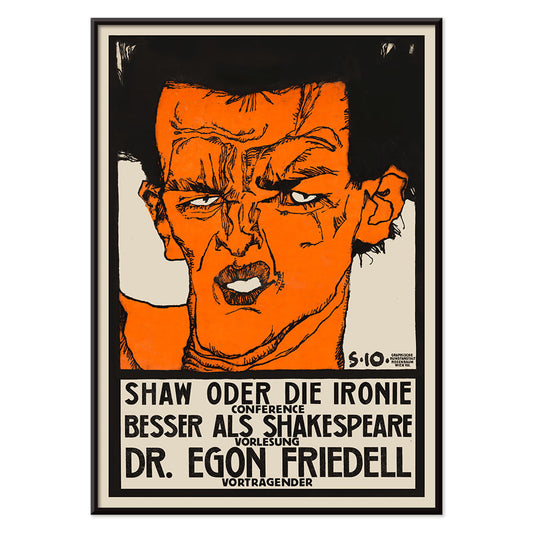
- Shaw eller ironi Plakat
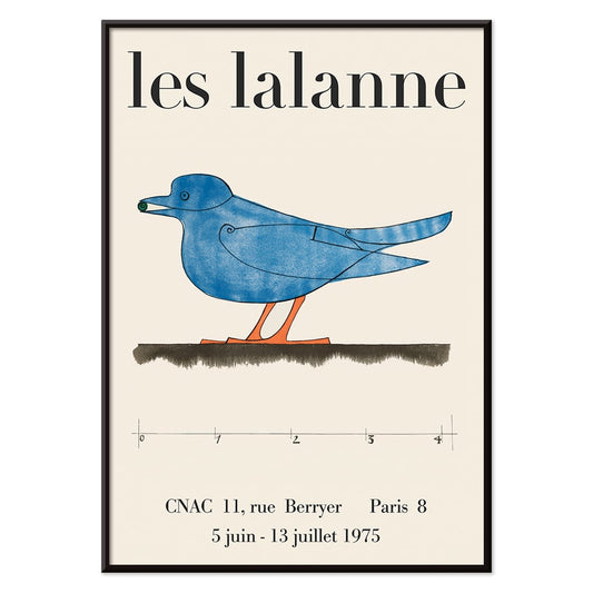
- Les Lalanne Plakat
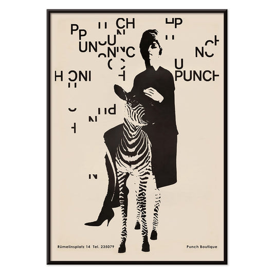
- Punch Boutique Plakat
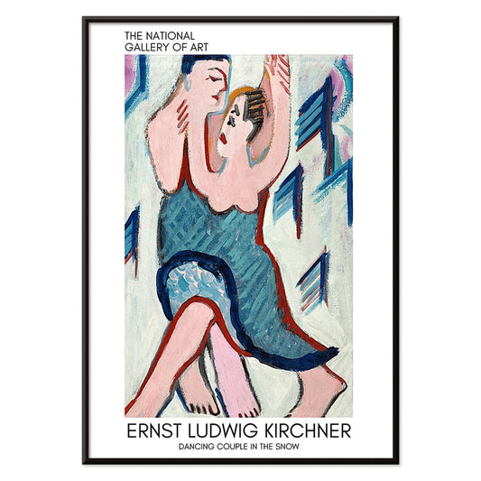
- Dansende par i sneen Plakat
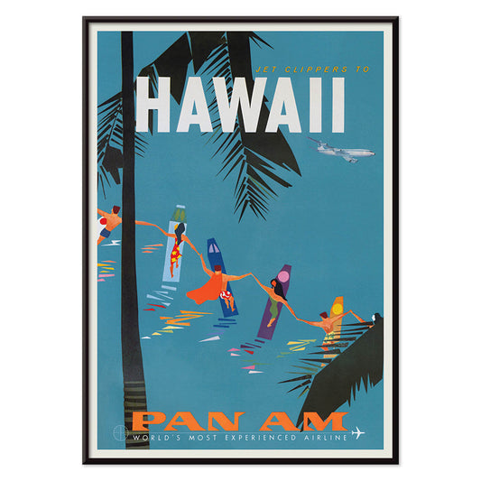
- Jet Clipper til Hawaii Plakat
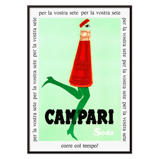
- Campari Soda Plakat
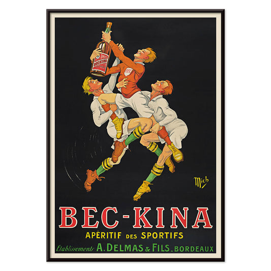
- Bec-Kina Plakat
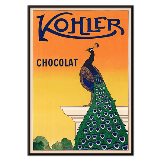
- Kohler Chocolat Plakat
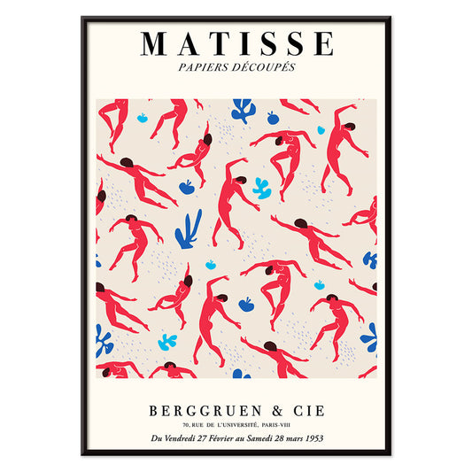
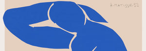
- Dansende figurer Matisse Plakat
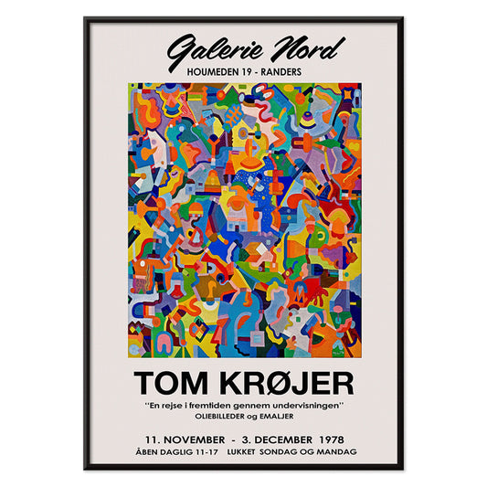
- Tom Krojer Udstillingsplakat
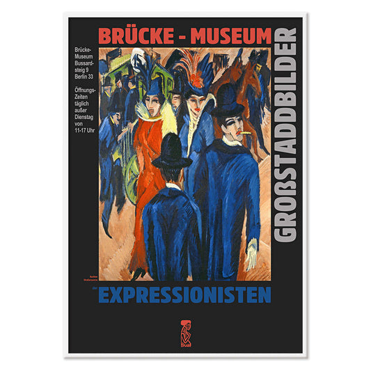
- Berlin gadescene Plakat
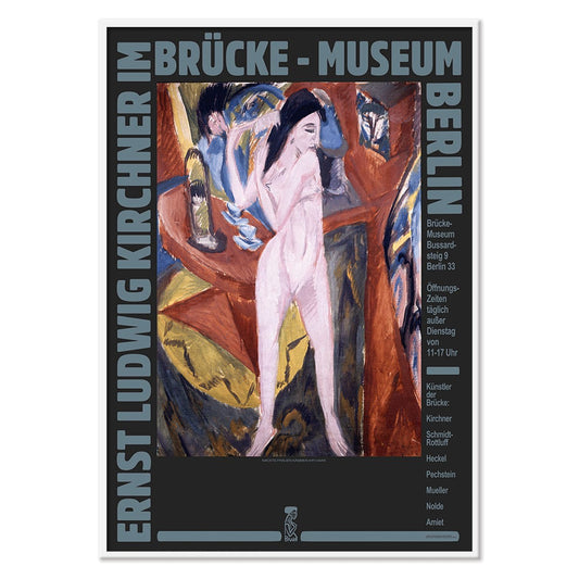
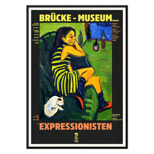
- Ernst Kirchner udstillingsplakat Plakat
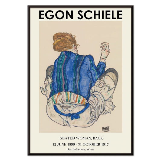
- Siddende kvinde set bagfra Plakat
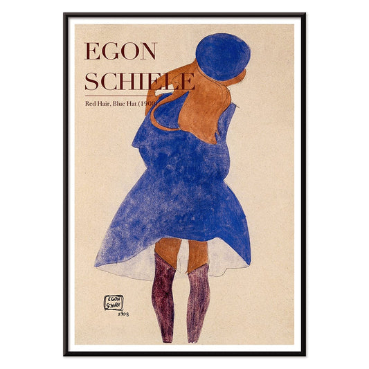
- Rødt hår blå hat Plakat
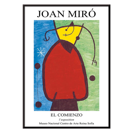
- El Comienzo Plakat
- Parler Seul 2 Plakat
- Mahatmaernes nuværende standpunkt Plakat
- Tusmørkets Ring Plakat
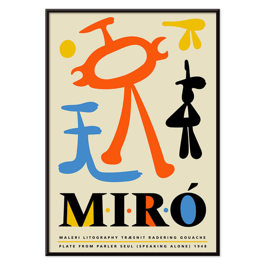
- Parler Seul Plakat
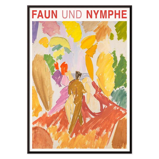
- Faun og Nymfe Plakat
- Drømmen Plakat
- Le Concert Plakat
- Fugl passerer gennem en sky Plakat
- Kvindelig kunstner Plakat
- Pink Panthers hævn Plakat
- Kvinde og fugl om natten Plakat
- Riley Blaze Plakat
- Besøg Puerto Rico Plakat
- Almanaque Plakat
- Spis flere frugter Plakat
- The Jefferson Airplane Plakat
- Snoopy Come Home Plakat
- Til London med Jet Clipper plakat
- Kyushu-Okinawa Plakat
- Xerez Pedro Domecq Plakat
- Balsam Aperitif Plakat
- Ødelæg dette rasende bæst Plakat
- Shaw eller ironi Plakat
- Les Lalanne Plakat
- Punch Boutique Plakat
- Dansende par i sneen Plakat
- Jet Clipper til Hawaii Plakat
- Campari Soda Plakat
- Bec-Kina Plakat
- Kohler Chocolat Plakat
- Dansende figurer Matisse Plakat
- Tom Krojer Udstillingsplakat
- Berlin gadescene Plakat
- Ernst Kirchner udstillingsplakat Plakat
- Siddende kvinde set bagfra Plakat
- Rødt hår blå hat Plakat
- El Comienzo Plakat
- Parler Seul 2 Plakat
- Mahatmaernes nuværende standpunkt Plakat
- Tusmørkets Ring Plakat
- Parler Seul Plakat
- Faun og Nymfe Plakat
- Drømmen Plakat
- Le Concert Plakat
- Fugl passerer gennem en sky Plakat
- Kvindelig kunstner Plakat
- Pink Panthers hævn Plakat
- Kvinde og fugl om natten Plakat


The street as gallery
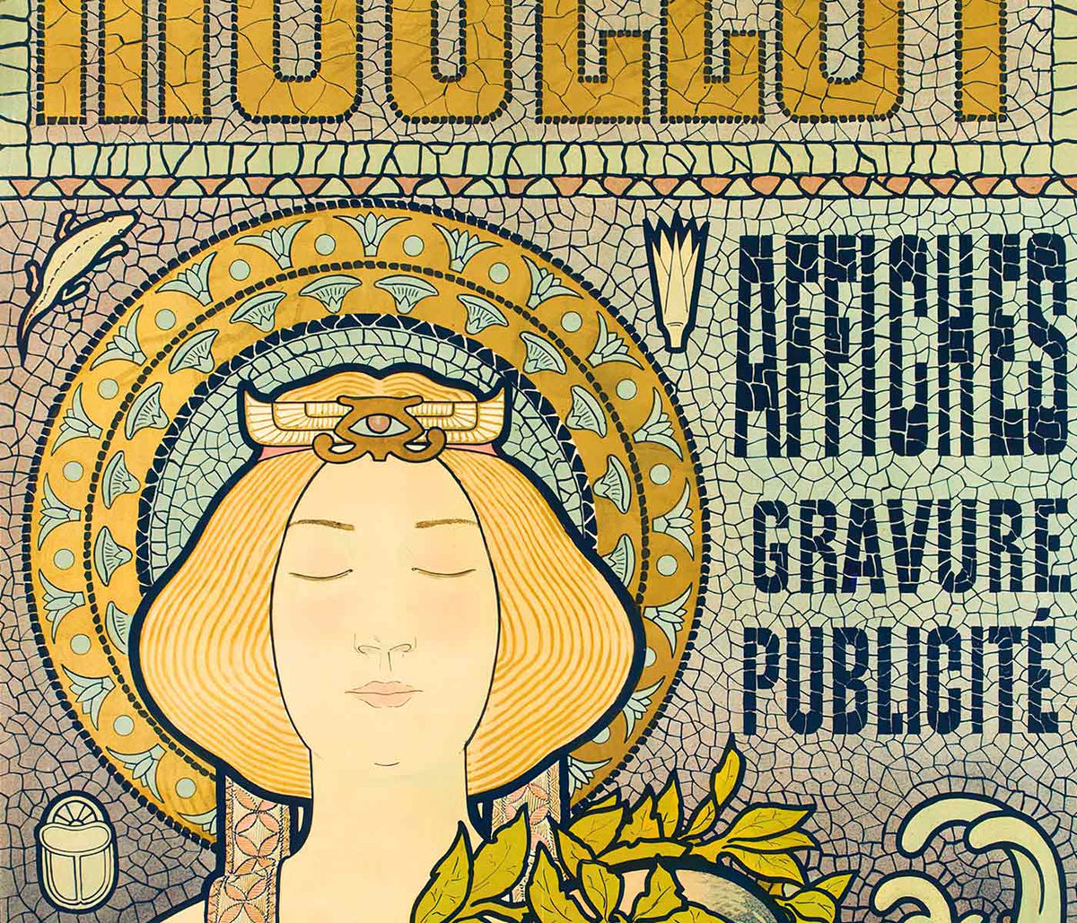
Advertising posters began as a public language, pasted to kiosks, tram stops, and café walls where images had seconds to do their work. From the Belle Époque to postwar modernism, the poster and the print evolved into everyday wall art that sat between news and theatre. Chromolithography offered velvety colour; later decades sharpened the message with blunt sans-serif typography and silhouettes legible from across a boulevard. These vintage sheets were never neutral decoration: they recorded what a city wanted to sell, celebrate, or warn against, with a pace set by crowds and streetlight.
Art Nouveau seduction and graphic simplification
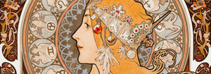
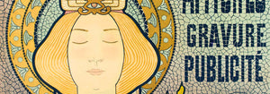
At the turn of the century, Art Nouveau treated commerce as spectacle, wrapping everyday products in ornamental line and stylised figure. Alphonse Mucha’s Job (1897) builds its profile from looping contours and muted golds, with smoke rendered as pattern, not haze. Leonetto Cappiello pushed further toward instant recognition: Vermouth Martini (1920) stages lemon-yellow bottles against a night-black field, a lesson in contrast that anticipates modern branding. Théophile Alexandre Steinlen’s Tournée du Chat Noir (1896) adds Montmartre bite with flat red, sharp whiskers, and a stare calibrated for the street. For adjacent styles and signatures, move between Advertising, Alphonse Mucha, and Leonetto Cappiello.
Placing vintage wall art in contemporary rooms
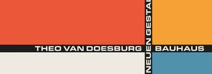
Because these posters were designed for quick reading, they behave well as design objects at home. Start with scale: one large poster over a sideboard reads like a piece of architecture, while two medium prints stacked can stabilise a narrow wall. Pull colour cues from the room rather than matching everything; a single echo of carmine, olive, or brass is enough to let the print feel intentional. In a studio or hallway, the disciplined geometry of Bauhaus keeps the rhythm brisk; in a living room with curved furniture and velvet, Art Nouveau line sits naturally beside softer textures. If the room already has strong pattern, consider calmer companions from Black & White to give the eye a rest.
Cinema modernism and Japanese graphic punch
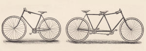
Mid-century design traded flourish for impact, and film posters became a laboratory for visual economy. Saul Bass’s Vertigo (1958) is practically a diagram of anxiety: spiral, figure, and off-kilter title arranged to deny stillness. Nearby, in Japanese modernism, Ikko Tanaka’s Kabuki (1974) treats black calligraphy as a drumbeat, letting white paper function as active space rather than background. These prints pair well with lacquer, walnut, brushed aluminium, and clean-lined shelving. To extend the same graphic cadence across eras, connect Movie with the calmer emphasis of Minimalist and the brisk motion cues in Bike.
Curating a wall that feels lived-in
To build a coherent gallery wall, repeat one constraint and vary everything else: keep margins consistent, or hold a tight palette while letting typography and illustration shift from piece to piece. Mixing vertical and horizontal formats can create a more editorial rhythm; Vertical Posters make strong anchors, while a single landscape print can act as a pause line. Frame choice matters less than proportion: a narrow black or walnut frame keeps type crisp, while a generous mat turns a commercial image into a considered art print. If you want a broad survey while keeping the theme, All Posters provides the wider context for building your own timeline of vintage decoration.


